

Connor Patterson
Defining the problem
As a product designer, I was tasked with creating an intuitive and user-friendly image upload UI for Cleeve web application.
The goal was to ensure that users could easily upload images or save links as bookmarks. This process involved multiple iterations, each refining the upload form design based on feedback and usability testing.
The initial challenge was to create an upload UI that was both ergonomic and visually appealing, guiding users through the process seamlessly.
The primary objectives were to:
- Design an upload UI that was easy to navigate.
- Ensure the image upload form was accessible on all devices.
- Create a visually appealing upload UI that captured user attention.
- Optimize the upload form design for better user interaction.
First iteration and initial design
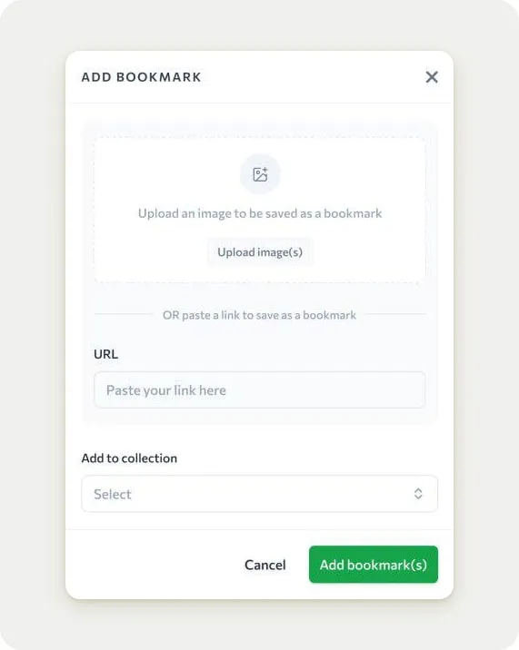
The first iteration of the upload UI design was straightforward.
The design featured a simple layout with a clear call-to-action for uploading images and a field for pasting URLs.
The interface was clean, but it lacked ergonomically. The layout was tall, which could be cumbersome on smaller screens. The text instructions were clear, but the overall design felt a bit bland and unengaging.
In this version, the "Upload image(s)" button was nicely placed, but it didn't stand out enough to grab the user's attention immediately. The "URL" input field was present but not underlined, making it less noticeable. The "Add to collection" dropdown was included, but its placement might not encourage interaction.
Feedback from this iteration highlighted the need for a more ergonomic layout and better visual order.
Client found the tall design inconvenient, especially on mobile devices. The lack of visual cues made it less effective for users to understand the primary actions they could take.
Second iteration and ergonomic tunes
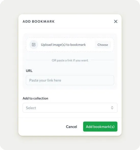
For the second iteration, I focused on creating a more ergonomic layout for the upload UI component.
The design was shortened to reduce scrolling, making it more accessible on mobile devices. The "Upload image(s)" button was a little bit scaled down, and the text instructions were simplified to make the process clearer.
The "URL" input field was kept but was not underlined, which made it less visually distinct. The "Add to collection" dropdown remained in the same position, but its design was slightly tuned to encourage interaction. The overall look was more streamlined, but it still was not enough to fit my client's satisfaction.
However, feedback from this iteration was positive regarding the layout, but users still found the interface somewhat might be improved.
The lack of visual hierarchy made it difficult for users to quickly understand the correct sequence. The "Upload image(s)" button, although more prominent, didn't stand out enough to be the first thing users noticed.
Third iteration with adding visual cues
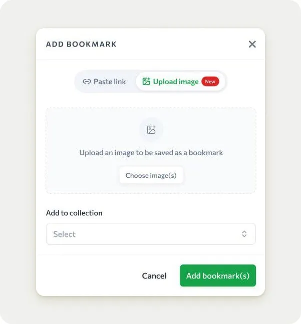
In the third iteration, I aimed to grab more attention by adding visual cues to the image upload UI design.
The most significant change was the addition of a red badge labeled "New" next to the "Upload image(s)" button. This was done to draw the user's eye to the primary action. The layout remained ergonomic, but the hierarchy was improved with the addition of the badge.
The "URL" input field was still not underlined, which made it less noticeable. The "Add to collection" dropdown was kept in the same position, but its design was further refined to encourage interaction. The overall look was more engaging, but the red badge felt a bit out of place and didn't integrate well with the rest of the design.
Feedback from this iteration was mixed.
While the red badge successfully drew attention to the "Upload image(s)" button, it felt too abrupt and didn't fit with the overall aesthetic. My client appreciated the improved adjustement but found the badge distracting. The "URL" input field was still not underlined, making it less intuitive for users to find.
Fourth iteration with optimal hierarchy and polished UI
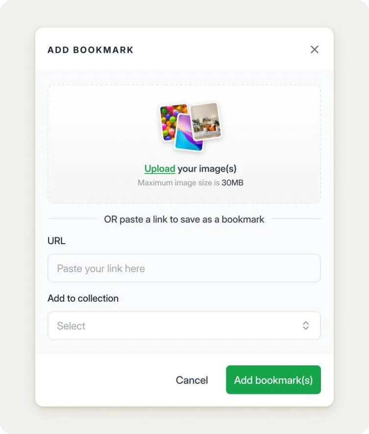
For the final iteration, I focused on final polishing the image upload form design.
The red badge was removed, and the "Upload image(s)" button was underlined to make it more active and eye-catching. The "URL" input field was brougth out as independent field, making it more significant. The layout remained ergonomic, and the overall design was polished to create a more cohesive look, whether it became taller a bit.
Fancy images were added to the upload section to make it more visually nice. The "Add to collection" dropdown was kept in the same position but was further refined to encourage interaction. The overall look was modern and engaging, with a clear visual hierarchy that guided users through the process.
Feedback from this iteration was overwhelmingly positive. Client found the design intuitive and engaging, with a clear understanding of the primary actions they could take. The underlined buttons and input fields made the interface more structured, and the fancy images added a touch of modern look.
This polished UI was well-received, and the client finally gave their approval.
What I learned during the process
The iterative design process for Cleeve's image upload component was complex but effective.
Each iteration built upon the previous one, refining the upload form design based on user feedback and usability rotation. The initial design was simple but lacked ergonomic considerations and proper order. The second iteration improved the layout but still needed better fixes. The third iteration added visual cues but felt too abrupt. The final iteration created an optimal hierarchy and polished UI, resulting in a design that was intuitive, effective, and well-received by users and the client.
Iteration is learning. Anyone afraid of iterating is afraid of learning, of being wrong. It's just ego. This process taught me the importance of embracing iteration as a means of continuous improvement. By being open to feedback and willing to make changes, we can create better upload UI designs that meet the needs of users and clients.
This case study highlights the importance of iterative design revisions. While refining the design based on feedback, we the designers are able to create the outstanding interfaces.
The process was ultimately rewarding, demonstrating the value of iterative design in product development.


