
Roman Kamushken
Part of: Dashboard UI design: From KPIs to layouts that convert — the complete reference to dashboard design on Setproduct.
AI has lowered the cost of producing polished UI.
A sleek SaaS dashboard can now appear in minutes. A designer can explore more directions in one session. A solo founder can move from idea to interface much faster. A product team can validate visual directions with far less friction.
This shift changes the source of advantage.
Visual production becomes easier, so the premium moves toward judgment. The strongest designers bring pattern recognition, structural taste, and the ability to choose dashboard layouts that support real product work.
That matters most in SaaS.
A dashboard serves as an operational surface. Teams use it to scan performance, spot anomalies, track workflows, compare segments, and move from overview to action. Because of that, strong dashboard design depends on hierarchy, clarity, filtering logic, chart readability, and state awareness.
This is why SaaS dashboard examples matter so much today.
The web already offers endless dashboard inspiration. The real opportunity lies in studying those examples with intent. A designer gains more from reading patterns than from collecting screenshots. A founder gains more from understanding structure than from chasing polished visuals. A product team gains more from reusable interface logic than from isolated eye candy.
That is the skill this article focuses on.
It covers how to study SaaS dashboard UI patterns, what to compare, which signals deserve attention, and why searchable pattern references have become more valuable in the AI era.
Why SaaS dashboard examples matter more today
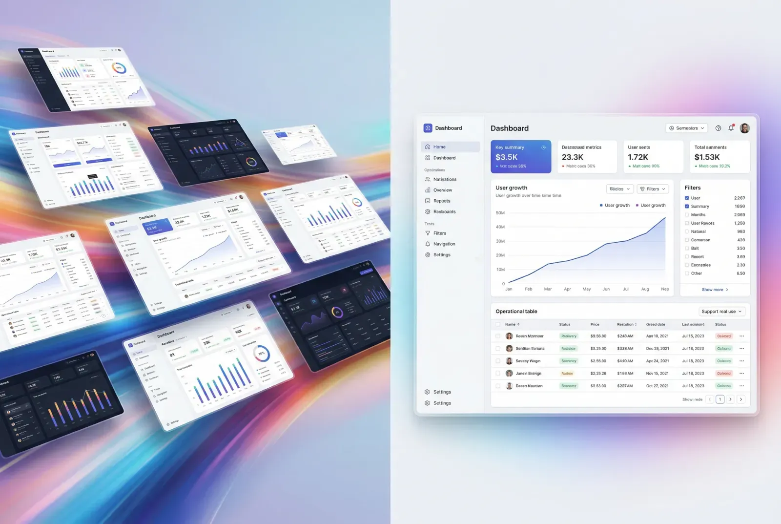
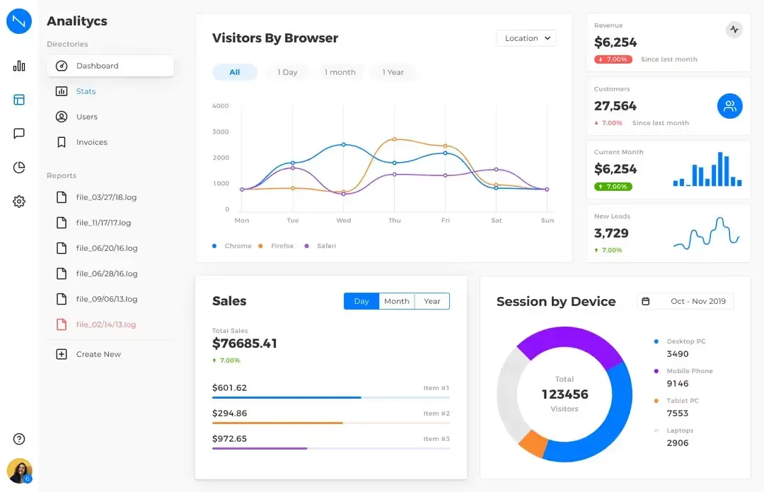
Elegant SaaS dashboard reference gallery composition
A few years ago, inspiration mainly expanded visual vocabulary.
Today it does more.
It sharpens decision-making.
As AI speeds up interface production, the designer’s edge comes from selecting stronger patterns, arranging information with precision, and building flows that support real product use. A polished screen gives one layer of value. Pattern literacy gives a system for repeated decisions.
That distinction matters in SaaS dashboards because these screens carry operational weight.
A dashboard supports scanning, filtering, comparison, monitoring, coordination, and action. The user opens it with a purpose. They want signals, movement, priority, and control. They want a surface that helps them understand what deserves attention and what to do next.
A strong dashboard reference teaches all of that.
It shows how the interface distributes weight across the screen. It reveals how navigation supports exploration. It demonstrates how data density can stay readable. It helps you see when a card works as a summary, when a chart deserves dominance, and when a table should carry the real workload.
That is why dashboard inspiration has become more important in the AI era.
Faster output creates more options. Better pattern judgment turns those options into stronger product decisions.
What makes a SaaS dashboard worth studying
The first useful question is simple:
What job is this dashboard helping the user perform?
That question immediately improves the quality of attention.
You move away from surface admiration and toward structure. You start reading the page through purpose. You notice what the layout emphasizes, what it de-emphasizes, how it guides the eye, and where the product expects action to happen.
A worthwhile SaaS dashboard reference usually reveals a few things within seconds:
☞ what the system wants you to notice first
☞ what deserves secondary attention
☞ how the page balances summary and detail
☞ how controls reshape the visible data
☞ how the user moves from overview into deeper analysis
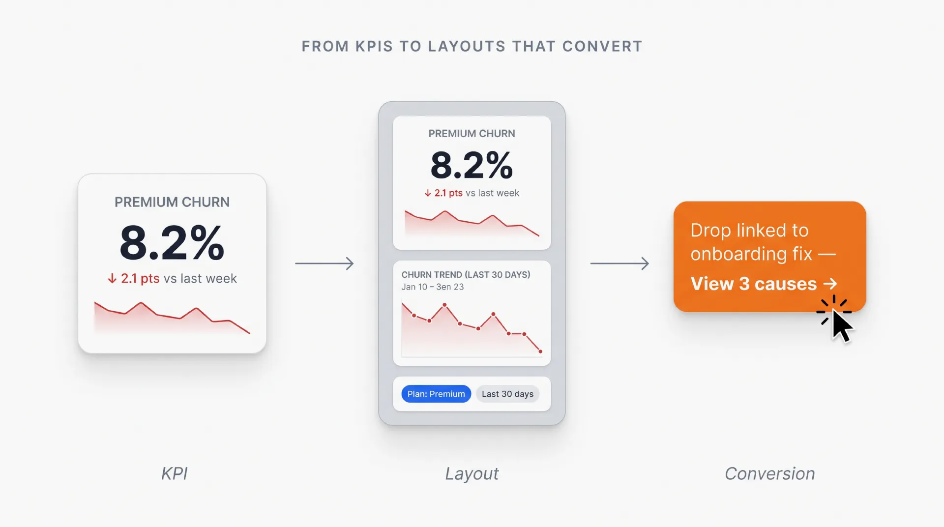
These qualities come from relationships, not isolated components.
A KPI card gains meaning through its position and context.
A chart gains value through comparison and interpretation.
A filter bar gains importance through the change it introduces.
A table gains strength through density management, row actions, and drill-down logic.
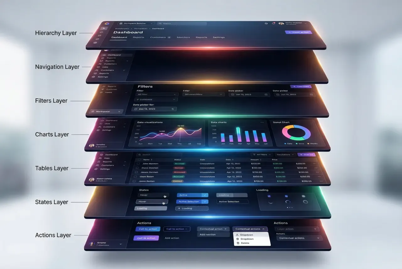
This is why chart types and dashboard layouts should be studied as a system of choices.
Layout, controls, metrics, tables, charts, actions, and states all work together. Once you read them together, SaaS dashboard examples become far more useful.
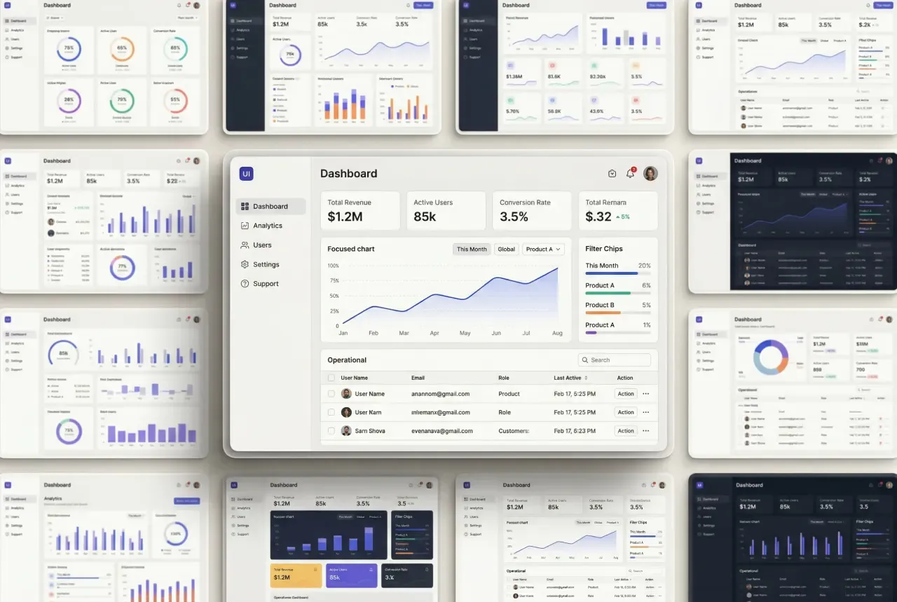
Premium light theme SaaS dashboard composition
How to study dashboard patterns with more intent
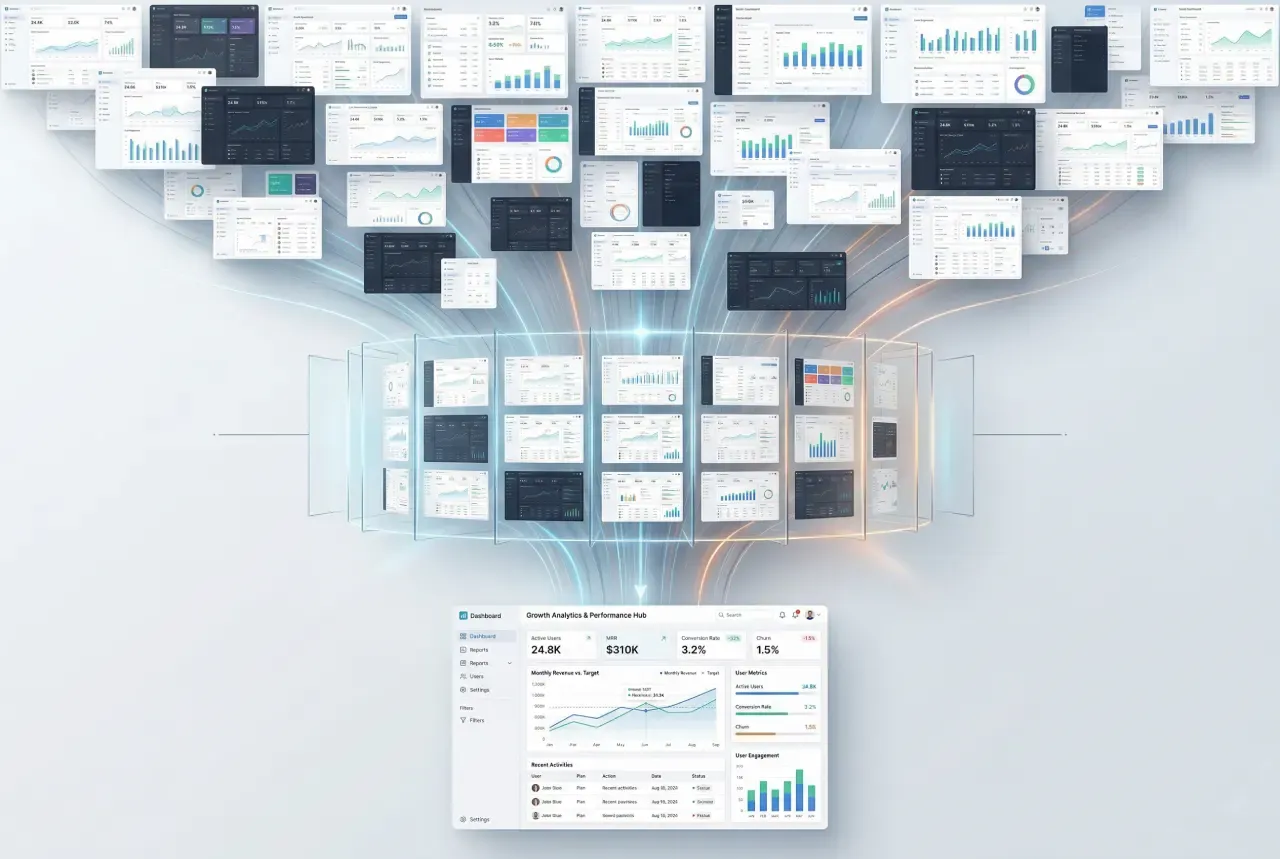
The fastest learning method is comparative.
Open three to five SaaS dashboard examples built for similar product needs and place them side by side. Look at them as design responses to the same class of problem. That shift changes everything.
Now ask more precise questions.
• Where do they place primary metrics?
• How do they structure the top of the page?
• What role do filters play?
• Which chart types appear in overview space?
• Which information gets pushed into tables?
• How do they handle row actions and drill-down?
• What part of the page feels static, and what part feels dynamic?
This approach turns passive inspiration into active analysis.
Instead of reacting to style, you begin to see repeated decisions. Summary cards often sit near the top because users want a fast health check. Filters cluster in stable areas because scope changes happen often. Tables take over lower regions because detailed work needs horizontal space and predictable scanning. Alerts interrupt the rhythm because some signals deserve immediate emphasis.
These patterns emerge across many strong dashboards because they solve real product needs.
A practical way to sharpen dashboard judgment is to generate several directions for the same UI task, then compare their hierarchy, filters, chart balance, and action paths. Tools like Venice.ai work well for this stage because they let you explore multiple visual directions quickly before you move into deeper pattern analysis.
A dashboard reference becomes valuable when it teaches reusable decisions.
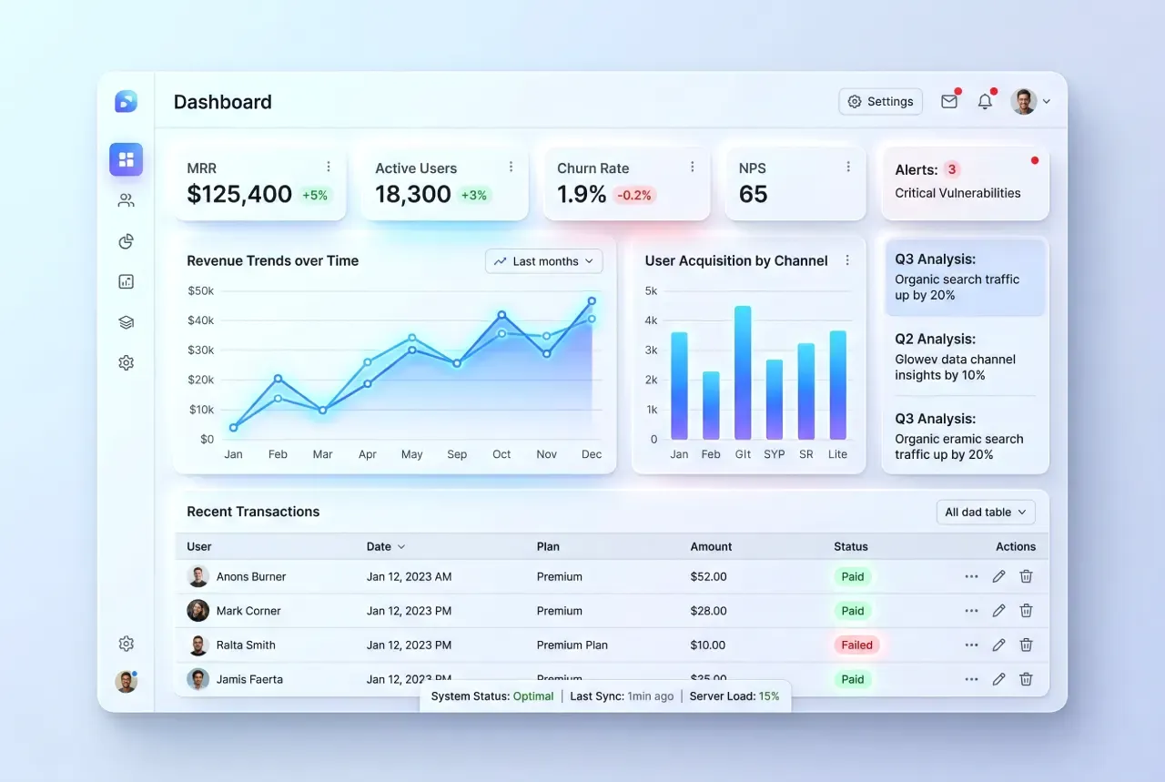
Premium finance SaaS dashboard illustration of the method to compare
Seven dimensions that deserve the most attention
When I study SaaS dashboard UI patterns, I focus on seven dimensions.
Information hierarchy
What carries the page? What gets the highest contrast, strongest position, and largest footprint? Can a user understand priority within seconds?
Navigation structure
Is the dashboard a single overview, a modular workspace, or a gateway into deeper product areas? Does the structure match the product’s complexity?
Filters and controls
How does the user change context? Date range, workspace, project, campaign, segment, environment, customer group, model, plan? The placement and clarity of these controls tell you a lot about the product.
Chart readability
Do charts support comparison, trend reading, and quick interpretation? Strong chart usage helps people understand movement and significance with low effort.
Table behavior
How does the dashboard handle dense operational information? Look at row status, sorting, selection, inline actions, pinned columns, expandable rows, and visual rhythm.
State design
How does the interface behave across empty, initial, sparse, active, warning, and error conditions? State quality carries a huge share of product trust.
Action paths
Once the user notices something important, what comes next? Investigate, export, assign, resolve, compare, message, approve, fix, drill deeper? A strong dashboard supports momentum.
These seven dimensions build a much stronger learning filter by analytics dashboard examples.
They help you move from this looks good to this works well for a real SaaS product.
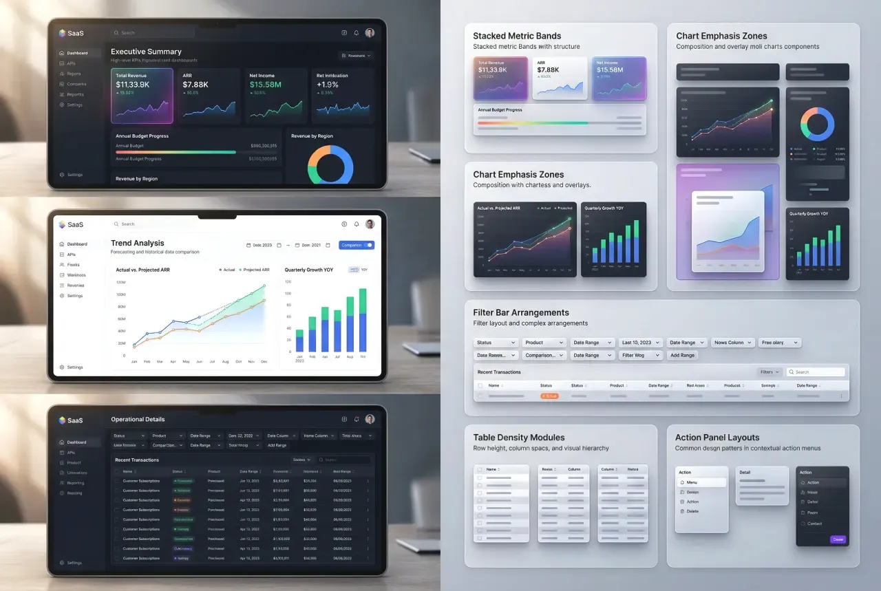
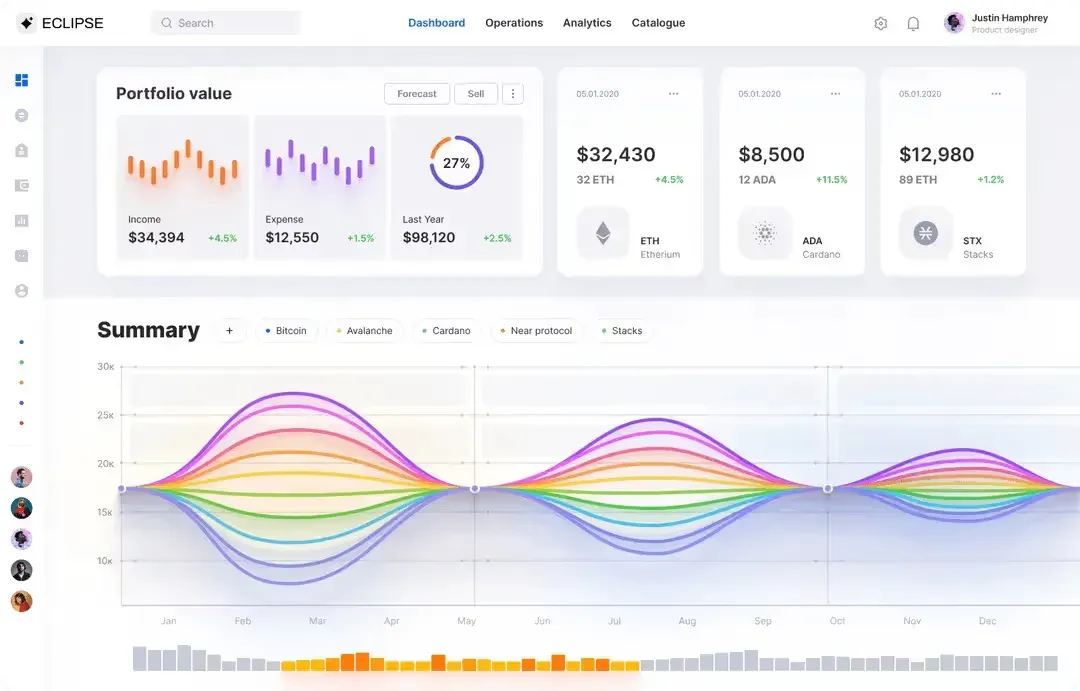
Advanced SaaS dashboard anatomy illustration
Why AI makes pattern literacy even more valuable
AI has accelerated exploration → That is a real gain.
A designer can generate more directions. A founder can express product ideas faster. A team can test visual territory with less friction. Early iteration becomes lighter, faster, and more abundant.
That abundance raises the value of selection.
The more directions you can produce, the more important it becomes to recognize which one deserves further development. Pattern literacy plays a huge role here. It helps you separate visual fluency from structural strength. It helps you identify dashboards that support real workflows, real data relationships, and real user decisions.
In practice, that means asking better questions while reviewing dashboard concepts.
Elegant funnel of AI-driven dashboard designs
☞ Does this layout support scanning?
☞ Does this chart earn its space?
☞ Does the hierarchy match the product goal?
☞ Does the table carry enough operational clarity?
☞ Does the screen guide the user toward action?
These questions become even more useful when AI expands the number of possible screens.
More output increases the value of better filters.
A practical workflow for building dashboard taste faster
Here is a practical method that works well for designers, founders, and SaaS teams.
❶ Start with a real dashboard problem
Choose a specific need: analytics overview, billing dashboard, admin control panel, AI usage dashboard, sales monitoring workspace, customer health view.
❷ Gather a focused set of examples
Aim for relevance over volume. A smaller set with clear product overlap teaches more than a giant folder of random inspiration.
❸ Compare them actively
Write down what each dashboard is doing structurally. Look at hierarchy, filters, charts, tables, actions, state handling, and navigation.
❹ Extract reusable observations
Turn visual impressions into design principles. For example: summary cards work better when paired with one dominant chart. Dense data becomes easier to manage when filters stay close to the table. A compact top bar can support fast context switching across related datasets.
❺ Revisit the strongest patterns during your own design work
This is the step that turns inspiration into a working asset. You stop relying on memory alone. You build a library of observations you can use repeatedly.
One useful way to train your dashboard judgment is to generate several directions for the same product problem, then compare hierarchy, chart dominance, filter placement, and action paths. I often use Venice.ai for this kind of exploration because it makes it easy to generate multiple visual directions quickly and iterate with controls like aspect ratio, seed, and negative prompts before moving to deeper UI study.
That process gives you more than references.
It gives you a sharper internal model of what strong SaaS dashboard design looks like.
Why searchable pattern references matter now
Inspiration has become abundant.
Searchable pattern references create leverage.
That difference matters because real product work rarely starts from a moodboard. It starts from a task. A team needs a metrics overview. A founder needs a better admin screen. A designer needs stronger ideas for chart hierarchy, table density, or workspace navigation.
At that point, browsing alone loses speed.
What helps more is a reference environment where you can search with intent, compare similar solutions, and revisit patterns while making decisions.
That is also the logic behind Setproduct AI UI inspiration app - https://app.setproduct.com/.
The value comes from turning inspiration into a more usable design resource. Instead of scrolling through disconnected pretty shots, you can search for stronger UI patterns, inspect visual directions, compare structures, and build taste around actual product needs.
For a UI/UX designer, this supports faster pattern recognition.
For a solo founder, this supports more grounded interface decisions while building with AI.
For a SaaS product designer, this supports a more deliberate way to study dashboard examples and find patterns worth adapting.
This is the bigger shift.
As UI production gets faster, reference quality becomes more important. Strong searchable references help transform inspiration into decisions, and decisions into better product surfaces.
Final thoughts
AI has made polished dashboard UI easier to produce.
That change raises the value of judgment.
Strong SaaS dashboard design still depends on hierarchy, clarity, filtering logic, data readability, state handling, and useful action paths. These qualities shape how teams work, how products communicate priority, and how users move from overview to action.
So the goal today is larger than collecting more dashboard design best practices.
The real goal is to study dashboard patterns with discipline.
☞ Compare structure, not just style
☞ Read the relationship between elements
☞ Look for reusable decisions
☞ Build pattern literacy that supports real product work
That is the skill that keeps gaining value in the AI era.
And that is why a tool for searching UI patterns with intent has become so useful today.


