


Roman Kamushken
That little red circle with a number on your messages icon? That is a badge. It is one of the smallest elements in any interface, yet it carries an outsized job: telling users that something changed without making them open the screen to find out. Get it right and people feel informed. Get it wrong and your UI looks broken or, worse, noisy.
This guide breaks down what a badge actually is, how it differs from chips, tags, labels and pills, and the anatomy, styling and use-case patterns that keep badges readable in real products.
TL;DR: badge rules in one line each
- A badge is a small overlay that shows a status, count, or notification on a parent element.
- Pick one content type per badge: number, short text, icon, or a plain dot.
- Use a dot-only badge when the fact that something changed matters more than the count.
- Abbreviate long counts with "9+" or "1k" so the badge never stretches the layout.
- A badge annotates a parent; it is not an interactive chip, tag, label, or pill.
- Give status badges a stroke in the surface color so they stay visible over any background.
- Keep a badge readable for screen readers; a red dot alone is invisible to them.
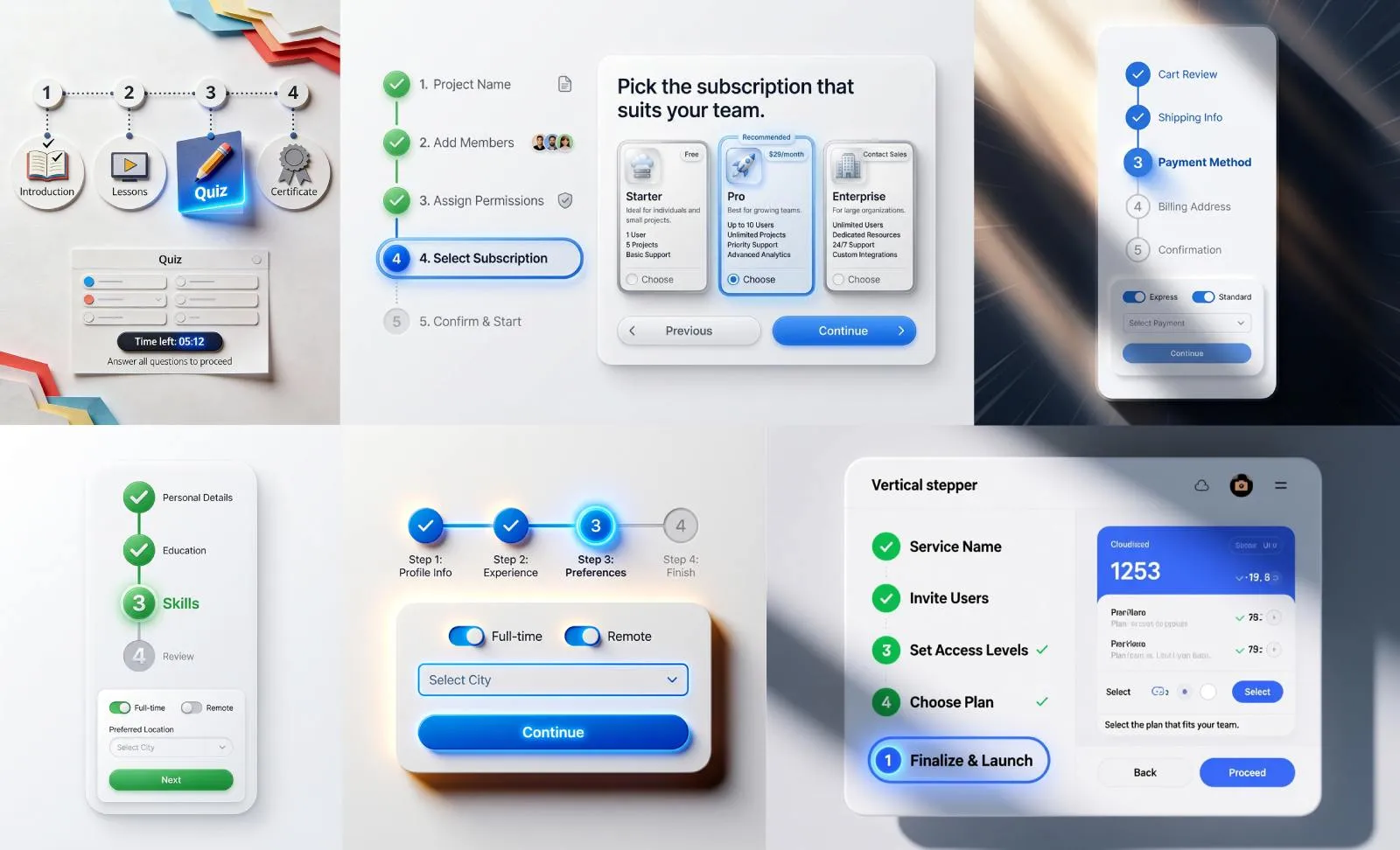
What is a badge in UI
A badge is a small visual indicator, usually overlapped on a parent element, that communicates status or activity at a glance. It does not replace the parent control; it annotates it. Think of the unread counter on an email icon or the green dot signalling that a contact is online. You will spot them on app icons, navigation tabs, and even onboarding steps, anywhere a small signal beats a full sentence.
In component libraries a badge is sometimes called a tag, but, as we will see below, badge and tag are not the same thing.
Badge vs chip vs tag vs label vs pill
These five elements look similar and get mixed up constantly, but they solve different problems. The fastest way to choose is to ask whether the element is interactive and whether it sits on top of a parent or stands on its own. A badge always rides on a parent and is never clickable; a chip is a standalone, often interactive object.
| Element | Shape | Purpose | Content | When to use | Anti-pattern |
|---|---|---|---|---|---|
| Badge | Tiny circle or pill, overlaid | Flag a status, count, or notification | Number, icon, or dot | Unread counts, online status, "new" markers | Making it clickable or stuffing long text inside |
| Chip | Rounded standalone block | Represent an interactive entity | Text plus optional icon or close button | Filters, selected tokens, input tags | Using it as a passive status label |
| Tag | Small rounded block | Categorize or label content | Short keyword text | Topics, article categories, skills | Treating it as a live counter |
| Label | Flat text marker | Name or describe a state | Short text, sometimes colored | Order status, form field state | Overloading it with counts or actions |
| Pill | Fully rounded block | A shape style, not a role | Whatever the host element holds | Styling badges, tags, or buttons as rounded | Calling "pill" a component when it is only a shape |
The takeaway: a badge annotates a parent and is passive. A chip is a standalone, interactive object. Tag and label are about naming rather than counting. "Pill" is just a corner-radius style that any of the others can adopt. Like a tooltip, a badge adds context to another element, yet unlike a tooltip it stays visible without any hover or focus.
Badge anatomy
Content
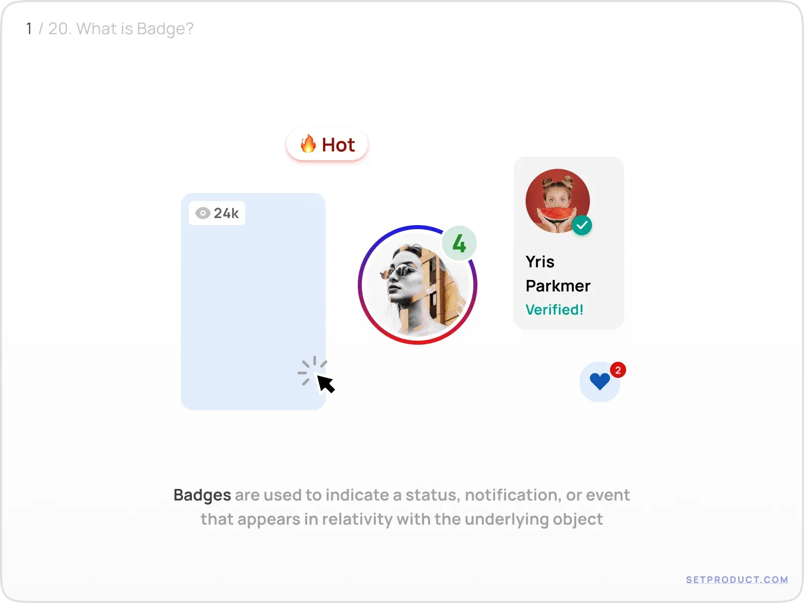
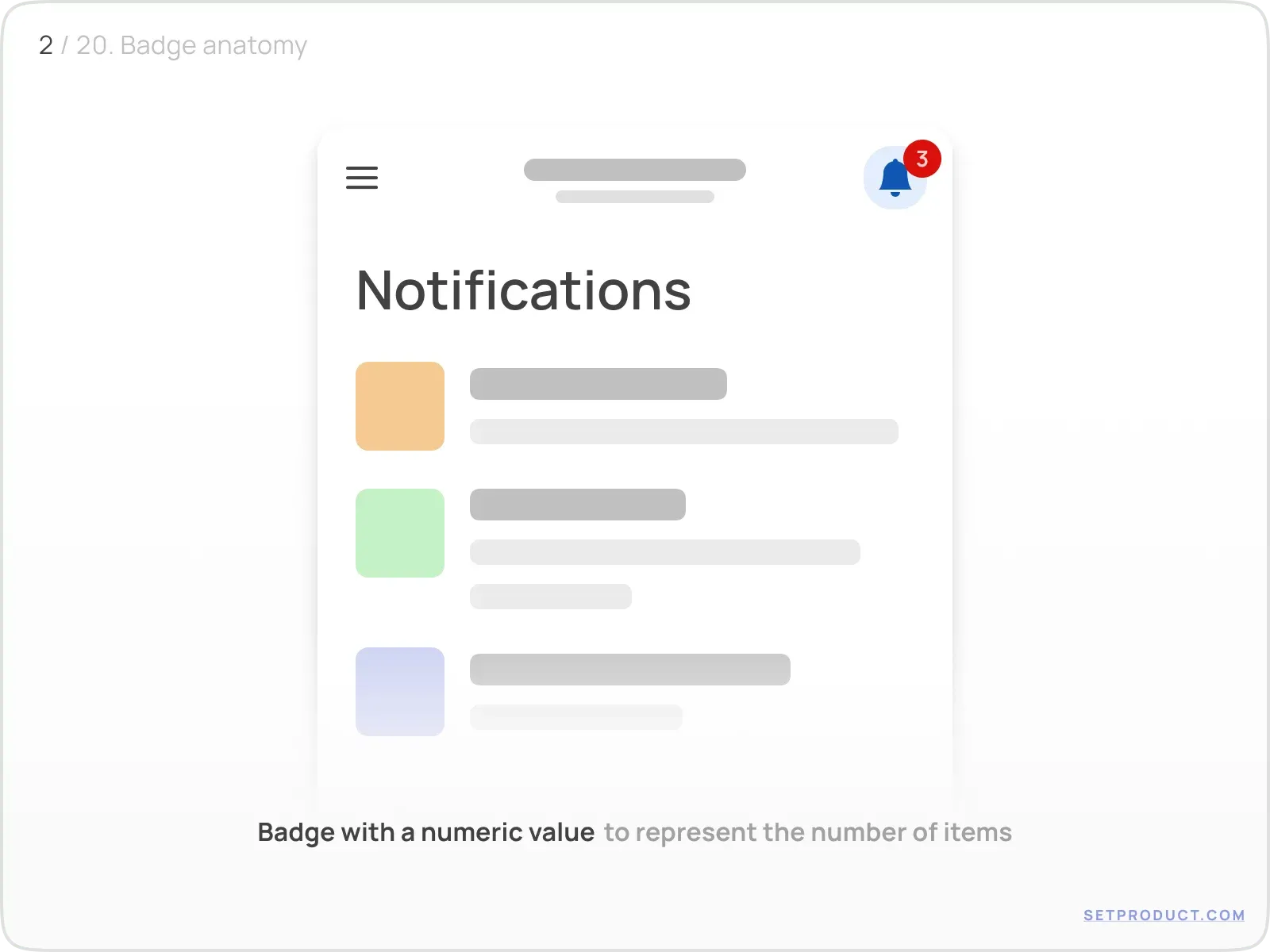
The default content of Badge's body is
- Numeric value → display the number of events
- Text caption → tag, name, or categorize items
- Icon → show the status of the underlying object
- No item (dot-only Badge) → inform without details
Purposes
Badge with a Numeric value is used to represent the number of events related to the parent UI item:
Use Badges with a Text caption to specify a label for the variety of objects (e.g. to tag a topic, categorize items, or indicate views amount):
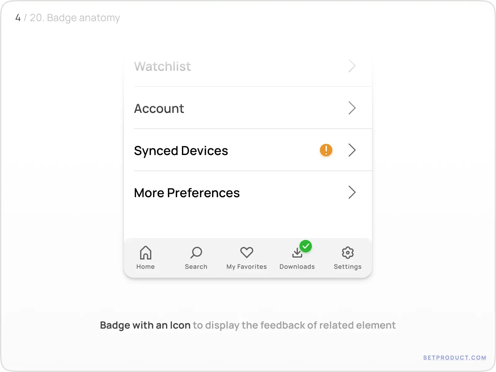
Use Icons inside Badge to show up the condition of a related component, or response to a user with the feedback.
For example, it's clear there is a kind of error with synced devices settings section and there is something downloaded successfully:
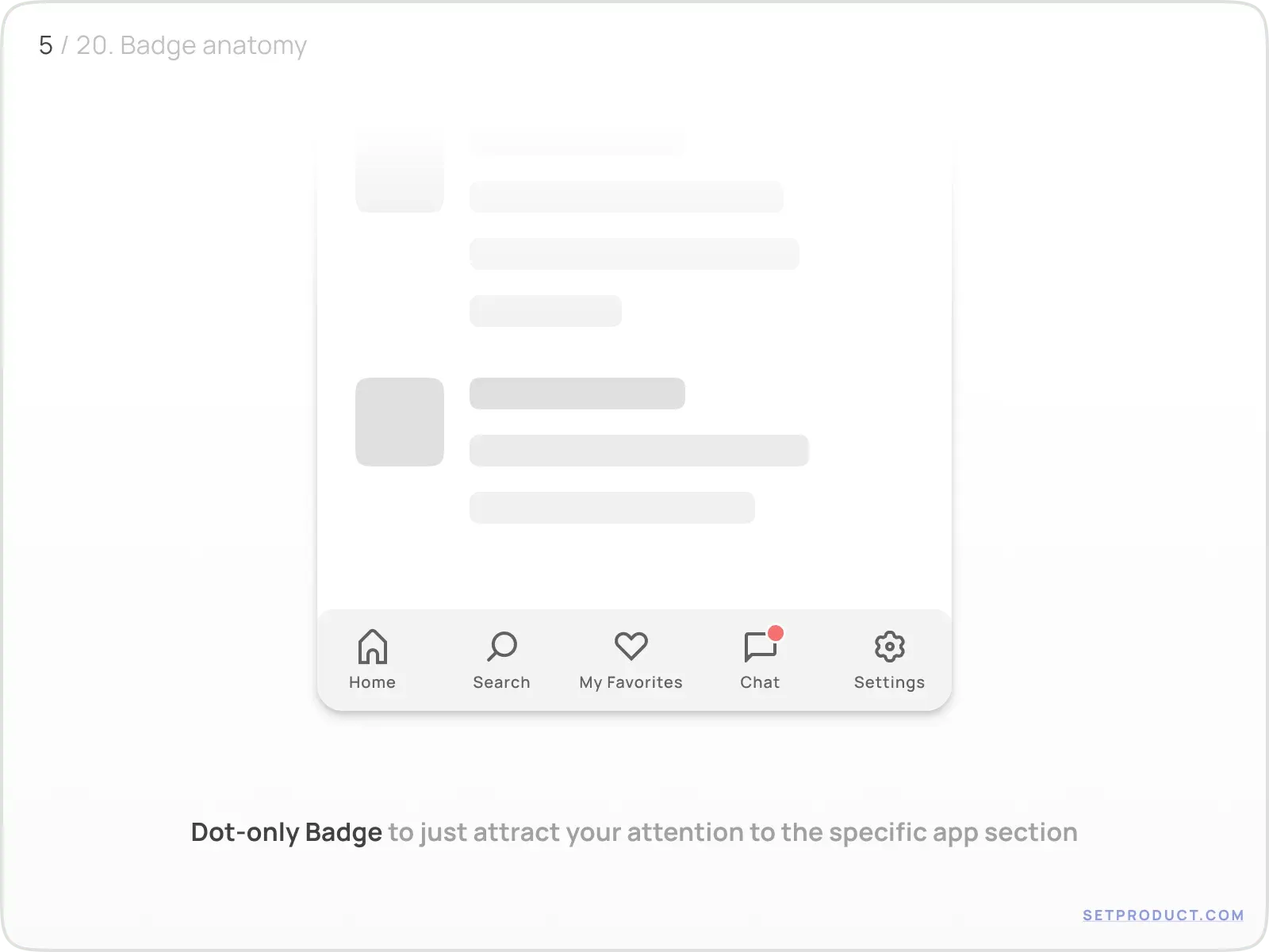
Dot-only Badge is used in order to just attract your attention to the specific control and encourage you to explore what is inside:
Behavior
The Badge's container expands to the left, right, or from the center depending on the number of caption symbols. Use "+" or "k" abbreviations to decrease symbols amount and save space:
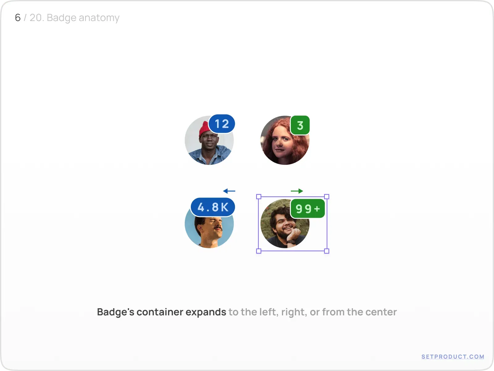
When Badge stretches to the right, make sure your neighbour UI elements aren't pushed aside in your layout, due to a container width is now enlarged.
My rule: never let a badge count climb past two digits. ❌ A raw "247" stretches the icon and shoves neighbouring elements around on every render. ✅ Cap it at "99+". Once the number is that high the exact value rarely matters, and the layout stays rock-steady.
Styles and themes
For a deep themification in order to set Badge more distinct, you have to apply several properties:
- Colors → regulate the badge priority
- Corner radius → set the container shape
- Outline stroke → visually separate the badge from the underlying item
- Shadow → add a subtle hovering effect
Colors
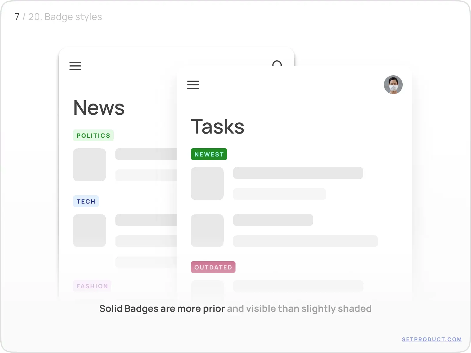
Solid Badges are more visible than shaded (where the opacity is reduced to 15–20%). Us them in priority cases, while shaded Badges may be applied for other cases, e.g. categorizing topics, tagging, etc.:
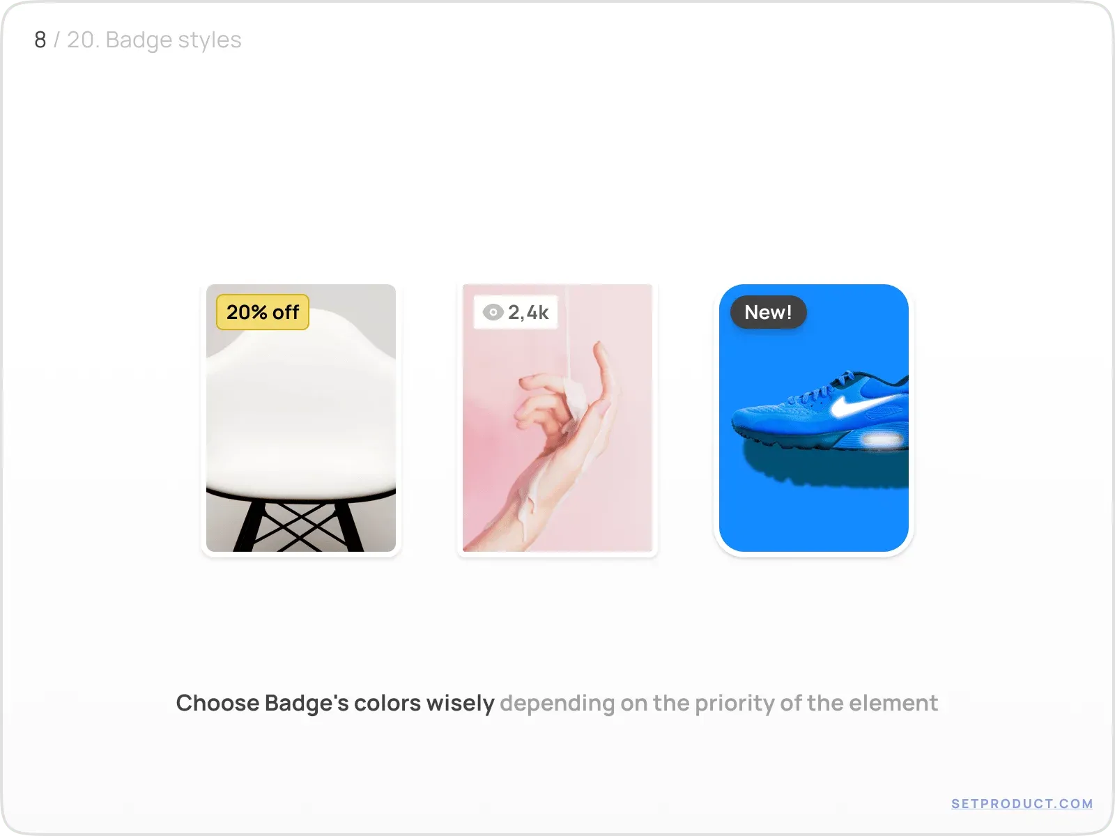
Choose Badge's colors wisely in order to make it more attentive or recognizable on every surface, especially when placed over images:
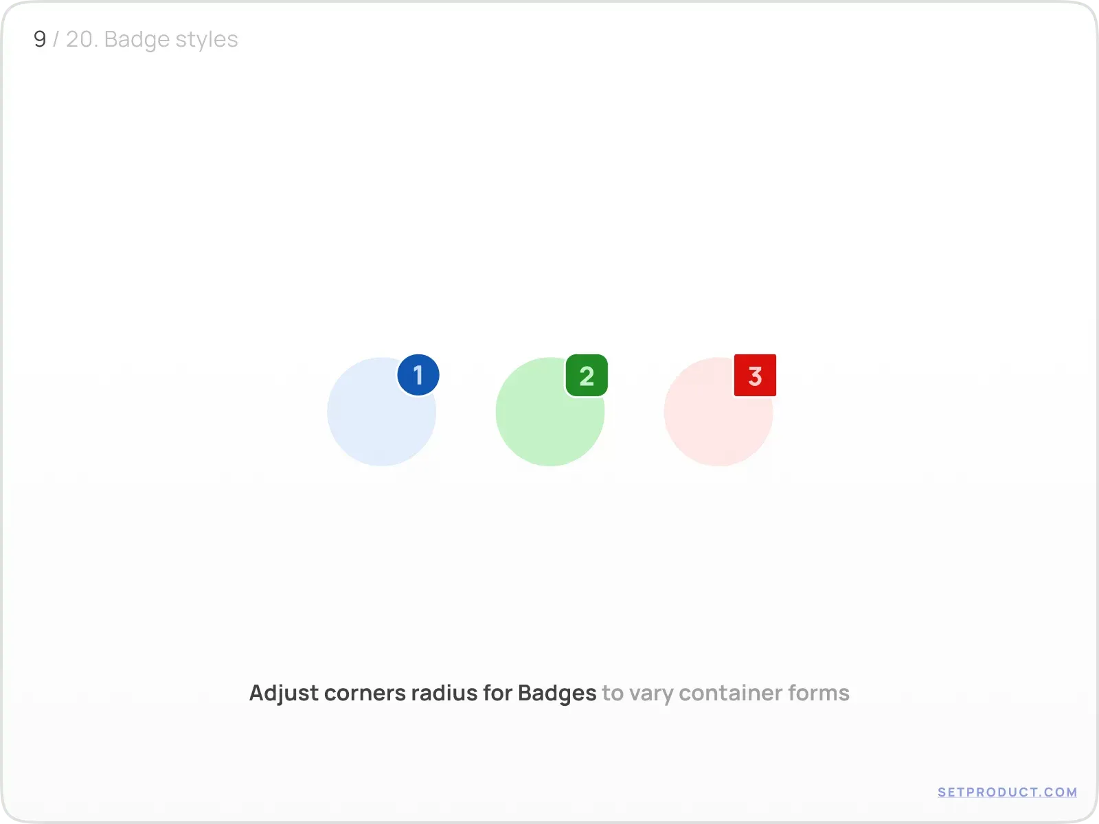
Corner radius
Adjust corners radius for Badges to vary container shapes. Rounded Badges are a popular use case, whereas enlarging to pilled when the counter is growing. You may use a square Badge in order to fit to your layout specs
(e.g. for square-grid UI such as the IBM Carbon design system):
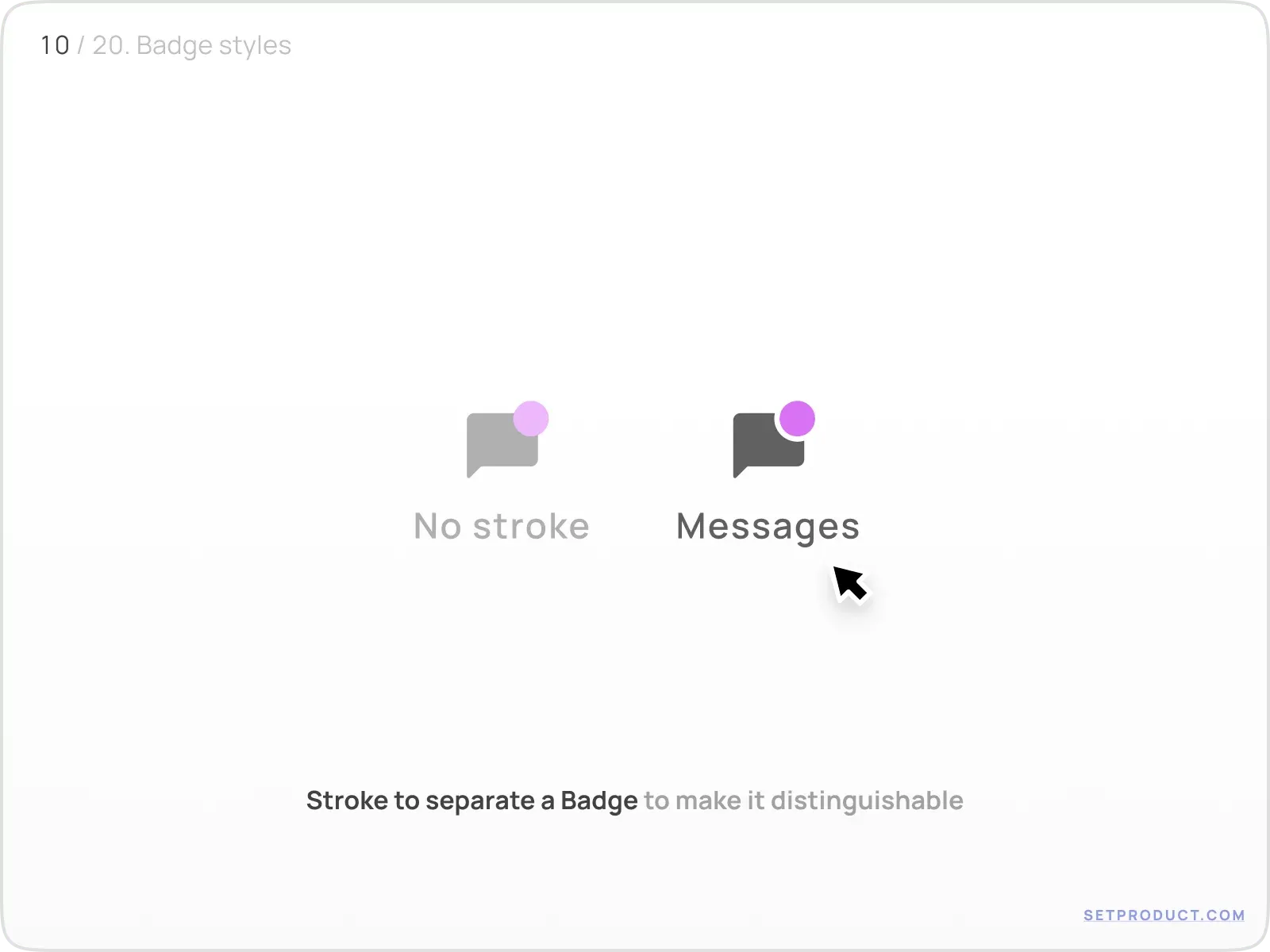
Outline stroke
This UI design small hack helps to separate a Badge and make it detached and detectable almost over every background color. Just stroke Badges with the same color as the surface:
This is the single fix I reach for most. ❌ A solid dot dropped straight onto a photo or a busy toolbar visually melts into the background. ✅ Add a 1–2px stroke in the surface color and the badge stays detached and legible over anything, light or dark.
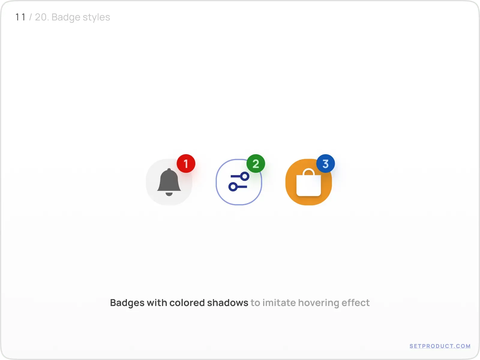
Using shadow
By setting a smooth shadow behind Badges (use the same color), you will simulate a tiny and elegant hovering effect:
Badge UX and use cases
There are several UX patterns where are Badges most commonly used:
- Messaging
- Filtering
- Ecommerce
- Social
- Marketing
- Categorizing
- Tagging
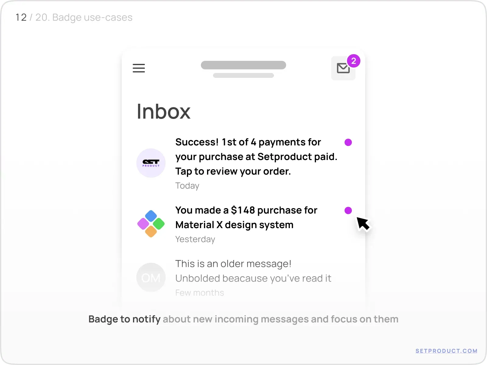
Messaging
In conversational patterns like Chat and Inbox, a badge is the quiet half of the notification system, flagging new incoming messages. Slack puts a numeric badge on a channel for unread mentions and a plain dot for general unread activity: two signals, two badge types. The dot cleanly separates fresh threads from older ones. When the inbox finally hits zero, hide the badge entirely and let a proper empty state confirm there is nothing left to read:
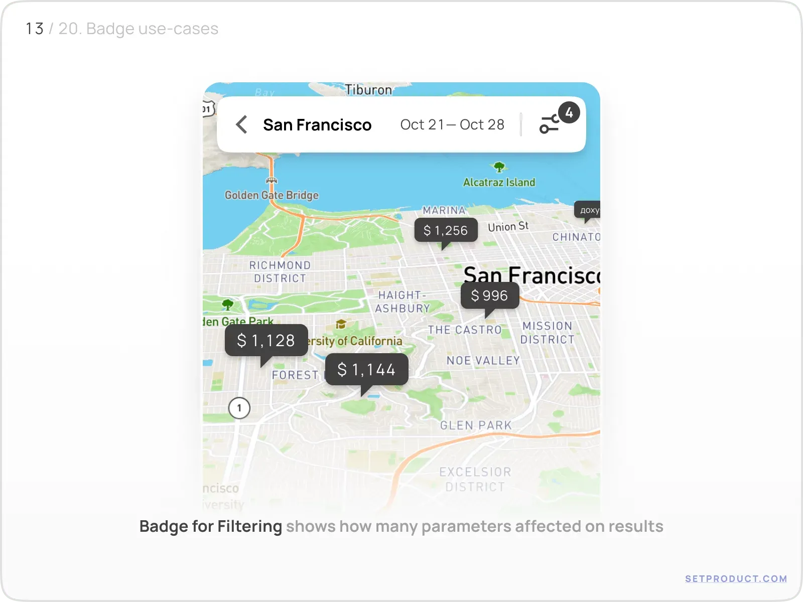
Filtering
It's user-friendly to overlap a Badge over filtering control when some options were selected before.
Below we see some tooltips on the map. It is clearly distinct: some filtering options were picked, affecting the results, and a Badge has now appeared at the app corner:
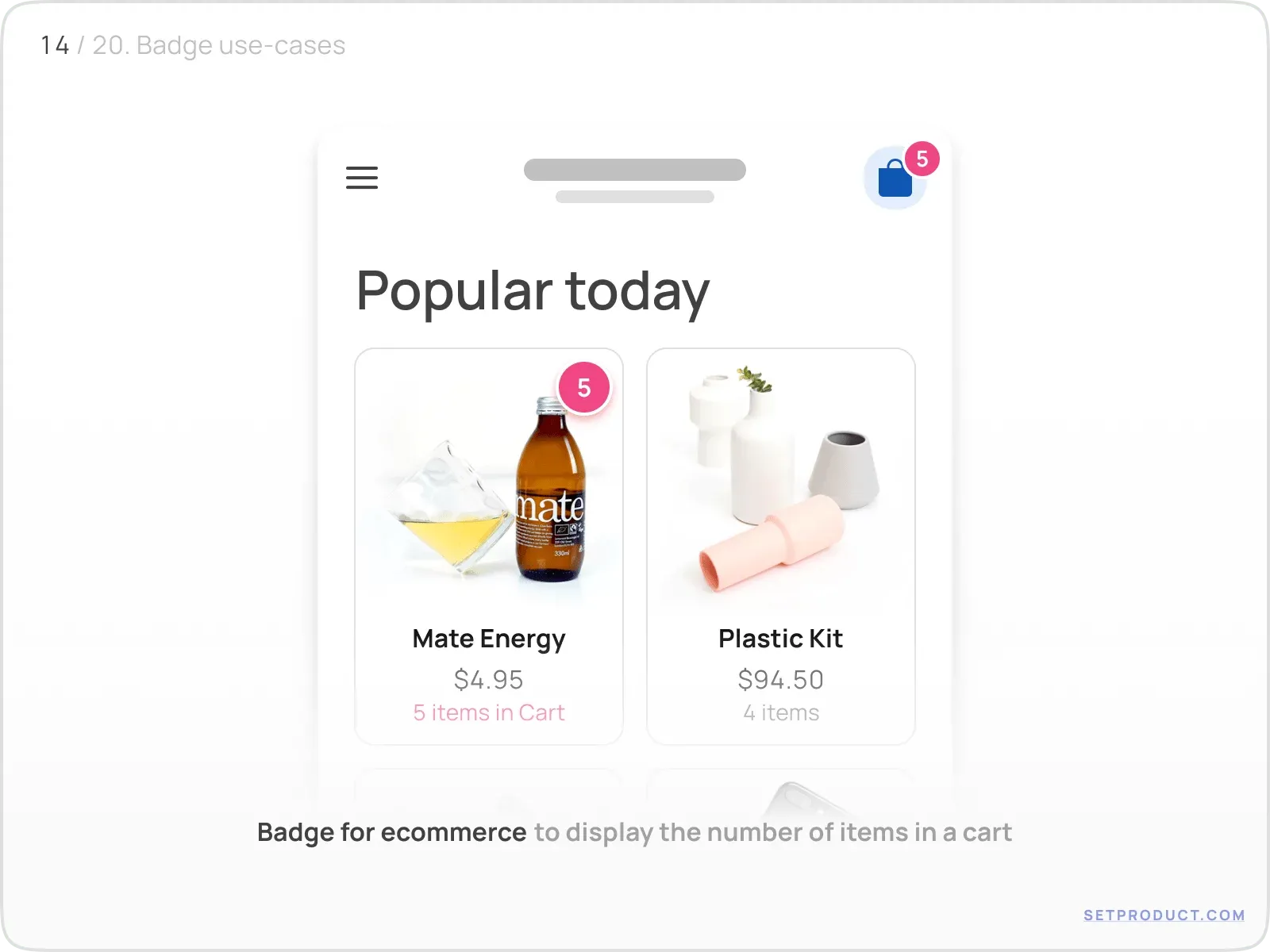
Ecommerce
In most shopping apps Badges are used to display the number of products added to a cart. The App Store does the same thing with pending updates, capping the count so a long number never breaks the icon:
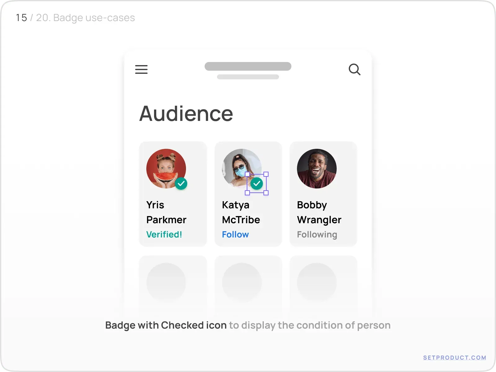
Social
Icon-only Badge represents additional properties/statements for the person:
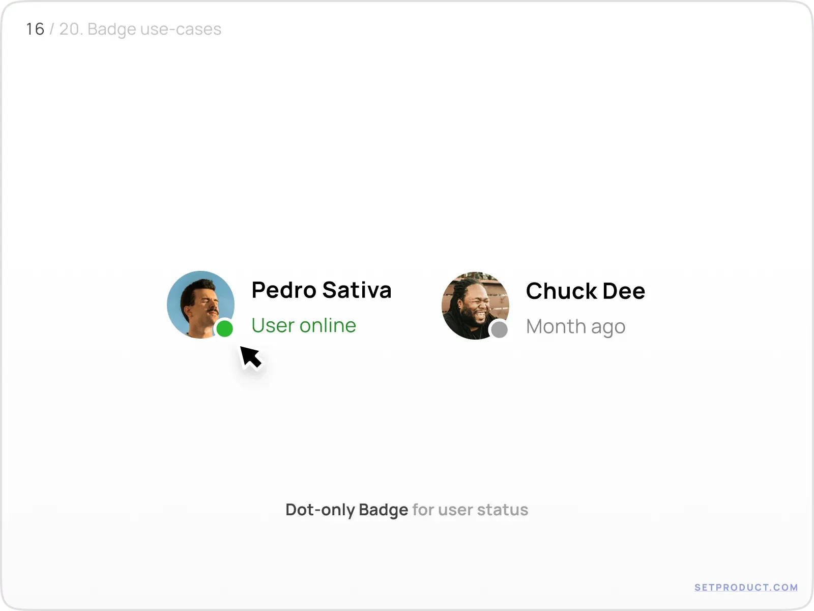
Dot-only Badge displays the user's status: online or not. Messaging apps like WhatsApp and Instagram lean on a single colored dot to mark presence without adding any text:
Marketing
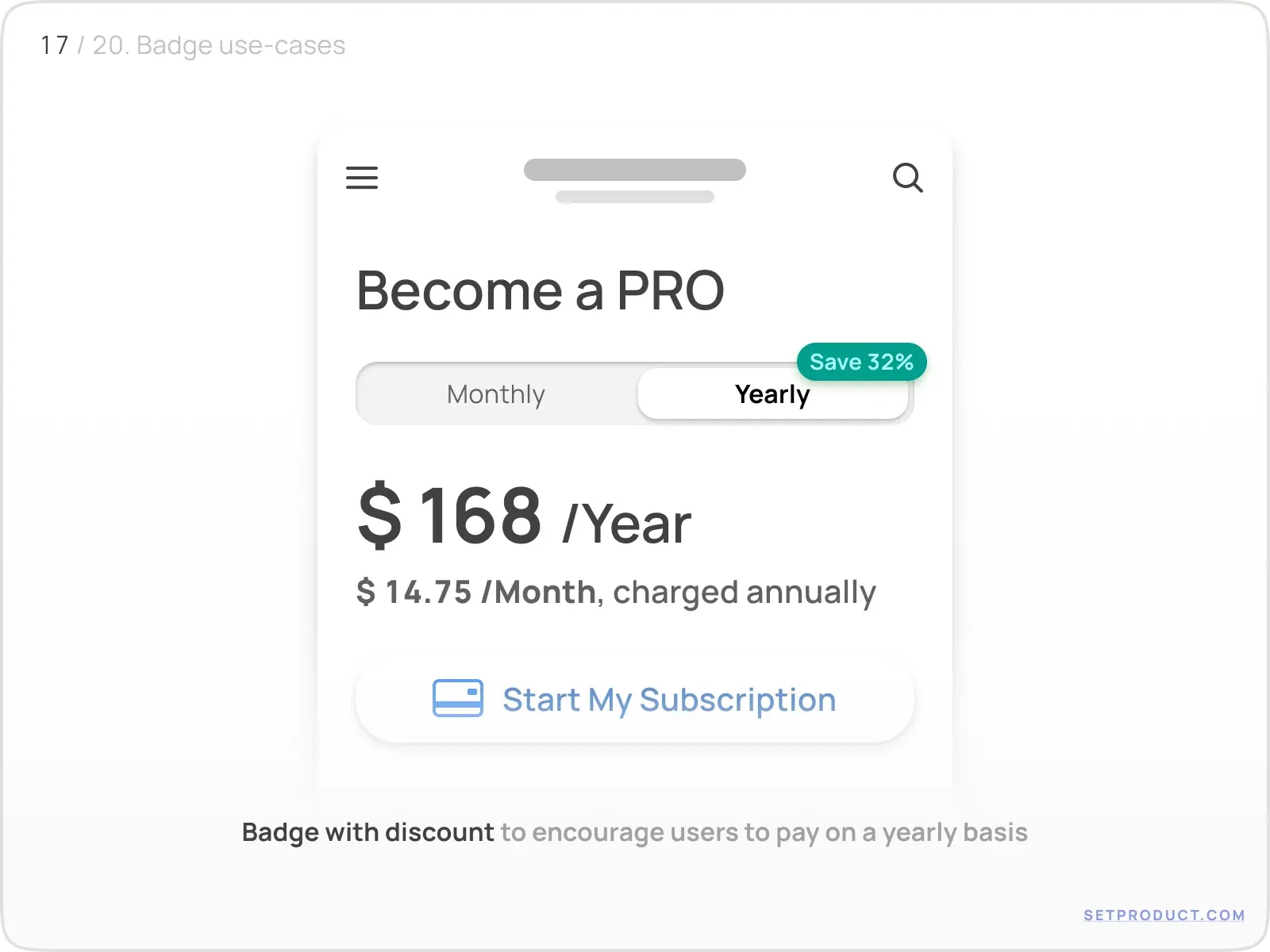
There are cases when Badge helps to encourage users to take action or perform a choice commercially valuable.
Here is a Badge placed over segmented control to highlight the necessity to choose yearly payment:
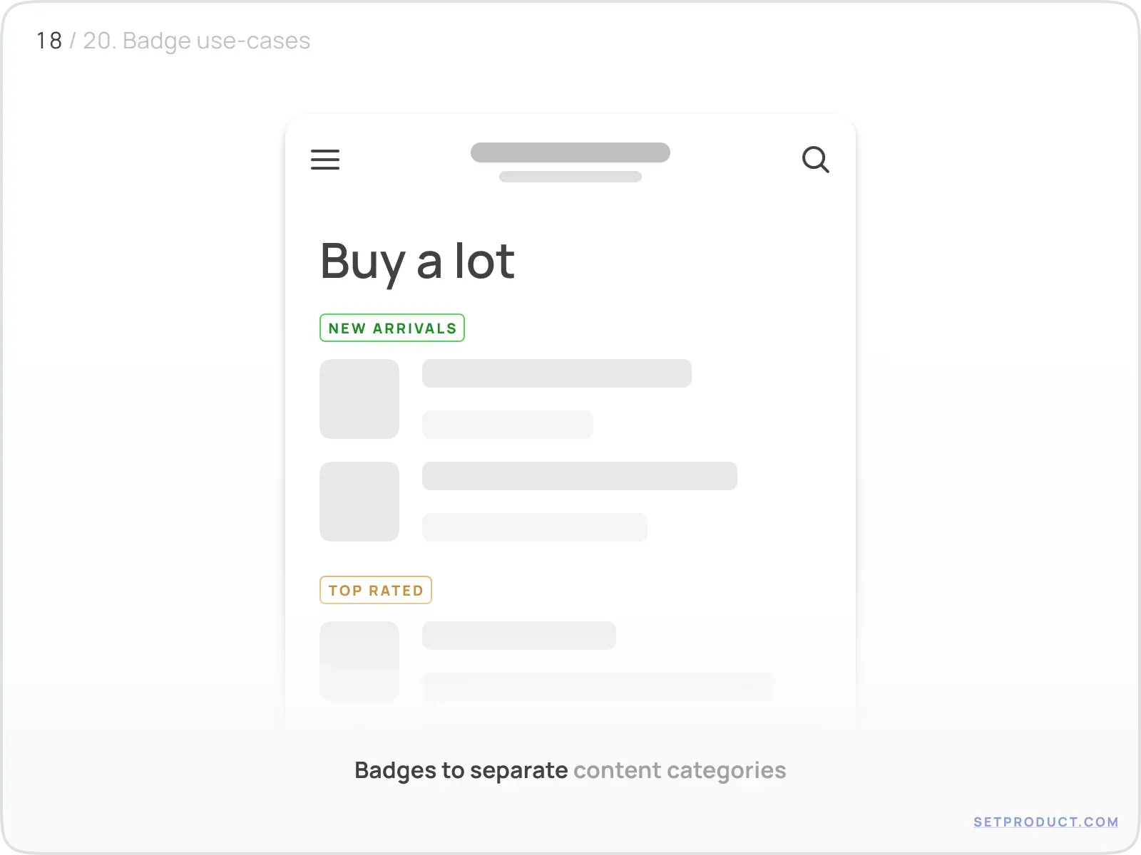
Categorizing
Separate content categories by using Badges to label and divide sections making them distinguishable by using different colors:
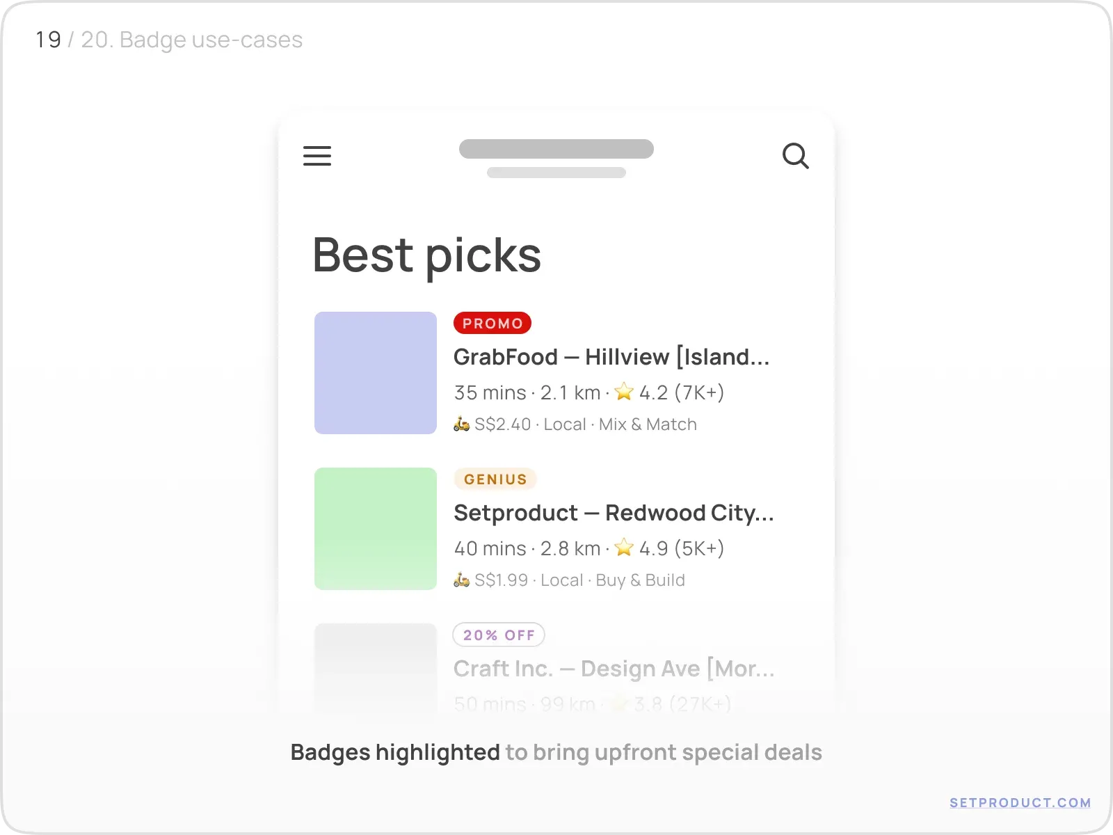
Sometimes Badges are used as tags to highlight special deals:
Tagging
Implement Badges to display extra properties for a content item, or to visualize the number of parameters the specific item is associated with:
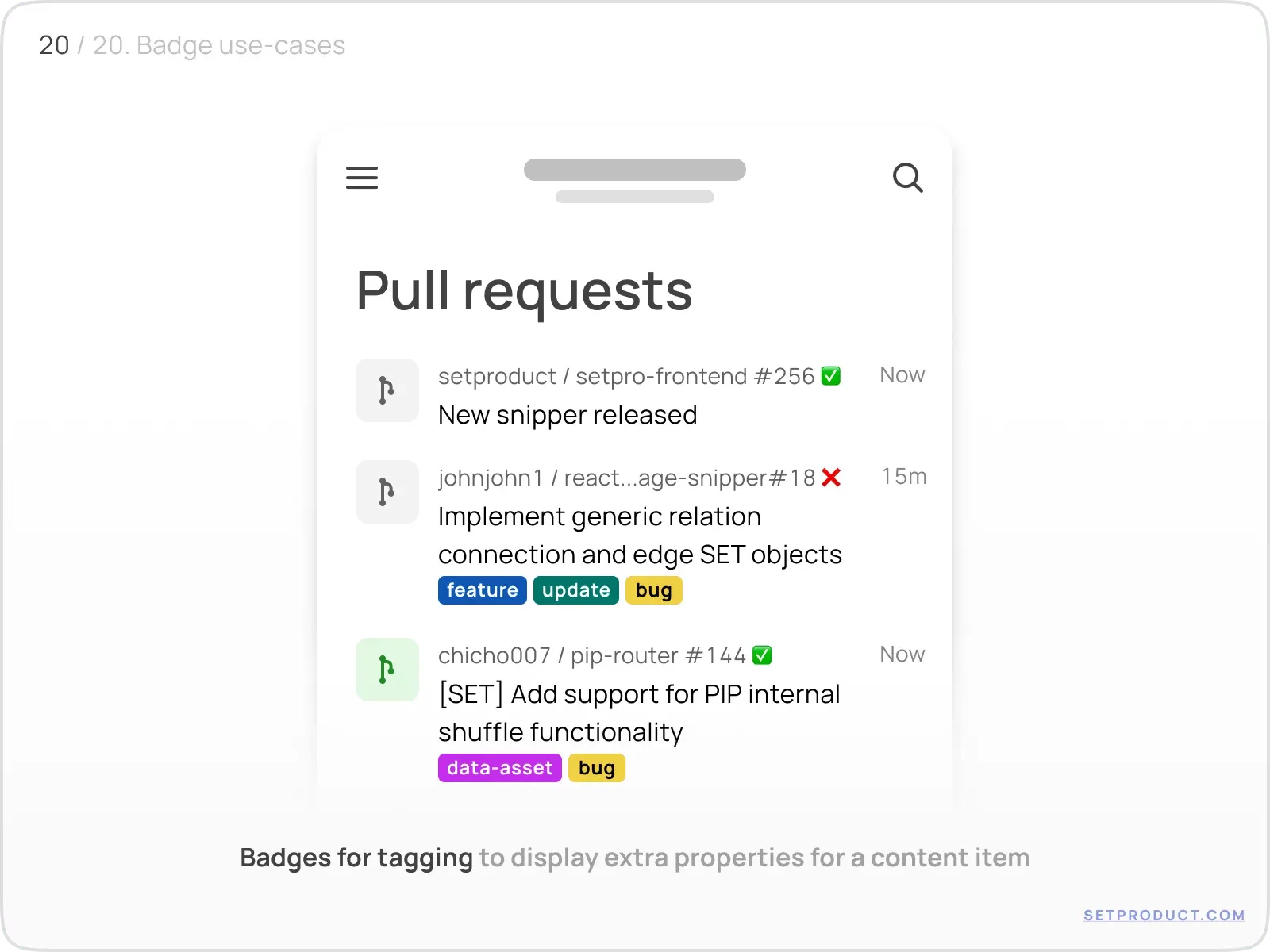
Badge design checklist
Run any badge through this list before you ship it:
- One content type only: a number, short text, an icon, or a dot, never a mix.
- Long counts are abbreviated ("9+", "99+", "1k") so the badge never stretches the layout.
- Neighbouring elements stay put when the badge grows to its widest value.
- Status badges carry a stroke in the surface color so they read over images and busy backgrounds.
- Color matches priority: solid for urgent, shaded (15–20% opacity) for passive labels.
- Corner radius fits the system: rounded by default, square only for square-grid systems like IBM Carbon.
- The badge is positioned consistently (usually top-right of the parent) across every screen.
- Meaning is never carried by color alone; a dot or count has a text or aria equivalent for screen readers.
- The badge annotates a parent and is never clickable; if it needs an action, it should be a chip instead.
Frequently asked questions
What is the difference between a badge and a chip?
A badge annotates a parent element and is passive, so you cannot click it. A chip is a standalone, often interactive object (a filter, a selected token, an input tag) that lives on its own. If the element needs an action, it is a chip; if it just flags a status or count on top of something else, it is a badge.
When should I use a dot-only badge instead of a number?
Use a dot when the fact that something changed matters more than how much. A dot says "there is something new here" without the noise of an exact count; it suits general unread activity, presence, or a section that has fresh updates. Switch to a number only when the precise quantity drives the user's next action, like an unread message count.
What is the maximum number a badge should show?
Cap it at two digits and abbreviate beyond that: "99+" for high counts, "1k" for thousands. A raw three- or four-digit number stretches the badge and shoves neighbouring elements around for little extra meaning beyond "a lot."
Where should a badge be positioned on its parent?
Top-right of the parent is the established convention for overlay badges, and it should stay consistent across every screen. The badge sits just over the edge of the icon or control so it reads as attached to it without fully covering the parent's own glyph.
How do I make a badge accessible for screen readers?
Never rely on color or a bare dot alone, since that information is invisible to assistive tech and fails WCAG's use of color rule. Pair the visual badge with a text or aria-label equivalent, for example "3 unread messages" or "online," so the same meaning reaches screen-reader users.
What colors should I use for status badges?
Match color to priority and meaning. Solid, high-contrast colors (commonly red) signal urgent or unread states; shaded badges at 15–20% opacity suit passive labels like categories or tags. Keep the palette consistent with your design system's semantic colors so red always means the same thing across the product.
This is all you need to know to design better Badges. Now it's time to visit the homepage of Setproduct, where you'll find a huge number of free and premium UI Kits and design systems.
Also, we specialize in custom design and development. We will be happy to help you with any project: Mobile & Web Apps, Websites, B2B, CRM, Delivery Systems, Online Learning Platforms, and lots more.
You can check our portfolio on many platforms: Dribbble, Twitter, Figma, Reddit, Pinterest, Linkedin. Also, make sure to check the Testimonials of our happy customers.
Related links
- Badges in Figma React UI kit
- Badges in Chakra-UI
- Badges in MUI
- Badges in Material You (Figma)
- Badges in Appka iOS kit (Figma)