Vercel aesthetic: a complete guide to Blueprint Grid design

Everything you need to know about the technical grid design trend. From psychology to Figma setup and CSS code for engineering grid backgrounds.

Vercel aesthetic: a complete guide to "Blueprint Grid" design
Design Trends

Published on

April 21, 2026

|

7 min read

Tutorials

Vercel aesthetic: a complete guide to "Blueprint Grid" design

Navigation

Subscribe to new posts

Thank you! Your submission has been received!
Oops! Something went wrong while submitting the form.

By subscribing you agree to with our Privacy Policy.

Share this post

Author image

Roman Kamushken

You've seen it everywhere. A subtle grid of lines or dots stretching across hero sections, behind pricing tables, beneath feature showcases. It looks technical, precise, almost like a blueprint, yet somehow feels effortless. SaaS landing pages, developer tool websites, AI product pages, portfolio sites.

This is the technical grid (aka Blueprint Grid) design trend that's reshaping how modern products present themselves. And this guide covers everything you need to know, from the psychology behind why it works to practical Figma setups and CSS code for engineering grid backgrounds.

What exactly is this style? And why has it taken over the tech industry landing page design? Let's explore.

What you'll learn:

• Where the Vercel aesthetic came from and why it spread so fast

• The psychology behind why technical grid design builds trust

• Step-by-step implementation in Figma and CSS

• Where this style works and where it fails

• Common mistakes that make grid backgrounds look cheap

• How this trend connects to a longer tradition of systematic design

A style without a name

This trend doesn't have an official name. Design communities call it different things. "Technical grid," "blueprint aesthetic," "engineering paper background," "dot matrix pattern." But the most common reference is The Vercel aesthetic.

Vercel didn't just adopt this style. They made it iconic.

When Vercel launched their redesigned website with a subtle grid pattern behind the hero content, something clicked. The design community took notice. Other companies followed. Stripe, Tailwind, Linear, dozens of startups began incorporating similar patterns into their own designs.

The style became so associated with Vercel that designers now casually refer to it as "that Vercel grid thing" or simply "the Vercel aesthetic."

Rauno Freiberg, one of the creators behind Vercel's design, published a detailed breakdown of the approach at rauno.me/craft/vercel. It remains the most authoritative source on the technique and worth studying if you want to understand the thinking behind the decisions.

Vercel website homepage showing technical grid design pattern

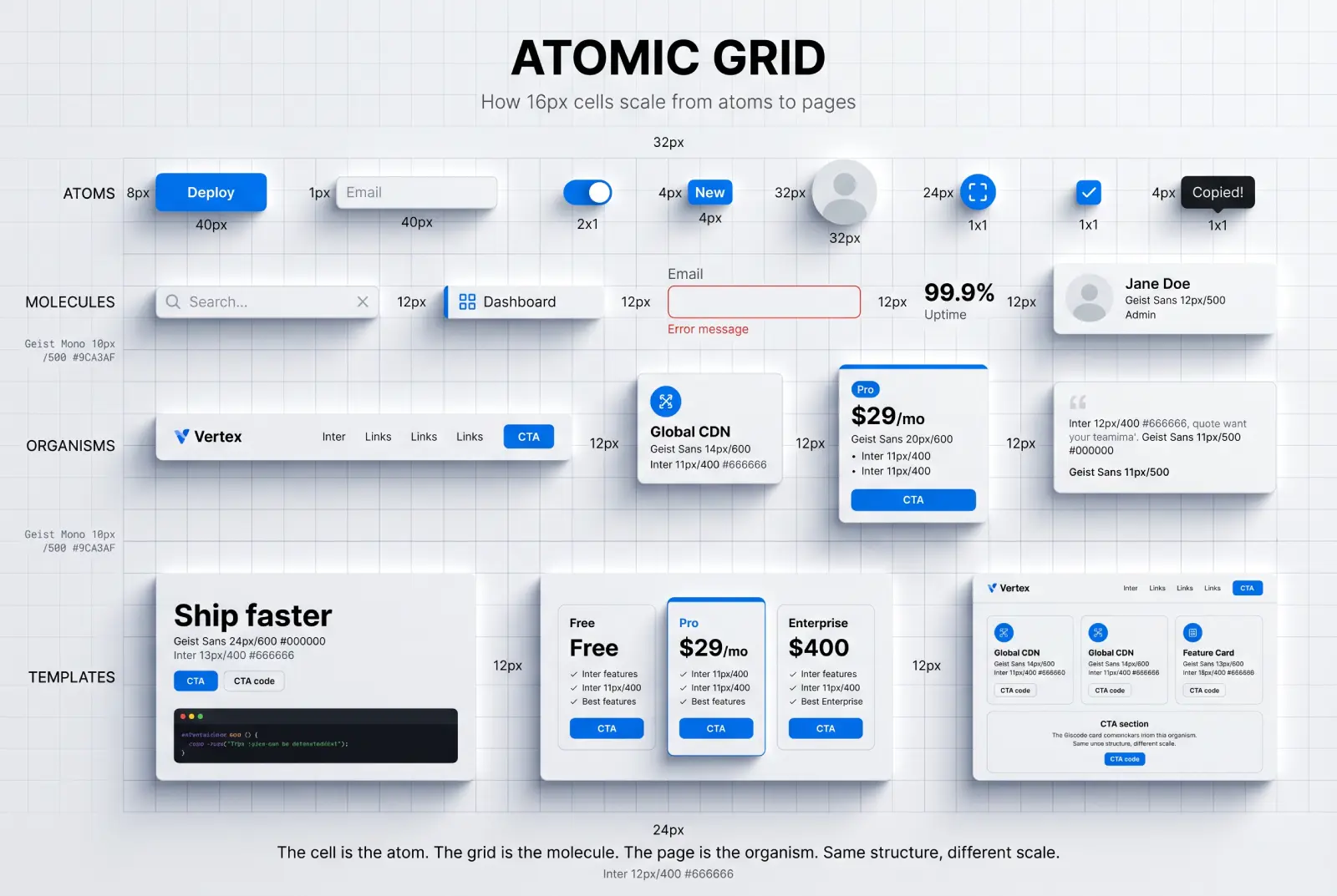
What makes up the Vercel aesthetic and blueprint grid design
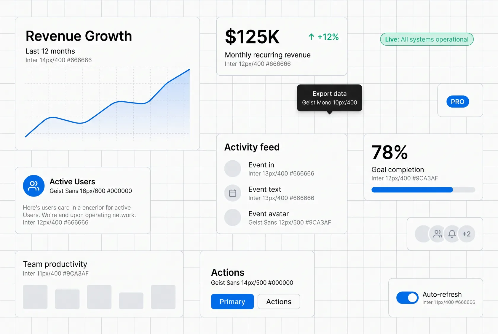
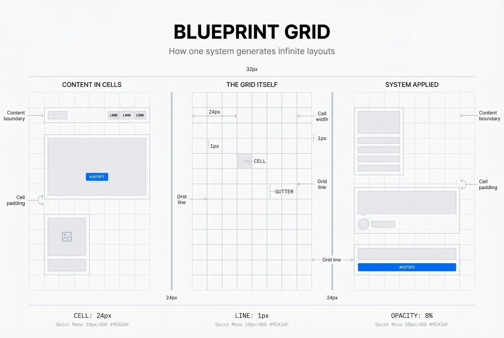
The grid pattern

The core element is a subtle, repeating grid of lines or dots. This isn't your standard design grid used for layout alignment. It's a visible, decorative element that creates texture and depth.

Key characteristics:
• Low opacity → typically 10-20%, never overpowering the content
• Consistent spacing → usually based on 8px or 16px increments
• Light color → often gray (#E5E7EB or similar) on white or dark backgrounds
• Uniform line weight → thin, precise, almost invisible until you look for it

The Geist design system

The grid doesn't exist in isolation. It's part of Vercel's broader design system called Geist, which encompasses:

• Typography → clean, monospaced-influenced sans-serif (Geist Sans and Geist Mono)
• Color palette → predominantly black and white with minimal accent colors
• Layout → generous whitespace, precise alignment, systematic spacing
• Motion → subtle, functional animations that enhance rather than distract

The grid is the most visible element, but it works because it's supported by the entire system. A grid alone is decoration. A grid within a coherent design system is architecture.

The overall feeling

The Vercel aesthetic communicates:
• Precision → everything is measured, intentional, systematic
• Engineering → it feels like a technical drawing or architectural blueprint
• Modernity → clean, minimal, forward-looking
• Trust → systematic design implies reliability and attention to detail

Figma setup for engineering grid background with 16px spacing

It works! The psychology behind the grid

Pattern recognition and trust

Humans are wired to recognize patterns. When we see a grid, our brains immediately process it as organized, structured, intentional. This creates an unconscious sense of reliability. A product with this level of visual precision must also have precision in its engineering.

If your audience values precision and engineering, the Vercel aesthetic might be perfect. If your audience values emotion, warmth, or creativity above all, proceed with caution.

The "engineered" signal

In a landscape saturated with gradient-heavy, illustration-rich designs, the grid aesthetic sends a different signal: we're serious about engineering. It's no coincidence that this style has been adopted primarily by developer tools, infrastructure products, and technical SaaS companies.

The grid says: "We think in systems. We build with precision. We care about the details."

Cultural context: the rise of developer-led design

The Vercel aesthetic coincides with a broader cultural shift:

• Developer tools are mainstream → products like Vercel, Stripe, and Tailwind have massive audiences
• Design literacy is increasing → more developers are making design decisions
• Minimalism has evolved → we've moved from "flat design" to something more intentional, systematic design

The grid is the natural visual language for this moment.

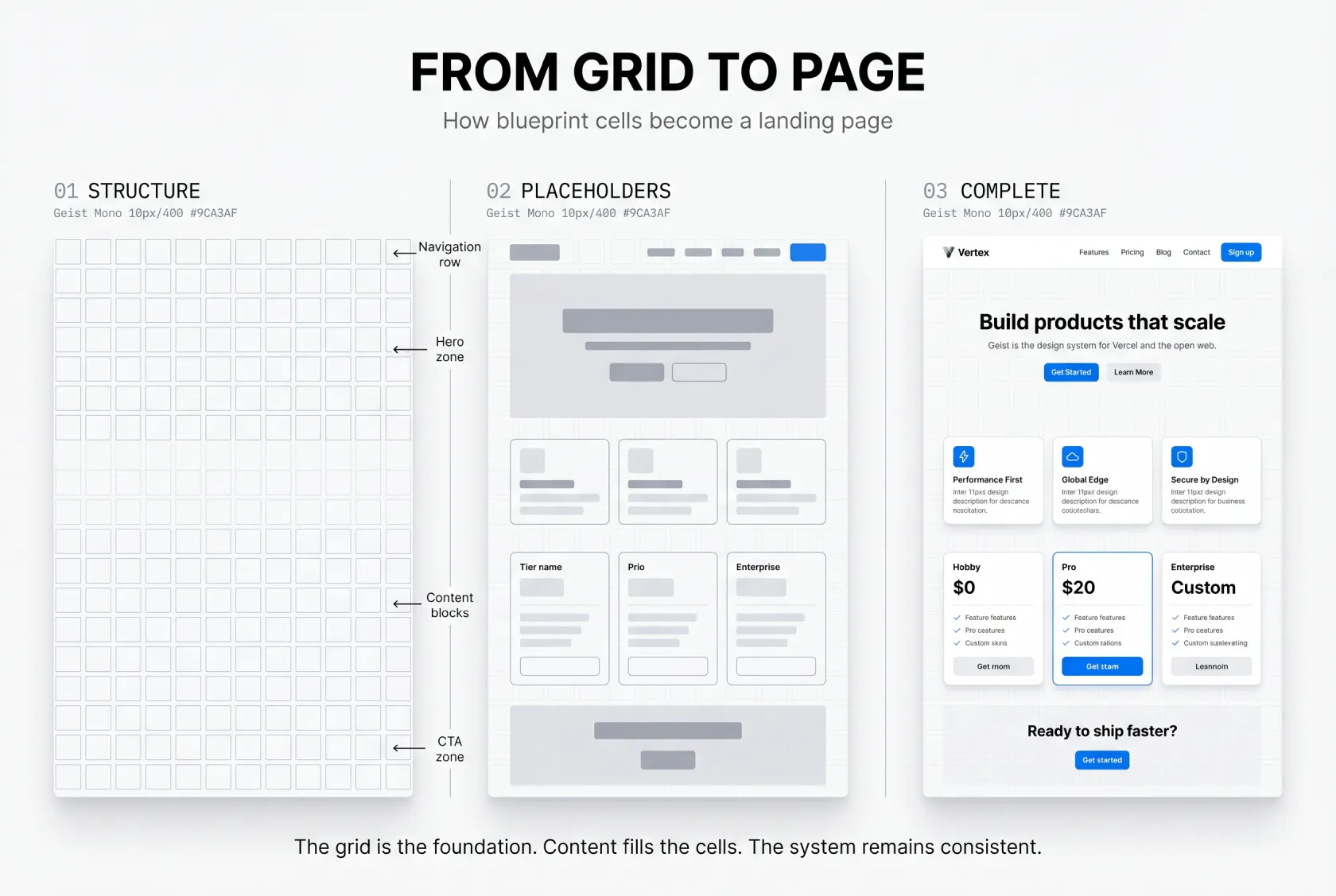
How to recreate the Vercel aesthetic in Figma

❶ Create a large rectangle with your background color (white or near-white works best)

❷ Apply a grid pattern using Figma's layout grid tool or a pattern plugin like Grid Generator

❸ Set grid lines to 1px width, light gray color (#E5E7EB)

❹ Reduce layer opacity to 10-20% → the grid should be barely visible

❺ Use consistent spacing throughout → 16px or 24px recommended for most cases

❻ Pair with Geist Sans or Inter for body text, Geist Mono or JetBrains Mono for code elements

❼ Limit your color palette to 2-3 colors maximum → black/white as primary, one accent color

The most common mistake is making the grid too strong. If it's the first thing you notice, reduce the opacity further. The best implementations are almost subliminal.

In CSS

For a line grid:

.grid-background {
  background-image: 
    linear-gradient(rgba(0, 0, 0, 0.05) 1px, transparent 1px),
    linear-gradient(90deg, rgba(0, 0, 0, 0.05) 1px, transparent 1px);
  background-size: 24px 24px;
}

For a dot matrix:

.dot-grid {
  background-image: radial-gradient(circle, rgba(0, 0, 0, 0.1) 1px, transparent 1px);
  background-size: 16px 16px;
}

Key principles

• Restraint is essential → the grid should be barely visible
• Consistency matters → use the same grid spacing throughout your entire design
• Content comes first → the grid supports your content, never competes with it
• Whitespace is your ally → don't fill every grid cell, let the pattern breathe

Where it works and where it doesn't

Perfect matches

• Developer tools and infrastructure products (Vercel, Supabase, Railway)
• SaaS platforms targeting technical audiences
• AI and machine learning products
• Design portfolios showcasing systematic thinking
• Technical documentation sites

Questionable applications

• Lifestyle and fashion brands → the grid feels too cold and systematic
• Food and hospitality → warmth and emotion are more important than precision
• Children's products → the aesthetic is too serious and restrained
• Health and wellness → organic shapes and softer patterns work better

Comparison of line grid vs dot matrix pattern in web design

Common mistakes that kill the effect

👁️ Making the grid too visible

The most common error. If your grid lines are more than 15-20% opacity, they're too strong. The best implementations are almost subliminal. You feel them before you consciously see them.

📏 Inconsistent spacing

The grid only works if it's systematic. Mixing 16px spacing in one section with 24px in another breaks the illusion of precision.

🧩 Ignoring the rest of the system

The grid alone isn't enough. If your typography is inconsistent, your spacing is random, and your colors are all over the place, the grid feels like an afterthought rather than a design decision.

🎪 Over-decorating

The Vercel aesthetic works because it's restrained. Adding too many gradients, illustrations, or decorative elements on top of the grid creates visual noise that defeats the purpose.

♿ Poor accessibility

Light gray grid lines on white backgrounds can cause issues for users with visual impairments. Always ensure your text maintains sufficient contrast ratio (4.5:1 minimum) against the grid pattern.

The evolution of systematic design

The Vercel aesthetic represents something larger than a single company's design choice. It's part of a movement toward systematic design, an approach where every element exists within a defined system, where decisions are intentional rather than arbitrary.

This isn't the first time engineering aesthetics have influenced design:

• Swiss Design (1950s-60s) → grid-based, systematic, objective
• Bauhaus (1919-33) → functional, industrial, honest materials
• De Stijl (1917-31) → abstract, reduced to essentials, geometric

The Vercel aesthetic is the digital continuation of these movements, adapted for screens, developer tools, and modern web applications.

What comes next

Like all design trends, the Vercel aesthetic will evolve. Some possibilities:

• Dot matrix variations → replacing lines with dots for a softer feel
• Isometric grids → adding depth and dimension
• Animated grids → subtle motion that responds to scrolling or interaction
• Contextual grids → patterns that change based on content or user behavior

The core principle, systematic, intentional, precision-oriented design, will remain relevant long after the specific visual patterns evolve.

Geist design system typography and color palette examples
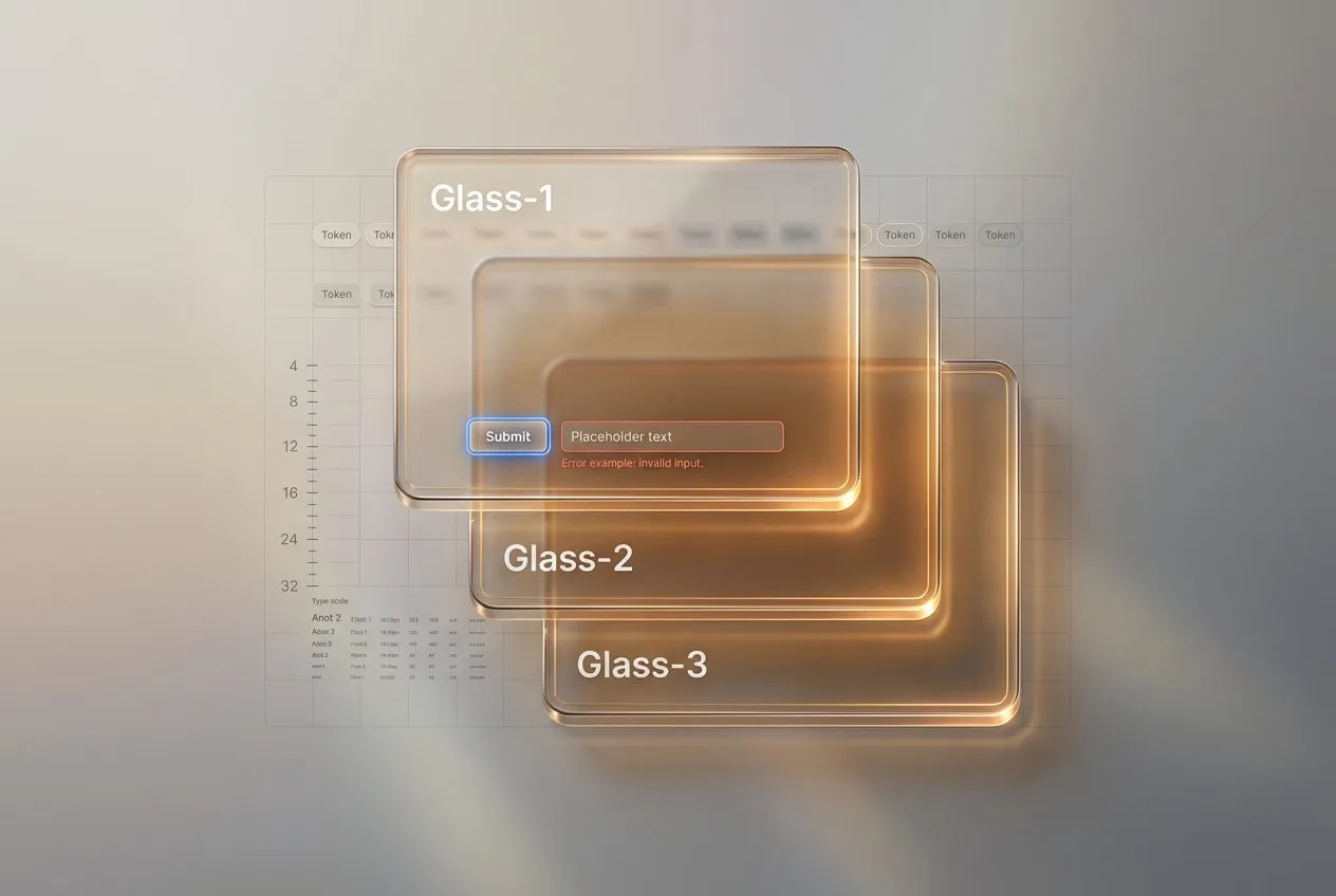
With Venice.AI (my fav tool) you can easily switch to HDR styles and suit your UI design generations with depth and dimention.
It's my favorite style to visually support my publications. Generated by Nano Banana in Venice.AI

Frequently asked questions about the Vercel aesthetic

❶ What is the Vercel aesthetic?
The Vercel aesthetic refers to a web design style characterized by subtle grid patterns (lines or dots) behind content, monospaced-influenced typography, minimal color palettes, and systematic spacing. It originated from Vercel's website redesign and has since been adopted by hundreds of SaaS and developer tool companies.

❷ What font does the Vercel aesthetic use?
The style primarily uses Geist Sans for body text and Geist Mono for code elements. Alternatives include Inter for body text and JetBrains Mono for code. The key is choosing fonts with a technical, systematic feel rather than decorative or handwritten styles.

❸ How do you create a grid background in CSS?
Use linear-gradient for line grids or radial-gradient for dot grids. Set opacity low (5-10% for the gradient color) and use consistent background-size values (16px or 24px). See the implementation section above for exact code snippets.

❹ Is the Vercel aesthetic just for developer tools?
While it originated in developer-focused products, the style works for any audience that values precision, engineering, and systematic thinking. AI products, technical SaaS platforms, and design portfolios are all strong fits. It's less effective for lifestyle, fashion, food, and wellness brands where warmth and emotion matter more than precision.

❺ How subtle should the grid pattern be?
The grid should be barely visible. Aim for 10-20% opacity on the pattern layer. If the grid is the first thing you notice on the page, it's too strong. The best implementations feel almost subliminal, you sense the structure before you consciously see it.

{{stars-conclusion}}

The Vercel aesthetic is a signal of a deeper shift in how we think about digital products.
When done well, it communicates precision & order, engineering excellence, and systematic thinking.

When done poorly, it's just another grid background.

The difference lies in understanding why it works, not just how to make it.
The grid is a tool. Use it intentionally, support it with a complete design system, and always let your content lead.

Your audience will notice, even if they can't quite put a name to it.

Share this post

Subscribe to Setproduct

Once per week we send a newsletter with new releases, freebies and blog publications
Thank you! Your submission has been received!
Oops! Something went wrong while submitting the form.

By clicking Sign Up you're confirming that you agree with our Terms and Conditions.

Congratulations!

You're in! Expect awesome updates in your inbox

FAQs

Lorem ipsum dolor sit amet, consectetur adipiscing elit. Suspendisse varius enim in eros elementum tristique.
No items found.

Our Dashboard Templates Will Make It A Treat To View Data

Experience the magic of data visualization with our user-friendly dashboard templates. Try out our dashboards now and enjoy efficient reporting processes, greater transparency in, among others monitoring and making educated decisions easily.
Nocra UI kit

Nocra UI kit

Nocra is a design system for AI products. Built specifically for startups harnessing AI generation: images, video, audio, music, prompts, and beyond.

Material X for Figma

Material X for Figma

Figma library with 1100+ components & 40 app templates beyond Material Design. Powered by top-notch shapes and Manrope font. Customizable & Adjustable UI kit now available for Angular & Figma

Material You UI kit

Material You UI kit

Figma & React library with 2600+ variants of 32 components compatible with Material Design 3. Plus 220+ dashboard templates for all the viewports. Now available for NextJS & TailwindCSS.

Figma React UI kit

Figma React UI kit

Designed and well-organized in Figma React-based UI toolkit for the web. Optimized for building complex data-dense interfaces for desktop and mobile applications.

Panda Design System

Panda Design System

Figma library with dashboard, calendar, kanban, profile, table, ecommerce and 80+ templates in total. Components with variants, dark theme included.

Eclipse UI kit

Eclipse UI kit

Figma library with 1100+ components & 74 templates for data-driven web applications. Powered by auto-layout. Supercharged by Figma's variants.

Rome UI kit for Figma

Rome UI kit for Figma

Customizable and well-organized team library. Contains 250+ components & 30 web app templates powered by stylish and trendy guidelines.

Material Design System

Material Design System

Figma library is based on 100% guidelines compliance with Material.io. Contains ready‑to-use templates to accelerate app UI design.

Neolex Dashboard UI kit

Neolex Dashboard UI kit

Customizable & adjustable dashboard design system with 50+ ready-to-use app layouts, 1900+ variants for 30 components with auto-layout.

Material Desktop Dashboard UI kit

Material Desktop Dashboard UI kit

Figma library with 48+ dashboard templates based on reusable desktop app patterns carefully handpicked from the most popular web apps.

Xela UI kit for Figma

Xela UI kit for Figma

Figma library with 1900+ variants of 30 components categories to craft perfectly shaped desktop & mobile apps. Customizable & Adjustable dashboard design system with 50+ web app templates.

Figma S8 Design System

Figma S8 Design System

Figma design library for mobile and desktop apps made of high quality styled components. Full version includes 67 dashboard templates.

OE Figma Design System

OE Figma Design System

Customizable and well-organized Figma library. This design system aimed to build highly loaded interfaces, boost the speed and save more costs.

Related posts

Lorem ipsum dolor sit amet, consectetur adipiscing elit.

Design Trends

9 min read

Liquid glass design explained: a practical guide

Liquid glass is a layered surface that keeps the background perceptible, keeps content stable, and behaves predictably across tiers, states, and stress tests.

Design Trends

8 min read

Dashboard Design Best Practices. Top Dashboard UI Design Tips

Learn how to optimize dashboards for effective data visualization. Learn key principles for increased user experience, making your applications or websites more effective and insightful.

Design Trends

2 mins read

iOS 17 design trends: More depth and shadows in Apple's mobile GUI

Experience the enhanced user interface design of iPhones and iPads with iOS 17, featuring increased use of shadows and depth for a more immersive, tactile experience.

Figma Templates & UI kits

Save time and human resources by reusing hundreds of pre-made templates crafted by us. Based on top notch UX taken from the World's best apps.

Nocra UI kit

Nocra is a design system for AI products. Built specifically for startups harnessing AI generation: images, video, audio, music, prompts, and beyond.

Material X for Figma

Figma library with 1100+ components & 40 app templates beyond Material Design. Powered by top-notch shapes and Manrope font. Customizable & Adjustable UI kit now available for Angular & Figma

Material You UI kit

Figma & React library with 2600+ variants of 32 components compatible with Material Design 3. Plus 220+ dashboard templates for all the viewports. Now available for NextJS & TailwindCSS.

Figma React UI kit

Designed and well-organized in Figma React-based UI toolkit for the web. Optimized for building complex data-dense interfaces for desktop and mobile applications.

Panda Design System

Figma library with dashboard, calendar, kanban, profile, table, ecommerce and 80+ templates in total. Components with variants, dark theme included.

Eclipse UI kit

Figma library with 1100+ components & 74 templates for data-driven web applications. Powered by auto-layout. Supercharged by Figma's variants.

Rome UI kit for Figma

Customizable and well-organized team library. Contains 250+ components & 30 web app templates powered by stylish and trendy guidelines.

Material Design System

Figma library is based on 100% guidelines compliance with Material.io. Contains ready‑to-use templates to accelerate app UI design.

Neolex Dashboard UI kit

Customizable & adjustable dashboard design system with 50+ ready-to-use app layouts, 1900+ variants for 30 components with auto-layout.

Material Desktop Dashboard UI kit

Figma library with 48+ dashboard templates based on reusable desktop app patterns carefully handpicked from the most popular web apps.

Xela UI kit for Figma

Figma library with 1900+ variants of 30 components categories to craft perfectly shaped desktop & mobile apps. Customizable & Adjustable dashboard design system with 50+ web app templates.

Figma S8 Design System

Figma design library for mobile and desktop apps made of high quality styled components. Full version includes 67 dashboard templates.

OE Figma Design System

Customizable and well-organized Figma library. This design system aimed to build highly loaded interfaces, boost the speed and save more costs.

Figma iOS kit

Figma library of iOS patterns served as ready-made templates. This UI kit inspired by World's best apps. Based on Human Interface guidelines.

Figma S8 Design System

Figma design library for mobile and desktop apps made of high quality styled components. Full version includes 67 dashboard templates.

Most iOS UI kit for Figma

iOS native components and app templates organized into a «Most Design System» fully compatible with Apple's Human Interface guidelines.

Rome UI kit for Figma

Customizable and well-organized team library. Contains 250+ components & 30 web app templates powered by stylish and trendy guidelines.

Material Design System

Figma library is based on 100% guidelines compliance with Material.io. Contains ready‑to-use templates to accelerate app UI design.

Nucleus UI

Nucleus UI contains 1000 components and variants with 500+ mobile screens designed for Figma (including 9 themes from Event, E-commerce, Finance, NFT, etc.).

Figma Android UI kit

Components-driven Android mobile UI library for Figma. Consists of 140 high quality application templates made of total 250+ UI components.

Mobile X UI kit

Customizable & adjustable iOS / Android design system loaded with ready-made 157 app templates based on 860+ variants for 20 components.

Appka iOS UI kit

Customizable & adjustable iOS design system with 4100+ variants for 28 components and 280+ ready-to-use app layouts crafted for Figma.

Full iOS UI kit

Customizable iOS design system with 320 ready-to-use app layouts. You can modify them or use as it is to save time and never design from scratch again.

Xela for Flutter

XelaUI for Flutter is a simple, modular and accessible component library that gives you the building Flutter apps for mobile and desktop.

Xela for Android

Ready-made collection of fully customizable widgets, UI screens and reusable components for Android coded with Jetpack Compose.

Xela for Swift

Designed for iOS Developers. We provide fully coded customizable components, widgets and well-organized iOS screens for Figma & SwiftUI.

Material You UI kit

Figma & React library with 2600+ variants of 32 components compatible with Material Design 3. Plus 220+ dashboard templates for all the viewports. Now available for NextJS & TailwindCSS.

Figma Charts UI kit

Components-driven graphs design kit for dashboards, presentations, infographics & data visualisation. Includes 25+ charts types for all the viewports.

Hyper Charts

Create impressive visuals with Figma's graphs templates – dozens of scalable and customizable data visualization blocks for dark and light modes.

Orion UI kit

Figma library with 40+ full-width charts templates served in light & dark themes. Contains 200+ of dataviz widgets that look perfect on desktop & mobile screens.

Xela for React

React based components library for beautiful user interface in React apps. Lightweight library for your projects. Contains pre-made web app templates.

Figma React UI kit

Designed and well-organized in Figma React-based UI toolkit for the web. Optimized for building complex data-dense interfaces for desktop and mobile applications.

Material X for Figma

Figma library with 1100+ components & 40 app templates beyond Material Design. Powered by top-notch shapes and Manrope font. Customizable & Adjustable UI kit now available for Angular & Figma

Xela for Flutter

XelaUI for Flutter is a simple, modular and accessible component library that gives you the building Flutter apps for mobile and desktop.

Xela for Android

Ready-made collection of fully customizable widgets, UI screens and reusable components for Android coded with Jetpack Compose.

Xela for Swift

Designed for iOS Developers. We provide fully coded customizable components, widgets and well-organized iOS screens for Figma & SwiftUI.

Material You UI kit

Figma & React library with 2600+ variants of 32 components compatible with Material Design 3. Plus 220+ dashboard templates for all the viewports. Now available for NextJS & TailwindCSS.

Xela for React

React based components library for beautiful user interface in React apps. Lightweight library for your projects. Contains pre-made web app templates.

Levitate 3D kit for Figma

Components-driven 3D kit to design eye-catching Figma presentations. Helps to enhance your landing page, product or app, brand ident, etc.

Website templates UI kit

Landing pages reusable templates kit based on most effective web design patterns. 140+ dark & light constrained design blocks.

Figma Landing Pages UI kit

Landing pages templates library based on constrained & organized components aimed to speed-up the production of effective websites.

Zeus UI kit

Create hassle-free landing pages in Figma. This kit is based on 10 landing page templates, powered by 1600+ variants for 630+ web blocks.

This is some text inside of a div block.