
Roman Kamushken
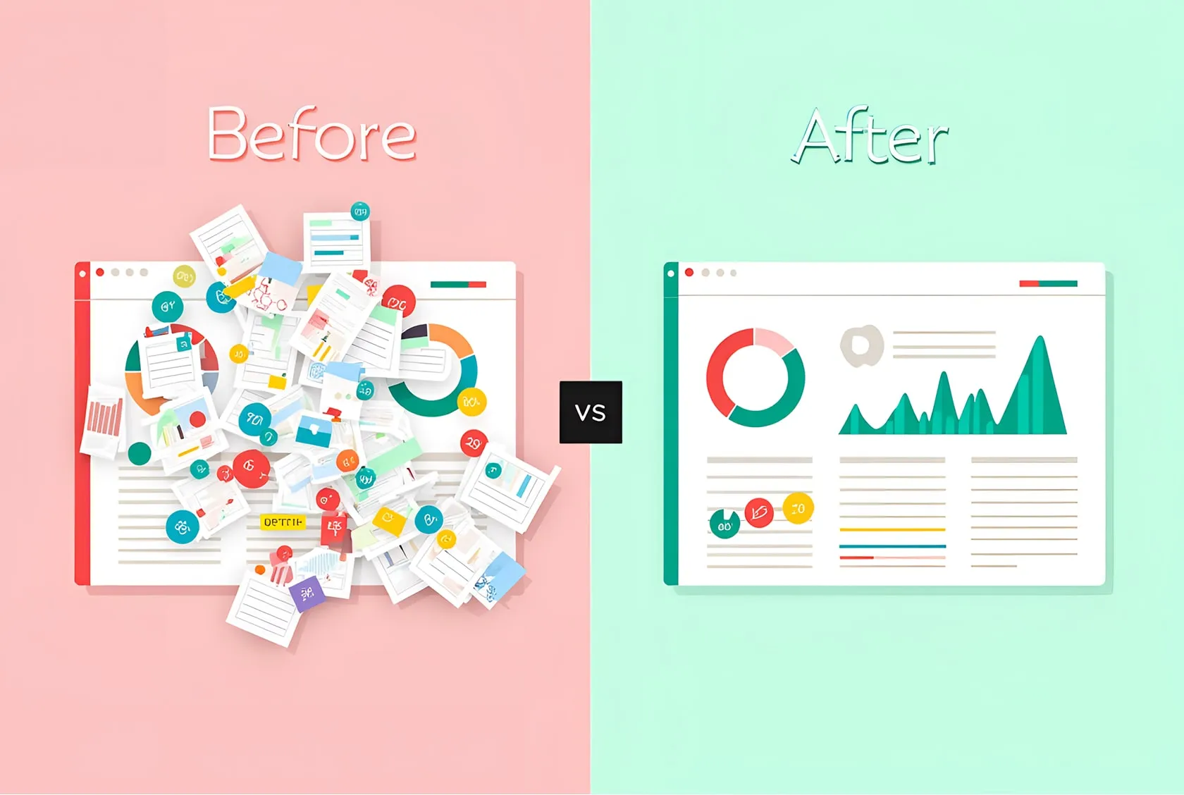
AI-generated UI used to be easy to mock. Many examples were overloaded with effects, vague in structure, and strangely empty once you looked past the first impression. That history still shapes the conversation. Many designers see an AI interface and assume there is nothing serious to learn from it.
I think that assumption now leaves a lot on the table.
The best AI-generated UI examples are becoming useful for the same reason strong concept work has always been useful. They compress visual exploration. They show new ways to stage a button, frame a selected step, highlight a combobox option, treat a modal as a separate depth layer, or make an accordion guide attention inside an expanded state. You are not studying them as finished products. You are studying them as carriers of visual ideas.
That distinction is important for anyone building modern interfaces. Inspiration becomes valuable when you can name what is working and translate it into real product decisions. That is the goal of this post. First, I will explain how to look at AI UI more critically. Then I will break down specific images and the design lessons hiding inside them.
What to look for before studying the examples
Before moving into the component breakdowns, it is worth defining what makes an AI-generated interface useful to study in the first place. The answer is usually smaller than the screen itself. A strong image does not need to be production-ready to have value. It only needs to contain one or two decisions that are visually clear, memorable, and transferable.
When reviewing AI-generated UI, I look for five things.
- A clear focal point
Every strong example tells the eye where to land first. Sometimes that is a button, sometimes a selected card, sometimes an expanded item inside a larger system. - Visible state treatment
Focused, selected, active, expanded, and highlighted states often carry the most useful lessons because they show how an interface communicates change. - Depth with purpose
Glow, blur, translucent layers, and tinted shadows become valuable when they make hierarchy easier to read. Decorative depth alone teaches very little. - Meaning between components
The most convincing interfaces are rarely about one isolated object. They show relationships. A toggle affects nearby controls. A stepper shapes the workspace below. A dialog changes how the background is perceived. - A decision worth stealing
The final test is practical. Can one specific move from this image be redrawn in Figma and adapted to a real product flow?
That is how section 3 is structured. Each example isolates one high-value component decision and explains why it deserves attention from a serious interface designer.
Breaking down the decisions worth stealing
The fastest way to learn from AI-generated UI is to stop treating each image as a complete answer. What matters more is the local decision hidden inside it: a stronger active state, a cleaner focal point, a better selected treatment, a smarter use of glow, depth, or hierarchy.
In the examples below, I will look at each component through that lens and focus on the part a designer could realistically borrow, redraw, and reuse.
Button. Hard outline, soft aura
What makes this image worth studying
This button is interesting because it combines two visual ideas that usually fight each other. The component itself is strict, clean, and almost product-neutral. It has a crisp dark outline, a white fill, simple iconography, and a stable pill shape. Under it, however, sits a blurred pink-to-blue glow that gives the whole object atmosphere, depth, and emotional charge. That contrast is what makes the button memorable.
What the AI got surprisingly right
The image does not rely on complexity. The effect comes from restraint. The outline keeps the button readable and grounded, while the colorful aura adds presence without turning the component into decoration. The glow also stays outside the main shape, so the label and icons remain sharp.
What a designer can learn from it
A CTA does not need heavy gradients, glass layers, or dramatic inner effects to feel premium. Sometimes the better move is to keep the component itself sober and place the expressive layer beneath it. This creates a strong separation between function and mood.
What to avoid copying blindly
The glow should not become visual noise. If it is too bright, too saturated, or too close to the text, the button starts to feel theatrical and less trustworthy.
How this can translate into real product design
This idea works especially well for hero actions in dashboards, editors, AI tools, and onboarding flows. In Figma, the principle is simple: build a disciplined button first, then add a soft blurred color bed as a secondary layer of emphasis.
Input. Glowing focus state without losing readability
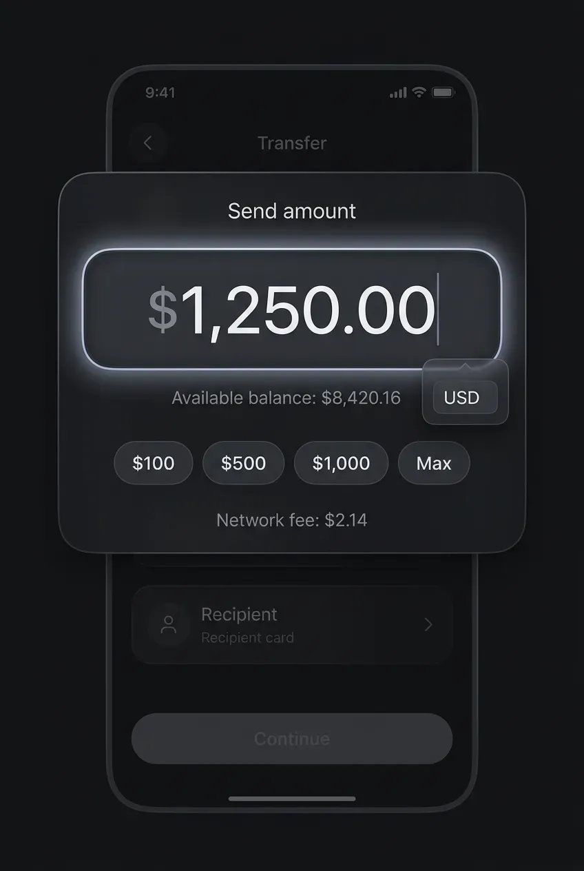
What makes this image worth studying
This input is worth studying because it turns a familiar focus state into something atmospheric without making the field feel vague or decorative. The active amount field has a soft luminous edge and a subtle halo around it, yet the number remains the clearest element on the screen. That balance is difficult to achieve. In many concept shots, glow makes inputs feel blurry, fragile, or hard to trust. Here, the glow supports attention instead of replacing structure.
What the AI got surprisingly right
The image keeps the hierarchy disciplined. The bright rim does not overpower the typography. The dark fill inside the field creates enough contrast for the amount to stay legible, while the outer light gives the input a sense of energy and importance. The result feels focused, premium, and still product-like.
What a designer can learn from it
A strong focus state does not always need to rely on a louder border color or a heavier stroke. It can be built as a layered effect: a clear field shape, readable text, controlled contrast, and then a soft aura around the component. That approach can make the state feel more intentional and less mechanical.
What to avoid copying blindly
Too much glow would quickly reduce trust, especially in finance flows. If the halo becomes brighter than the content, the input starts to feel cinematic rather than usable.
How this can translate into real product design
This idea works best for high-value fields such as amount entry, search, promo codes, or destination inputs where focus deserves extra emphasis.
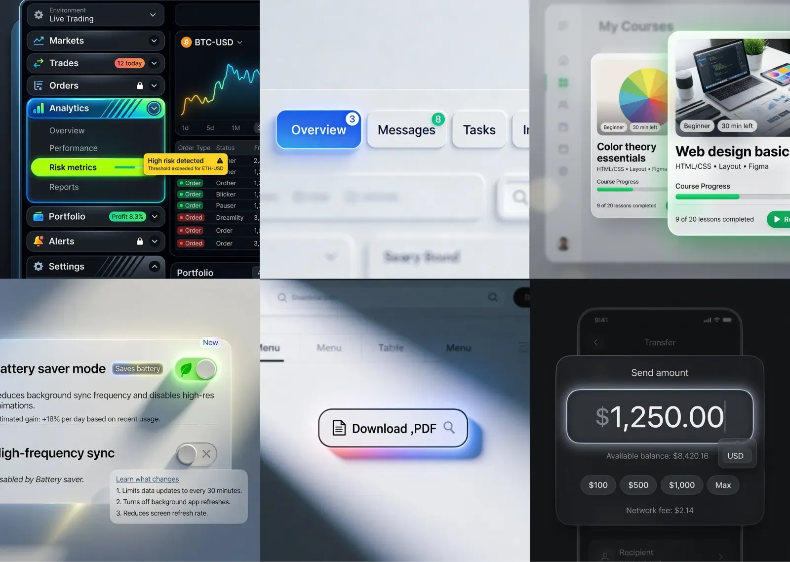
Tabs. Notification and status markers integrated into navigation
What makes this image worth studying
This tab pattern navigation does more than switch sections. Each tab also carries a small signal about what is happening inside that area of the product. The numeric badges on Overview and Messages, along with the dot markers on Invoices and Preferences, turn the tab row into a live status surface. That makes the interface feel active, current, and more product-aware than a standard static tab bar.
What the AI got surprisingly right
The indicators are integrated with good restraint. They are visible enough to add meaning, yet small enough to keep the labels readable and the tabs structurally clean. The image also uses different signal types instead of repeating the same pattern everywhere. A count suggests volume, while a dot suggests presence, update, or pending attention. That variation gives the navigation more nuance.
What a designer can learn from it
Tabs can carry lightweight system feedback without becoming cluttered. A tab row can quietly answer useful questions before the user even clicks: where new activity appeared, which section needs attention, and where content volume changed. This turns navigation into a richer orientation tool.
What to avoid copying blindly
Too many badges would quickly make the row noisy and stressful. Every marker needs a clear semantic role. Otherwise the interface starts to feel busy instead of informed.
How this can translate into real product design
This idea works especially well in dashboards, inboxes, admin panels, finance tools, and project software where section-level updates matter.
Toggle. Active glow used as functional emphasis
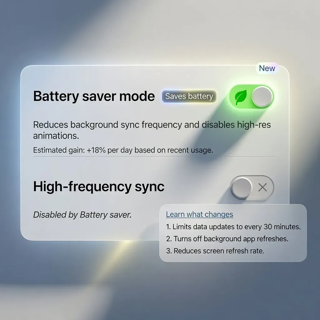
What makes this image worth studying
This toggle's glow feels purposeful rather than decorative. The active green track is surrounded by a soft halo, but the effect does more than make the control look polished. It visually reinforces that the setting is currently doing real work in the system. In this case, Battery saver mode is clearly on, and the glow helps communicate that this state is live, consequential, and tied to the behavior of nearby settings.
What the AI got surprisingly right
The image keeps the structure of the toggle intact. The control still reads instantly as a familiar switch: clear track, visible thumb, strong contrast, obvious on-state color. The glow sits around that structure instead of competing with it. That is an important distinction. Many concept images add light effects that make a control feel vague or toy-like. Here, the lighting supports the semantic meaning of the state.
What a designer can learn from it
An active state can be emphasized with more than color alone. A controlled halo can add urgency, energy, or system-level importance to a toggle, especially when the setting affects performance, privacy, battery, or automation. Used carefully, glow becomes part of the UX language.
What to avoid copying blindly
Too much bloom would reduce trust and make the control feel theatrical. The switch should still look precise, clickable, and stable.
How this can translate into real product design
This idea works best for important toggles where activation changes behavior in a noticeable way, not for every switch in a settings list.
Accordion. Neon-highlighted sub-item as the true focal point
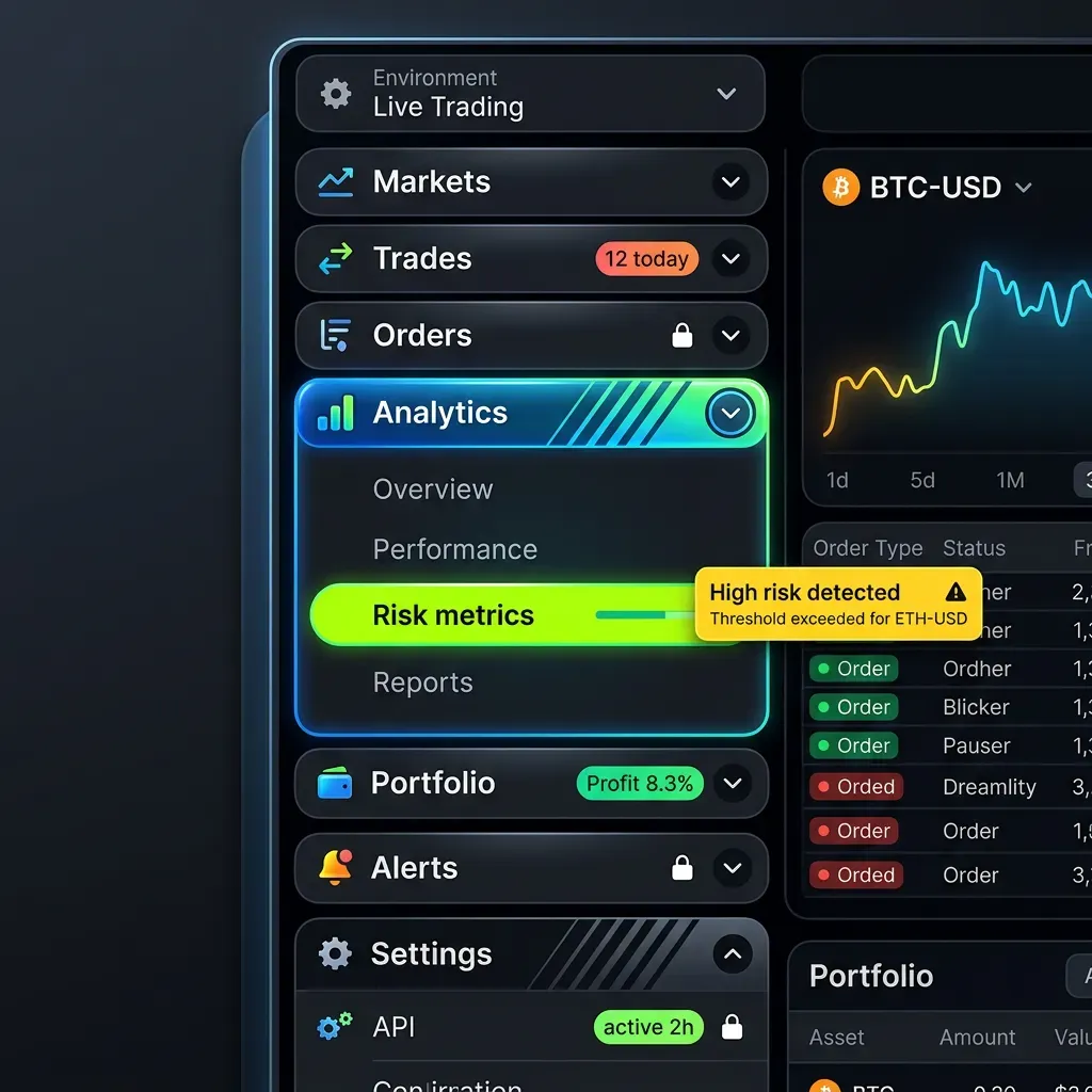
What makes this image worth studying
This accordion is worth studying because the visual center of the composition is not the expanded container itself, but one item inside it. Once Analytics opens, the eye lands on Risk metrics almost immediately. The bright acid-green pill, high contrast text, and embedded progress-like indicator create a second-level focal point inside the revealed content. That makes the accordion feel more intentional. It is not expanding just to show more options. It is expanding to guide attention toward the most important option.
What the AI got surprisingly right
The image creates hierarchy in layers. First, Analytics is clearly the active section. Then, within that section, Risk metrics becomes the dominant destination. The glow around the expanded block supports the parent state, while the neon treatment on the sub-item marks a more urgent action. That separation is smart. It keeps the interface energetic without collapsing everything into one loud visual surface.
What a designer can learn from it
Expanded content does not have to be visually flat. A good accordion can reveal structure, priority, and intent. If one revealed option matters more than the rest, the design can say so directly. That turns the pattern from passive disclosure into guided navigation.
What to avoid copying blindly
The highlighted sub-item should remain rare. If multiple child rows fight for attention, the accordion quickly becomes noisy and harder to scan.
How this can translate into real product design
This idea works well in dashboards, admin panels, analytics tools, and settings areas where one revealed destination often matters most.
Card. Center card as the selected hero among secondary cards
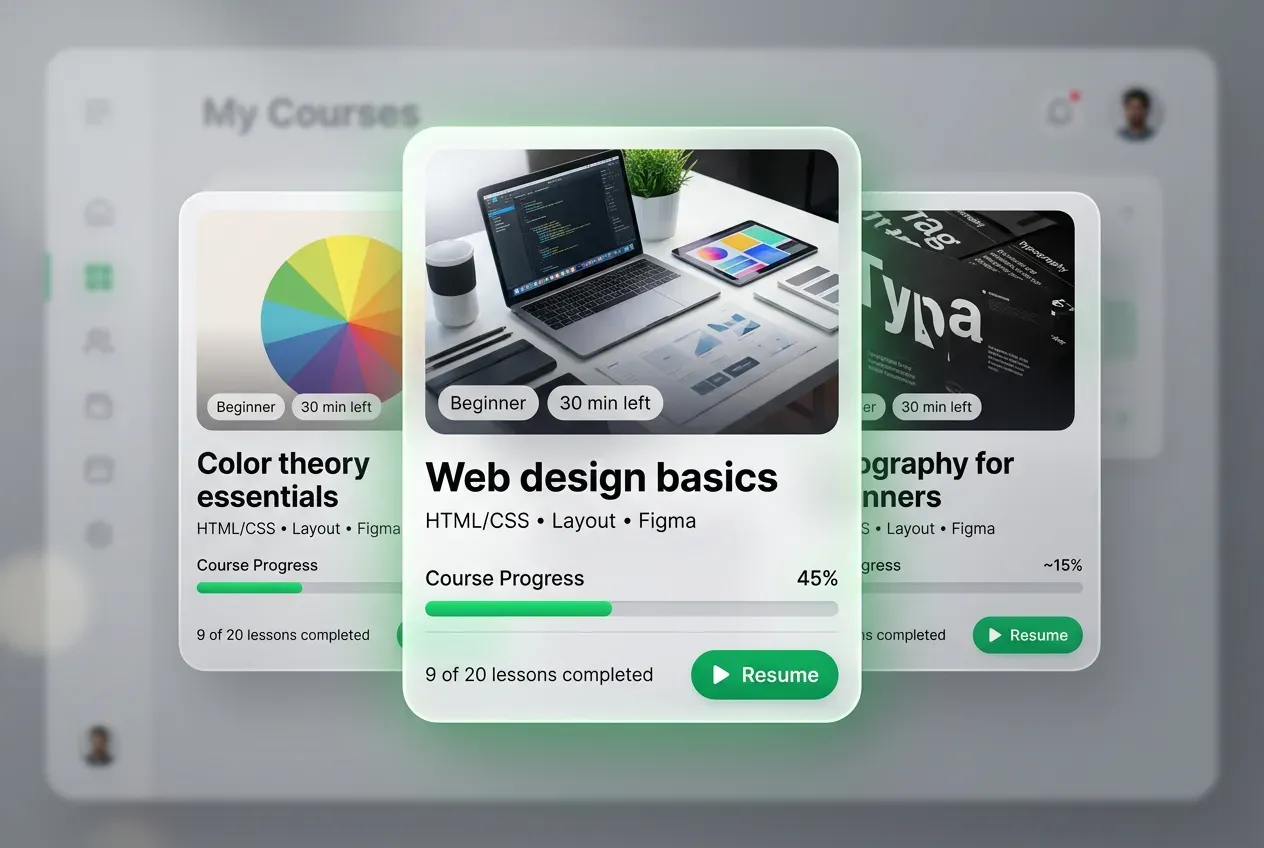
What makes this image worth studying
This card solves a common problem in product UI: how to show multiple options while still making one option feel clearly preferred. The center card is treated as the visual hero. It is larger, sharper, slightly closer, and more dominant than the two cards behind it. That simple staging move creates immediate hierarchy. Even before reading the text, the eye understands which course matters most in this moment.
What the AI got surprisingly right
The composition uses emphasis with control. The side cards are still informative, but they quietly support the main card instead of competing with it. The overlap, depth, and spacing all help the central card feel selected without needing a loud border or oversized badge. The green halo is especially effective here. It gives the hero card a premium selected-state feel, and it works because the effect reads like a softly tinted shadow rather than a cheap neon outline. That makes the emphasis feel atmospheric, polished, and product-friendly.
What a designer can learn from it
A selected card does not always need more UI chrome. It can win through staging, scale, contrast, and a carefully colored shadow. This is a strong lesson for dashboards, content hubs, course platforms, and recommendation surfaces.
What to avoid copying blindly
Too much size difference or too much glow would make the layout feel theatrical. The supporting cards still need enough presence to preserve the sense of choice.
How this can translate into real product design
This idea works especially well when one recommendation, recent item, or active item should lead the scene without hiding the surrounding context.
Dialog. Frosted dialog as the clear focal plane
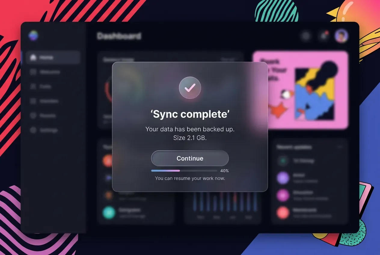
What makes this image worth studying
This dialog creates a very clean sense of visual depth. The modal does not feel like a flat alert pasted on top of the screen. It feels like a separate layer of material placed in front of the dashboard. The frosted surface, soft transparency, and controlled blur make the component feel calm, elevated, and immediately important. As a result, the user does not need to search for the main action. The eye lands on the dialog first.
What the AI got surprisingly right
The effect stays disciplined. The glass treatment does not destroy readability, and the background remains recognizable enough to preserve context. That balance matters. In weaker concept shots, blur and transparency often make the dialog feel vague or overly decorative. Here, the modal still has a solid enough presence to support the headline, message, button, and secondary status detail.
What a designer can learn from it
A strong modal can establish hierarchy through depth, not only through darker overlays or louder borders. When the dialog feels like its own focal plane, the interface becomes easier to scan and more memorable. This is especially useful for success states, confirmations, restore flows, and other moments that deserve a brief pause in the user journey. For when frosted glass is the right call versus glassmorphism or liquid glass, see the glass aesthetics comparison.
What to avoid copying blindly
Too much transparency would weaken contrast and trust. A dialog still needs enough opacity and edge definition to feel stable.
How this can translate into real product design
This idea works best when the modal represents an important interruption and should feel distinct from the screen behind it without becoming heavy.
Stepper. Active step framed as a selected card
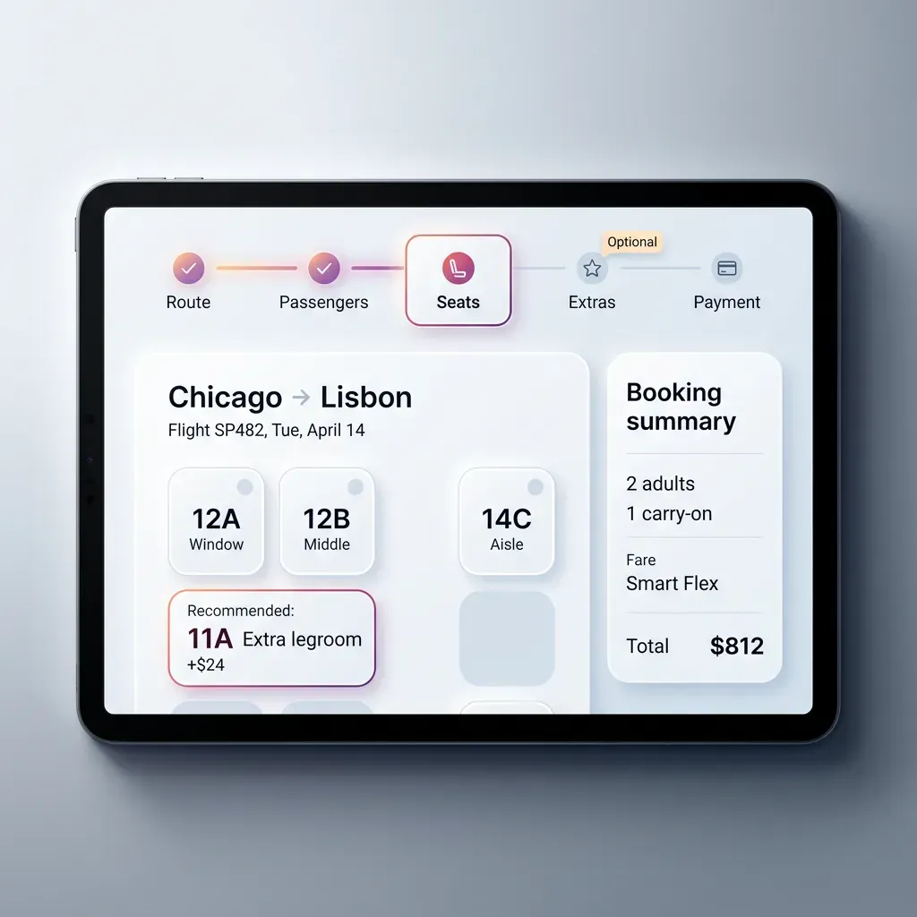
What makes this image worth studying
This stepper is treated as a real destination, not just as a marker on a progress line. The active step, Seats, is framed like a compact card with its own border, soft glow, icon container, and visual weight. That immediately slows the eye down and gives the process a stronger sense of place. Instead of reading the flow as a thin sequence of dots and labels, the user reads it as a series of stages with one clear stage currently in focus.
What the AI got surprisingly right
The selected step feels elevated without becoming bulky. It is larger and more prominent than the completed and upcoming steps, yet it still sits naturally inside the horizontal rhythm of the flow. The treatment also matches the importance of the screen below, which is all about seat selection. That alignment between navigation and workspace makes the pattern feel coherent.
What a designer can learn from it
A current step can carry more structure than a colored icon or bold label. By giving it a card-like frame, the interface makes the workflow feel more tactile, guided, and easier to scan. It also creates a useful pause in the sequence, which helps users understand where they are before making a decision.
What to avoid copying blindly
If every step receives too much chrome, the flow will feel heavy and crowded. The stronger card treatment should belong only to the current stage.
How this can translate into real product design
This idea works especially well in booking, onboarding, checkout, and setup flows where each stage deserves a clear visual checkpoint.
Combobox. Highlighted option through tinted shadow instead of loud fill
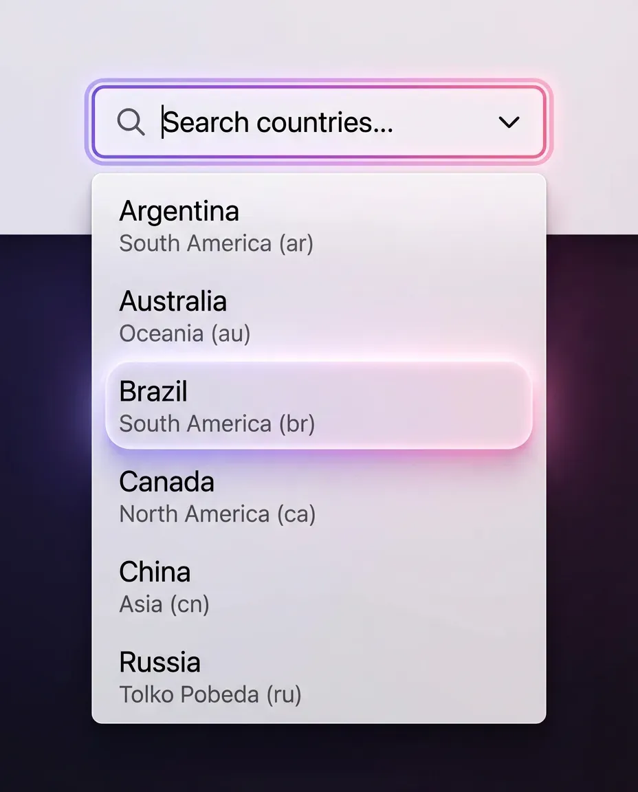
What makes this image worth studying
This combobox's selected option feels important without relying on an obvious colored block. The Brazil row stands out through atmosphere rather than brute contrast. Its surface stays very light, close to the rest of the panel, while a pink-violet tinted shadow and soft glow create the feeling of selection underneath it. That choice keeps the list elegant and calm. The result feels more refined than a standard highlighted row with a flat blue fill.
What the AI got surprisingly right
The image understands restraint. The selected row is clearly different, yet it does not break the visual language of the dropdown. Typography stays readable, the white surface still feels clean, and the emphasis lives mostly in depth and light. That is a mature move. Instead of painting the row louder, the design gives it a slight lift, almost as if the option is hovering above the rest of the list.
What a designer can learn from it
Selection does not always need to be communicated through stronger fill color. In some interfaces, especially light themes, it can feel more premium to use a tinted shadow, a subtle glow, and a slightly elevated surface. That creates focus while preserving softness.
What to avoid copying blindly
Too much color bloom would make the row feel sugary or less trustworthy. The glow should stay secondary to the text and shape.
How this can translate into real product design
This idea works especially well in premium search, filter, country-picker, and command-style dropdowns where clarity matters but hard selection colors would feel too heavy.
Turning visual inspiration into reusable product decisions
The value of AI-generated UI does not come from treating it as a finished answer. It becomes useful when you can convert a visual impression into a design decision that still makes sense inside a real product. A simple four-step filter helps.
❶ Extract the move, not the screen
The screen is often too specific, too theatrical, or too incomplete to reuse directly. Instead, isolate the local move that made it memorable. It might be a selected card lifted by a tinted shadow, a combobox option highlighted through atmosphere, or a dialog separated from the background through depth.
❷ Turn the move into a rule
Once you isolate the idea, rewrite it in plain design language. For example: use a softly colored shadow to mark selection without adding a louder fill.
❸ Test it against product reality
Good inspiration still needs friction. Check contrast, spacing, responsiveness, engineering realism, and repeated use across common states.
❹ Keep only what survives scale
The strongest ideas remain clear when they appear again and again across a product. If the effect works only in a single hero shot, it belongs to concept art more than product UI.
That is the mindset behind using AI inspiration seriously.
From visual inspiration to better interface decisions
AI-generated UI becomes useful when you treat it as reference material, not as a shortcut to finished product design.
Who benefits from it most?
-> Designers use it to study emphasis, hierarchy, and component treatment
-> Founders use it to explore directions before committing too early
-> Developers use it to get clearer UI targets before implementation
-> Teams use it to compare options faster and discuss concrete examples instead of vague taste
That is the new frame.
The real question is no longer whether AI-generated UI should replace product design. It should not. The better question is this: can it sharpen visual judgment, expand exploration, and help people make stronger interface decisions?
In many cases, yes.
What matters most is not volume, but reference quality. Random pretty screens are easy to save and easy to forget. Useful references are different. They help you compare patterns, isolate strong decisions, and translate visual ideas into real product work.
That is where Setproduct app fits: a growing AI-generated UI reference library built for study, comparison, and better design decisions.


