

Roman Kamushken
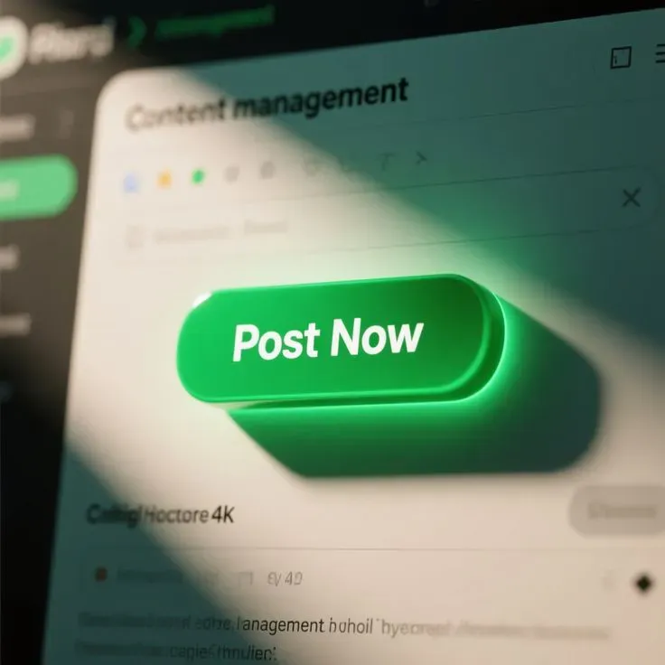
AI-generated UI used to be a toy. It looked glossy, it broke under real copy, and it collapsed the moment you asked for states. That changed. Today the output is often coherent enough to be useful as a reference layer, especially when you treat it as material for decisions rather than pixels to trace.
This guide is a workflow for turning AI UI inspiration into shippable UI. It is written for the moment when you need speed, consistency, and breadth, while still staying responsible about usability.
Start with intent, open the gallery later
If you browse first, you will end up collecting styles. If you write intent first, you collect decisions.
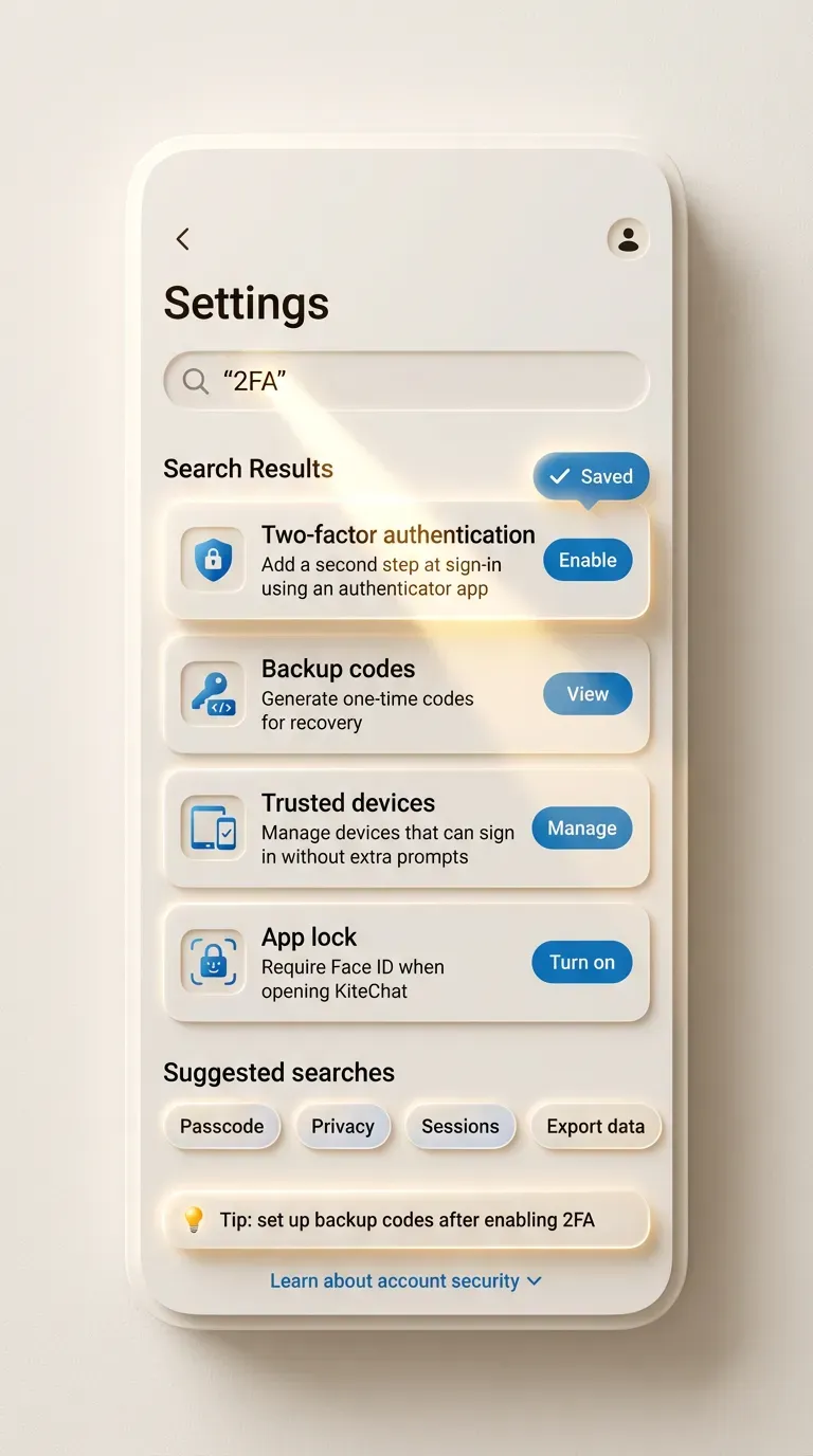
A fast brief takes 60 seconds. Use one sentence that contains context, user, and constraint. Example for a Settings pattern: Power user settings for a B2B analytics tool, dense but readable, advanced options grouped behind clear sections, with safe defaults.
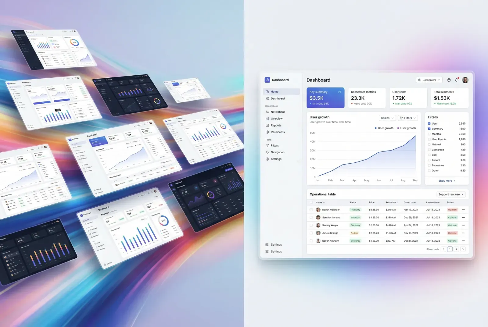
Now your browsing becomes targeted. In app.setproduct.com you can open a pattern category like Settings and filter further by component ideas, like Tabs or Switch. Your goal is one reference that solves structure, one that solves interaction, one that defines tone.
☞ Do: start with a single sentence that includes platform and audience. Example: Mobile checkout for first-time buyers, single column, trust cues visible, friction minimized for address entry.
✘ Don’t: start with a style request. Example: Make it glassy and neon. That brief has no product shape, so your reference will have no useful constraints.
Real example. You need a Checkout screen for a small ecommerce store. The intent sentence might be: Mobile checkout, guest flow, address plus delivery slots, clear error messaging, no hidden fees. When you browse, you ignore fancy hero banners and look for form density, validation, and order summary placement.
Collect references in sets, avoiding singles
A single screenshot can be persuasive and still be wrong. A set exposes the hidden parts: states, edge cases, and content realism.
Use the 3-reference rule.
❶ Structure reference. It defines layout, grouping, hierarchy.
❷ Interaction reference. It shows states, validation, feedback.
❸ Tone reference. It sets typography weight, contrast, motion philosophy.
Real example. You are designing Buttons for a web dashboard.
Structure reference: a button group layout inside a toolbar, showing how primary and secondary actions align with filters.
Interaction reference: a state matrix, hover, pressed, disabled, loading.
Tone reference: a restrained theme that keeps buttons readable in dense UI.
In your AI gallery, this often means opening the Buttons category, then saving three items that differ by purpose, rather than three that share the same gradient.
☞ Do: save sets with names like Toolbar actions, Destructive confirm, Loading state.
✘ Don’t: save ten variations of the same shiny primary button. It looks like progress and produces zero decisions.
To make sets actionable, attach a short note to each saved reference in your head. You can also treat the prompt as a hint about why the design looks the way it looks, especially when you see consistent choices like radius, elevation, and spacing.
Validate a reference with a 30-second checklist
AI inspiration tends to optimize for coherence, not for failure modes. Your job is to filter references before they infect your Figma file with risky decisions.
Here is a fast validation frame you can run mentally on the detail page.
First, states. If the reference shows only the happy path, treat it as incomplete. Second, hierarchy. If the eye has no stable reading order, the design will feel expensive and still frustrate users. Third, copy realism. If the text is decorative filler, the layout will break when product copy arrives.
Real example. You open a Settings reference that looks clean. Then you notice advanced sections hidden behind tiny accordions, with no explanation and no search. For a power user tool, that is a problem. You keep the layout idea, then you replace the navigation pattern with a left rail or search-driven settings.
☞ Do: prefer references that show at least one error or empty state in the same visual language. Example: a login form that shows invalid password feedback without jumping layout.
✘ Don’t: accept a reference that hides all complexity behind micro text. Example: critical privacy toggles pushed to footnotes.
When you see a strong reference, write down the decision it implies. Example: error messages occupy a reserved line under each input, so the layout stays stable. That decision is reusable across your product.
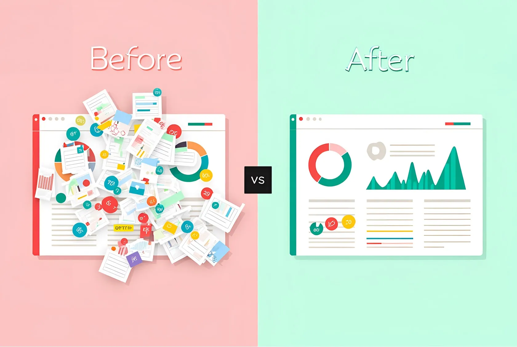
Translate inspiration into constraints and tokens
This is the step that prevents copying. You extract rules, then you build your own UI with your own content.
Take one reference and translate it into tokens. Tokens are roles, not colors. Spacing is a scale, not a one-off padding. Shadows are levels, not random blur.
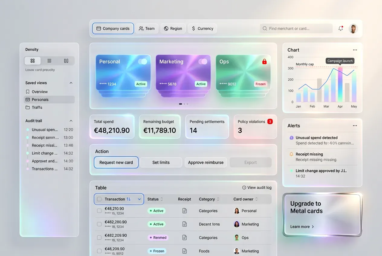
Real example. You like a Dashboard card layout from the gallery. Instead of copying the card, you extract:
Radius strategy: 12 for containers, 10 for inputs, 999 for chips.
Elevation: 0 for surfaces, 1 for cards, 2 for floating controls.
Type scale: 20 for section titles, 14 for body, 12 for metadata.
Spacing: 8 as base, 16 as section padding, 24 as block spacing.
Now you can recreate the feel in shadcn components, while changing the layout as needed.
Do & Don’t applied to a Tabs reference.
☞ Do: extract tab anatomy. Example: label, count badge, focus ring, active indicator thickness, overflow behavior.
✘ Don’t: extract only the gradient and call it a day. A tabs component is a navigation contract, not a color exercise.
This is also the right moment to make component inventory explicit. Look at the reference and name what exists: buttons, badges, tabs, search, table, empty state. If you cannot name it, you cannot implement it.
Rebuild in Figma, stress test it after
Rebuild has a predictable order. You can do it fast with shadcn-style building blocks.
❶ Skeleton layout with real spacing.
❷ Realistic copy and real data density.
❸ States and feedback.
❹ Stress tests.
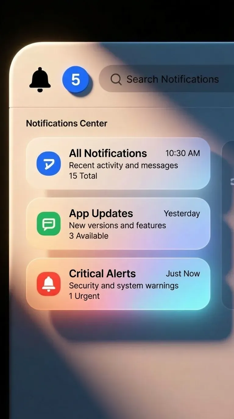
Real example. You rebuild a Notifications center reference.
Skeleton: header, filters, list, detail panel.
Copy: replace lorem with real notification titles like Payment failed, Invite accepted, Report ready.
States: unread, read, muted, action required.
Stress tests: very long titles, empty list, offline mode, bulk actions.
Stress tests are where glossy references lose. They also show you where to spend your next hour.
Use stress tests that reflect your product realities.
A common one is localization. If you target EU markets, German strings will increase length. If your UI survives that, it is robust. Another is permissions. If you have file access, the first denial must keep the user oriented.
☞ Do: stress test before you fall in love with the visuals. Example: switch a compact table into a small viewport and see if columns collapse gracefully.
✘ Don’t: polish shadows before you have error messaging. That order produces attractive failure.
If you want a systematic habit, pick one stress test per screen type and always apply it. For checkout, that can be invalid card, invalid address, and slow network.
Use AI inspiration for speed, then decide like a human

AI is strongest at breadth. It gives you many plausible variants quickly. Humans decide tradeoffs.
Use AI references to explore questions like: what if the settings are grouped by mental model instead of product modules, what if the primary button is persistent versus contextual, what if the tabs use badges versus dots.
Then decide using constraints: accessibility, clarity, implementation cost, and consistency across your design system.
Real example. You browse Button UI design references and see a trendy pill with glass blur. It looks great. Your constraints say the app must pass contrast checks, and the interface is dense. You keep the pill shape, you drop the blur, and you use a solid fill with a clearer focus ring.
☞ Do: treat prompts as a recipe to recreate style quickly. Example: use the same prompt structure to generate variations for Tabs, Inputs, and Tables, so the system stays consistent.
✘ Don’t: treat prompts as a source of truth. Your product constraints and user tasks stay the truth.
This is the mindset that makes your AI gallery valuable. It becomes a way to generate controlled variety, while the final design remains human-led.
A reusable workflow in six moves
If you want a repeatable habit, keep it short.
❶ Intent sentence
❷ Set of three references
❸ 30-second validation
❹ Extract constraints and tokens
❺ Rebuild with real content
❻ Stress test states and edge cases
You can run this workflow on any component category inside app.setproduct.com: Buttons, Tabs, Tables, Settings, Checkout. The category gives breadth, your intent gives direction, and the constraint extraction gives you a design you can ship without shame.
If you want to try it today, open the gallery, pick one component you are currently working on, and build a set of three references with a written intent sentence. The output should be a clearer Figma file, fewer random decisions, and a system that holds under real content.


