
Roman Kamushken
Part of: Dashboard UI design: From KPIs to layouts that convert — the complete reference to dashboard design on Setproduct.
Dashboards live or die by one thing: how fast they let someone answer a question. Most fail at this. They stack KPIs, fight for color, and treat density like a virtue. The result is a wall of numbers nobody trusts.
Below are eight principles that consistently separate readable dashboards from noisy ones. Each comes with a concrete rule you can apply tomorrow: a number, a ratio, or a pattern. They draw on common patterns from Stripe, Linear, Vercel, and the dashboards inside Eclipse and Neolex.
TL;DR — eight rules in one line each
- Start from the question first. Decide what the user needs to know before you pick a chart.
- One screen, one decision. Each view should serve a single primary action.
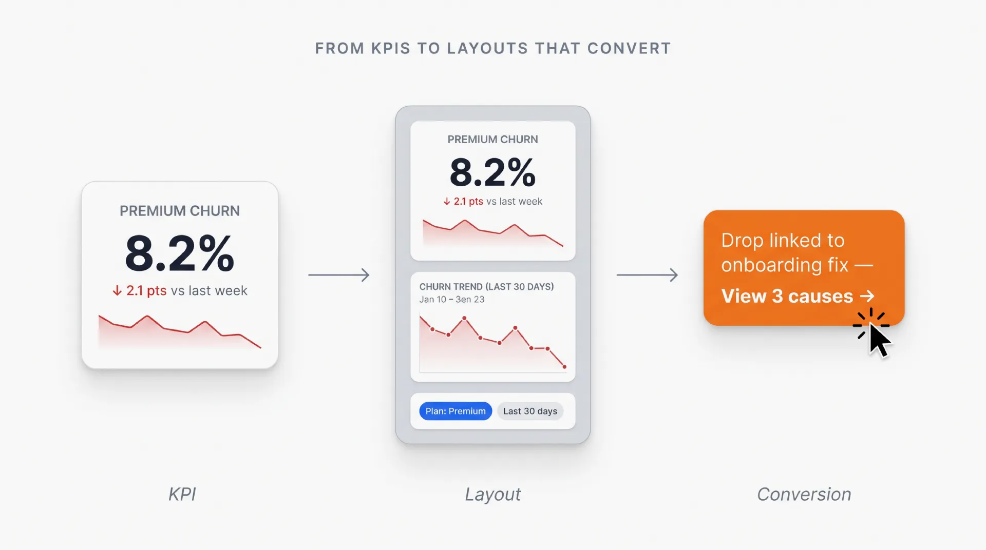
- Show change over snapshots. Deltas beat absolute numbers for almost every KPI.
- Round aggressively. Display 1.2M, not 1,234,567.
- Color encodes meaning, not decoration. Reserve hue for status; use grayscale for everything else.
- Density follows information value. Pack high-value zones tightly, leave low-value zones quiet.
- Make filtering reversible and visible. Users must always see what they filtered and how to undo it.
- Match update frequency to user need. Real-time is rarely the right answer.
Principle 1. Start from the user's question
Open a Figma file with a blank artboard and you’ll be tempted to plot whatever data exists. Don’t. Write one sentence first: what question does this screen answer? If you can’t finish that sentence in under twelve words, the dashboard isn’t ready to be designed.
Linear’s project view answers “is this cycle on track?” in a single header. Stripe’s payments dashboard answers “did revenue grow this week?” at the top. Everything else on those screens supports the lead question. Anything that doesn’t support it gets demoted or removed.
What this looks like in practice:
- Write the lead question as a sticky note on the artboard.
- The largest visual element on the screen must answer it directly.
Principle 2. One screen, one decision
A dashboard that supports five decisions supports none of them well. If a user opens the page and can’t tell within two seconds what action it suggests, you’ve built a report.
Pick the single decision: ship or hold, scale or pause, escalate or ignore. Every chart on the screen should either confirm or refute that decision. Anything else belongs on a different tab or a different page entirely.
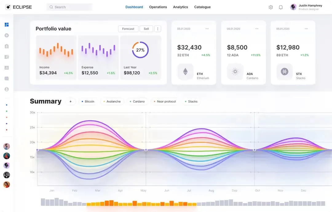
Vercel’s analytics dashboard is a clean example. The entire page nudges you toward one question: “is performance healthy right now?” Multi-decision dashboards do exist (think trading terminals), but they’re a specialist tool for trained users and a poor default everywhere else.
Principle 3. Show change over snapshots
A number on its own is almost useless. 42,300 active users means nothing. +8% vs last week tells you whether to celebrate or investigate. Always pair the absolute number with a delta and a time window.
Use three slots per KPI tile: the headline number, the delta, and the comparison label (“vs last 7 days”). Keep the delta color-coded only by direction (green up, red down) and resist coloring the headline number itself.
What this looks like in practice:
- Headline: 42.3K
- Delta: ▲ 8.2% vs last 7 days
- One sparkline below if trend matters more than the point estimate.
Principle 4. Round aggressively
A user can’t parse 1,234,567 at a glance. They can parse 1.2M. Use the smallest precision that preserves the decision.
The hierarchy:
- Counts under 1,000: show exact (842, 999).
- 1K to 999K: one decimal (12.4K, 487.0K).
- 1M and above: one decimal (1.2M, 38.5M).
- Percentages: one decimal max (8.2%, not 8.234%).
- Currency: drop cents in summaries ($12.4K, not $12,398.42).
The exception is tables with comparable rows. There, alignment and precision matter more than scannability. In KPI tiles, charts, and tooltips, round.
Principle 5. Color encodes meaning
A dashboard should be readable in grayscale. If you remove color and the screen falls apart, color was doing work it shouldn’t have been doing.
Reserve hue for three semantic roles only:
- Status: green, red, or amber for success, failure, attention.
- Categorical grouping: when you genuinely need to distinguish 3 to 5 series in a chart.
- Brand accent: used once per screen, on the primary CTA or focal metric.
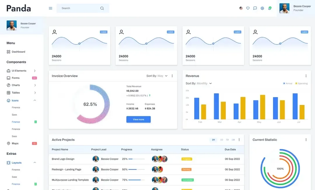
Everything else (borders, separators, axes, default text, secondary metrics) uses a neutral grayscale. Notion’s dashboards are a textbook example: 90% of the pixels are grayscale, and color shows up only where it changes a user’s decision.
Principle 6. Density follows information value
“Add more whitespace” is bad advice when applied uniformly. High-value zones, like the lead KPI strip and the primary chart, deserve density: tight gutters, smaller text, lots of information per square inch. Low-value zones, like filters, secondary metrics, and footers, deserve quiet: generous padding, fewer elements.
Aim for a 3:1 information density ratio between primary and secondary zones. The eye should be pulled to the dense area, because that’s where the answer lives.
What this looks like in practice:
- Primary KPI strip: 4 to 6 tiles, gutters of 8 to 12 px.
- Secondary filter or context panel: 24 to 32 px padding, max two elements.
Principle 7. Make filtering reversible and visible
Hidden filters are the single most reported cause of “the dashboard is wrong.” The user filtered something three views ago, forgot, and now thinks the data is broken.
Two rules:
- Active filters are always visible. Render them as removable chips at the top of the screen, never tucked inside a dropdown.
- One-click reset. A “clear all filters” button must always be reachable. Bonus points for showing a count: “3 filters applied, clear all”.
Stripe and Linear both do this well. Every active filter is a removable chip, and the URL reflects the filter state so it can be shared. Treat filters as a first-class part of your application state.
Principle 8. Match update frequency to user need
Real-time updates feel impressive in demos and create anxiety in production. A flickering number forces the user to constantly re-evaluate, even when nothing actionable changed.
Match cadence to the decision cycle:
- Operational dashboards (incidents, on-call, payments fraud): seconds to minutes.
- Analytics dashboards (product, marketing, growth): hourly or daily.
- Strategic dashboards (revenue, headcount, retention): weekly or monthly snapshots.
Always show a “last updated” timestamp. If you’re polling more often than the user decides, you’re wasting attention and bandwidth.
Common dashboard anti-patterns
Most broken dashboards share the same handful of mistakes. Audit yours against this list.
- Twelve KPIs above the fold. Bad because nothing is the lead. If everything is important, nothing is.
- Rainbow charts. Bad because color carries no meaning. A six-color pie chart is a riddle.
- Truncated y-axes. Bad because they exaggerate change. A bar chart starting at 87% turns a 2% lift into a “huge spike.”
- 3D charts and pie slices for more than 5 categories. Bad because they hide proportion. Use a sorted bar chart instead.
- Hidden filter state. Bad because users blame the data when they should blame the filter.
- Real-time everything. Bad because constant motion erodes trust. A flickering KPI screams “unstable.”
- Decorative icons next to every metric. Bad because icons compete with the number for attention.
Dashboard design checklist before you ship
Run this list before any dashboard goes live. If you can’t check eight of these ten, the screen isn’t done.
✅ Lead question. The screen answers a single, written-down question in under two seconds.
✅ Primary metric. One KPI is visually dominant; the rest support it.
✅ Deltas everywhere. Every KPI tile shows a number, a change, and a time window.
✅ Rounded numbers. No raw values like 1,234,567 in summary views.
✅ Grayscale readable. Screenshot the dashboard, desaturate, confirm it still works.
✅ Color = meaning. Every colored element maps to status, category, or brand accent.
✅ Density gradient. Primary zone is dense, secondary zones are quiet.
✅ Active filters visible. A user can see and clear filters in one click.
✅ Update cadence stated. A “last updated” timestamp is present and honest.
✅ Empty and loading states. Every chart has a defined empty state with text and an action.
Dashboard design questions and answers (FAQ)
❶ How many KPIs should a dashboard show? Aim for 4 to 6 KPI tiles in the lead strip, no more than 8. Above that, the eye can’t hold them in working memory and the lead question gets diluted. If you have more metrics, split them into tabs or secondary pages. Don’t cram.
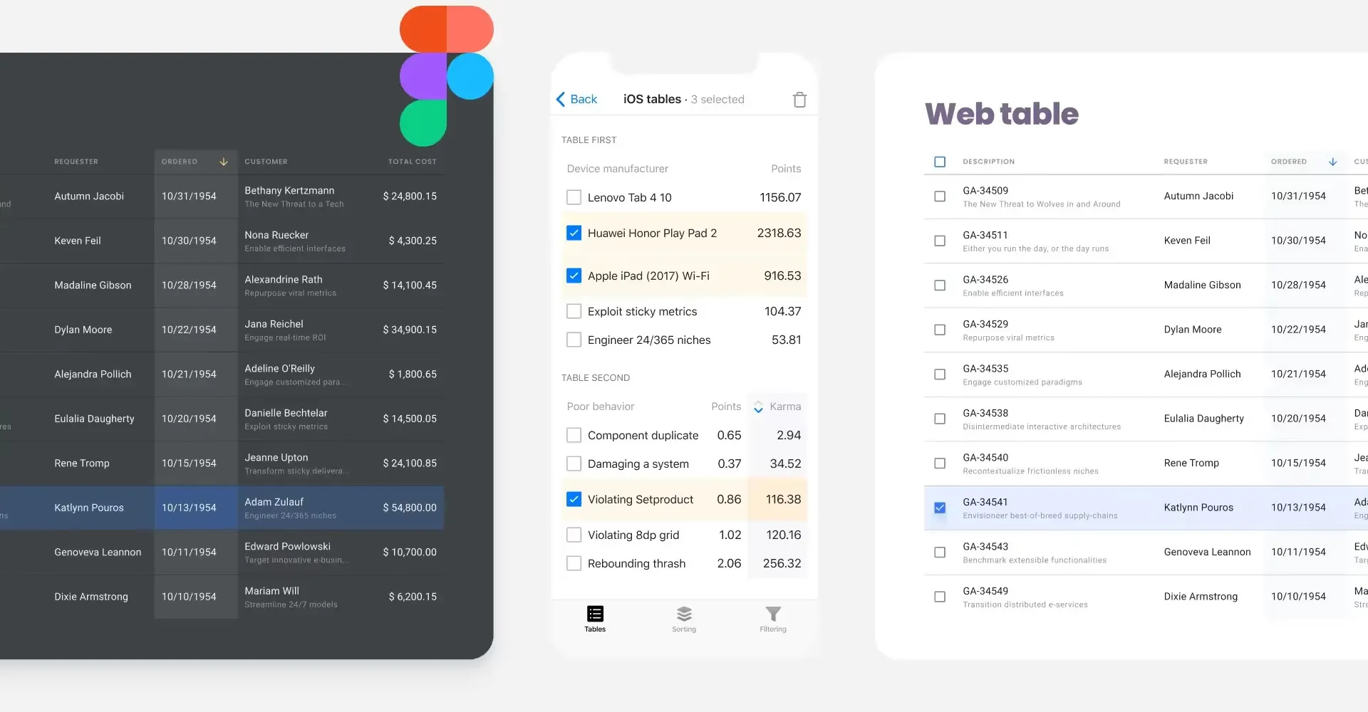
❷ When is a table better than a chart? When users need exact values, when they compare across many attributes, or when rows are independently actionable (sort, filter, click). Charts win for trends and proportions; tables win for lookups and audits. If the user’s question is “what’s the exact number for row X?”, use a table.
❸ Should dashboards be customizable? Only when you have evidence users want it. Customization adds complexity, cognitive load, and onboarding cost. Start with a single well-designed default. Add saved views before you add drag-and-drop layouts. Most users never customize, they trust your defaults.
❹ How often should dashboards update? Match the cadence to the user’s decision cycle. Operations: seconds to minutes. Analytics: hourly or daily. Strategy: weekly or monthly. Real-time is rarely the right answer outside of incident response and trading. Always show a timestamp so trust isn’t guessed.
❺ Mobile vs desktop dashboard design? On mobile, drop to one or two KPIs above the fold and stack everything vertically. Don’t shrink desktop charts, rebuild them. Use sparklines instead of full charts, hide secondary tables behind expanders, and put filters in a bottom sheet. If the desktop layout needs side-by-side comparison, mobile probably needs a different screen entirely.
A good dashboard answers a question before the user asks the next one. It doesn’t show off the data, it gets out of the way. Apply the eight principles above, run the checklist, kill anything that fails it.
Now go build dashboards that answer questions, not ones that show off data.


