

Roman Kamushken
If you want the hands-on version of just one of these, read our practical guide to liquid glass first. This post is the map around it: where each glass aesthetic came from, how they actually differ, and which one belongs in your next product.
TL;DR
Here is the whole comparison in five lines:
❶ Glassmorphism = translucent card + background blur. Easy to ship with backdrop-filter, easy to break on busy backgrounds.
❷ Neumorphism = soft monochrome embossing with two shadows. Beautiful in dribbble shots, an accessibility trap in production.
❸ Frosted UI / Aero = the OS-level ancestors (Windows Aero, Apple's frosted sidebars) that made translucency feel native.
❹ Liquid glass = Apple's 2025 reset, where the surface refracts and responds instead of just blurring.
❺ Pick by context: glassmorphism for marketing flair, frosted UI for native chrome, liquid glass for Apple platforms, and almost never pure neumorphism.
A 13-year detour from skeuomorphism to liquid glass
Depth in interfaces is not new. It just keeps changing its disguise. To understand why liquid glass feels both fresh and familiar, it helps to walk the line from 2013 to 2026.
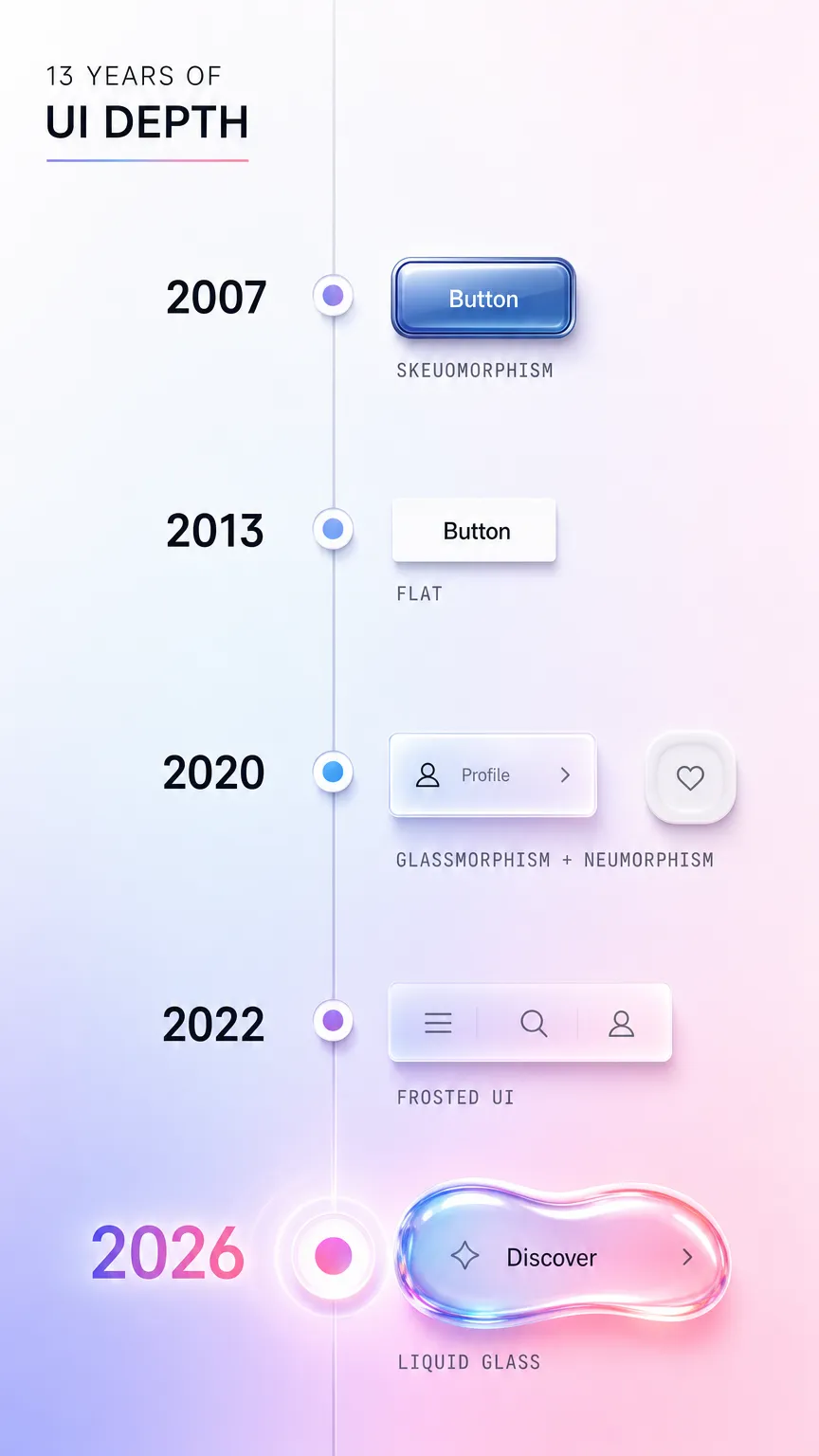
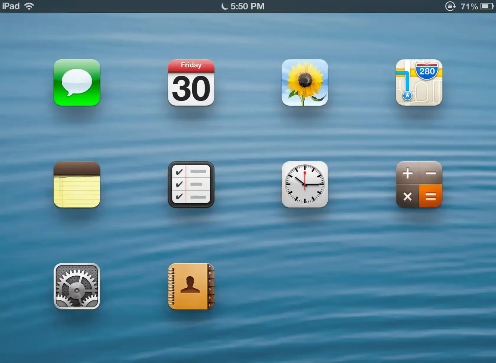
Before 2013, screens pretended to be objects. Buttons had bevels, notepads had stitched leather, and the calculator looked like a calculator. That was skeuomorphism, and it taught a generation of users what was tappable.
Then iOS 7 wiped it all flat. Google followed with Material Design in 2014, which kept one honest idea from the old world: elevation. Surfaces could still sit above each other, but depth was now expressed through shadows and motion instead of fake textures. Flat design won the decade because it scaled to every screen size and loaded fast.
Flat got boring, though. Around 2020 designers started smuggling depth back in. Glassmorphism arrived as frosted translucent cards. Neumorphism tried soft embossing. Both were reactions to years of sterile flat rectangles, and both spread through Dribbble faster than through real apps.
By 2025 Apple closed the loop. At WWDC 2025 it introduced liquid glass across its platforms, a material that does not just blur the background but refracts and reacts to it. The detour that started by killing skeuomorphism ended by reinventing physical depth, this time with the GPU doing the heavy lifting. Everything below is a tour of the stops along that road.
Skeuomorphism: where digital depth came from
Visual signature: literal real-world objects. Textures, bevels, drop shadows, and gloss that imitate leather, metal, glass, or paper.
Era and context: the dominant style of early touch interfaces, roughly 2007 to 2013, peaking in early iOS and desktop widgets. Its job was teaching. When touchscreens were new, a button that looked physically raised told you to press it.
Materials and depth philosophy: depth was decorative and imitative. A shadow existed because real objects cast shadows, not because the layout needed hierarchy.
Why it lost favor: it aged badly and scaled worse. Hand-painted textures looked dated within a year, and rendering them across dozens of screen densities was a nightmare. Flat design promised speed and consistency, so the industry switched overnight.
A faint echo of skeuomorphism still ships today in the form of subtle gloss and rounded "pressable" controls:
.skeuo-button {
  background: linear-gradient(#fdfdfd, #e4e4e4);
  border: 1px solid #c4c4c4;
  border-radius: 8px;
  box-shadow:
    inset 0 1px 0 rgba(255, 255, 255, 0.9),
    0 2px 3px rgba(0, 0, 0, 0.2);
}
Glassmorphism: when blur became a language
Visual signature: semi-transparent panels floating over a colorful, blurred background, usually with a thin light border and a soft shadow. You can see shapes moving behind the card without reading them.
Era and context: it broke out around 2020, helped along by Apple's frosted surfaces and a wave of concept shots. It became the default way to make a flat layout feel layered again.
Materials and depth philosophy: the panel is a sheet of frosted glass. Depth comes from what you can partially see through it. The background is part of the component, which is exactly what makes it fragile.
Why it gained, then cooled: glassmorphism is genuinely easy to produce and looks premium on a controlled gradient. The problem is contrast. Text on glass depends entirely on whatever sits behind it, so a card that passes WCAG contrast on one screen fails on the next. It still trends in 2026, but mostly as accent surfaces rather than full layouts.
.glass-card {
  background: rgba(255, 255, 255, 0.12);
  backdrop-filter: blur(16px);
  -webkit-backdrop-filter: blur(16px);
  border: 1px solid rgba(255, 255, 255, 0.25);
  border-radius: 16px;
}
Neumorphism: the soft-UI experiment that broke contrast
Visual signature: monochrome shapes that look pressed into or extruded out of the same surface, sculpted with one light shadow and one dark shadow. Everything is the same color as its background.
Era and context: a brief, intense moment in 2020. It went viral as "soft UI" and almost as quickly became a cautionary tale.
Materials and depth philosophy: there is no glass and no transparency here. The whole illusion is built from two opposing shadows on a flat fill. Depth is sculpted, not layered.
Why it failed in production: contrast. When a button is the same color as its background, the only thing separating them is a soft shadow, and soft shadows do not survive accessibility audits or bright sunlight. It looks calm in a portfolio and unusable in a real app. In 2026 neumorphism is effectively declining, surviving only as a texture inside larger systems. Its colorful cousin, claymorphism, keeps the soft feel but floats saturated surfaces above the page to hold contrast, and the case study on shipping a claymorphism landing page an AI agent can rebrand shows what that fix looks like in production.
.neumorph {
  background: #e0e5ec;
  border-radius: 16px;
  box-shadow:
    8px 8px 16px #a3b1c6,
    -8px -8px 16px #ffffff;
}
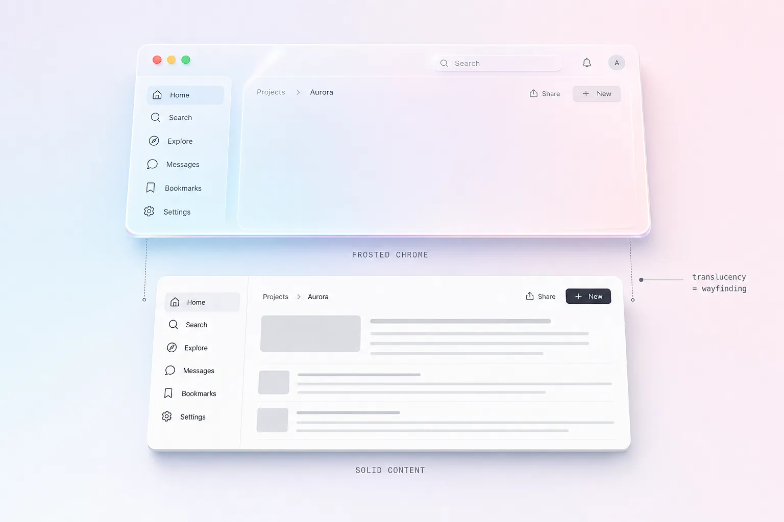
Frosted UI and Aero: the translucent ancestors
Visual signature: translucent system chrome. Sidebars, menu bars, and panels that take on a blurred tint of the content or wallpaper behind them. Less flashy than glassmorphism, more structural.
Era and context: this is the oldest living branch. Windows Vista shipped Aero glass in 2007, Microsoft later refined it into the Acrylic material in Fluent Design, and Apple has used frosted translucency in its sidebars and control surfaces for years.
Materials and depth philosophy: translucency as a wayfinding tool, not decoration. A frosted toolbar tells you it is system chrome sitting above your content. It belongs to the OS layer, so it tends to be tuned far more carefully than a marketing-page glass card.
Why it endures: because it is functional. Frosted UI signals hierarchy between app content and system controls, and the platform vendors solved its contrast and performance edges long ago. It is not trending so much as permanently installed.
You can see it shipping right now in the Windows 11 Start menu and flyouts, built on Microsoft's Acrylic material, and in the translucent Finder and Mail sidebars on macOS.
Liquid glass: Apple's 2025 reset
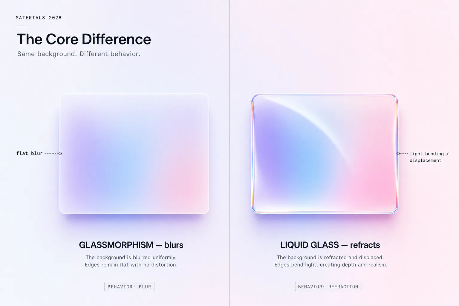
Visual signature: a surface that refracts light, picks up color from below, and shifts as you scroll or tilt. It is glass that behaves like a lens, not glass that merely blurs.
Era and context: introduced at WWDC 2025 as a system-wide material across Apple's platforms, described in the updated Apple Human Interface Guidelines. It is the current high-water mark for digital depth. In production today it shows up across Apple's 2025 releases: the iOS 26 Control Center and Lock Screen, the translucent sidebars and toolbars in macOS Tahoe, and the depth-forward surfaces of visionOS. These are the reference implementations to study, since the material is tuned at the OS level.
Materials and depth philosophy: liquid glass treats the surface as an optical object. Where glassmorphism blurs the background, liquid glass bends it, adding specular highlights and edge refraction that respond to motion. The depth is dynamic instead of static.
Why it matters: it answers the contrast problem that plagued flat glassmorphism by building legibility and adaptive tinting into the material itself, at the OS level. The catch is that the full effect is native. On the web you can approximate the look, but the real refraction lives in Apple's rendering stack. For the production rules on shipping it well, the liquid glass practical guide covers states, density, and fallbacks in detail. Once you are applying it across a real component library, the liquid glass UI playbook goes further with tiers, stress boards, and a production checklist.
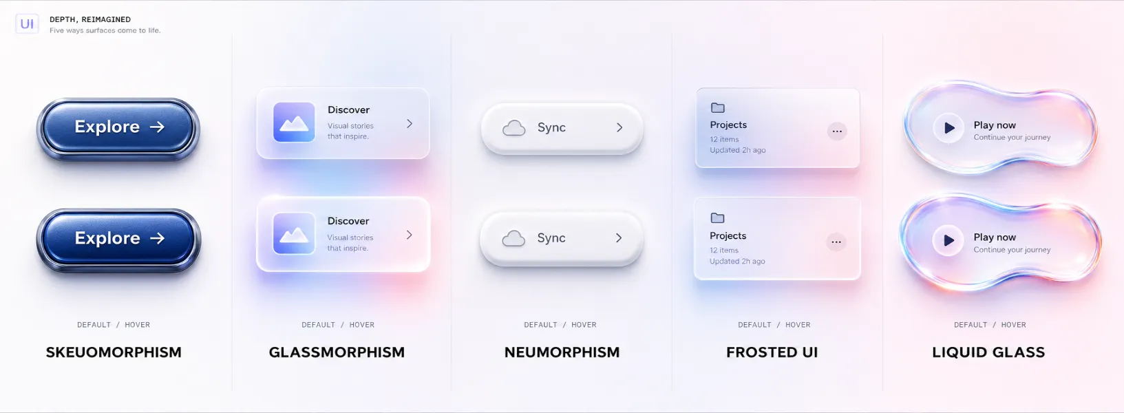
Every glass aesthetic side by side
This is the table to bookmark. Five aesthetics, the axes that actually matter when you choose between them.
| Axis | Skeuomorphism | Glassmorphism | Neumorphism | Frosted UI / Aero | Liquid glass |
|---|---|---|---|---|---|
| Visual signature | Real-object textures and gloss | Translucent blurred card | Soft monochrome embossing | Translucent system chrome | Refractive, reactive surface |
| Color palette | Rich, photographic | Vivid gradient behind glass | Single muted base tone | Neutral, tinted by content | Adaptive, tints from below |
| Typography pairing | Humanist, decorative | Clean geometric sans | Low-contrast sans (risky) | Native system font | Native system font |
| Materials / textures | Leather, metal, paper | Frosted glass | None, sculpted fill | Frosted glass | Optical glass + light |
| Depth approach | Imitative shadows | See-through layering | Two-shadow sculpting | Translucent layering | Dynamic refraction |
| Motion design | Static | Mostly static | Static | Subtle parallax | Reactive, scroll and tilt |
| Accessibility | Decent contrast | Fragile, context-dependent | Poor by default | Solid, OS-tuned | Strong, built into material |
| Implementation difficulty | High | Low | Low | Mid | High (native) |
| Best use cases | Nostalgia, games | Marketing, accents | Portfolio concepts | Native app chrome | Apple-platform products |
| Anti-patterns | Heavy app UI | Full-screen text layouts | Primary actions, forms | Overuse on content | Web-only "fake" refraction |
| Trending in 2026 | No | Yes (as accents) | Declining | Stable | Yes (rising) |
How to choose: liquid glass vs glassmorphism vs frosted UI
A table tells you what they are. A decision needs context. Run your project through four questions.
Which platform are you on? If you are building for iOS, iPadOS, or macOS and want to feel native in 2026, liquid glass is the answer, because the system already speaks it. On the web, default to glassmorphism for accent surfaces, since the native refraction simply is not available in the browser yet.
Is the surface content or chrome? Chrome that floats above content (navigation, sidebars, toolbars) is where frosted UI earns its keep. Content that people read for more than a few seconds should sit on a solid, high-contrast surface, whatever the surrounding style.
What is your accessibility budget? If you cannot guarantee the background behind a glass panel, you cannot guarantee its contrast. Reserve translucency for places where the backdrop is controlled, and give every glass surface a solid fallback. This single rule kills most glassmorphism failures.
How much brand flair do you need? Glassmorphism reads as modern and premium on a landing page. For a dense dashboard with tables and forms, that same flair becomes noise. Match the intensity of the effect to the density of the screen.
If you only remember one heuristic: liquid glass for Apple platforms, frosted UI for native chrome, glassmorphism for web accents, and skip neumorphism for anything a user must operate.
Common mistakes with glass interfaces
The same handful of errors sink most glass designs. Watch for these.
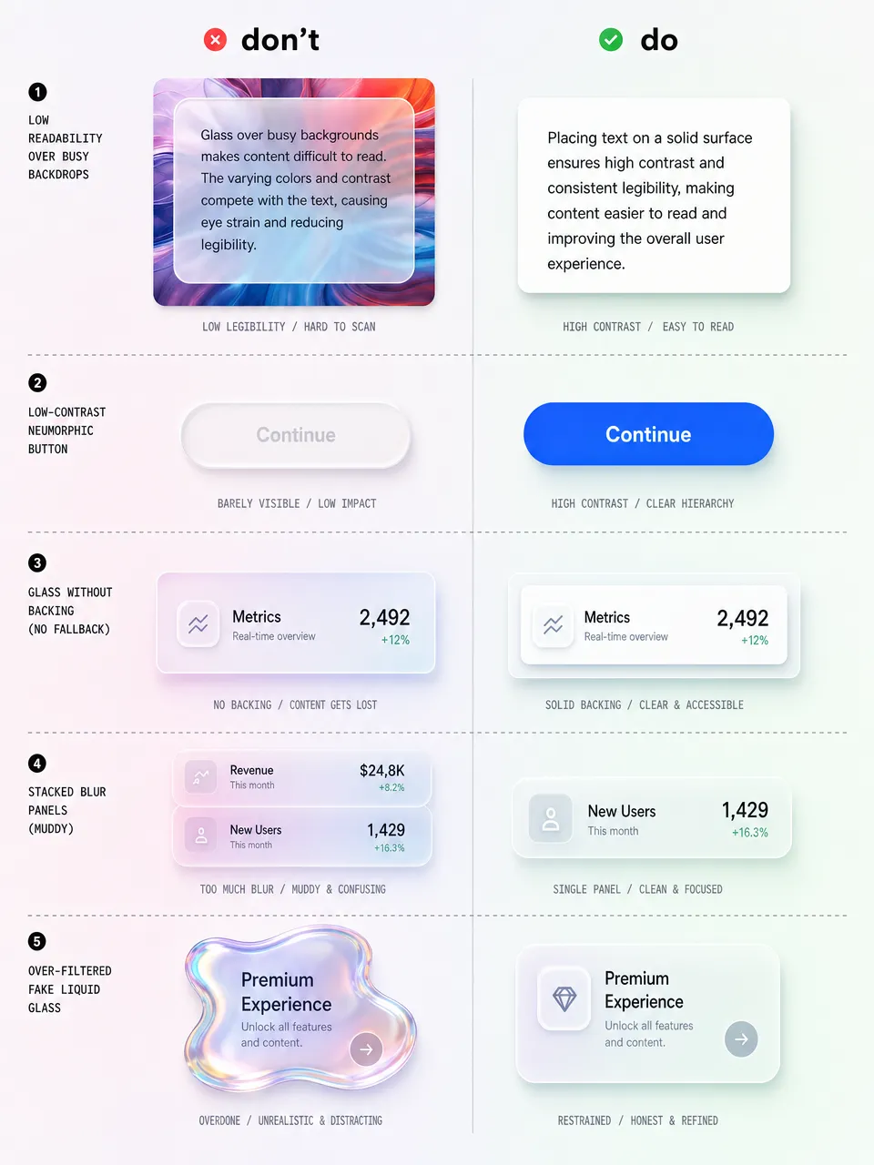
✗ Long-form text on a glass panel. Body copy needs a stable contrast ratio. A frosted card over a moving photo cannot promise one. Put paragraphs on solid surfaces and save glass for cards, chips, and chrome.
✗ Neumorphism on primary actions. A "Buy" button that is the same color as its background, defined only by a soft shadow, is the clearest example of style beating function. Primary actions need real contrast.
✗ No fallback layer. backdrop-filter is well supported but not universal, and it can be disabled for performance or reduced-transparency settings. Always design the solid-color version first, then layer glass on top.
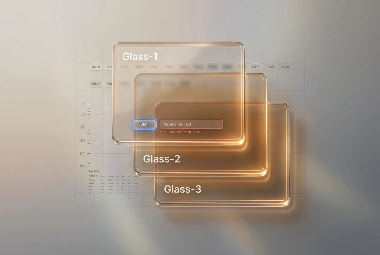
✗ Stacking blur on blur. Every translucent layer multiplies the GPU cost and muddies legibility. Two stacked glass panels usually look worse and run slower than one.
✗ Faking liquid glass on the web with heavy filters. Piling on blur, noise, and gradients to imitate Apple's refraction rarely lands and tanks performance. If you need true liquid glass, you need a native surface, and a disciplined set of edge and thickness cues like the ones in the liquid glass UI playbook.
Glass aesthetics questions and answers (FAQ)
❶ What's the difference between liquid glass and glassmorphism? Glassmorphism blurs whatever sits behind a translucent card. Liquid glass refracts it, bending light and adapting its tint in real time. Glassmorphism is a CSS effect you can ship on the web today. Liquid glass is a native Apple material introduced at WWDC 2025, and the full effect lives in the OS rendering stack.
❷ Is glassmorphism dead in 2026? No, but its role shrank. It is no longer a viable foundation for full layouts because of contrast problems on uncontrolled backgrounds. As an accent on cards, badges, and navigation over controlled gradients, it is still very much alive.
❸ Can I use liquid glass on the web today? You can approximate the look with layered blur, gradients, and highlights, but you cannot reproduce the real-time refraction, which is native to Apple platforms. For web work, honest glassmorphism usually looks better than a heavy fake.
❹ What's the accessibility impact of glass effects? The main risk is text contrast. Because translucent surfaces inherit whatever is behind them, a panel can pass WCAG on one screen and fail on another. Always provide a solid fallback and respect the reduced-transparency setting.
❺ Why did neumorphism fail when glassmorphism survived? Neumorphism removed contrast on purpose by making controls the same color as their background. Glassmorphism at least keeps a visible boundary and a blurred backdrop, so it degrades less severely. One broke a core usability rule, the other only bends it.
❻ Will liquid glass replace flat design? Not entirely. Flat design is the efficient default for dense, content-heavy screens, and that will not change. Liquid glass adds an expressive material layer on top, especially for chrome and hero moments on Apple platforms. Expect a hybrid: flat foundations with glass surfaces where they earn attention.
❼ What's the easiest glass style to implement?
Glassmorphism, by a wide margin. A backdrop-filter: blur() with a translucent background and a thin border gets you most of the way in a few CSS lines. The hard part is not the code, it is keeping contrast safe.
❽ Which glass aesthetic should a SaaS dashboard use? Mostly none on the content itself. Dense data needs solid, high-contrast surfaces. Reserve frosted UI for the navigation chrome and a touch of glassmorphism for elevated panels like modals or notification toasts. For two angles on this, see depth in iOS design and the dashboard UI design guide.
Closing thoughts
I have watched this pendulum swing twice now, and the lesson holds: depth always comes back, but only the honest versions stay. Skeuomorphism died because its depth was fake decoration. Neumorphism died faster because its depth erased contrast. The styles that survive, frosted UI and now liquid glass, treat depth as information rather than ornament.
So my advice for 2026 is unglamorous. Pick the glass that matches your platform and your screen density, build the solid version first, and let translucency be the reward, not the foundation. If you want to see where the pendulum might swing next, the opposite reaction is already brewing in retro and brutalist UI. And when you do commit to liquid glass, do it properly: start with the practical guide, then grab the full liquid glass UI playbook when you are ready to roll it across a real product. The material is good. The discipline around it is what makes it ship.


