

Roman Kamushken
In 2026, a growing slice of the web is loud again. Designers are walking away from soft shadows and frosted glass toward raw borders, pixel fonts, and interfaces that look like they escaped a 1998 desktop. This field guide breaks down the three retro aesthetics taking over indie web, with real examples and a clear call on when the look actually helps.
TL;DR. Retro and brutalist UI is the 2026 reaction to a decade of near-identical minimal landing pages. Three looks lead the movement, and accessibility is the risk that decides where they belong.→ Brutalist is raw and anti-corporate. Y2K is chrome and nostalgia. OS-inspired revives System 7 and Windows 98.
→ The biggest risk is accessibility and conversion, so the style fits portfolios and editorial far better than banking or healthcare.
→ Treat retro as a positioning decision, a deliberate signal, never a way to hide a weak interface.
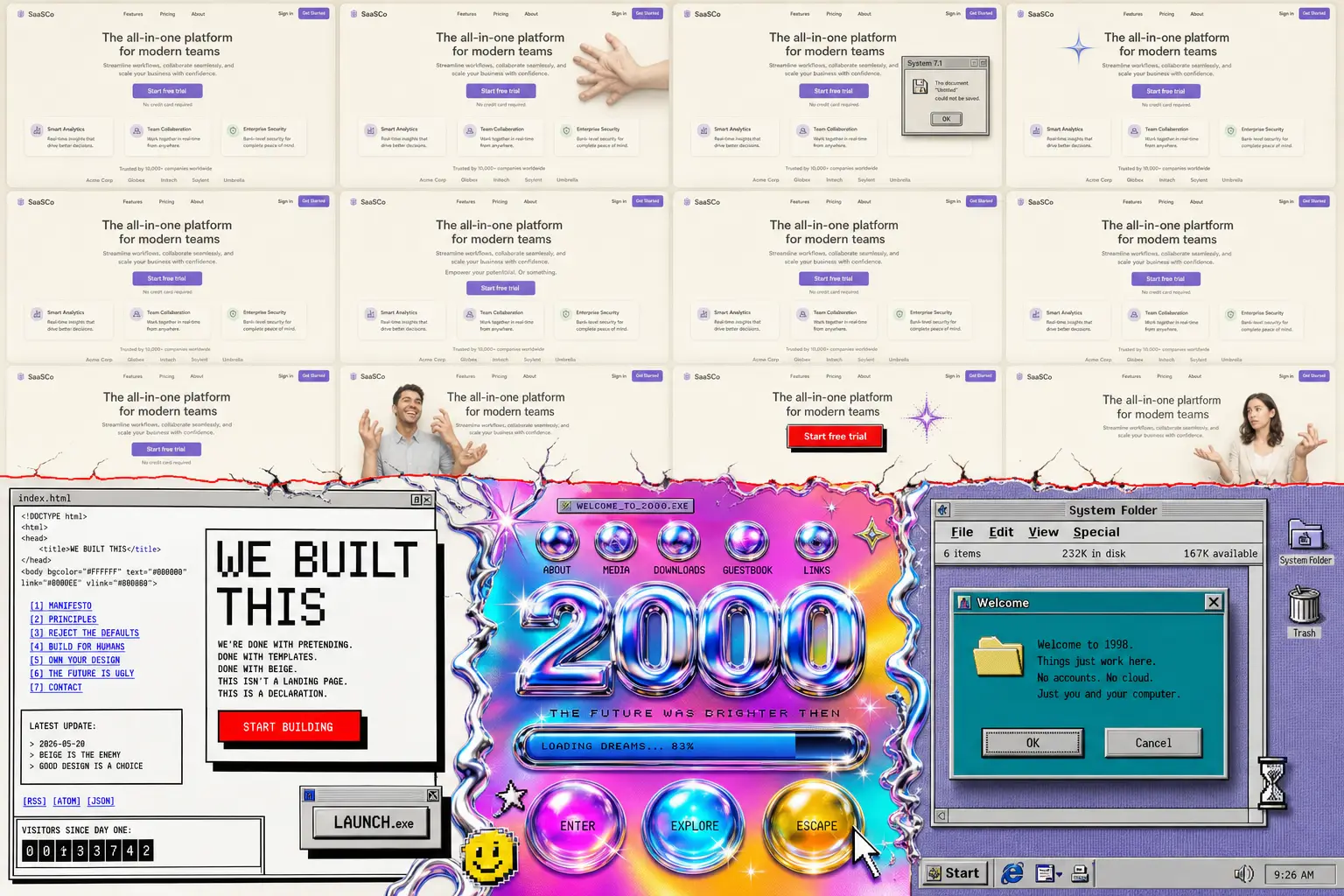
The 2026 split: a decade of near-identical clean minimalism on top, the brutalist and retro reaction breaking through below.
The shift away from clean minimalism
The web turned beige. After ten years of the same rounded cards and gentle gradients, the same Inter typeface everywhere, a lot of product pages became impossible to tell apart. AI page builders made it worse by shipping the identical safe template to everyone at once.
So designers pushed back. You can watch it happen on Are.na, where research boards fill up with scanned zines, terminal screenshots, and old software manuals. The same energy drives Cosmos, the visual platform a lot of designers now open instead of Pinterest. Both feel handmade in a way the algorithmic feeds stopped feeling years ago.
Developer culture fed the fire too. Monospaced typefaces like Berkeley Mono and Departure Mono went from niche to default on engineering sites, and the stark black-on-white look of the Vercel ecosystem became its own genre. Once dev tools embraced raw typography, the rest of indie SaaS followed.
There is a quieter reason as well. Clean minimalism started reading as corporate and a little cold, which I argued back when I wrote about why app UX keeps getting worse. Retro interfaces feel like a person made them. In a year flooded with generated visuals, looking human is a competitive edge.
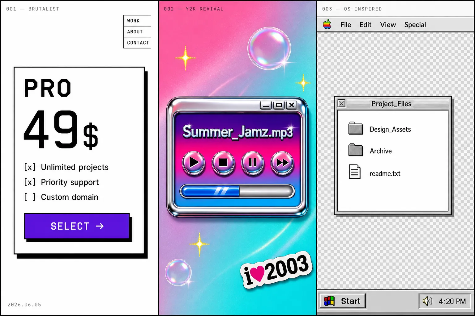
Three retro aesthetics defined
People throw "retro" around as one bucket, but three distinct movements are doing the heavy lifting in 2026. Each has its own roots and visual grammar, its own reason for existing. Mixing them up is the fastest way to ship something that looks confused rather than intentional.
Brutalist design
Brutalism in UI borrows from the architecture term. It exposes the raw structure of a page instead of dressing it up. Think default HTML blue links, hard 2px borders, system fonts, harsh contrast, and zero border radius.
The visual signals are easy to spot. Flat blocks of saturated color sit on stark backgrounds. Buttons look like buttons from a 1996 form. Layouts feel almost unstyled, like the designer refused to soften any edge. If you have ever shipped a brutalist button with a hard offset shadow and no hover easing, you know the feeling.
The psychology is anti-corporate honesty. Brutalist UI says "we did not hire an agency to smooth this over." That rawness reads as authenticity, which is gold for indie founders and creative tools trying to stand apart from polished enterprise software.
Gumroad is the canonical production example. Bold flat color, heavy outlines, and chunky type that never apologizes for taking up space. It sells digital products to creators, and the look signals "built by one of us" louder than any tagline could.
Y2K revival
Y2K design revives the visual language of the early-2000s web, all chrome gradients and bubbly lo-fi 3D. Glossy buttons, metallic text, lens flares, iridescent meshes, and that specific optimism of the dial-up era before the web got serious.
The visual signals lean shiny. Reflective surfaces, candy colors, star and sparkle motifs, pixel-soft glows, and typography that looks inflated with air. It is maximal where brutalism is bare.
The psychology is nostalgia for a time most of the audience never experienced firsthand. Gen Z designers romanticize the early internet as a freer, weirder place, so the chrome and sparkle work as a kind of borrowed memory. It signals play and rebellion against the flat sterility of modern apps.
Poolsuite FM is the reference everyone points to, a retro music player wrapped in summer-2003 nostalgia that still ships polished interaction. It proves the look can carry a real product without collapsing into a gimmick.
OS-inspired (System 7, Windows 98, classic Mac OS)
OS-inspired design rebuilds the chrome of old operating systems inside the browser. Title bars, beveled buttons, dotted focus rectangles, pixel icons, and draggable windows that recreate System 7 or Windows 98 on a modern site.
Skeuomorphism, the practice of mimicking real-world materials and controls in software, never fully died here. The signals are window frames with close and minimize widgets, inset and outset 3D borders, monospaced or bitmap fonts, and that gray Chicago-era palette.
The psychology is digital comfort food. These interfaces feel tactile and legible in a way flat design abandoned, and I made a similar case about tactility when I wrote about depth in iOS design. Old OS chrome carries decades of muscle memory, so it feels instantly usable even when it is decorative.
Two open libraries power most of this look in production. 98.css recreates Windows 98 components, and system.css rebuilds classic Mac OS. Both let teams adopt the aesthetic without redrawing every control by hand.
The three aesthetics side by side: brutalist structure, Y2K chrome, and OS-inspired window chrome each speak a different visual language.
Comparison table, choosing between aesthetics
Pick the aesthetic that matches your audience and risk tolerance before you touch a single pixel. The three looks pull in different directions, and the table below is the fastest way to see where each one fits and where it backfires.
| Aspect | Brutalist | Y2K revival | OS-inspired |
|---|---|---|---|
| Typography | System fonts, mono, oversized weights, no smoothing | Inflated sans, chrome and metallic text effects | Bitmap, Chicago, pixel and mono faces |
| Color palette | Harsh contrast, default link blue, saturated primaries | Iridescent, candy, silver chrome gradients | Gray system chrome, teal accents, limited palette |
| Layout principles | Exposed structure, zero radius, intentional asymmetry | Floating glossy elements, busy compositions | Window frames, draggable panels, fixed chrome |
| Motion and animation | Abrupt, hard offset shadows, little easing | Bouncy, shiny hover states, glints | Snappy window open and close, no fluid motion |
| Best for | Indie SaaS, creator tools, dev products | Music, fashion, events, culture brands | Playful portfolios, nostalgia products, demos |
| Anti-patterns | Low contrast text dressed as "raw" | Sparkle overload that buries the content | Real tasks trapped behind fake windows |
☞ The table works as a standalone reference. If your product handles money or health data, none of the three columns is a safe default, and the decision framework below explains why.
Real examples in the wild (2025-2026)
Every example here is a live product or platform, not a concept shot. I deliberately skipped Dribbble, because pretty mockups that never shipped tell you nothing about how a style survives real content and real users. These do.
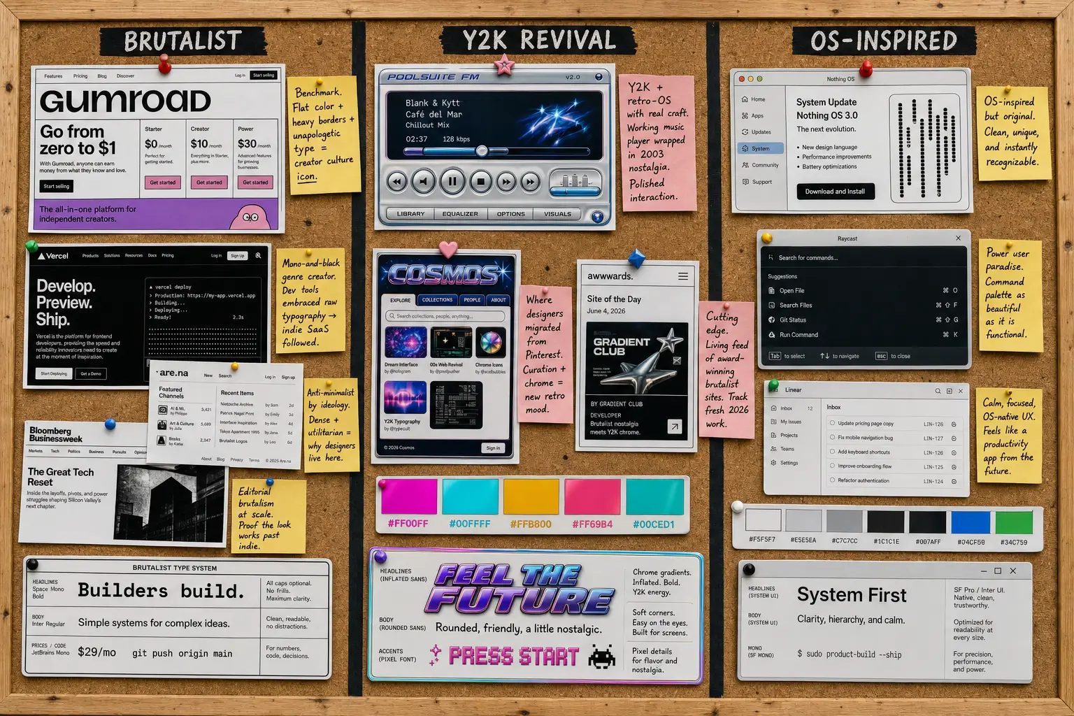
A mood board of live 2026 references, each annotated with why the look works in production rather than just in a mockup.
-
Gumroad is the brutalist benchmark. Flat color, heavy borders, and unapologetic type that turned a payments tool into a creator-culture icon.
-
Poolsuite FM is Y2K and retro-OS done with real craft. A working music player wrapped in early-2000s summer nostalgia.
-
Are.na, where the platform interface itself is anti-minimalist. Dense and utilitarian, proudly unpolished, which is exactly why designers live there.
-
Cosmos is where a lot of designers migrated from Pinterest. The curation and chrome carry the new retro mood.
-
Vercel set the stark mono-and-black developer aesthetic that pulled brutalist typography into mainstream SaaS.
-
98.css is a Windows 98 component library used in real side projects and demos, not just galleries.
-
system.css rebuilds classic Mac OS as a usable CSS toolkit for the browser.
-
Teenage Engineering is industrial retro restraint. Proof that nostalgic hardware branding can stay legible and premium.
-
US Graphics Company pairs sharp retro-technical branding with Berkeley Mono. TO VERIFY the current URL before publishing.
-
Cargo is the platform behind a wave of editorial and brutalist artist portfolios. TO VERIFY a specific 2026 site to feature.
-
Bloomberg Businessweek brings editorial brutalism inside a major publisher, evidence the look scales past indie. TO VERIFY after the latest redesign.
-
Awwwards brutalism collection is a living feed of award-winning brutalist sites to track fresh 2026 work. Use it as a source, not a single example.
I also scan the AI inspiration gallery most weeks, and lately the retro patterns surfacing there are a useful early signal of where the look is heading next.
Decision framework: when retro works (and when it kills your product)
Retro works when the aesthetic is part of the message. It fails when it fights the job the product has to do. That single rule sorts most cases, and the rest is honesty about your audience.
The look earns its place in artist and designer portfolios, indie SaaS aimed at people who already read Are.na, editorial and culture sites, music apps, and event tech for younger crowds. In those contexts the friction is the feature. A brutalist portfolio that takes a beat to parse signals taste, and the audience enjoys the puzzle.
It kills products in banking, healthcare, government services, and any productivity tool serving a broad, non-design audience. People moving money or booking a medical appointment want zero novelty in the way. A 70-year-old paying a utility bill should never decode a faux Windows 98 window to find the submit button.
☛ What most teams miss: accessibility is where retro quietly fails. Default link blue on a colored block can drop below the contrast ratios in WCAG, and pixel fonts at small sizes wreck readability. The aesthetic is no excuse to fail an audit.
The contrast with the polished end of the spectrum is stark. I covered the opposite pole in the liquid glass design guide, and mapped the whole glass family in the glassmorphism vs liquid glass comparison. The two looks serve almost opposite goals. Liquid glass whispers premium calm. Brutalism shouts personality. Knowing which signal your product needs is the whole decision.
Implementation patterns
You can get most of the retro look with a tight set of CSS choices and the right fonts. None of this needs a framework. It needs restraint and a few deliberate tokens.
Typography. The fastest way into the aesthetic is a monospaced or bitmap face. Berkeley Mono and Departure Mono are the current favorites, and Departure Mono in particular is free. Pair a strong display face with a readable body, the same pairing logic I broke down in the best font pairing guide.
:root {
  --font-mono: "Berkeley Mono", "Departure Mono", ui-monospace, monospace;
}
body {
  font-family: var(--font-mono);
  -webkit-font-smoothing: none;
}
Color. Build a small, opinionated palette. CRT phosphor green, Windows 95 teal, and a paper-and-ink pair cover most retro needs without descending into chaos.
:root {
  --crt-green: #33ff66;
  --win95-teal: #008080;
  --paper: #f4f0e6;
  --ink: #111111;
}
Layout. Kill the radius and add a hard offset shadow. Intentional asymmetry and exposed structure do the rest. The point is a deliberate break from the centered, rounded grid everyone defaults to.
.brutalist-card {
  border: 2px solid var(--ink);
  box-shadow: 8px 8px 0 var(--ink);
  border-radius: 0;
  background: var(--paper);
}
Texture. Noise, grain, and scanlines sell the CRT feel, but only as a thin top layer. Keep them under the content and never let them touch contrast on real text.
.scanlines::after {
  content: "";
  position: absolute;
  inset: 0;
  background: repeating-linear-gradient(
    to bottom,
    rgba(0, 0, 0, 0.06) 0,
    rgba(0, 0, 0, 0.06) 1px,
    transparent 1px,
    transparent 3px
  );
  pointer-events: none;
}
If you want the polished opposite for comparison, a clean system like Material You shows how far the other direction goes. Studying both ends sharpens your taste for either.
Frequently asked questions
❶ Is brutalism the same as anti-design?
No, and conflating them is how brutalist projects go wrong. Anti-design rejects usability rules on purpose, often as art. Brutalist UI keeps the underlying structure functional and readable, then strips the decoration on top. A good brutalist site still has clear hierarchy and working navigation, with legible type throughout. It just refuses to soften the edges. If your "brutalism" buries the primary action or breaks on mobile, you built anti-design by accident, and users will leave.
❷ How do you make a brutalist UI accessible?
Start with contrast. Run every text-on-color combination against WCAG and hit at least 4.5:1 for body copy, even when the raw look tempts you lower. Keep focus states visible, since brutalist sites love removing them. Avoid pixel fonts below roughly 16px for anything users must read. Add real alt text and semantic HTML under the rough surface. The aesthetic lives in borders and color, plus type weight, none of which require failing an audit.
❸ Will retro UI hurt my conversion rate?
It depends entirely on audience match. For a creator tool or a culture brand, the personality can lift conversion by making you memorable in a sea of identical SaaS pages. For a broad-audience checkout or a financial dashboard, novelty usually adds friction and costs you sales. Test it. Ship the retro look to a slice of traffic, watch task completion and not just vibes, and keep it only if the numbers hold. Aesthetics that lose conversions are a hobby, not a strategy.
❹ Can you mix retro aesthetics with modern usability?
Yes, and the best examples already do. Poolsuite looks like 2003 but runs on smooth modern interaction. The trick is to keep the retro layer visual and the usability layer current. Use old-school chrome and color, then back it with responsive layouts, real focus management, and fast loads. Treat the aesthetic as a costume over a healthy body. The moment the costume blocks a core task, peel it back on that screen and let function win.
❺ What fonts work for Y2K design without looking cheap?
Skip the free chrome-text generators, they read as clip art instantly. Reach for quality display faces with real weight and pair them carefully. Inflated grotesques, glossy custom letterforms, and well-drawn pixel fonts hold up far better than a bevel filter on Arial. Departure Mono is a strong free starting point for the technical side. For the shiny side, invest in one good display face and let restraint do the work, the same discipline I covered in the font pairing guide.
❻ Is this trend going to last?
The surface styles will rotate, the underlying motive will not. Retro and brutalist UI exists because the web got visually uniform, and that pressure is structural, not seasonal. Specific looks like chrome Y2K or Windows 98 chrome will peak and fade over the next two to three years. The deeper move, designers reaching for personality and humanity against generated sameness, is here for the long run. Build the aesthetic so you can dial it down later, and you keep the upside without the regret.
Closing thought
Here is the thing nobody admits at the trend talks. Retro is the easiest aesthetic to fake and the hardest to pull off. Anyone can slap a hard border and a pixel font on a weak interface and call it brutalist. The product still has to work, the hierarchy still has to guide, and the accessibility still has to pass.
So use the look when you have something to say, and skip it when you are just bored of clean. The best retro interfaces of 2026 are not nostalgic for the old web. They borrow its courage to look like a person made them, on purpose, with full control over every rough edge. That is a position worth taking. A bevel is not.
And if the raw look is not your product's voice, the opposite pole is just as deliberate: soft, warm, and friendly. The Claylo landing template is that reverse position shipped as a real build, rounded claymorphism surfaces where brutalism would use hard borders, and it stays just as opinionated about every edge.


