

Roman Kamushken
Good dashboard design turns scattered data into fast, confident decisions. A strong dashboard shows the right metrics at the right level of detail, highlights what changed, and guides the eye from overview to action without clutter. This guide breaks down dashboard UI design end to end — anatomy, layout patterns, data visualization, navigation, mobile, accessibility, and the anti-patterns that quietly erode trust.
What is a dashboard?
A dashboard is a single screen that visualizes key metrics, KPIs, and data trends so people can monitor performance and make decisions at a glance. It pulls data from multiple sources into charts, tables, and cards organized by priority. Dashboards span operational, analytical, and strategic types, each tuned to a different audience and real-world examples.
Why dashboard design matters
A dashboard earns its place when it shortens the path from question to decision. That is the whole job. Everything else is decoration.
Bad dashboard design costs real money. A sales lead who cannot find this week's pipeline number opens a spreadsheet instead, and now two sources of truth disagree. A founder who misreads a vanity metric ships the wrong feature. The data was right. The presentation failed.
Good design does the opposite. It puts the one number that drives a decision where the eye lands first, then supports it with just enough context to act. When I audit dashboards for clients, the fastest win is almost always removing things, not adding them. Cut the chart nobody reads and the remaining signal gets louder.
Speed is the metric that matters. If someone needs more than a few seconds to answer "are we on track," the layout is working against them. Effective dashboards are judged by time-to-answer, and that number drops when the hierarchy is honest about what is important.
There is a team angle too. A shared dashboard becomes the single source of truth a meeting can point at. No more arguing about whose export is current. Marketing and support read the same screen, and the conversation moves to what to do next.
This is also why a consistent component foundation pays off. When KPI cards and tables behave the same on every screen, people stop relearning the interface and start trusting it. A system like Eclipse gives you that baseline, so the design effort goes into decisions instead of re-styling another card.
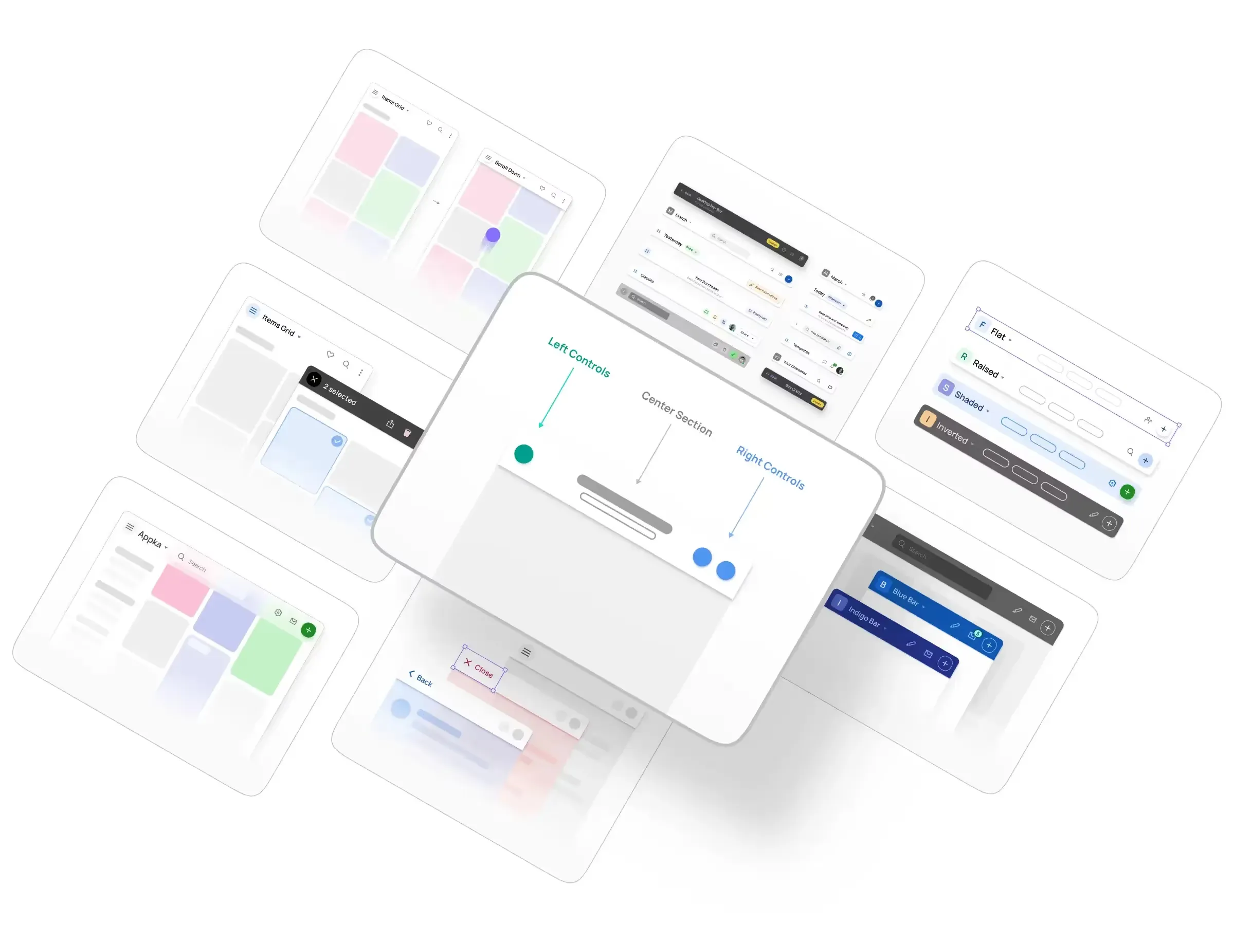
Anatomy of a modern dashboard
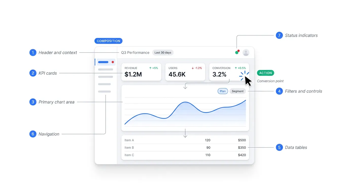
Most dashboards are built from the same seven parts. Learn the parts and you can read or design almost any of them.
❶ Header and context. The top strip tells you where you are. Page title and active date range sit here, with the account switcher tucked to the right. It sounds trivial. People get lost without it.
❷ KPI cards. The row of big numbers near the top. Each card shows one metric and its delta against the previous period. This is the first thing the eye should reach, so it carries the heaviest visual weight.
❸ Primary chart area. The largest block on the screen, reserved for the trend that matters most. A revenue line, an active-user curve. One hero chart beats four competing ones.
❹ Filters and controls. Date pickers and segment selectors. These reshape everything below them, so they belong above or beside the content they affect, never buried three clicks deep.
❺ Data tables. Where numbers get specific. Sortable columns, with a clear split between header and row and real restraint on borders. Table design is its own craft, and data grids in Figma deserve more attention than they usually get.
❻ Navigation. The sidebar or tab bar that moves people between views. It frames the whole product and should stay predictable on every screen.
❼ Status indicators. The small signals that something needs attention. A red badge on an overdue invoice, a green dot on a healthy service.
Empty and error states are the parts this seven-block anatomy often forgets. A new user with no data yet, or a filter that returns nothing, needs a deliberate design rather than a blank panel that reads as broken. A good empty state names what will appear here and offers the one action that fills it, turning a dead end into a first step. For the full catalogue of empty state design patterns, the dedicated guide covers each case.
These parts share a budget. Every pixel you give the navigation is a pixel taken from the data. The real skill is deciding what gets emphasis and what recedes.
A practical test: squint at the screen until the detail blurs. The shapes that stay visible are your hierarchy. If the KPI cards and the hero chart dominate, you are close. If the sidebar and a dense table win the squint test, rework the weight before touching anything else.
For a worked example that ties these parts to a real layout, the marketing dashboard UI guide walks through each block on a live screen.
Types of dashboards
Three categories cover almost everything, and they differ by one question: how fast does someone need to act on what they see?
Operational dashboards run the day. They sit on a wall or a second monitor and update in near real time. A support queue, a live ops board. The audience is whoever is on shift, and the cadence is now.
Analytical dashboards answer "why." An analyst slices a few weeks of data, compares segments, and hunts for the cause behind a number that moved. Less urgency, more depth. Interactivity matters here because the questions keep branching.
Strategic dashboards track the long arc. A founder or an exec checks them weekly or monthly against goals. Fewer metrics and a calmer pace. The job is steering toward direction, and reaction can wait.
| Type | Audience | Update cadence | Main job |
|---|---|---|---|
| Operational | On-shift team | Real time to hourly | Monitor and react |
| Analytical | Analysts, specialists | Daily to weekly | Explore and explain |
| Strategic | Leadership | Weekly to monthly | Track goals and direction |
The classic mistake is mixing the modes on one screen. A real-time ops widget bolted next to a quarterly goal tracker forces two reading speeds at once, and neither gets served well. Pick the dominant job of the screen and design for that tempo.
Most products end up with a small set rather than a single dashboard. A SaaS tool might ship an operational view for daily users and a strategic summary for admins, each tuned to its audience.
For the full breakdown with deeper examples of each category, the guide on types of dashboards goes further than this overview can.
Dashboard examples by industry
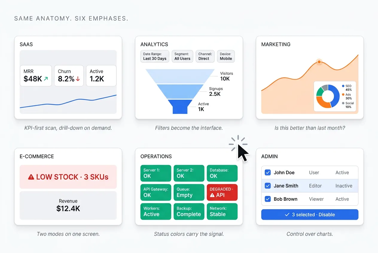
Dashboard design varies by industry because data density and refresh speed differ, and because the questions users ask are never quite the same. A monitoring tool needs sub-second updates and loud alerts. A strategic SaaS view can refresh nightly and stay calm. The anatomy holds constant, yet the emphasis shifts hard from one domain to the next. Here is how six common categories play out.
SaaS dashboards
These track recurring revenue and churn first, with activation and feature usage one layer down. The pattern is a fast scan of headline metrics, then drill-down by plan or cohort. Stripe and Linear both nail this: a calm KPI row up top, detail on demand. See more SaaS dashboard examples for the full set.
Analytics dashboards
Here the job is funnels and cohorts, with event streams and retention curves alongside. Filters and date range stop being controls and become the main interface. Density is high and exploration beats reporting. Google Analytics 4 and Mixpanel both lean this way. The best analytics dashboard examples break down the patterns.
Marketing dashboards
Campaign performance and attribution sit at the center, with ROAS and channel mix shaping the story. Time-series charts dominate, because the question is almost always "is this better than last month." HubSpot and the GA4 Acquisition reports show the shape. The marketing dashboard UI guide walks the full layout.
E-commerce dashboards
Revenue and conversion lead, with inventory levels and customer lifetime value close behind. The twist is that one screen serves two modes at once: an operational pulse plus deeper analysis, with alerts firing when stock runs low. Shopify admin and Amazon Seller Central are the reference points. More in e-commerce dashboard examples.
Operations and monitoring dashboards
Uptime and latency get top billing, with error rates and incident status right alongside. Everything updates in real time, and status colors carry the primary signal before any number is read. Alerts are loud by design. Datadog and Grafana set the visual standard here, where a single red panel can pull a whole team's attention.
Internal admin dashboards
User management and configuration dominate, with content moderation queues in the mix. The interface is table-first, built around bulk actions and filters more advanced than anything in analytics. Notion and Linear settings show the calm version. This is less about charts and more about control, so the patterns lean closer to data tables than data viz.
Across all six, the foundation holds. The same anatomy and the same hierarchy rules apply, only the weighting changes. Learn one well and the others read faster. For a broader gallery across domains, top dashboard design examples collects more. Once the content is decided, the next question is how to arrange it on the page.
Layout patterns
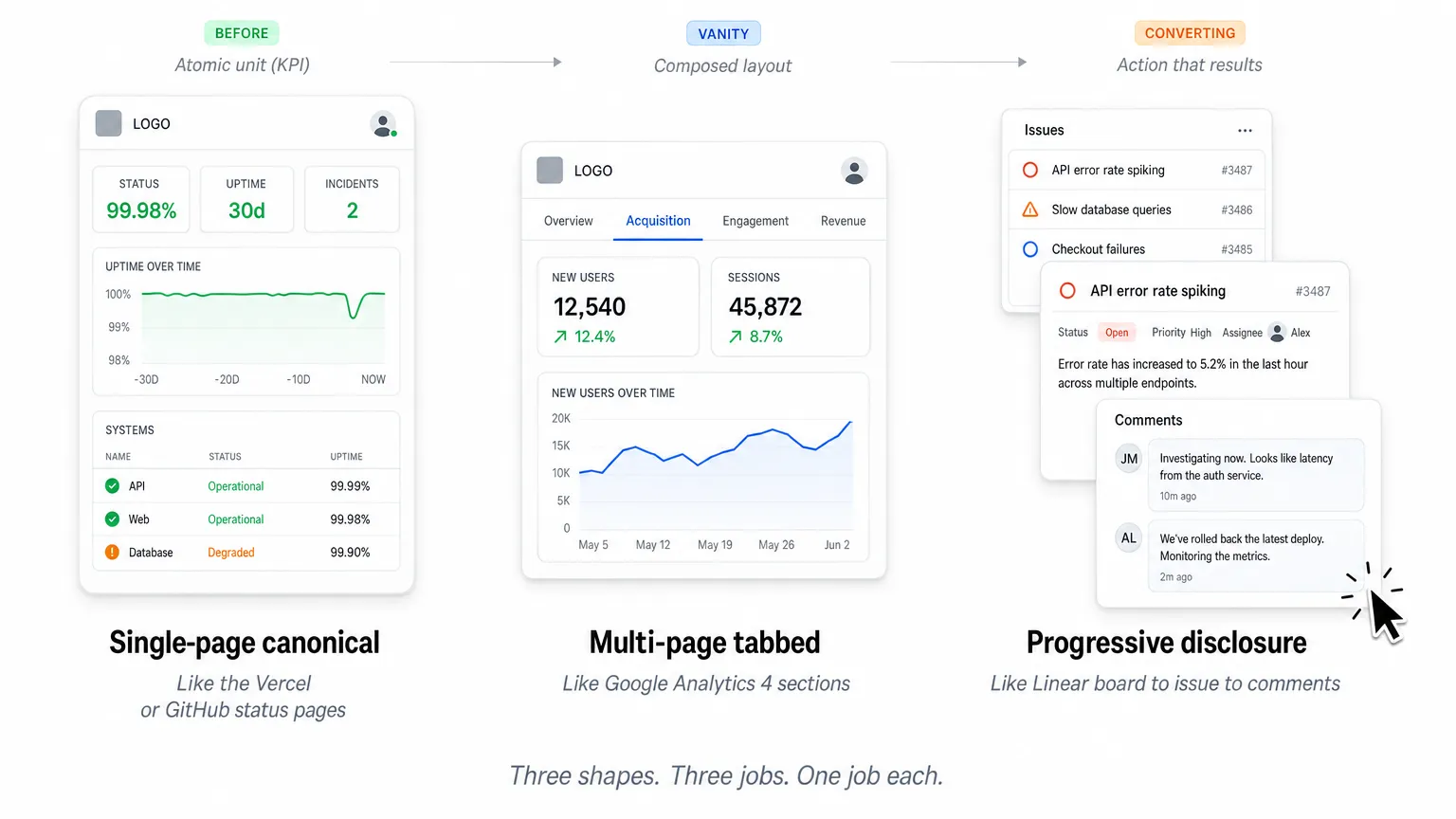
Dashboard layouts come down to three patterns, and picking the right one matters more than any visual polish. Single-page shows everything on one scroll. Multi-page splits content across tabs. Progressive disclosure opens with an overview and reveals detail on demand. Which fits depends on how people actually use the screen.
Single-page (canonical view). One scrollable screen with everything visible at once. Best for focused tools where the whole story fits without tabs, like a status page or one team's metrics. The Vercel and GitHub status pages are the clean reference: current state and recent history, nothing more. When the data set is small, this beats any navigation.
Multi-page, tabbed. Content split by theme, so each tab answers one job. Best for multi-faceted analytics where different users arrive with different questions. Google Analytics 4 does this with its Acquisition and Engagement sections. The tab pattern carries its own design rules, covered in tabs UI design.
Progressive disclosure, drill-down. Start at an overview, click into detail, then click again for more. Best for investigative work where most users need only the top layer but some go deep. Linear models this well: a board view opens into an issue, which opens into its full history and comments. The screen stays calm until you ask for more.
The choice follows the user journey rather than taste. Operational views usually want a single page so nothing hides during a shift. Analytical tools lean multi-page as the questions multiply. Whatever the shape, the page is only as clear as the charts inside it, which is where visualization rules come in.
| Pattern | Best for | Example product | Avoid when |
|---|---|---|---|
| Single-page, canonical | A focused tool where the whole story fits one scroll | Vercel status, GitHub status | Content spans many themes or audiences |
| Multi-page, tabbed | Multi-faceted analytics where users arrive with different questions | Google Analytics 4 | One glance has to show everything at once |
| Progressive disclosure, drill-down | Investigative work where only some users go deep | Linear | Every user needs all the detail immediately |
Data visualization principles
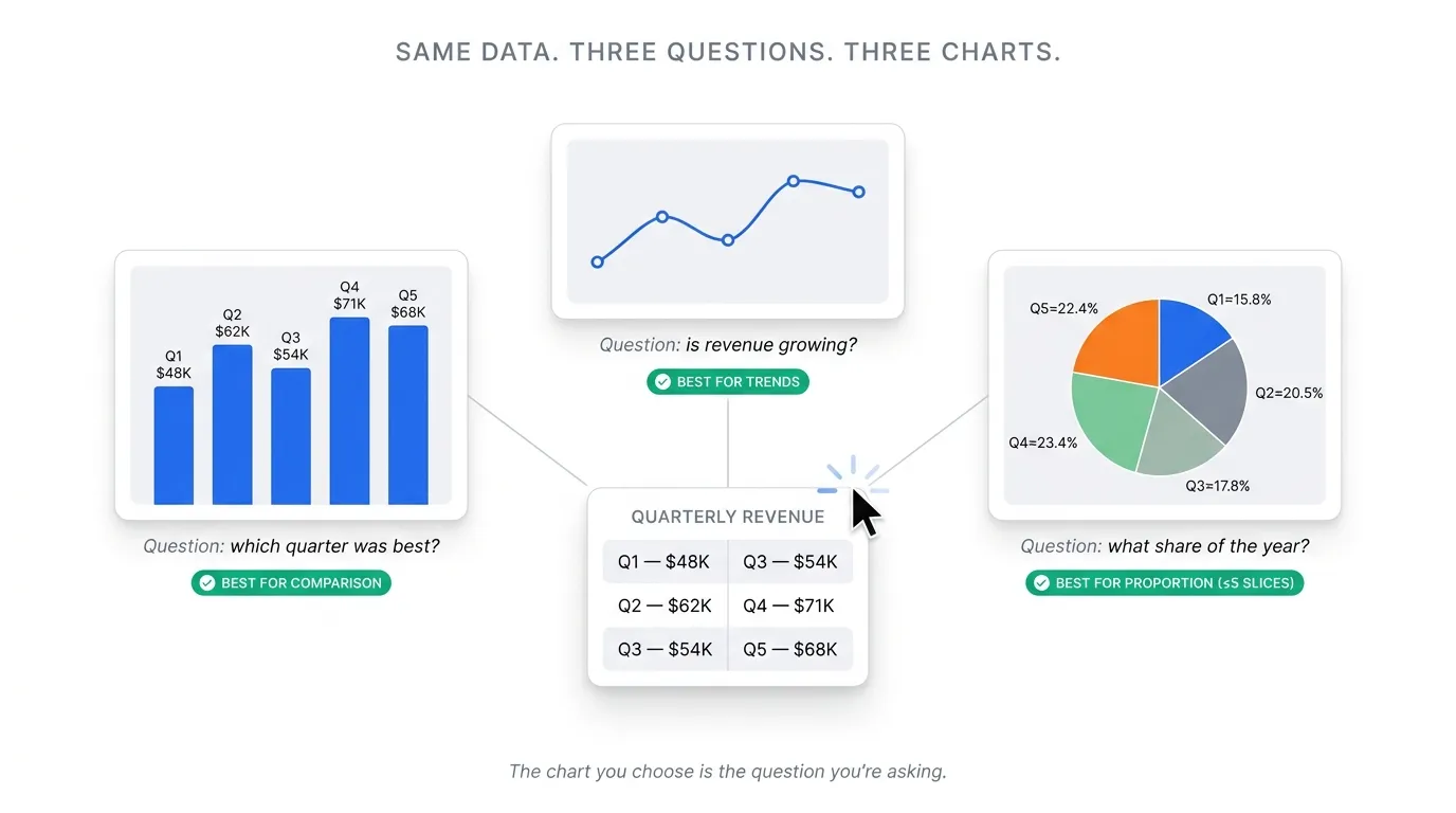
Effective data visualization in dashboards rests on a few hard rules that survive every redesign. Match the chart to the question being asked. Encode values so they read accurately rather than merely looking good. Respect how much a person can absorb in a single glance. Break any of these and the screen looks busy while saying less than it should. Get them right and one look answers the question. The rest is refinement.
Match chart type to question. Each chart answers a specific shape of question.
• Bar for comparison across categories
• Line for a trend over time
• Area for composition as it shifts
• Scatter for correlation between two values
• Heatmap for density and pattern
Pie and donut work only for proportion, and only with five slices or fewer. The wrong pick is choosing whatever looks most impressive.
Encode for accuracy. People read position most precisely, then length, then angle, with area and color trailing far behind. Build the important comparison on the most accurate channel available. This is why 3D charts mislead: they distort area and depth for decoration. Let color support the story, never carry the main signal on its own.
Respect data density. Treat the overview as a few-second read, because that is all most people give it before acting. Twenty charts on one screen waste that window. One primary chart with a few supporting metrics will always outperform five competing for attention. When everything is emphasized, nothing is. Cut until the most important number is the easiest thing to find.
These rules cover the common cases, but charts reward deeper study. The principles behind effective dashboard design go further into hierarchy and restraint. When the data belongs in a table rather than a chart, data grid design in Figma covers the details that matter, particularly for Figma-based design systems where every cell state has to be drawn by hand.
| Chart type | Question shape | Example use | When NOT to use |
|---|---|---|---|
| Bar | Comparison across categories | Revenue by channel | Showing a continuous trend over time |
| Line | Trend over time | Active users by week | Comparing unrelated categories |
| Area | Composition as it shifts | Traffic mix over months | Precise per-series comparison |
| Scatter | Correlation between two values | Spend against conversions | Tracking a single metric over time |
| Heatmap | Density and pattern | Activity by hour and day | Reading exact individual values |
| Pie or donut | Proportion of a whole | Share by segment | More than five slices, or any trend |
Navigation patterns in dashboards
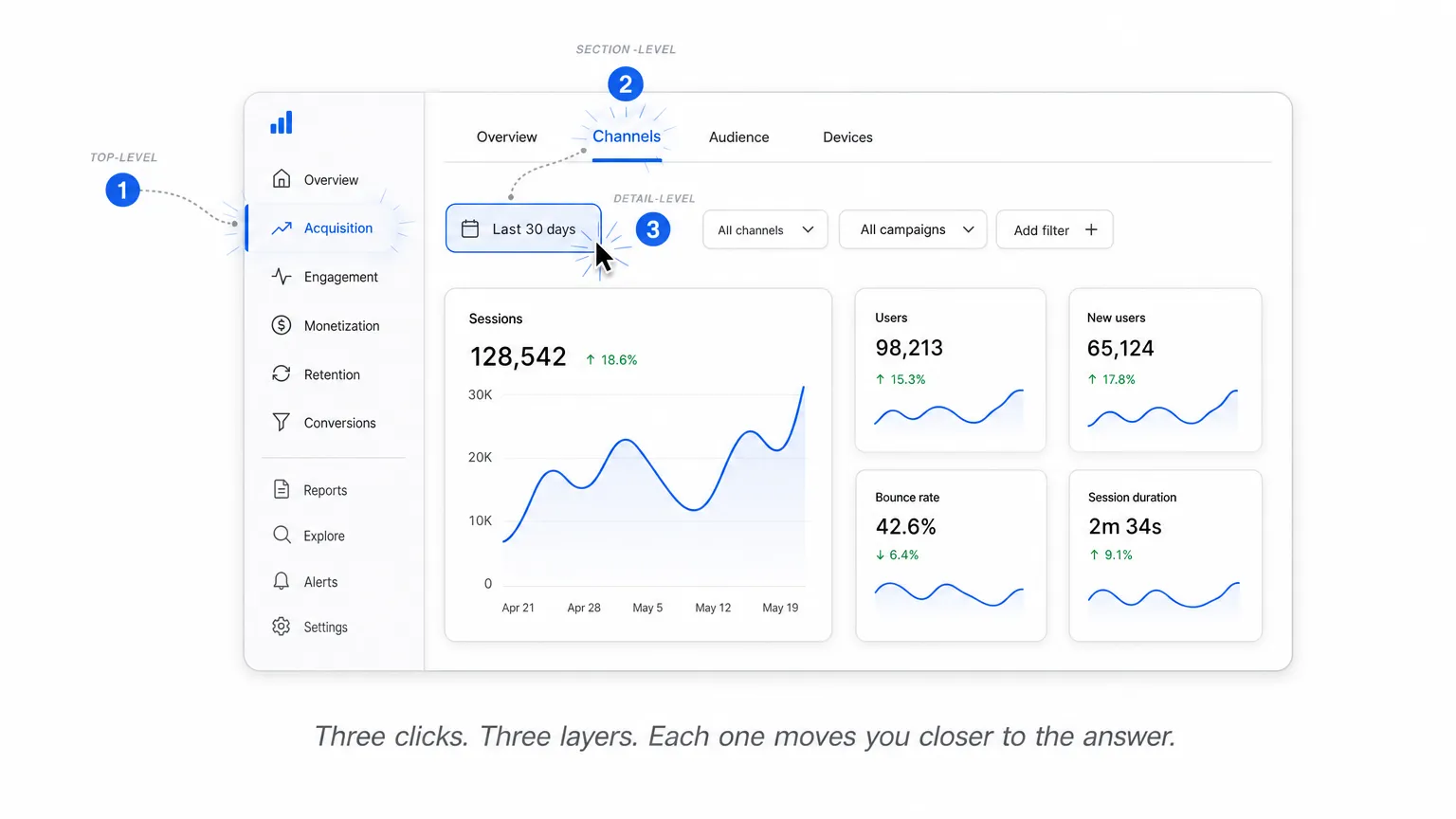
Dashboard navigation works across three layers: top-level picks which dashboard you are in, section-level picks which view, and detail-level picks which slice of data you see. Most confusion comes from collapsing these into one control. Keep them distinct and the interface stays legible even as the product grows.
Top-level: sidebar or top nav. A sidebar wins once you have five or more destinations, or any multi-product app where sections nest. Top nav fits focused tools with two to four areas. Linear leans on a sidebar for its many views, while Stripe keeps a top nav for a tighter set.
Section-level: tabs and segmented controls. Tabs handle three to seven parallel views that share a context, like Overview, Acquisition, and Retention sitting side by side. They keep related data one click apart without a full page change. The pattern has its own rules, covered in tabs UI design.
Detail-level: filters, breadcrumbs, drill-down. This is the date range, the dimension filters, the segment selectors. Breadcrumbs earn their place here by showing the drill path back out of a deep view, so nobody gets stranded. The full treatment lives in breadcrumbs UI design.
The classic mistake is mixing the layers. Drop a date filter into the main sidebar and people read it as navigation, then wonder why the page did not change. Keep filtering separate from moving between views, and the whole thing reads itself. The same discipline carries over when the screen shrinks to a phone.
Mobile and responsive dashboards
Dashboards on mobile are not desktop dashboards squeezed smaller. They demand ruthless KPI prioritization, vertical stacking, and a rethink of which interactions actually matter on a small touch surface. The data may be the same, but the reading order and the gestures change completely. Design for the phone as its own context, not as a leftover.
Prioritize ruthlessly. Lead with the top KPIs, then the primary chart, then any table or list at the bottom. Push secondary filters behind a sheet or drawer so they stay reachable without crowding the screen. Keep the first viewport to three or four KPIs at most, because anything more turns into a scroll people abandon.
Replace rather than reduce. A dense table or a multi-line chart rarely survives the shrink intact. Swap it for a summary card with a drill-down link into the full view. The marketing dashboard UI guide covers the mobile section in more depth, including how to decide what gets summarized.
Touch and sticky context. Size touch targets to at least 44 by 44 points, the long-standing iOS and WCAG guideline. Keep a sticky header carrying the current date range and active dimension so nobody loses their place mid-scroll. Where it helps, let time-series charts pinch-zoom for a closer read.
Tablet sits in its own category, closer to desktop but driven by touch. A well-built responsive desktop layout often just works there with little extra effort. Phones are where the hard prioritization happens. Either way, none of it counts if the screen locks out the people trying to read it.
Accessibility and performance
Dashboards stack two challenges most apps avoid: communicating data through visuals a screen reader cannot see, and rendering large datasets without freezing the interface. Both decide whether the dashboard is usable in practice. A chart nobody can parse and a table that stalls on scroll fail the same goal, just by different routes.
Accessibility essentials. Build for non-visual access from the start.
→ Hold contrast at 4.5:1 for text and 3:1 for UI components and chart elements (WCAG 2.2 AA)
→ Never lean on color alone to separate categories; add a pattern, a shape, or a direct label
→ Give data tables proper <th scope>, a caption, and arrow-key movement between cells
→ Add ARIA labels to chart SVGs, plus a text data summary or table export beneath the visual
→ Wrap real-time updates in an aria-live="polite" region so a screen reader announces changes without spamming
Performance essentials. Speed is an access requirement, not a nicety.
→ Virtualize any table past roughly 100 rows with a tool like react-window or TanStack Virtual
→ Lazy-load sections below the first viewport instead of rendering everything upfront
→ Show skeleton screens during data fetch rather than empty blocks that look broken
→ Debounce filter inputs so a chart does not repaint on every keystroke in a date field
→ Memoize chart props, a frequent cause of freezes once the dataset grows
These two concerns meet in the middle. A sluggish dashboard is inaccessible in effect, even when it passes every WCAG check on paper. Which leads to the failures worth naming outright.
Common anti-patterns
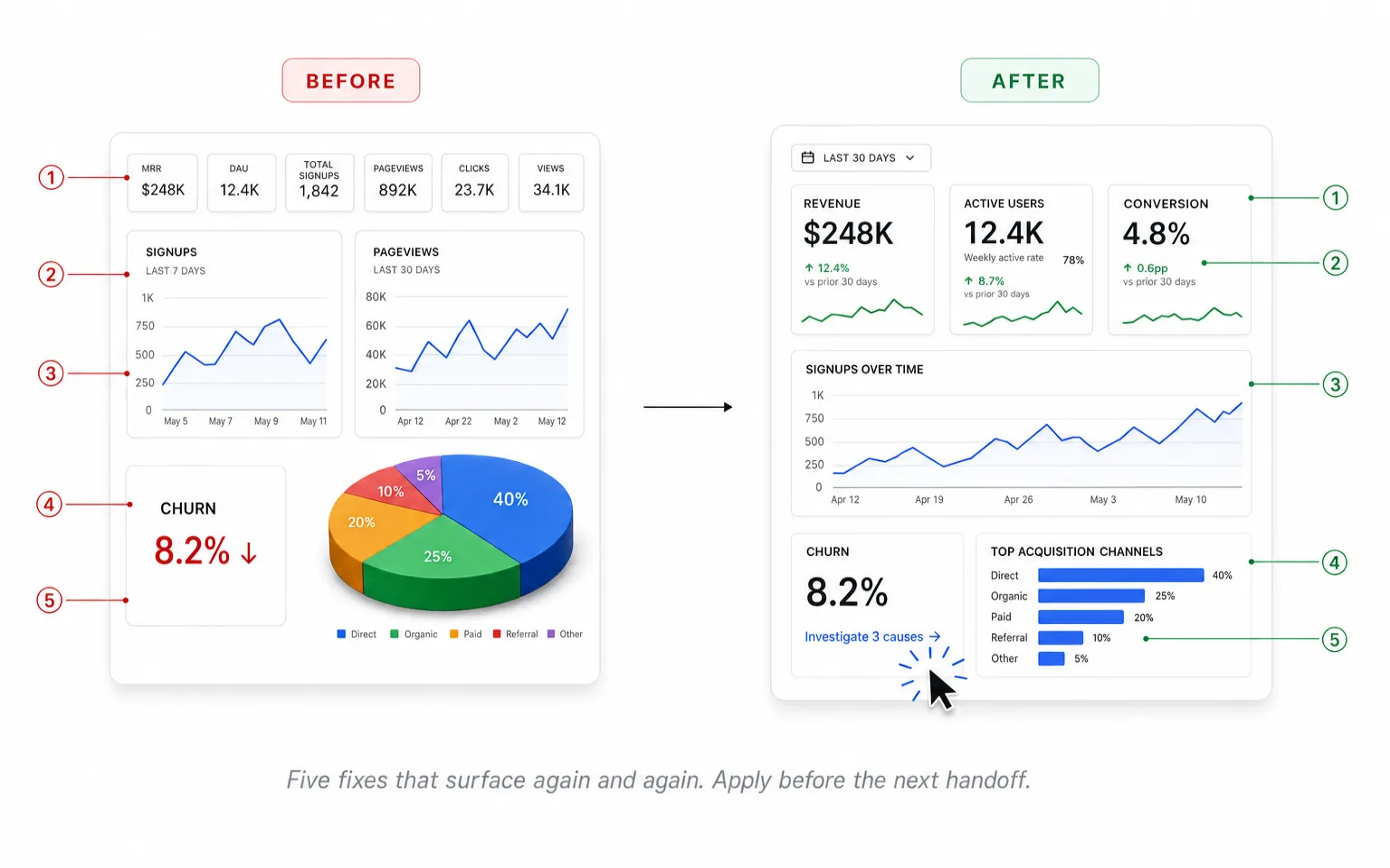
The most common dashboard mistakes share a root cause: designing for what is measurable instead of what is actionable. A dashboard that shows everything helps with nothing. Below are five failures that surface again and again in design reviews, each with a quick fix you can apply before the next handoff.
❶ Data dump
Cramming every available metric onto one screen because users might want it. The result is that nothing stands out and decisions slow down. The fix is ruthless prioritization: one primary question per dashboard, everything else demoted or pushed into drill-down.
❷ Vanity metrics
Total signups and total pageviews are numbers that only ever climb and rarely reflect health. Pair every vanity metric with a rate or quality signal beside it, so the figure means something the moment it is read rather than just looking impressive.
❸ Inconsistent time ranges across charts
One chart shows the last 7 days, the next shows the last 30, with no visible label to flag the mismatch. People read across them and draw false comparisons. Pin a single date range to the whole dashboard, or label each chart unmistakably.
❹ Misleading visualizations
A truncated y-axis makes a tiny change look dramatic, and a 3D pie chart distorts every proportion it shows. Lean on position-based encoding like bars and lines, where length maps honestly to value and the eye is not tricked into seeing a trend that is not there.
❺ No actionable next step
The dashboard flags that something is wrong but offers nowhere to go and fix it. Good dashboards wire each problem state to a drill-down link or an action button that leads straight to where the fix actually happens.
These five cover the failures that show up most, but a thorough audit goes further. For the full set of design principles and a longer list of anti-patterns to check your own dashboard against, see our guide to effective dashboard design principles.
Frequently asked questions
Designers ask the same foundational questions when approaching dashboards for the first time. Here is what comes up most often, answered briefly enough to act on and broad enough to point you toward the deeper guides where they exist.
What is a dashboard?
A dashboard is a curated single view that aggregates the most important metrics for a specific audience and decision context. Unlike a report, which documents a snapshot in time, a dashboard is built for ongoing monitoring and quick action, so its layout favors scanning over reading.
What are the main types of dashboards?
Three broad types cover most cases. Operational dashboards track live activity for day-to-day work. Analytical dashboards support exploration and trend-finding across historical data. Strategic dashboards summarize high-level KPIs for leadership. For the full taxonomy and where each one fits, see types of dashboards.
What is the difference between a dashboard and a report?
A report documents what happened: it is historical, usually a static PDF, archived for the record. A dashboard is a live decision surface: interactive, optimized for a quick scan, and built to prompt action rather than to be filed away. One looks back at the data, the other drives the next move.
How many KPIs should a dashboard show?
There is no magic number, but a workable rule is 3 to 7 KPIs in the primary above-the-fold area. Past that, focus dissolves and the eye has nowhere to land first. Push the rest into secondary sections or behind a drill-down, where they stay available without competing for attention.
What should every dashboard include?
Three things. Primary KPIs that state what you are measuring. Context that answers compared to what, whether a previous period or a stated target. And an action: a drill-down or a clear next step. Drop any one of them and the dashboard quietly becomes a slide.
How do you design a dashboard for mobile?
Rethink the layout rather than shrink the desktop one. KPI cards stack vertically, the primary chart is simplified or swapped for a summary, and secondary filters move into a drawer or sheet. Lead with the few metrics that matter on a small screen and let everything else wait behind a tap. The mobile and responsive section above goes deeper.
What tools do designers use to build dashboards?
Most dashboard design happens in Figma, from early wireframes through high-fidelity prototypes. Component libraries and UI kits speed up production by giving you ready-made KPI cards and chart components instead of drawing each state from scratch. Setproduct's dashboard UI kits collect these patterns, and templates like Material X ship with full dashboard screens to start from.
Dashboard templates and UI kits
Designing a dashboard from scratch takes weeks: every KPI card, chart state, and empty state drawn and wired by hand. Starting from a battle-tested template cuts that to days while leaving room for the customization your product actually needs. The sections above cover how to make the calls; this is where production-ready kits help you skip the groundwork and spend your time on the decisions that are specific to your data.
Browse the full range of Setproduct dashboard UI kits to see what is ready to build on today.
Choose by use case
SaaS analytics and product metrics
Tracking activation, retention, and conversion funnels for a product team. These lean on time-series charts and cohort views, so reach for a SaaS analytics dashboard template built around those patterns.
Internal admin panels
User management, content moderation, and configuration for back-office tools. Table-heavy layouts with bulk actions and inline editing matter most here, which is the focus of the admin dashboard template.
iOS apps
Native dashboard patterns that follow Apple HIG conventions, with large titles, segmented controls, and list-based detail views. An iOS dashboard template gives you those conventions already wired in.
Android apps
Material Design 3 surfaces for an Android-native context, with the elevation, typography, and motion the platform expects. Start from an Android dashboard template to stay on-spec.
Mobile-first responsive dashboards
For products where mobile is the primary surface, not an afterthought. KPI prioritization, vertical stacking, and sheet or drawer patterns lead the design, all covered in a mobile dashboard template.
Fintech and finance
Heavy data density, real-time updates, and regulatory considerations shape these screens. A finance dashboard template accounts for that density from the start.
Angular projects
When the tech stack drives the choice as much as the design, pre-built Angular dashboard components keep design and implementation aligned from day one.
| Use case | Template | Best for | Stack |
|---|---|---|---|
| SaaS analytics and product metrics | Analytics dashboard | Activation, retention, conversion funnels | Figma |
| Internal admin panels | Admin dashboard | Table-heavy back-office tools with bulk actions | Figma |
| iOS apps | iOS dashboard | Native Apple HIG patterns | iOS |
| Android apps | Android dashboard | Material Design 3 surfaces | Android |
| Mobile-first responsive | Mobile dashboard | Products where mobile is the primary surface | Figma |
| Fintech and finance | Finance dashboard | Dense, real-time, regulated data | Figma |
| Angular projects | Angular dashboard | Stack-driven implementation | Angular |
When you need a complete design system foundation rather than a single dashboard template, production-ready libraries carry more weight. Kits like the Material You UI kit, Material X for Figma, and the Neolex Dashboard kit provide thousands of variants and dozens of pre-built templates ready to customize, so a new dashboard inherits a coherent system instead of a one-off screen.
If none of these fit your niche, or you want to compare options side by side, the full Setproduct dashboard collection catalogues every available template by industry, stack, and complexity, so you can weigh the trade-offs before committing to one.
Continue reading
Dashboard design rewards depth, and these companion guides expand on angles only touched briefly above.
AI era research and study patterns. How to deconstruct the dashboards you admire, with AI tools as a research multiplier rather than a copy machine. See how to study SaaS dashboards in the AI era.
Campaign analytics dashboards. Audience-focused marketing dashboards built around demographics, geography, and behavioral cuts. Read the campaign marketing dashboards guide.
Examples gallery for inspiration. A curated collection of dashboard examples across industries for quick visual reference. Browse top dashboard design examples.
Dashboard design is iterative. Return to this guide when starting your next project, and to the cluster guides when refining a specific layer.


