

Roman Kamushken
Part of: Dashboard UI design: From KPIs to layouts that convert — the complete reference to dashboard design on Setproduct.
One cell to rule them all
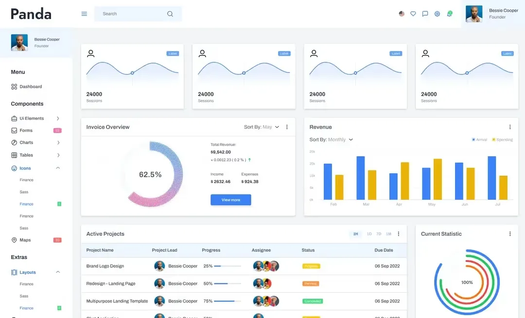
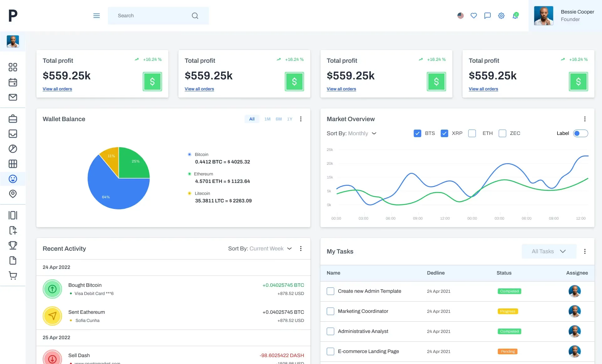
Building a table of components is a task that sooner or later arises for every design systems developer in Figma. There are three approaches to table design to create a data grid with a flexible architecture. In each case, either a row component, a column component or a cell component is used. Each of the cases will be disclosed below.What is all that for?
Why put everything in one box? Does a medium-sized project really need this flexibility? Do I need a component architecture for a regular table? Within a large team project, it's the only true way to create new data grids — through a component. This helps to generate more options and validate new ideas faster.
My observations show that not all Figma designers train themselves to work with components from the earliest stages of a new project. According to a recent survey in Figma chat, just under half of designers use components.
Most part just uses frames and copy-paste. But those who managed to switch their workflow to component one will most likely never take a step back, because this approach gives more flexibility and is in demand among organisations with their own design staff. If you want to maintain interest in your vacancy, if you're thinking of joining a cool organisation where they are already working in the Figma — work with components.
Table styles
When I created my design-systems in Figma which were not the first, I reviewed hundreds of tables and I managed to categorise the most commonly used styles:
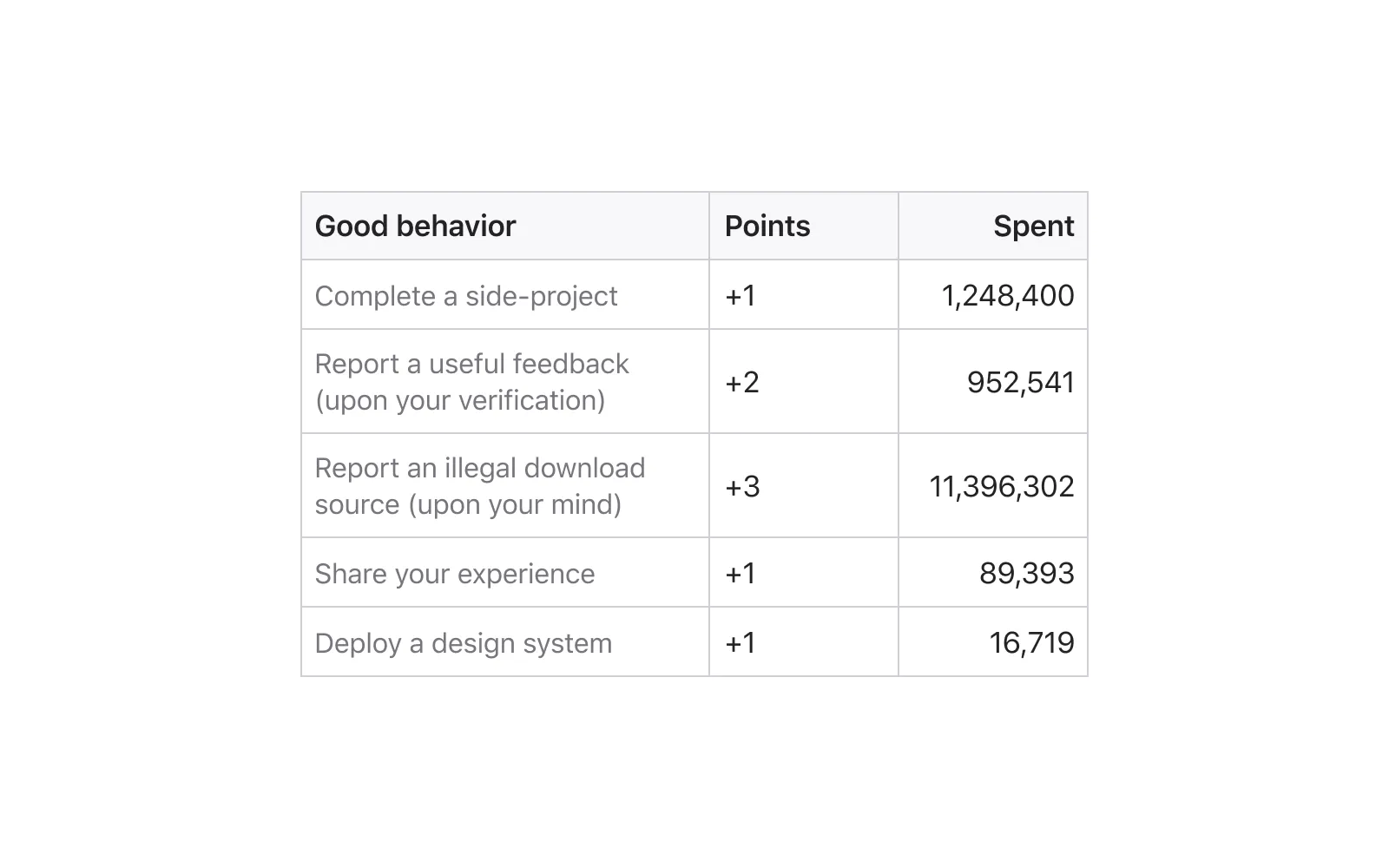
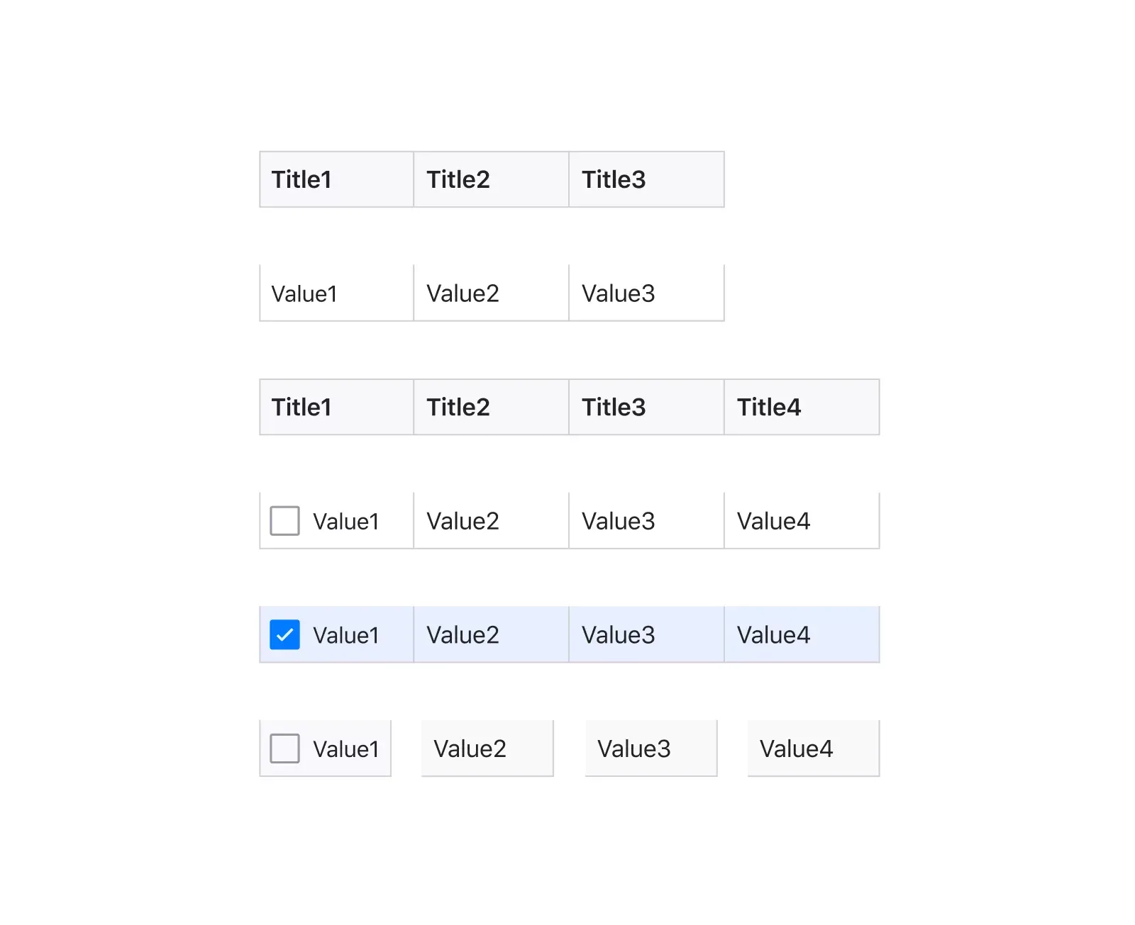
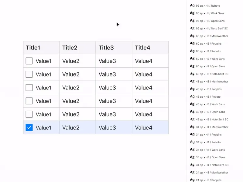
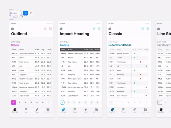
Classic style
Horizontal and vertical borders are clearly visible, headings are bold and separated from the cells with content. Literally, the Excel-style:
Contrast heading
There may not be separators or they may only be horizontal. Thanks to intensive headings, such data grid is quickly separated by a glance if there are many of them on one dashboard:
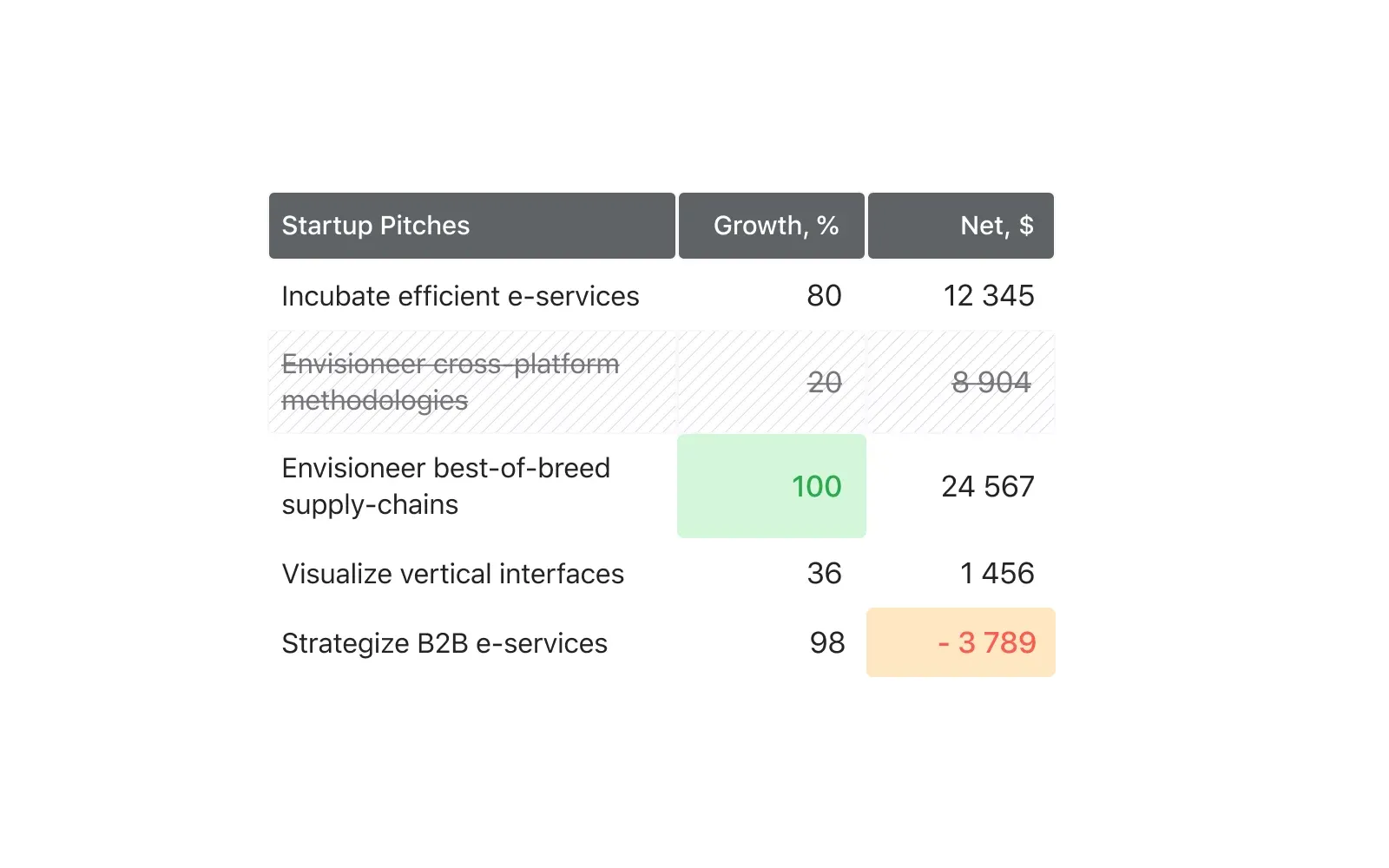
Material table
Data-first approach. Such tables can be found in material design. A more intense upper separator and a single-pixel internal ones qualitatively separate the data:
Patchwork
These tables are straight from the past, but to this day the use of alternating grey and white rows is often found in modern products:

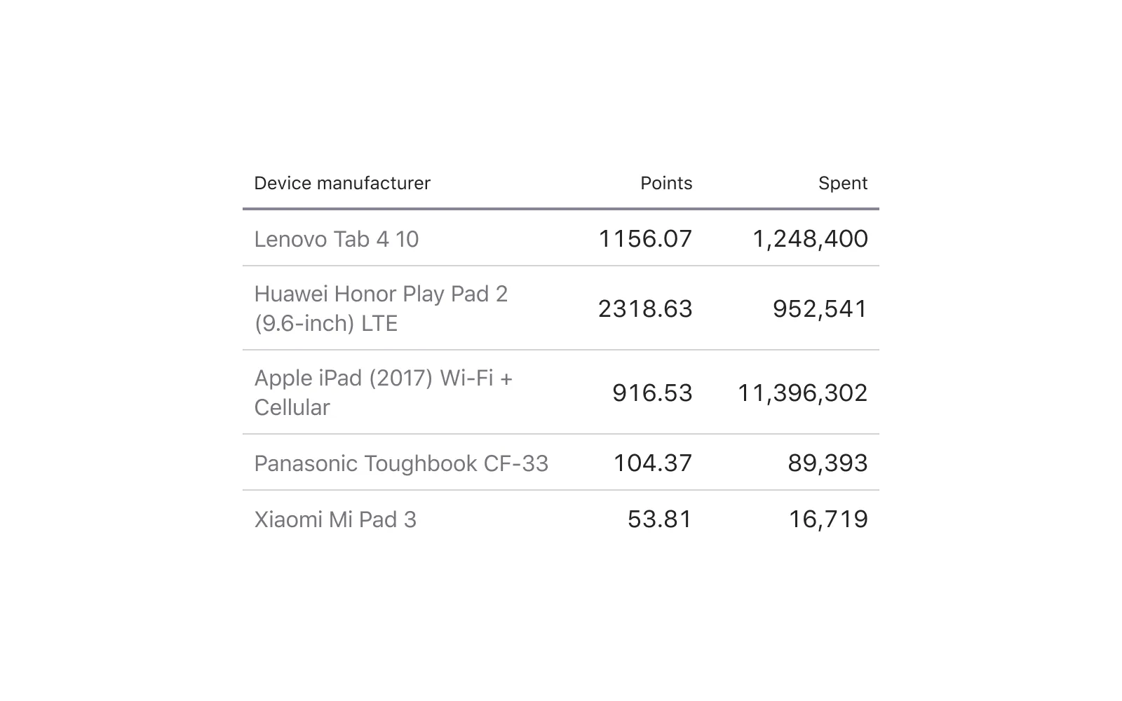
Minimalism
Nothing but the data! This is justified on thick desktop interfaces where each pixel counts.
Using components to create a table
All 5 styles I've shown above are collected from one cell-component, the difference is only in content and all they will refer on one and the only chief component. I consider this method to be the most flexible and I will tell you about it in detail soon, but first I will list two other approaches:
Row-component
Use a row with cells of a predefined quantity. Thus, the table is quickly made by simply cloning from top to bottom. Then the width and height of each row are adjusted.
Cons: low degree of flexibility, the cells are always proportionally scaled. You will have to keep many components in the system with a different set of cells, and then create new states for each set, which can complicate the organisation.
Pros: Row height is convenient to adjust. Ideal for dashboard projects where the horizontal states in the project often change: onhover, selected, focused and so on, and the development specifics require frequent switching between them:
An example of switching the horizontal states via the Instances menu
Column-component
This idea came to my mind for the first time a little more than a year ago and I implemented it in later versions of Figma Material You System. It would be convenient to make the table from the component-columns, inside of which the number of rows is predetermined and multiplied, and all the extra ones would be cut off outside the frame through the Clip Content option. Then it would be enough to pull the frame down by the bottom border to show more additional cells in the column:

An example of cloning and scaling the columns
Cons: inside a component, you cannot adjust the height of each cell (horizontal step), because otherwise you can't hide the excess outside the instance.
Pros: inside a component, you cannot adjust the height of each cell (horizontal step), because otherwise you can't hide the excess outside the instance.
Tip: you can keep three of these components in different increments: S-32px / M-48px / XL-64px, for example, and solve the cell density problem to some extent. This is especially useful when creating both mobile and desktop templates within the same project/team library.
Cell-component
The use of a cell-component gives maximum flexibility in styling the table. Of course, such a project rarely requires the use of both Material-style and classic one. But if you're a freelancer who regularly creates new dashboards for your customers from your own or commercial component base, then you'd better start with the cell from which you'll create tables brick-by-brick. Then it will be enough to enclose 4 lines, press them on the sides of the cell, place constraints and generate new styles.
FYI, in iOS design kit for Figma, I can turn everything upside down through a component :) By the way, it is on the basis of templates from this product that the materials for this article were made
Cons: there are almost none, except that this approach requires more time and system design skills.
Pros: maximum flexibility, ability to control the grid with a single component, adjust separators, background, nested icons and more.
I'll consider the detailed composition of such a super-cell in the next issue. Follow me on Twitter, there will be all announcements
Sample Figma file with the cell-components for your experiments.


