

Roman Kamushken
I have spent the last two years using Claude.ai, ChatGPT, Cursor, Cline, Perplexity, and Venice almost daily. Some of them feel like tools. Some feel like toys. The difference is rarely the model. It is the interface around the model. This guide is what I wish I had read before I started shipping AI features into my own products.
What is an AI chat interface
An AI chat interface is a UI surface where a person types a request in natural language and a language model replies, usually with streamed text, often with attachments, tool calls, citations, and follow-up suggestions. It sits between a search box, a code editor, and a messenger. None of those metaphors fit perfectly, which is why so many products get the design wrong by copying the wrong reference.
Three things make AI chat its own category:
- The reply is generative, not retrieved. The same question can return slightly different answers. Users need cues that explain this without scaring them.
- The reply takes time and arrives piece by piece. The streaming pattern is the single biggest UX difference from any other UI you have shipped before.
- The reply can be wrong with full confidence. Hallucinations are a fact of life with current language models. The interface either helps users verify or hides the problem until it bites.
Designers who treat AI chat as a skin over messaging end up with cute bubbles and broken trust. Designers who treat it as a search results page end up with walls of text and no conversation memory. The right model is something new, and it has its own anatomy.
AI chat vs traditional chatbot vs messaging
These three patterns share a vertical scroll of messages and that is roughly where the similarity ends. Conflating them is the most common reason AI chat UI feels off.
| Aspect | AI chat (Claude, ChatGPT, Perplexity) | Traditional chatbot (intercom-style flow) | Messaging (Slack, WhatsApp) |
|---|---|---|---|
| Response source | Generative LLM | Scripted rules or decision tree | Another human |
| Response time | 1–30 seconds, streamed | Instant, pre-written | Seconds to days, async |
| Response shape | Long-form, structured, often with code | Short, button-driven | Short, conversational |
| Failure mode | Hallucination, off-topic drift | Dead-end "I did not understand that" | Misread tone, ghosting |
| User input | Long prompts, attachments, follow-ups | Short replies, quick buttons | Quick text, emoji, voice |
| Persistence | Threaded conversations saved long-term | Session-scoped, often discarded | Permanent message history |
| Editing previous turns | Yes, often re-runs the whole branch | Rarely, flow restarts | Edit recent message only |
| Trust signals needed | Sources, citations, confidence, model name | Disclaimer "I am a bot" | Profile photo, online status |
| Typical layout | Single column, full width, sidebar for history | Bottom-right widget, 360px wide | Two-pane, list + thread |
☛ The line that matters most is failure mode. Messaging fails through silence. Chatbots fail through dead ends. AI chat fails through confident wrong answers. Your UI has to make that third failure mode visible and recoverable, or you are shipping a quietly dangerous product.
Anatomy of an AI chat interface
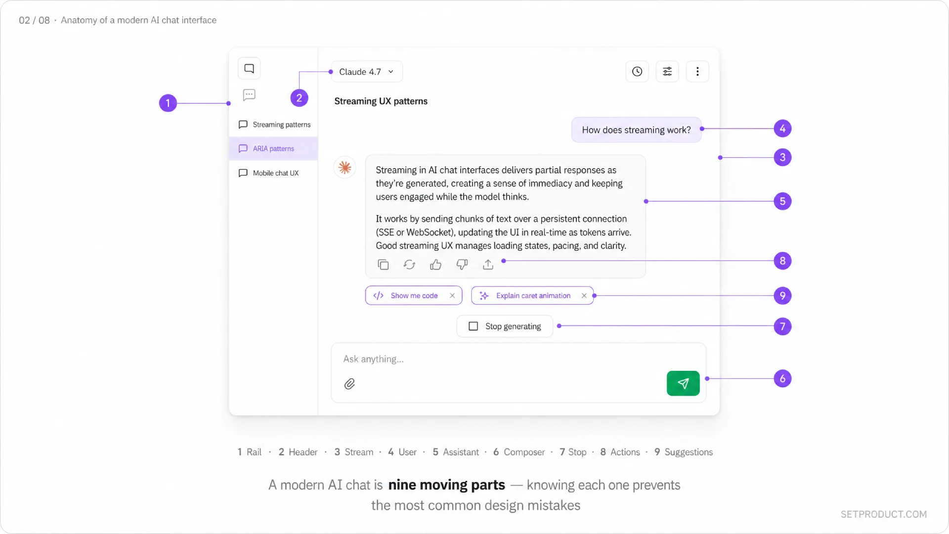
Strip away the branding and every serious AI chat looks like a stack of the same parts. Knowing the parts by name makes it easier to discuss them in design reviews and to spot what is missing when something feels off. Here are the regions I always check.
❶ Conversation list
The left rail or drawer that holds prior threads. Each item shows a title (auto-generated from the first prompt or model-summarized), timestamp, and sometimes a model or project tag. Claude.ai groups by Projects. ChatGPT groups by recency. The pattern is now expected — if you ship AI chat without it, users assume their history is gone.
❷ Header
Holds the model selector, conversation title (editable in place), share button, and any per-conversation settings (system prompt, temperature, web search toggle). The model selector acts like a tab pattern — same logic of mutually exclusive choices, one active at a time. Keep it slim. The header should never compete with the message area.
❸ Message stream
The vertical scroll where prompts and responses live. This is the entire product. Every other element exists to serve it. Use a comfortable max-width — Claude.ai uses around 768 pixels, ChatGPT around 768, Perplexity around 720. Beyond that, long answers become unreadable.
❹ User message
Right-aligned or visually distinct from the model reply. Editable, because users will catch typos after pressing enter and editing is faster than retyping. Editing should fork or replace the conversation from that point — make the choice explicit, do not silently lose context.
❺ Assistant message
The model reply. Rendered as rich Markdown — headings, lists, code blocks with copy button, tables, math, sometimes diagrams. This is where most of your design work lives. The reply has its own substates (streaming, complete, error, regenerating) which I cover in the next section.
❻ Input composer
A multiline textarea with attachment button, model picker (if not in header), submit button, and shortcut hints. Cursor handles Cmd+Enter to send, Shift+Enter for newline — match those defaults. The composer should grow with content up to a sensible cap, then become scrollable.
❼ Stop / regenerate controls
A Stop generating button while the reply streams, swapped for Regenerate or Try again once it ends. These are non-negotiable. Letting users abort a bad response is a basic respect signal. Hiding the regenerate button forces awkward copy-paste workarounds.
❽ Per-message actions
Copy, edit, like, dislike, share, branch from this point. Surfaced on hover on desktop, always visible on mobile. Cursor and Cline add Apply to file, which is a domain-specific action — design yours around the actual jobs your users do, not a generic toolbar.
❾ Suggestions and follow-ups
Optional row of prompt chips under the last reply. Perplexity uses them aggressively as "Related". Claude.ai uses them sparingly. Suggestions are useful when the user is exploring and harmful when the user knows what they want. Make them dismissible.
All nine regions also exist as ready-made Figma components inside Nocra, with the streaming and error variants already wired up.
States of an AI message
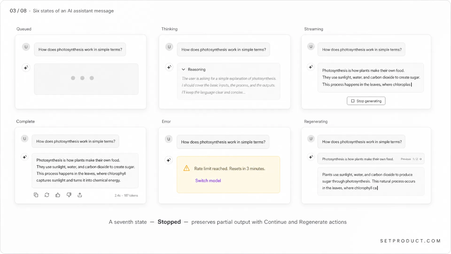
A model reply has more states than a button does, and most teams ship only two of them: streaming and done. That is why their chat feels janky. Here is the full set I design for, in roughly the order the user encounters them.
Queued
The user hit submit. The request is in flight but the model has not started returning tokens. This window is usually 200ms to 2 seconds. Show a placeholder bubble with a subtle pulsing dot or a single shimmering line. Do not show a percentage progress bar — there is no progress to report and a fake one breaks trust the moment the user notices.
Thinking / reasoning
Some models (Claude.ai with extended thinking, ChatGPT o-series, Cursor with agent mode) expose a separate reasoning phase before the visible reply. Structurally it is the same idea as a multi-step wizard flow, just collapsed by default instead of expanded. Treat it as a collapsible section above the answer. Default collapsed. Label it honestly — Thinking, Reasoning, or Searching the web — not vague terms like Working on it. Users want to know what the model is doing with their time.
Streaming
Tokens are arriving and rendering in real time. This is the signature AI chat state and deserves its own deep dive (next section). The cursor blinks, the layout reflows, and the user reads as the answer writes itself.
Complete
Generation finished. Show the full reply, render the final Markdown pass, reveal per-message actions (copy, regenerate, edit). The timestamp can appear here. Cursor adds token count and cost — useful for power users, distracting for everyone else.
Error
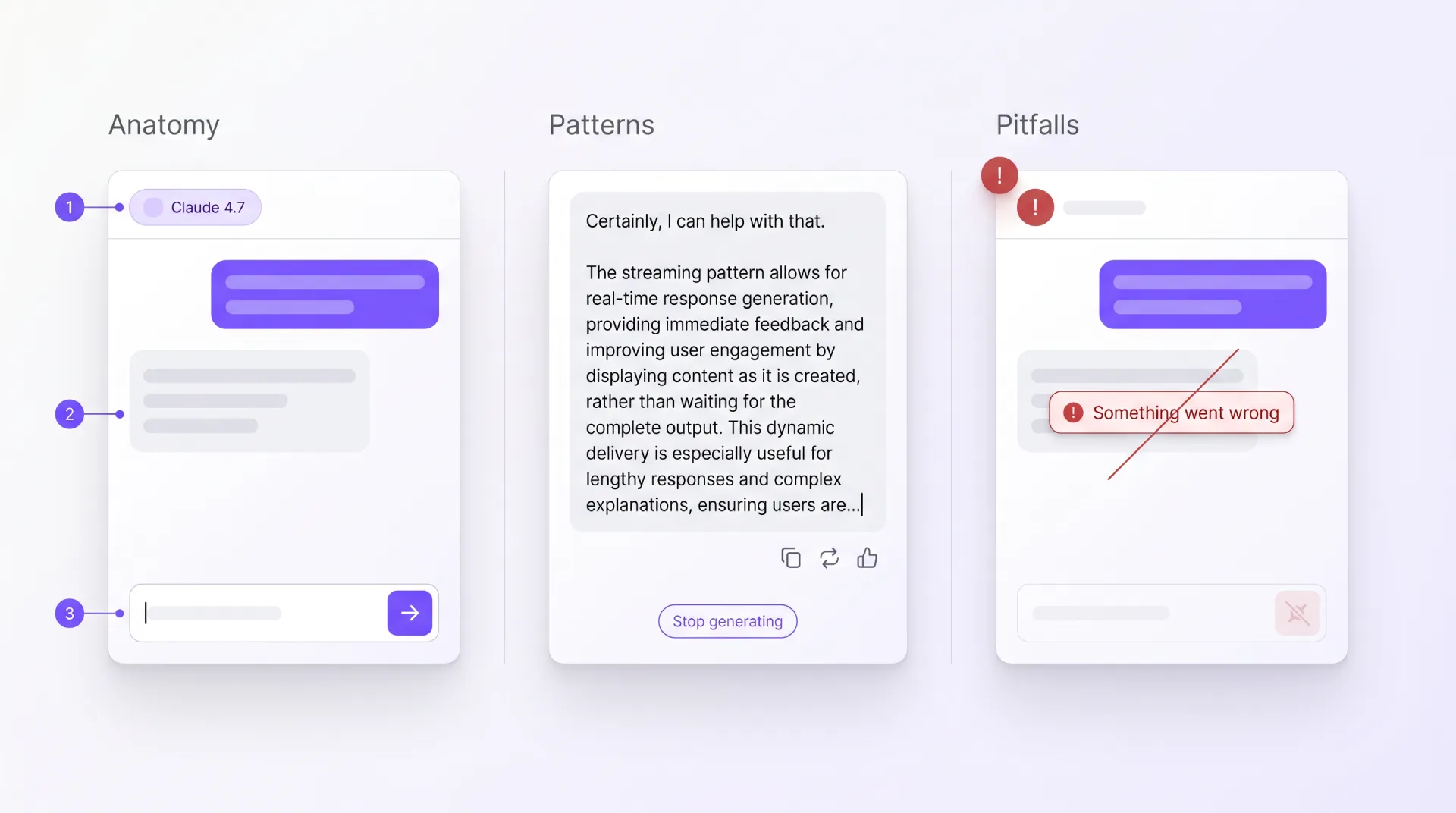
Network drop, rate limit, content filter, context window exceeded, or model timeout. Each has a different message and a different recovery action. ☞ Never collapse all errors into a generic "Something went wrong" — that is the laziest possible failure UX and forces users to guess. Show: what happened, why it happened (one short line), and the single action that resolves it (Try again, Switch model, Shorten prompt).
Regenerating
The user asked for a new attempt. The old reply either disappears, gets pushed into a Previous response accordion, or sits in a horizontal carousel of variants (ChatGPT and Claude.ai both use the carousel). The carousel is the right answer because it preserves work the user might want to compare or copy from.
Stopped
The user pressed Stop generating mid-stream. Show the partial reply, mark it as interrupted, and offer Continue and Regenerate as the two clear next moves. Do not delete the partial output — it may already be useful.
The streaming text pattern, deep dive
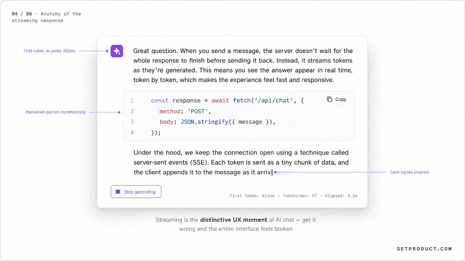
Streaming is what separates AI chat from every UI pattern that came before. Done well, it makes a 20-second response feel instant. Done badly, it makes a fast response feel broken. Most teams underestimate how much engineering and design care this single pattern deserves.
Why we stream at all
Language models generate one token at a time. If you wait for the whole response and dump it on screen, the user stares at a spinner for 10–30 seconds. If you stream, the first word appears in 200–600 milliseconds and the user starts reading immediately. The total time is the same, but the perceived time is dramatically shorter. The pattern is borrowed from the same psychology that makes progressive image loading feel faster than a single blocking load.
The caret
A blinking caret at the end of the streamed text is the cheapest possible "alive" signal. It costs nothing and reassures the user that more is coming. Cursor uses a thin vertical bar. Claude.ai uses a small filled square. ChatGPT uses a pulsing dot. Any of these work. The mistake is dropping the caret entirely — without it, a paused stream looks identical to a finished one.
Markdown rendering during stream
Here is where most products fall apart. Markdown is parsed in chunks, but tokens arrive mid-syntax. The model writes ```python and your renderer either shows the literal backticks (ugly) or guesses prematurely and re-renders the whole block when the closing fence arrives (flickery). The right answer: parse Markdown incrementally, accept that code blocks render as plain text until the closing fence, and apply syntax highlighting in a second pass once the block closes. Cursor and Claude.ai both do this and the result feels smooth.
Reflow without scroll jank
As tokens stream in, the message grows. If the user is at the bottom, you want to auto-scroll. If the user has scrolled up to read something earlier, you must not yank them back down. The rule: auto-scroll only when the viewport is within 100 pixels of the bottom at the moment new tokens render. The instant the user scrolls up, lock the position and show a Jump to latest floating button. Perplexity gets this right. Some open-source clones do not, and reading their output mid-stream is physically uncomfortable.
Stop button placement
The Stop generating button needs to be exactly where the user expects it: at the bottom of the message stream, near the composer, large enough to hit without precision aiming. Hide it the moment streaming ends — leaving it visible after completion is a small bug that quietly says "this team did not check their own product".
Speed perception tricks
- Optimistic user message: render the user's prompt instantly before the request even leaves the client. This shaves 100–300ms off perceived latency.
- First-token target under 800ms: aim to start streaming faster than a slow page load. Cursor pushes this aggressively in their agent flow.
- Token grouping: do not re-render the DOM on every single token. Batch into 30–60ms paint windows. Smoother and uses less CPU on the user's machine.
☛ The streaming pattern is the one place where good engineering and good design are inseparable. You cannot polish your way out of a slow first-token time, and you cannot engineer around a bad layout that reflows on every chunk. Treat it as a joint problem from day one.
Layout patterns: desktop vs mobile
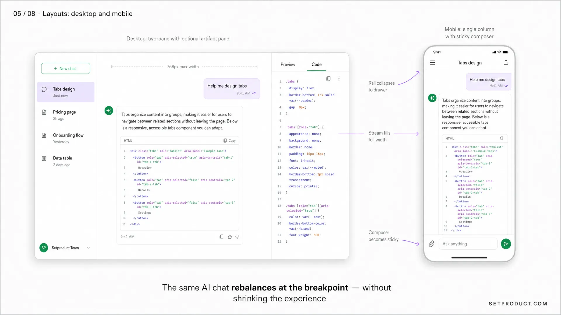
AI chat does not have one canonical layout. It has three or four, and each has a job. Picking the wrong one for your context is the most common structural mistake I see.
Desktop: the two-pane standard
A left rail with conversation history, a center column with the message stream capped at about 720–768 pixels, and an optional right panel for artifacts (code preview, document, citations). Claude.ai, ChatGPT, and Perplexity all converge on this. The rail collapses to icons under about 1200px wide. The artifact panel slides in only when there is something to show — keeping it persistent wastes space and forces the reader to scan a narrower column.
Desktop: the IDE embed
Cursor and Cline put chat next to code. The chat panel is a vertical strip on the right or left, 400–520 pixels wide, with the editor taking the rest. The composer sits at the bottom of the panel and grows upward. ☛ Inside an IDE, do not give chat a full-page layout — users want to see code and chat at the same time, and a tabbed mode breaks that.
Mobile: single column, full bleed
The conversation list becomes a slide-in drawer behind a hamburger or a top-left avatar. The message stream takes the full viewport width with 16px side padding. The composer pins to the bottom and rises with the keyboard. Send and stop are large, thumb-reachable, high-contrast. Avoid floating action buttons that overlap message content during streaming.
Mobile: the input-first pattern
Notion AI, Linear AI, and most in-app assistants open with a centered input and a few suggestion chips, no message history visible until the user has sent something. This pattern works when the assistant is task-scoped (summarize this, write that) rather than a long-running conversation. It feels lighter and avoids the "empty chat" intimidation.
Sticky composer, never floating
The composer should be docked, not floating. A floating composer that overlaps the last message is the single most common mobile UX bug in AI chat right now. Dock it, give the message stream bottom padding equal to the composer height, and let the keyboard push it without jumping. iOS safe-area handling matters here — test on a notched device before shipping.
Reading width and density
Long-form replies need a generous line-height (around 1.6) and a max content width of about 65–72 characters per line. The classic readability research from the WCAG 2.2 guidelines recommends no more than 80 characters per line for sustained reading. Going wider than that to fill the viewport is the lazy choice that punishes anyone trying to actually read the answer.
Desktop and mobile versions of these layouts are inside Nocra, with Figma auto-layout grids that adapt between breakpoints.
When to use what: AI chat vs alternatives
AI chat is the loudest pattern of 2026 and the most over-applied. Not every AI feature wants to be a chat. Sometimes a button, an inline action, or a single-shot prompt is better. This table is the decision tree I run through before defaulting to a chat surface.
| User goal | Best pattern | Why |
|---|---|---|
| Get a fast, well-defined transformation (translate, summarize, rewrite) | Inline action or button | One click, no conversation overhead. Notion AI and Grammarly do this well. |
| Explore an open-ended question with follow-ups | Full AI chat | Conversation memory and refinement is the whole point. |
| Generate a structured artifact (image, slide, doc) | Single prompt + result canvas | Chat is overhead; users want the artifact, not the dialogue. |
| Answer questions about a specific document | Sidebar chat scoped to the document | Context is the document, not the world. Notion and Google Docs do this. |
| Help me write code | IDE-embedded chat plus inline diff | Cursor and GitHub Copilot Chat — chat is necessary but the diff is the product. |
| Run a multi-step automated task | Agent UI with step list, not chat | Chat hides the plan. Show the steps as a stepper, not as messages. |
| Customer support | Hybrid: AI chat with handoff to human | Pure chatbot dead-ends frustrate. Always provide an exit to a person. |
| Quick command-style query inside an app | Command palette with AI suggestions | Linear AI and Raycast — faster than typing a sentence. |
| Brainstorm with no defined output | Full AI chat | Genuinely conversational. The right tool. |
☞ When in doubt, ask: "Would this be better as a button?" If the answer is yes for 80% of the use cases, ship a button and skip the chat. You will save your users a lot of typing and yourself a lot of design debt.
Real-world use cases
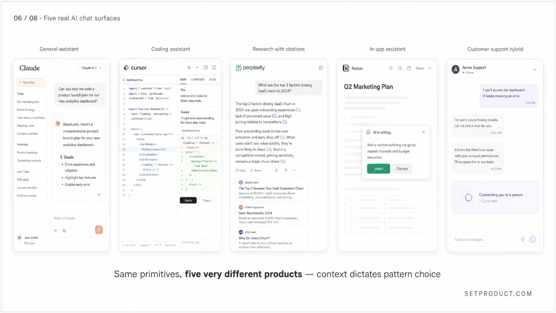
The pattern bends differently depending on the job. Here are the five surfaces I study most often, with what each one teaches.
General-purpose assistant (Claude.ai, ChatGPT, Venice)
The reference implementation. Wide model choice, projects or folders for context, long memory, artifact panels for code and documents. The design lesson here is restraint — these products earn trust by keeping the message stream clean and putting power features one click away rather than on the surface. The biggest recent shift is artifact-style side panels that let users iterate on a single output without scrolling through the conversation.
Coding assistant (Cursor, Cline, GitHub Copilot Chat)
Chat is one surface among several — inline edit, agent mode, terminal command suggestions. The chat panel lives next to code, references files by name with @filename syntax, streams diffs the user can accept or reject. The lesson: pair every chat response with a concrete action button. Apply, Insert at cursor, Open in editor — chat without action is just expensive documentation.
Research and search (Perplexity)
Every reply has citations as numbered footnotes that link to sources. The reply is the answer; the citations are the receipts. This is the trust pattern AI chat has been missing for years and other products are slowly copying. If your AI chat answers factual questions and you do not show sources, you are asking users to take your word for it — and current LLMs do not deserve that yet.
In-app assistant (Notion AI, Linear AI)
Scoped to the document, project, or workspace the user is already in. Opens as a sidebar or floating panel. Knows the context without being told. The lesson: the smaller the context, the lighter the chat UI can be. A Notion AI chat does not need conversation history because each invocation is task-scoped. Less UI is the right answer.
Customer support hybrid
AI handles tier-one questions, hands off to a human when it detects frustration or the question is out of scope. The handoff must be visible — a banner that says "Connecting you to a person" with an ETA. ☞ The worst pattern here is silent handoff where the user keeps talking to "the bot" and only realizes much later that the tone changed because a human took over. Be honest about who is on the other end.
Accessibility: critical and often skipped
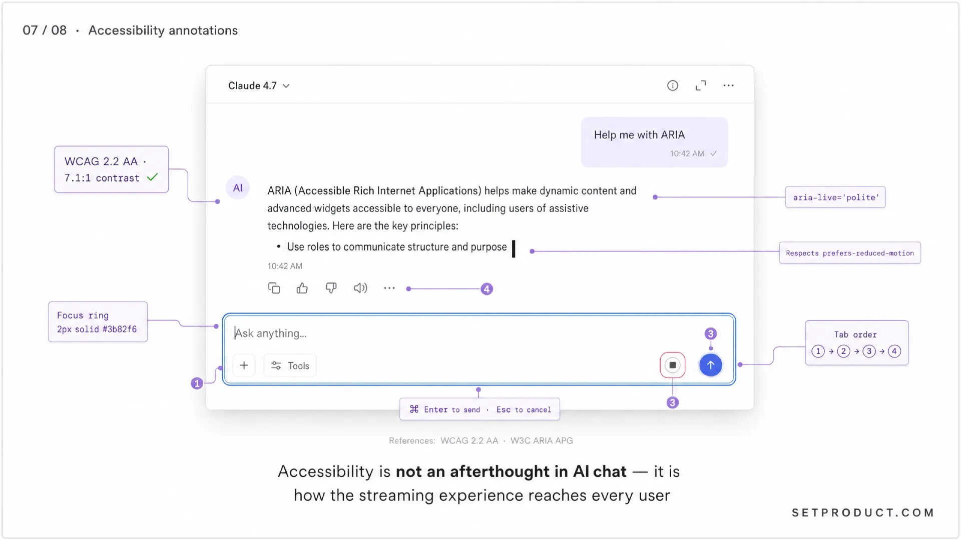
AI chat is harder to make accessible than most components because the content changes constantly. Tokens stream in, layouts reflow, new buttons appear. Screen reader users get a confusing experience by default, and most teams ship that default. Here is what actually matters.
Live regions for streaming responses
Wrap the assistant message in an ARIA live region (aria-live="polite") so screen readers announce new content as it streams. Use polite not assertive — assertive interrupts and is hostile during a long reply. The W3C ARIA Authoring Practices Guide covers the pattern in detail under live regions.
Keyboard navigation
Every action — send, stop, regenerate, copy, edit, switch model — needs a keyboard path. Tab order should be: composer first, then per-message actions on the focused message, then global actions in the header. Cmd+Enter to send is standard. Esc to cancel an edit is standard. Test the whole product without a mouse before you ship.
Focus management after submit
When the user submits a prompt, focus stays in the composer. When they edit a previous message, focus moves to the edit field. When the reply completes, do not steal focus — let the user decide where to go next. Auto-focusing the next input is tempting and almost always wrong.
Color contrast and dark mode
Streamed text on a dark background needs at least the WCAG 2.2 AA contrast ratio of 4.5:1 for normal text. Code blocks often fail this because designers pick low-contrast syntax themes that look pretty but punish readers. Test with a contrast checker, not your eyes.
Reduced motion
The blinking caret, the slide-in suggestions, the auto-scroll — all of it needs to respect prefers-reduced-motion. Replace animations with instant state changes when the user has the system preference set. Most AI chat products skip this entirely. It is a one-line CSS media query.
Reading order for screen readers
Per-message actions (copy, regenerate) should come after the message text in the DOM, not before. If they come before, the screen reader announces "copy, regenerate, edit" before the user has heard a single word of the actual reply. Order matters even when it is visually invisible.
Anti-patterns: what kills AI chat UX
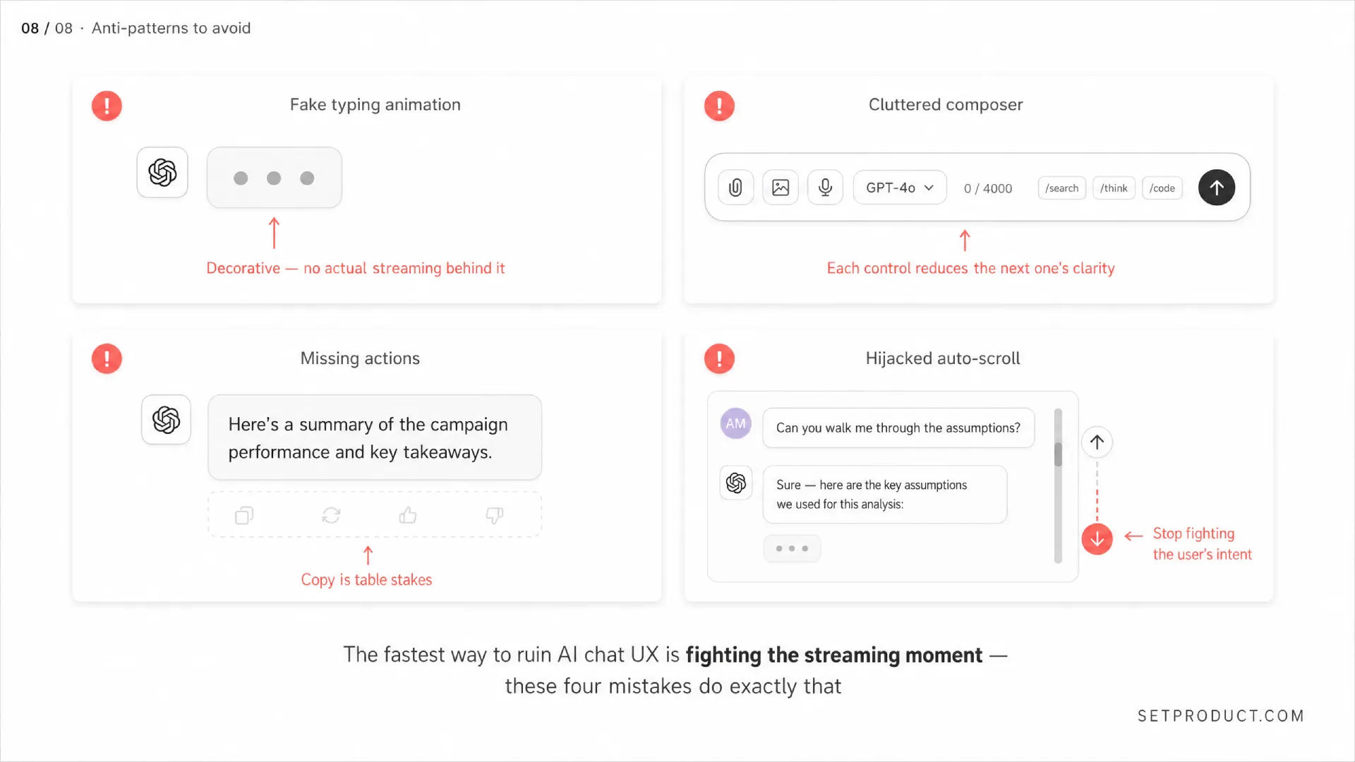
These are the mistakes I see over and over. Some are lazy, some are well-intentioned, all of them quietly damage the product. Audit your AI chat against this list before shipping.
☞ Fake typing animation that throttles a fast model. If your model can stream at 80 tokens per second, do not artificially slow it down to "feel human". Users prefer fast and honest over slow and theatrical. ChatGPT used to do this. They stopped. Learn from that.
☞ Hiding errors as generic toast messages. "Something went wrong" with no detail forces the user to retry blindly. The same rules from the notifications UI guide apply here — show the actual error class — rate limit, content filter, network drop — and the action that fixes it.
☞ No stop button during generation. The user has no escape from a bad response. They watch tokens stream knowing the answer is wrong and cannot do anything about it. Inexcusable.
☞ Auto-scroll that fights the user. Yanking the viewport back to the bottom every time a new token renders, even when the user has clearly scrolled up to read. Lock scroll position the instant the user takes manual control.
☞ No conversation history. Every refresh wipes the thread. Users lose work they cannot recreate because the model output is not deterministic. Persist conversations from session one.
☞ Buried model selector. The user cannot tell which model wrote a reply. When the answer is wrong, they cannot escalate to a stronger model or downgrade for speed. Show the model name on every assistant message, even as a small label.
☞ Disclaimers as walls of text. "I am an AI and may make mistakes" pinned to every single message becomes noise. Show it once in the welcome state and again on errors. Users learned the lesson; stop repeating it.
☞ Suggestions you cannot dismiss. Three "Related" chips under every reply, always there, always pushing the user toward someone else's path. If the user knows what they want next, suggestions are friction. Tooltip timing rules apply to suggestion chips that appear on hover too — give the user time to ignore them.
☞ No way to copy code. Code blocks without a one-click copy button force users to triple-click and pray. Add a copy button. Show a transient checkmark on click. Cursor and Claude.ai both nail this.
☞ Modal-locking the chat during streaming. Disabling navigation, edits, or other UI while a reply streams. Users want to start composing the next prompt while reading the current one. Let them.
☞ Silent context truncation. The conversation gets too long, the model loses the earlier turns, the replies start contradicting things from earlier in the thread. Either show a clear "Earlier messages summarized" marker or warn the user when they approach the context window.
☞ Bubble shapes that mimic SMS. Round colorful bubbles signal "casual texting" and undermine the tool framing. Most serious AI chat products (Claude.ai, ChatGPT, Cursor) have moved to flat, full-width messages with subtle background differentiation. Follow that lead unless you have a specific reason not to.
And the worst of all: shipping AI chat as the answer to every question in your product. Sometimes a button is better. Sometimes a form is better. Sometimes the right answer is "we should not add AI here at all". Restraint is a design choice.
Pre-launch checklist
Run your AI chat against this list before you ship it. If you cannot tick a box, you have homework before launch, not after.
Anatomy and structure
✔ Conversation history is persisted across sessions and visible in a left rail or drawer.
✔ Each assistant message shows which model produced it.
✔ Message stream max-width is capped between 65 and 80 characters per line for sustained reading.
✔ Per-message actions (copy, regenerate, edit, share) are reachable on every message.
States and streaming
✔ First token starts streaming within 800ms of submit, or a queued state is shown.
✔ A Stop generating button is visible during streaming and disappears the moment generation ends.
✔ Stopped responses preserve the partial output with Continue and Regenerate actions.
✔ Errors specify the cause (rate limit, content filter, network) and the recovery action.
✔ Regenerated responses are kept in a navigable carousel, not overwritten silently.
Layout and reflow
✔ Auto-scroll only fires when the viewport is within 100px of the bottom; user scroll-up locks the position.
✔ Composer is docked to the bottom, never floating over the last message.
✔ On mobile, the keyboard pushes the composer without obscuring the latest reply.
Accessibility
✔ Assistant messages are inside an aria-live="polite" region so screen readers announce streamed content.
✔ Every action has a keyboard path; Cmd+Enter sends, Esc cancels edits.
✔ Color contrast meets WCAG 2.2 AA (4.5:1 for body text, 3:1 for large text), including code blocks.
✔ Animations respect prefers-reduced-motion.
✔ Focus does not jump to the assistant reply when streaming completes.
Trust and honesty
✔ Factual replies show sources or citations when the model is grounded in retrieval.
✔ Disclaimers about AI accuracy appear in the welcome state and on errors, not on every message.
✔ Handoff from AI to human (for support flows) is announced visibly with an ETA.
✔ The model name is shown so users can switch up or down.
Restraint
✔ Every AI chat surface was challenged against the "Would a button be better?" question before being added.
✔ Suggestion chips are dismissible and never block the composer.
Frequently asked questions
❶ Should I use bubbles or full-width messages for AI chat?
Full-width is the current best practice for serious AI chat. Bubbles signal "messenger" and undermine the tool framing users now expect from products like Claude.ai, ChatGPT, and Cursor. Use subtle background shading or alignment to separate user and assistant messages instead. Bubbles are fine for narrow in-app assistants where the chat is clearly a small widget, not the main surface.
❷ How fast does my AI chat need to feel?
Aim for first-token latency under 800ms. The total response can take 10 to 30 seconds for long replies — that is fine as long as streaming starts quickly and the caret signals progress. What kills perceived performance is a blank screen for two seconds before anything happens, not the total duration of the response.
❸ Do I need to show citations in AI chat?
If the model answers factual questions and you are using retrieval-augmented generation, yes — citations are non-negotiable for trust. Perplexity proved this is the new baseline. If the chat is purely creative or transformational (rewrite this, brainstorm that), citations do not apply. Do not fake them.
❹ How do I handle long conversations that exceed the context window?
Show a clear marker in the thread when earlier messages get summarized or dropped. Never silently truncate. Offer a "Start new conversation" option before the user runs into degraded replies. Claude.ai and ChatGPT both handle this by showing context indicators and prompting new threads.
❺ Should AI chat replace forms in my product?
Almost never. Forms collect structured input fast, with validation, and without ambiguity. Chat is conversational, slow, and prone to misunderstanding. Use chat for open-ended, exploratory tasks and forms for everything that has a clear data shape. The current overuse of AI chat in 2026 is a pendulum swing that will correct itself within a year.
❻ How do I design AI chat for mobile when the keyboard takes half the screen?
Dock the composer, give the message stream bottom padding equal to composer plus safe area, and let the keyboard animation push the layout without jumping. Show only the last two or three messages above the keyboard. Make the send and stop buttons at least 44 pixels tall for thumb reach. Hide non-essential header chrome when the keyboard is open.
❼ What is the biggest mistake teams make when adding AI chat to an existing product?
Bolting it on as a floating widget without rethinking the surrounding flows. AI chat that does not know what the user is doing elsewhere in the product is just a worse version of ChatGPT in a sidebar. The win comes from giving the chat real context — the current document, the selected text, the active project — so the answers are grounded in what the user already cares about.
The best AI chat interface disappears when it should. It streams without showing off, fails honestly, and respects the fact that the user is here to get something done — not to admire your animation work. If you remember one thing from this guide, remember that AI chat is a tool first and a conversation second. Design the tool. The conversation will follow. Now go make every token count.