

Roman Kamushken
1. What “liquid glass” means in UI
Liquid glass is not a visual UI trick. It is a material system. If you treat it as “blur + transparency”, you will get one impressive hero screen and a pile of broken states the moment you add real text, real backgrounds, and real density.
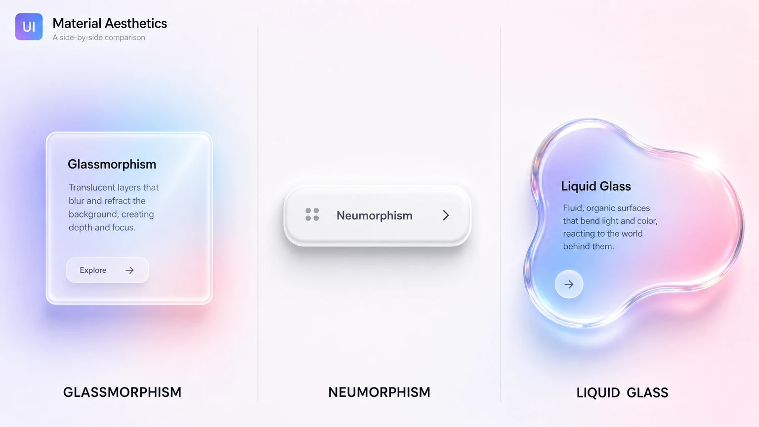
If you are still untangling liquid glass from glassmorphism, neumorphism, and frosted UI, the side-by-side comparison maps how each one differs. This guide is the hands-on counterpart.
A practical definition that survives product UI:
Liquid glass – is a layered surface that keeps the background perceptible, keeps content stable, and behaves predictably across tiers, states, and stress tests.
That sentence matters because it forces discipline. “Perceptible” means the background is still there, not erased into fog. “Stable” means text does not depend on whatever sits behind it. “Predictable” means the same recipe produces the same result across the system.
The material cues that define the look
**Transparency with control
**The background should remain recognizable. If it turns into a milky wash, you are no longer communicating glass. You are communicating a soft overlay. Good glass keeps clarity while still separating layers. That separation comes from how you handle edges, not from cranking blur.
Thickness and edge separation
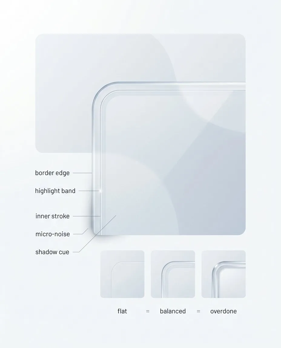
Thickness cues are where “glass” becomes repeatable. Border edge, highlight band, inner stroke, micro-noise, and shadow must stay consistent across components, otherwise you get a one-off render. The full playbook turns these cues into a usable recipe and tier rules, see Full Liquid Glass Playbook.
Most fake glass fails because it has no thickness. It is a flat rectangle with a blur filter. Thickness is communicated by a small set of repeatable cues: a thin border that breaks the edge, a controlled highlight band that implies a light direction, and sometimes a subtle inner stroke that hints at a cross section. If these cues are inconsistent between components, the whole UI starts looking like stitched screenshots.
**A locked light model
**Liquid glass needs one light direction. Not because it is “more aesthetic”, but because it is the fastest way to make a system look coherent. Random highlights are the shortest path to CGI vibes.
The stabilized plate under content
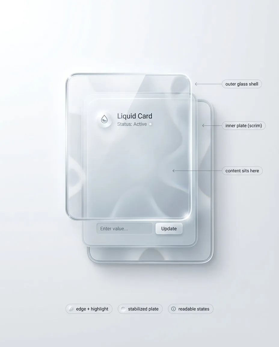
Liquid glass ships as a stack, not as a blur effect. The outer shell sells material, the inner plate protects content, and the light model must be locked across the system. I break this stack into practical tiers and board templates in the complete Liquid Glass playbook.
This is the part most inspiration posts avoid. If you want transparency and readability, you need a stack, not a single layer. Think in two surfaces:
- Outer glass shell: thickness cues, edge, highlight, controlled refraction
- Inner stabilized plate: text and icon stability, consistent contrast, state clarity
The stabilized plate can be subtle. Sometimes it is just a slightly denser patch under typography. But it must exist, otherwise your UI becomes background-dependent. Background-dependent text is not a style. It is a bug.
**State deltas you can spot instantly
**Glass does not get a free pass on interaction. Hover, pressed, focus, disabled, error, loading must remain obvious. The safe approach is to make state changes affect the recipe, not just the color. Focus is a crisp ring that ignores the background. Pressed compresses shadow and shifts highlight. Disabled loses edge sparkle and contrast. Error adds structure: border, icon, helper line, spacing.
What liquid glass is not
Two common traps:
**☛ Trap 1: Glass equals blur.
**Blur is one ingredient. Without edge separation, stabilized content, and consistent highlights, blur gives you a soft card, not glass.
**☛ Trap 2: More transparency is always better.
**Extreme transparency can look premium and still fail under stress. In a system, transparency is tiered. You decide where you can afford it.
Where glass works best in product UI
Glass shines where it behaves like an overlay material:
- navigation surfaces sitting above content
- sheets, modals, drawers, side panels
- tooltips and toasts
- small chips and tabs, if selected and focus states stay clear
Risk zones:
- dense forms with helper text and long labels
- tables and settings pages
- long paragraphs and multi-line lists
This does not mean “never use glass there”. It means these zones should default to the most readable tier and the strongest stabilized plate. If you start with a cinematic tier, you will spend your time patching readability instead of designing.
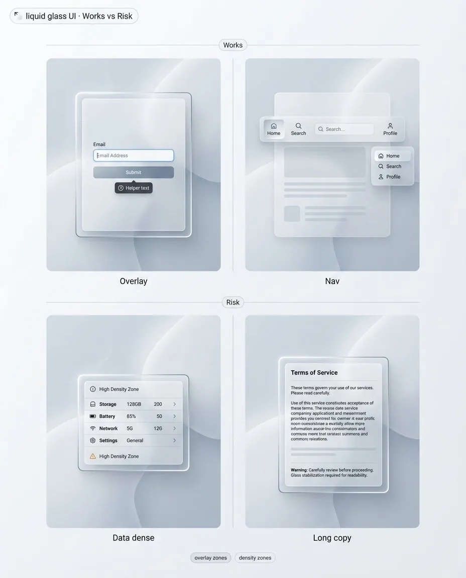
“Works vs risk” is the fastest way to stop glass from spreading everywhere. Overlays and lightweight surfaces benefit, dense data and long copy punish you. The full playbook expands this into tier defaults and decision checks in the full UI design guide.
A mental model that keeps you honest
Liquid glass is a controlled stack: outer shell for material, inner plate for content.
Once you treat it as a stack, decisions get simpler:
- Which tier is this surface, and why.
- Where does content sit, and what stabilizes it.
- Which states must remain obvious, even on chaotic backgrounds.
- What happens when blur or transparency is not available.
Next we stress-test this model. Not with opinions, but with checks that either pass or force a recipe change.
2. The non negotiables: readability and states
If liquid glass is a material system, then it has to survive the same things any UI system survives: arbitrary backgrounds, real copy, real density, and real interaction states. This is where most “glass” examples quietly fail. They look great in a single controlled mock, then collapse when you move them into production constraints.
This section is intentionally strict. It is not about taste. It is about failure modes you can predict and prevent.
Why blur is not a readability guarantee
Designers often reach for blur as if it is a universal contrast solution. It is not. Blur removes detail, but it does not remove brightness, macro shapes, or high-contrast blobs. In other words, blur can erase texture while preserving the exact signals that destroy legibility.
Here are the typical ways blur lies to you:
**☛ Blur preserves luminance extremes.
**If the background has a bright hotspot behind a label, blur turns it into a bigger bright hotspot. Your text still loses contrast, sometimes even more, because the bright area expands.
**☛ Blur keeps large shapes readable.
**Big shapes, icons, photos, and high-level silhouettes remain recognizable through blur. That is the point of transparency, but it is also the problem. Your content now competes with a second layer of meaning. This is how glass UIs become visually noisy even when they look “clean”.
**☛ Blur is inconsistent across contexts.
**The same blur strength behaves differently on different content. A soft gradient behind glass feels calm. A busy photo behind the same glass can become a muddy mess. If your readability depends on choosing “the right” background, you do not have a system.
**☛ Blur does not solve small text.
**Captions, helper lines, table values, and secondary labels are the first to break. Glass systems that look fine with headline-level typography will fail as soon as you introduce UI density.
So what is the correct mental model?
Blur is only one ingredient. Readability comes from a controlled stack: an outer shell that conveys the material, and an inner stabilized plate that protects content. This is not optional. If you want high transparency and consistent legibility, you need both.
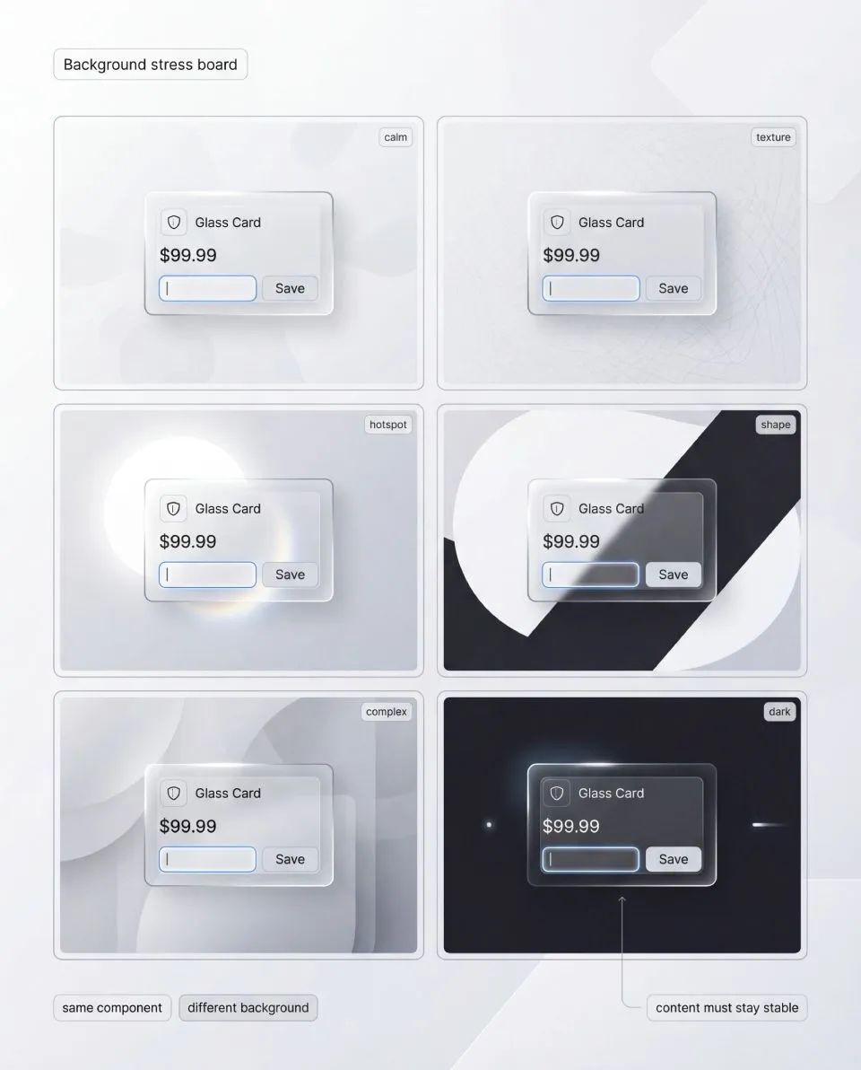
Background stress board: same component, multiple background archetypes. If your label fails on hotspots or strong shapes, it is not an edge case, it is a recipe bug. The full liquid glass guide includes the full stress workflow and pass criteria, get the full playbook.
A stabilized plate is not a heavy opaque slab. It can be subtle. The important part is that it behaves predictably. When background conditions change, your content layer stays stable.
Also note a second trap: “just increase opacity”. It works, but it erodes the style. If your solution is to keep raising opacity until readability returns, you are gradually replacing glass with a normal card. The goal is to keep glass cues while keeping content stable. That is why tiers exist later in the guide.
The four stress tests every glass system must pass
A real system is defined by what it can endure. For liquid glass, durability can be reduced to four stress tests. If your style passes these, most other decisions become easier. If it fails any of them, you should change the recipe, not patch the screen.
The point is not to prove that glass is “hard”. The point is to stop arguing about aesthetics and start working with repeatable checks. A stress test either passes, or it forces a recipe change.
States must read instantly, even when the surface is reactive. Focus, pressed, disabled, error, loading should be structural deltas, not tiny tint shifts that vanish on real backgrounds. I document state rules and a review checklist in the complete playbook.
Stress test 1: Background stress
Take one identical component and place it on multiple backgrounds that represent real product conditions. You are not trying to make every background look equally pretty. You are checking whether the content layer remains stable without per-screen hacks.
Use a compact set of background archetypes, not a random gallery:
- Calm: flat color or soft gradient
- Textured: subtle pattern or low-contrast noise
- Hotspot: a bright area directly behind the component
- Shape conflict: a large contrasting shape under the component
- Dark with accents: dark field with bright elements
→ Pass criteria: the component keeps the same typography, spacing, and basic recipe while staying readable. The background can remain perceptible, but it cannot rewrite hierarchy.
If the only way to restore readability is to raise opacity until the card becomes a normal surface, you did not pass. You replaced the material with a workaround.
✗ Typical failures: contrast fluctuates between backgrounds, edges disappear on some tiles, the glass turns milky on complex content, the surface feels like it changes material depending on what is behind it.
✔ Fix direction: start with the stack, not blur. Strengthen the stabilized plate before raising whole-surface opacity. Improve edge separation by tuning border and inner stroke. If blur creates fog, reduce blur tier rather than increasing it. If tint muddies the scene, lower saturation and let edge cues carry the material.
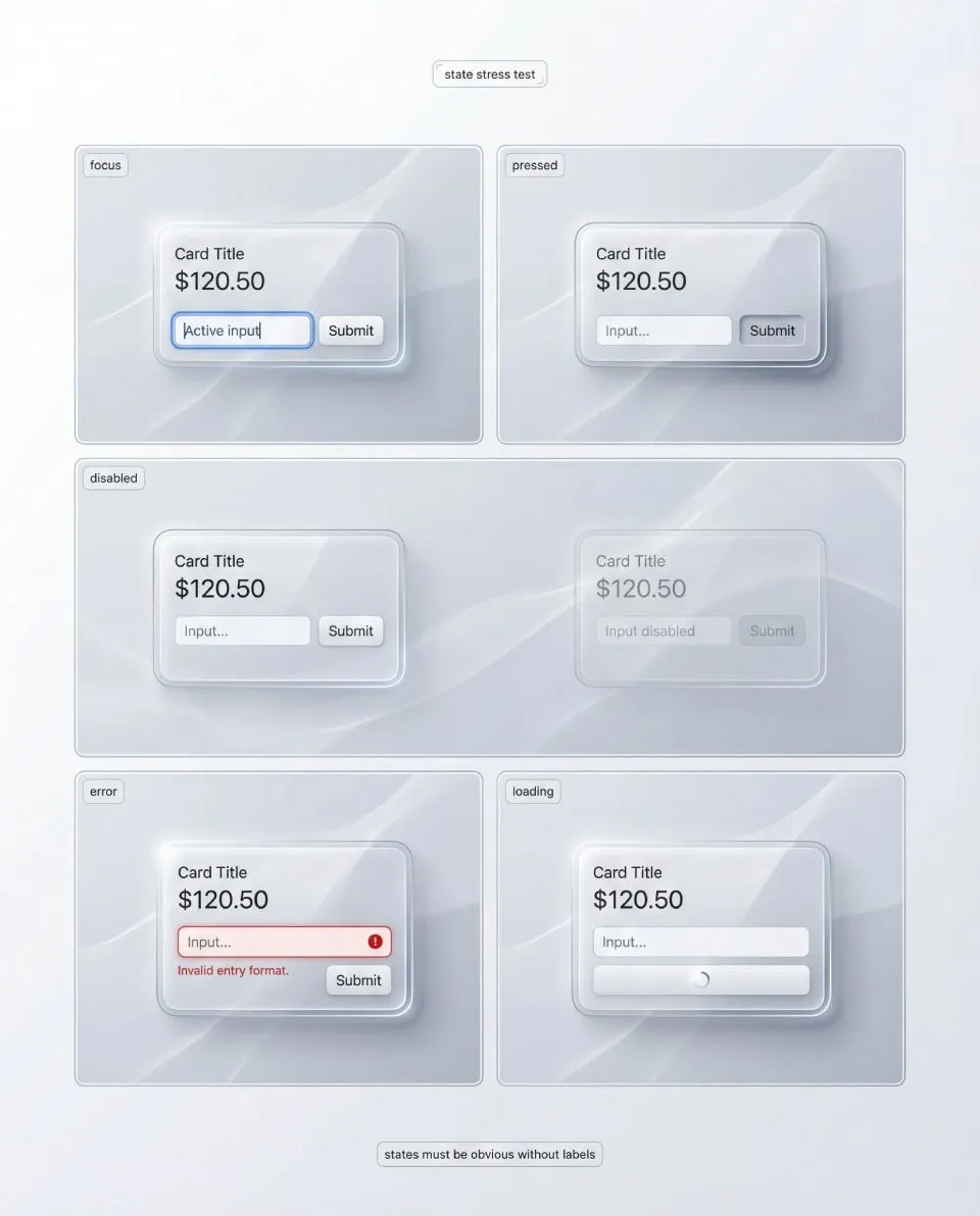
Stress test 2: State stress
Glass surfaces are already reactive, so many designers become timid with interaction signals. The result is predictable: hover, pressed, focus, and disabled collapse into small variations of shine.
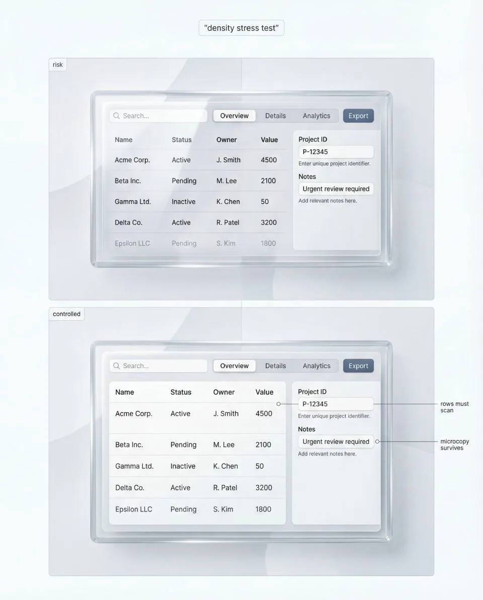
Density is the honesty test for liquid glass. Forms, tables, and settings screens reveal hierarchy problems first, especially microcopy and separators. The full playbook shows how to pick a density-safe tier and how to debug failures in the full guide.
State stress asks one question: can a user understand states instantly, even when the background is chaotic?
Test the states that fail first:
- Focus
- Pressed
- Disabled
- Error
- Loading
→ Pass criteria: each state is recognizable without labels and without relying on a single fragile cue. Focus must remain visible regardless of background brightness and regardless of highlight behavior on the glass.
✗ Failure patterns: focus reads like “just another highlight”. Disabled still looks premium and clickable because edge sparkle remains. Error is only a tint shift and disappears on certain backgrounds. Pressed has no physical response.
✔ Fix direction: design states as structural changes to the recipe. Focus should be a crisp ring that sits above the stack, not inside it. Disabled should lose sparkle and contrast intentionally, not only reduce opacity. Error should be a structured message (border, icon, helper line, spacing) supported by a stable content plate. Pressed should compress shadow and shift highlight in a controlled way.
One hard rule: states must not depend on finding a calmer background.
Stress test 3: Density stress
Most glass inspiration avoids density because density makes readability become work. Real products cannot avoid it.
Density stress is your honesty check: does the system survive real UI content, not hero shots?
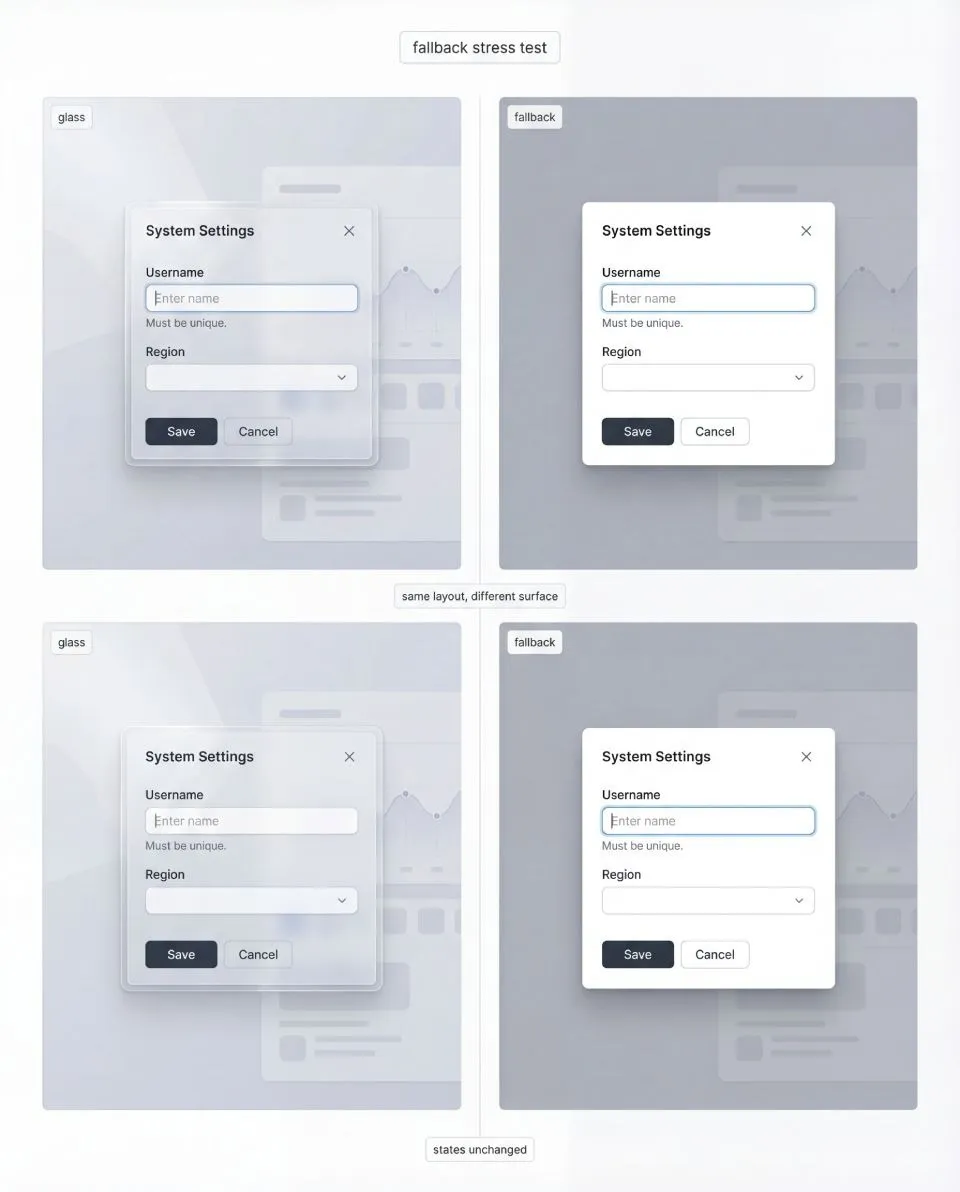
Fallback is not a downgrade UI, it is a sibling surface recipe. Same layout, same anatomy, same states, different rendering constraints when blur is unavailable. The full playbook includes side-by-side fallback patterns and parity rules in Full Liquid Glass Playbook.
Pick one dense scenario and push it until it feels uncomfortable. Forms with helper text are excellent because they introduce microcopy and error structure. Tables are harsher because they force alignment, small numbers, separators, and repetition. Settings lists sit in the middle and expose hierarchy problems fast.
→ Pass criteria: hierarchy stays intact, primary actions remain obvious, and secondary text does not become the first casualty. Structure remains readable even if you dial down the “wow” factor.
✗ Common failures: everything merges into one glossy surface, microcopy loses contrast, separators vanish, repeated rows stop being scannable.
✔ Fix direction: dense zones default to the most readable tier. Strengthen the stabilized plate under text blocks, not only under titles. Use honest, consistent separators. Reduce decorative highlights in dense zones to protect hierarchy.
Stress test 4: Fallback stress
Blur and transparency are not guaranteed across browsers, devices, performance budgets, and user preferences. If your system collapses without blur, it was never a system.
Fallback is not a different UI. It is the same layout, the same component anatomy, and the same state logic executed with a different surface recipe.
→ Pass criteria: fallback still looks intentional. The user should not feel punished for being on a different device or configuration.
✗ Common failures: fallback becomes a generic gray slab, borders and dividers disappear so structure collapses, and states become unclear because they were tied to glass reflections.
✔ Fix direction: define fallback as a first-class sibling to your glass tiers. Keep the stabilized plate concept even in fallback, it simply becomes your normal surface. Keep state deltas defined through rings, borders, structure, and spacing rather than through blur.
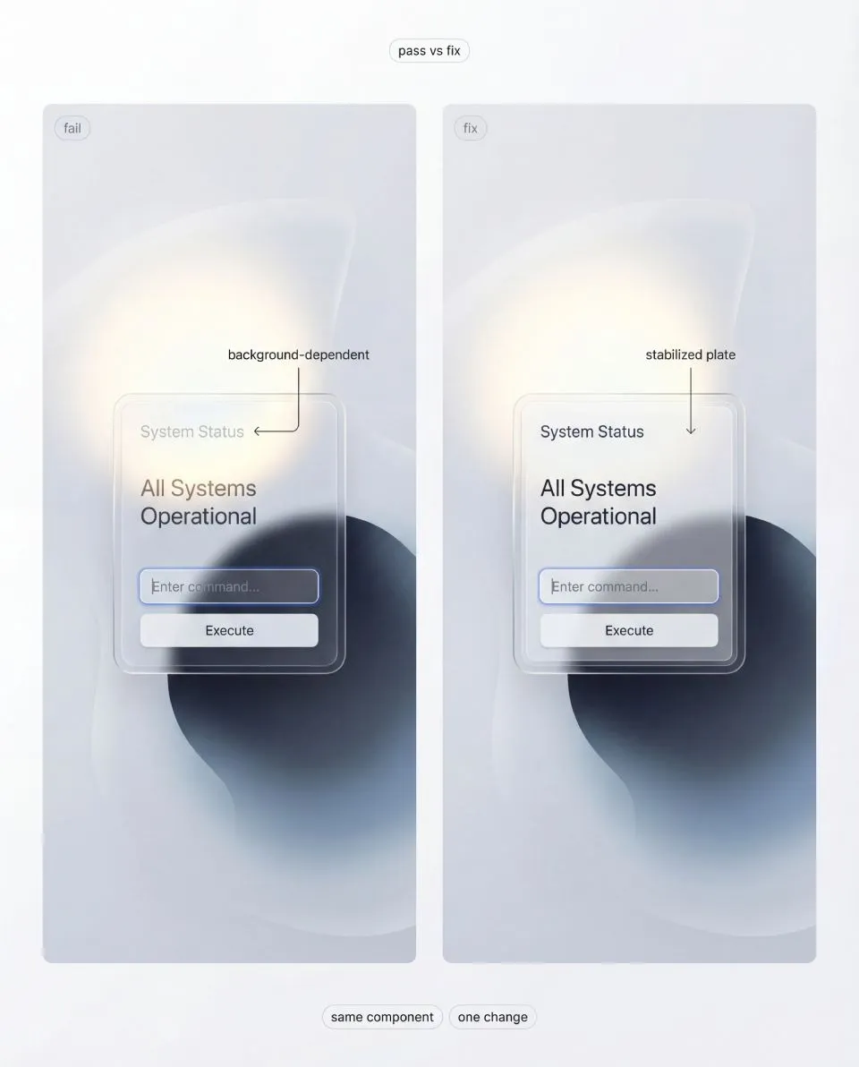
Pass vs fix: avoid per-screen opacity hacks. One controlled change, a stabilized plate under content, is what makes glass predictable across backgrounds. The full playbook turns this into repeatable “fix directions” and board templates in the complete playbook.
When fallback is disciplined, you gain freedom. You can push glass aesthetics in safe zones because the system has an escape hatch that still looks like part of the same design language.
3. Do and Don’t rules that make liquid glass shippable
This section is not a style gallery. It is a set of constraints that keep the material honest under stress.
If you follow these rules, you stop patching screens and you start building a repeatable system.
If you break them, your glass will still look impressive, but only in staged hero shots.
This free article includes 3 sample Do and Don’t rules to show the method. The full playbook includes the complete set, plus stress boards, tier mapping, state deltas, density checks, and a fallback system.
⒈ Build the stack first, then tune the blur
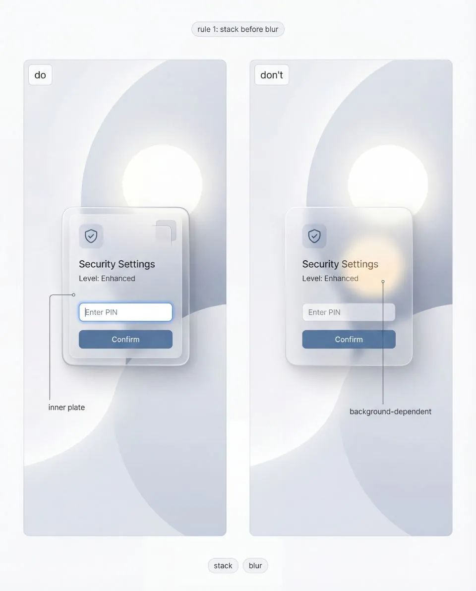
Blur removes detail, not risk, and it can amplify hotspots into bigger contrast problems. The full playbook explains how to tune plate strength and edges as a system.
Do: Treat liquid glass as a controlled stack with two responsibilities.
The outer shell exists to communicate material. The inner plate exists to protect content.
Don’t: Start with a blur slider and then try to rescue readability with random opacity tweaks.
☞ Blur removes detail, not risk.
It can actually enlarge bright hotspots and keep big shapes readable enough to compete with your UI.
What “pass” looks like: the same component remains readable across backgrounds without changing typography.
What “fail” looks like: you keep adjusting the whole card opacity per screen.
✔ Fix cue: If text becomes background-dependent, your inner plate is too weak.
Touch the plate first. Blur is a secondary control.
⒉ Stabilize text and icons with a dedicated plate
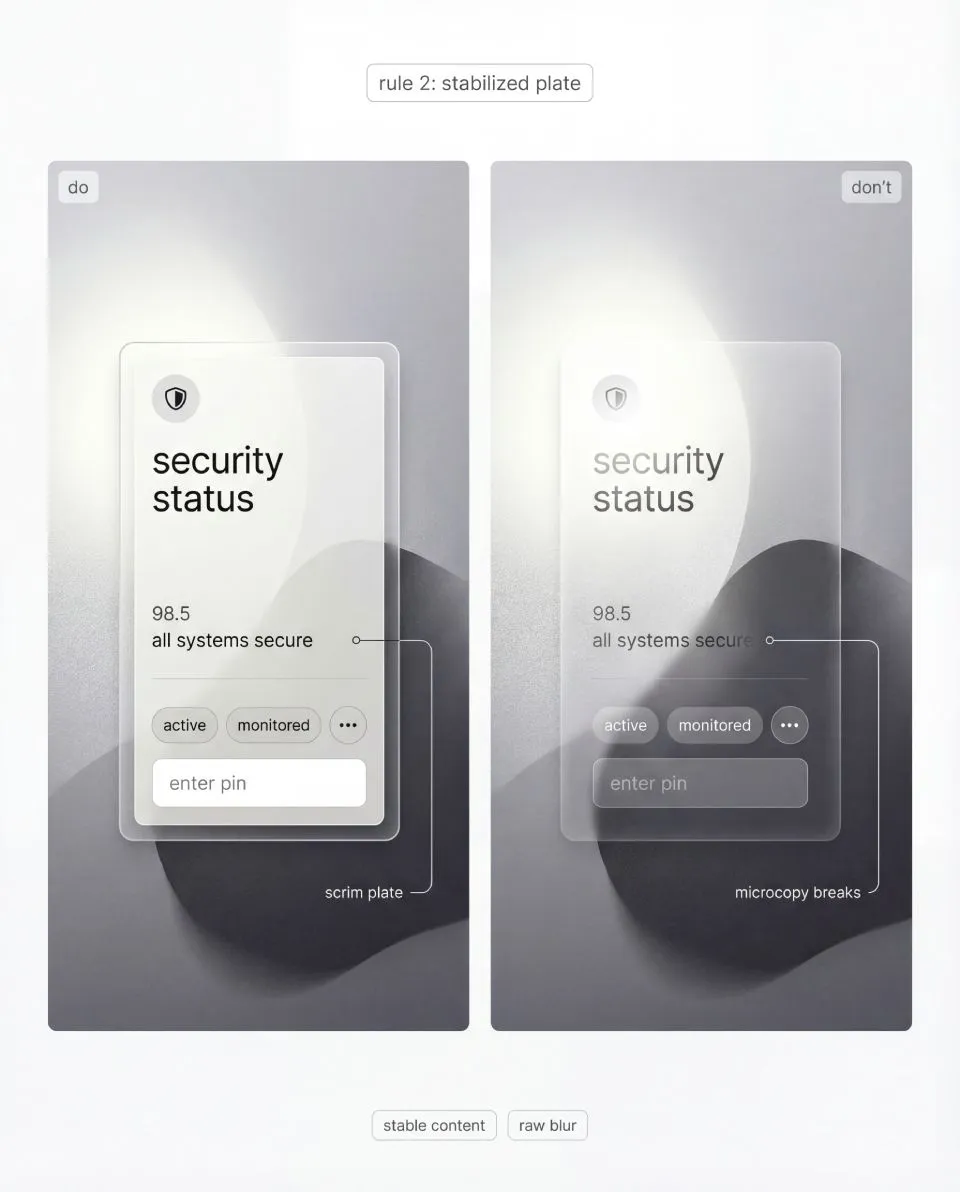
If microcopy fails, your system is not ready, no matter how premium the shell looks. The full playbook includes a production checklist and stress boards to verify this.
Do: Put content on a stabilized plate (scrim) that behaves predictably.
It should cover text, icons, helper lines, and small numerals, not just the title.
Don’t: Let text sit directly on raw blur because it looks “more transparent”.
☞ Raw blur is a trap.
It passes on calm gradients and fails on real content, which is how a system quietly turns into a collection of exceptions.
Pass: microcopy stays readable, even when background luminance changes behind the card.
Fail: you add a stronger drop shadow under text to compensate.
✔ Fix cue: Stabilize the content region, not the entire surface.
The goal is not opacity. The goal is stable contrast.
⒊ Make thickness visible with edge discipline
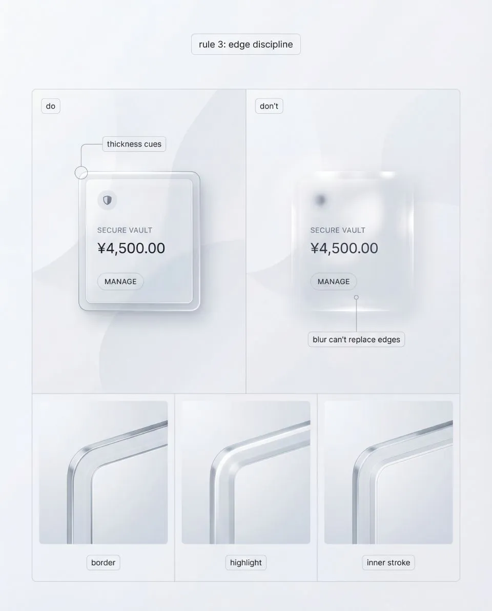
Border, highlight, and inner stroke do the heavy lifting for readability and material cues across components. The complete set of rules, boards, and troubleshooting is in Full Liquid Glass Playbook.
Do: Communicate thickness through repeatable edge cues.
A thin border edge defines the silhouette. A controlled highlight band implies light direction. An optional inner stroke suggests a cross-section. A quiet shadow provides elevation.
Don’t: Try to sell glass with heavier blur, bigger glow, or busier reflections.
☞ If thickness cues are missing, the surface reads as a soft overlay.
If they are inconsistent, the UI reads like stitched renders.
Pass: you can crop just the corner and it still reads as glass.
Fail: the surface only reads as glass when you see the whole card.
✔ Fix cue: Lock one baseline for border thickness and highlight behavior.Scale intensity via tiers, not improvisation.
⒋ Lock one light model across the system
Do: Choose one light direction and keep it stable across components.
Your highlights should feel like the same material under the same light, not like random reflections per card.
Don’t: Allow each component to invent its own highlight direction or reflection pattern.
☞ Random reflections do not make product UI “more realistic”.
They make it look like CGI, because the viewer reads inconsistency as rendering noise.
Pass: the system feels coherent even when you mix components on one screen.
Fail: two cards look like they were generated from different prompts.
Fix: If components feel like they live in different rooms, your light model is not locked.Fix the rule, not the screen.
4. Get the Liquid Glass UI Playbook
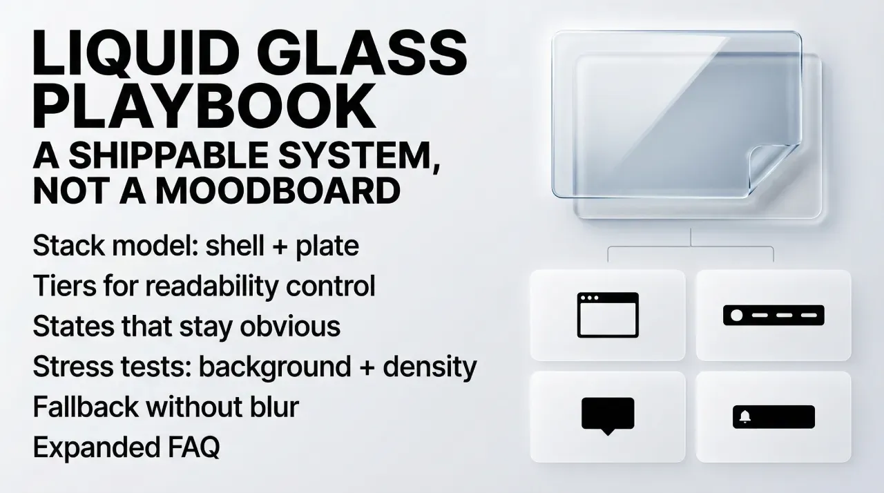
If you want the full system, not just the first three chapters, the complete “Liquid glass UI playbook” goes deeper into tiers, stress tests, and repeatable Do and Don’t rules you can apply to real component libraries. It is a paid release, because the value is in the full checklist and the production-grade visual boards.
Purchase (direct checkout): https://setproduct.gumroad.com/l/liquid-glass?wanted=true


