Name a bigger downgrade: The absence of depth in iOS UI design

Reminiscing on possible future directions for the iOS GUI design, particularly regarding the inclusion of a mix of flat and 3D design features.

Design Trends

Published on

June 15, 2023

|

2 mins read

Blog

iOS 17 design trends: More depth and shadows in Apple's mobile GUI

Navigation

Subscribe to newsletter

Thank you! Your submission has been received!
Oops! Something went wrong while submitting the form.

By subscribing you agree to with our Privacy Policy.

Share this post

Roman Kamushken

<span class="blog_big-paragraph">The absence of depth, shadows and elevation in iOS styleguides has been a topic of conversation and debate among UI designers for some time now.</span>

10 years ago, Apple Inc. took a big leap forward by introducing a whole new user experience design for its iOS operating system. One of the biggest changes was the removal of skeuomorphism, a design philosophy that imitated the look and feel of real-world objects. Its absence caused a stir among users and designers since then.

Though time has passed, some still argue that Apple should bring back the depth that was once a hallmark of their UI design. The release of iOS 17 has brought about a noticeable change in the GUI. We see increased use of shadows and a greater emphasis on depth, providing a more tactile and immersive experience for users.

This shift represents a departure from the flat, two-dimensional design that characterized earlier iOS releases, and has sparked a renewed interest in the importance of depth in UI design.

{{spacer-24}}

TL/DR

  • iOS 17 has brought about increased use of shadows and depth in UI design
  • This departure from flat, two-dimensional design offers a more tactile and immersive user experience
  • Incorporating depth in UI design has benefits and drawbacks
  • Benefits include improved usability and more engaging user experiences
  • Drawbacks include potential confusion for users and increased design complexity
  • Future iOS UI design may continue down this path, or shift to a different visual style
Name a bigger downgrade: The absence of depth in iOS UI design

{{spacer-64}}

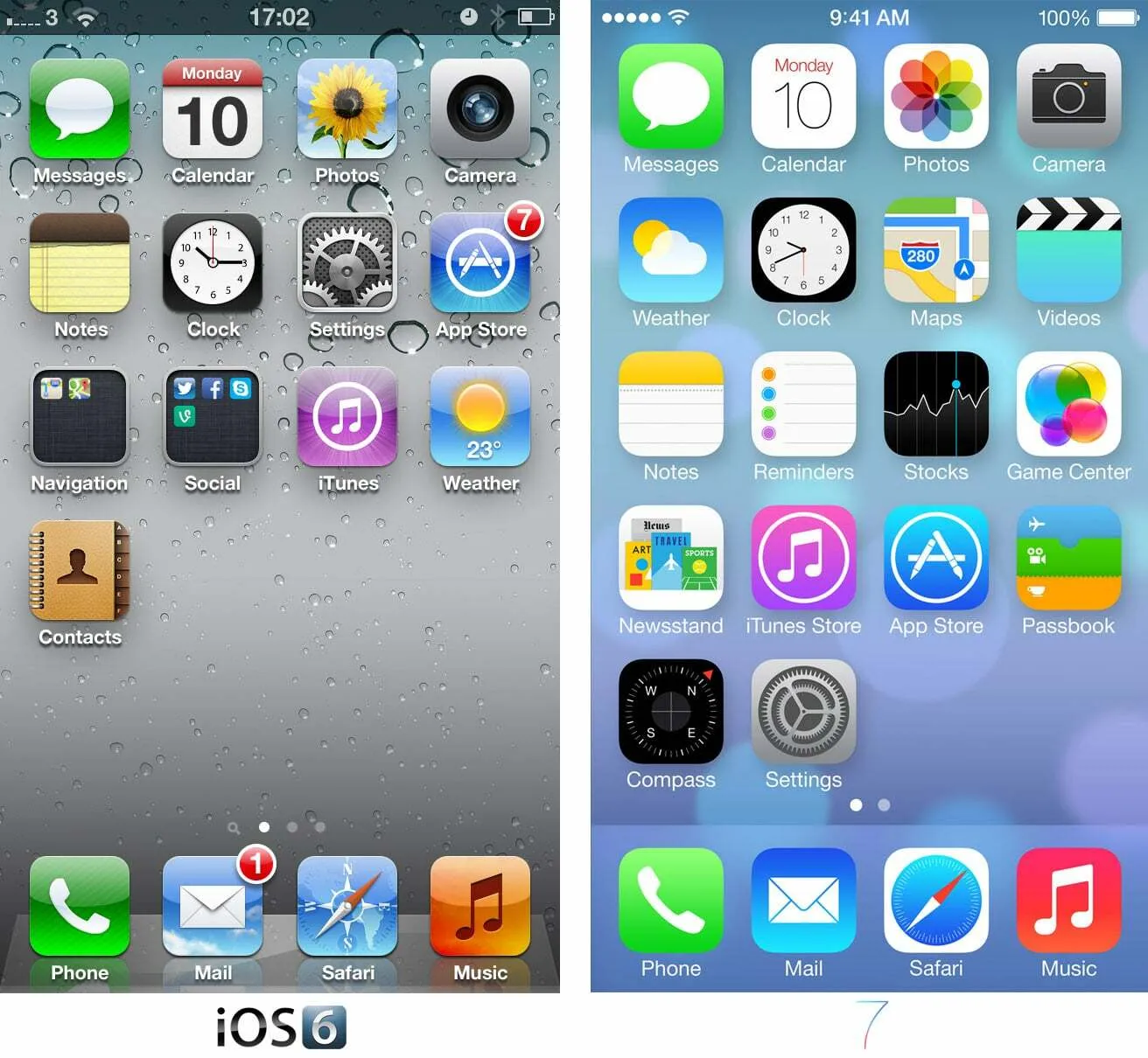
What's wrong with flat iOS

iOS 7+ lacks depth and texture, which has resulted in a less engaging user experience.

One of the major issues with the visual switch of iOS 7+ is the lack of depth and texture in the interface. This has resulted in a less engaging user experience for many users who prefer a more immersive, tactile experience and clear UI feedback.

The flat and two-dimensional UIs misse the opportunity to create a sense of depth and allows users to truly interact with the interface elements. As a result, users may find the UI less visually appealing and engaging, which could ultimately lead to decreased user satisfaction and retention.

Now we, the designers, dream to find ways to incorporate depth and texture back into the design while keeping usability and user experience in mind. By addressing this issue, we can improve the overall visual appeal and engagement for users.

{{spacer-24}}

Pros of skeuomorphic UIs

  1. Better user experience: Designs that mimic real-world objects provide a more immersive user experience. Skeuomorphic designs elevate user involvement. A good interface can even make us feel more connected to the world around us.
  2. Helps to onboard users: Skeuomorphic designs make the interface more intuitive and pleasant to use, especially for those who are new to the app or device.
  3. Familiarity: Skeuomorphic designs provide a sense of familiarity between the application and users familiar with the particular real-life object.

{{spacer-24}}

Cons

  1. Unnecessary ornamentation: Skeuomorphism can lead to unnecessarily complicated interfaces. Too over-detailed design elements can distract from the most important function of the application.
  2. Looks outdated: With so many advancements in digital technology, skeuomorphic designs can often look dated, out of style, and old fashioned. But why can't we reimagine them today?
  3. Distracting: Skeuomorphic elements can distract the user from the essential functionality of the application or system on which they are working.

{{spacer-64}}

The comeback of glossy interfaces

The trend in UI design continues to move towards minimalist design which removes textures, gradients, and shadows to create cleaner and flatter designs.

While skeuomorphism may not fit in well with a modern design approach, it may still find a niche for specific applications. Moreover, as virtual and augmented reality become more prevalent, the design philosophy of skeuomorphism could have a new life in creating more realistic environments.

With iOS 18, we may see even more components being given a sense of depth and texture through the addition of subtle shadows or other effects. This could be a response to some recent design trends that have been moving away from the overly flat or simplistic design style that has been prevalent in the past. Instead, there seems to be a growing emphasis on creating a more immersive and engaging visual experience, even if this means sacrificing some of the simplicity and minimalism that has defined Apple's design philosophy for so long.

{{spacer-64}}

To consider the depth, or not?

The arguments for and against skeuomorphism in UI design are compelling. Although Apple's current UI design approach is comparatively flat, the loss of skeuomorphism and visual depth from earlier iOS versions is missed by many users.

Nonetheless, this does not make skeuomorphism the most appropriate design concept for all applications. The best design is one that serves the needs of the users and the purpose of the application without interfering with its use.

But if history has taught us anything, it's that we should never forget where we came from. Bringing back the depth we once had in iOS design can help us forge a better user interface design future.

<span class="blog_big-paragraph">Designers will need to find ways to incorporate depth and texture back into the interface design while keeping usability and user experience in mind
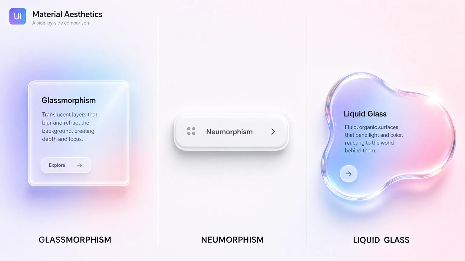
</span>

{{stars-conclusion}}

Share this post

Subscribe to Setproduct

Once per week we send a newsletter with new releases, freebies and blog publications
Oops! Something went wrong while submitting the form.

By clicking Sign Up you're confirming that you agree with our Terms and Conditions.

Congratulations!

You're in! Expect awesome updates in your inbox

Related posts

Lorem ipsum dolor sit amet, consectetur adipiscing elit.
No items found.

Figma Templates & UI kits

Save time and human resources by reusing hundreds of pre-made templates crafted by us. Based on top notch UX taken from the World's best apps.

Material X for Figma

Figma library with 1100+ components & 40 app templates beyond Material Design. Powered by top-notch shapes and Manrope font. Customizable & Adjustable UI kit now available for Angular & Figma

Material You UI kit

Figma & React library with 2600+ variants of 32 components compatible with Material Design 3. Plus 220+ dashboard templates for all the viewports. Now available for NextJS & TailwindCSS.

Figma React UI kit

Designed and well-organized in Figma React-based UI toolkit for the web. Optimized for building complex data-dense interfaces for desktop and mobile applications.

Panda Design System

Figma library with dashboard, calendar, kanban, profile, table, ecommerce and 80+ templates in total. Components with variants, dark theme included.

Eclipse UI kit

Figma library with 1100+ components & 74 templates for data-driven web applications. Powered by auto-layout. Supercharged by Figma's variants.

Rome UI kit for Figma

Customizable and well-organized team library. Contains 250+ components & 30 web app templates powered by stylish and trendy guidelines.

Material Design System

Figma library is based on 100% guidelines compliance with Material.io. Contains ready‑to-use templates to accelerate app UI design.

Neolex Dashboard UI kit

Customizable & adjustable dashboard design system with 50+ ready-to-use app layouts, 1900+ variants for 30 components with auto-layout.

Material Desktop Dashboard UI kit

Figma library with 48+ dashboard templates based on reusable desktop app patterns carefully handpicked from the most popular web apps.

Xela UI kit for Figma

Figma library with 1900+ variants of 30 components categories to craft perfectly shaped desktop & mobile apps. Customizable & Adjustable dashboard design system with 50+ web app templates.

Figma S8 Design System

Figma design library for mobile and desktop apps made of high quality styled components. Full version includes 67 dashboard templates.

OE Figma Design System

Customizable and well-organized Figma library. This design system aimed to build highly loaded interfaces, boost the speed and save more costs.

Figma iOS kit

Figma library of iOS patterns served as ready-made templates. This UI kit inspired by World's best apps. Based on Human Interface guidelines.

Figma S8 Design System

Figma design library for mobile and desktop apps made of high quality styled components. Full version includes 67 dashboard templates.

Most iOS UI kit for Figma

iOS native components and app templates organized into a «Most Design System» fully compatible with Apple's Human Interface guidelines.

Rome UI kit for Figma

Customizable and well-organized team library. Contains 250+ components & 30 web app templates powered by stylish and trendy guidelines.

Material Design System

Figma library is based on 100% guidelines compliance with Material.io. Contains ready‑to-use templates to accelerate app UI design.

Nucleus UI

Nucleus UI contains 1000 components and variants with 500+ mobile screens designed for Figma (including 9 themes from Event, E-commerce, Finance, NFT, etc.).

Figma Android UI kit

Components-driven Android mobile UI library for Figma. Consists of 140 high quality application templates made of total 250+ UI components.

Mobile X UI kit

Customizable & adjustable iOS / Android design system loaded with ready-made 157 app templates based on 860+ variants for 20 components.

Appka iOS UI kit

Customizable & adjustable iOS design system with 4100+ variants for 28 components and 280+ ready-to-use app layouts crafted for Figma.

Full iOS UI kit

Customizable iOS design system with 320 ready-to-use app layouts. You can modify them or use as it is to save time and never design from scratch again.

Xela for Flutter

XelaUI for Flutter is a simple, modular and accessible component library that gives you the building Flutter apps for mobile and desktop.

Xela for Android

Ready-made collection of fully customizable widgets, UI screens and reusable components for Android coded with Jetpack Compose.

Xela for Swift

Designed for iOS Developers. We provide fully coded customizable components, widgets and well-organized iOS screens for Figma & SwiftUI.

Material You UI kit

Figma & React library with 2600+ variants of 32 components compatible with Material Design 3. Plus 220+ dashboard templates for all the viewports. Now available for NextJS & TailwindCSS.

Figma Charts UI kit

Components-driven graphs design kit for dashboards, presentations, infographics & data visualisation. Includes 25+ charts types for all the viewports.

Hyper Charts

Create impressive visuals with Figma's graphs templates – dozens of scalable and customizable data visualization blocks for dark and light modes.

Orion UI kit

Figma library with 40+ full-width charts templates served in light & dark themes. Contains 200+ of dataviz widgets that look perfect on desktop & mobile screens.

Xela for React

React based components library for beautiful user interface in React apps. Lightweight library for your projects. Contains pre-made web app templates.

Figma React UI kit

Designed and well-organized in Figma React-based UI toolkit for the web. Optimized for building complex data-dense interfaces for desktop and mobile applications.

Material X for Figma

Figma library with 1100+ components & 40 app templates beyond Material Design. Powered by top-notch shapes and Manrope font. Customizable & Adjustable UI kit now available for Angular & Figma

Xela for Flutter

XelaUI for Flutter is a simple, modular and accessible component library that gives you the building Flutter apps for mobile and desktop.

Xela for Android

Ready-made collection of fully customizable widgets, UI screens and reusable components for Android coded with Jetpack Compose.

Xela for Swift

Designed for iOS Developers. We provide fully coded customizable components, widgets and well-organized iOS screens for Figma & SwiftUI.

Material You UI kit

Figma & React library with 2600+ variants of 32 components compatible with Material Design 3. Plus 220+ dashboard templates for all the viewports. Now available for NextJS & TailwindCSS.

Xela for React

React based components library for beautiful user interface in React apps. Lightweight library for your projects. Contains pre-made web app templates.

Levitate 3D kit for Figma

Components-driven 3D kit to design eye-catching Figma presentations. Helps to enhance your landing page, product or app, brand ident, etc.

Website templates UI kit

Landing pages reusable templates kit based on most effective web design patterns. 140+ dark & light constrained design blocks.

Figma Landing Pages UI kit

Landing pages templates library based on constrained & organized components aimed to speed-up the production of effective websites.

Zeus UI kit

Create hassle-free landing pages in Figma. This kit is based on 10 landing page templates, powered by 1600+ variants for 630+ web blocks.

Research, copy and ideate with SetGPT!

We've launched the alternative ChatGPT clone dedicated to UI designers, UX researchers, writers and indiehackers.

Powered by the latest OpenAI gtp-3.5-turbo model, this free chatbot is the perfect tool for those in need of intelligent and innovative insights, wrapped with a slick UI and sophisticated user experience.

Start now

SetGPT is a free service; however, authentication is required

This is some text inside of a div block.