


Roman Kamushken
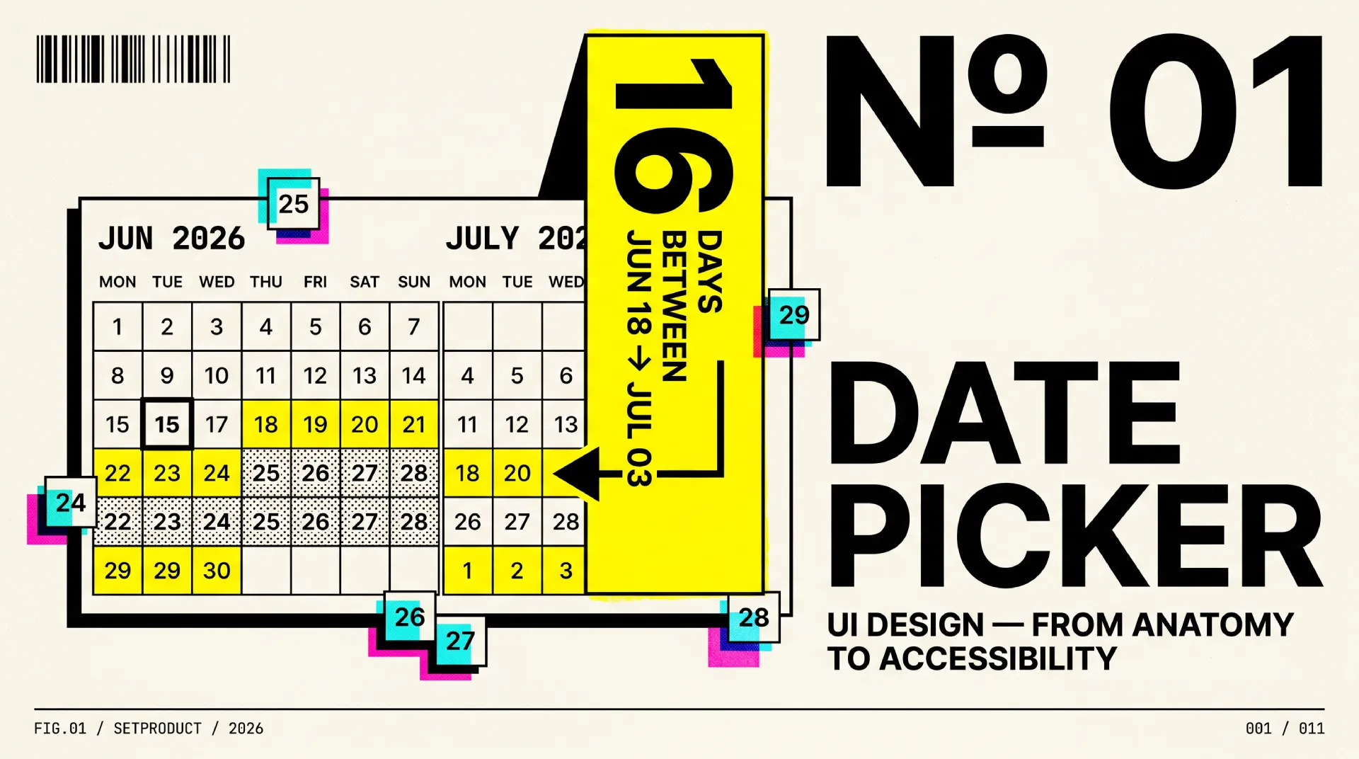
A date picker is a control that lets someone choose a date, or a span of dates, from a calendar surface instead of typing raw characters into a field. This guide is the long version. It covers anatomy, every type, states, range selection, accessibility, internationalization, and the mobile trade-offs that decide whether picking a date feels effortless or like a small fight.
I have shipped date pickers inside dashboard UI kits for years, and the failure is almost never the happy path. The single-date, this-month case looks fine in every demo. The cracks show at the edges, so this is the reference I wish I could hand to a client before the first design review.
TL;DR
→ Reach for a date picker when the calendar context helps the choice, like booking or scheduling. For a known, fixed date such as a birthday, a plain typed input is faster and a calendar just slows people down.
→ Range selection is its own pattern, not a single picker used twice. On desktop, show two months side by side so a span that crosses a month boundary is selectable without hunting.
→ Accessibility is decided by structure. Real focus management, arrow-key grid navigation, and labeled day cells give keyboard and screen-reader support. The W3C ARIA date picker dialog pattern is the spec to follow.
→ On mobile, the native picker usually wins on accessibility and familiarity. Build a custom one only when ranges, presets, or business rules demand it.
→ The anti-patterns I flag most: a calendar-only field with no typing fallback, an ambiguous date format with no hint, and disabled days with no explanation. Each one quietly costs you completed entries.
What a date picker is (and is not)
A date picker is a focused selection tool. Its whole job is to capture one date or a range and hand that value back to a form, a filter, or a query. It opens, you choose, it closes. The calendar grid is a means to an end, not the destination.
This is where teams get confused, because three different components all show a grid of days and look superficially alike. They solve different problems.
A date input is the plain text field. Someone types 03/14/2026 and moves on. No popover, no grid, just a field with a format. It is the fastest path for a date the user already knows by heart.
A date picker adds a calendar surface so the user can see and click a day in context. It shines when the date depends on surrounding days, weekday, or availability, like choosing the next free Tuesday or a check-in that avoids a sold-out night.
A calendar is a different animal. It is an event-management surface, closer to a Gantt chart than to an input. Google Calendar does not capture a value and close; it displays a timeline of meetings and tasks that you read, scan, and manage. If your component returns a value to a form, it is a picker. If it visualizes events across time, it is a calendar.
| Aspect | Date input | Date picker | Calendar |
|---|---|---|---|
| Primary job | Type a known date | Choose a date in context | Manage events over time |
| Surface | Single text field | Field plus calendar popover | Full month, week, or day view |
| Returns | A value to a form | A value to a form | Nothing; it is a view |
| Best for | Birthdays, expiry dates | Bookings, scheduling, filters | Planners, agendas, timelines |
| Typical example | Checkout card expiry | Airbnb check-in or check-out | Google Calendar week view |
The practical takeaway: pick the lightest tool that fits. If you only need a value the user already knows, a styled date input beats a calendar popover. If the choice needs surrounding context, you want a picker. If people need to read and arrange events, you want a calendar, which I covered separately. The rest of this guide is about the middle one.
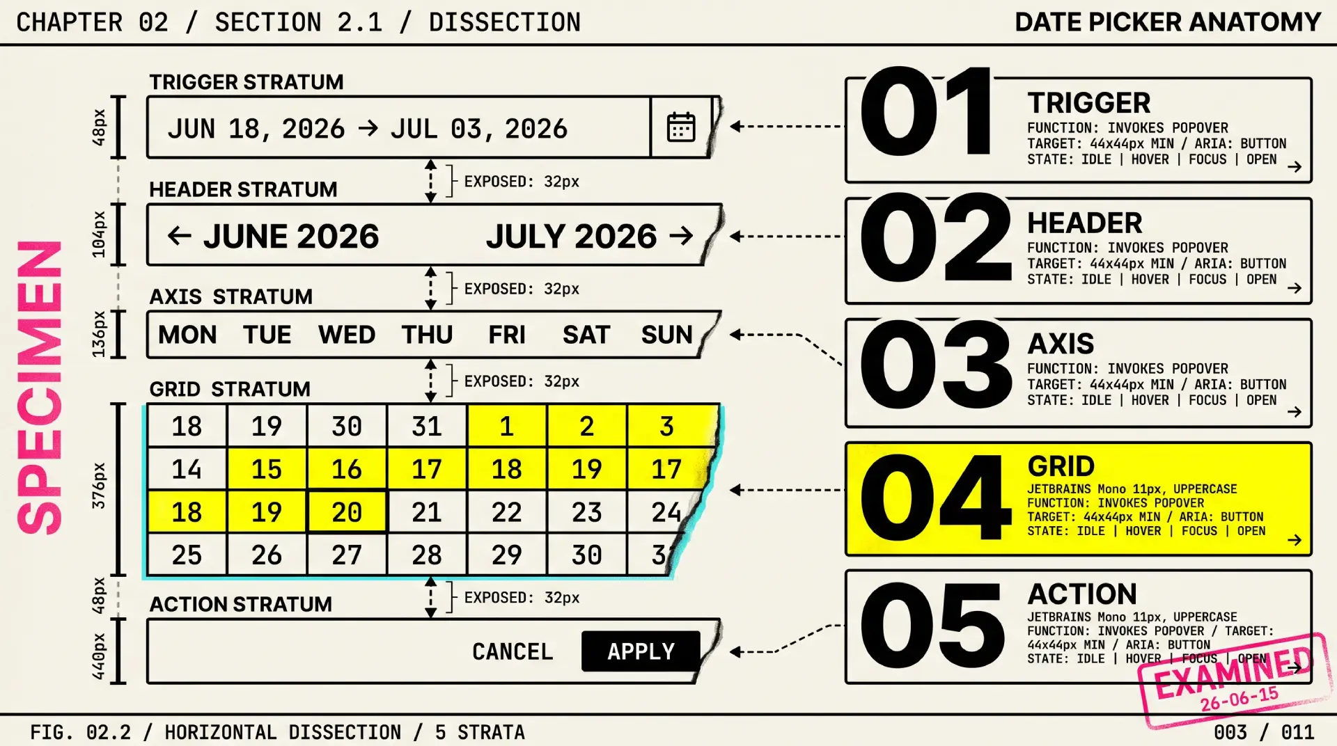
Anatomy of a date picker
A date picker looks simple until you list its parts. Each one carries a job, and skipping any of them is where pickers start to feel cheap. Here is the full set, with a design note on each.
• Trigger field. The input that opens the picker. It should show the current value in a readable format and stay editable for people who would rather type. A bare icon with no field is a guessing game; pair the icon with a real input.
• Calendar popover. The floating surface that holds the grid. Anchor it to the trigger, flip it when it would clip the viewport edge, and give it enough elevation to read as a layer above the page without drowning the content in shadow.
• Month and year header. The label that tells people where they are. Make the month and year directly clickable to jump to a month grid or year grid. Forcing twelve clicks of a chevron to move one year is the single most common date picker sin.
• Previous and next navigation. The chevrons that step one month at a time. Keep the hit area generous, label them for assistive tech, and disable the one that would cross a min or max boundary instead of letting people walk into dead months.
• Weekday row. The Mon–Sun header above the grid. It anchors the columns and must respect locale, because the first day of the week is not universal. Keep the labels short but unambiguous.
• Day grid. The 7-column matrix of dates. Align days to their weekday columns, dim the leading and trailing days that belong to adjacent months, and keep every cell a consistent size so the grid never reflows as months change length.
• Day cell. The atomic unit people actually click. It carries the heaviest state load in the whole component: default, hover, focus, today, selected, in-range, and disabled. Size it for touch, not just for the mouse.
• Today marker. A persistent hint of the current date, usually a ring or a dot. It gives people an anchor to orient from. Keep it visually distinct from the selected state so the two never blur together.
• Range highlight. The connected band between a start and end date. It needs distinct treatment for the two endpoints and the days between them, and it has to survive the hover preview while someone is mid-selection.
• Preset shortcuts. Optional quick picks like Today, Last 7 days, or This month. In analytics and reporting tools these are not a nice-to-have; they are the fastest path to the date most people actually want.
• Footer actions. Apply, Cancel, and Clear. Decide deliberately whether selection commits instantly or waits for an explicit Apply. Ranges usually want an explicit commit so a half-finished selection never leaks into the query.
Types of date pickers
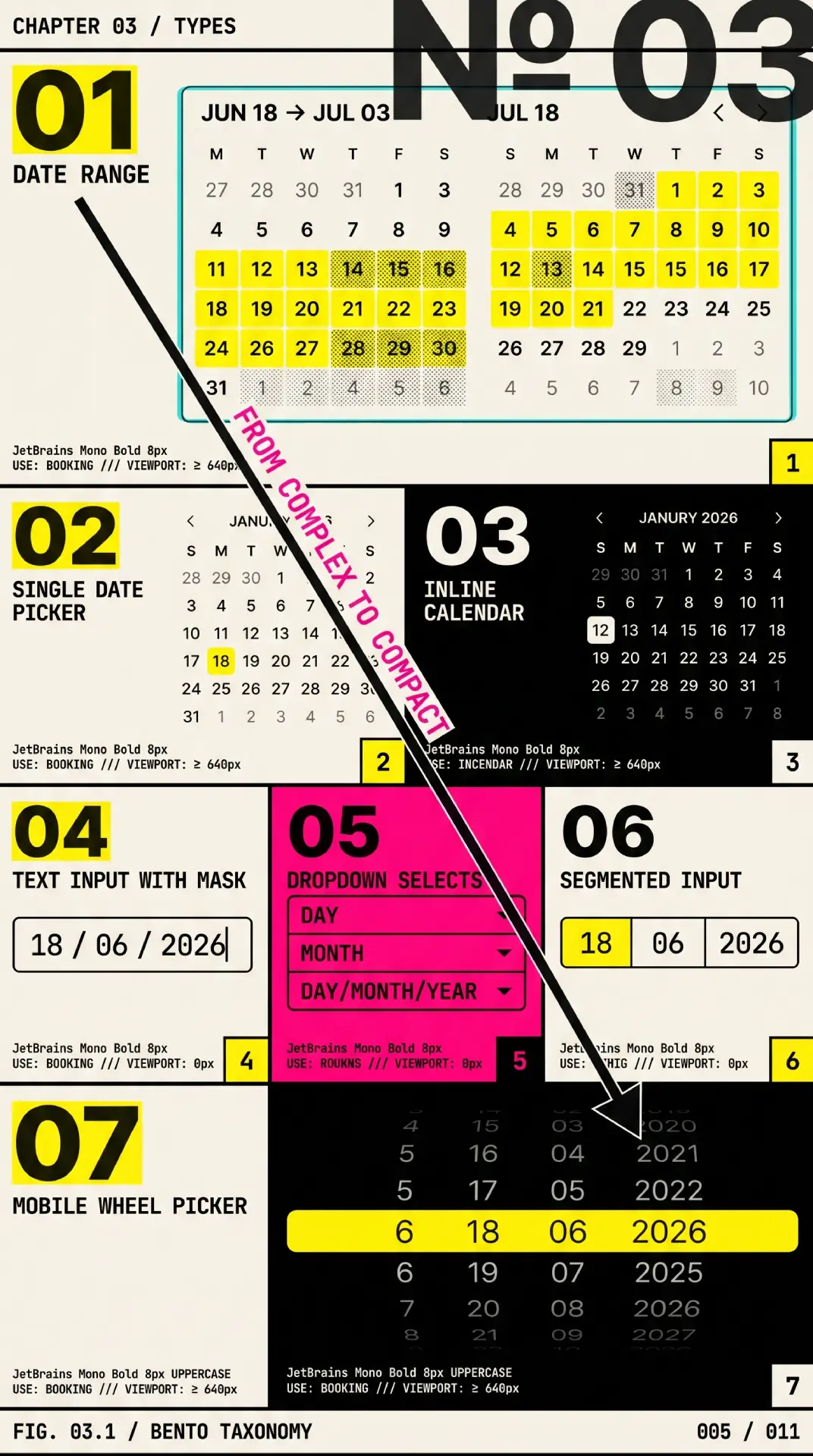
There is no single correct date picker. There is the one that fits the task. Picking the wrong type is how you end up with a booking flow that cannot span two months, or a birthday field that makes someone tap a back arrow forty times. Here are the seven that cover almost every product need.
❶ Single date picker. One date in, one value out. The default for due dates, publish dates, and appointment slots. Keep it boring and fast; this is the type people meet most often, so it sets their expectation for the rest.
❷ Date range picker. A start and an end, selected as a connected span. This is the type with the most edge cases: hover previews, endpoint styling, and the desktop rule of showing two months at once. Airbnb and Booking.com live or die on this pattern.
❸ Date and time picker. A date plus a time-of-day control, for scheduling that needs both. Google Calendar's event creation and most meeting tools combine a day grid with a time field or wheel. Keep the two controls visually grouped so they read as one decision.
❹ Inline picker. The calendar sits open on the page with no popover and no trigger. Good when date selection is the primary task of the screen, such as a booking step, where hiding the calendar behind a field would only add a click.
❺ Segmented or dropdown input. Separate fields or dropdowns for day, month, and year. It dodges format ambiguity entirely, which is why it is common for dates of birth. The trade-off is more taps, so reserve it for known dates rather than exploratory ones. It borrows the same logic as a dropdown component.
❻ Native mobile picker. The OS-provided control from <input type="date"> on the web, or the platform wheel on iOS and Android. It costs almost nothing, inherits platform accessibility, and feels instantly familiar. For single dates on mobile it is usually the right default.
❼ Scrolling or wheel picker. The spinning columns familiar from iOS. Excellent for quick, near-term dates on touch, weaker for dates far in the past or future where scrolling becomes a chore. Apple's Human Interface Guidelines cover this pattern in detail.
| Type | Best for | Real example |
|---|---|---|
| Single date | Due dates, appointments | Linear issue due date |
| Date range | Bookings, analytics windows | Airbnb stay dates |
| Date and time | Scheduling meetings | Google Calendar event |
| Inline | Date-centric screens | Booking.com search step |
| Segmented input | Date of birth, known dates | Government and KYC forms |
| Native mobile | Single dates on phones | iOS Safari input type="date" |
| Wheel | Quick near-term touch picks | iOS alarm and timer |
Real products mix these freely. Notion uses a popover single picker for a date property and switches to a range when you toggle "end date." Stripe's dashboard pairs a range picker with presets so finance teams jump to "last month" without touching the grid. Google Analytics put the dual-month range with presets next to a comparison toggle, which is close to the canonical analytics date picker. Study the ones you trust, then copy the structure, not the pixels.
States and interactions

The day cell is where a date picker earns or loses trust, because it has to communicate a lot in a tiny square. A cell that does not clearly say "you can pick me," "you already picked me," or "you cannot have me" leaves people guessing, and guessing on a date is how bookings get cancelled.
Every day cell needs to handle this full set of states, and each must be distinguishable from the others without relying on color alone:
→ Default. Idle and selectable. Quiet enough that the grid reads as a calm field, not a wall of buttons.
→ Hover. A soft background or outline that confirms the target under the cursor before the click lands.
→ Focus. A visible focus ring for keyboard users. This is non-negotiable; without it, arrow-key navigation is invisible and the picker is unusable without a mouse.
→ Today. A persistent marker, distinct from selection, that anchors people to the current date.
→ Selected. The committed choice, the loudest state in the grid. A single date gets a solid fill; in a range it marks the endpoints.
→ In-range. The days between a start and end, shown with a lighter band that reads as connected without competing with the endpoints.
→ Disabled or out of range. Days outside the allowed window, past a max, or blocked by availability. Dim them, and crucially, hint at why. A blocked day with no explanation reads as a bug.
The interaction model matters as much as the states. Opening the picker should move focus into the grid and land it on the selected date, or today if nothing is selected. From there the keyboard does the work: arrow keys move day by day, Page Up and Page Down jump a month, Home and End reach the start and end of a week, and Escape closes without committing. A click or Enter selects. For ranges, the first click sets the start, a hover previews the span, and the second click locks the end, with a guard so an end before the start either swaps or resets cleanly rather than producing a negative range.
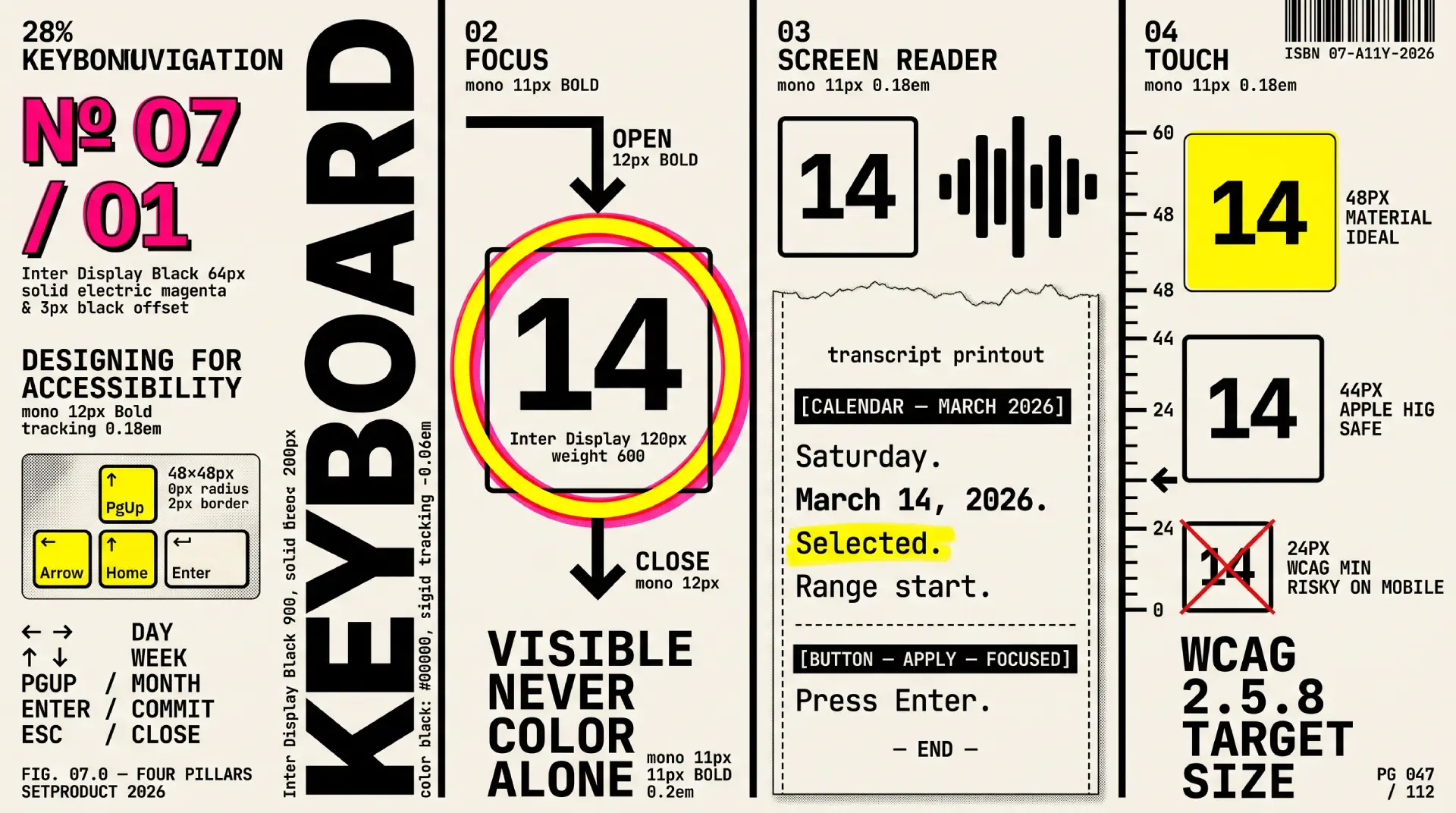
Designing for accessibility
A date picker is one of the harder components to make accessible, which is exactly why so many ship broken. A grid of clickable days that only works with a mouse excludes everyone who navigates by keyboard or screen reader. The good news: the patterns are well documented, so you are following a spec, not inventing one.
Start with the canonical reference. The W3C ARIA Authoring Practices date picker dialog example defines the expected structure, roles, and keyboard behavior, and the underlying grid pattern governs how the day matrix is navigated. Build to those and you inherit decades of assistive-technology testing.
Keyboard navigation. Every action must be reachable without a mouse. Arrow keys move within the grid, Page Up and Page Down change month, Shift with those keys changes year, Home and End jump to week boundaries, Enter or Space selects, and Escape dismisses. Tab should move between the controls in the dialog, not trap people inside the grid with no way out.
Focus management. When the picker opens, move focus into the calendar and place it on a sensible day. When it closes, return focus to the trigger that opened it. Focus must be visible at every step, with a ring that never relies on color alone, in line with the contrast requirements in the WCAG 2.2 standard.
Screen reader support. Each day cell needs an accessible name that reads the full date, like "Tuesday, March 14, 2026," not just the number 14. Announce the visible month and year as the user navigates between months, and use a polite live region so that selecting a date or completing a range is spoken aloud. Mark disabled days with aria-disabled so they are perceivable rather than silently skipped.
Touch target size. Day cells are small by nature, which makes them a target-size risk. The WCAG 2.2 target size minimum, success criterion 2.5.8, sets a floor of 24 by 24 CSS pixels, and platform guidance such as Material Design and Apple's HIG pushes toward 44 to 48. On mobile especially, give each cell room so people are not tapping the day next to the one they meant. When the native control is an option, the platform handles all of this for you, which is one more argument for <input type="date"> on phones, documented on MDN.
Internationalization
Dates are deceptively local. A picker that feels obvious to a designer in one country can mislead a user in another, and the failure is silent: people do not report confusion, they just book the wrong day. If your product crosses borders, these are the variables to design around.
Date format. The string 03/04/2026 means March 4 to an American and April 3 to most of Europe. That ambiguity is a real source of wrong dates, not a pedantic footnote. Show the month as a word where you can, offer ISO 8601 (2026-03-04) in technical contexts, and let the Intl.DateTimeFormat API localize the display rather than hard-coding one order. When you must show a numeric format in an input, label its expected pattern next to the field.
First day of the week. It is not universally Monday. Much of the United States and Canada starts the week on Sunday, parts of the Middle East start on Saturday, and the ISO standard starts on Monday. Hard-coding one shifts every column for half your users, so derive it from locale.
Right-to-left layouts. In Arabic, Hebrew, and other RTL locales, the whole grid mirrors. The week reads right to left, the previous and next chevrons swap sides, and the range direction flips with it. Test the picker in an RTL locale instead of assuming a flipped stylesheet handles it.
Non-Gregorian calendars. Some audiences expect a Hijri, Buddhist, Persian, or Japanese-era calendar, sometimes alongside the Gregorian one. You may not need this on day one, but know whether your market does before you bake the Gregorian grid in as the only option.
A note on timezones. This is where date pickers quietly corrupt data. A user in Tokyo picking "March 14" and a server interpreting that midnight as UTC can land the value on March 13. The rule of thumb: store an unambiguous value, typically UTC or a date-only string with no implied time, and convert for display at the edges. Decide explicitly whether the date is anchored to the user's timezone, the event's timezone, or no timezone at all, because "it depends" is how off-by-one-day bugs are born.

Mobile vs desktop UX
A date picker that works on a 1440px dashboard rarely survives a 375px phone unchanged. The screen is smaller, the input is a thumb instead of a cursor, and the operating system already ships a perfectly good picker of its own. The central decision on mobile is whether to use the native control or build a custom one.
The native control, from <input type="date"> or the platform wheel, is free, familiar, and accessible out of the box. It inherits the OS keyboard, voice control, and target sizes, and people already know how it behaves. Its limits are real, though: you get almost no styling control, range selection is poor or absent, and you cannot add presets or custom business rules. A custom picker buys you all of that flexibility and pays for it in code, accessibility work, and testing across devices.
| Factor | Native picker | Custom picker |
|---|---|---|
| Effort | Near zero | High, plus ongoing maintenance |
| Accessibility | Inherited from the OS | You own every bit of it |
| Familiarity | Matches the user's phone | Has to be learned |
| Styling control | Minimal | Full |
| Range support | Weak or missing | Full, if you build it |
| Best for | Single dates, birthdays | Ranges, presets, complex rules |
My default: use the native control on mobile for single dates, and reach for a custom picker only when the task genuinely needs a range, presets, or rules the platform cannot express. On desktop the calculus flips, because a popover calendar with two months and presets is both expected and easy to operate with a mouse and keyboard.
Two desktop-specific rules earn their keep. First, for ranges, render two months side by side. A user booking the last night of one month and the first night of the next should never have to select a start, navigate forward, and then find the end; both endpoints should be visible at once. Google Analytics and most booking sites do this for a reason. Second, give analytics and reporting pickers a column of presets, because "last 30 days" is one click where the grid is four.
Common anti-patterns
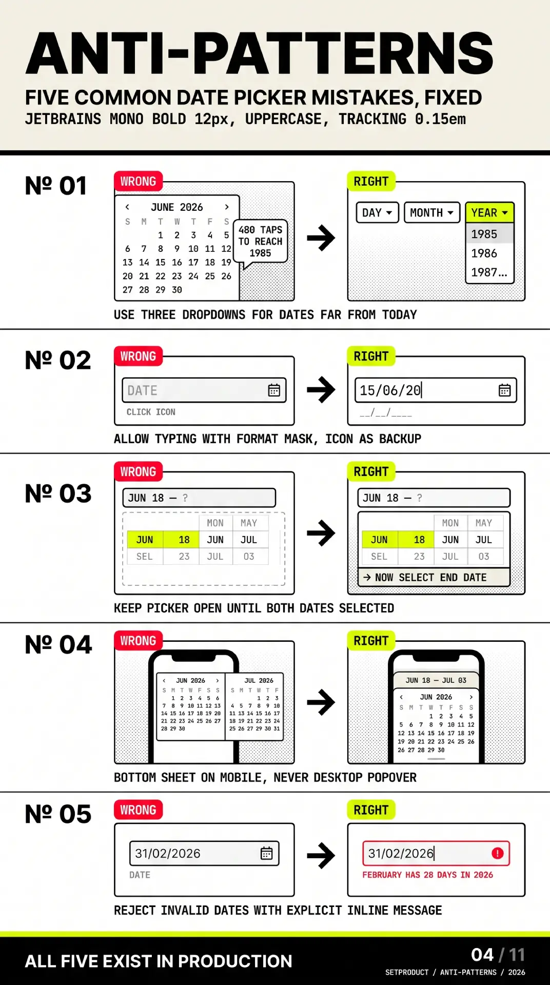
Most date pickers fail in the same predictable ways. After auditing dozens of them across dashboards and booking flows, these are the mistakes that show up again and again. Each one is fixable, and each one quietly costs you completed tasks.
☞ Forcing the calendar when typing is faster. A date of birth does not belong behind a grid that opens in the current month and makes the user page back forty years. Let people type it. Reserve the calendar for dates where seeing the surrounding days actually helps.
☞ No typed input at all. Power users live on the keyboard. A picker that only accepts clicks forces a mouse detour for a value they could have typed in two seconds. Accept text and validate it; the calendar is the fallback, not the only door.
☞ Hiding why a day is disabled. A greyed-out date with no explanation reads as a broken control. If a day is unavailable, say so on hover or focus, "booked," "past the cutoff," "minimum stay not met," so the dim state is information rather than a dead end.
☞ Closing the popover on the first click of a range. If selecting a start date dismisses the calendar, the user has to reopen it to pick the end. Keep the popover open through both clicks and preview the span on hover between them.
☞ A single month for range selection on desktop. Picking a span that crosses a month boundary in a one-month view means select, navigate, hunt, select. Show two months. The screen has room and the task demands it.
☞ Ambiguous numeric formats with no guidance. Shipping 03/04/2026 to a global audience guarantees some users read it backwards. Spell the month, or label the expected pattern next to the field, or both.
☞ Tiny tap targets on mobile. Cramming a full month grid into a phone width produces day cells too small to hit reliably. Honor the WCAG 2.2 target size minimum of 24 pixels, aim higher, and lean on the native control when you cannot.
☞ Reinventing the wheel and skipping accessibility. A hand-rolled grid of divs with click handlers will not announce dates, will not take keyboard input, and will fail an audit. If you build custom, build to the ARIA APG date picker pattern from the start, not as a retrofit.
☞ Timezone-naive storage. Saving "the date the user clicked" without deciding which timezone it belongs to produces off-by-one-day bugs that surface only for users far from the server. Store an unambiguous value and convert at the edges.
☞ No today, no clear, no escape hatch. A picker with no "today" shortcut, no way to clear a wrong selection, and no Escape to back out makes the user fight it. These three affordances are cheap and people expect them.
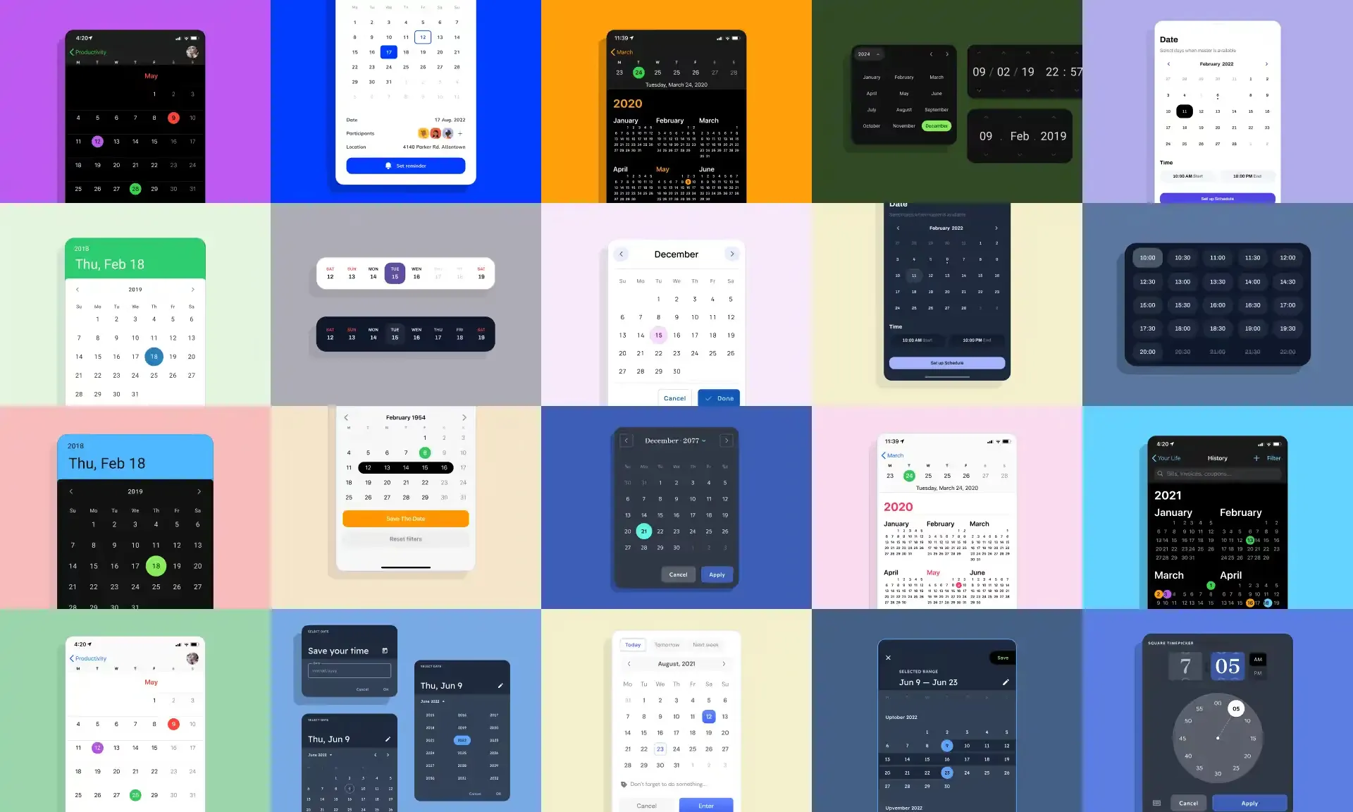
If you want to see correct versions of these states rendered rather than described, the Setproduct date picker gallery shows default, hover, focus, selected, range, and disabled days as live components you can inspect.
Implementation considerations
Design does not end at the mockup. The choice between native, headless, and full-featured libraries shapes how much of the accessibility and internationalization work above you actually have to do yourself, so it is worth deciding early rather than discovering the cost mid-build.
The honest first question is whether you need a custom picker at all. For a single date on mobile, <input type="date"> is almost always the right answer, and even on desktop it is a defensible default for simple forms. You only graduate to a library when you need ranges, presets, multi-month views, or tight visual control. When you do, the field sorts into three rough tiers.
| Approach | What you get | What you own | Good fit for |
|---|---|---|---|
| Native input | Zero-cost, accessible, familiar | Almost nothing | Single dates, simple forms |
| Headless (e.g. React Aria, Radix) | Behavior, a11y, keyboard, state | All of the styling | Design systems with a custom look |
| Full component (e.g. MUI, Ant) | Behavior plus a finished UI | Theming within their system | Shipping fast on an existing kit |
Headless libraries are the sweet spot for teams with a design system: you inherit the hard accessibility and keyboard work and paint your own surface on top. Full component libraries trade flexibility for speed, which is the right deal when you are matching an existing kit rather than inventing one. Whatever you pick, validate it against the same checklist you would apply to your own build, since a popular package is not automatically an accessible one.
This is also where a production design kit saves weeks. The date pickers in the Eclipse dashboard UI kit ship with every state, range behavior, and preset column already designed and wired to component properties, so the handoff to engineering starts from a correct baseline instead of a blank grid.
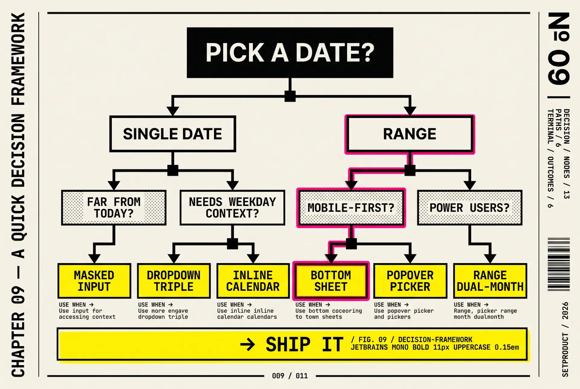
A quick decision framework
When you are staring at a field and unsure which pattern it deserves, four questions settle it faster than any debate.
❶ Is it a single date or a range? Single dates can often skip the calendar entirely; ranges almost always need one, plus a two-month view on desktop.
❷ Is the date close to today or far from it? Near-term dates (an appointment next week) reward a calendar that opens on the current month. Distant or arbitrary dates (a birth date, a contract from 2015) reward a typed input, because nobody wants to page through years.
❸ Mobile or desktop first? On mobile, default to the native control unless the task truly needs a range or presets. On desktop, a custom popover is expected and cheap to operate.
❹ Does the task need presets? Analytics, reporting, and booking flows lean on "last 7 days" or "this weekend" far more than on the grid. If presets cover eighty percent of selections, lead with them and treat the calendar as the exception path.
Answer those four and the right component usually picks itself. The grid is a powerful tool, but it is not the only one, and reaching for it reflexively is how simple date fields turn into four-click chores.
Frequently asked questions
❶ What is the difference between a date picker and a calendar?
A date picker is a form control for selecting one date or a range to submit as a value, usually hidden in a popover until needed. A calendar is a persistent view for browsing and managing events over time, like a month grid full of meetings. The picker answers "what date?"; the calendar answers "what is happening?" We cover the latter in the calendar UI design guide.
❷ Should I let users type a date or only pick it?
Offer both whenever you can. Typing is faster for anyone who knows the date, especially distant ones like a birth date, while the calendar helps when the surrounding days matter, like choosing a weekend. A typed input with a calendar fallback serves more people than either alone. The same logic applies to most form fields, which the input UI design guide goes into.
❸ How do I make a date picker accessible?
Build to the W3C ARIA Authoring Practices date picker pattern: full keyboard navigation, managed focus that moves into the grid on open and returns to the trigger on close, day cells with accessible names that read the whole date, a live region announcing selections, and target sizes that meet WCAG 2.2. When in doubt, the native <input type="date"> gives you most of this for free.
❹ What is the best way to handle date ranges?
Two clicks in a single popover that stays open: first click sets the start, hover previews the span, second click sets the end. On desktop, show two months side by side so a range crossing a month boundary needs no navigation. Add a preset column for common spans, and guard against an end date earlier than the start.
❺ Should I use the native date picker or build my own?
Use native for single dates, especially on mobile, where it is free, accessible, and familiar. Build a custom picker only when you need ranges, presets, multi-month views, or styling the native control cannot deliver. The flexibility is real, but so is the accessibility and maintenance cost you take on.
❻ How do I handle different date formats across countries?
Never hard-code one numeric order. Display the month as a word where possible, use ISO 8601 in technical contexts, and let Intl.DateTimeFormat localize the output. Derive the first day of the week from locale, test in right-to-left layouts, and store dates in an unambiguous, timezone-safe form.
❼ Where should the date picker open, and what about small screens?
On desktop, anchor the popover to the input and flip it above when there is no room below, so it never clips off-screen. On mobile, prefer the native control or a full-screen sheet over a cramped floating grid, because a month squeezed into 375 pixels produces tap targets too small to hit reliably.
Checklist before you ship
Run a date picker against this list before it leaves your file. Most of the failures from the anti-patterns section are caught by a single pass through it.
✔ Typed input is accepted and validated, not just calendar clicks.
✔ The picker opens with focus on the selected date, or today if none is set.
✔ Arrow keys, Page Up and Page Down, Home, End, Enter, and Escape all work.
✔ Focus returns to the trigger when the picker closes.
✔ Every day cell has an accessible name that reads the full date.
✔ Disabled days explain why, and are marked with aria-disabled.
✔ Ranges select in two clicks with a hover preview between them.
✔ Desktop range selection shows two months side by side.
✔ Presets are offered wherever common spans dominate, such as analytics.
✔ Target sizes meet 24 pixels minimum, larger on touch.
✔ Date format is unambiguous, with the month spelled or the pattern labeled.
✔ First day of the week, RTL mirroring, and locale come from the user, not a hard-coded default.
✔ Stored values are timezone-safe and convert for display at the edges.
✔ The picker repositions instead of clipping when there is no room below.
Pair this with the patterns from the dropdown UI design guide, since a date picker is a specialized dropdown and shares its positioning, focus, and dismissal rules.
Closing thought
The best date picker is often the one you do not build. A native input on mobile and a typed field with a calendar fallback on desktop will outperform a clever custom grid for the vast majority of dates people actually enter. The calendar is a specialist tool for ranges, near-term dates, and tasks where seeing the surrounding days changes the answer, and it shines in exactly those cases. The mistake is treating it as the default for every date in the product.
So before you drop a calendar icon next to a field, ask what the user is really doing. A birth date wants typing. A vacation wants a two-month range with presets. A reporting filter wants "last 30 days" before it wants a grid at all. Match the control to the task, build the one you do need to the accessibility spec instead of bolting it on later, and the humble date field stops being the thing users quietly dread.
When you do reach for a calendar, start from working references rather than a blank artboard. Browse production-grade date pickers in the Setproduct date picker gallery to see the states, ranges, and footer actions laid out, and if you want a faster way to gather and pressure-test patterns, read how to use AI UI inspiration to design faster without copying blindly. Treat both as a starting grid, not a finished answer, and the date picker you ship will be the one users barely notice.

.webp&w=1920&q=75)
.webp&w=1920&q=75)

.webp&w=1920&q=75)
.webp&w=1920&q=75)


.webp&w=1920&q=75)
.webp&w=1920&q=75)


