

Roman Kamushken
The template is called Claylo. This is the honest build log: what I decided, why, where it broke, and what you can steal for your own work. Go poke the live thing yourself as you read, that is the whole point of the project.
Why AI-generated landings all look the same

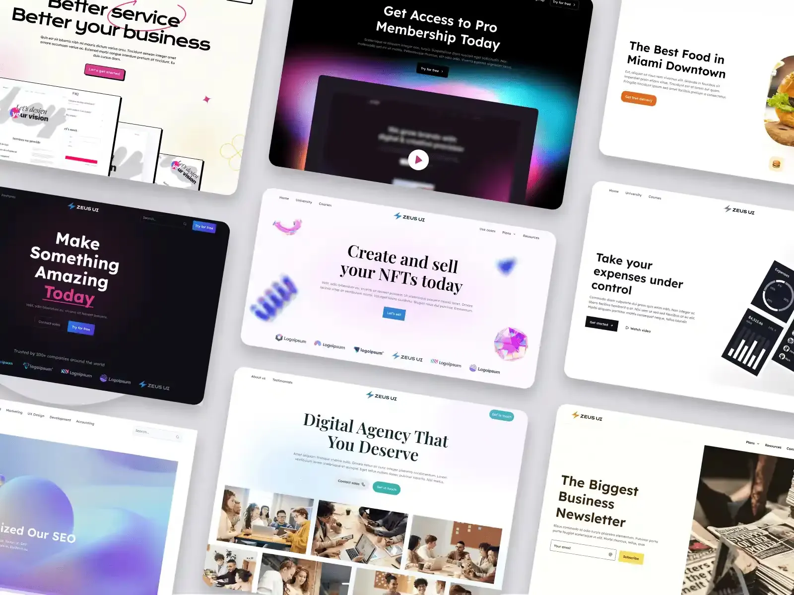
Here is the pattern I kept hitting. You describe a product to an agent, it scaffolds a landing, and the output is competent and forgettable. The model reaches for the most statistically average layout it has ever seen, because that is what "landing page" means to it.
The visuals are the first casualty. Flat cards, a stock gradient, a hero with a screenshot that will look dated in six months. The second casualty is consistency. Ask the agent for one change and it happily invents a new shadow, a new radius, a new blue that almost matches the old blue. Three prompts later the page has drifted.
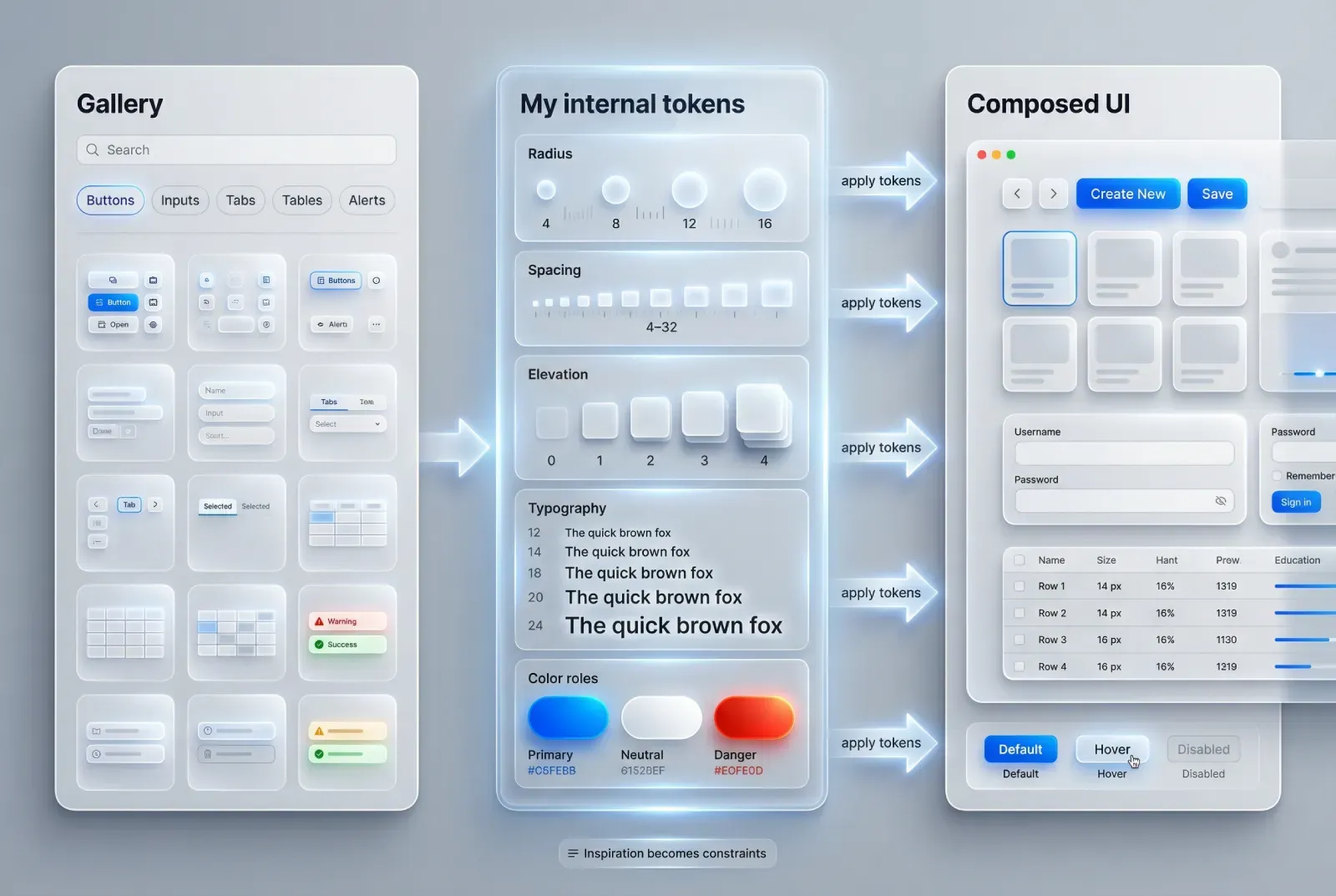
I wrote more about the copying trap in how AI UI inspiration helps without copying blindly. The short version: an agent is only as good as the constraints you give it. Hand it a blank canvas and you get the average of the internet. Hand it a system and rules, and you get your brand.
That gap is the whole product idea. A landing that is rare to look at, plus the rulebook that keeps it rare when a machine edits it.
Starting with a look you won't see elsewhere
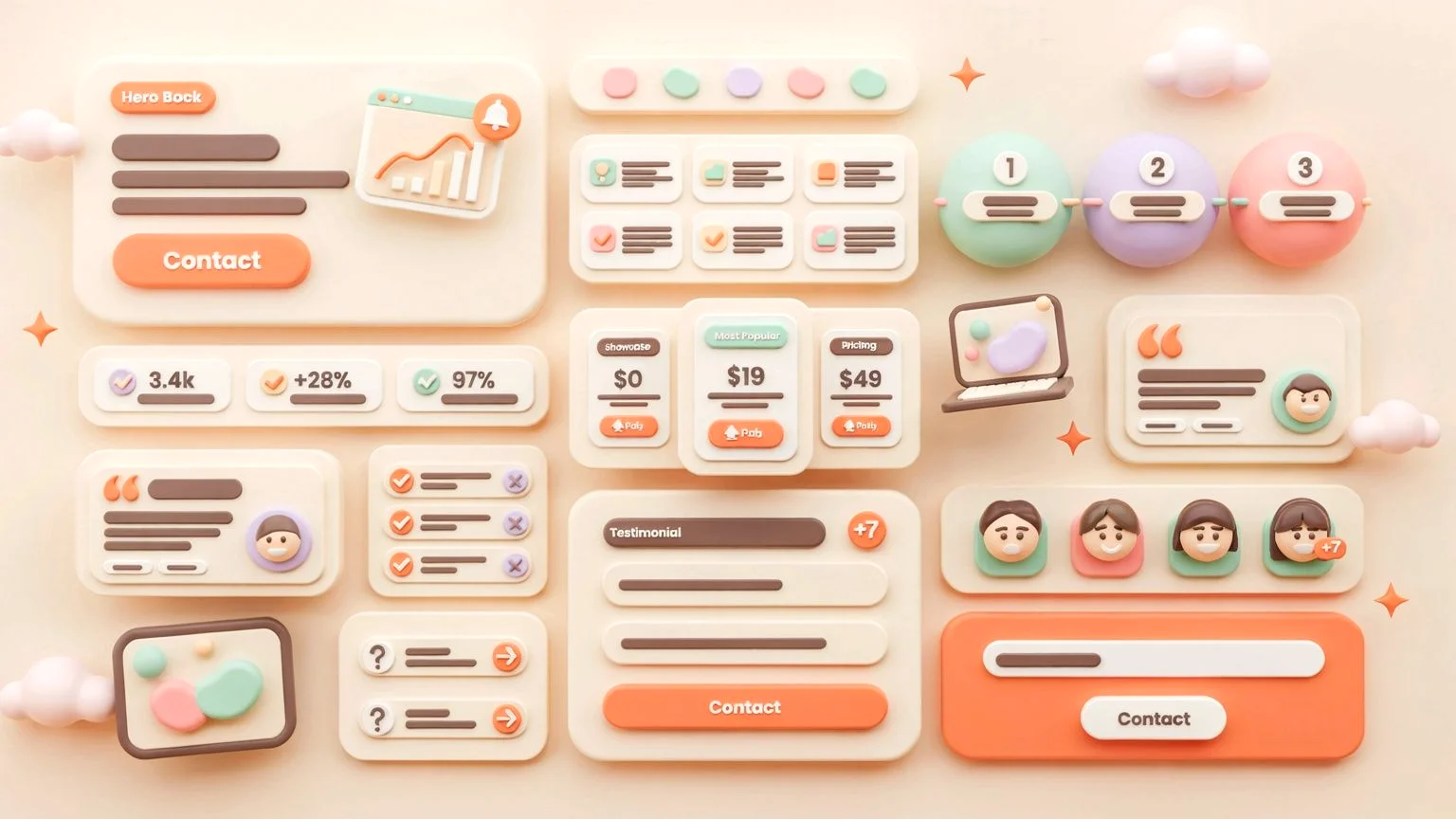
Most templates are the same Bootstrap grid wearing a different accent color. On a marketplace thumbnail they blur together. So the first decision was the visual language, and I picked claymorphism: soft, squishy clay UI. Think Duolingo meets a kids' learning app.
Two reasons. It is uncommon, which means the thumbnail stops the scroll. And it is achievable in pure CSS, because clay depth is just layered box-shadows and gradients over big rounded corners. The style and my technical limits pointed the same direction, which almost never happens.
If you want the anatomy of the style itself, I broke it down in the claymorphism design guide, including the shadow recipe and a prompt you can paste. For this post the relevant thing is what claymorphism demands: discipline. One black shadow, one flat border, and the clay illusion collapses into mud. A rare look is a fragile look, and fragile looks are exactly what an AI breaks first.
☛ A distinctive style is a conversion asset before it is an aesthetic one. It buys attention in the half-second before anyone reads your headline, which research from Nielsen Norman Group says is roughly all the time you get.
The design system I wrote before any code
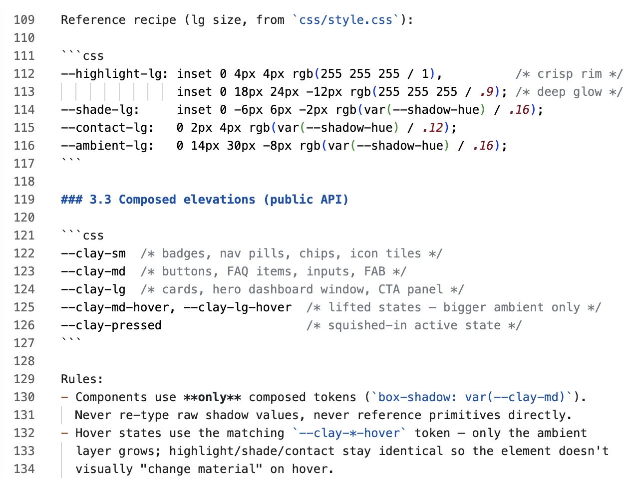
Before a single section existed, I wrote the design system as a document. Philosophy, palette, the shadow architecture, radii, type, component recipes, an anti-pattern list, and a checklist for every new block. Code came second, on purpose.
The heart of it is a three-tier shadow system. One value at the top, a --shadow-hue, feeds four named primitives (highlight, shade, contact, ambient), which compose into the public tokens components actually use: --clay-sm, --clay-md, --clay-lg. Components only ever touch that top layer. Retinting the entire site becomes a one-value edit.
☞ This is the trick that makes AI rebranding possible. If restyling means editing 200 scattered shadow declarations, an agent will miss some and the page drifts. If it means changing one token, the agent cannot get it wrong.
The palette works the same way. A warm cream base, a tangerine accent with a fixed gradient, and a pastel set (mint, lavender, pink, and the rest) locked into a fixed rotation. Fixed rotation removes the "which color next?" decision for me and for the machine. I go deeper on this design-first habit in how to design a landing page, but the principle is simple: order in the document produces order in the output.
Rules that stop an AI from breaking the style
The design system tells an agent what good looks like. A second document, the agent rulebook, tells it what it must never do. This is the file that turns "AI-editable" from a wish into a feature.
It spells out the guardrails in plain language. Stay inside the design tokens. No external font calls. No random shadows. And one specific trap I only learned by hitting it: never put transform, filter, backdrop-filter, or contain on the header or any ancestor of the floating mobile menu button. Any of those creates a new containing block and traps the fixed button off-screen.
That single rule is the most likely way a future edit breaks the page, so it lives in the rulebook in capital letters. An agent reading the folder sees the landmine before it steps on it.
You drop the folder into Cursor, Claude, or Codex, describe your brand, and the agent rewrites the copy across every section and retints the whole page by editing a handful of tokens. It does that safely because the rules fence off the dangerous moves. When I want fresh pattern ideas to feed an agent, I keep the AI inspiration gallery open in a tab and pull references from real production UI instead of guessing.
Drawing the interface in CSS and SVG
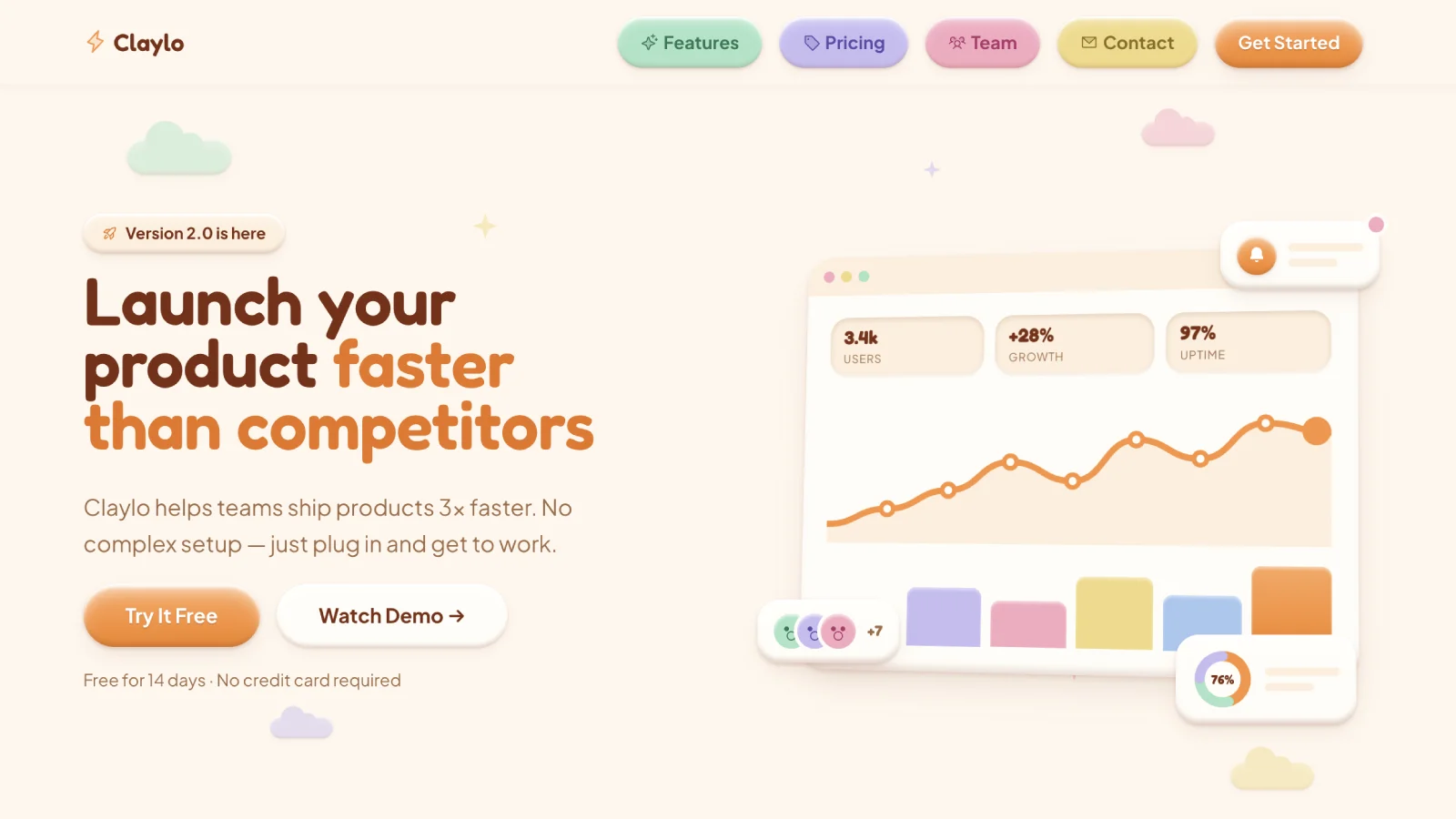
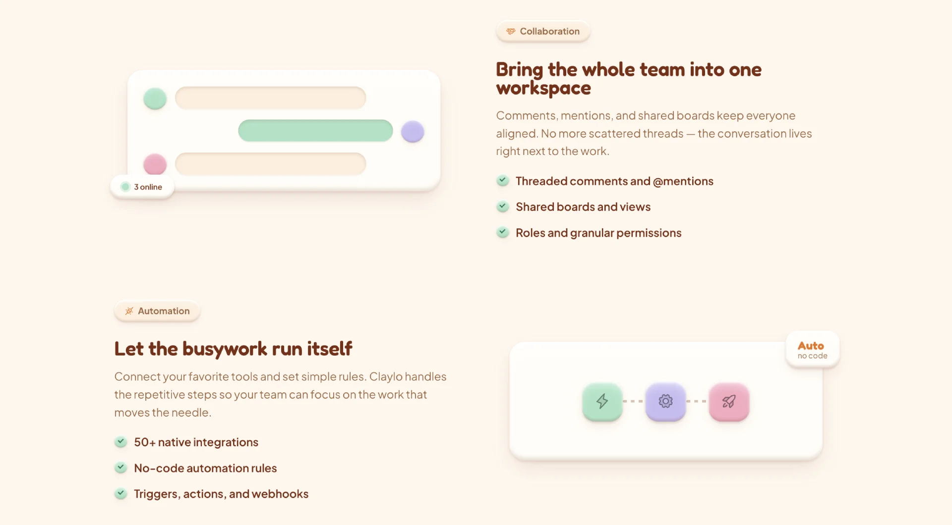
The hero is a 3D dashboard scene: a tilted window with KPI pills, a self-drawing line chart, a pastel column chart, floating widget cards. None of it is an image. It is CSS and inline SVG.
I did this for a reason beyond speed. A screenshot ages, and worse, a screenshot cannot be rebranded. When an agent retints the page, a coded scene recolors with the tokens automatically. A PNG just sits there in last season's colors, quietly making the whole landing look stale.
The product tour further down reuses the same building blocks: panels, bars driven by inline --h and --col variables, floating clay chips. Per-shape values live right in the markup, so a buyer or an agent tweaks one number to change one bar. The visual language stays unified because every scene is made of the same parts.
The boring constraints that came for free

I locked three technical rules at the start: no JavaScript, no build step, and a target PageSpeed near 100. Plenty of template pages lead with these. I am putting them sixth, because the person buying a landing expects them by default.
They matter, though. They worked as a decision filter more than a headline. Anything that threatened a pillar got rejected automatically, which made every later choice easier. The billing toggle everyone assumes needs JavaScript runs on a checkbox and CSS. Motion is pure CSS with a reduced-motion fallback. Fonts are self-hosted, so there is no Google Fonts call and nothing to leak.
The result is a page that scores a clean 100 on Lighthouse and weighs about 150KB total. Speed correlates with conversion, and Google's own data on Core Web Vitals backs that up across real businesses. So the constraints pay off. They set the floor. The pitch lives elsewhere.
The audit before shipping
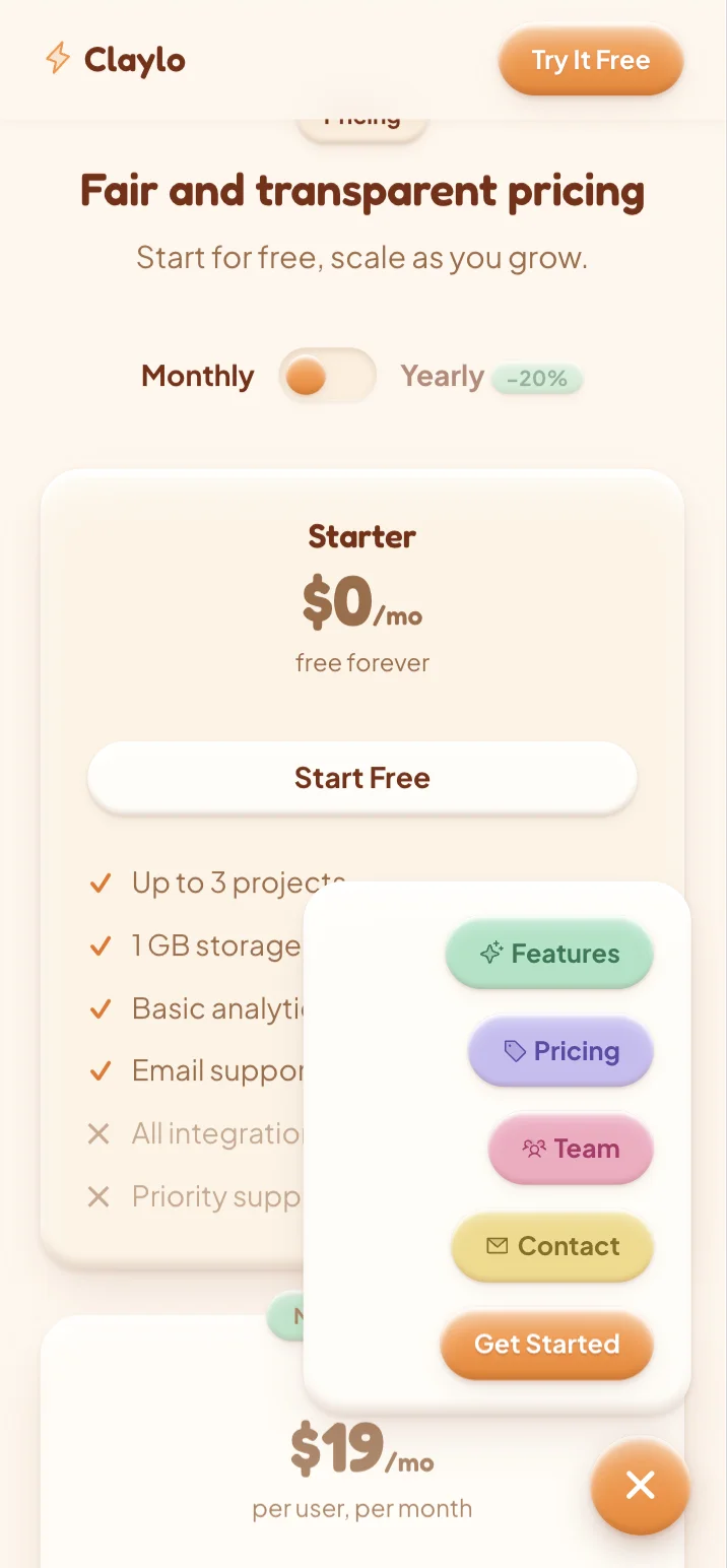
Nothing ships until it survives a hostile read. Mine was mobile. A tester reported the layout tearing with a horizontal scrollbar on small screens, which is the single fastest way to make a product feel broken.
I traced it to four sources. No global overflow guard, a hero headline that could exceed the viewport, floating chips with negative offsets that only reset below 480px, and a comparison table with a negative-margin trick. The fix went in two layers: a safety net (overflow-x: clip on the root, chosen over hidden so it would not trap the fixed button), plus targeted containment at each source.
Then I re-checked every failing width by hand: 320, 360, 414, 768. No scrollbar, headline inside the frame, chips contained, table scrolling inside its own wrapper, mobile menu still opening. A fix is not done until it is proven on the exact widths that failed.
Mobile is also where the UX earns its keep beyond bug fixing. Two decisions carry it. The primary CTA slides into the header the moment you scroll past the hero, so the buy button stays on screen however far down someone reads. And the menu trigger sits low on the right, inside the natural arc of a right thumb, so one hand opens it without stretching. That is what usability first means here: the two actions people reach for most are always a thumb away.
☛ Structural fixes beat pixel math. I killed the overflow at its causes instead of nudging gutters until it looked fine on my screen.
Turning it into a product
A finished page is not a product. The last stretch was making it buyable without giving away the parts that make it valuable.
The live preview deploys to Netlify, but the deploy copies only the public demo files into a clean folder. The design system, the agent rulebook, and the pricing notes stay off the public server. You can click through the Claylo live preview end to end, on desktop and mobile, and what you see is what you download.
On price, I went against the subscription grain. Framer and Webflow templates charge you every month. Claylo is $28 once and you own the file. Over two years that is $28 against roughly $360 to $936, and you get the raw HTML and CSS instead of a hosted export, so you can host it anywhere. If you are launching lean, that math matters, and I wrote a whole piece on marketing a SaaS with zero budget that leans on exactly this kind of thinking. The full breakdown lives on the Claylo product page.
There is a cost you do not see in that $28 too. Building the template, writing the system rules, and polishing every section back and forth ran me north of $200 in Claude tokens alone, before a single line of my own time. That work is baked into the file you download. For a team it stacks up faster: skip the token bill, skip the weeks of trial and error, and put the whole thing in front of everyone at once. The team license covers that and still costs less than a month of the tokens I burned figuring it out.
What to steal from this
You do not need my template to use the method. The method is the transferable part.
→ Pick a look that is uncommon enough to stop a scroll, then check that you can actually build it within your limits.
→ Write the design system as a document before you write code. Put your whole visual language behind a small set of tokens so restyling takes a few edits instead of a scavenger hunt.
→ If you plan to let an AI touch the code, write it a rulebook. List the tokens to use and the specific moves that break things. Guardrails are what make "AI-editable" true.
→ Draw what you can in CSS and SVG instead of screenshotting it, so your visuals recolor with your brand instead of aging in place.
→ Audit against the meanest reasonable reader before you ship, and fix causes rather than symptoms.
Do that, and whether a human or an agent picks up your project next, it stays yours.
Frequently asked questions
Can an AI agent really rebrand a landing template in one prompt?
Yes, if the template is built for it. Claylo ships with a design system doc and an agent rulebook. You point Cursor, Claude, or Codex at the folder, describe your brand, and the agent edits a small set of CSS tokens and rewrites the copy across all 13 sections. It works because restyling touches a handful of token changes instead of hundreds of scattered edits.
Does letting AI edit the design usually break the layout?
It does when there are no guardrails. An agent invents new shadows, radii, and colors that drift from the original. The fix is a rulebook that names the exact dangerous moves, like putting a filter on the header, so the model avoids them. With that in place, edits stay inside the system and the page holds together.
Is a claymorphism style better for conversion than a generic template?
A distinctive style earns attention in the first half-second, before anyone reads a word. That is its main conversion job. Generic templates blur together on a marketplace and in a crowded market. A rare, tactile look stops the scroll, which is the prerequisite for every metric downstream.
How fast can I actually make the template my own?
By hand, roughly an hour to swap copy, colors, and fonts, because everything sits behind tokens. With an AI agent, a first rebrand pass takes one prompt and a few minutes of review. The live preview lets you judge the starting point before you commit, so you know what you are shaping.