


Roman Kamushken
I have a soft spot for this one. When everything on Dribbble started looking like the same gray SaaS table, claymorphism showed up looking like a kids' toy and somehow still worked. This post is the practical map: what it is, how it is built, a CSS recipe you can paste, and a guidelines block you can hand straight to an AI agent.
What is claymorphism
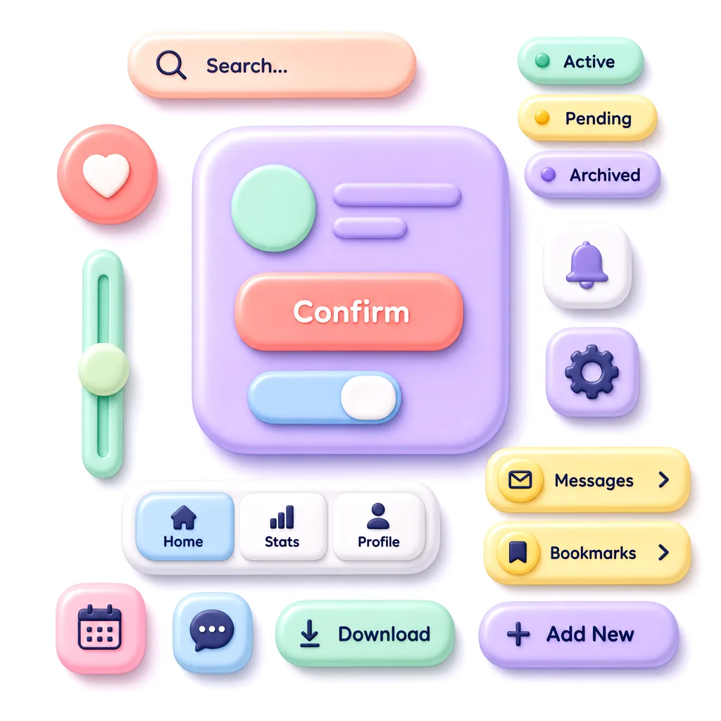
Claymorphism is a soft, three-dimensional UI style where components look like rounded blobs of modeling clay, achieved through large border radii and a pair of shadows that fake inflated depth. It sits in the same family as glassmorphism and neumorphism, yet it reads warmer and more cartoonish than either.
The style got its name and its first real wave of attention around 2021, when designer Michał Malewicz wrote about it and a flood of concept shots followed. The timing made sense. Designers were tired of flat rectangles and the accessibility headaches of pure neumorphism, so a softer, higher-contrast cousin felt like relief. As of 2026 claymorphism is no longer the hot new thing, but it has settled into a comfortable niche: onboarding flows, kids' apps, fintech with a friendly face, and 3D landing pages built in Spline or Blender.
People constantly confuse it with neumorphism, so here is the clean line between them. Neumorphism extrudes shapes from the same background color using one light and one dark shadow, which kills contrast and breaks for low-vision users. Claymorphism floats a colored shape above the page with a soft outer drop shadow plus a bright inner highlight, so it keeps real contrast while still feeling soft. One whispers, the other waves at you.
Anatomy of the style
Every claymorphism interface I have taken apart shares the same handful of moves. Learn these six and you can recognize it instantly, or rebuild it from scratch.
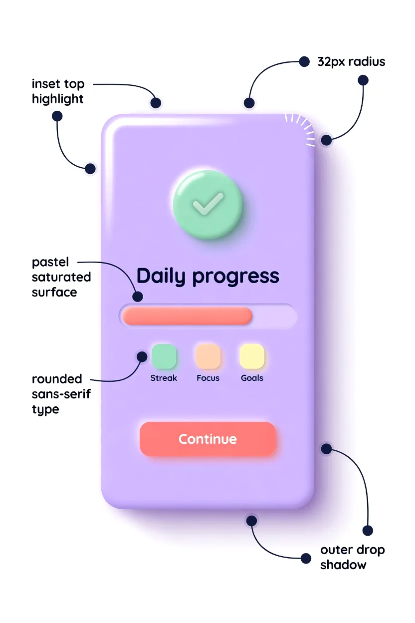
❶ Soft, oversized border radius. This is the signature. Cards sit around 24-32px radius, buttons around 16-20px, small chips around 12px. The rule of thumb: bigger than you think is comfortable, then a little bigger. Sharp corners instantly break the clay illusion.
❷ Dual shadow recipe. The depth comes from two shadows working together. A soft outer drop shadow (large blur, low opacity, brand-tinted) pushes the element up off the page, while a bright inner highlight along the top edge fakes light hitting a rounded surface. Skip either one and it flattens.
❸ Pastel, saturated palette. Backgrounds are pale and tinted, rarely pure white. Surfaces use soft pastels with enough saturation to feel candy-like: lavender, mint, peach, sky blue. The shadows borrow the surface hue instead of using neutral gray, which is what gives clay its colored glow.
❹ Light depth elevation. Elements look inflated, like a balloon or a gummy. You read them as objects you could squish. Elevation stays modest, usually one or two layers, because stacking too many clay surfaces turns the screen into visual soup.
❺ Rounded sans-serif typography. Sharp grotesks fight the mood. Claymorphism leans on rounded sans-serifs such as Quicksand, Nunito, Outfit, or Fredoka, set at medium to bold weight with generous letter spacing. The type should feel as soft as the shapes.
❻ Friendly, playful microinteractions. On press, clay buttons squish. They scale down slightly, the shadow tightens, and sometimes a tiny bounce plays on release. These springy reactions sell the material more than any static shadow can. Google's Material Design motion guidance on responsive springs is a solid reference for tuning the easing here.
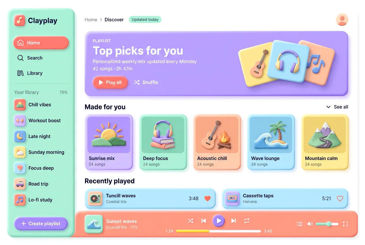
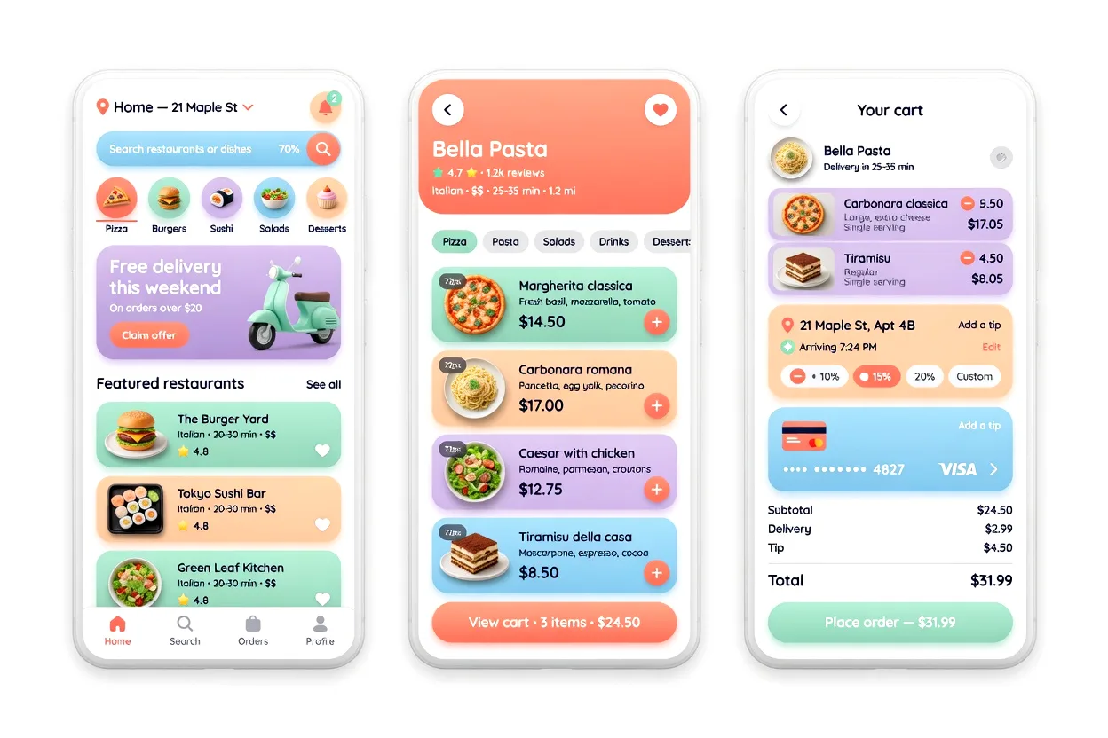
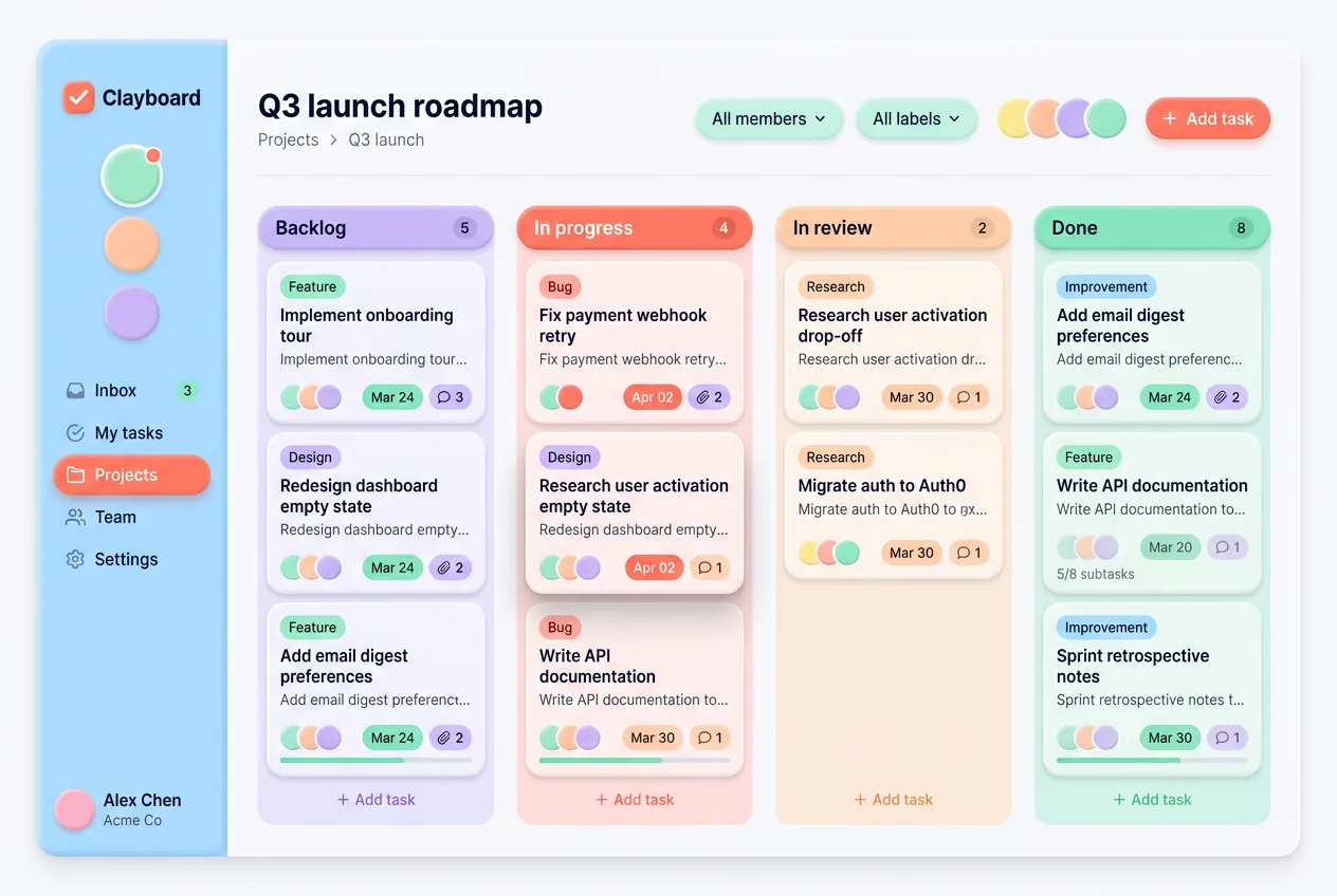
Visual examples gallery
Six interfaces where the style earns its keep. Hover any tile for the context.
CSS recipe: claymorphism in 30 lines
Here is a working card you can paste into any project. The trick is the dual shadow on the box-shadow property: one soft colored drop shadow for lift, one bright inset highlight for the inflated top edge. Variables keep the palette swappable.
:root {
  --clay-bg: #e0d7ff;          /* pale tinted page */
  --clay-surface: #b8a6ff;     /* saturated pastel */
  --clay-radius: 28px;
  --clay-shadow: #6c4cf0;      /* hue-matched shadow */
}

.clay-card {
  background: var(--clay-surface);
  border-radius: var(--clay-radius);
  padding: 28px;
  box-shadow:
    8px 8px 24px rgba(108, 76, 240, 0.35),       /* soft outer drop */
    inset -6px -6px 16px rgba(80, 50, 200, 0.25),/* lower-right shade */
    inset 6px 6px 16px rgba(255, 255, 255, 0.55);/* top-left highlight */
  transition: transform 140ms ease, box-shadow 140ms ease;
}
That single block is enough to read as clay. For interactive elements, add a squish on press so the surface reacts like real material:
.clay-card:hover {
  transform: translateY(-2px);
}

.clay-card:active {
  transform: scale(0.97);
  box-shadow:
    4px 4px 12px rgba(108, 76, 240, 0.3),
    inset -3px -3px 10px rgba(80, 50, 200, 0.3),
    inset 3px 3px 10px rgba(255, 255, 255, 0.4);
}
Notice the active state tightens every shadow at once. That collapse is what makes the button feel pressed into the page instead of just shrinking.
CLAYMORPHISM.md for AI agents
This is the part I actually use. When I prototype a clay concept in Cursor, Claude, v0, or Lovable, a vague prompt like "make it claymorphism" gives mushy results. A precise spec gives shippable ones. Copy the block below into your AI tool as a system or style instruction, then describe the screen you want. It encodes the exact values so the model stops guessing.
CLAYMORPHISM.md — design spec for AI agents
Follow these tokens verbatim. Do not improvise colors or shadows.

== 1. Color tokens (use these hex values, no substitutes) ==
Backgrounds
  --bg-app:      #F7F5FB  /* tinted near-white, never pure #FFF */
  --bg-raised:   #FFFFFF  /* only for floating sheets over --bg-app */
Surfaces (the clay itself, pick by semantic role)
  --surface-lavender: #B8A6FF  /* primary cards, hero blocks */
  --surface-sky:      #9EC9F0  /* info, secondary cards */
  --surface-mint:     #7DD4A8  /* success, positive stats */
  --surface-peach:    #FFB59E  /* warm cards, highlights */
  --surface-pink:     #F5B8D0  /* accent, playful cards */
  --surface-lemon:    #F5D77A  /* attention rows, badges */
Actions & status (saturated, reserved for intent)
  --action-primary:   #FF7A6B  /* coral: confirm, start, play */
  --action-on:        #FFFFFF  /* label on coral, ratio >= 4.5 */
  --status-active:    #7DD4A8  /* green pill */
  --status-pending:   #F5D77A  /* yellow pill */
  --status-archived:  #C9B5FF  /* muted lavender pill */
Text
  --text-strong:  #2E2A3F  /* headings, never pure black */
  --text-muted:   #6B6580  /* captions, secondary labels */

Rule: one saturated --action-* per screen as the hero CTA.
Surfaces carry the mood; actions carry the verb.

== 2. Radius tokens (chunky is the brand) ==
  --r-card:   28px   /* range 24-32 by card size */
  --r-button: 18px   /* range 16-20 */
  --r-chip:   999px  /* pills are fully round, not 12px */
  --r-input:  16px
  --r-icon:   20px   /* squircle app-icon tiles */
Never drop below 16px on interactive elements, or the soft
shadow reads as a flat drop-shadow instead of molded clay.

== 3. Spacing & sizing scale (8pt grid) ==
  4 / 8 / 12 / 16 / 24 / 32 / 48
  Card padding: 24 (compact) to 28 (default)
  Gap between clay siblings: 16 min (shadows need breathing room)
  Tap target: 48x48 min, button height 52-56

== 4. The shadow recipe (the whole look lives here) ==
Every clay surface = 3 stacked shadows, all keyed to its own hue:
  box-shadow:
    8px 8px 24px rgba(H, 0.35),          /* colored drop, SE */
    -8px -8px 24px rgba(255,255,255,0.6),/* light lift, NW */
    inset 4px 4px 8px rgba(255,255,255,0.5),  /* top-left sheen */
    inset -6px -6px 12px rgba(H, 0.30);  /* bottom-right depth */
H = the surface's OWN color darkened ~15%, never gray.
  lavender surface -> shadow rgba(140,108,255,..)
  coral button     -> shadow rgba(255,90,75,..)
Light always comes from top-left; depth pools bottom-right.
Keep it consistent across the entire screen.

Elevation levels (do not stack clay on clay beyond level 2):
  L0 flat tint     : no shadow, just --bg-app
  L1 resting card  : recipe above at full strength
  L2 floating sheet: same recipe, drop offset 12px, blur 32px

== 5. Component recipes ==
Button (primary):
  bg --action-primary, label --action-on bold 16,
  radius --r-button, height 54, padding 0 24,
  shadow recipe keyed to coral,
  :active -> transform scale(0.97) + all shadow offsets halve
  (the squish: it sinks into the page, not just smaller)
Button (secondary):
  bg --surface-lavender or white, label --text-strong,
  same geometry, softer shadow strength (0.25)
Card:
  bg a --surface-*, radius --r-card, padding 24-28,
  full shadow recipe, one heading + content, no inner borders
Chip / status pill:
  radius 999, padding 6 14, height 28-32,
  bg the matching --status-*, label --text-strong 13 semibold,
  shadow at half strength (chips are small, keep it subtle)
Toggle switch:
  track 52x32 radius 999, off=--bg-app inset shadow,
  on=--surface-sky, thumb white 26px with tiny clay shadow
Input:
  bg --bg-app, radius --r-input,
  INSET shadow only (pressed-inward well), no outer drop,
  inset 3px 3px 8px rgba(H,0.2), inset -3px -3px 8px #FFF
Bottom nav bar:
  bg white, radius --r-card on top corners or floating pill,
  active item -> coral icon + label, inactive --text-muted,
  one clay shadow lifting the whole bar
App-icon tile:
  squircle --r-icon, single --surface-* fill,
  full recipe, optional 3D glyph centered

== 6. Typography ==
  Family: rounded sans — Quicksand, Nunito, Outfit, Fredoka
  Weights: 500 body, 600 labels, 700 headings (chunky to match)
  Sizes: h1 28-32, h2 22, body 16 (min), caption 13
  Letter-spacing: 0.01em body, tighten headings to 0
  Line-height: 1.4 body, 1.2 headings

== 7. Do ==
  - Match every shadow color to its surface hue
  - Keep light source top-left on the entire screen
  - Use exactly one --action-* CTA per view
  - Give each clay element 16px+ of breathing room
  - Pair chunky radii with chunky bold type

== 8. Don't (the mistakes agents repeat) ==
  - Gray/neutral shadows — kills the molded feel instantly
  - Radius under 16 on buttons — reads as flat-with-shadow
  - Pure #FFF page background — erases the soft tinted glow
  - Skipping the inset top-left sheen — surface looks stuck flat
  - Stacking clay on clay 3+ deep — turns to mush
  - Sharp grotesk fonts (Inter, Helvetica) fighting the round mood
  - Multiple saturated CTAs competing on one screen

== 9. When to use / avoid ==
  Use:   onboarding, kids & education, friendly fintech, savings
         apps, 3D landing pages, empty states, celebratory moments
  Avoid: dense data tables, analytics dashboards, enterprise
         tools, anything text-heavy or high-density
If you keep that spec handy, you can also feed it to the AI inspiration gallery when you want to compare your generation against real production patterns before committing to the look.
When claymorphism works and when it doesn't
The style is a personality, and personality is wrong in plenty of contexts. Use this as a decision framework rather than a vibe check.
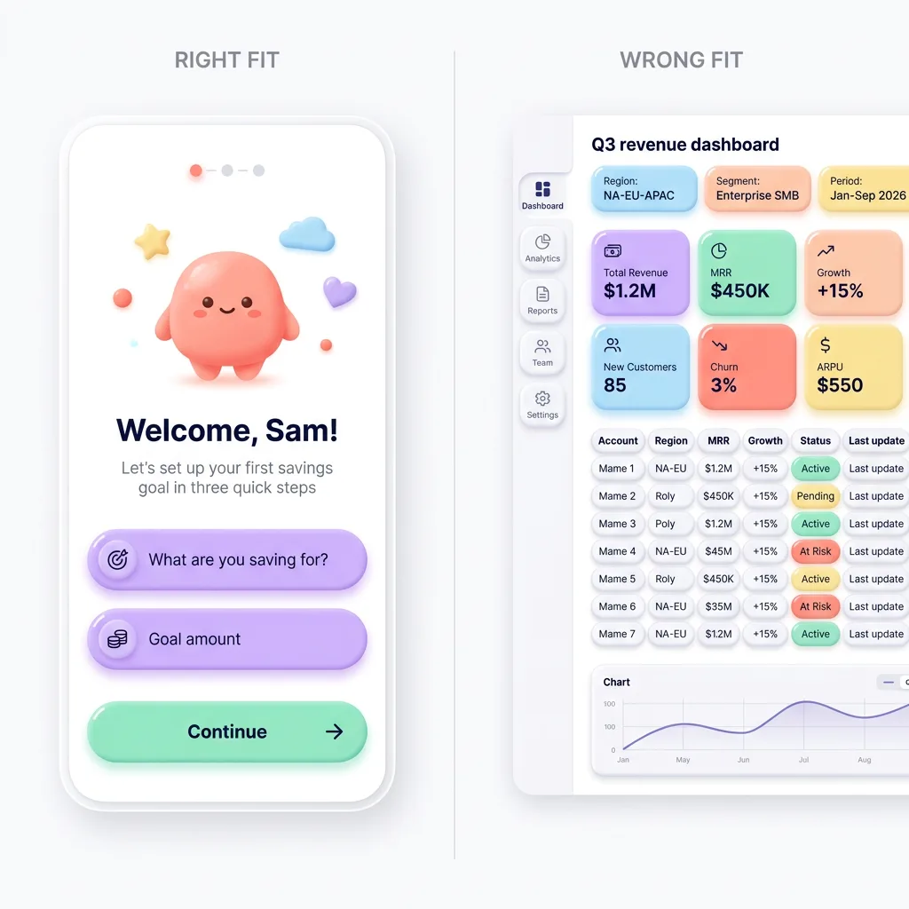
Works for:
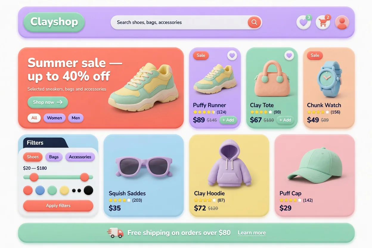
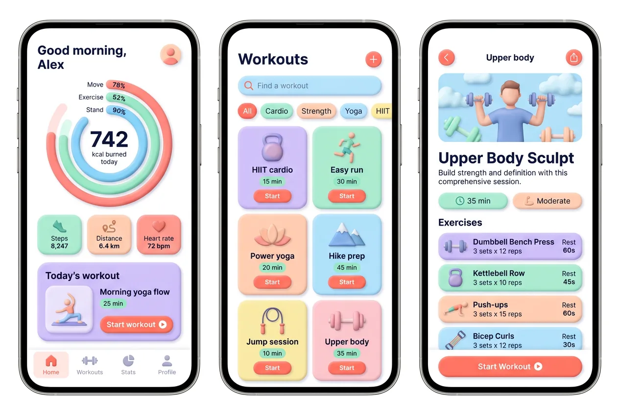
- Onboarding and welcome flows where warmth lowers anxiety
- Kids' and education products that should feel like toys
- Friendly fintech and savings apps softening a scary topic
- 3D and illustrated landing pages built in Spline or Blender
- Empty states and celebratory moments that reward the user
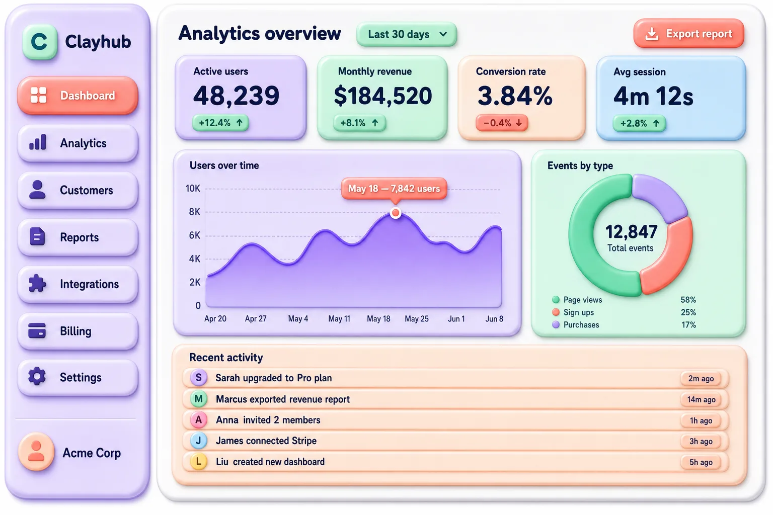
Avoid for:
- Dense data tables and analytics where every pixel counts
- Enterprise dashboards that need to read as serious and fast
- Text-heavy reading interfaces where chunky radii waste room
- High-density admin tools with hundreds of controls per screen
- Accessibility-critical flows if your palette drifts low-contrast
The honest test: if the product's job is to help someone feel calm or delighted, clay helps. If the job is to move dense information quickly, clay gets in the way. I have seen teams force it onto a B2B reporting tool and watch usability tank, because soft shapes and tight data are a bad marriage.
Related design morphisms
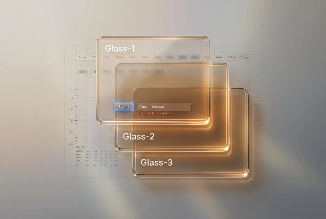
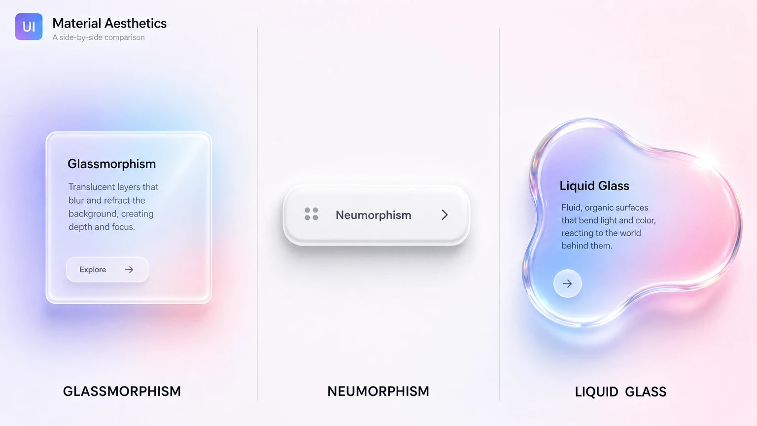
Claymorphism is one stop on a longer tour of depth styles, and the comparison is half the fun. If you want the frosted, translucent cousin, read the practical guide to liquid glass, Apple's 2025 material that refracts instead of just blurring. For a side-by-side of the whole glass family, including glassmorphism and neumorphism (the style clay gets confused with), the glassmorphism vs neumorphism vs liquid glass breakdown lays out the visual signatures and trade-offs. And for the polar opposite of soft and friendly, the retro brutalist UI guide shows what happens when a style does the exact reverse of everything claymorphism stands for.
Frequently asked questions
Is claymorphism still relevant in 2026?
Yes, in its niche. Claymorphism never became a default like flat design, and it cooled off after the 2021-2022 hype. As of 2026 it stays popular for onboarding, kids' apps, friendly fintech, and 3D landing pages. It is a deliberate stylistic choice for warm, playful products rather than a general-purpose system.
What is the difference between claymorphism and neumorphism?
Neumorphism extrudes shapes from the same background color using one light and one dark shadow, which often fails contrast checks. Claymorphism floats a saturated colored surface above the page with a soft outer drop shadow and a bright inner highlight. Clay keeps real contrast and looks puffy, while neumorphism looks embossed and risks accessibility problems.
How do I create the claymorphism shadow in CSS?
Stack three shadows on one box-shadow: a large soft outer drop shadow tinted with the surface hue, an inset shadow on the bottom-right for shade, and an inset white highlight on the top-left. Match the shadow color to the surface color instead of using gray, and keep a border radius of at least 24px on cards.
Is claymorphism accessible?
It can be, if you control contrast. The danger is letting pastel surfaces and soft shadows pull text contrast below the WCAG AA threshold of 4.5:1. Keep text dark and crisp on light clay surfaces, test every color pair, and never rely on shadow alone to communicate state. The soft look should apply to shapes, not to legibility.
Which fonts pair well with claymorphism?
Rounded sans-serifs match the soft geometry best. Quicksand, Nunito, Outfit, and Fredoka all work well at medium to bold weight. Avoid sharp grotesks and serifs, which visually fight the puffy, rounded shapes and break the toy-like consistency the style depends on.