


Roman Kamushken
Part of: Dashboard UI design: From KPIs to layouts that convert — the complete reference to dashboard design on Setproduct.
SaaS dashboard templates have become crucial tools in negotiating the nuances of business processes with greater dynamism in the Software as a Service (SaaS) world of today. These dashboards are central places that pull together real-time data so you can understand and know how to act upon it in order to make strategic decisions. SaaS dashboards, for lean startups or mature organizations, provide an overview of KPIs like revenue trends and customer acquisition costs.
The SaaS dashboard templates are, therefore, trending as the SaaS industry evolves. They simplify data visualization, help save time by avoiding manual effort for combining data and enable teams to track the performance metrics with ease. Our guide will dive deep into how important these dashboards are, the range of benefits they provide, and the most effective strategies for implementing them to promote successful business growth and operational excellence.
Definition of SaaS Dashboards
SaaS dashboard is a one-stop destination for monitoring and managing performance metrics of Software-based (SaaS) service-based businesses. It brings in live data from different places and visualizes them in plainly, giving the decision-makers a quick picture of how the key KPIs are performing. Into something like the cockpit of an airplane, they give you all the necessary information to navigate your business strategies through the SaaS competitive landscape.
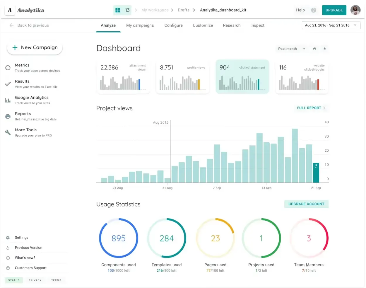
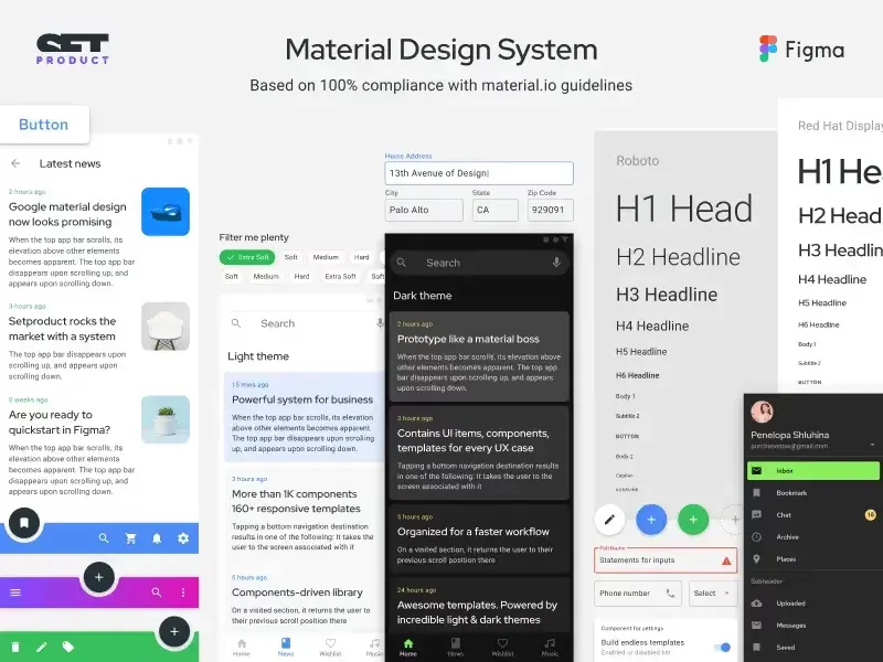
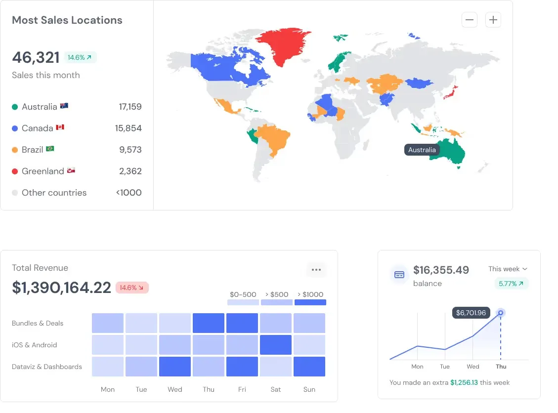
Source**:** Material Desktop UI Kit
Benefits of SaaS Dashboard Templates
An integrated SaaS dashboard provides numerous benefits:
- Real-time data tracking: Allows companies to make more agile decisions by responding immediately to shifts in the business environment.
- Informed decision-making Decision-making backed by data-led strategies helps make informed decisions, which in turn helps to reach business goals with even more accuracy.
- Enhanced productivity: Automates data consolidation activities to save time and boost productivity
- All metrics in one single interface: This tool brings together several data formats (data sources, commands) under the same window so that you can visualize all of your business metrics.
The above benefits highlight the importance of SaaS dashboards in streamlining business operations and promoting growth by providing data-driven insights.
Key Elements and Features of SaaS Dashboards
Some critical components and features that go into creating a good SaaS dashboard designed to boost BI and decision-making include:
- Key Performance Indicators (KPIs): Some benchmarks record your performance according to the strategic goals. Examples include:
- Churn Rate: Defined by customer retention/attrition and happiness levels.
- MRR (Monthly Recurring Revenue): This one shows whether you have consistent revenue streams.
- Customer Acquisition Cost (CAC): Deals with the cost-efficiency of bringing new customers.
- Customer Lifetime Value (CLV): Estimates the long-term value leveraged from each customer relationship.
- Simple Navigation: A good dashboard is easy to navigate and user-friendly regarding understanding ability. It should empower its users to quickly switch insights and act accordingly and not make it unnecessarily complex.
- Live Data Refresh: This feature allows users to keep data updated in real-time or near real-time so that decision-makers have fresh content. This feature is indispensable, for making quick decisions and, of course, the right calls to make the first move before it targets the market.
- Customization Options: A good SaaS sales dashboard should be customizable to meet specific business requirements and user needs. This includes:
- Integrating with Business Systems: It must liaise with present business tools and systems to bring data from several sources together.
- Advanced Charting & Graph Styles: Multiple visualization choices (line charts, bar graphs, heat map) that can fit different types of reporting and analysis requirements.
- Comprehensive Metrics: In addition to key financial metrics that signal general health, SaaS dashboards should contain a comprehensive set of other useful metrics that depend on the business model and objectives. These include things within operational metrics, customer engagement metrics, etc. Understanding these key SaaS metrics gives you a clear indication of where your business stands and if the grass is really greener on the other side (for the competitor) from a growth perspective.
These interconnected elements and capabilities, when woven into a unified SaaS dashboard, help businesses to identify areas where operations can be made more efficient, decision-making processes streamlined, and establish long-term growth backed by data-driven insights. The capability to monitor and manage key metrics in real-time enables SaaS businesses to respond next-day to changing market conditions and emerging opportunities effectively.
Top 5 SaaS Dashboard Examples Based on Client's Choice
Businesses look for a SaaS dashboard that is designed keeping in mind the intuition of the users, a dashboard that offers insights aligned with user data and is configurable to accommodate unique business needs. Here are five best SaaS dashboards recognized for their functionality and effectiveness:
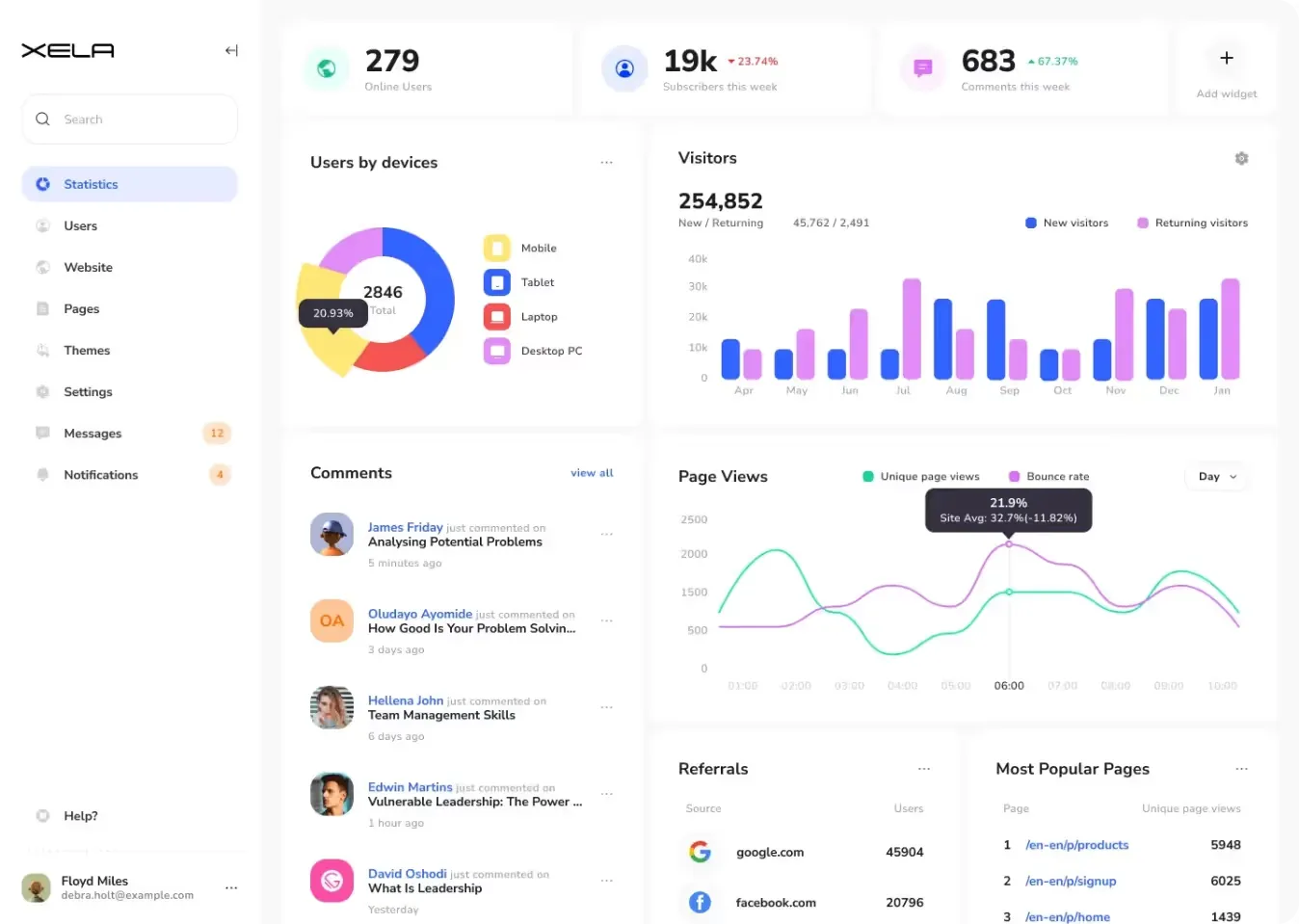
Material-X
Its capability to track performance and adaptability to different business requirements stands out.
Key Features:
- SaaS Metrics and Reporting: Built to help better manage the core SaaS metrics like MRR, churn rate, and customer acquisition cost.
- Customizable Components: Everyone is tailored to use a set of criteria that meets the needs of business goals and reporting reach.
- Real-time Data Updates: This guarantees real-time data, which gives agile business predictions.
- Interactive Visualizations: It enables developers to create advanced charts helping users to get more insights into data trends and patterns.
Material Desktop UI Kit
The Material Desktop UI Kit is an excellent resource for SaaS companies interested in improving the customer experience and saving time during app development.
Key Features:
- SaaS Application Components: A rich array of UI components specially built for SaaS applications, enabling effortless integration and customization.
- Easy to Use: The interface is polished for simplicity so users at all stages can easily navigate through the website.
- Responsive Design: This works seamlessly across all devices and screen sizes making the application accessible to any gadget.
- Data Visualization Tools: It offers a variety of easy-to-understand charts to help you display even your most intricate data to other startup stakeholders in a manner they can use.
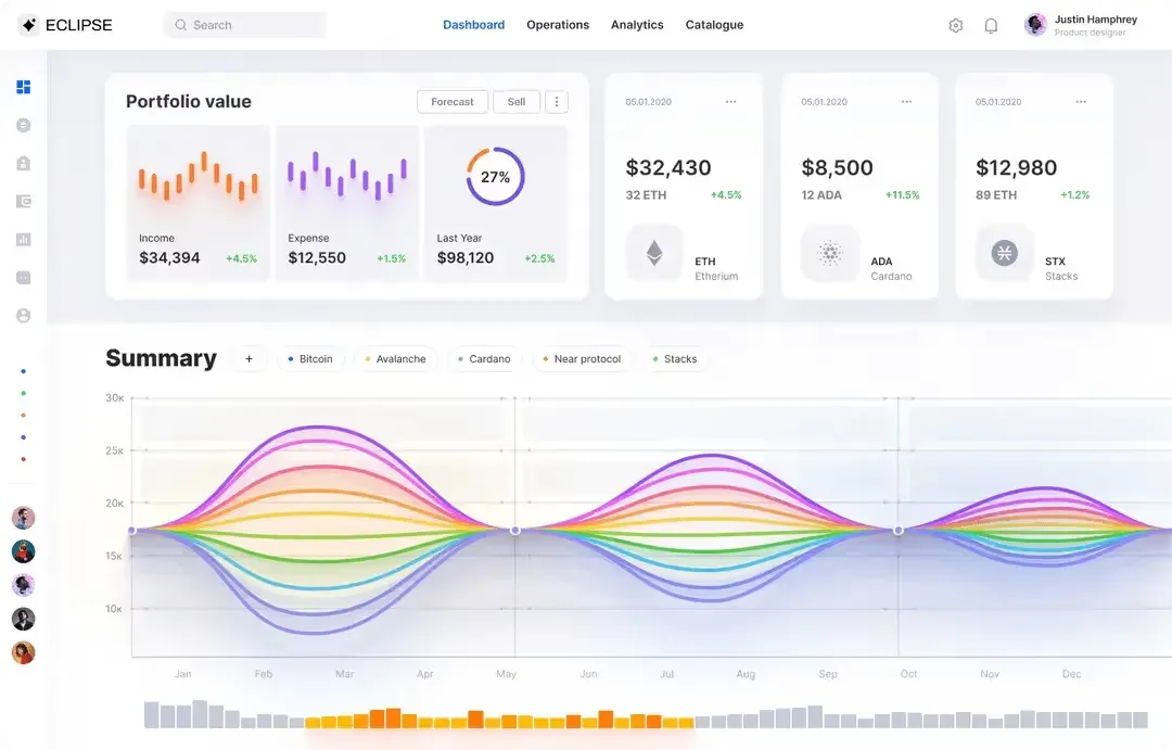
Eclipse UI Kit
This SaaS dashboard example is highly efficient in terms of user-centric metrics, scale well, to mainly adjust one or more core SaaS business needs for the Eclipse UI Kit.
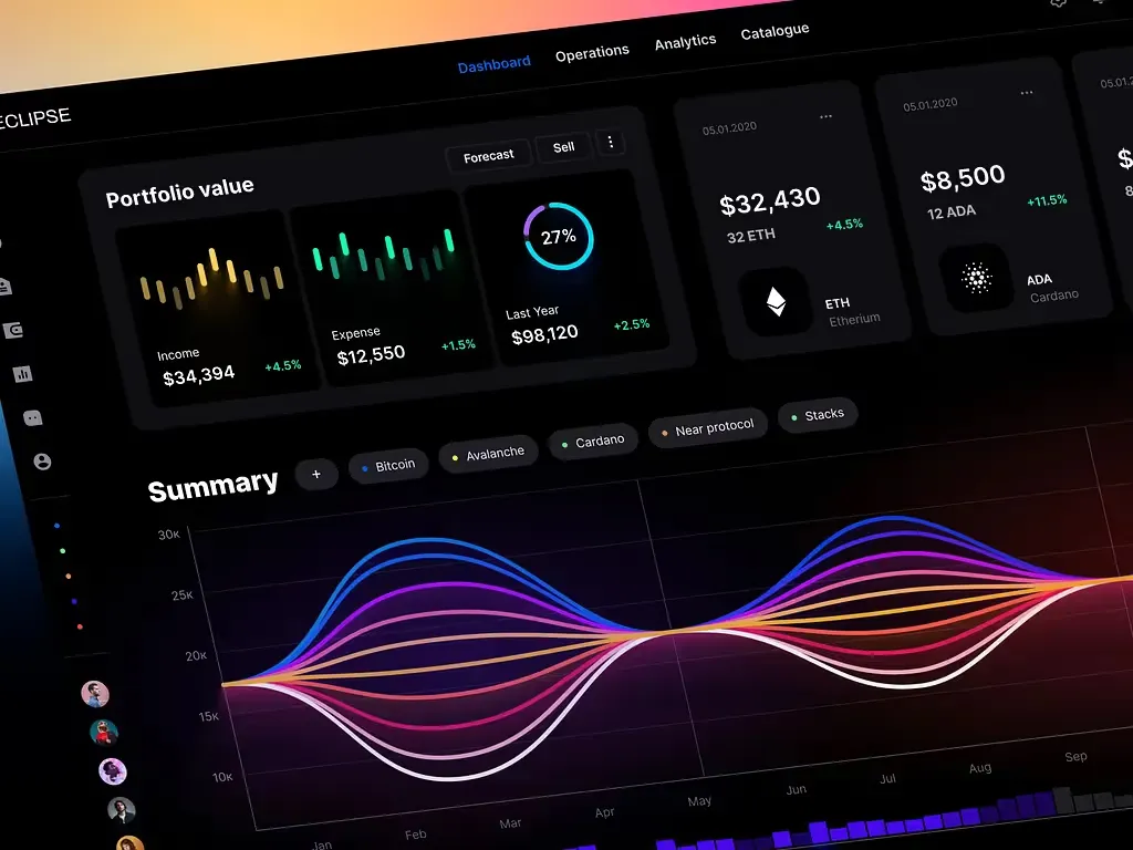
Key Features:
- SaaS User Metrics Templates: Provides you with built-in templates that allow you to monitor your user engagement metrics, conversion rates, and analytics of user behavior.
- Scalable Architecture: Scalable architecture that can handle large data volumes and expand businesses.
- Custom Dashboard Modules: It offers a module-based custom dashboard to meet customized reporting needs and strategic objectives.
- Integration Capabilities: Seamlessly integrates with all widely used SaaS platforms and data sources to facilitate unified data collection.
Rome UI Kit
Comprehensive analytics are the strength of Rome UI Kit, and it has everything that companies need, from detailed actionable insights about their operations to predictive analytics for strategic planning.

Key Features:
- Advanced, Detailed Analytics: Customized to provide deep business performance metric analysis on advanced analytics and detailed reporting for SaaS analytics solutions.
- Predictive Analytics Tools: Includes predictive modeling and forecasting features necessary to predict trends and opportunities
- Collaboration Features: Collaborative data analysis and sharing across teams increases alignment and informed decision-making
- Data Security Measures: Data security measures that prevent breaches and ensure compliance with the latest industry standards.
Material Design System
Having one of the most detailed toolkits and a high level of flexibility, Material Design System is an ideal solution for certain SaaS applications and business models.
Key Features:
- Complete SaaS Templates: Collection of templates for everything within the world of a SaaS application (marketing, sales, etc.)
- Modular Design: The components are modular and it can be designed to be customized and scalable accordingly for the changes in business requirements.
- Cross-platform Compatibility: Allows compatibility with different operating systems and devices, which improves access and usability.
- API Integration: Ability to integrate APIs with external systems and data sources thereby enabling seamless data flow and synchronization.
These SaaS dashboards showcase how data visualization, accessibility, and personalization can create avenues for businesses to make use of the insights proactively towards better performance and growth. These tools provide the flexibility and functionality needed to optimize operational efficiency, track user engagement, or perform advanced analytics.
SaaS Dashboards Design Best Practices
To have an effective SaaS analytics dashboard, you need to ensure usability, functionality, and visual clarity are of the highest order. It can significantly impact decision-making and productivity if you follow the best practices of what makes up a dashboard and what delivers business performance improvements.
- Define Your Goals: The first step you need to take is to define what you want your dashboard to do. Your Dashboard Must Serve a Clear Business Purpose Whether you are following sales performance, customer satisfaction, or streamlining operational efficiency, the design of your dashboard should be in sync with your fundamental business goals. Focus on metrics such as those which indicate customer behavior and satisfaction, if enhancing customer retention is important, while as an illustration.
- Identify KPIs: These are the sorts of metrics that should provide you with practical actionable learnings, or benchmarks which indicate how successful something has been. Some typical KPIs are revenue metrics, churn rate, CAC or customer acquisition cost and CLV or customer lifetime value.
- Select Dashboard Software: Choose a dashboard solution based on your business requirement, budget range and technical expertise. Choose software with a simple interface and synching data in real time. See if the tool plays nicely with your existing systems, and whether or not it offers enough customization to get your dashboards where you want them to go.
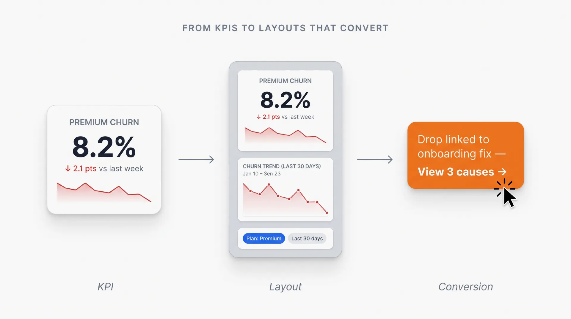
- Design Your Dashboard Layout: Build an attractive layout that is easy to navigate Group information by importance it allows the information to be read quicker so that all key KPIs can be recognized quickly. Clearly label, color code and make the important metrics more prominent through visual hierarchy. Place related metrics into groups (cards) and use features like drill-down to get some more detailed view.
- Implement and Test Your Dashboard: Before deploying your dashboard, you need to carry out a rigorous testing to be sure that everything is working correctly. Confirm that data is updated correctly in a timely manner, that visualizations represent the underlying data properly, and that user navigation makes sense. Get feedback from stakeholders, improve design accordingly as required and enhance the usability functionality.
If you adhere to these best practices religiously, chances are high of your SaaS dashboard efficiently supporting data-driven decision-making and enhancing operational efficiency - ultimately leading business growth.
Conclusion
SaaS dashboards are essential for modern-day businesses, as they provide up-to-minute information and can look after everything else that has been put together. Using these dashboards, organizations can measure their key data, improve the operations and keep growing sustainably in this competitive SaaS world.

.webp&w=1920&q=75)
.webp&w=1920&q=75)

.webp&w=1920&q=75)
.webp&w=1920&q=75)


.webp&w=1920&q=75)
.webp&w=1920&q=75)


