


Roman Kamushken
I find this style fascinating for the wrong reasons. Neumorphism is beautiful in a static mockup and quietly broken the moment a real person with average eyesight tries to find the button. This post is the honest map: what it is, how it is built, CSS you can paste, a spec you can hand to an AI agent, and a clear-eyed section on the accessibility problem that everyone screenshots and nobody fixes.
What is neumorphism
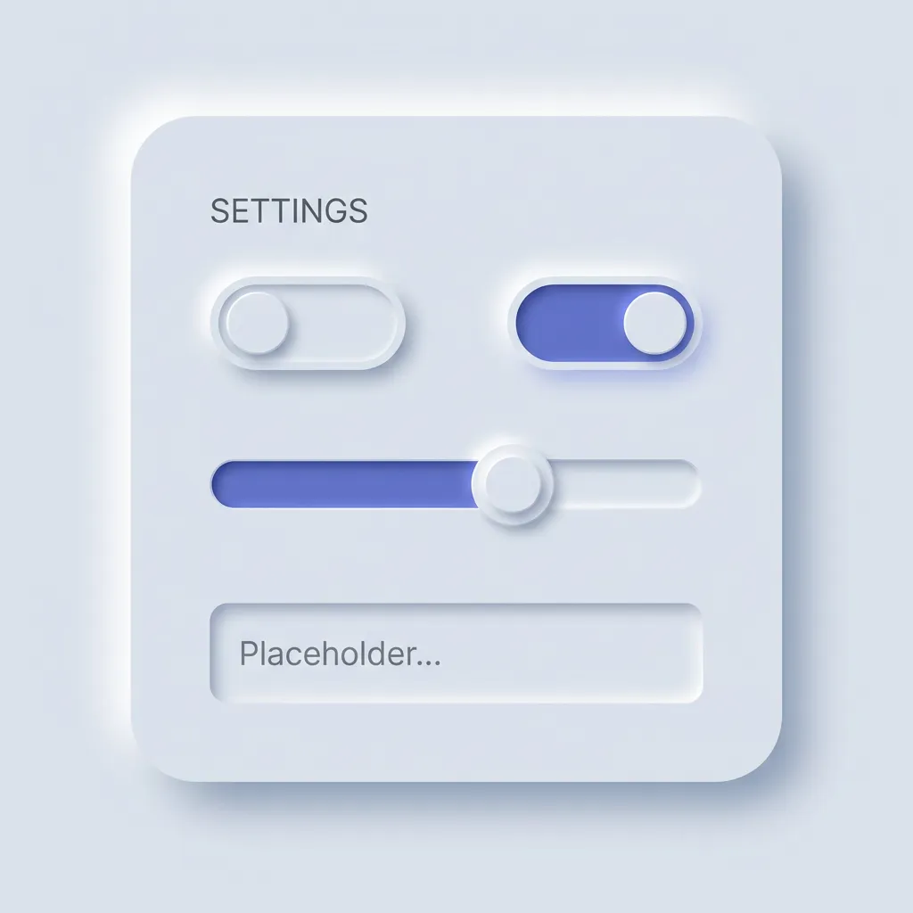
Neumorphism is a soft UI style where elements share the background color and gain depth from two opposing shadows, a light one on the top-left and a dark one on the bottom-right, so they appear extruded from or pressed into the surface. The name is a blend of "new" and "skeuomorphism," and it describes a near-monochrome look with no hard borders and no bright highlights.
The style arrived in late 2019 and peaked through 2020. Designer Alexander Plyuto posted a concept on Dribbble that spread fast, and within months "neumorphism" was the term everyone used for the soft, shadow-molded look. The timing fit a mood. Flat design felt tired, people wanted depth back, and this gave them depth without the heavy gradients of old skeuomorphism. Then the accessibility critiques landed, hard and correct, and the hype cooled almost as quickly as it rose.
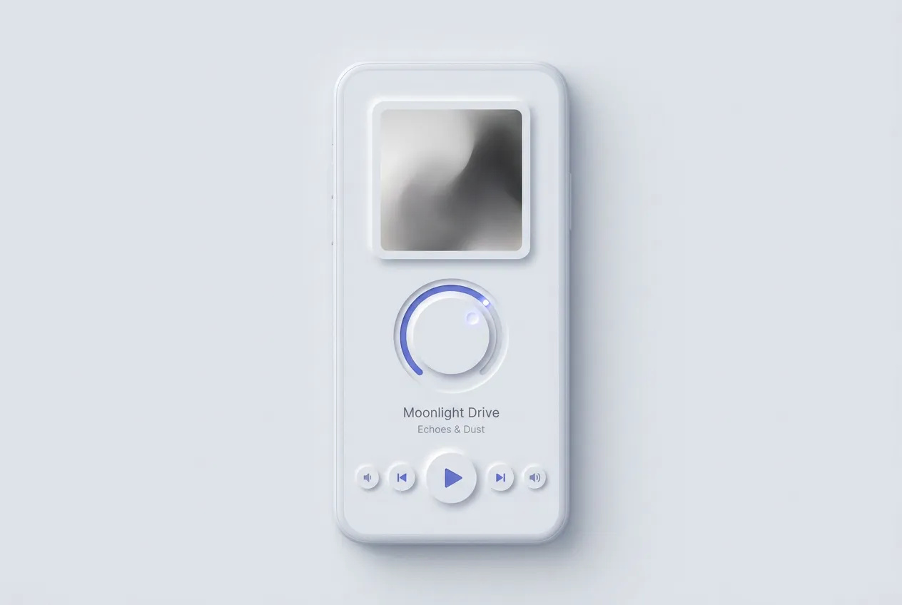
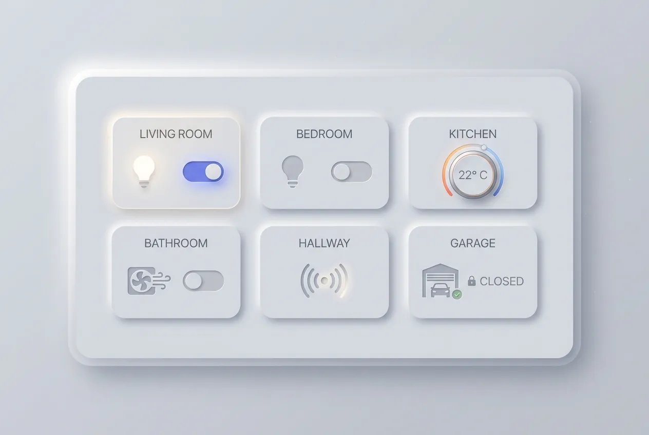
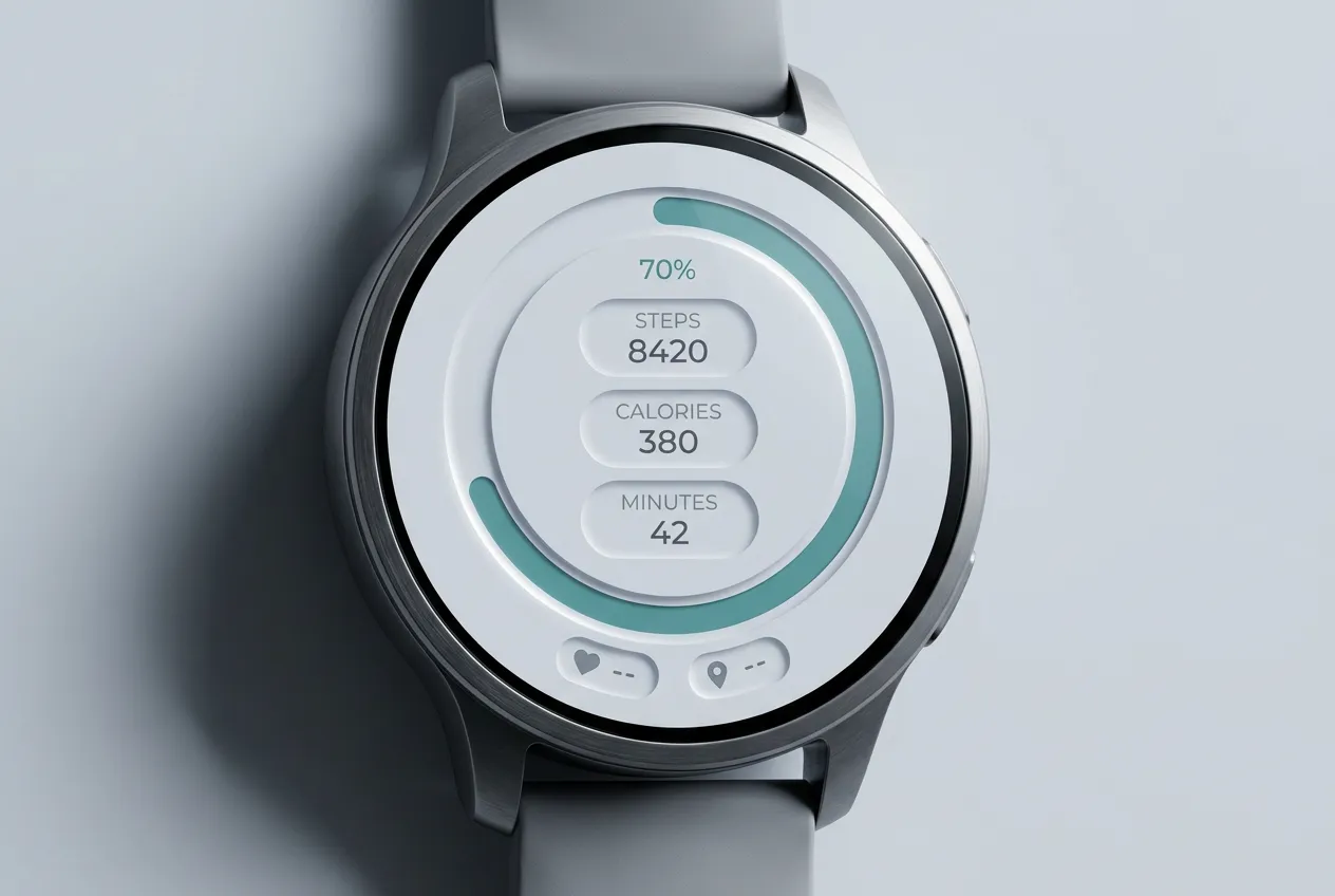
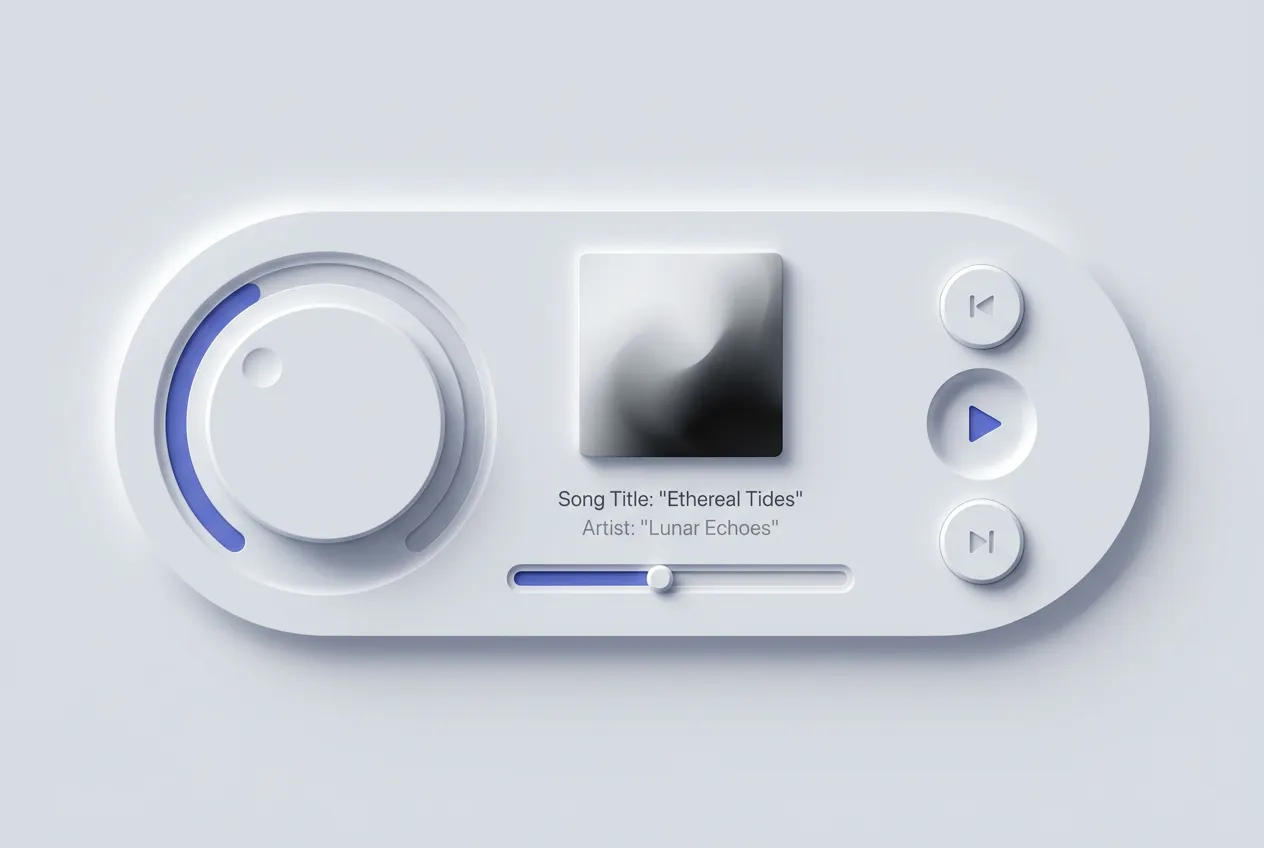
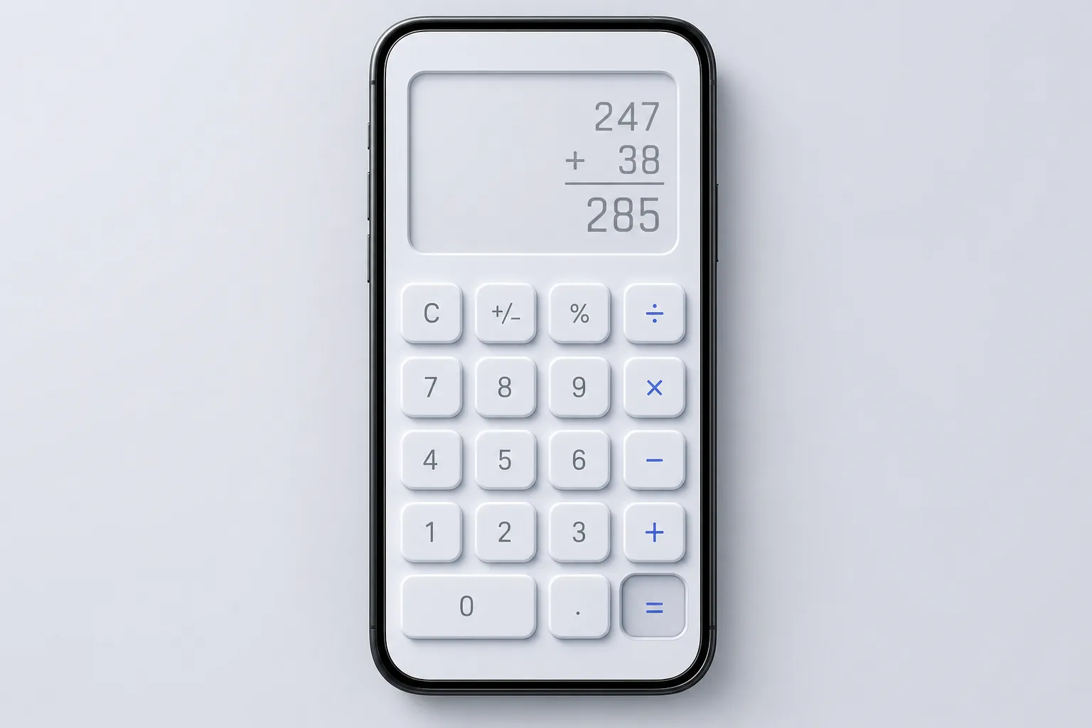
As of 2026 neumorphism lives in two places. It thrives in concept art, design challenges, and single-purpose interfaces where the whole screen is one calm instrument: a smart-home remote, a music player, a calculator. It mostly died in production software that has to serve everyone, because the look fights legibility. You will see it on Dribbble far more than in a shipped product you use daily.
People constantly mix it up with claymorphism, so here is the clean line. Neumorphism keeps the surface the same color as the page and uses one light plus one dark shadow to extrude it, which crushes contrast. Claymorphism floats a saturated pastel shape above the page with a colored drop shadow and a bright inner highlight, so it stays readable while still feeling soft. For the friendlier, higher-contrast cousin, read the claymorphism design guide. One whispers in monochrome, the other waves in candy colors.
Anatomy of neumorphism
Every neumorphism interface runs on the same small set of moves. Learn these six and you can spot the style instantly, or rebuild it from a blank file.
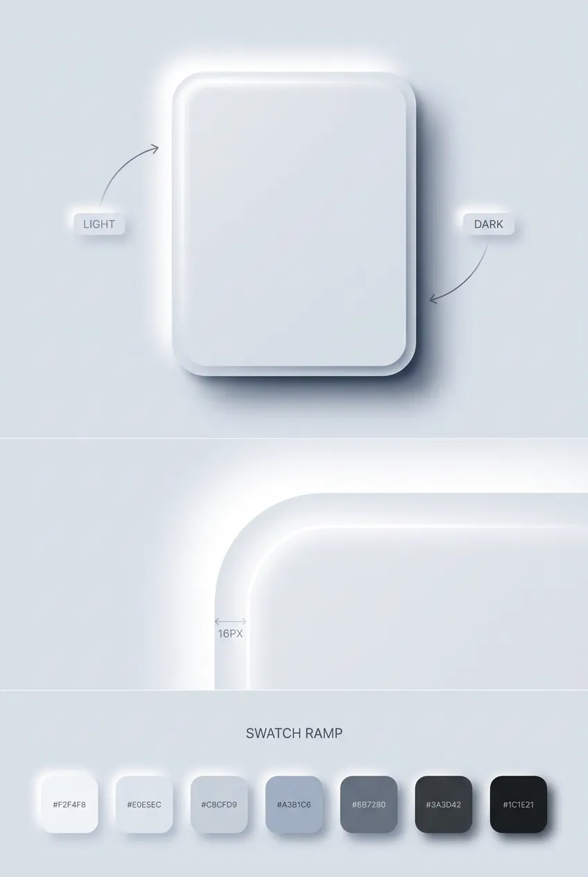
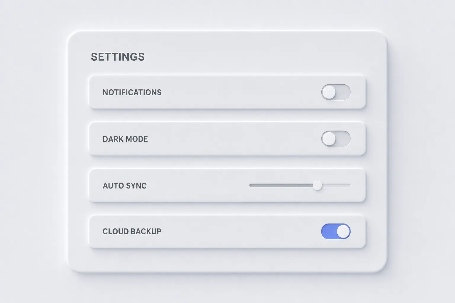
❶ Background-matching surfaces. This is the defining trait and the root of every problem. Cards and buttons use the exact background color, or within a few percent of it. There are no contrasting panels. Depth comes only from shadow, never from fill, which is the opposite of how claymorphism uses bright surfaces.
❷ Dual shadow recipe. Each element carries two shadows at once. A light shadow on the top-left, as if a soft lamp sits above and left, and a dark shadow on the bottom-right. Together they read as a rounded extrusion. Remove either one and the shape collapses flat.
❸ Subtle border radius. Corners are rounded but restrained, usually 12-20px, softer and tighter than claymorphism's chunky 24-32px. The radius should feel like molded hardware, not an inflated balloon. Sharp corners break the molded illusion just as fast as oversized ones overshoot it.
❹ Monochrome palette. The default is one hue across the whole screen, most often a light gray or a desaturated tint. Color, when it appears, is reserved for a single accent. This restraint is what gives neumorphism its quiet, instrument-panel calm.
❺ Low-contrast typography. Text sits close to the background in tone, soft grays on lighter grays. This is both the signature and the wound. It looks serene in a hero shot and fails real legibility tests, which is the central tension of the entire style.
❻ Pressed and inset states. Interaction flips the shadows inward. A resting button extrudes outward, and on press the same shadows move to inset, so the surface looks pushed into the page. This inversion is the one motion neumorphism does genuinely well, because a physical-looking dent reads as "pressed" even without color change.
Visual examples gallery
Eight interfaces where the soft, monochrome instrument look earns its place. Hover any tile for context.
CSS recipes, neumorphism in practice
The whole look lives in box-shadow. You stack one light shadow and one dark shadow on a surface that matches the page, then swap both to inset for the pressed state. Variables keep the base color and depth swappable, which matters because neumorphism only works when every element shares the same light source.
:root {
  --neu-bg: #e0e5ec;          /* surface AND page share this */
  --neu-radius: 16px;
  --neu-light: #ffffff;       /* top-left highlight */
  --neu-dark: #a3b1c6;        /* bottom-right shade */
  --neu-distance: 8px;
  --neu-blur: 16px;
}

.neu-card {
  background: var(--neu-bg);
  border-radius: var(--neu-radius);
  padding: 24px;
  box-shadow:
    calc(var(--neu-distance) * -1) calc(var(--neu-distance) * -1)
      var(--neu-blur) var(--neu-light),   /* light, top-left */
    var(--neu-distance) var(--neu-distance)
      var(--neu-blur) var(--neu-dark);    /* dark, bottom-right */
  transition: box-shadow 160ms ease, transform 160ms ease;
}
That single block reads as extruded. For an interactive element, the press should sink it into the page by moving both shadows inward with the inset keyword:
.neu-button:hover {
  transform: translateY(-1px);
}

.neu-button:active {
  transform: translateY(0);
  box-shadow:
    inset 6px 6px 12px var(--neu-dark),     /* dark moves inside */
    inset -6px -6px 12px var(--neu-light);  /* light moves inside */
}
Notice how the active state flips both shadows to inset at the same time. That inversion is the entire trick: the button stops bulging out and looks dented in. Forget it and a press feels dead. For theming, you swap the three core variables and the rest follows:
:root[data-theme="dark"] {
  --neu-bg: #2a2d32;
  --neu-light: #34383e;   /* highlight is a lighter gray, not white */
  --neu-dark: #1c1e21;    /* shade is a darker gray, not black */
}
In dark mode the highlight is never pure white and the shade is never pure black, or the soft molded effect turns into harsh plastic.
The accessibility problem
This is where I stop being charmed. Neumorphism has a structural accessibility problem that no amount of polish removes, because the look depends on low contrast by design.
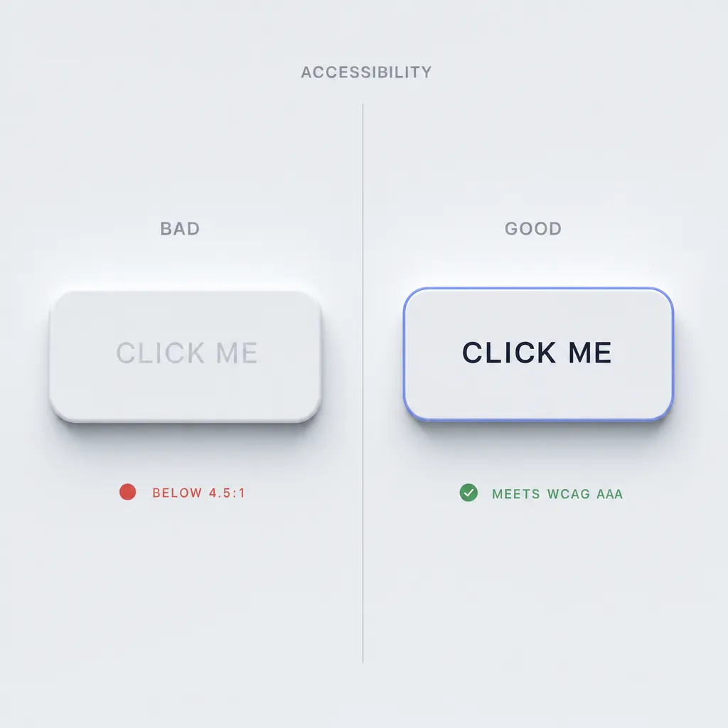
The failures are specific. Text on a background-matching surface routinely lands below the WCAG AA minimum of 4.5:1 for normal text, because soft gray on gray is the whole aesthetic. Buttons look identical to non-interactive surfaces, so users cannot tell what is clickable without trial and error. Focus states are weak, since a focus ring on a shadow-only element is barely visible. And screen readers get nothing from shadows, so any state you communicate through depth alone is invisible to assistive technology.
The fix is not to abandon the style. It is to bend it. Add a real accent color on interactive elements so a button announces itself instead of hiding. Use a visible border or a bold ring for focus, not a soft glow, and lean on the MDX-friendly :focus-visible selector so the indicator shows for keyboard users. Push text contrast to 7:1 even when the aesthetic begs for less, matching the WCAG AAA bar rather than the AA floor. The WCAG 2.2 contrast guidelines give you the exact ratios to test against. When in doubt, ship hybrid neumorphism: keep the soft shadows for mood, but add clear borders and accent fills so the interface stays usable. The shadows can stay soft. The legibility cannot.
Neumorphism guidelines for AI agents
This is the part I actually keep on hand. When I prototype a neumorphic screen in Cursor, Claude, v0, or Lovable, the prompt "make it neumorphism" produces gray mush with unreadable text. A precise spec produces something shippable and accessible. Copy the block below into your AI tool as a style instruction, then describe the screen. It pins the exact shadow values and, more importantly, the accessibility floors the model would otherwise ignore.
NEUMORPHISM.md — design spec for AI agents
Follow these tokens verbatim. Accessibility rules are NOT optional.
== 1. Visual identity ==
Palette: monochrome. One base hue for page AND every surface.
--bg: #E0E5EC /* light mode: page and cards are identical */
--bg-dark: #2A2D32 /* dark mode base */
Accent: exactly one saturated color, used ONLY on interactive
--accent: #5B7CFA /* buttons, active toggle, focus ring */
Radius: 12-20px on all elements. Never sharp, never balloon-round.
Contrast rule: surfaces match the page; depth comes from shadow,
never from fill color.
== 2. Shadow recipes (the whole look) ==
Light source is ALWAYS top-left. Keep it consistent screen-wide.
Extrude (resting, raised):
box-shadow:
-8px -8px 16px var(--light), /* highlight, top-left */
8px 8px 16px var(--dark); /* shade, bottom-right */
Inset (pressed / input wells):
box-shadow:
inset 6px 6px 12px var(--dark),
inset -6px -6px 12px var(--light);
Light/dark stops:
light mode -> --light #FFFFFF, --dark #A3B1C6
dark mode -> --light #34383E, --dark #1C1E21
(dark mode: highlight is light gray, NOT white; shade is
dark gray, NOT black)
== 3. Typography ==
Family: clean sans — Inter, SF Pro, Manrope, Nunito Sans
Weights: 500 body, 600 labels, 700 headings
Sizes: h1 28-32, h2 22, body 16 min, caption 13
Contrast: body text >= 7:1 against the surface. This overrides
the soft look. If gray-on-gray fails 7:1, darken the text.
== 4. Component recipes ==
Button (primary):
bg --bg, label uses --accent or text >= 7:1,
extrude shadow at rest,
:active -> swap to INSET shadow (the dent = pressed feedback)
ALWAYS add a 1px --accent border OR accent label so the button
is distinguishable from a plain surface.
Card:
bg --bg, radius 16-20, extrude shadow, no inner border.
Cards are non-interactive: no accent, softer shadow is fine.
Input:
INSET shadow only (a pressed-in well), radius 12-16,
text >= 7:1, visible --accent border on :focus-visible.
Toggle:
track = inset well, thumb = extruded circle,
ON state fills the track or thumb with --accent (color, not
shadow, communicates state — screen readers need aria-checked).
Slider:
track = inset groove, thumb = extruded knob with --accent dot,
never rely on shadow alone to show the filled portion.
== 5. Accessibility requirements (mandatory) ==
- Body text contrast >= 7:1, never below 4.5:1 (WCAG AA floor)
- Every interactive element needs a non-shadow cue: accent
color, border, or label. Shadow alone is not a state.
- Focus: visible 2px --accent ring or border via :focus-visible
- Hit target >= 44x44px (WCAG 2.2)
- Pressed state must change shadow direction (extrude -> inset)
AND set the matching ARIA state attribute.
== 6. Use when ==
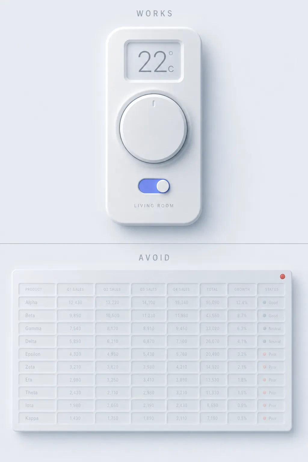
- Single-purpose instrument UIs (player, remote, calculator)
- Smart-home and IoT control panels
- Tactile widgets where one calm screen is the whole product
- Concept work and design-challenge shots
== 7. Avoid when ==
- Data-dense dashboards and tables
- Long reading or content-heavy flows
- Accessibility-critical audiences (low vision, older users)
- E-commerce or any screen with many competing CTAs
== 8. Common mistakes AI agents make ==
- Forgetting the INSET shadow on the active state, so presses
feel dead instead of dented
- Letting text sit gray-on-gray below 4.5:1 (the cardinal sin)
- Using a single drop shadow instead of the dual light+dark pair
- Adding bright, saturated accent colors everywhere, which
destroys the monochrome calm — accent is ONE color, used rarely
- Making buttons indistinguishable from cards (no accent, no
border), so users cannot find the clickable element
- Pure white highlights / pure black shades in dark mode, which
turns soft molding into harsh plastic
If you keep that spec around, you can compare your generation against real production patterns in the AI inspiration gallery before you commit to the look.
When neumorphism works and when it doesn't
The style is a narrow instrument, and most products are not the nail it hits. Use this as a decision framework, not a vibe.
Works for:
- Smart-home and IoT control panels where one calm screen is the product
- Audio and music interfaces with big, tactile transport buttons
- Calculators and keypads where the extruded keys feel physical
- Single-purpose widget UIs with few elements and one clear job
- Concept work where the monochrome look reads as premium and quiet
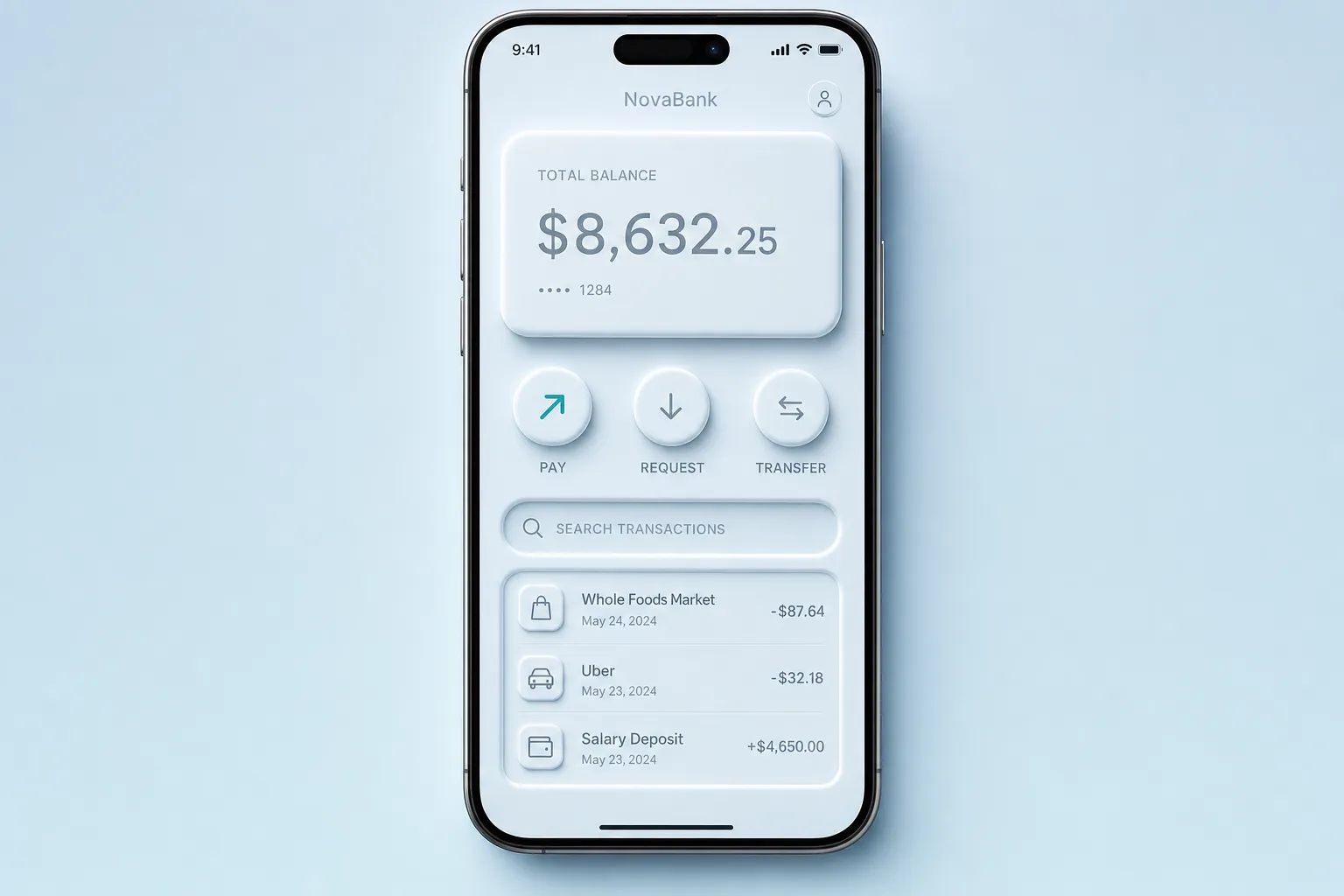
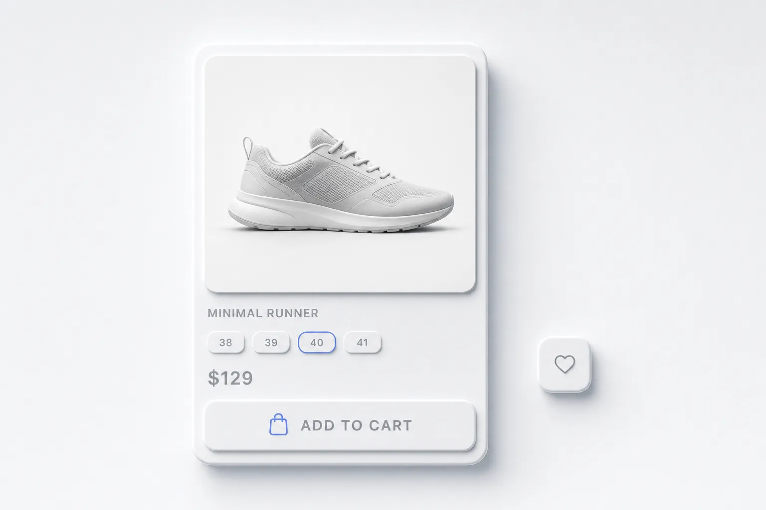
Avoid for:
- Data-dense dashboards where every value needs to be read fast
- Any interface serving an accessibility-critical audience
- Long reading flows where low-contrast text exhausts the eye
- E-commerce and multi-CTA screens where buttons must stand out
- Forms with many fields, where soft wells hide the active input
The honest test: if the product is one tactile instrument used by people with good eyesight and patience, neumorphism feels lovely. If the product moves dense information or serves a broad public, the soft monochrome turns into a guessing game. I have watched teams apply it to a real dashboard and then spend the next sprint adding borders back, which is just admitting the style needed help all along.
Related design morphisms
Neumorphism is one stop on a longer tour of depth styles, and the contrast between them is the fun part. For the warmer, higher-contrast cousin that fixes most of neumorphism's legibility sins, read the claymorphism design guide, where bright pastel surfaces do the work shadows cannot. For the frosted, translucent direction that Apple pushed into the mainstream, the practical guide to liquid glass shows depth built from refraction instead of extrusion. And for the exact opposite philosophy, loud, sharp, and deliberately ugly, the retro brutalist UI guide does everything neumorphism refuses to.
Trends like these rarely win outright. They each solve one mood well and then overstay it. The useful skill is not picking a favorite, it is knowing which one the screen in front of you actually needs.
Frequently asked questions
Is neumorphism still used in 2026?
In its niche, yes. Neumorphism never became a default like flat design, and the accessibility backlash cooled the 2020 hype fast. As of 2026 it stays popular for single-purpose instruments like players, smart-home remotes, and calculators, plus concept shots on Dribbble. It is a deliberate stylistic choice for calm, tactile widgets, not a general-purpose system.
What is the difference between neumorphism and claymorphism?
Neumorphism keeps surfaces the same color as the page and extrudes them with one light and one dark shadow, which crushes contrast. Claymorphism floats a saturated pastel surface above the page with a colored drop shadow and a bright inner highlight, so it stays readable. Neumorphism looks embossed and monochrome; claymorphism looks puffy and colorful.
Why is neumorphism considered bad for accessibility?
Because the look depends on low contrast. Text on a background-matching surface often falls below the WCAG AA minimum of 4.5:1, buttons look identical to non-interactive surfaces, focus states are weak, and screen readers get no cue from shadows. You can adapt the style with accent colors, borders, and higher text contrast, but the default version fails common accessibility checks.
How do I create the neumorphism shadow in CSS?
Stack two shadows on one box-shadow: a light shadow on the top-left and a dark shadow on the bottom-right, on a surface that matches the page color. For the pressed state, swap both shadows to inset so the element looks dented in. Keep the light source on the top-left for every element on the screen, and use a border radius around 12-20px.
Which fonts pair well with neumorphism?
Clean, neutral sans-serifs match the calm monochrome look. Inter, SF Pro, Manrope, and Nunito Sans all work at medium to bold weight. Avoid decorative or sharp display faces, which fight the soft, instrument-panel mood. Whatever font you pick, push its contrast against the surface to at least 7:1 so the type stays readable despite the soft palette.