


Roman Kamushken
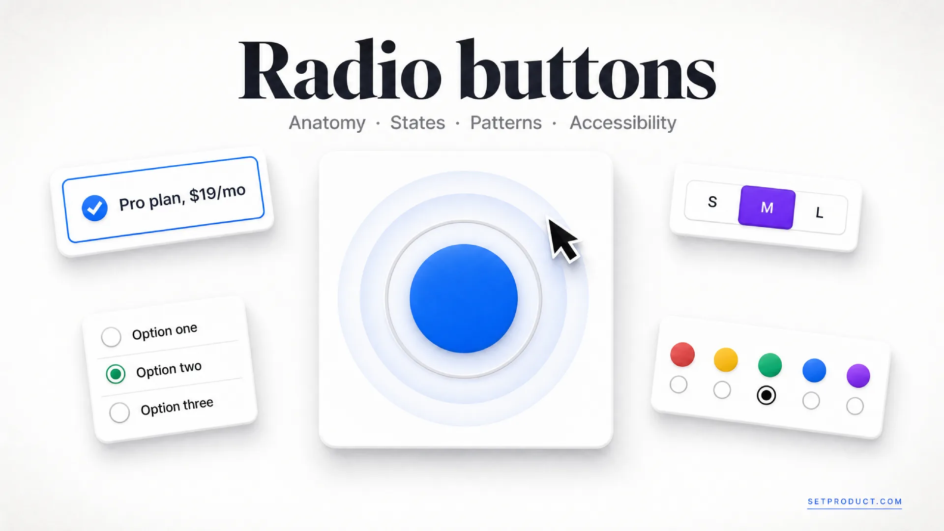
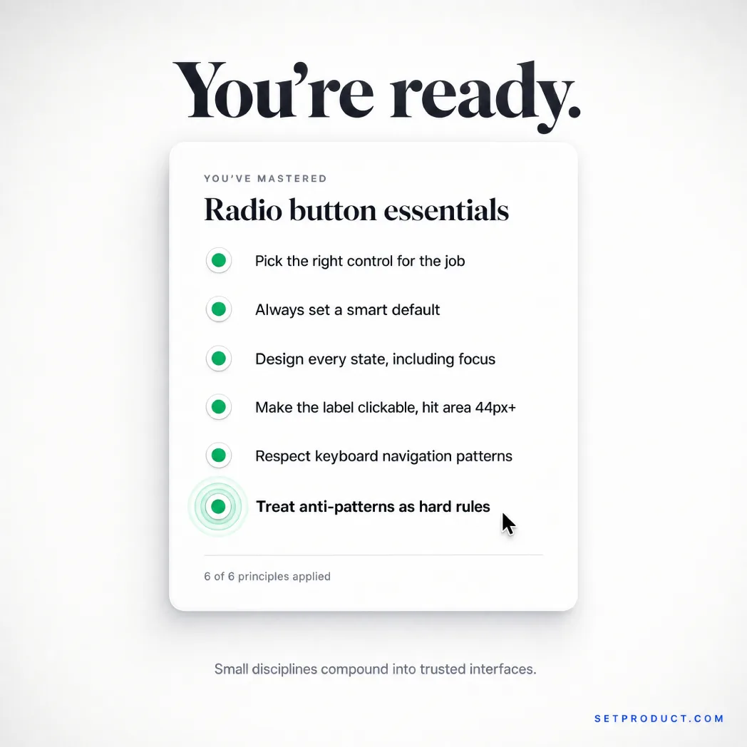
A radio button is a control that lets someone pick exactly one option from a small, fixed set, where choosing one clears the rest. This guide is the long version. It covers anatomy, every state, the card-based patterns that dominate modern SaaS, accessibility, and the quiet mistakes that turn a simple choice into a frustrating form.
I have shipped radio groups inside dashboard and onboarding UI kits for years, and the control almost never fails on the happy path. One option selected, four to go, it looks fine in the demo. The cracks show in the edges: the group with no default, the disabled option no one explains, the card selector that traps a keyboard user. This is the reference I wish I could hand to a team before the first design review.
TL;DR
→ Reach for radio buttons when options are mutually exclusive and the user benefits from seeing every choice at once. For two opposing states like on and off, a toggle switch is the better fit, and for many independent choices you want checkboxes.
→ A radio group is the real unit, not the single button. Wrap it in a fieldset with a legend, and the group gains a name, a structure, and the keyboard behavior screen-reader users expect.
→ Accessibility is decided by structure. One tab stop for the whole group, arrow keys to move between options, and a labeled legend give you a control that works without a mouse. The W3C ARIA radio group pattern is the spec to follow.
→ Card-based radios are the modern default for pricing, plans, and onboarding. Make the entire card a label so the whole surface is clickable, not just the 20-pixel circle in the corner.
→ The anti-patterns I flag most: using radios for two options, offering no default when one is safe, and shipping a card selector that only the mouse can operate. Each one quietly costs you completed forms.
What a radio button is (and is not)
In UI design, a radio button is a form control that lets users select a single option from a set of two or more mutually exclusive choices. Selecting one option automatically deselects any other in the same group. The name comes from old car radios, where pushing one station button popped the others out.
That mechanical metaphor still explains the whole behavior. A radio button never lives alone. It is one member of a group, and the group enforces a single answer. Tap a different option and the previous one releases, because the question only has one correct response at a time: one plan, one shipping speed, one payment method.
This is the line teams blur most, because radios, checkboxes, and toggles all look like small clickable controls and solve choice-shaped problems. They answer different questions.
A radio button asks "which one?" and accepts exactly one answer from a visible set. Shipping method, subscription tier, and survey rating are radio questions.
A checkbox asks "which ones?" and accepts zero, one, or many. Toppings on a pizza, notification types, and filters in a list are checkbox questions. A lone checkbox also handles a single yes or no, like accepting terms, where a radio would be overkill. The checkbox UI design guide covers that side in full.
A toggle switch asks "on or off?" and flips a single setting with an immediate effect, no submit step. Dark mode and notifications-on are toggle questions, not radio ones.
| Aspect | Radio button | Checkbox | Toggle switch | Dropdown |
|---|---|---|---|---|
| Question it answers | Which one? | Which ones? | On or off? | Which one (from many)? |
| Selections allowed | Exactly one | Zero to many | One binary state | Exactly one |
| Options visible | All at once | All at once | Just the switch | Hidden until opened |
| Best option count | 2 to 6 | Any | 1 setting | 7 or more |
| Typical example | Shipping speed | Email preferences | Dark mode | Country selector |
The practical rule is about visibility and count. When there are roughly two to six mutually exclusive options and seeing them all helps the choice, radios win. Push past six or seven and the group eats too much vertical space, so a dropdown menu that hides the options until needed becomes the better tool. The rest of this guide is about the radio end of that range.
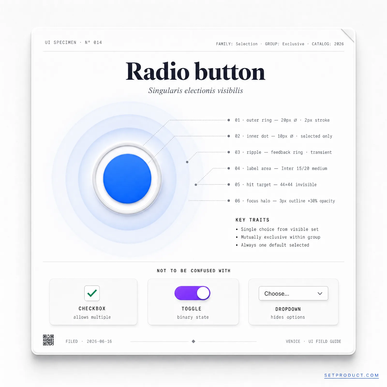
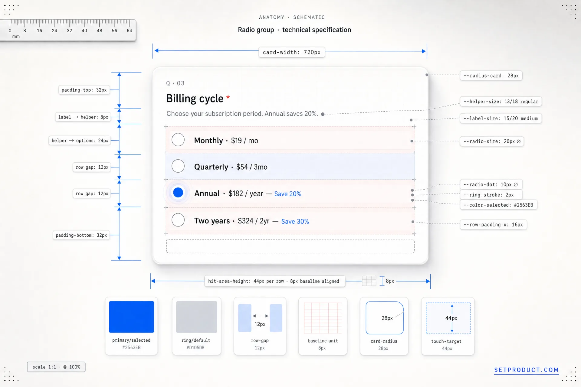
Anatomy of a radio group
A radio button looks like a single circle until you list its parts, and the most important part is the one people forget: the group itself. Here is the full set, with a design note on each.
• The group container. The fieldset that binds the options into one question. It is invisible in most designs but structural for assistive tech, and it is what makes arrow-key navigation and a single tab stop possible. Designing the button without the group is where accessibility quietly breaks.
• The group label. The legend or heading that states the question, like "Shipping method." Every option answers this label, so it has to be present and clear. A group of options with no question above them forces the user to reverse-engineer what they are choosing.
• The control. The circle itself, drawn as a ring when empty and a filled dot when chosen. Its round shape is a learned signal for single choice, the same way a square signals multi-select. Do not square off a radio or round a checkbox; the shapes carry meaning.
• The inner dot. The filled center that marks the selected option. It needs enough contrast against the ring and the background to read at a glance, and it should animate in quickly rather than snapping, so the selection feels acknowledged.
• The option label. The text naming each choice. It must be clickable, not just the circle, because a 20-pixel target is a miss waiting to happen. Tying the label to the input with for and id doubles the hit area and is the cheapest accessibility win in the component.
• Helper or description text. Optional supporting copy under an option, common in pricing cards, like "Best for small teams." Keep it tied to its option so screen readers announce it with the right choice rather than as orphaned text.
• The spacing rhythm. The vertical gap between options. Too tight and the group reads as one block and invites mis-taps; too loose and it stops reading as a single question. Consistent spacing is what tells the eye these items belong together.
The states of a radio button
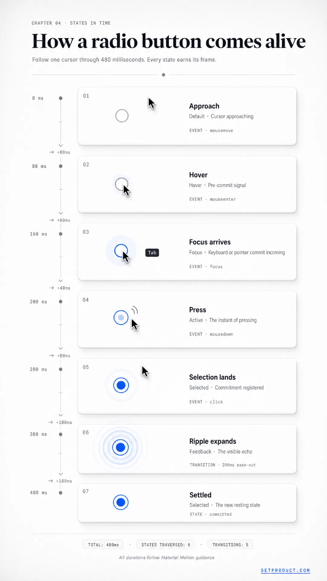
A radio button carries a small state machine, and the gap between a cheap control and a polished one lives entirely in how those states are drawn. Design all of them up front, because the ones you skip are the ones a real user lands on first. Here are the seven that matter.
Default (unselected)
The resting state of an option no one has chosen yet: an empty ring with no inner dot. It has to read as clearly interactive, with enough contrast that it does not fade into the background, while staying visually quieter than the selected option. If your unselected radios look disabled, people will not realize they can pick them.
Selected
The chosen option, marked by the filled inner dot. This is the most important state in the group, because it answers the question, so it needs the strongest visual weight: a saturated fill, a clear dot, and enough contrast that someone scanning the form sees the answer instantly. Only one option in a group ever wears this state at a time.
Hover
The pointer-over feedback on desktop, signaling that the option is live before the click. A subtle ring color shift or a soft background tint on the row is enough. The job is to confirm the target, especially in card-based layouts where the whole card should respond, not just the circle, so the user trusts that clicking anywhere counts.
Focus
The keyboard state, and the one teams forget most. When a radio receives focus it needs a visible focus ring, not just the native dotted outline you suppressed in a reset. This is the single most common accessibility failure I see: outline: none with no replacement, leaving keyboard users with no idea where they are in the group. Keep a clear focus indicator that meets WCAG 2.2 focus visibility.
Active (pressing)
The brief moment between press and release, when the control acknowledges the input. A small scale-down or a momentary ring darkening makes the interaction feel physical and responsive. It is a detail, but its absence makes a control feel slightly dead, like a button that does not depress.
Disabled
An option that exists but cannot be chosen right now, such as a plan unavailable on the current tier. Lower its contrast so it reads as inactive, and set aria-disabled or the disabled attribute so assistive tech skips it. A disabled radio with no explanation reads as a bug, so pair it with a short reason on hover or nearby, like "Upgrade to unlock."
Error
The state when a required group was left unanswered on submit. The whole group, not one option, needs the error treatment: a message tied to the legend, a color or border shift on the group, and an accessible announcement so a screen-reader user hears the problem. Mark the error on the group because the question is what failed, not any single circle.
Types and variants
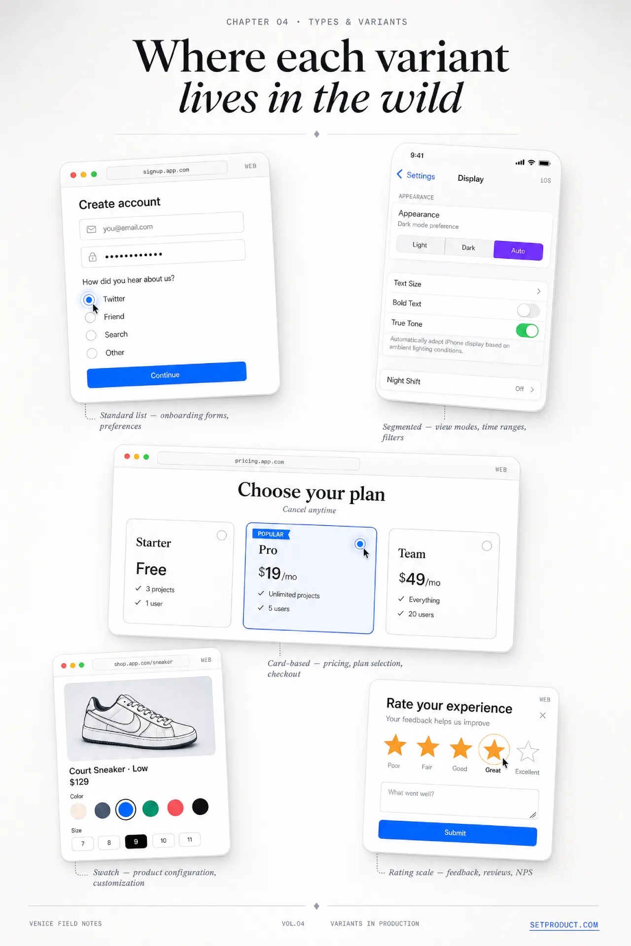
The plain circle-and-label list is only one way to ask a single-choice question. The underlying behavior stays identical, one selection out of many, but the presentation changes the feel and the conversion. Here are the five variants that cover almost every product need.
❶ Standard radio list. The classic vertical stack of circle-plus-label rows. It is the right default for surveys, settings, and any group where the options are plain text. Stack them vertically rather than in a row, because a vertical list is easier to scan and far easier to read on a phone.
❷ Card-based radio. Each option becomes a full card, often with a title, a description, an icon, and a price. This is the modern default for pricing tiers, plan pickers, and onboarding choices, and it is where most of today's radio design effort goes. The control circle may shrink or vanish, replaced by a selected border and background, but underneath it is still a radio group with all the same rules.
❸ Segmented control. A horizontal row of joined buttons where one stays pressed, familiar from iOS. It works for two to five short options that benefit from sitting on one line, like a Day / Week / Month view switch. Past five options or with long labels it cramps, so keep it tight. Apple's Human Interface Guidelines cover this pattern in detail.
❹ Image or swatch radio. The option is a thumbnail, a color chip, or a product photo rather than text. Common in checkout for sizes and colors, and in theme pickers. The selected state needs a strong border or check overlay, since a tinted swatch alone can be ambiguous against a colorful image.
❺ Rating or scale radio. A horizontal scale, like a 1-to-5 survey row or an NPS strip, where the options are inherently ordered. Each point is still one radio in one group, but the layout signals a continuum. Label at least the two ends so the scale is not left to interpretation.
The thing to hold onto across all five: the variant is a costume, not a new component. A card selector and a survey row are the same radio group with different paint. If you skip the group semantics because it "looks like cards," you ship something that fails the moment a keyboard or a screen reader touches it.
A closer look at card-based radios
Because card selectors now drive so many pricing and onboarding flows, they deserve their own rules. They are also where the most expensive mistakes hide, since a beautiful card that only the mouse can operate looks done while being broken.
→ Make the entire card a label. The whole surface should be clickable and announced as one option, not just a tiny circle in a corner. Wrapping the card markup in a label tied to a visually present or visually hidden input is what delivers this.
→ Give the selected card unmistakable treatment. A border color change alone is too subtle for many users; combine it with a background tint and a visible check or filled circle so the choice survives a quick scan and a colorblind eye.
→ Keep a real radio underneath. Whether you hide the native input or restyle it, the name, value, and group semantics must stay, so the keyboard, the form submission, and assistive tech all keep working.
→ Mind the spacing and tap size. Cards invite generous padding, which is good for touch, but keep the gaps between them clear so the group still reads as one question rather than a scattered set of unrelated panels.
Accessibility, keyboard, and screen readers
This is the section most radio button tutorials wave at and move past, and it is exactly where real products break. A radio group is one of the few controls where getting the structure right is most of the accessibility work, and getting it wrong cannot be patched with a label later. Build it correctly once and keyboard, screen-reader, and touch support fall out almost for free.
Start with native HTML
The single best decision is to use real <input type="radio"> elements, sharing one name attribute, wrapped in a <fieldset> with a <legend>. That markup alone gives you the group semantics, the single tab stop, the arrow-key navigation, and the form submission behavior, all from the browser, all tested across assistive tech for decades. The name is what binds the options into a group so selecting one releases the others.
<fieldset>
  <legend>Shipping method</legend>
  <label><input type="radio" name="shipping" value="standard" checked> Standard, 5 to 7 days</label>
  <label><input type="radio" name="shipping" value="express"> Express, 2 days</label>
  <label><input type="radio" name="shipping" value="overnight"> Overnight</label>
</fieldset>
When you cannot use native inputs, because a design system renders custom elements, you rebuild the same contract with ARIA: a container with role="radiogroup" and an accessible name, each option with role="radio" and aria-checked, and the keyboard behavior wired by hand. The W3C ARIA Authoring Practices radio group pattern is the exact spec, and it is worth following to the letter rather than approximating.
Keyboard behavior is not optional
A radio group has a specific, expected keyboard model, and it differs from a list of checkboxes in one crucial way: the whole group is a single tab stop. Tabbing lands on the group once, and the arrow keys move within it.
• Tab moves focus into the group, landing on the selected option, or the first option if none is selected, then Tab again leaves the group entirely.
• Arrow keys move between options inside the group, and in the standard pattern moving to an option also selects it, which is why a sensible default matters.
• Space selects the focused option when selection is not automatic on arrow.
This "one tab stop, arrows inside" model is called a roving tabindex, and it is why you must never give every radio its own tab stop. A group of six radios that each take a Tab press is a hand-rolled control that ignored the spec, and it makes keyboard users press Tab five extra times for one answer.
What the screen reader must announce
When a screen-reader user reaches the group, three things have to be spoken: the group's name from the legend, the option's own label, and its position, like "Shipping method, Express 2 days, radio button, 2 of 3, selected." Native inputs produce all of this automatically. Custom controls have to supply it through the accessible name, role, aria-checked, and correct grouping. If your radio announces only "selected" with no question and no position, the user is choosing in the dark.
Touch targets and contrast
The visible circle is often 20 pixels, which is far below a safe touch target. Extend the clickable area to the full label and row so the real target meets the WCAG 2.2 target size minimum of 24 pixels, and aim higher on touch. Make sure the selected dot, the focus ring, and the option text all clear contrast thresholds, and never rely on color alone to show which option is chosen, since that fails for colorblind users. Material Design's radio button guidance is a solid reference for the sizing and contrast specifics.
Theming and styling
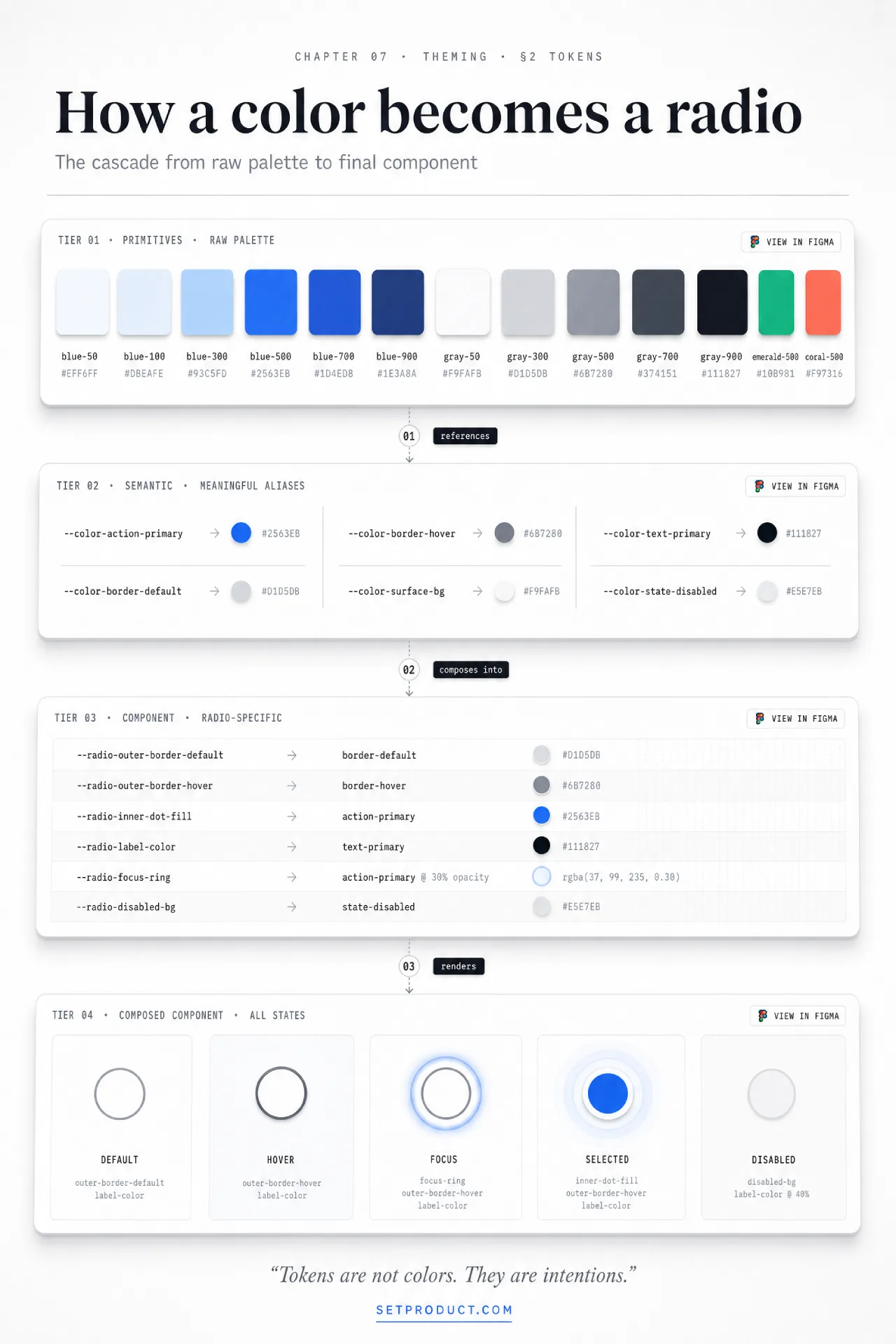
Once the structure is sound, the styling is where a radio group either matches your brand or looks like a default browser leftover. The trick is to restyle the control without throwing away the native behavior you just secured.
The modern approach uses appearance: none to strip the browser's default rendering, then rebuilds the ring and dot with CSS while the real <input> stays in the DOM doing its job. You draw the ring with a border, the inner dot with a pseudo-element scaled up on :checked, and the focus ring with :focus-visible so it shows for keyboard users without flashing on every mouse click. This keeps the accessibility intact and gives you full visual control, which beats the old trick of hiding the input off-screen and faking everything.
A few styling decisions carry more weight than they look:
• Size the control to the type. A radio circle that is dramatically smaller than its label text looks like an afterthought. Scale the ring to sit comfortably with the label's cap height, and keep the proportion consistent across the whole system.
• Animate the dot, briefly. A quick scale or fade on the inner dot, around 120 to 150 milliseconds, makes selection feel acknowledged. Anything slower starts to feel laggy on a control people expect to be instant.
• Theme the selected color deliberately. The filled state usually borrows your primary brand color. Check it against both light and dark backgrounds, and verify the dot-to-ring contrast holds in a dark theme, where a mid-tone brand color can wash out.
• Respect the system. Honor prefers-reduced-motion by dropping the dot animation, and let the control inherit dark-mode tokens rather than hard-coding a single palette.
A consistent radio style is also a design-token problem, not a one-off. The same ring weight, dot size, focus ring, and selected color should flow from your tokens into every radio, checkbox, and input field so the whole form library feels like one system rather than a pile of separately styled controls.
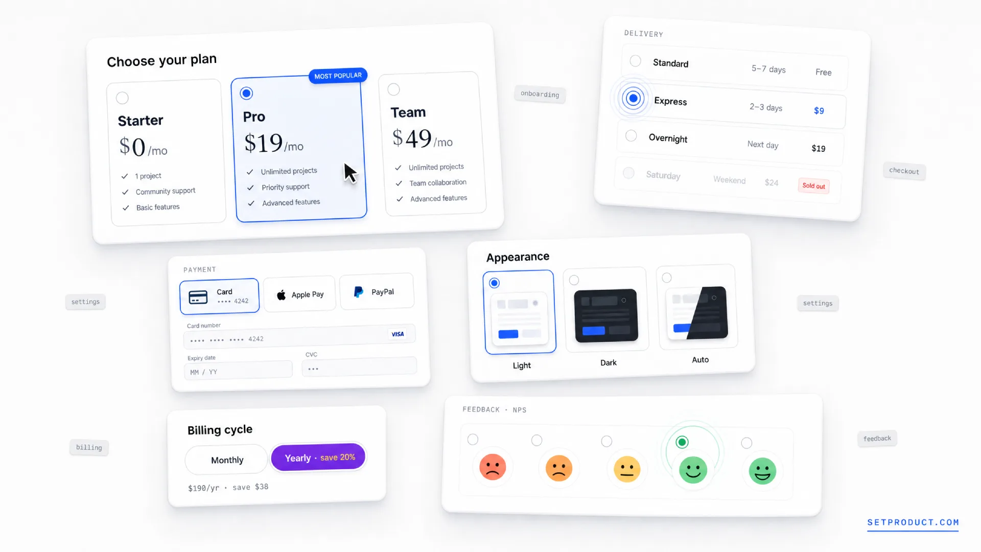
Real-world radio patterns
Theory gets you a clean control; seeing where it lands in real products tells you which variant to reach for. These are the patterns that show up again and again across the SaaS and commerce flows I audit.
→ Pricing and plan selection. Card-based radios are the standard here. Each tier is a card with a name, a price, and a feature line, and the selected tier gets a bold border and tint. Stripe, Notion, and most SaaS pricing pages run on this exact pattern, because a single visible choice with a clear default nudges people toward the plan you want to highlight.
→ Checkout and shipping options. Shipping speed is the textbook radio question: standard, express, or overnight, exactly one, with the price beside each. Showing all options at once, rather than hiding them in a dropdown, lets the user weigh speed against cost in a single glance, which is why nearly every checkout uses radios here.
→ Onboarding and segmentation. "What brings you here?" or "How big is your team?" are single-choice questions that shape the rest of the flow. Card or large-tap radios work well because the options are few and the moment deserves visual weight. These often feed into the kind of multi-step flow design where each answer routes the next step.
→ Settings with mutually exclusive modes. Choosing one of several layouts, one notification frequency, or one default view is a radio job, not a toggle one. The distinction matters: a toggle is for a single on/off setting, while three competing options need a group, which the toggle switch guide draws out in detail.
→ Surveys and feedback scales. Rating rows, NPS strips, and single-answer survey questions are radio groups by definition. The ordered scale variant fits here, with labeled endpoints so a 1 and a 5 are not left to guesswork.
If you want to study these patterns as live, inspectable components rather than static screenshots, browsing a component gallery of real radio buttons is faster than rebuilding each one to see how its states behave.
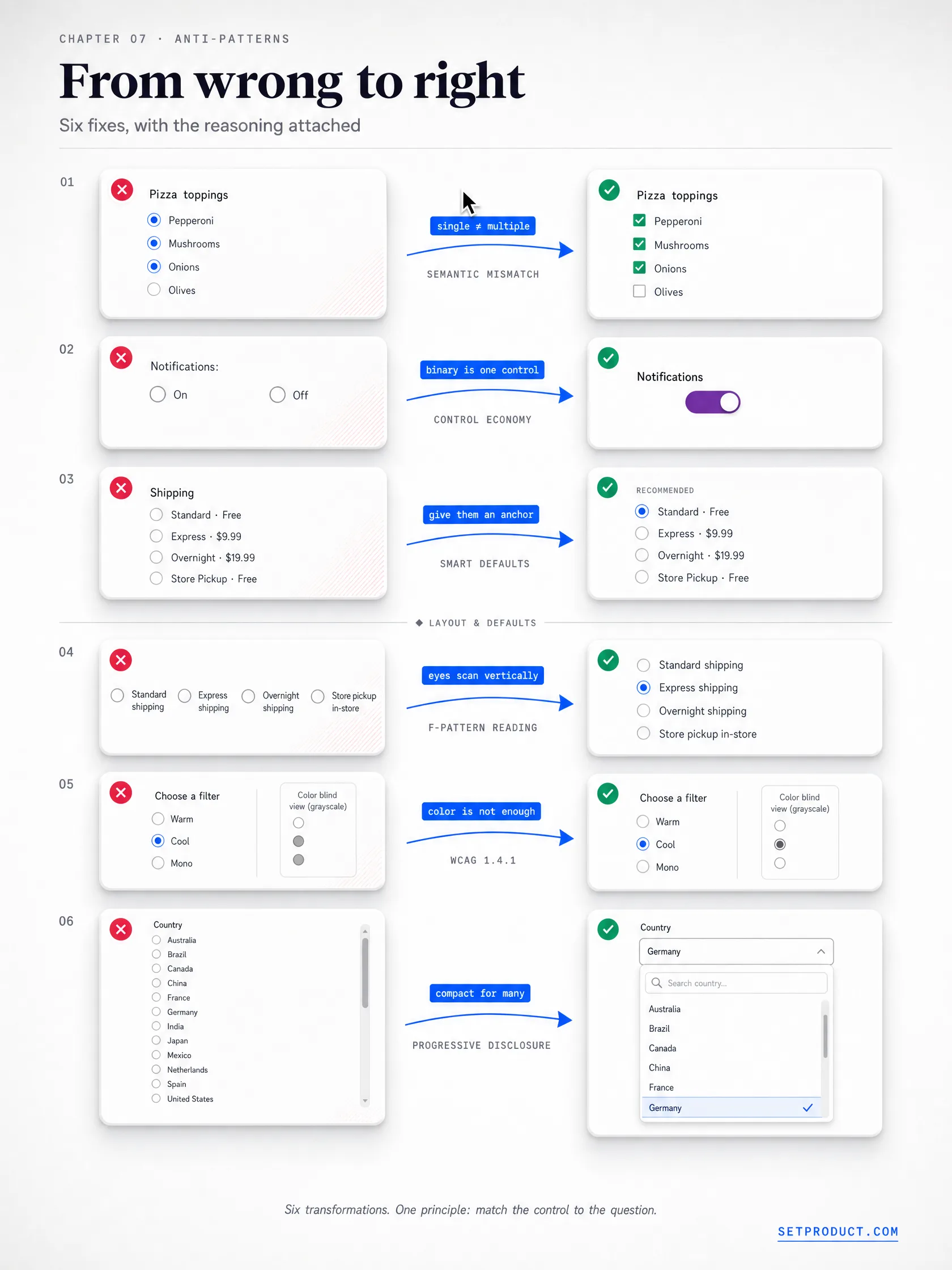
Anti-patterns to avoid
Most radio buttons fail in the same predictable ways. After auditing dozens of forms across SaaS and commerce, these are the mistakes that show up again and again. Each one is fixable, and each one quietly costs you completed forms.
☞ Using radios for two opposing states. A pair of radios for "on" and "off" is two controls doing one control's job. If the choice is binary and applies a setting, use a toggle switch. Reserve radios for three or more options, or for two that are genuinely peer choices rather than an on/off setting.
☞ No default when one is safe. Leaving every option blank forces a decision the user may not have an opinion on yet. If a sensible default exists, like the most common shipping speed, preselect it. The exception is consequential or personal choices, such as consent or a survey answer, where a forced default biases the result.
☞ Letting the user deselect into nothing. Unlike a checkbox, a radio in a group should not be clearable back to empty once a choice is made. If "none" is a valid answer, add an explicit "None" option rather than letting people clear the group, so the absence of a choice is intentional rather than accidental.
☞ A clickable circle but a dead label. Tying the click to only the 20-pixel circle, while the label sits there inert, throws away the easiest hit area in the component. Make the label and the whole row selectable by tying them to the input. This is also the most common touch-target failure.
☞ Killing the focus ring. An outline: none reset with no :focus-visible replacement leaves keyboard users with no idea where they are in the group. This is the single most frequent accessibility bug I find in radio groups, and it is invisible to anyone testing with a mouse.
☞ Too many options for a radio. Past six or seven choices, a radio list becomes a wall that eats the screen and slows scanning. At that point a dropdown menu that collapses the options is kinder. Radios are for small, surveyable sets, not long lists.
☞ A card selector only the mouse can use. Beautiful pricing cards that respond to clicks but have no real radio underneath fail the instant a keyboard or screen reader arrives. The card must wrap a genuine input, take focus, and announce itself, or it is a decoration pretending to be a control.
☞ Disabled options with no explanation. A greyed-out plan with no reason reads as a broken control. If an option is unavailable, say why on hover or nearby, like "Available on the Pro plan," so the dim state is information rather than a dead end.
☞ Horizontal lists that wrap badly. Laying radios in a row saves vertical space until the labels wrap on a narrow screen and the alignment falls apart. Default to a vertical stack, which scans cleanly and survives every viewport, and reserve horizontal layouts for short, fixed labels.
Checklist before you ship
Run a radio group against this list before it leaves your file. Most of the failures from the anti-patterns section are caught by a single pass through it.
✔ The control is a true single-choice group, not a job better done by a checkbox or toggle.
✔ Options are wrapped in a fieldset with a legend, or a role="radiogroup" with an accessible name.
✔ All options share one name so selecting one releases the others.
✔ A sensible default is preselected, unless a forced choice would bias the answer.
✔ The whole group is one tab stop, and arrow keys move between options.
✔ Every option has a visible focus ring via :focus-visible, not a suppressed outline.
✔ The label and full row are clickable, not just the circle.
✔ Touch targets meet 24 pixels minimum, larger on touch surfaces.
✔ The selected state uses more than color, such as a dot plus a border or tint.
✔ Disabled options explain why, and carry aria-disabled or disabled.
✔ Card-based selectors wrap a real input and take keyboard focus.
✔ Required groups show an error on the group, tied to the legend, on invalid submit.
✔ Screen readers announce the group name, the option label, position, and selected state.
✔ Selected color and focus ring clear contrast in both light and dark themes.
Pair this with the patterns from the checkbox UI design guide, since radios and checkboxes share most of their structure and differ mainly in how many answers they allow.
Frequently asked questions
❶ What is the difference between a radio button and a checkbox?
A radio button lets users select exactly one option from a group, where choosing one clears the others, while a checkbox lets users select any number of options independently, including none. Use radios for mutually exclusive choices like shipping speed, and checkboxes for multiple selections like notification types. The shapes signal this: round means one, square means many. The checkbox UI design guide covers the multi-select side.
❷ When should I use a radio button instead of a dropdown?
Use radio buttons when there are roughly two to six options and seeing all of them at once helps the decision, such as a pricing tier or a shipping method. Switch to a dropdown when there are seven or more options, or when the choices are familiar enough that hiding them saves space, like a country selector. Radios trade screen space for visibility, so they win when the comparison itself matters.
❸ Should radio buttons have a default option selected?
Usually yes. Preselecting a sensible default, like the most common choice, reduces effort and prevents empty submissions. The exception is consequential or opinion-based questions, such as consent checkboxes or survey answers, where a preselected option would bias the result or imply a choice the user did not make. For those, leave the group unselected and validate on submit.
❹ How do I make a radio group accessible?
Wrap the options in a fieldset with a legend that states the question, give every option the same name, and use native <input type="radio"> elements so the browser handles grouping and keyboard navigation. The group should be a single tab stop with arrow keys moving between options, each option needs a visible focus ring, and the selected state must not rely on color alone. Follow the W3C ARIA radio group pattern when building custom controls.
❺ Can radio buttons be displayed horizontally?
Yes, but default to a vertical stack. Horizontal layouts save vertical space and suit short, fixed labels like a 1-to-5 scale, but they break when labels wrap on narrow screens and become harder to scan. A vertical list reads cleanly on every viewport, so reserve horizontal arrangements for segmented controls and short rating rows where the labels stay compact.
❻ How many radio buttons should a group have?
A radio group works best with two to six options. Below two, you do not have a choice to make; a single setting is a toggle switch instead. Above six or seven, the list grows tall and slow to scan, so a dropdown that collapses the options becomes the better pattern. Radios are for small, surveyable sets where comparison is the point.
❼ What is a card-based radio button?
A card-based radio button presents each option as a full clickable card, often with a title, description, icon, and price, instead of a plain circle and label. It is the standard pattern for pricing tiers, plan pickers, and onboarding choices. Underneath, it is still a radio group: each card must wrap a real input, take keyboard focus, and show a clear selected state, so the visual upgrade does not cost accessibility.
Closing thought
The radio button is one of the oldest controls on the web, and it is still one of the easiest to get subtly wrong. The failure is rarely the circle and the dot. It is the missing group structure, the suppressed focus ring, the card selector that looks finished but locks out a keyboard, the binary choice that should have been a toggle. None of those show up in a static mockup, which is exactly why they survive to production.
So before you drop a stack of circles into a form, ask the simple questions first. Is this really one choice from a few, or have I reached for a radio where a checkbox, a toggle, or a dropdown fits better? Is there a safe default? Does the group have a name, a single tab stop, and a focus ring a keyboard user can see? Answer those, build to the accessibility spec from the start instead of bolting it on, and the humble radio button does its quiet job without anyone noticing it at all.
When you do design one, start from working references rather than a blank artboard. Browse production-grade radio buttons and card selectors in the Setproduct component gallery to see every state laid out, and if you want a faster way to gather and pressure-test patterns, read how to use AI UI inspiration to design faster without copying blindly. Treat both as a starting grid, not a finished answer, and the radio group you ship will be the one users barely notice.

.webp&w=1920&q=75)
.webp&w=1920&q=75)

.webp&w=1920&q=75)
.webp&w=1920&q=75)


.webp&w=1920&q=75)
.webp&w=1920&q=75)


