Steps UI design tutorial. Build better flows through visual guidance

A great Steps UI guides users, reduces drop-offs, and removes friction. Learn the rules that make it work across desktop and mobile.

Steps UI design best practices
UI Design

Published on

December 9, 2025

|

7 min read

Tutorials

Steps UI design best practices

Navigation

Subscribe to new posts

Thank you! Your submission has been received!
Oops! Something went wrong while submitting the form.

By subscribing you agree to with our Privacy Policy.

Share this post

Author image

Roman Kamushken

Steps UI serve as progress indicators, combining labels, states, and connectors to show how far the user has gone and what remains. They reduce uncertainty and encourage task completion.

Designing a clear, user-friendly multi-step interface is one of the most critical yet underestimated parts of modern web and product design. Whether you’re building a checkout, onboarding, KYC flow, survey, or any form-driven experience, a well-crafted Steps UI can drastically improve usability and user satisfaction.

This tutorial is a deep-dive into the anatomy, logic, usability, and visual design principles behind the effective Step UI component.

Steps UI serve as progress indicators, combining labels, states, and connectors to show how far the user has gone and what remains

{{spacer-16}}

What Steps UI exactly is

The Steps UI is not just a string of circles and lines. It’s a visual metaphor for progress and a tool for structuring interaction

The Steps UI is not just a string of circles and lines. It’s a visual metaphor for progress and a tool for structuring interaction. At its best, it turns a long or intimidating flow into a manageable journey. It sets expectations, helps users understand where they are and what’s ahead, and makes multi-screen tasks feel organized and purposeful.

You’ve seen it in:

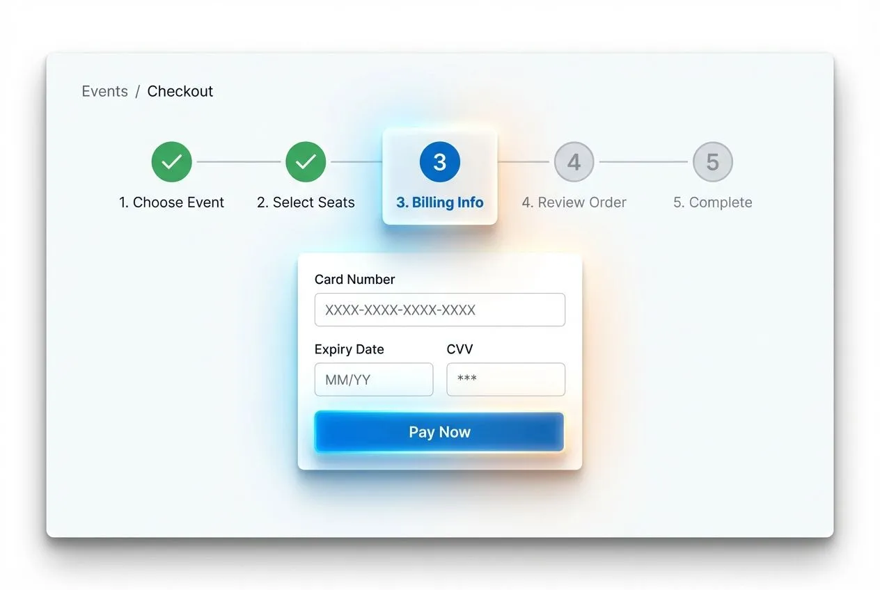
  • Checkout processes (e.g. Cart → Shipping → Payment → Review)
  • Account setups or onboarding
  • Identity verification and document uploads
  • Quizzes, forms, and surveys
  • Booking systems

Without Steps UI, these flows either feel like a surprise every time you hit “Next,” or rely on progress bars that don’t reveal what steps actually represent. Steps UI gives semantic structure and safety.

It’s also important to clarify that Steps UI is not the same as a stepper input. A stepper input is a control element that lets users increase or decrease a numeric value using +/− buttons, usually seen in quantity selectors or counters. Steps UI, on the other hand, refers to a visual guide across multiple screens or sections of a process.

Done poorly, it confuses. Done well, it leads.

{{spacer-16}}

Anatomy of a Step component

Each individual Step inside the Steps UI rail has its own structure and logic. Understanding this is critical for visual and interactive consistency.

A well-built Step includes:
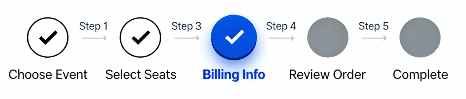
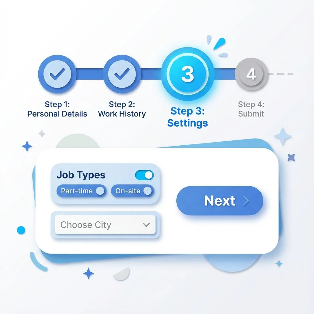
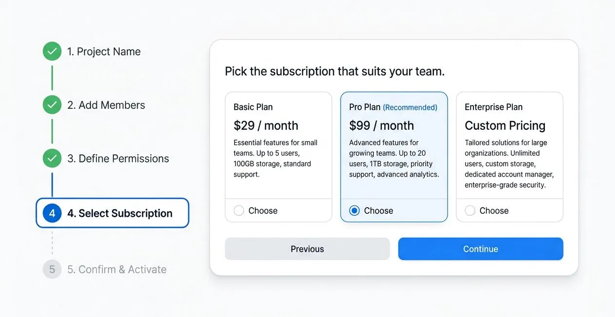
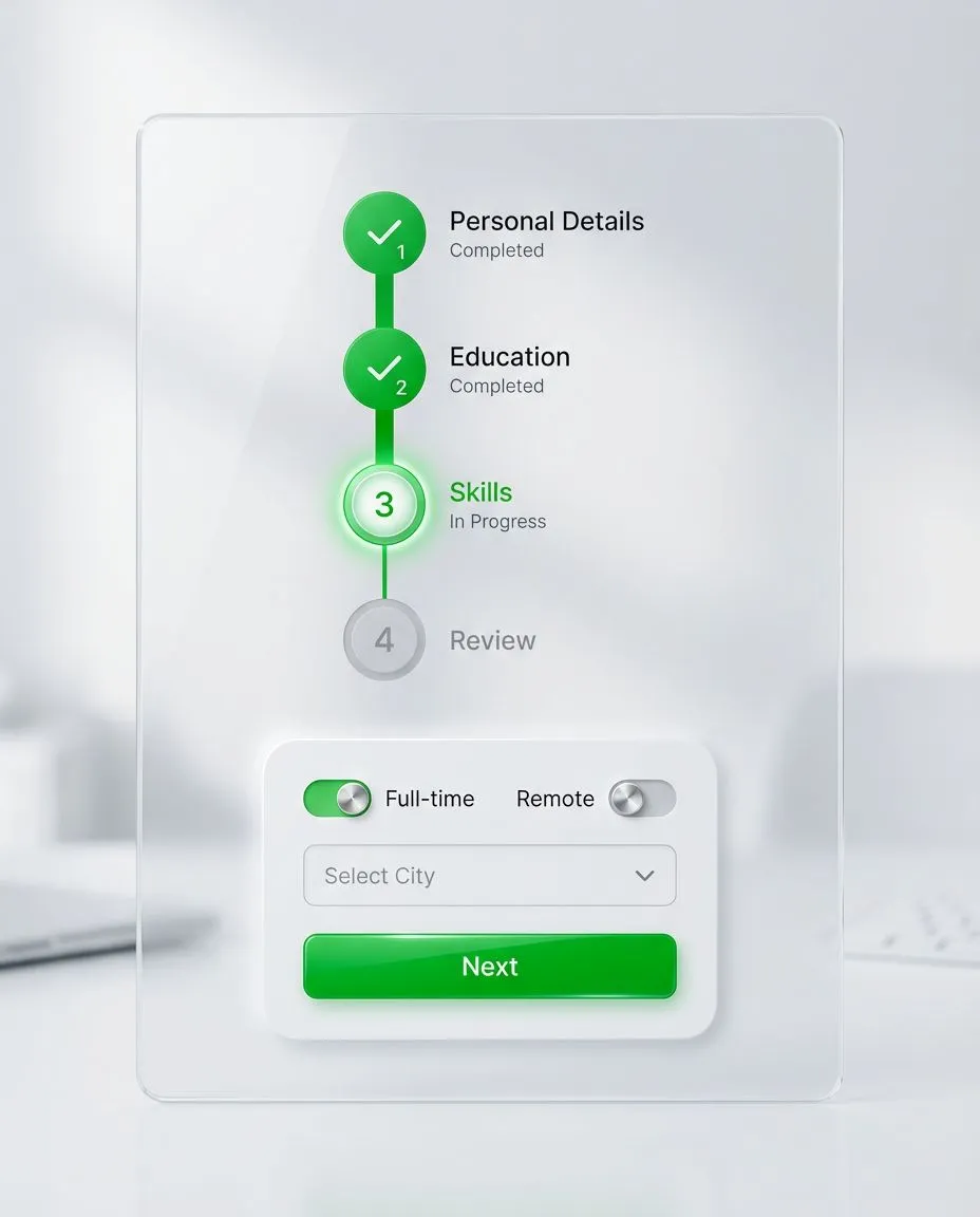
Label: The name of the step, short and readable.

State indicator: Completed, current, or upcoming. Each has its own appearance.

Optional subtitle: Brief description or helper text (e.g. “Confirm your shipping details”).

Clickable behavior (optional): Often, previous steps can be clicked for editing.

Index or icon: Either a number (1, 2, 3...) or an icon that visually suggests the step’s meaning.

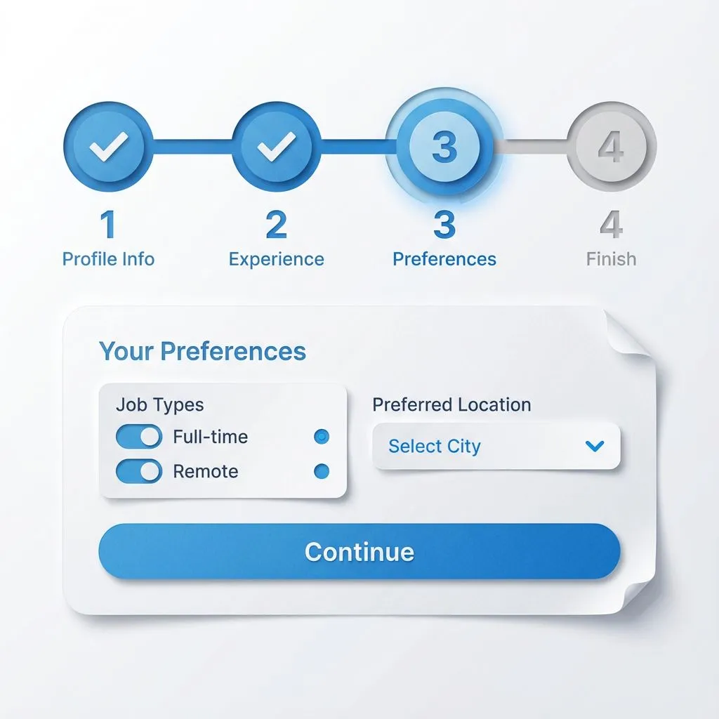
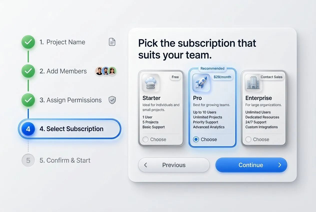
The component lives in either a horizontal or vertical layout. Horizontal is better for simple, linear flows. Vertical shines when you need to show more text, context, or branching.

Lines or rails connect the steps and reinforce the feeling of progress. The connector style (solid, dashed, gradient) carries meaning. We’ll explore that below.

Today AI is capable to generate real-made UI/UX shots. I use handy Venice.ai tool for this purposes.

{{spacer-16}}

Mapping Steps to the user flow

Before you draw anything, zoom out. Your Steps UI is only as useful as the way it reflects the user's journey.
The question is not “how many screens do we have?” but “how many mental transitions does the user make?

Group fields, questions, and interactions by cognitive similarity, not by technical categories. For example, in a signup:

Step ❶: Create Account (Email, Password)

Step ❷: Personal Details (Name, Date of Birth, Gender)

Step ❸: Address and Contact

Step ❹: Preferences or Notifications

Step ❺: Review and Submit

Avoid breaking things into unnatural slices just because your backend has different tables. A good Step should complete a conceptual unit of user input.
If a step feels like “half an idea,” rework the flow.

Also, don’t fall into the trap of cramming everything into one long step just to reduce the number of steps. Clarity beats speed.

{{spacer-16}}

How to design Steps right

Every visual choice in a Step is a signal to the user. Get these wrong, and even a clear flow feels clunky

Let’s talk visuals: borders, backgrounds, shadows, lines, corners.
Every visual choice in a Step is a signal to the user. Get these wrong, and even a clear flow feels clunky.

☛ Borders are essential for defining the boundary of a Step, especially when using outline styles. A current step may use a 2px solid border with a primary color, while completed steps use thinner, subtle outlines. Avoid border clutter by grouping only related steps together in bordered containers.

☛ Fill and backgrounds define state hierarchy. A filled Step usually means it’s active or done. Subtle gradients work better than loud colors. If all steps have the same fill, none stands out. Keep future steps low contrast. Current step better to highlight it, but don’t blast the retina.

☛ Shadows can help show elevation or focus, especially for the active Step. But keep shadows soft. Overusing them across all steps dilutes focus and introduces visual noise.

☛ Connector lines between steps carry rich meaning. Use solid lines for confirmed paths, dashed lines for upcoming or optional steps. Consider adding micro-animations or hover states if steps are interactive.

☛ Corner radius should be consistent with the rest of your design system. Typically, steps use a circle or soft rounded rectangle. Don’t mix radii across states. Icon-only Steps can go with circular tokens.

Avoid over-decorating. If you’re using icons inside steps, keep it relevant.
Don’t stack icons, gradients, and micro-labels into one token: the Step is not a playground.

{{spacer-16}}

Usability tips for Steps UI

The best visual structure won’t save a Steps UI if it fails in interaction. Here are key usability principles to bake into your component from day one:

☛ Navigation: The user should never wonder where to click next. “Next” and “Back” buttons must be prominent and predictably placed. If you disable “Next” due to validation, always explain why.

☛ Error handling: If a step has errors, show them immediately and highlight the affected Step in the rail. Use red outlines or warning icons, but keep it consistent. Don't force users to guess which field went wrong.

☛ Microcopy matters: A line like “You’re almost done!” on Step 4 of 5 can boost motivation. But don’t fake it. If step 2 of 10 says “You’re halfway there,” users will feel manipulated.

☛ State awareness: Reinforce context. Display “Step 3 of 6” in the header, or show a progress meter. If the flow is conditional or dynamic, adapt the step count accordingly.

☛ Clickability: If a Step is editable and the user can go back, make that obvious. Hover states, underlines, or cursor changes help. But don’t allow going forward to a step that hasn’t passed validation unless you're intentionally supporting non-linear flows.

☛ Consistency: Keep layout, spacing, and interactions predictable. If Step 1 uses a subtitle and small icon, Step 3 should match unless there's a good reason to vary.

The best visual structure won’t save a Steps UI if it fails in interaction.

{{spacer-16}}

Responsive and accessible variants

Designing Steps UI for mobile and accessibility requires simplification without losing structure.

On mobile, avoid displaying the full Steps UI if there are more than three steps. Instead:

  • Show the current step title and a light progress bar.
  • Use a collapsible menu or drawer to view all steps if needed.
  • Consider a vertical stacked approach for onboarding flows.

Avoid microtext or icon-only Steps unless labels are accessible. Finger targets for tapping must be at least 44px.

For accessibility:

  • Use ARIA labels to indicate which step is current.
  • Don't rely on color alone: add shape or label differences.
  • Allow keyboard navigation through steps and inside fields.
  • Screen readers should announce the step name and its state (e.g. “Step 2 of 4, Personal Info, current”).

Transitions between steps should be instant or lightly animated. Avoid full-page reloads or heavy animations unless they serve a purpose.

{{spacer-16}}

Anti-patterns and what to avoid

Too many Steps UI implementations suffer from one or more of the fatal mistakes

Too many Steps UI implementations suffer from one or more of the following mistakes:

☞ Steps with cryptic labels like “General” or “Misc.” These confuse users.

☞ Progress bars that pretend to be Steps UI but show no structure.

☞ Overuse of icons, shadows, gradients, and neon. Steps UI is not an artboard.

☞ Inflexible order logic that forces re-doing all previous steps to edit one field.

☞ Step transitions that wipe user data or reset validation.

☞ Mobile views that squash steps into illegible mini-circles.

And worst of all: fake Steps UI, where all the fields are dumped into one giant form with a pretty stepper on top. That’s lying to users.

{{spacer-16}}

Checklist before you ship

Let’s recap the key elements to verify in your final Steps UI implementation:

✔ Clear structure: Steps represent real milestones in the user’s flow.

✔ Proper states: Each step shows whether it’s done, active, or upcoming.

✔ Strong visuals: Borders, fills, connectors, and shadows used with intent.

✔ Responsive design: Mobile-friendly without hiding essential info.

✔ Keyboard and screen reader access: Basic accessibility is non-negotiable.

✔ Meaningful labels: Each step uses natural language, not internal terms.

✔ Click behavior: Steps behave predictably when edited or revisited.

✔ Error logic: Failed validations are traceable to their source.

Let’s recap the key elements to verify in your final Steps UI implementation

{{spacer-16}}

Steps questions and answers (FAQ)

❶ What’s the ideal number of steps in a multi-step flow?
There’s no strict rule, but most effective flows use between 3 and 6 steps. Too few can overwhelm users with dense forms, while too many may feel exhausting. The key is to group fields logically and give each step a clear purpose.

❷ Should users be able to go back and edit previous steps?
Yes, especially in flows where data accuracy matters (like checkout or KYC). Letting users revisit and update previous steps improves trust and reduces drop-off. Just make sure validation logic supports backward navigation without breaking the process.

❸ How do I handle optional steps or branches in the flow?
Label optional steps clearly within the Steps UI using subtle text like “(optional)” or lighter styling. For conditional steps, dynamically insert them into the step list as needed, and update progress indicators accordingly. Avoid showing steps the user will never see.

❹ What’s the difference between horizontal and vertical Steps UI?
Horizontal layouts work best for short, linear flows with limited text. Vertical layouts are more flexible for longer forms, deeper context, or steps with nested fields. Choose based on screen space, content density, and user context.

❺ Can I use icons instead of numbers for step indicators?
Yes, if the icons clearly represent the purpose of each step (like a credit card for “Payment”). But never rely on icons alone — always include a label. Combining a meaningful icon with short text improves both scannability and accessibility.

{{stars-conclusion}}

A great Steps UI is invisible when done right. It gently guides, informs, and adapts without interrupting. It brings visual structure to user flows and transforms complex tasks into clear progress.

If you’re building interfaces with any multi-step logic, investing time in your Steps UI will pay off in smoother experiences and better retention.

Now go make every step count.

Share this post

Subscribe to Setproduct

Once per week we send a newsletter with new releases, freebies and blog publications
Thank you! Your submission has been received!
Oops! Something went wrong while submitting the form.

By clicking Sign Up you're confirming that you agree with our Terms and Conditions.

Congratulations!

You're in! Expect awesome updates in your inbox

FAQs

Lorem ipsum dolor sit amet, consectetur adipiscing elit. Suspendisse varius enim in eros elementum tristique.
No items found.

Our Dashboard Templates Will Make It A Treat To View Data

Experience the magic of data visualization with our user-friendly dashboard templates. Try out our dashboards now and enjoy efficient reporting processes, greater transparency in, among others monitoring and making educated decisions easily.
Material X for Figma

Material X for Figma

Figma library with 1100+ components & 40 app templates beyond Material Design. Powered by top-notch shapes and Manrope font. Customizable & Adjustable UI kit now available for Angular & Figma

Material You UI kit

Material You UI kit

Figma & React library with 2600+ variants of 32 components compatible with Material Design 3. Plus 220+ dashboard templates for all the viewports. Now available for NextJS & TailwindCSS.

Figma React UI kit

Figma React UI kit

Designed and well-organized in Figma React-based UI toolkit for the web. Optimized for building complex data-dense interfaces for desktop and mobile applications.

Panda Design System

Panda Design System

Figma library with dashboard, calendar, kanban, profile, table, ecommerce and 80+ templates in total. Components with variants, dark theme included.

Eclipse UI kit

Eclipse UI kit

Figma library with 1100+ components & 74 templates for data-driven web applications. Powered by auto-layout. Supercharged by Figma's variants.

Rome UI kit for Figma

Rome UI kit for Figma

Customizable and well-organized team library. Contains 250+ components & 30 web app templates powered by stylish and trendy guidelines.

Material Design System

Material Design System

Figma library is based on 100% guidelines compliance with Material.io. Contains ready‑to-use templates to accelerate app UI design.

Neolex Dashboard UI kit

Neolex Dashboard UI kit

Customizable & adjustable dashboard design system with 50+ ready-to-use app layouts, 1900+ variants for 30 components with auto-layout.

Material Desktop Dashboard UI kit

Material Desktop Dashboard UI kit

Figma library with 48+ dashboard templates based on reusable desktop app patterns carefully handpicked from the most popular web apps.

Xela UI kit for Figma

Xela UI kit for Figma

Figma library with 1900+ variants of 30 components categories to craft perfectly shaped desktop & mobile apps. Customizable & Adjustable dashboard design system with 50+ web app templates.

Figma S8 Design System

Figma S8 Design System

Figma design library for mobile and desktop apps made of high quality styled components. Full version includes 67 dashboard templates.

OE Figma Design System

OE Figma Design System

Customizable and well-organized Figma library. This design system aimed to build highly loaded interfaces, boost the speed and save more costs.

Related posts

Lorem ipsum dolor sit amet, consectetur adipiscing elit.

UI Design

7 min read

Tooltip UI design – A tutorial with anatomy, usability tips, and when to use

Tooltips are a small component with a big impact on usability. Our new complete guide breaks down the technical and UX aspects of tooltip design, including accessibility (ARIA), timing, and how to choose between a tooltip and a popover.

UI Design

6 mins read

Slider UI design – A tutorial with UX, states, usability & styling tips

Useful for UI/UX designers, frontend developers, and product folks who want to make sliders that feel as good as they look. With illustrations, live usability tips, and handoff-ready insights.

UI Design

4 mins read

Toggle Switch UI design – A guide for Anatomy, UX tips, and Use cases

Optimize Toggles for your design system with custom styling options, and usability tips. Learn how to create smooth UX and enhance application aesthetics with fine-designed Switches.

Figma Templates & UI kits

Save time and human resources by reusing hundreds of pre-made templates crafted by us. Based on top notch UX taken from the World's best apps.

Material X for Figma

Figma library with 1100+ components & 40 app templates beyond Material Design. Powered by top-notch shapes and Manrope font. Customizable & Adjustable UI kit now available for Angular & Figma

Material You UI kit

Figma & React library with 2600+ variants of 32 components compatible with Material Design 3. Plus 220+ dashboard templates for all the viewports. Now available for NextJS & TailwindCSS.

Figma React UI kit

Designed and well-organized in Figma React-based UI toolkit for the web. Optimized for building complex data-dense interfaces for desktop and mobile applications.

Panda Design System

Figma library with dashboard, calendar, kanban, profile, table, ecommerce and 80+ templates in total. Components with variants, dark theme included.

Eclipse UI kit

Figma library with 1100+ components & 74 templates for data-driven web applications. Powered by auto-layout. Supercharged by Figma's variants.

Rome UI kit for Figma

Customizable and well-organized team library. Contains 250+ components & 30 web app templates powered by stylish and trendy guidelines.

Material Design System

Figma library is based on 100% guidelines compliance with Material.io. Contains ready‑to-use templates to accelerate app UI design.

Neolex Dashboard UI kit

Customizable & adjustable dashboard design system with 50+ ready-to-use app layouts, 1900+ variants for 30 components with auto-layout.

Material Desktop Dashboard UI kit

Figma library with 48+ dashboard templates based on reusable desktop app patterns carefully handpicked from the most popular web apps.

Xela UI kit for Figma

Figma library with 1900+ variants of 30 components categories to craft perfectly shaped desktop & mobile apps. Customizable & Adjustable dashboard design system with 50+ web app templates.

Figma S8 Design System

Figma design library for mobile and desktop apps made of high quality styled components. Full version includes 67 dashboard templates.

OE Figma Design System

Customizable and well-organized Figma library. This design system aimed to build highly loaded interfaces, boost the speed and save more costs.

Figma iOS kit

Figma library of iOS patterns served as ready-made templates. This UI kit inspired by World's best apps. Based on Human Interface guidelines.

Figma S8 Design System

Figma design library for mobile and desktop apps made of high quality styled components. Full version includes 67 dashboard templates.

Most iOS UI kit for Figma

iOS native components and app templates organized into a «Most Design System» fully compatible with Apple's Human Interface guidelines.

Rome UI kit for Figma

Customizable and well-organized team library. Contains 250+ components & 30 web app templates powered by stylish and trendy guidelines.

Material Design System

Figma library is based on 100% guidelines compliance with Material.io. Contains ready‑to-use templates to accelerate app UI design.

Nucleus UI

Nucleus UI contains 1000 components and variants with 500+ mobile screens designed for Figma (including 9 themes from Event, E-commerce, Finance, NFT, etc.).

Figma Android UI kit

Components-driven Android mobile UI library for Figma. Consists of 140 high quality application templates made of total 250+ UI components.

Mobile X UI kit

Customizable & adjustable iOS / Android design system loaded with ready-made 157 app templates based on 860+ variants for 20 components.

Appka iOS UI kit

Customizable & adjustable iOS design system with 4100+ variants for 28 components and 280+ ready-to-use app layouts crafted for Figma.

Full iOS UI kit

Customizable iOS design system with 320 ready-to-use app layouts. You can modify them or use as it is to save time and never design from scratch again.

Xela for Flutter

XelaUI for Flutter is a simple, modular and accessible component library that gives you the building Flutter apps for mobile and desktop.

Xela for Android

Ready-made collection of fully customizable widgets, UI screens and reusable components for Android coded with Jetpack Compose.

Xela for Swift

Designed for iOS Developers. We provide fully coded customizable components, widgets and well-organized iOS screens for Figma & SwiftUI.

Material You UI kit

Figma & React library with 2600+ variants of 32 components compatible with Material Design 3. Plus 220+ dashboard templates for all the viewports. Now available for NextJS & TailwindCSS.

Figma Charts UI kit

Components-driven graphs design kit for dashboards, presentations, infographics & data visualisation. Includes 25+ charts types for all the viewports.

Hyper Charts

Create impressive visuals with Figma's graphs templates – dozens of scalable and customizable data visualization blocks for dark and light modes.

Orion UI kit

Figma library with 40+ full-width charts templates served in light & dark themes. Contains 200+ of dataviz widgets that look perfect on desktop & mobile screens.

Xela for React

React based components library for beautiful user interface in React apps. Lightweight library for your projects. Contains pre-made web app templates.

Figma React UI kit

Designed and well-organized in Figma React-based UI toolkit for the web. Optimized for building complex data-dense interfaces for desktop and mobile applications.

Material X for Figma

Figma library with 1100+ components & 40 app templates beyond Material Design. Powered by top-notch shapes and Manrope font. Customizable & Adjustable UI kit now available for Angular & Figma

Xela for Flutter

XelaUI for Flutter is a simple, modular and accessible component library that gives you the building Flutter apps for mobile and desktop.

Xela for Android

Ready-made collection of fully customizable widgets, UI screens and reusable components for Android coded with Jetpack Compose.

Xela for Swift

Designed for iOS Developers. We provide fully coded customizable components, widgets and well-organized iOS screens for Figma & SwiftUI.

Material You UI kit

Figma & React library with 2600+ variants of 32 components compatible with Material Design 3. Plus 220+ dashboard templates for all the viewports. Now available for NextJS & TailwindCSS.

Xela for React

React based components library for beautiful user interface in React apps. Lightweight library for your projects. Contains pre-made web app templates.

Levitate 3D kit for Figma

Components-driven 3D kit to design eye-catching Figma presentations. Helps to enhance your landing page, product or app, brand ident, etc.

Website templates UI kit

Landing pages reusable templates kit based on most effective web design patterns. 140+ dark & light constrained design blocks.

Figma Landing Pages UI kit

Landing pages templates library based on constrained & organized components aimed to speed-up the production of effective websites.

Zeus UI kit

Create hassle-free landing pages in Figma. This kit is based on 10 landing page templates, powered by 1600+ variants for 630+ web blocks.

This is some text inside of a div block.