

Roman Kamushken
Toggle switches are among the most widely used interactive components in modern interfaces.
They provide an intuitive way to represent binary states: on/off, enabled/disabled, subscribed/unsubscribed.
While they may seem simple on the surface, creating an effective, accessible, and responsive toggle component demands detailed attention to interaction, state, accessibility, and contextual use.
This guide covers everything you need to know about designing and implementing toggle switches: from anatomy and states to micro-interactions, accessibility best practices, mobile-specific behavior, and edge cases.
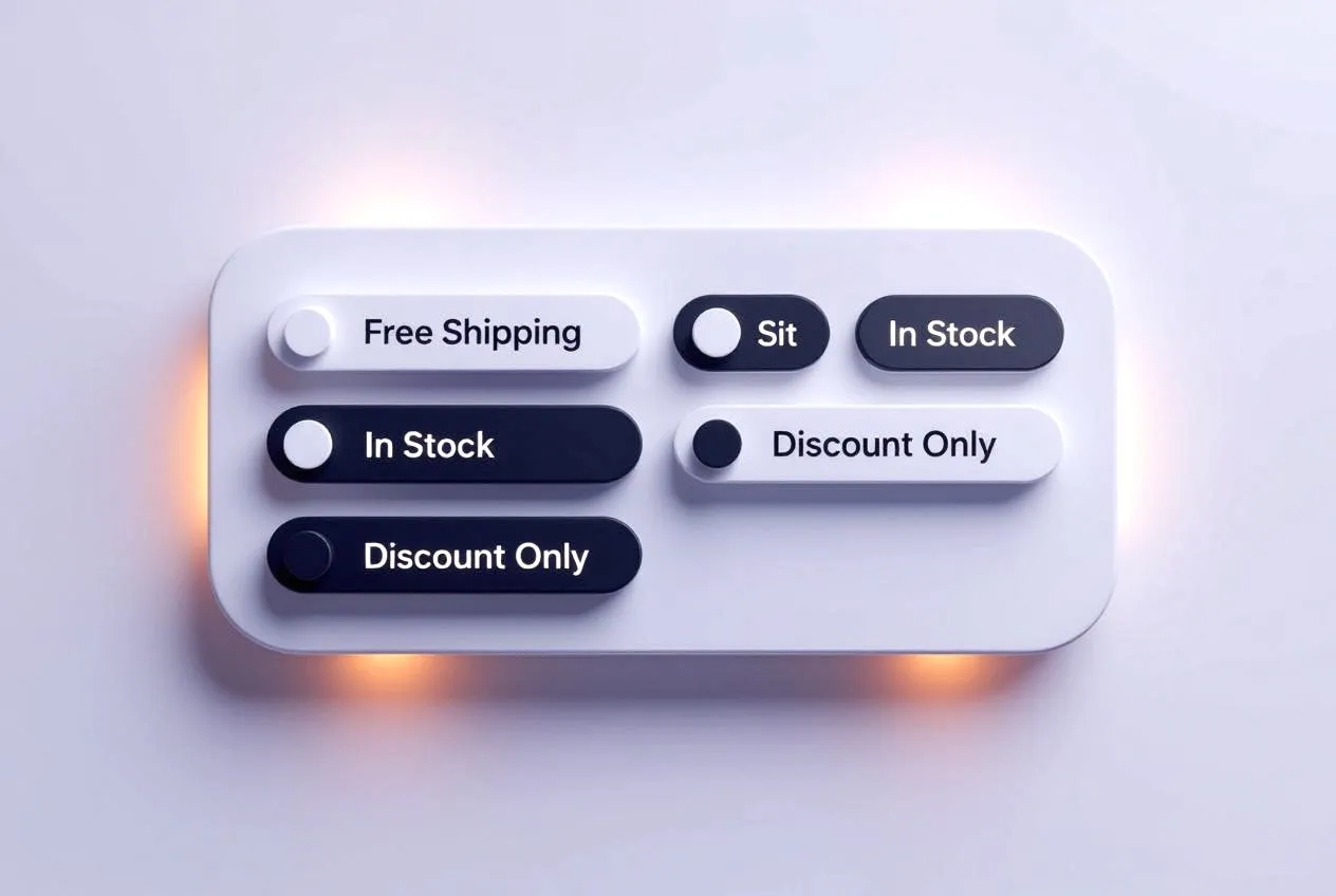
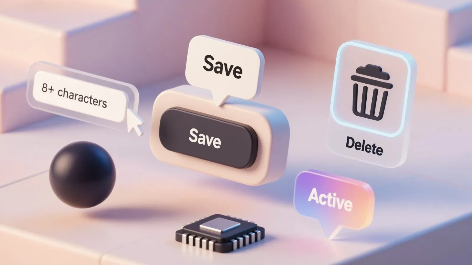
I used AI-generated UI images (made by handy Venice.ai tool) for my daily inspiration, and you must too!
What is a toggle switch?
A toggle switch is a binary UI control that allows users to turn a setting or feature on or off.
It’s most commonly used to control system settings, feature access, privacy preferences, or notifications.
Key idea: A toggle is not a checkbox. It implies an immediate action, whereas checkboxes typically imply a selection to be confirmed later (e.g., via Save button).
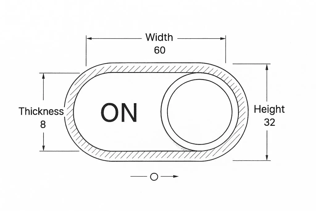
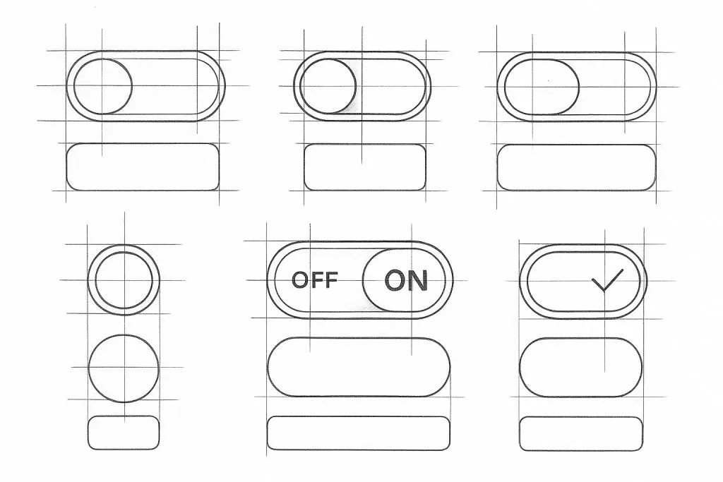
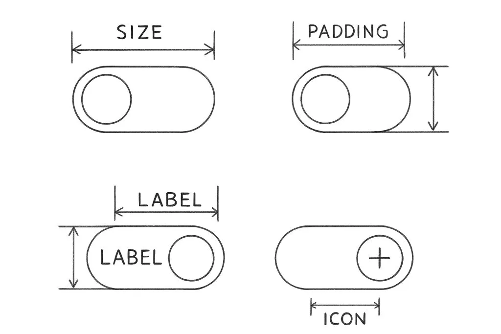
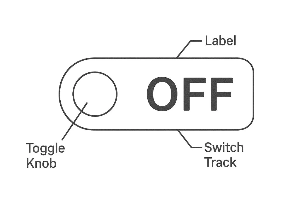
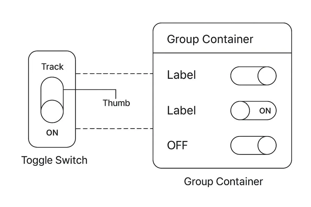
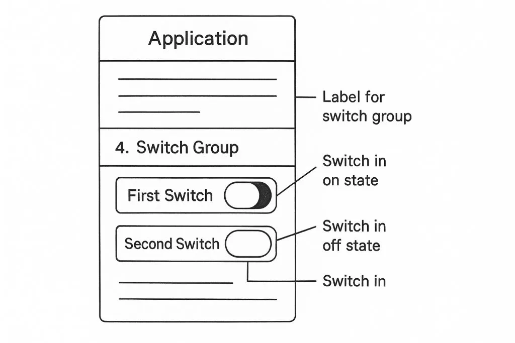
Anatomy of a toggle switch
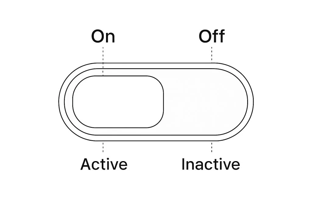
A well-structured toggle switch consists of:
- Track: the background bar that visually connects ON and OFF positions.
- Thumb: the circular (or square) handle that slides from one side to the other.
- State color: ON state is typically accent color (e.g., blue/green); OFF is gray or neutral.
- Label (optional): Describes what the toggle controls (e.g., "Dark mode", "Auto updates").
- Icons (optional): Some toggles use icons (sun/moon, lock/unlock) inside or next to the track.
Best practice: Keep the thumb size at least 44px on mobile to meet tap target standards.
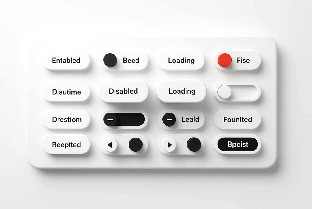
States & behaviors
Toggle switches must handle the following states clearly:
- Default (off): inactive, neutral background
- On (enabled): active, brand color or highlight
- Hover (desktop): subtle glow or track color change
- Focus (keyboard): visible focus ring around entire component
- Disabled: faded state with no interactivity
- Loading (optional): animated spinner or shimmer on the thumb
Behavioral notes:
☞ Clicking the label can toggle the state (if linked properly).
☞ Avoid using toggles when the state change is destructive or irreversible.
☞ Keyboard navigation: Space or Enter should toggle the switch when focused.
Visual alignment and spacing
Visual rhythm matters. Toggles should be aligned on a vertical axis when placed in lists or settings pages.
Common layout styles:
❶ Inline with label on the left, toggle on the right (typical in mobile settings).
❷ Stack toggle above/below label for dense layouts.
❸ Grid or card-based toggles for preference dashboards.
Don’t squash the toggle. Ensure at least 8–12px padding around to avoid visual cramping or accidental taps.
When to use (or not use) a Toggle
Use a toggle when:
✔ The action can be instantly applied (e.g., enable notifications).
✔ The outcome is binary and doesn’t need further configuration.
✔ Reversibility is safe and expected.
Avoid toggles when:
✗ The setting requires multiple steps (e.g., confirmation, input).
✗ The setting involves destructive consequences (e.g., delete account).
✗ Users expect a Save or Confirm action to finalize changes.
For multi-choice settings, use radio buttons or dropdowns instead.
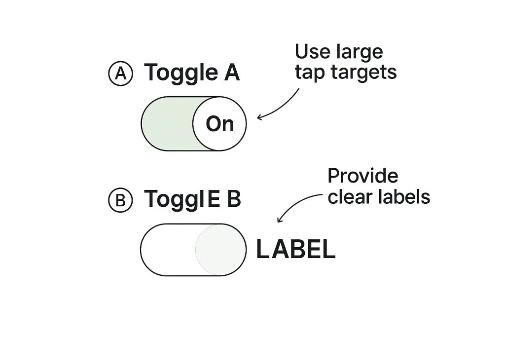
Usability tips
Clarity first
Pair toggle with a descriptive label. Avoid ambiguity ("Enable" by itself is unclear).
Immediate feedback
Apply the effect instantly after toggle action. For slow operations, show loading state.
Avoid double negatives
"Disable notifications" with an OFF toggle is confusing. Rephrase as "Receive notifications".
Consistency
Use same styles and behavior across app. Don’t mix pill toggles with square ones unless justified by context.
Touch-friendly
On mobile, ensure the toggle is large enough and has sufficient spacing. Never nest toggles inside another interactive component.
Mobile vs desktop behavior
📱 On mobile:
- Use full-width toggles in settings
- Increase spacing between multiple toggles
- Avoid placing toggles next to swipe gestures
- Provide haptic feedback on iOS/Android when toggled (if native)
🖥️ On desktop:
- Hover state should provide gentle feedback
- Support mouse + keyboard input simultaneously
- Consider accessibility preferences (e.g., reduced motion)
Micro-interactions
Well-crafted toggle interactions improve perceived quality.
Ideas to try:
☞ Thumb slide animation
☞ Track color fill with velocity based on toggle speed
☞ Bounce or easing when thumb hits the edge
☞ Subtle sound feedback (native apps only)
☞ Tooltip on hover (e.g., "Turn off notifications")
But keep it fast. Transitions longer than 300ms may feel sluggish.
Toggle switch in design systems
If you’re maintaining a design system:
➀ Document usage guidelines with do/don’t
➁ Provide code-ready tokens for spacing, radius, colors
➂ Offer variations (icon toggle, text+icon, grouped toggles)
➃ Include dark mode states and RTL layout examples
➄ Version control changes to avoid regressions
Recommended tokens: toggle.track.width, toggle.thumb.radius, toggle.on.color, toggle.transition.duration
Common mistakes and how to avoid them
No label: Users don’t know what the switch does.
Wrong control: Using a toggle instead of a radio or checkbox.
Lack of feedback: State changes without visible or haptic response.
Unclear state: OFF and disabled look the same.
Clutter: Too many toggles in a single screen = fatigue.
Developer checklist
✔ Semantic HTML (role="switch", aria-checked)
✔ State managed in UI framework (e.g., React: useState, Vue: v-model)
✔ Animate thumb and track using CSS transitions or JS libraries
✔ Test focus trap and keyboard nav
✔ Respect system preferences: reduced motion, dark/light mode
Example snippet (React JSX):
<label className="toggle"><input type="checkbox" role="switch" aria-checked={isOn} onChange={toggleHandler} /><span className="track"><span className="thumb"></span></span><span className="label-text">Enable 2FA</span></label>
FAQ: Toggle UI design
Should I use a toggle or a checkbox?
Toggles imply instant change. Checkboxes are better when grouped or need confirmation.
Should a toggle have a label inside or outside?
Prefer external labels for clarity and accessibility.
Can I use toggles for destructive actions?
No. Use dialogs or confirmation flows.
What’s the difference between enabled/off and disabled?
Enabled = interactive. Disabled = grayed out and inert.
Can I stack multiple toggles together?
Yes, but group them with spacing and organize by category.
How do I localize toggle labels?
Write neutral, context-agnostic phrases (e.g., "Allow app tracking") that are easy to translate.
Can toggles default to ON?
Only if user consent is implied. Otherwise, default to OFF.
Appendix: Generate toggle UI variants with AI
I used AI-generated UI images (made by handy Venice.ai tool) for my daily inspiration, and you must too!
Need quick visual variations of toggles for your spec or component library? Use AI image generation models like Venice.ai to visualize on/off states, hover styles, or themed versions instantly.
Benefits:
• Fast: Create dozens of UI toggles in seconds
• Consistent: Structured outputs without hallucinated shapes
• Private: Venice doesn’t track or store your prompts
• Versatile: Generate toggles for mobile, web, or embedded UIs
Try it out, then document what works for your team.
Affiliate note: Venice.ai is my go-to tool for generating visual UI component variants. Using the link above helps support this guide.


