


Roman Kamushken
An empty state is what a screen shows when there is no content yet: no tasks, no messages, no search results. It is not a dead end. Done right, it explains why the screen is empty and points to the one action that fills it. Done wrong, it reads as a bug, and users leave.
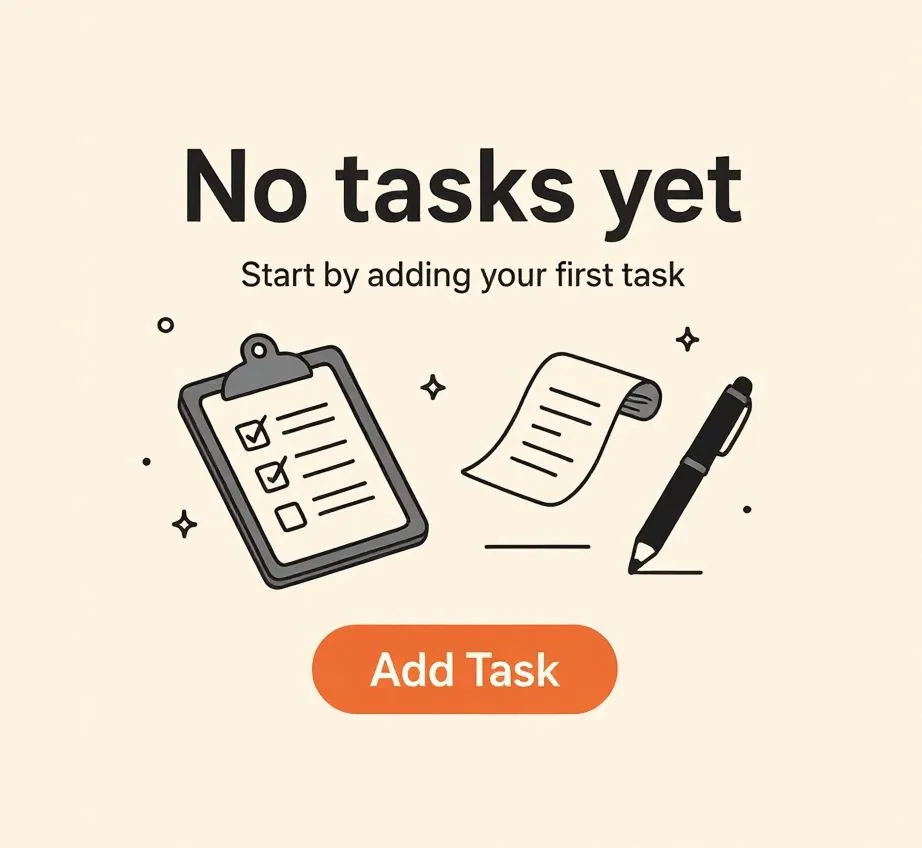
Open a task manager for the first time. No projects yet. Just whitespace and maybe a frowning folder. That’s your empty state!
Now imagine two paths: one where it just says “No tasks found” in gray text, and another where it greets you with a warm “Let’s get productive! Start by creating your first task” next to a small clipboard illustration and a shiny CTA. The second one makes you feel like the product is speaking to you. The first one feels like a glitch.
Empty states are those UI moments when there is no content yet to display. It could be because:
- the user just signed up
- they haven't added anything yet
- filters returned no results
- they cleared a section (e.g., inbox or cart)
And while they seem minor, they're incredibly high-leverage. These are moments of friction, hesitation, or abandonment. Or, with the right design, they become moments of engagement, guidance, or delight.
In short: empty states are not errors. They are opportunities. They can teach, direct, and emotionally resonate with users. But too often they’re treated as low-priority placeholders.
This article explores how to design Empty State UI screens that not only look good but feel right, convert better, and statistically improve product metrics.
TL;DR — empty state rules in one line each
- An empty state is a screen with no content yet, not an error to hide.
- Explain why the screen is empty so it never reads as a glitch.
- Give one clear primary action that fills the screen.
- Write the message like a human, not a system log.
- Use an illustration to set the mood, not to decorate.
- Make a no-results state look different from a first-use state.
- Treat the first empty screen as onboarding, because that is what it is.
What is Empty State UI
Empty state UI refers to any screen or component that is currently displaying no content, usually as a result of initial use, filtering, deletion, or data unavailability.
Some typical forms include: Empty to-do list, Empty shopping cart, No search results, No messages yet, No saved favorites, No notifications, Cleared trash
At a surface level, it might seem like these are simply transitional states. But from a UX perspective, they are critical moments of perception. This is when users:
- form first impressions of the interface
- decide whether they understand how the product works
- feel either welcomed or confused
- choose to continue or abandon
The Nielsen Norman Group describes this as a “teachable moment.”
If your interface shows nothing but silence, your user might leave. If it explains, suggests, and guides, the same screen becomes onboarding.
Why empty states deserve priority
→ They define first use. The initial impression for any new user happens when there is nothing yet. You must guide that blank slate.
→ They occur often. More than you think: filtering, resetting, clearing lists, signing out, switching modes: all bring users to zero.
→ They build empathy. A warm message or quirky illustration at the right time can humanize your brand more than your entire design system.
A poorly designed empty state tells the user “you broke it.” A well-designed one says “we’re here to help.”
Where Empty States appear
Understanding where empty states appear helps identify which flows to optimize.
Let’s categorize the most common use cases, along with their distinct functional and emotional goals.
| Type | When it appears | What to show |
|---|---|---|
| First-time use | User just arrived, nothing created yet | Why it's empty plus one primary action |
| No results | Search or filter returned nothing | The reason plus a way to broaden or reset |
| Cleared | User finished or deleted everything | Confirmation plus a path back to activity |
| Unavailable | No connection or data is loading | What went wrong plus a retry |
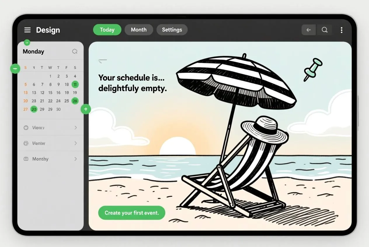
❶ First-time use (FTU) screens
Goal: Onboard and motivate.
This is the most sensitive empty state. The user has just arrived, and there's no data yet. For example, a habit tracker with zero habits or a finance app with no transactions.
Effective FTU empty states often include:
- A friendly greeting
- A short explainer of what this screen does
- A single strong CTA to create or import something, ideally framed as a clear first step
Example: Notion shows an encouraging “Let’s create your first page!” with a big + button when you open a new workspace.
❷ No search results / No matches
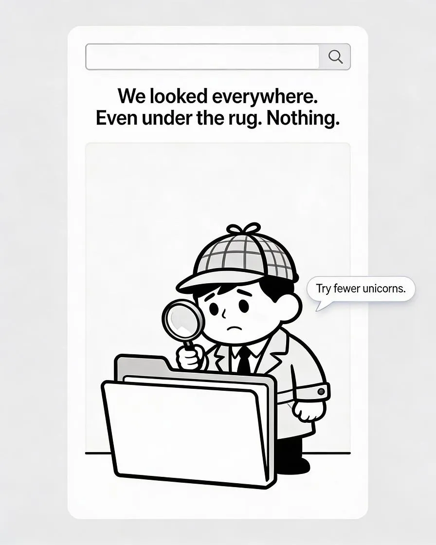
Goal: Reorient and recover gracefully.
These occur when filters return no hits or search terms don’t match any content. It’s a frequent edge case, especially in apps with rich filtering or large datasets.
Best practice:
- Explain what happened clearly
- Offer corrective action (e.g., “Reset filters” or “Try broader keywords”)
- Optionally, add light humor or a character to ease the tone
Example: Etsy’s empty search result shows a cute illustration with the message: “We couldn’t find anything. Maybe try fewer filters?”
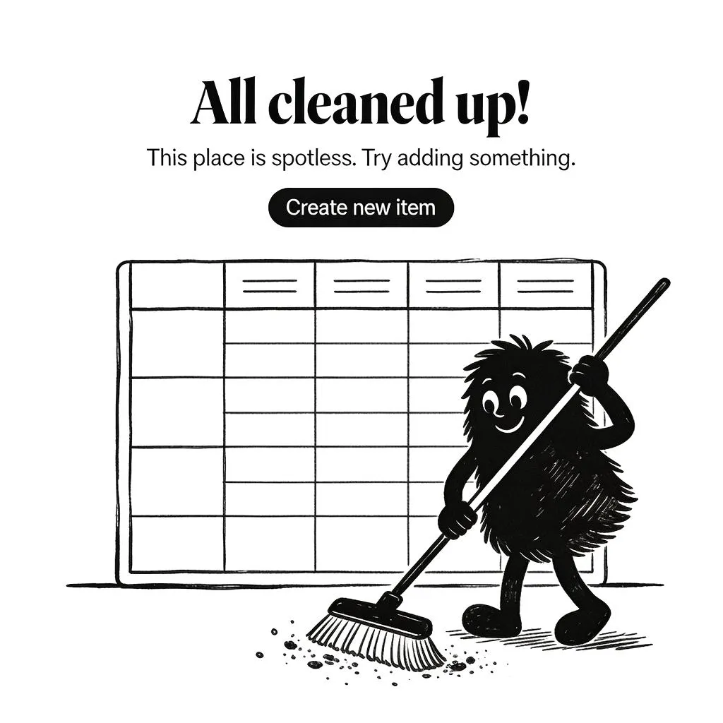
❸ Deleted or cleared content
Goal: Confirm success and suggest next steps.
When users clear out a list (like deleting all tasks, archiving emails, or emptying a cart), the interface needs to:
- Confirm that the action was successful
- Visually signal the state is empty, not broken
- Optionally celebrate (“Inbox Zero” is a great example)
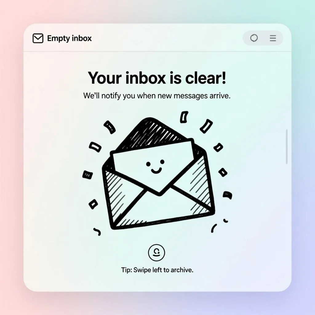
Example: Gmail's empty inbox animation with a sun over mountains reinforces peace of mind.
❹ Temporarily unavailable or not connected
Goal: Inform and retry.
Apps that rely on syncing, real-time data, or devices often run into temporary zero-states due to: No internet, Device not connected, Server-side lag
In these cases, it's best to:
- Show a neutral, non-accusatory message
- Offer a retry or troubleshoot option
- Use UI hints to indicate whether this is temporary
Example: Spotify shows a “You’re offline” message with a retry button and soft graphic of a disconnected cable.
❺ Empty saved states (favorites, bookmarks, likes)
Goal: Encourage content exploration.
These moments reflect that the user hasn’t interacted deeply yet. Design should gently nudge them to discover features, not shame them.
Recommendations:
- Invite exploration (“Start saving items you love”)
- Provide a shortcut to the library, feed, or browse
- Use illustrations to show the potential of a filled state
Example: Airbnb’s empty “Wishlist” screen shows a heart in a suitcase and encourages users to start saving places they like.
This creative, fun, and humorous empty state illustration was generated by handy Venice.AI tool. I seriously recommend to try it out!
How to design Empty State right
Designing an empty state is not a visual afterthought. It is a UX-focused component that must balance three forces: clarity, tone, and action. The layout, spacing, and messaging should gently nudge the user forward without overwhelming them. Below is a structured breakdown of the most effective design principles when building empty states.
Prioritize structure
The visual structure should support fast scanning and clear affordances. Use a familiar layout pattern:
☞ A concise headline
☞ Supporting description
☞ Relevant icon or illustration
☞ Call-to-action (CTA) button or link
These elements should be centered within a container, especially for mobile and modal-based screens. On desktop, you can introduce a slightly more horizontal layout with CTA buttons aligned left or right, but always leave ample whitespace.
Respect visual hierarchy
Text and visuals should work together, not compete. The headline must be visually dominant, followed by supporting text in lighter tone and smaller size. Use illustration scale carefully - it must add personality but not steal the attention.
Keep it contextual
A good empty state feels native to its function. Avoid generic placeholders across different features. The empty state of a calendar should not look like the one for a shopping cart.
☞ For inbox: show email icon or paper plane
☞ For photos: use a camera or frame illustration
☞ For tasks: use checklist or sticky notes
If you're using component libraries or design systems, build modular patterns where each feature can plug in its own content.
Offer a clear next step
Every empty state should answer: “What should the user do now?” If there’s no suggested action, the screen becomes a dead end.
That’s why the most effective empty states always provide a CTA:
☞ "Create your first invoice" (pair it with a focused input field)
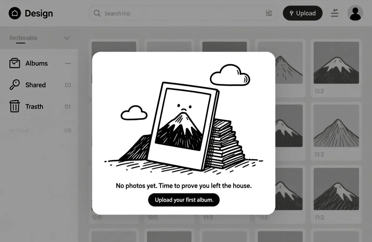
☞ "Upload your first photo"
☞ "Browse available templates"
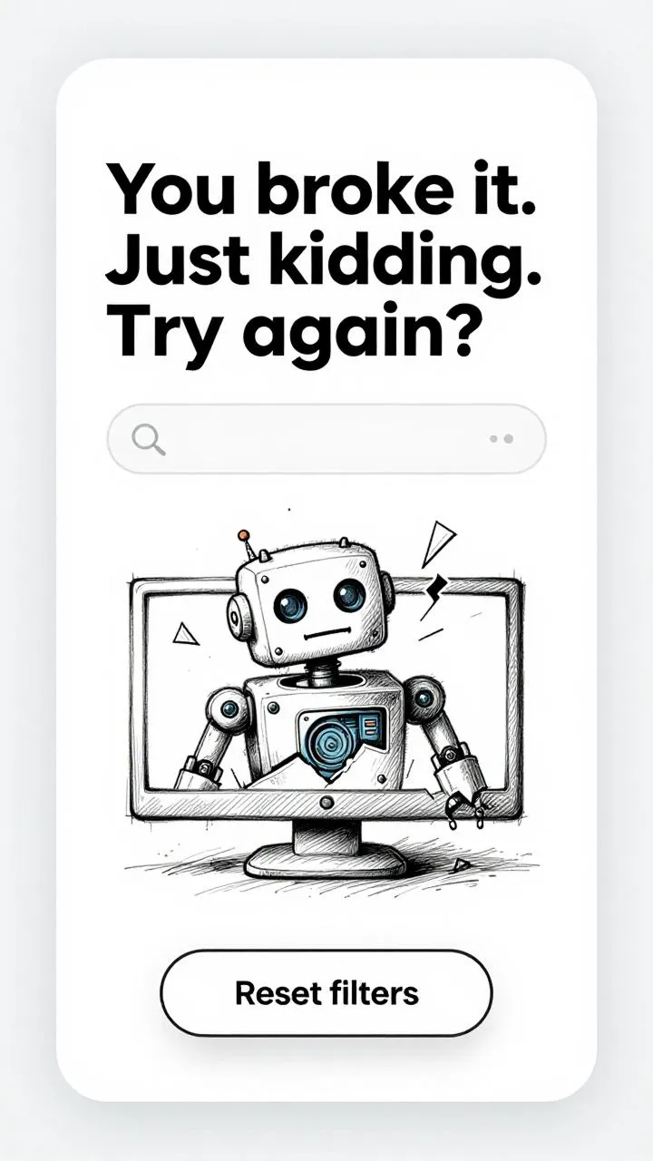
☞ "Reset filters"
Avoid offering multiple actions. One path is better than three vague options.
Usability tips that help
Designing empty states is not just about looks or copy. It's a usability issue.
If your empty states are unclear, misleading, or contextually broken, users will feel confused or ignored.
Here are actionable usability tips that help you avoid those traps.
Tip 1: Avoid blaming the user
Language matters. Never phrase the message in a way that implies user fault, even if their actions led to the empty state.
❌ “You didn’t add anything yet.”
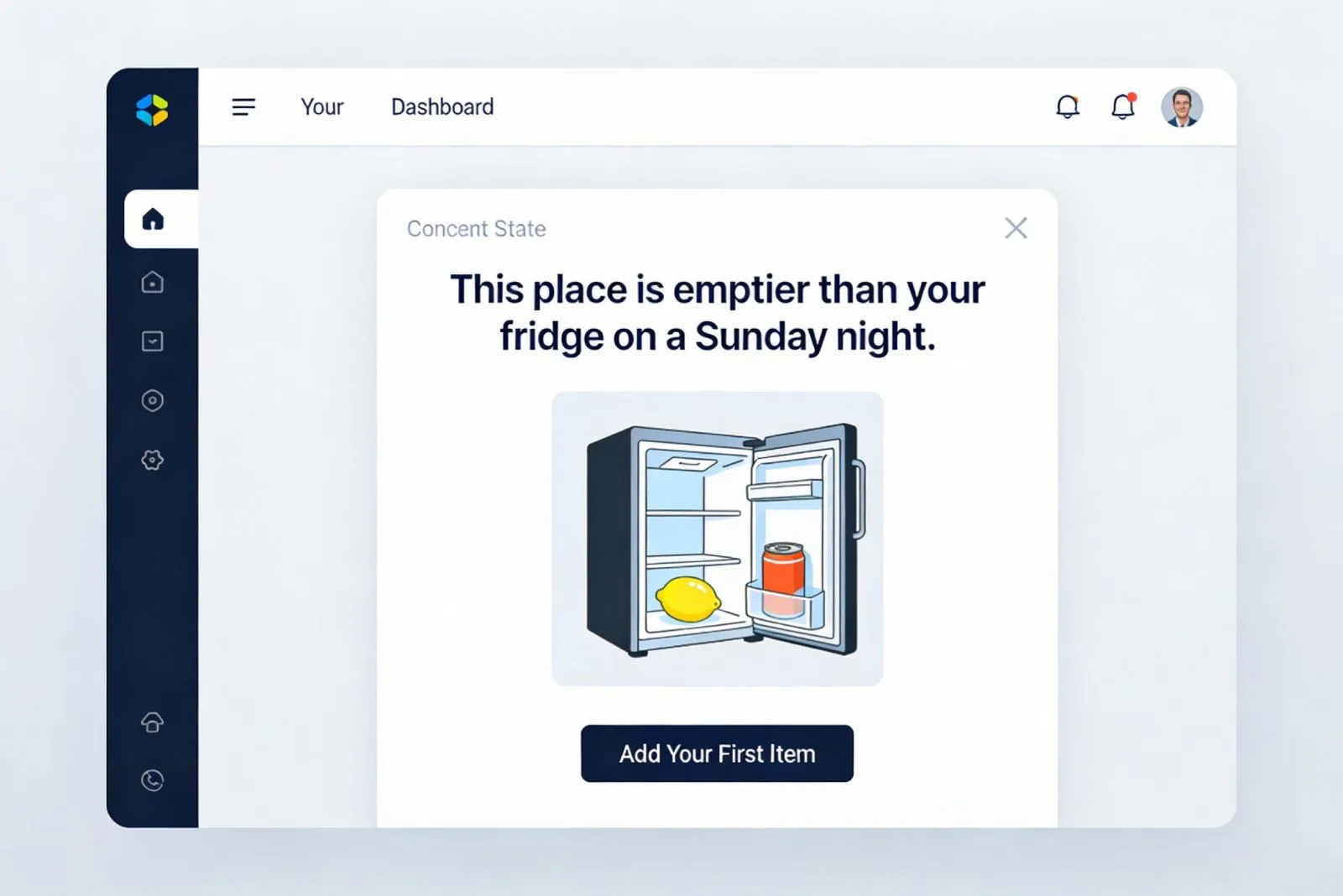
✅ “This space will hold your saved items.”
People are emotionally sensitive in blank spaces. Keep the tone helpful, not judgmental.
Tip 2: Be honest about what happened
Don’t make the user guess why they’re seeing nothing. For example, in a failed search, say:
"No results found for 'banana stand'."
"Try checking your spelling or searching for related terms."
You can also reflect back filters that were applied, giving users clues to resolve the issue.
Tip 3: Adapt to device context
📱 On mobile: Keep it short, Stack vertically, Prioritize tappable elements
🖥️ On desktop: Leverage wider layout, Use inline visuals, Avoid center-aligned text that stretches across large viewports
A one-size-fits-all empty state won’t adapt well across platforms.
Tip 4: Show structure behind the emptiness
Users feel more comfortable when they understand what would normally appear. A grayed-out placeholder or faded table columns help suggest what this view is supposed to show.
This is especially important in: Dashboards, Lists and tables, Complex widgets with sub-sections
It reduces fear of bugs or system failure.
Tip 5: Be subtle with humor and illustration
Humor can go a long way in calming the moment, but only when used carefully.
If the product tone allows, adding a light illustration or friendly character can humanize the message.
But don’t overdo it. Overly cartoonish or flippant messages in banking, medical, or B2B SaaS apps may feel out of place.
Writing Empty State human messages
Good copywriting is the soul of an effective empty state.
It replaces silence with tone, context, empathy, and direction. When done well, it can turn confusion into clarity and doubt into motivation.
But most empty state messages fall into one of two traps:
→ Too robotic: “No data available” → Too vague: “Looks like it’s empty in here…”
Both fail the user. The first feels like a system error. The second tries to be casual but offers no guidance.
What makes it effective?
The best empty state messages are:
→ Contextual to the feature → Conversational in tone → Actionable, gently nudging users forward
Let’s break this down with examples.
❶ Contextual
Tailor the message to the user’s current action, location, and intent.
Search results example:
❌ “No items found”
✅ “We couldn’t find any results for ‘budget spreadsheet’. Try fewer keywords or check spelling.”
Here, we reflect back the query and give a suggestion. This reduces the feeling of system failure.
❷ Conversational
Speak like a human, not a backend log file. Use contractions, light humor, and an inclusive tone.
Favorites tab example:
❌ “There are no saved items.”
✅ “You haven’t saved anything yet, but we bet you will!”
This keeps it friendly without being pushy.
❸ Actionable
Guide the user to the next step. Don’t leave them in limbo.
Empty task board example:
❌ “No tasks created.”
✅ “Your board is empty. Click +New Task to get started.”
Adding a subtle CTA inside the message or just below it improves flow.
Which emotional patterns work?
Many effective empty states use emotional hooks to build connection. Here are a few recurring patterns seen in well-crafted UIs:
→ Reassurance: “You’re all caught up. Enjoy the calm.” → Encouragement: “It all starts with your first note.” → Celebration: “Inbox zero. You’ve earned it.” → Curiosity: “No saved places... yet. Let’s go explore.”
These messages suggest momentum. They recognize where the user is and give a tiny push toward where they could go.
Illustrations for the soulful connect
Illustrations in empty states do more than decorate.
They set the mood, deliver visual metaphors, and compensate for the absence of content. When words are sparse, images carry the emotional weight.
Not every empty state needs an illustration. But when used wisely, visual elements can:
- Ease the tension of a failed query
- Turn empty lists into playful metaphors
- Reinforce the feature’s purpose
- Humanize the brand
Rules for using illustrations
❶ Centralized, not overwhelming: Empty states must feel empty. Don’t crowd the screen with oversized characters or detailed scenes. Keep visuals centered and surrounded by breathing room.
❷ Avoid generic stock graphics: Use visuals that tie back to the action or data type. A paper plane works well in a messaging app. A suitcase with a heart fits for wishlists. Abstract blobs say nothing.
❸ Keep consistent visual language: If your product uses line illustrations elsewhere, don’t switch to 3D here. The empty state is part of the design system, not an art gallery.
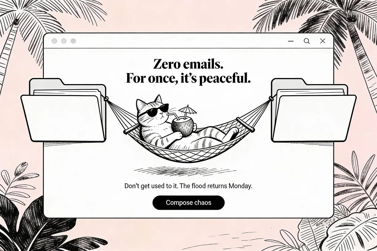
This empty state cat was generated by AI! I use the handy tool Venice.AI for such purposes.
Emotive power of character-based illustration
A growing trend is to include character illustrations (animals, robots, humans) that express emotion.
Why it works:
→ People empathize with faces and posture
→ A surprised duck or bored cat builds a smile
→ It makes the app feel alive
Figma uses tiny avatars to express emptiness in community features. Dropbox famously used whimsical illustrations of characters playing with documents or chilling out. These built an emotional brand narrative from day one.
Accessibility and inclusion considerations
Don’t rely solely on illustration to convey meaning. Text must remain readable and primary.
☞ Ensure color contrast between illustration and background
☞ Do not encode messages purely in image form
☞ If using animation, offer a static fallback for screen readers
Accessibility ensures that every user (regardless of visual ability) can experience clarity, not confusion.
Evidence and metrics around Empty States
If you want to treat empty states as “just visuals”, the product will treat them as friction.
Empty states appear exactly when users are most likely to doubt the system: first run, no results, cleared content, or incomplete setup. In these moments, uncertainty becomes behavior: people retry, refresh, backtrack, abandon, or open support tickets.
Nielsen Norman Group summarizes a consistent finding from applied usability research and field observations: a blank container is not neutral. It reduces confidence, damages discoverability, and slows task completion. A designed empty state fixes this by doing three jobs at once: it communicates system status, teaches what belongs here, and provides a direct path to the next meaningful action.
The most persuasive “proof” in product work is measurement.
Empty states are perfect for that because they sit on high-frequency screens and influence clear downstream actions. When you improve them, you should expect movement in metrics that reflect confusion vs momentum:
- Repeated actions rate (refreshes, re-running the same search, toggling filters back and forth)
- Search recovery rate (query edits that lead to results, use of “Reset filters”, alternative suggestions clicked)
- Time to first value (time from landing on an empty screen to completing the first meaningful action)
- CTA engagement (click-through on “Create”, “Import”, “Connect”, “Reset”, “Browse”)
- Support demand signals (help-center opens, “contact support” clicks from the empty state flow)
Empty state design questions and answers (FAQ)
❶ What is an empty state in UI? It is what a screen shows when there is no content yet, such as an empty list, an empty inbox, or no search results. A good empty state explains the situation and offers one clear next action.
❷ When does an empty state appear? On first-time use before any content exists, after a search or filter returns nothing, after a user clears or deletes everything, and when data is temporarily unavailable.
❸ What makes a good empty state? It explains why the screen is empty, points to a single primary action, speaks in human language, and never looks like a broken page.
❹ Should an empty state have an illustration? An illustration helps set the mood and soften the moment, but it is optional. The message and the action matter more, and the visual should support them, not replace them.
❺ How is an empty state different from an error state? An empty state means nothing is there yet, which is normal. An error state means something failed. They look and read differently: empty states invite an action, while error states explain a problem and how to recover.
❻ What should the empty state CTA say? Name the next action in plain words the user already understands, such as “Create your first project”, “Import data”, or “Reset filters”, and keep it to one primary button.
Empty state checklist before you ship
- ✅ The screen explains why it is empty, so it never reads as a glitch.
- ✅ There is exactly one primary action that fills the screen.
- ✅ The message is written in human language, not a system log.
- ✅ The state looks intentional, not like a broken or half-loaded page.
- ✅ The illustration supports the message instead of distracting from it.
- ✅ A no-results state looks clearly different from a first-use state.
- ✅ The CTA leads to a real action, not a dead link or a generic page.
- ✅ The layout holds up on mobile, where most empty states are first seen.
- ✅ Color contrast and a static fallback keep it accessible to every user.
Final Thoughts
Empty states are quiet, often invisible parts of your product. But that’s exactly why they matter so much.
They show up when things go wrong, when nothing’s been started, or when the user feels stuck. That makes them moments of vulnerability and opportunity.
If you treat them like a UX edge case, you miss a chance to: onboard with clarity, teach through interface, connect emotionally, increase retention
Designing a great empty state means thinking empathetically, writing clearly, and illustrating with purpose. It means replacing silence with support.
And in doing so, you give your users something they didn’t expect from an empty screen — trust.


.webp&w=1920&q=75)
.webp&w=1920&q=75)

.webp&w=1920&q=75)
.webp&w=1920&q=75)


.webp&w=1920&q=75)
.webp&w=1920&q=75)


