


Roman Kamushken
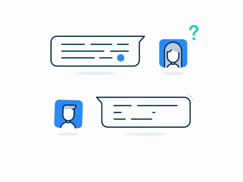
Notifications UI design typically includes a combination of textual content, icons, imagery, and sometimes even sound or vibration effects. They are designed to grab the user's attention and provide valuable and timely information.
Notifications can vary in purpose, such as delivering personalized messages, notifying about new content, indicating system status or updates, requesting user actions, or providing reminders.
TL;DR. A notification is a timely message that informs, confirms, or prompts action without making the user go looking for it. Good notification UI design comes down to choosing the right component for the job and timing it so it helps instead of interrupts. Below you'll find every notification component and type, UX best practices, a channel-by-channel comparison, settings patterns, real product examples, and a ship-ready checklist.
Today you will learn:
- Understand notification components: Learn about toasts, popovers, dialogs, and action buttons in notifications and how they contribute to effective communication.
- Types of notifications: Gain insight into system-generated, user-triggered, personalized, promotional notifications, exploring various contexts for its usage.
- Design best practices: Guidelines for attention-grabbing notifications that balance text and visuals, convey information effectively through tone, animation, sound.
- Usability tips: Techniques to ensure user-friendly notifications, avoiding overload, maintaining consistency, timeliness, relevance, and providing control over settings.
- Practical use cases: Explore onboarding, user engagement, account activity, transactional, and reminder notifications, understanding how they enhance UX.
Notification components
A notification is only as good as the component carrying it. Each component below has a job it does well and a job it ruins when misused. Pick the one that matches how urgent the message is and how much the user needs to act on it.
Badge
Notification badge @ Codepen
A badge is a small count or dot that sits on an app icon, tab, or menu item to signal unseen activity. It's the quietest notification you can ship: it pulls attention without blocking anything. Use it sparingly for activity that's worth a glance, keep it visually distinct, and read the full badge design guide for counts, placement, and overflow rules.
Toast and snackbar
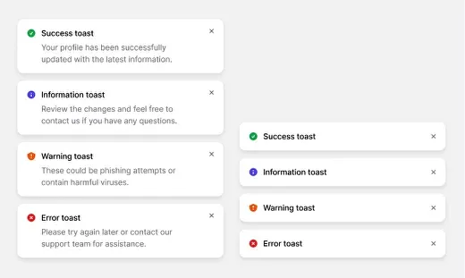
Toast components by Bertrand
A toast (or snackbar) is a brief, transient message that surfaces near a screen edge to confirm an action or share a non-critical update, then disappears on its own. Keep the copy short, hold enough contrast against the background, and give the user a sense of how long it will stay. For anything destructive, pair it with an undo action so the message earns its interruption.
Dialog and modal
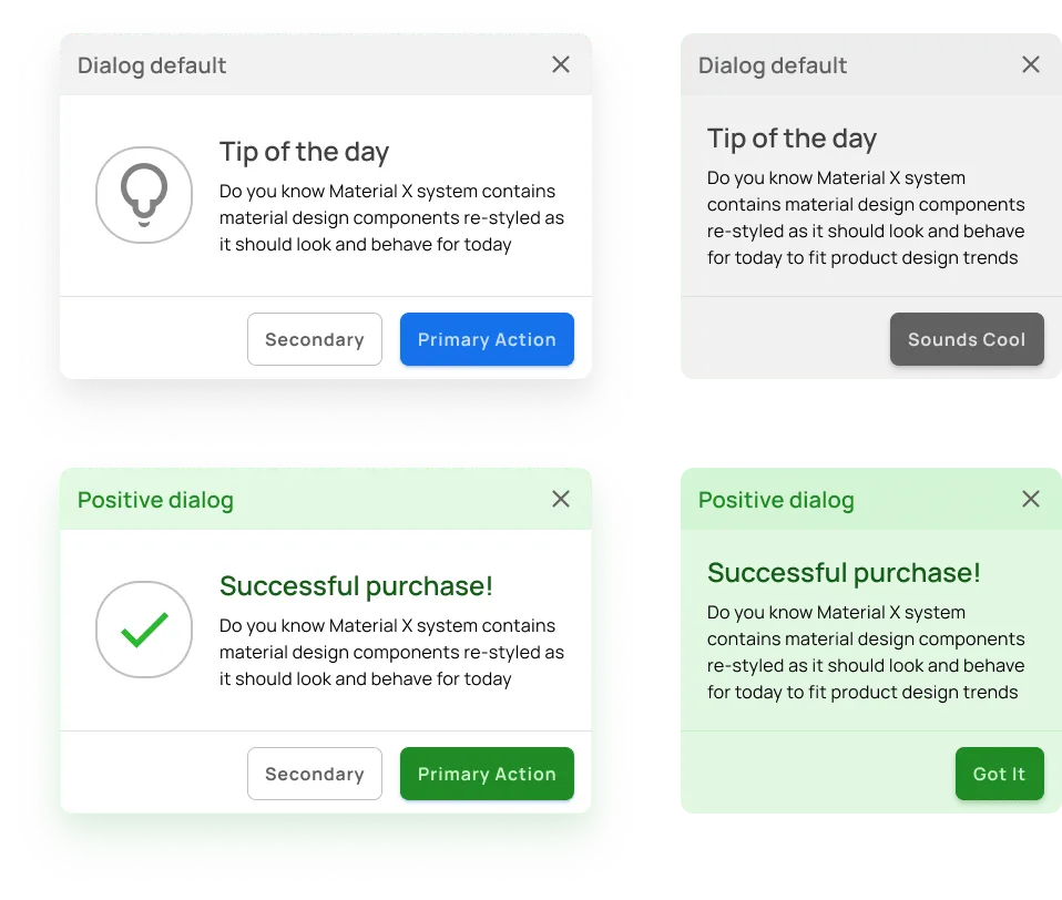
Dialog/Modal components by Material X UI kit
A dialog or modal is a focused overlay that stops the flow until the user confirms, cancels, or supplies input. It's the loudest component here, so reserve it for decisions that genuinely block progress. Make the primary action obvious and resist stuffing the box with options. The full breakdown of layout, focus, and button order lives in our guide to designing dialogs.
Popover
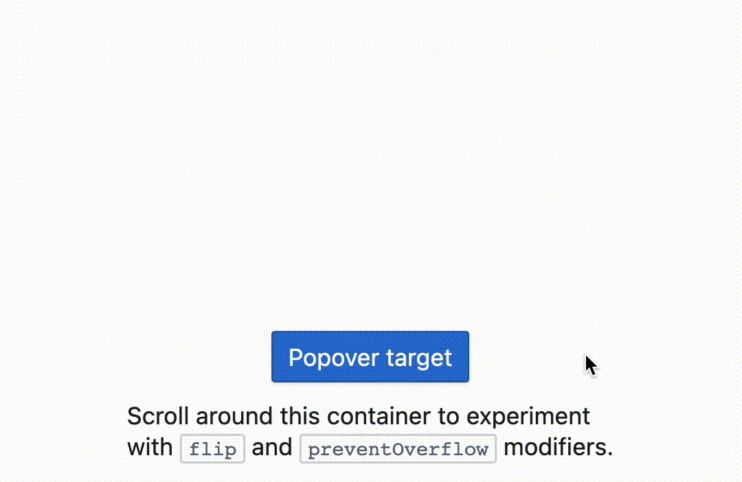
Popover component by BlueprintJS
A popover is a small overlay anchored to a specific element, surfacing contextual detail or quick actions without sending the user to another screen. Make the trigger obvious with an icon such as a question mark or "i", point the popover at its anchor with an arrow, and let people dismiss it easily so it never traps focus. Microinteractions on open and close help it feel attached to the thing it explains.
Tooltip
Tooltips for notifications @ Codepen
A tooltip is a tiny label that appears on hover or tap to clarify an unfamiliar control. It's barely a notification, more a just-in-time hint, so save it for the few features that genuinely need explaining and add a short delay so it doesn't flicker on every pass of the cursor. Our tooltip design guide covers timing, positioning, and accessibility in depth.
Banner
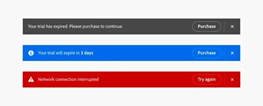
Banner Alerts by Adobe Spectrum
A banner is a wide, persistent strip pinned to the top or bottom of the screen for announcements and system-wide alerts that shouldn't vanish on a timer. Give it contrast so it reads as separate from the page, attach a clear call-to-action button, and let people dismiss or close it once they've dealt with it. Banners work best for status that stays true until the user resolves it: an outage, a trial ending, a payment that failed.
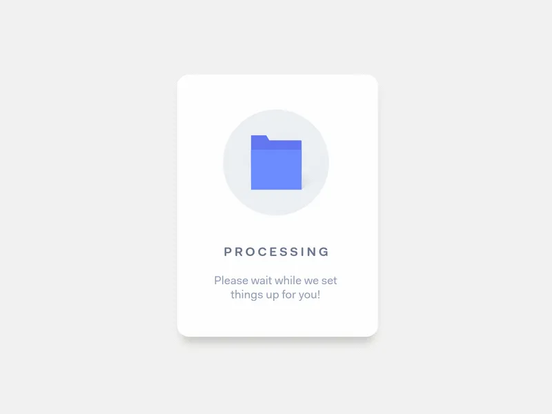
Progress indicator

Progress bar with Toast @ Codepen
A progress indicator reports the status of an ongoing task so the wait feels accounted for rather than broken. Use it for uploads, syncs, and background jobs, show how far along the task is and roughly how long is left when you can, and back it with a short message so the user knows what's actually happening behind the bar.
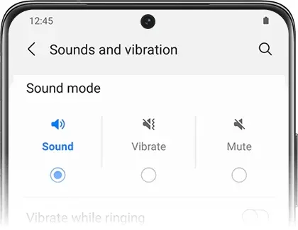
Sound notifications
Sound notifications guidelines
Sound notifications are audio cues that reach the user when their eyes are elsewhere. Treat sound as an accessory to a visual notification, never the only channel. Let people mute or customise it, match the tone to the message, and keep the volume noticeable without being startling.
Push notifications
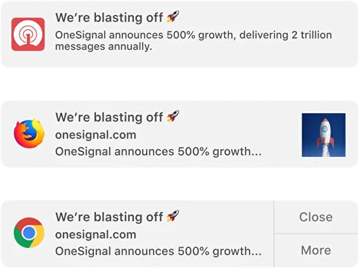
Push notifications for Figma
A push notification reaches the user on their device while your app is closed, which makes it the highest-stakes component here: get it wrong and people disable the channel for good. Offer clear opt-in and opt-out, let users control which types and how often they receive, and schedule around their habits instead of yours so each push lands when it's actually welcome.
Toast vs snackbar vs banner vs push at a glance:
| Component | Persistence | Interrupts the user? | Needs OS permission? | Best for |
|---|---|---|---|---|
| Toast / snackbar | Transient (auto-dismiss) | No | No | Confirmations, non-critical updates |
| Banner | Persistent until dismissed | Low | No | Status that stays true: outages, expiring trials |
| Dialog / modal | Persistent until resolved | High (blocks) | No | Decisions that must happen now |
| Push | Delivered then stored | Medium (off-app) | Yes | Re-engagement while the app is closed |
Notification types
Informational notifications
Informational notifications keep users in the loop about relevant updates and news tied to their app or account. They surface timely information to boost engagement and awareness without demanding action.
⬛⬜⬜ Low Priority: These notifications provide non-critical information and do not require immediate user attention, but they are still valuable for user engagement and awareness.
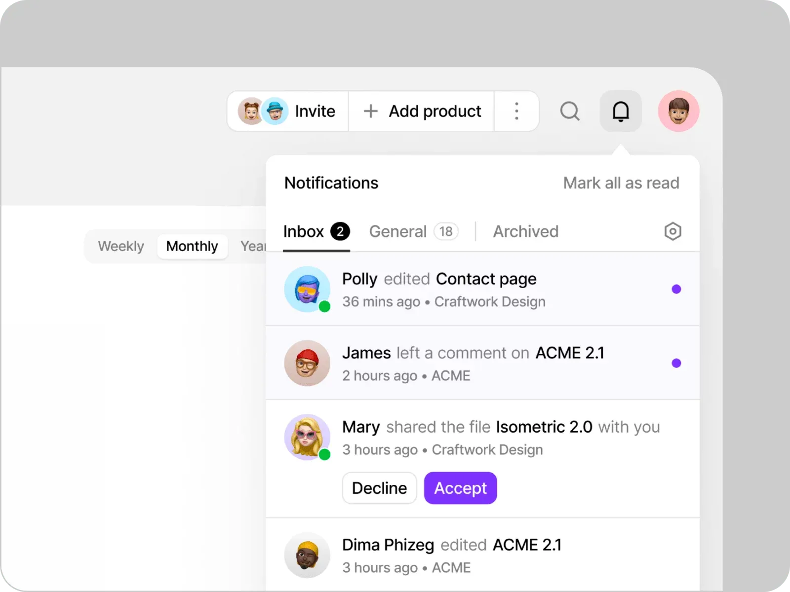
Account Activity Inspiration by Craftwork
Examples:
- Account Activity: Notifying users about recent activity on their accounts, such as successful logins, password changes, or suspicious login attempts.
- App Updates: Informing users about new features, bug fixes, or enhancements through release notes.
- News and Updates: Sharing relevant news or announcements related to the app or its industry.
Design considerations:
- Timing and Context: Deliver informational notifications at appropriate times and within relevant contexts to increase their usefulness and relevancy to the user.
- Actionable Content: Include appropriate and meaningful actions within the notification to allow to take immediate action without navigating through the app.
- Personalization: Tailor the content of the notification to match the user's preferences, location, or previous interactions to enhance relevance and engagement.
Transactional notifications
Transactional notifications fire in response to a specific user action or event in the app. They deliver immediate feedback, confirmation, or status updates tied to a transaction the user just made.
⬛⬛⬜ Medium Priority: These notifications are more time-sensitive and require users' attention to ensure they stay up-to-date with important transactional information.
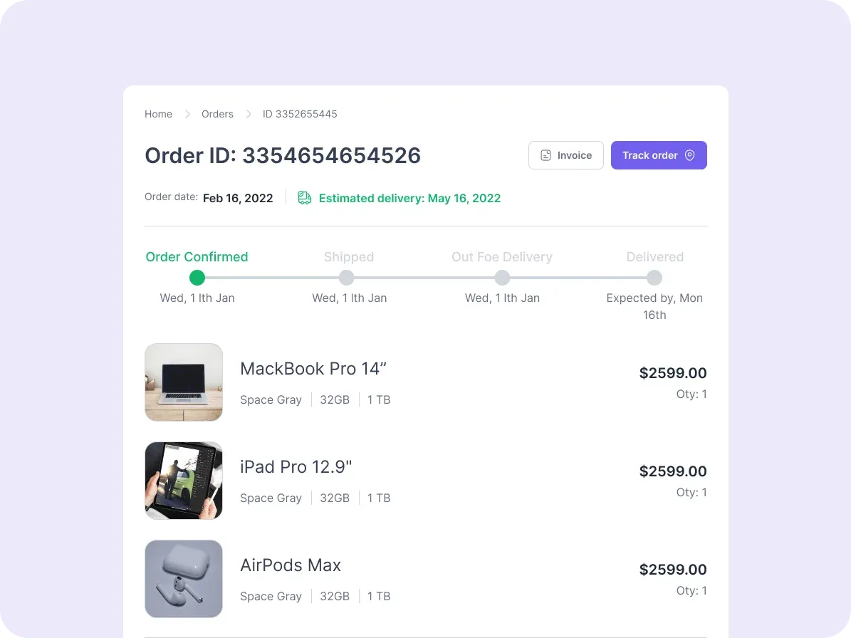
Order Status Inspiration from Pigma Community
Examples:
- Order Status: Informing users about the status updates of their orders, such as order confirmation, shipped status, or delivery updates.
- Payment Confirmation: Notifying users about successful payments, failed transactions, or pending payment reminders.
- Booking Confirmation: Informing users about successful bookings, reservations, or ticket purchases.
Design considerations:
-
Be Transparent with Timing: Clearly communicate any time-sensitive information, such as cutoff times, deadlines, or expected response times.
-
Use Visual Cues: Utilize icons, colors, or progress indicators to visually represent the status or outcome of transactions within the notification.
-
Provide Feedback and Confirmation: Once users complete the transaction-related action, provide immediate feedback or confirmation to reassure them that their action was successful.
Feedback notifications
Feedback notifications tell users the outcome or status of an interaction with the app, whether that's an acknowledgement, a success message, or an error alert tied to something they just did.
⬛⬛⬜ Medium Priority: These notifications are important for user feedback and may require user attention to address errors or provide additional information.
Rating and Reviews Inspiration by IIdiko Gaspar
Examples:
- Form Submission: Notifying users about the success or failure of submitting a form, ensuring they are aware of the outcome.
- Error Alerts: Alerting users to errors or issues encountered during their interactions, such as invalid inputs, network errors, or server maintenance.
- Ratings and Reviews: Prompting users to provide feedback, ratings, or reviews about the app or specific features.
Design considerations:
- Positive reinforcement: Whenever possible, provide positive feedback or acknowledge progress made by the user.
- Timely delivery: Send feedback notifications in a timely manner, when the user is actively engaged with the app or after they have completed a serious task.
- User-friendly dismiss actions: Provide simple and intuitive ways for users to dismiss or clear feedback notifications if they are not interested.
Error/success notifications
Error and success notifications confirm that an action went through or flag a failure tied to the user's interaction with the app. They close the loop so people never have to guess what happened.
⬛⬛⬛ High Priority: These notifications require immediate user attention, as they indicate important outcomes or errors.
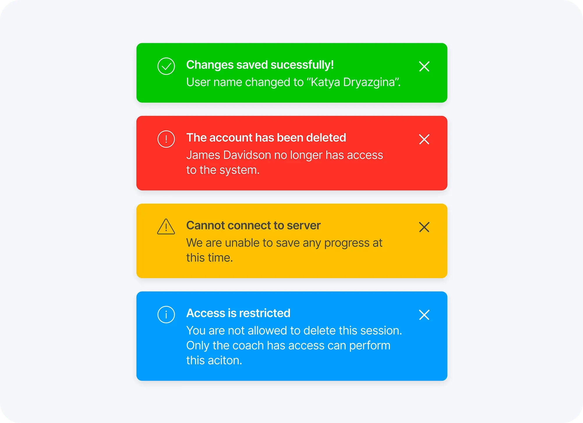
Error/Success Notifications by Katya Dryazgina
Examples:
- Successful Registration: Notifying users about the successful creation of their account or registration process.
- Password Reset: Confirming to users that their password reset has been successful.
- Invalid Input: Alerting users about errors in form submissions due to missing or incorrect inputs.
Design considerations:
- Visual Clarity: Utilize visual cues such as icons or color coding to quickly convey the nature of the notification.
- Error Reporting: Provide users with the means to easily report errors, ensuring that their feedback is properly recorded and addressed.
- Contextual Help: Include links or resources in error/success notifications that can provide users with additional context or assistance.
Actionable notifications
Actionable notifications let users act straight from the notification itself, without opening the app. They cut friction and save time by bringing the task to the user instead of the other way around.
⬛⬛⬛ High Priority: Actionable notifications require immediate user attention as they enable to take direct actions or perform tasks without navigating to the app.
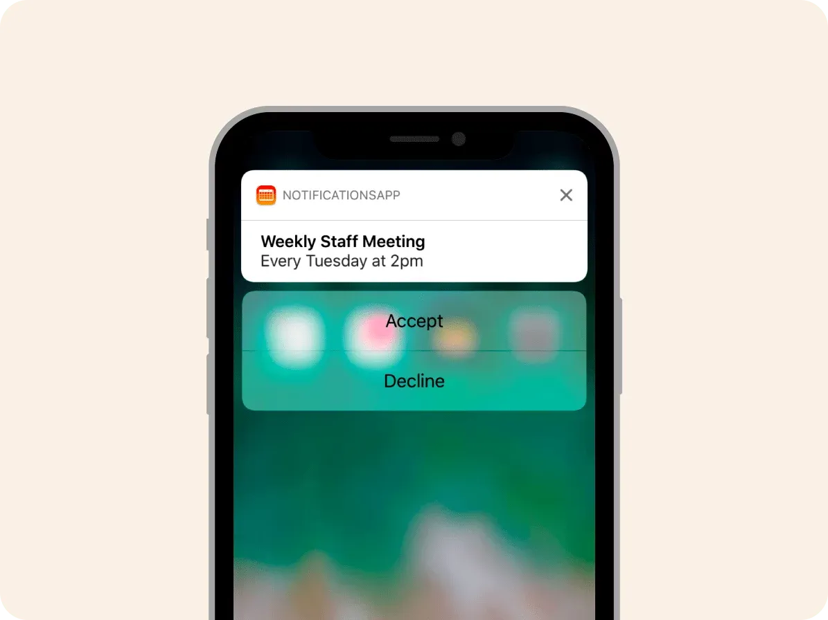
Actionable Notification iOS Inspiration by Apple
Examples:
- Reply to Messages: Allowing users to respond to messages or conversations directly from the notification, saving them time and effort.
- Social Media Interactions: Enabling users to like, comment, or share posts directly from the notification without opening the social media app.
- Task Completion: Providing users with the ability to mark tasks as complete, snooze reminders, or perform necessary actions without opening the app.
Design considerations:
- Prioritize Actions: If there are multiple actions possible, prioritize them based on user needs and preferences. Make it easy for users to understand the most relevant or frequently used actions.
- Deep Linking: Utilize deep linking within your actionable notifications to take users directly to specific content or actions within your app.
- Confirmation Notifications: Send a follow-up notification or visual confirmation within the app to inform users that their action has been successfully completed.
System notifications
System notifications come from the operating system or device rather than your app. They cover device-level updates, settings, and actions that happen outside any single app.
⬜⬜ Low Priority: System notifications are often essential but do not require the same level of attention as other types of notifications.
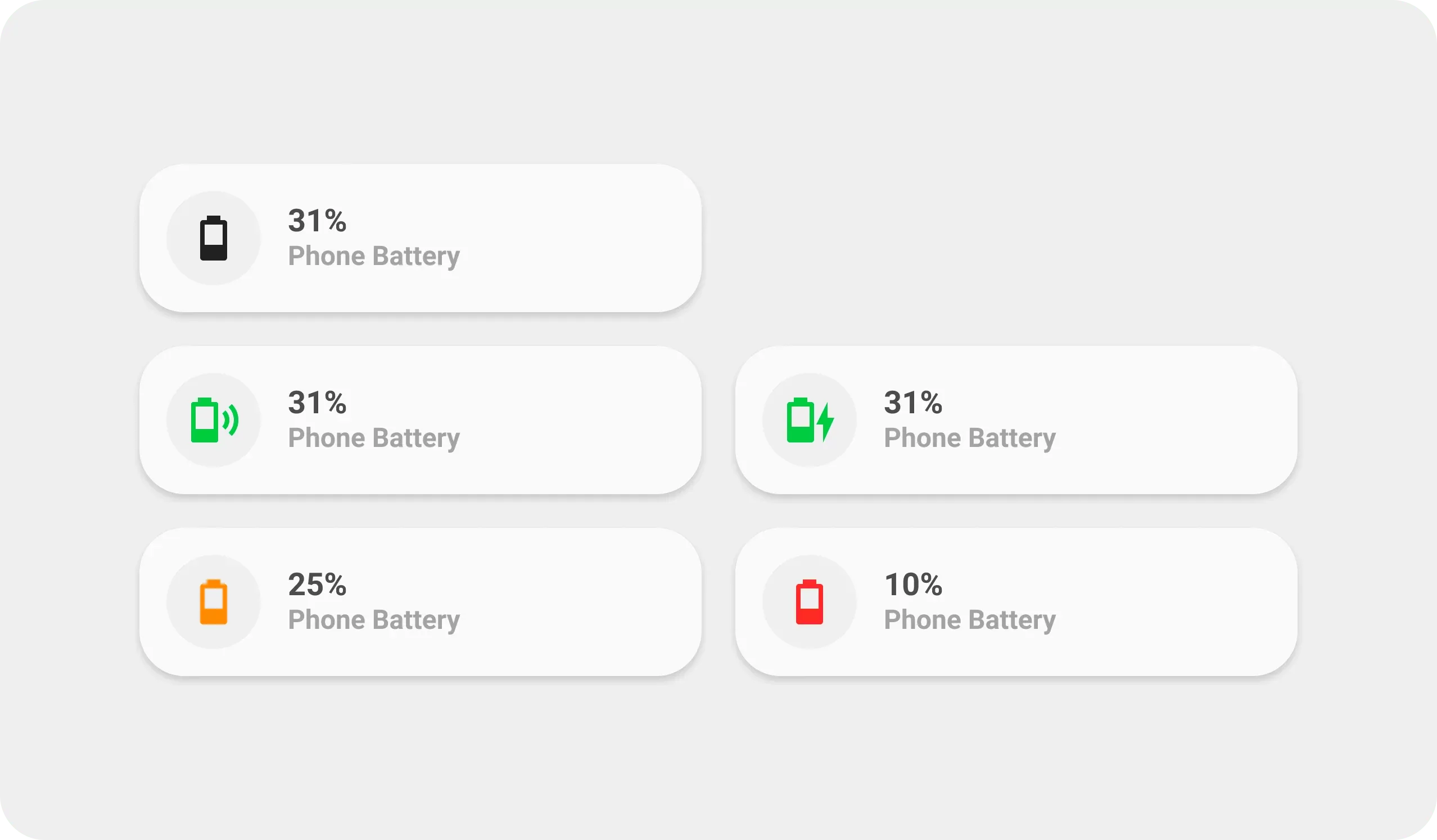
Battery Notification Ideas by UI Lovelace Minimalist
Examples:
- Software Updates: Notifying about available software updates for their device.
- Battery Level: Alerting users about low battery or when the device is fully charged.
- Do Not Disturb Mode: Informing users when device behavior is set to silent mode.
Design considerations:
- Short and Actionable Text: Keep the notification message short, using action-oriented language to guide users on what to do next
- Use Appropriate System Icons: Utilize recognizable system icons to enhance understandability and familiarity.
- Minimal Disruption: System notifications should not disrupt the user experience within the app, but instead provide valuable information or settings.
Reminders and alerts
Reminders and alerts nudge users about tasks, events, or time-sensitive actions they need to take or stay aware of inside the app.
⬛⬛⬜ Medium Priority: These notifications require users' attention as they serve as time-sensitive reminders or alerts for important actions or events.
Task & Appointment Reminders Inspiration by Keitoto
Examples:
- Appointment Reminders: Notifying users about upcoming appointments, scheduled meetings, or events they have on their calendar.
- Task Reminders: Reminding users about pending tasks, deadlines, or important to-do items within their task management app.
- Subscription Renewal: Prompting users to renew or upgrade their subscriptions, ensuring timely action to avoid interruption of services.
Design considerations:
- Timing and Frequency: Deliver reminder notifications at appropriate times and limit the frequency to avoid annoying or overwhelming the user.
- Opt-out or Snooze Options: Provide users with the ability to snooze or opt-out of receiving reminder notifications if they no longer require them or prefer a different mode of receiving reminders.
- Contextual Information: Include relevant details within the notification, such as event location, task description, or subscription details, to provide context.
Location-based notifications
Location-based notifications use a user's geographic position to deliver targeted, contextually relevant information at the right place.
⬛⬛⬜ Medium Priority: Location-based notifications are time-sensitive and require user attention, especially when they offer contextually relevant information.
Geofencing Alerts on Map by Orion UI kit
Examples:
- Store Promotions: Notifying users of nearby stores offering discounts or promotions based on their location.
- Event Recommendations: Alerting users about events taking place nearby based on their current location.
- Geofencing Alerts: Sending notifications when a user enters or exits a specific geographic area.
Design considerations:
- Opt-in and Privacy: Clearly communicate and obtain user consent for accessing location information, while ensuring the privacy and security of user data.
- Proximity Awareness: Utilize proximity-based triggers to deliver notifications based on nearby points of interest or relevant locations to drive engagement.
- Visual cues: Incorporate maps, markers, or pin icons to provide users with a clear understanding of their current location in relation to the notification's content.
Notification UX best practices
Good notification UX is less about how a single message looks and more about how the whole system behaves over time. The practices below are what separate a notification people trust from one they mute. Each is paired with a product that does it well.
Placement and visibility

Put notifications where users already look, and keep the entry point consistent so people learn where to find them. A predictable, easy-to-spot location lifts discoverability and engagement without adding noise. YouTube anchors its bell in the top-right corner, so users can check what's new mid-browse and get straight back to watching.
Let users personalize

Give people control over what they receive and when. Granular preferences cut irrelevant interruptions and make every message that does arrive feel intentional, which is the single biggest lever on long-term opt-in rates. X (Twitter) lets users toggle notification types individually, from new followers to likes and mentions, so the feed matches each person's tolerance.
Use meaningful icons

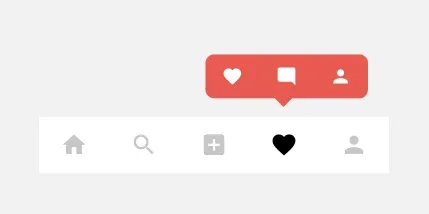
A well-chosen icon communicates the notification's intent before the user reads a word. Consistent visual language lets people triage at a glance and decide what's worth opening. Instagram leans on this hard: a heart for likes, a speech bubble for comments, a tag for mentions, all instantly legible.
Timing and frequency

The right message at the wrong moment is still an interruption. Pace notifications to the user's rhythm and cap how often you send, or you train people to swipe everything away unread. LinkedIn spaces out job alerts, connection requests, and industry insights so users stay informed without feeling pestered.
Close the loop with feedback
Like animation by Shakuro
Every notification-triggering action deserves a clear response: what happened, what's next, or what went wrong. Immediate feedback removes doubt and keeps people moving. Instagram's heart animation and sound confirm a like the instant it lands, so the action never feels lost.
Use motion with intent
Subtle animation draws the eye to a new notification and makes the interface feel alive, as long as it serves the message instead of showing off. Slack slides new messages in just enough to catch attention without yanking focus from whatever the user is doing.
Notification design patterns by scenario
Once you know the components and types, the real skill is matching the right one to the job in front of you. Here are eight common scenarios and the notification pattern that fits each best.
Social interactions
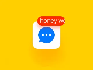
Push animation by Arthur Arapov
A new message or mention from another person is real-time and personal, so it earns an interruption. A banner or push notification that deep-links straight to the relevant chat screen lets people respond in one tap, which is exactly the immediacy social contexts demand.
Promotional and marketing
Badged message by Oleg Frolov
A limited-time offer lives or dies on attention, so a rich media notification carrying a product image or short video earns the tap far better than plain text. Send it sparingly and tie it to a clear deep link to the deal, or it reads as spam.
User feedback
Success animation by Miguel Serra
When someone submits a form or completes an action, a toast is the right call: it confirms success and disappears on its own, so people get reassurance without losing their place. Critical for high-stakes flows like banking, where a silent submit breeds anxiety.
Permission requests
File fetching animation by Vinoth
Asking for access to the camera, photos, or location calls for a system permission dialog, and timing is everything. Trigger it in context, right when the user tries the feature that needs it, and explain why first so consent feels earned rather than ambushed.
Onboarding and welcome
Onboarding animation by Nata
First-run guidance works best as a popover anchored to the control it describes. It focuses attention on one spot, supports interactive content, and dismisses cleanly once the user feels oriented, without blocking the whole screen the way a modal would.
Progress and completion
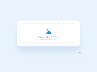
Image upload by Oğuz Kara
For uploads, exports, or syncs, a progress bar notification turns a black box into something the user can trust. Showing the percentage reassures people their action is in flight and frees them to do other things while it finishes.
Update available
Not every update deserves a push. A simple app-icon badge signals there's something new to explore whenever the user is ready, surfacing fresh content without interrupting whatever they're doing right now.
Upcoming event
Screen notifications by Ashraf
Time-sensitive events such as a concert on sale or a meeting about to start belong on the lock screen, where they're visible at a glance even on a locked phone. A single tap into the booking or detail flow turns awareness into action before the moment passes.
Notification settings UI design
The fastest way to lose a notification channel is to give users no way to tune it. A good notification settings screen is what stands between "I'll allow this" and "I'm turning everything off." Treat it as a core part of the feature, not an afterthought buried three menus deep.
Group preferences by what users care about
People don't think in terms of your backend events. They think in topics: messages, mentions, security, billing, marketing. Group the settings the same way, and let each group be toggled independently so someone can keep security alerts on while silencing promos. Clear grouping is also what makes the screen scannable instead of a wall of switches.
Separate channel from category
The strongest pattern is a matrix: notification categories down the side, delivery channels (in-app, push, email) across the top. That lets a user say "email me about billing, push me about mentions, never ping me about tips," all in one glance. The humble toggle switch does the heavy lifting here, so make its on/off state unmistakable.
Default to restraint, then earn more
Ship with sensible defaults that lean quiet, especially for marketing notifications, and let engaged users opt into more. Over-sending by default is the single fastest route to a system-wide mute. For the broader patterns behind these screens, see the dedicated guide on settings UI design.
In-app vs push vs web vs desktop notifications
The same message behaves very differently depending on where it lands. Picking the right channel is as much a part of notification design as the visual itself, because each one carries different permission rules, visibility, and user expectations.
| Channel | Where it appears | Needs opt-in? | Best for | Watch out for |
|---|---|---|---|---|
| In-app | Inside your app while it's open | No | Contextual updates, confirmations, activity feeds | Easy to miss if the user isn't looking |
| Push (mobile) | Device lock screen and tray | Yes (OS permission) | Re-engagement, time-sensitive alerts | One bad batch and people disable it for good |
| Web push | Browser, even when the tab is closed | Yes (per-site) | Bringing visitors back, breaking updates | High opt-out; intrusive if over-used |
| Desktop | OS notification center | Yes (per-app) | Workflow apps, chat, calendar reminders | Competes with every other app's noise |
The rule of thumb: keep low-stakes, contextual messages in-app, and reserve push and web push for things genuinely worth pulling someone back. A notification that interrupts had better be worth the interruption.
Real-world notification design examples
The clearest way to learn notification design is to watch how strong products handle it. Five worth studying:
- Slack keeps the noise down with granular per-channel controls and a "notify me about" matrix that respects keywords, threads, and do-not-disturb hours. It's the gold standard for letting users tune a high-volume notification stream.
- Stripe treats transactional notifications as trust signals: every payment, dispute, and payout fires a clear, plainly worded confirmation, so businesses always know where their money stands.
- Linear uses fast, unobtrusive in-app toasts and a tightly scoped inbox, proving that a productivity tool can keep people informed without ever feeling busy.
- Notion batches low-priority updates into a single digest instead of pinging on every comment, a smart defense against notification fatigue in a collaborative workspace.
- GitHub layers a notification inbox with reason labels ("you were mentioned," "you're reviewing"), so developers can triage dozens of alerts by relevance in seconds.
The thread connecting all five is control and clarity: each gives users a way to dial the volume and tells them exactly why a notification arrived.
Material Design notification patterns
If you're building on Android or any Material-based system, lean on the patterns already defined in Material Design rather than inventing your own. Material draws a sharp line between snackbars (brief, auto-dismissing feedback at the bottom of the screen), banners (a persistent, dismissible message for a single important update), and dialogs (modal interruptions reserved for decisions that must happen now). It also specifies system notification anatomy: small icon, title, text, timestamp, and actions. Following these conventions means users get behavior they already understand, and you get accessibility and motion handled for free. The official Material Design components docs lay out the full spec.
Before you ship: notification checklist
Run any new notification through this list before it goes live:
- ✅ The message is timely and genuinely useful, not just technically possible
- ✅ You've chosen the right component for the stakes (toast for low, dialog for blocking)
- ✅ The copy is clear in one read, with a single obvious action where needed
- ✅ Users can control or mute this notification type from settings
- ✅ Push and web channels ask permission in context, with a reason
- ✅ An icon or color signals the notification's intent at a glance
- ✅ Frequency is capped so the channel never feels spammy
- ✅ The notification is accessible: sufficient contrast, screen-reader text, no color-only meaning
- ✅ There's clear feedback confirming the action that triggered it
- ✅ Defaults lean quiet, and the most intrusive types are opt-in
Notifications design FAQ
What makes a good notification design? A good notification is timely, relevant, and respectful of attention. It uses the right component for the stakes, says what happened in one read, offers a clear action when one is needed, and can always be controlled or muted by the user. The best ones feel like help, not interruption.
What's the difference between in-app and push notifications? In-app notifications appear while your app is open and need no permission, making them ideal for contextual, low-stakes updates. Push notifications reach the device even when the app is closed, require OS permission, and should be reserved for messages genuinely worth pulling someone back.
How do I design notification settings users won't disable? Group preferences by topic, let users toggle categories and channels independently, and default to restraint, especially for marketing. When people feel in control of what they receive, they leave far more of it switched on.
Toast vs banner vs dialog: which should I use? Use a toast for transient, non-critical feedback that auto-dismisses; a banner for a persistent status that stays true until resolved, like an outage; and a dialog only for decisions that must be made right now, since it blocks everything else.
How many notifications are too many? There's no fixed number, but the moment a user starts swiping notifications away unread, you've crossed the line. Cap frequency, batch low-priority updates into digests, and watch your opt-out rate as the real signal.
How do I make notifications accessible? Never rely on color alone to convey meaning, keep contrast high, provide screen-reader text for icons and status, and make sure transient messages like toasts stay on screen long enough to be read or are mirrored somewhere persistent.
What are Material Design's notification patterns? Material Design separates snackbars (brief auto-dismissing feedback), banners (persistent single messages), and dialogs (modal decisions), plus a defined anatomy for system notifications. Following the spec gives users familiar behavior and handles much of the accessibility for you.
A last word on notifications
After enough product work, one belief hardens: notification design is attention design, and attention is the most expensive thing your user owns. Every ping spends a little of the trust that keeps your channel switched on, so the discipline isn't in how many notifications you can send, it's in how many you choose not to. The teams that win treat silence as a feature, default to quiet, and make every message earn its interruption. Get the components right, match each one to its job, hand users real control, and a notification system stops being something people tolerate and starts being something they rely on. That shift, from noise to signal, is the whole game.
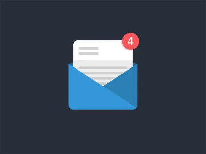
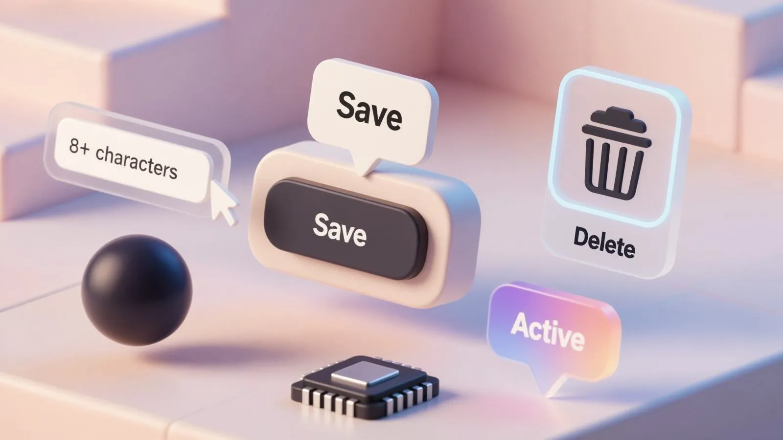
Cover Image Credit © Unread notifications (Codepen) by Joey Stevens

.webp&w=1920&q=75)
.webp&w=1920&q=75)

.webp&w=1920&q=75)
.webp&w=1920&q=75)


.webp&w=1920&q=75)
.webp&w=1920&q=75)


