


Roman Kamushken
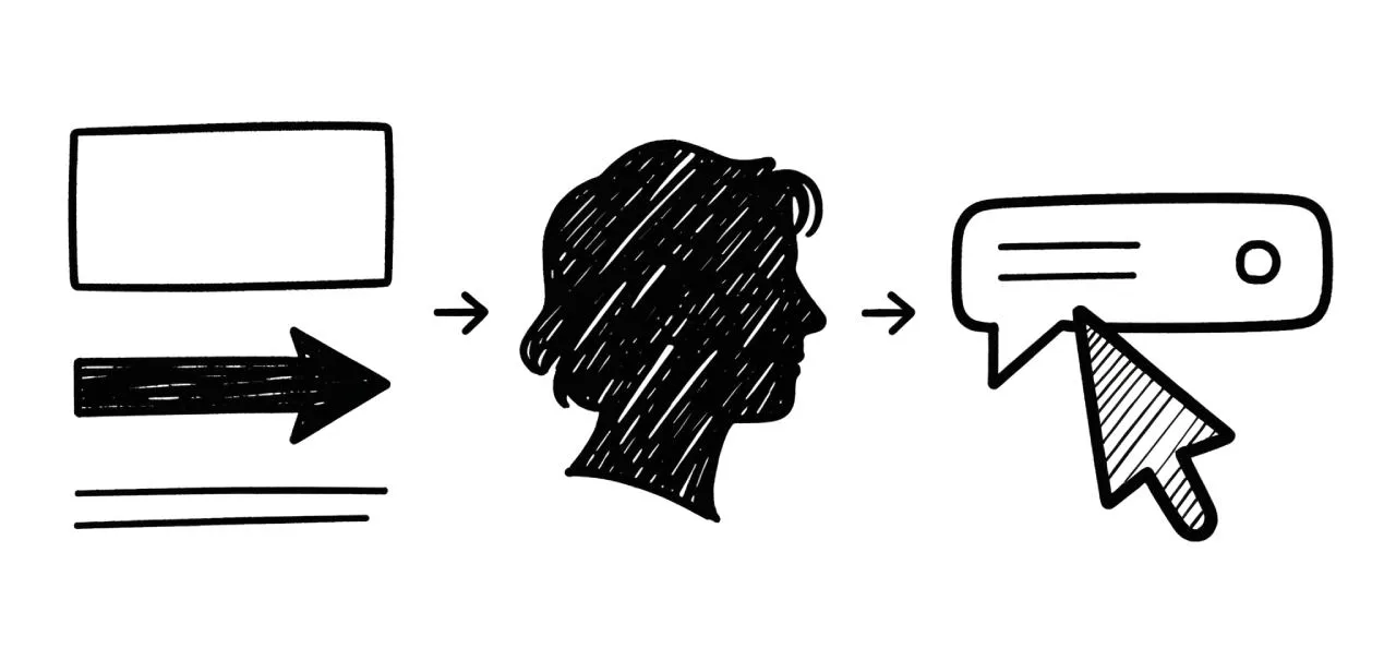
A tooltip is a small, contextual pop-up that displays on hover, focus, or tap. Its primary function is to provide concise, supplementary information about an interface element without cluttering the main view. Think of it as a helpful whisper, not a loud announcement. When used correctly, tooltips enhance usability, clarify ambiguity, and guide users, contributing to a seamless and intuitive experience.
In this guide, we will deconstruct the tooltip component, exploring its anatomy, various states, theming options, and the critical UX best practices that separate a good tooltip from a great one.
Get inspired by this Pinterest board related to Tooltips styles, theming and variations.
Anatomy
To build a consistent and functional tooltip, we need to understand its core components. While seemingly simple, a tooltip's anatomy dictates its clarity and effectiveness.
Types
Not all tooltips are created equal. The type you choose depends on the complexity of the information you need to convey.
Standard Tooltip
• Definition: A simple text-only tooltip used for brief explanations or definitions.
• Use Case: Explaining the function of an icon-only button, such as a "download" or "settings" icon.
• Design Tip: Keep the text under 15 words for optimal readability. Use sentence case for a friendlier tone.
Rich Tooltip
• Definition: A tooltip that includes elements beyond plain text, such as icons, bold text, or links.
• Use Case: Providing a shortcut link to documentation or displaying a status with a corresponding icon.
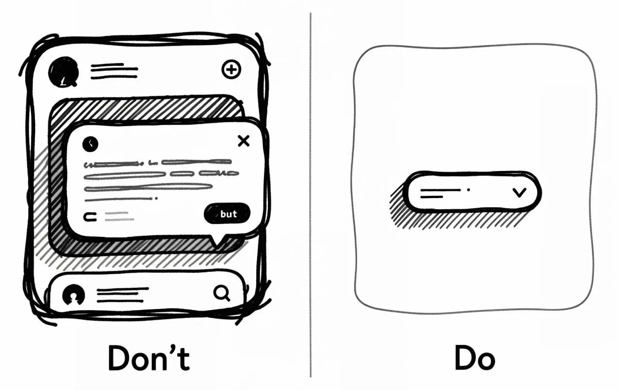
• Design Tip: Use rich content sparingly. If a tooltip becomes too complex, consider using a popover or modal dialog instead.
Tooltip with action
• Definition: A tooltip that contains a clickable element, like a "Dismiss" or "Learn More" button.
• Use Case: A first-time user experience (FTUE) hint that can be permanently dismissed.
• Design Tip: This blurs the line between a tooltip and a popover. Ensure the action is clear and that the tooltip remains on screen long enough for the user to discover and click it.
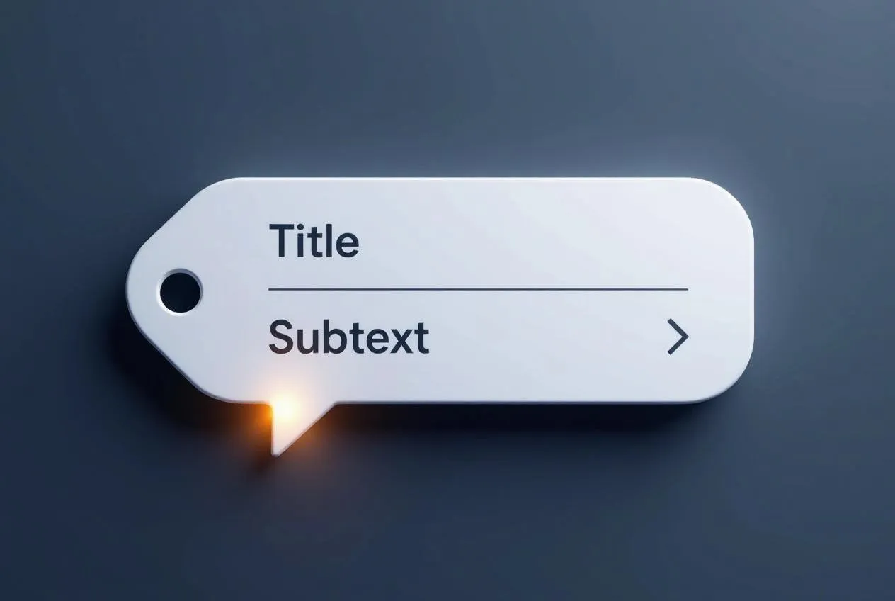
Key elements
Every tooltip, regardless of type, is composed of a few fundamental building blocks.
Container
• Definition: The rectangular or rounded shape that holds the tooltip's content.
• Use Case: Provides a high-contrast background to make the text readable against any underlying content.
• Design Tip: Use a subtle box-shadow to create depth and visually separate the tooltip from the background.
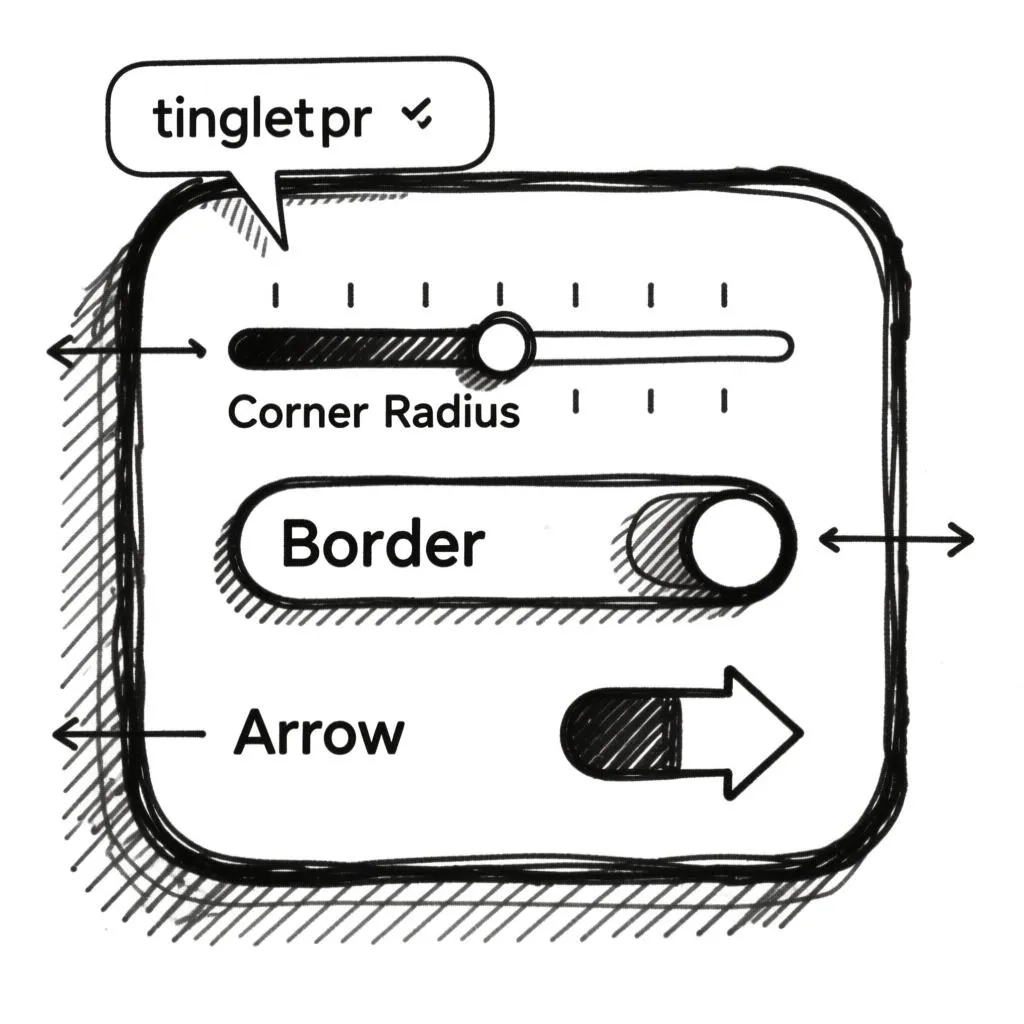
Arrow (Tail)
• Definition: The small triangular pointer that connects the container to its target element (the trigger).
• Use Case: Clearly indicates which element the tooltip is referring to, eliminating ambiguity.
• Design Tip: The arrow should point directly to the center of the trigger element. Its color should match the container's fill.
Text (Content)
• Definition: The actual message displayed to the user.
• Use Case: To explain, define, or clarify the function of the trigger element.
• Design Tip: Use a legible font size (typically 14px) and ensure sufficient color contrast between the text and the container background.
Close Icon
• Definition: An optional "x" icon that allows the user to manually close the tooltip.
• Use Case: Essential for tooltips that appear on focus (for keyboard users) or for tooltips that block important content.
• Design Tip: Only include a close icon if the tooltip doesn't disappear automatically when the user's cursor or focus moves away.
States & Interactions
A tooltip is not a static element; it exists in several states that communicate its status and respond to user interaction.
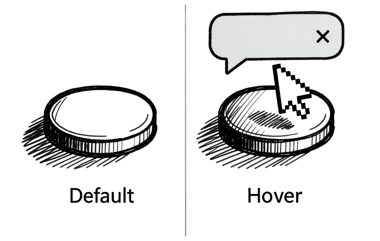
Default (Hidden)
• Description: The tooltip is not visible on the screen. The trigger element is in its normal state.
• Function: This is the default state of the component, ensuring the interface is clean and uncluttered.
Visible (Shown)
• Description: The tooltip appears on screen after a user hovers over or focuses on the trigger.
• Function: This is the core state where the tooltip delivers its information.
Hover
• Description: The state of the trigger element when the user's cursor is over it. This state usually triggers the tooltip's appearance.
• Function: Provides visual feedback to the user that the element is interactive and has more information to offer.
Focus
• Description: The state of the trigger element when it is selected using the keyboard (e.g., by tabbing to it).
• Function: Essential for accessibility. The tooltip must also appear on focus to ensure users who cannot use a mouse receive the same information.
Disabled
• Description: The trigger element is inactive, often greyed out. Hovering or focusing on it does not trigger a tooltip.
• Function: Prevents user confusion by making it clear that an inactive element has no associated information or function.
Theming
Tooltip design must be flexible enough to integrate seamlessly into any design system while maintaining its core purpose.
Color schemes
Light-on-Dark: The most common and accessible option. Light text on a dark container provides high contrast against most backgrounds.
Dark-on-Light: Useful for interfaces with very dark themes where a light tooltip would be jarring.
Branded: Can be used to subtly reinforce brand identity, but be cautious not to sacrifice readability for brand colors.
Container style
Corner Radius: A border-radius of 4-8px is standard. Match it to the general design language of your UI.
Border & Shadow: A subtle border can help define the container, but a box-shadow is often more effective at creating a sense of elevation and separation from the content below.
Positioning
Top: The default and most preferred position. It appears above the trigger and is less likely to be obscured by the user's cursor.
Bottom, Left, Right: Alternative positions used when the top position is not available due to screen edge constraints. The positioning logic should automatically choose the best available spot.
Animation
Fade In/Out: A subtle opacity transition (e.g., 150-200ms) is the most common and professional animation.
Slide & Fade: Combining a slight transform (e.g., moving 2-4px) with a fade can make the appearance feel smoother and more dynamic. Avoid overly bouncy or complex animations.
Use cases
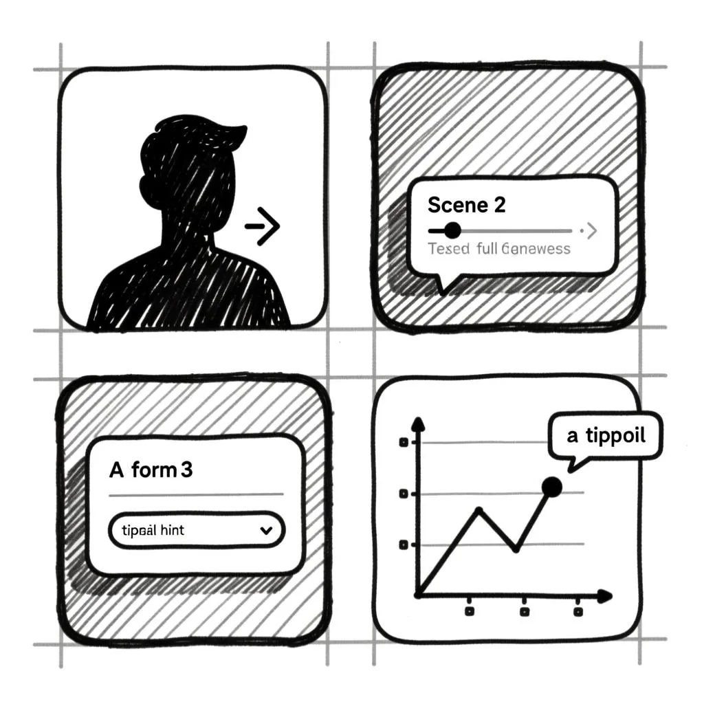
Tooltips are versatile, but their power lies in using them for the right tasks.
Defining icons
• Example: An icon of a trash can without a label. A tooltip on hover says "Delete item".
• Benefit: Saves screen space while ensuring functionality is clear.
Providing field hints in forms
• Example: A password text field with an info icon. Hovering over the icon reveals a tooltip: "Password must be at least 8 characters and include a number".
• Benefit: Offers contextual help without cluttering the form layout.
Displaying full content
• Example: In a data table, a cell with a long email address is truncated to "user@exa...". Hovering reveals the full address in a tooltip.
• Benefit: Maintains a clean table layout while ensuring no data is hidden from the user.
Explaining complex terms
• Example: In a financial app, the term "APR" is followed by a question mark icon. The tooltip explains what Annual Percentage Rate means.
• Benefit: Educates users without forcing them to leave the current context.
UX & Usability tips
Even a perfectly designed tooltip can fail if its implementation is flawed. Here are the most common pitfalls and how to avoid them.
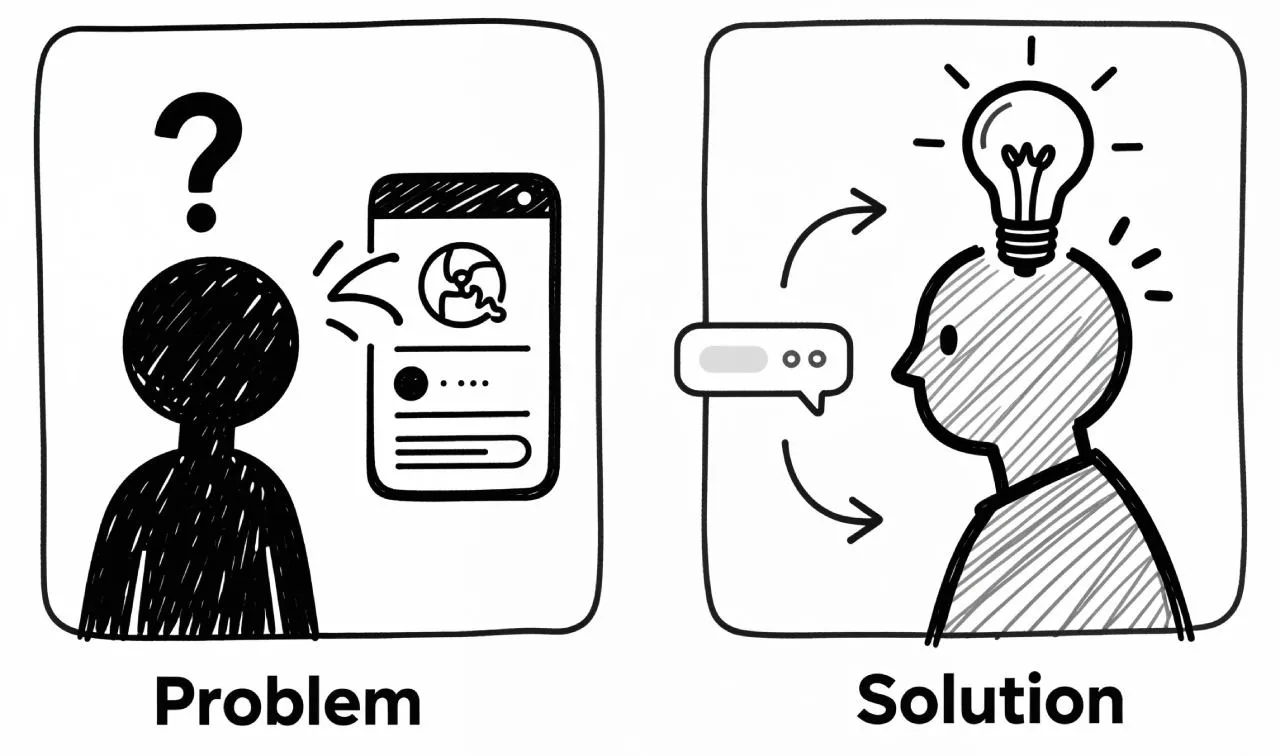
✘ Problem: Tooltips appear instantly, creating a distracting and flickering effect as the cursor moves across the screen.
✔Solution: Introduce a slight delay before the tooltip appears. A delay of ~500ms is a good starting point. This prevents tooltips from firing accidentally when a user is simply moving their mouse across an area.
✘ Problem: Tooltips are not accessible to keyboard users, hiding critical information from a segment of your audience.
✔Solution: Ensure every tooltip that appears on hover also appears on focus. Use ARIA attributes like aria-describedby to programmatically link the trigger element to the tooltip's content for screen readers.
✘ Problem: The tooltip's content is too long, turning a simple hint into a wall of text that is hard to read and quickly disappears.
✔Solution: Be ruthlessly concise. A tooltip should be a short sentence or a phrase. If you need more space, consider linking to a documentation page or using a more persistent component like a popover.
✘ Problem: The tooltip covers the very element it is describing, or it appears off-screen, making it unreadable.
✔Solution: Implement smart positioning. The logic should check available space and automatically reposition the tooltip (e.g., from top to bottom) to ensure it is always fully visible and does not obscure the trigger.
✘ Problem: Tooltips are used for critical information or primary actions, like "Click here to save your changes".
✔Solution: Never rely on tooltips for essential information. Tooltips are a discovery mechanism; they are hidden by default. Critical warnings, confirmations, and primary actions must always be directly visible in the interface.
Mastering the tooltip is about understanding its role as a subtle guide. When these principles are followed, you can create tooltips that are helpful, accessible, and elegant, significantly improving the overall quality of your user interface.
User scenarios
Theory is one thing, but real-world use is another. These several scenarios show how well-designed tooltips solve actual problems, save time, and guide users to their goals effectively.
Scenario ①: The Data Analyst
Maria was deep in her quarterly review, staring at the sales dashboard. A specific bar on the chart spiked unusually high, an anomaly she needed to explain for her board presentation. She hovered her cursor over it, and a sleek tooltip appeared: "Sales: $18,500 | March 15th - Product Launch". This single piece of contextual information was the missing link. It instantly connected the data spike to the new product's release, saving her from cross-referencing multiple calendars and sales reports. With this insight, she could confidently attribute the success to the marketing campaign, finalize her report, and prepare for the meeting.
Scenario ②: The First-Time User
David was setting up his new smart home hub, a process he found intimidating. He reached the account creation form and hesitated at the "Display Name" field, unsure if it should be formal like "David Smith" or casual like "Dave's Place". He noticed a small info icon and tentatively tapped it. A gentle tooltip materialized: "This is how other users on your network will see you." This simple clarification was all he needed. He confidently entered "Dave's Hub" and completed the setup, feeling guided and empowered, not frustrated by ambiguity.
Scenario ③: The Busy Professional
Sarah was scanning her email inbox during a hectic morning, trying to triage dozens of messages. She saw a message from an unknown sender, "alex.johnson@", but the preview was cut short. It could be spam or a critical client. She long-pressed the name, and a tooltip instantly revealed the full address: "alex.johnson@partnerfirm.com". Recognizing the partner firm's domain, she immediately opened the email. The tooltip saved her from potentially ignoring a message that led to a major new project.
Scenario ④: The Cautious Borrower
Ben was reviewing his loan application online, a significant financial decision. He came across the term "APR" next to the interest rate. He knew it was important but couldn't recall the exact formula. He hovered over the info icon, and a tooltip popped up, explaining: "Annual Percentage Rate: The yearly cost of your loan, including interest and fees." This clear, on-the-spot explanation demystified the fine print. He now understood the true cost and could confidently compare this offer with others, making an informed choice.
Scenario ⑤: The Online Shopper
Chloe was excitedly buying a limited-edition art poster she knew would sell out fast. She went to select the size and hovered over the "L" option, her preferred choice. A tooltip immediately appeared: "Low stock: only 1 left!". This urgent warning was a powerful psychological trigger. It prompted her to add it to her cart instantly without second-guessing. She proceeded to checkout immediately, securing the item. The tooltip created a sense of urgency that directly led to a successful conversion.
Scenario ⑥: The Novice Coder
Anna was customizing her new code editor's interface to boost her productivity. She saw an icon of a pair of glasses in the toolbar but didn't know its function. She hovered over it, and a tooltip appeared: "Format Code (Ctrl+Shift+F)". This was a revelation. Not only did she learn the icon's purpose, but she also learned the keyboard shortcut. From then on, she used the shortcut constantly, saving her clicks and seconds with each use, which accumulated into a significant speed boost for her entire workflow.
Scenario ⑦: The Project Manager
Fatima was reviewing a project board in her team's management tool, preparing for a daily stand-up meeting. She saw a task card assigned to "S. Chen" but couldn't immediately recall the full name or role of the new team member. She hovered over the small circular avatar, and a tooltip revealed: "Sarah Chen | Frontend Developer". This instant context helped her understand the task's technical implications at a glance without having to click away and search the team directory.
I made this image with AI. I used Venice.AI – a handy tool not only for designers.
FAQ: Tooltip UI design
❶ What is the difference between a Tooltip and a Popover? The key difference is complexity. A tooltip is for non-essential, concise information and disappears on disengagement. A popover can contain rich content, interactive elements, or forms, and often requires a click to open. If your content needs a button or more than two sentences, use a popover.
❷ Should a tooltip appear on click or on hover? For desktop, hover is the standard. The best practice is to support both hover and focus events. This ensures the component works for mouse users and remains fully accessible for keyboard users.
❸ How long should a tooltip stay on screen? It should remain visible as long as the user is hovering over the trigger element. It should disappear almost immediately once the cursor moves away. A fixed timer is frustrating; the user's interaction should dictate the lifespan.
❹ Are tooltips accessible for screen readers? They can be with proper ARIA implementation. Give the tooltip a unique id and add aria-describedby="tooltip-id" to the trigger element. This tells the screen reader to announce the tooltip's content when the trigger receives focus.
❺ What is the ideal maximum width for a tooltip? A tooltip should be narrow to maintain readability. Set a max-width of around 200-250 pixels. This prevents long, difficult-to-read lines. If your content consistently exceeds this, you should be using a popover instead.
❻ Is it okay to have a tooltip without an arrow (tail)? It is generally not recommended. The arrow is a critical visual cue that explicitly links the tooltip to its trigger. Without it, users might have to guess which element the tooltip refers to. Only omit the arrow if its origin is unmistakably obvious.
❼ Can I include links or other interactive elements inside a tooltip? You should avoid it. A tooltip is for passive, read-only information. Adding an interactive element creates a usability problem, as the tooltip will disappear when the user tries to move their cursor to the link. For actions, use a popover or modal dialog.
❽ How to use tooltips on mobile devices? The hover event does not exist on touch interfaces. On mobile, a tooltip should appear on a tap of the trigger element. Crucially, it must also disappear when the user taps anywhere else on the screen. For accessibility, ensure the tooltip also appears on focus when the user navigates to the trigger using keyboard-like controls on their device.