

Roman Kamushken
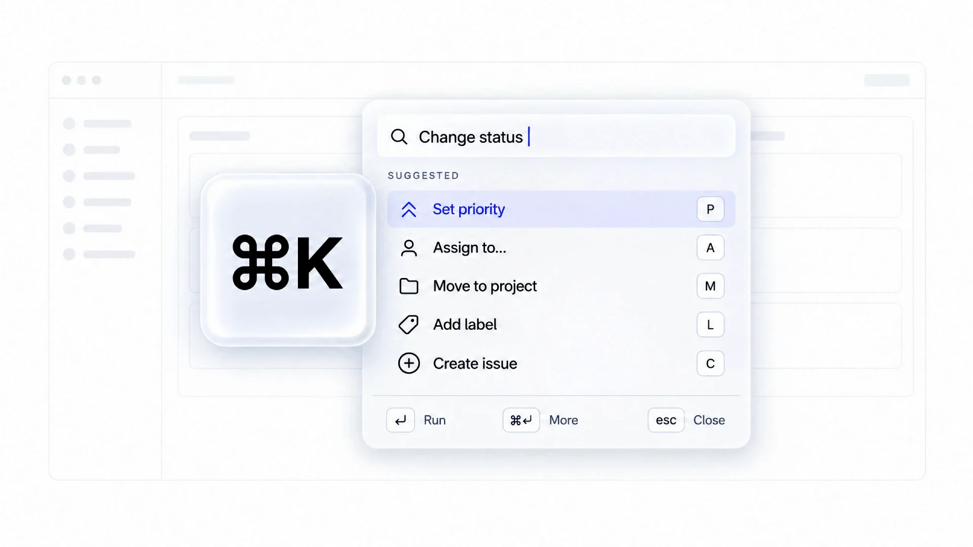
Every serious SaaS now ships one. Or claims to. The gap between a real palette and a search box with a shortcut glued on is wide. Users press Cmd+K once, get pages they could have clicked anyway, and leave.
This guide covers the full anatomy, the eight states most teams never design, the interaction rules that hold up in production, and ten teardowns where each product gets one honest weakness.
We opened every palette on a fresh account in September 2026 and recorded four things: how it is invoked, what it shows on an empty query, how deep it nests, and which of the eight states it actually handles. We have specified this component for our own dashboard kits, so the dimensions below come from shipped work, not from mockups.
What a command palette is (and what it is not)
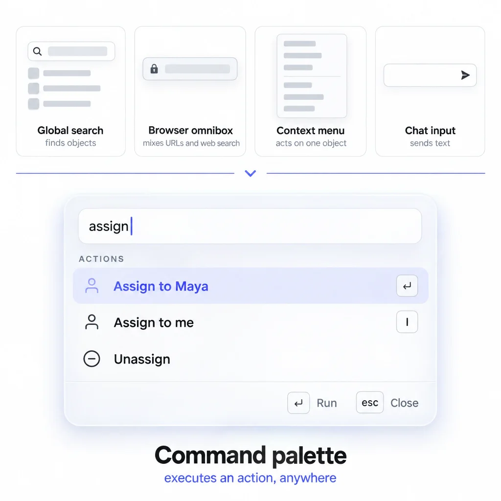
A command palette is a keyboard-invoked overlay that lets a user type to find and execute an action anywhere in the product, without navigating there first.
Four things get confused with it. A global search finds objects and hands them to you. A browser omnibox mixes URLs and history with web search. A context menu offers actions tied to one selected object. A chat input sends text to another person or a model.
Execution defines it. Search answers "where is it", a palette answers "do it".
Four look-alikes find, navigate, act on one object or send. Only the palette executes anywhere.
Anatomy of a command palette
Seven parts, each specifiable in a ticket.
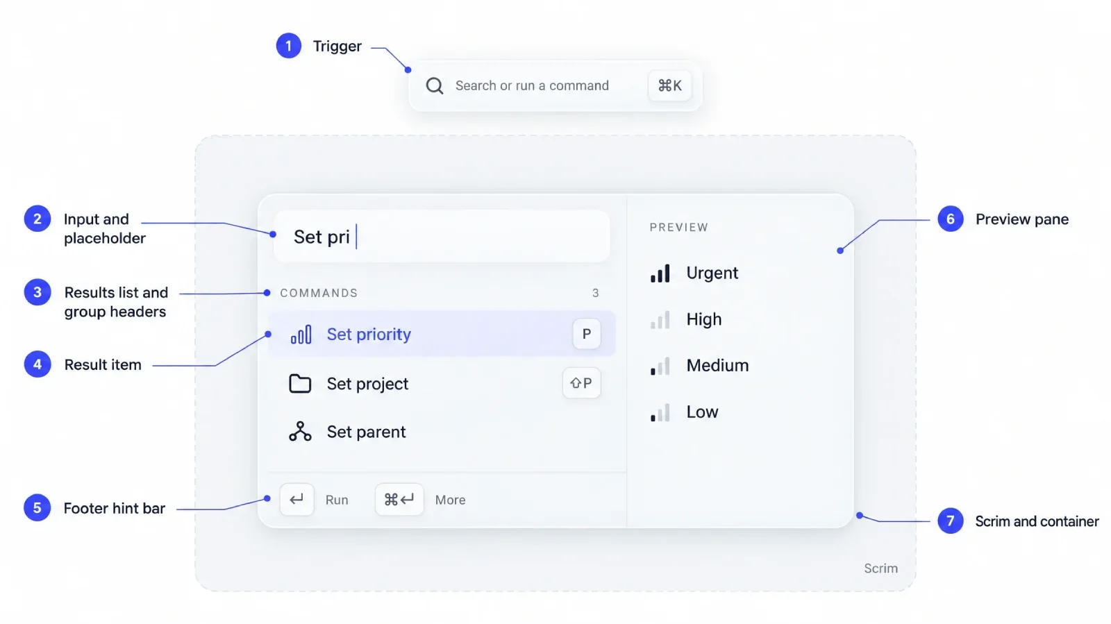
The seven parts every palette ticket should name. Numbers match the sections below.
Trigger and invocation
The keyboard binding (Cmd+K on macOS, Ctrl+K elsewhere) works anywhere in the app, including inside text fields. The visible trigger sits in the header as a clickable button styled to look like a search field, with the shortcut printed on the right. Clicking it opens the palette; it is never a real input. Printing the binding on it is the cheapest adoption tool you have.
Input field and placeholder
The input takes focus on mount, and the caret is visible without a click.
Write the placeholder as a capability statement, such as "Search or run a command", and swap it when a mode prefix is active.
Results list and grouping headers
Results sit below the input in one scroll region. Grouping headers are small uppercase labels with a count.
☞ Spatial memory is the only thing making a mouse-free list usable. Never reorder groups between keystrokes.
Result item anatomy
A row holds an icon, a label, an optional description, and a right-aligned shortcut hint. The label carries the only weight, and the hint sits in a boxed keycap until the row is active.
In a nested page, add a breadcrumb line above the label, such as "Project / Settings". Selection is a filled row background.
Footer hint bar
A thin bar at the bottom shows contextual shortcuts for the active row: Enter to run, Cmd+Enter for a secondary action. Keep the height near 36px and the text at 12 to 13px, and treat its copy as product copy.
Preview or detail pane
Some palettes split into list and preview on wide screens, showing a document or a settings form beside the results. The preview never replaces the list.
Trigger the split only above roughly 900px. Below that, the content becomes a nested page with a back affordance.
Scrim and container
The scrim dims the app and clicking it dismisses the overlay. The container is centered horizontally and anchored toward the top rather than vertically centered.
The container scrolls internally, never the page behind it. Pair the overlay with a focus trap and restore focus to the trigger on close. The AI chat interface guide covers overlay layering in more depth.
The interaction model
Seven rules, each with a product that proves it.
Keyboard navigation and focus rules
Arrow keys move a single active row, Enter runs it, and the row scrolls into view. Focus never leaves the input: the active option is tracked with aria-activedescendant, so typing stays uninterrupted.
Wrap-around is optional, but if you enable it, enable it everywhere. Linear keeps the active row consistent across a group boundary.
Fuzzy matching versus prefix matching
Prefix matching is predictable. Fuzzy matching forgives typos and abbreviations, which is what users type under pressure ("stpr" for "Set priority").
Ship fuzzy matching with a visible highlight on matched characters. Without it the order looks arbitrary, and users assume the palette is broken. Vercel's dashboard palette leans on this: the highlight explains why one project outranks another.
Recents and frecency ranking
Frecency combines frequency and recency, the highest-impact ranking signal. A command used twice today outranks one used last week.
Store it per user, and decay it, or the list freezes into whatever the user did during onboarding.
Nested commands and sub-pages
A palette with 400 commands cannot be flat. Either a parent row expands inline, or it pushes a sub-page with a breadcrumb. The second is easier to build.
Backspace on an empty input walks back one level inside a nested page. That makes deep palettes feel safe. Linear uses it for status changes.
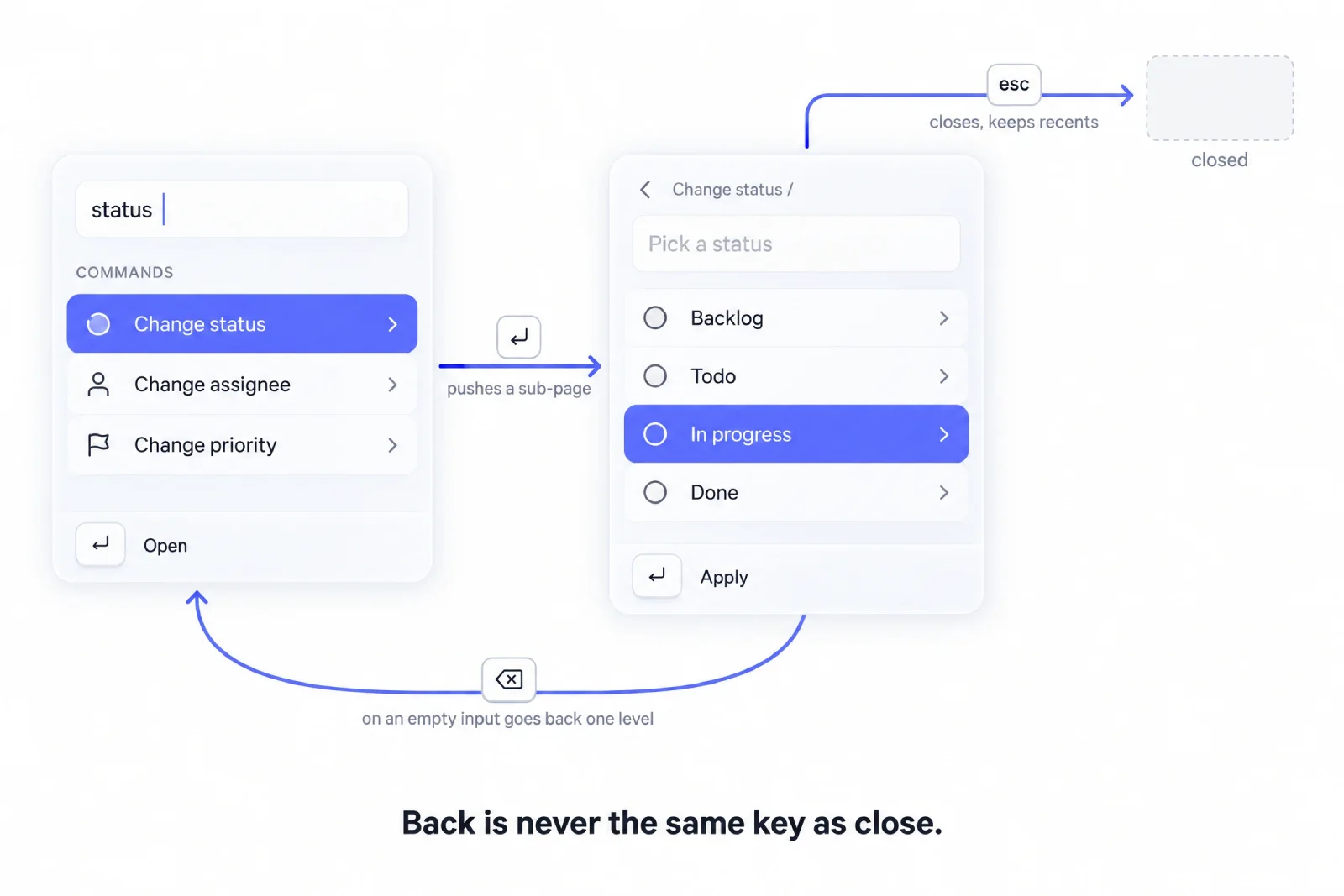
Enter goes deeper, Backspace on an empty input goes back, Esc closes. Back is never the same key as close.
Secondary actions on a result
The primary action is Enter. The secondary is usually Cmd+Enter, with Tab or ArrowRight opening that row's detail. Raycast maps Cmd+K to the action panel for the active row.
Reserve the secondary slot for the action users ask for second.
Mode prefixes
Prefixes turn one input into more than one tool. A > at the start restricts to commands, @ to people, # to tags or channels, ? to help articles. The prefix appears in the input, and the placeholder confirms the mode.
Keep the set small and consistent with conventions users know from VS Code and Slack.
Escape and dismissal behavior
Esc closes the overlay at the root level. Backspace on an empty input walks back one level inside a nested page.
Dismissal must be instant and must not lose state. If the user reopens the palette, recents should still be there. Never animate a long exit on Esc.
The 8 states most teams forget to design
| State | Trigger | What the user must see | Most common mistake |
|---|---|---|---|
| Default with empty query | Palette opens | Recents plus suggestions | Blank list with a placeholder |
| Typing with live results | Any keystroke | Ranked, highlighted matches | Unhighlighted fuzzy output |
| No results | Query matches nothing | A recovery path, not a dead end | A bare "No results" label |
| Loading and async results | Remote source queried | Skeleton rows and a "Searching" label | Blank list, then a hard jump |
| Error or offline | Network or API failure | Local commands still work, with a notice | Whole palette fails silently |
| Nested page with breadcrumb | Parent command selected | Breadcrumb and a back action | No visible back action |
| Multi-select or batch action | User marks rows | Selection count and a batch bar | Per-item actions only |
| Disabled command with reason | Command unavailable | Greyed row with a reason | Command hidden silently |
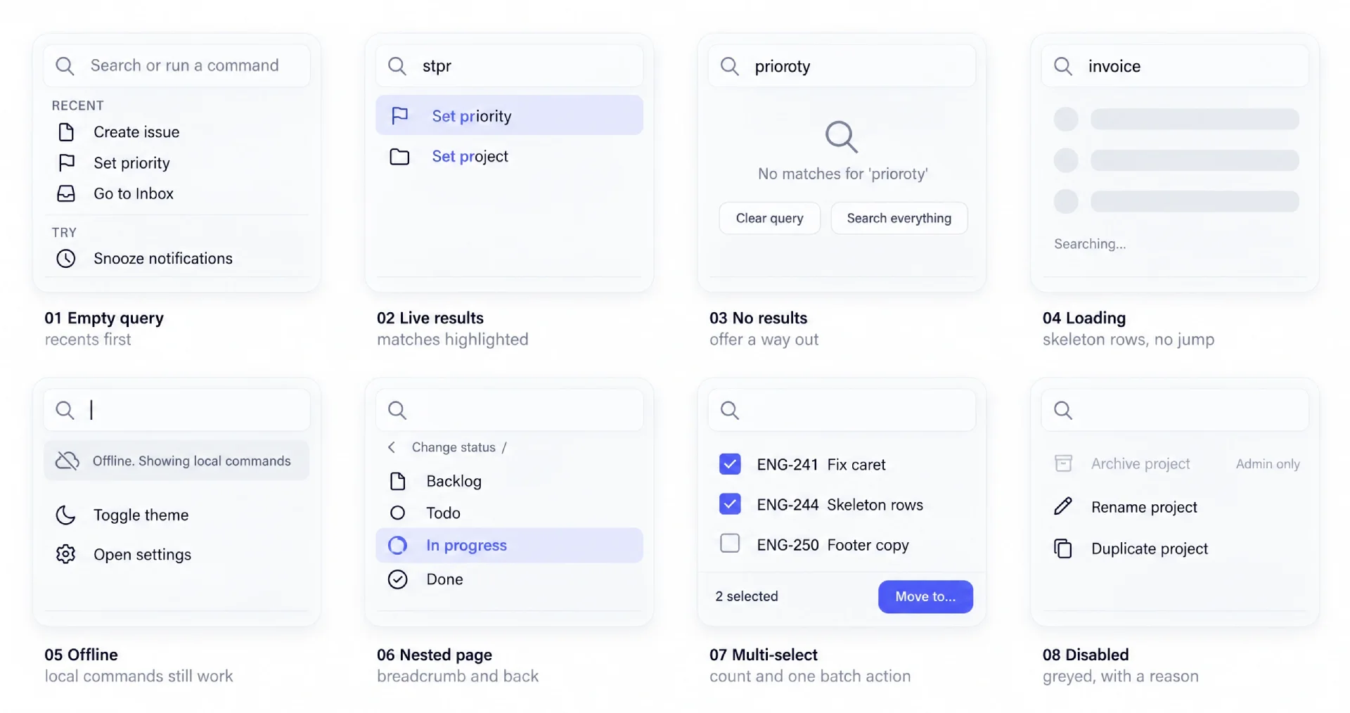
The eight states side by side. Most teams design the first two and ship the rest by accident.
Default with empty query. Show four to six recents, then suggestions for capabilities the user never invoked. Cheapest onboarding you will ship, as we unpacked in our guide to replacing onboarding with contextual help.
Typing with live results. Results must update within a frame. Above roughly 100 items, keep render work off the main thread.
No results. Offer exits: clear the query, open the parent command, or widen the search. A dead end teaches users the palette is unreliable.
Loading and async results. Render skeleton rows at final row height so the container never jumps, because a jump loses the active row.
Error or offline. Local commands must keep working when the network drops, with a quiet status line. Never block the whole overlay.
Nested page with breadcrumb. The breadcrumb belongs above the input or directly under it, and the back action needs a visible target. Backspace alone is not discoverable at this depth.
Multi-select or batch action. Once rows can be marked, the footer switches to a selection summary with a count and one batch action. Changing the footer contract mid-flow breaks trust.
Disabled command with reason. Grey the row, keep it in place, explain why on hover or focus. Hiding a command makes users think it does not exist.
10 teardowns
Linear
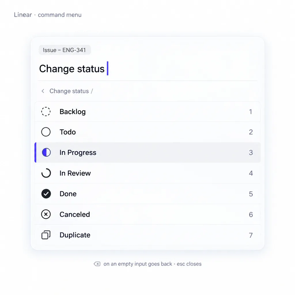
Invocation: Cmd+K from anywhere, opening a centered overlay with the input focused and recents listed first.
Signature move: nested sub-pages feel like one list. Selecting "Change status" pushes a sub-page, keeps the parent in a breadcrumb, and Backspace walks back one level. The input never loses focus.
Where it leaks: the default view is long enough that new users see a wall of commands before their own recents.
Steal this: give users a back gesture that is not the same key as close, once the palette has depth.
Pattern tags: nested-pages, frecency, breadcrumb, keyboard-nav
Raycast
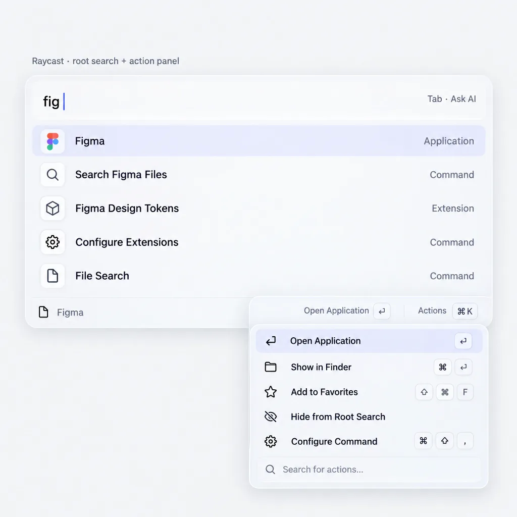
Invocation: Option+Space by default, opening a compact floating window over the desktop, with the input focused and a ranked list of recent commands and apps beneath it.
Signature move: the action panel. Cmd+K opens a second list of every operation for the highlighted result, including ones with no shortcut.
Where it leaks: the model runs deep enough that new users never discover the action panel, and extensions with argument screens break the single-input rhythm.
Steal this: give the active row a discoverable action list instead of hardcoding guesses.
Pattern tags: action-panel, secondary-actions, mode-prefix, preview-pane
Vercel
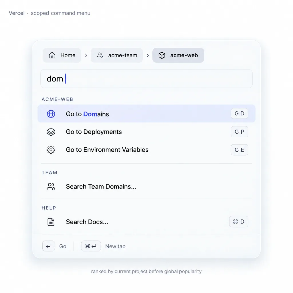
Invocation: Cmd+K in the dashboard, opening a compact palette scoped to the project you are inside.
Signature move: context scoping. The palette knows which project you are in, so the first results apply to it.
Where it leaks: the command set is thin next to Linear or Raycast, so heavy users hit the ceiling and fall back to the sidebar.
Steal this: rank by current context before ranking by global popularity.
Pattern tags: context-scoping, fuzzy-match, grouped-results, keyboard-nav
Notion
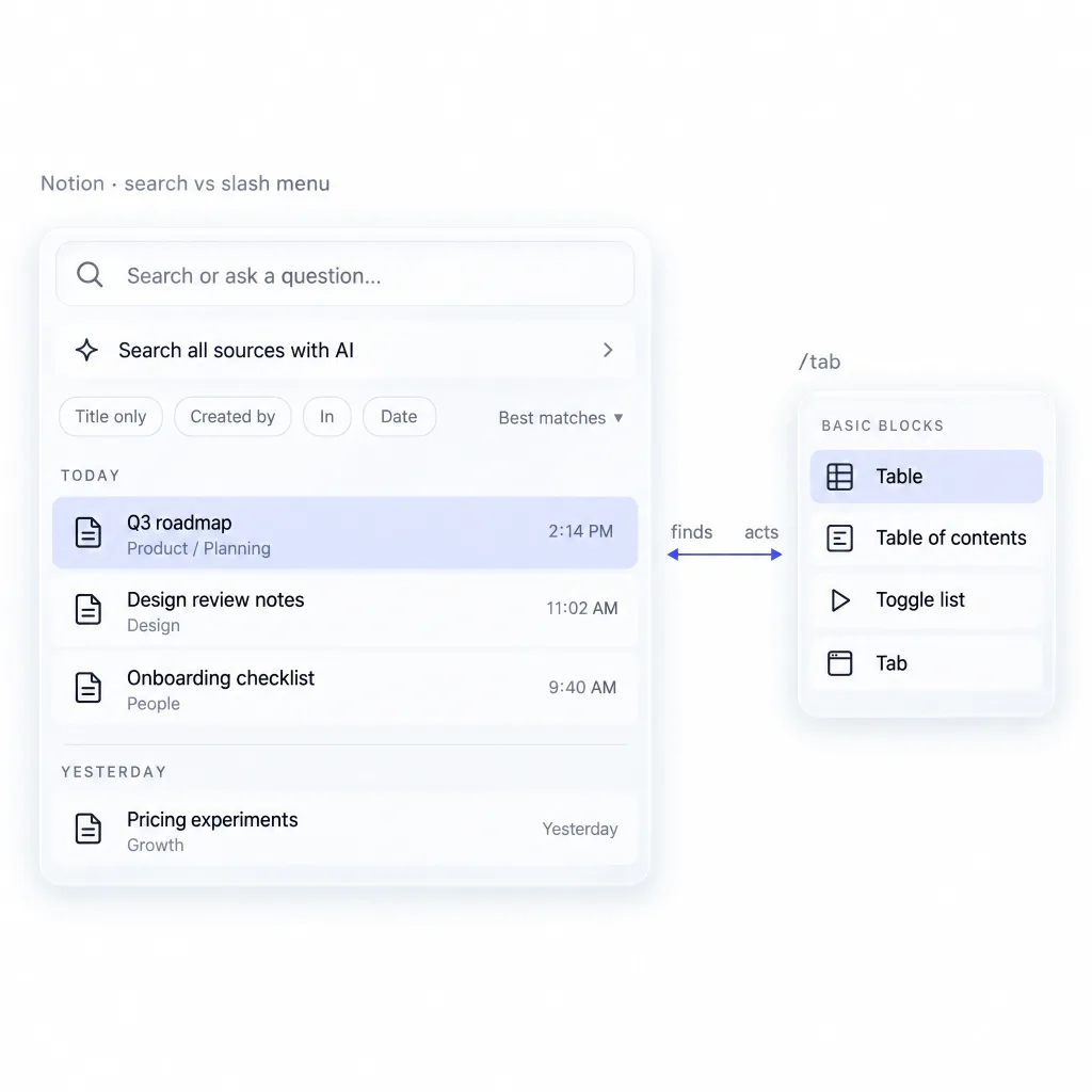
Invocation: Cmd+K and Cmd+P both open Quick Find, which sits closer to search than a palette.
Signature move: the slash menu inside the editor, a palette with a syntax instead of a shortcut. Typing / at the cursor filters blocks with the same model.
Where it leaks: Cmd+K finds pages and not much else. Users trained by Linear expect actions and get a navigation list.
Steal this: if your product has an editor, the slash menu is the palette and the modal is the fallback.
Pattern tags: search-first, slash-commands, recents, no-actions
Figma
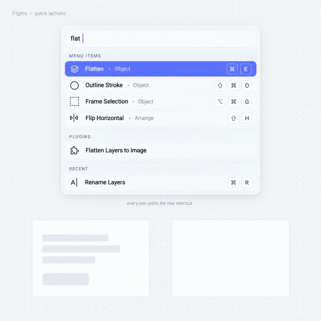
Invocation: Cmd+/ or Cmd+P opens quick actions from anywhere on the canvas, with recently used actions listed first.
Signature move: it teaches the keyboard. Quick actions print the real shortcut beside each command, so a designer who came to click leaves knowing a few bindings.
Where it leaks: quick actions compete with the canvas for muscle memory, so designers who know their shortcuts rarely open it.
Steal this: always print the real shortcut on the row, even when it is long.
Pattern tags: shortcut-hints, recents, fuzzy-match, keyboard-nav
GitHub
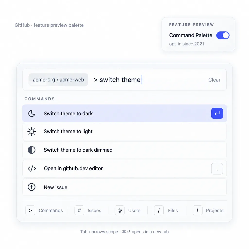
Invocation: Cmd+K (Ctrl+K) on any page, Cmd+Alt+K for command mode, scoped to the repository you are in. And only for users who switch it on under Feature preview, where it has sat since the 2021 beta.
Signature move: modes and scoping. One input reaches files, branches and pull requests, and the first results follow the repository you are inside.
Where it leaks: it never built the usage numbers to defend itself. In July 2025 GitHub announced its removal for low usage, then reversed within a day when developers objected (Update: Pausing command palette deprecation). The palette lives on with no promise of a future.
Steal this: a palette hidden behind a setting never earns the numbers that keep it alive. Ship it on by default with a visible trigger, or do not ship it.
Pattern tags: feature-preview, mode-prefix, context-scoping, low-discoverability
Slack
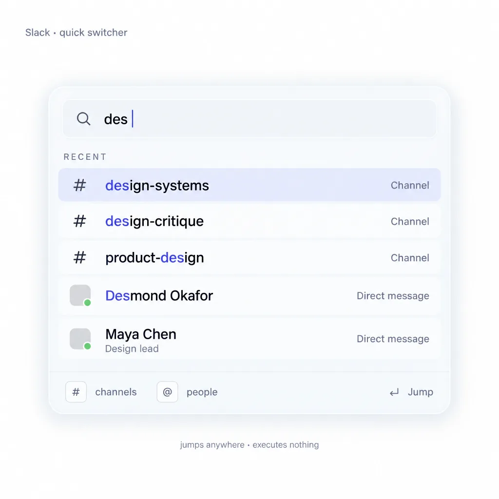
Invocation: Cmd+K opens the quick switcher, a switcher rather than a general palette.
Signature move: typing filters channels and people with a per-type prefix, and the list stays short enough to scan in one pass.
Where it leaks: it cannot execute much. You can jump somewhere, but the palette will not run the action you wanted, so Slack actions hide behind right-click menus.
Steal this: copy the short-list discipline, then add one action layer on top.
Pattern tags: quick-switcher, mode-prefix, recents, no-actions
Superhuman
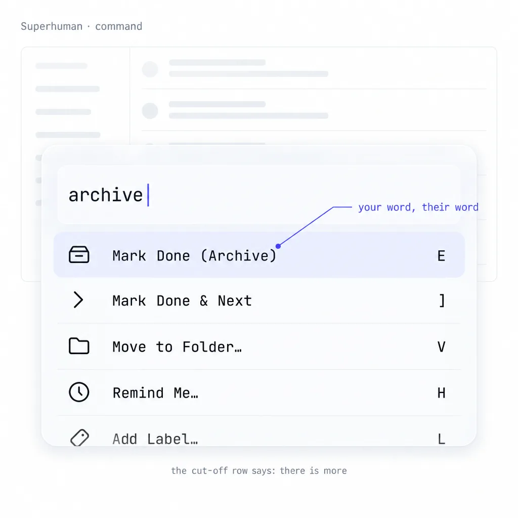
Invocation: Cmd+K opens the command palette, and the product assumes the keyboard is the primary input rather than an accelerator.
Signature move: every command carries a visible single-key shortcut, and the palette is built to make users stop needing it.
Where it leaks: the pattern depends on a shortcut culture the team maintains. Without it, the palette decays into an unscannable list of links.
Steal this: design the palette to make itself unnecessary, then measure how often it is opened.
Pattern tags: shortcut-hints, frecency, teaching-surface, keyboard-nav
Arc
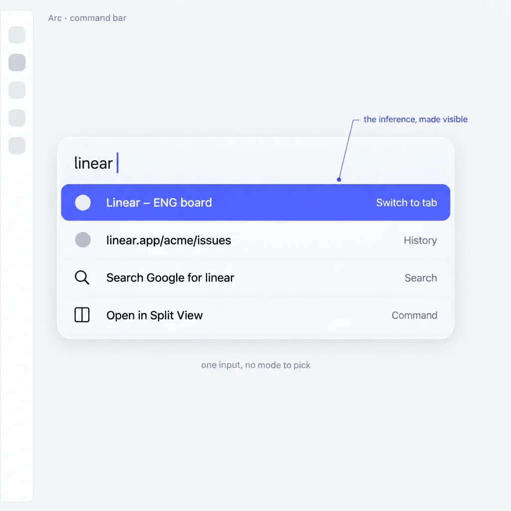
Invocation: Cmd+T opens the command bar as a centered overlay above the page, taking the place of a traditional address bar.
Signature move: it folds search and commands into one input, then infers intent from what you type instead of asking for a mode.
Where it leaks: inference is invisible, so users cannot tell why a query became a search instead of a command. The Browser Company has since shifted its focus to Dia, so treat Arc as a reference for the pattern, not a product to track.
Steal this: if you infer intent, show the inference in a label above the results.
Pattern tags: inferred-mode, mixed-results, search-and-command, fuzzy-match
Cal.com
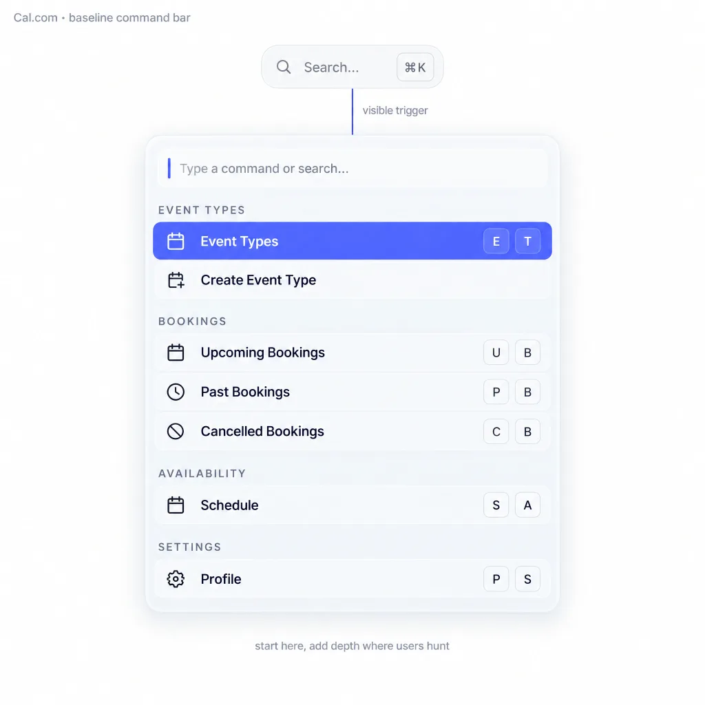
Invocation: Cmd+K in the app shell, opening a palette for navigation and the most common scheduling actions.
Signature move: it shows how little a palette needs. Grouped navigation, a handful of scheduling actions, recents, shortcut hints. That beats a sidebar for anyone who knows the shortcut.
Where it leaks: it stops at the baseline. No nested pages, no context scoping, plain visual treatment, so it reads as a developer feature rather than product identity.
Steal this: start here, then add depth only where usage data shows users hunting.
Pattern tags: baseline, navigation, grouping, recents, shortcut-hints
Visual design decisions
Size and max height
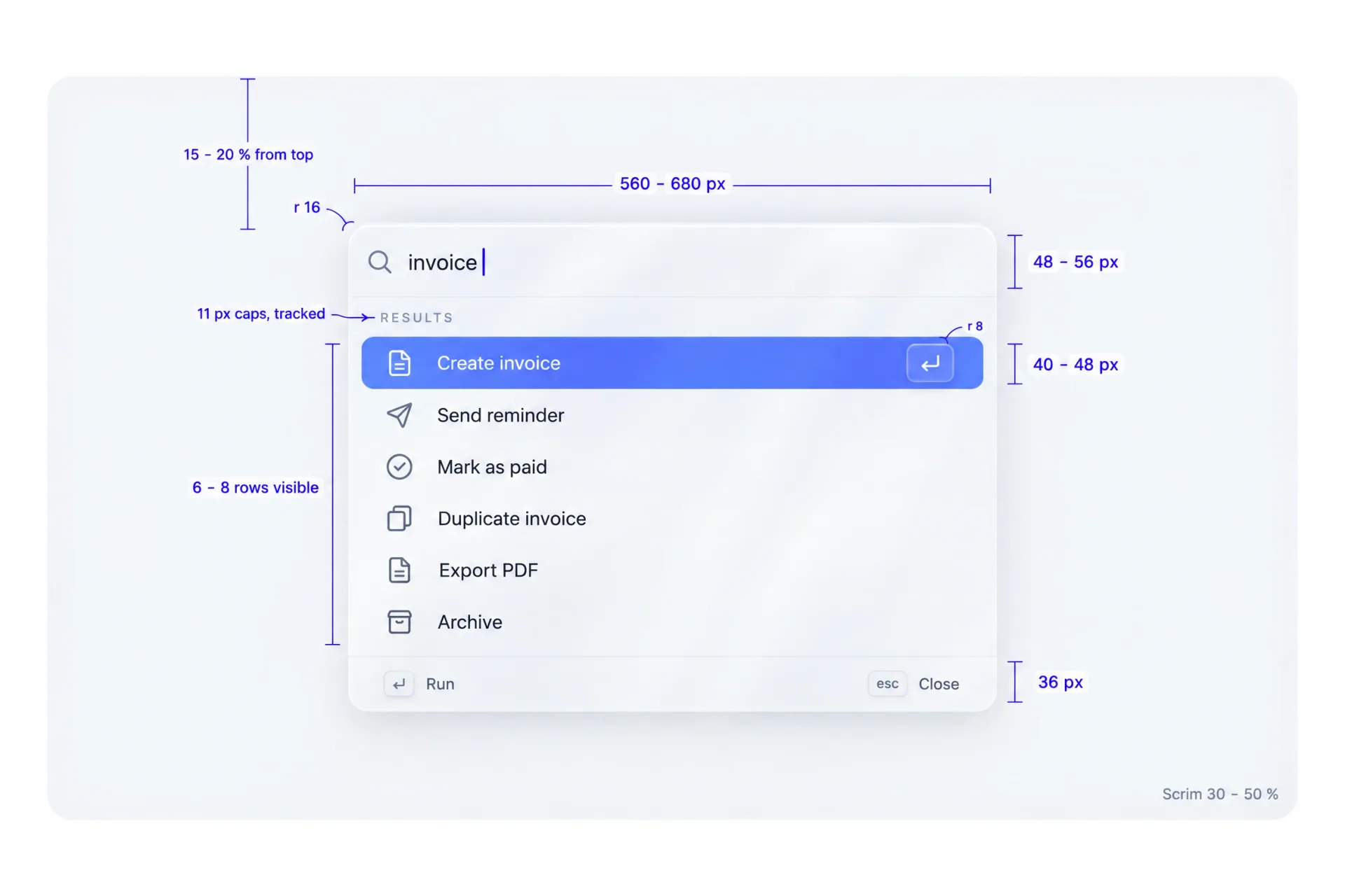
Width runs 560 to 680px on desktop, and the container starts roughly 15% to 20% down from the top. Cap the visible list at six to eight rows, and cap the total height at roughly 60% of the viewport. Beyond that, restructure into nested pages instead of scrolling further.
Border versus shadow, and the scrim
Use a hairline border plus a wide, soft shadow. A border alone looks flat against a darkened app, and a shadow alone loses its edge on light backgrounds.
The scrim should be dark and neutral, between 30% and 50% opacity. Lighter and the background competes with the results; heavier and the app behind looks broken.
Density and typography scale
Row height runs 40 to 48px with a single-line label, or 52 to 60px with a description underneath. Keep the label at the product's base size and the description one step smaller. Vertical padding between rows stays at 2 to 4px, because density is the point of a palette. The same argument shaped our data table guide.
Icon consistency and the shortcut hint style
Icons come from one family at 16 or 20px and stay monochrome. They never carry their own brand color. The shortcut hint uses boxed keycaps with 8px rounding and 1px borders at low contrast.
Hints align to the right edge and stay at reduced opacity until the row is active. Full contrast on the active row is enough emphasis.
Dark mode contrast rules
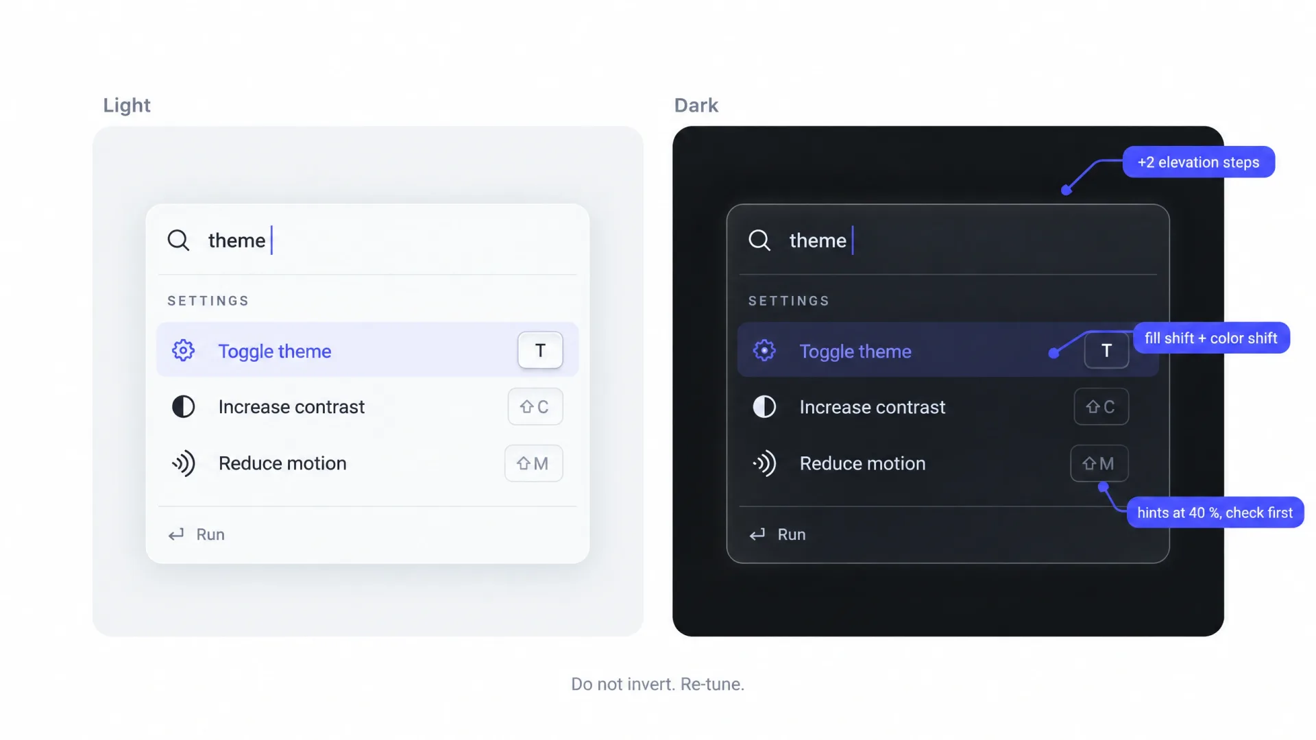
Do not simply invert. Raise the container above the page background by two or three steps of surface elevation, and keep the scrim darker than the page. The active row needs a background shift on top of a text-color change, because dark themes compress the contrast range. Check shortcut hints at 40% opacity on the dark surface, because they disappear first and they are the most useful thing in the row.
Motion and list reflow
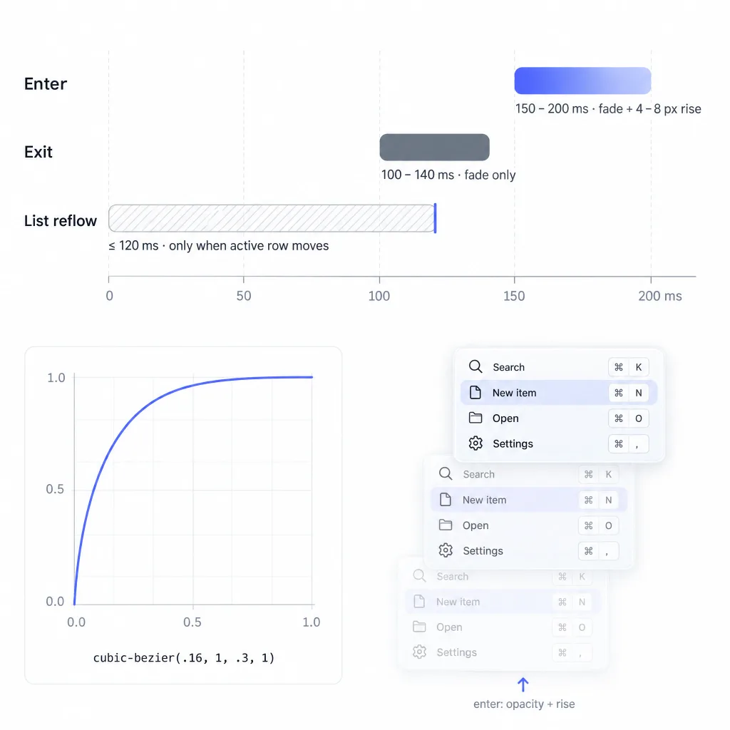
Enter the container with a fade plus a 4 to 8px rise, over 150 to 200ms on a decelerating curve such as cubic-bezier(.16,1,.3,1). Exit is a pure fade at 100 to 140ms.
The list itself must not animate on every keystroke. Animate only when the active row changes position, and cap reflow transitions at 120ms. The same restraint is covered in our tabs guide.
Command palettes for AI-native products
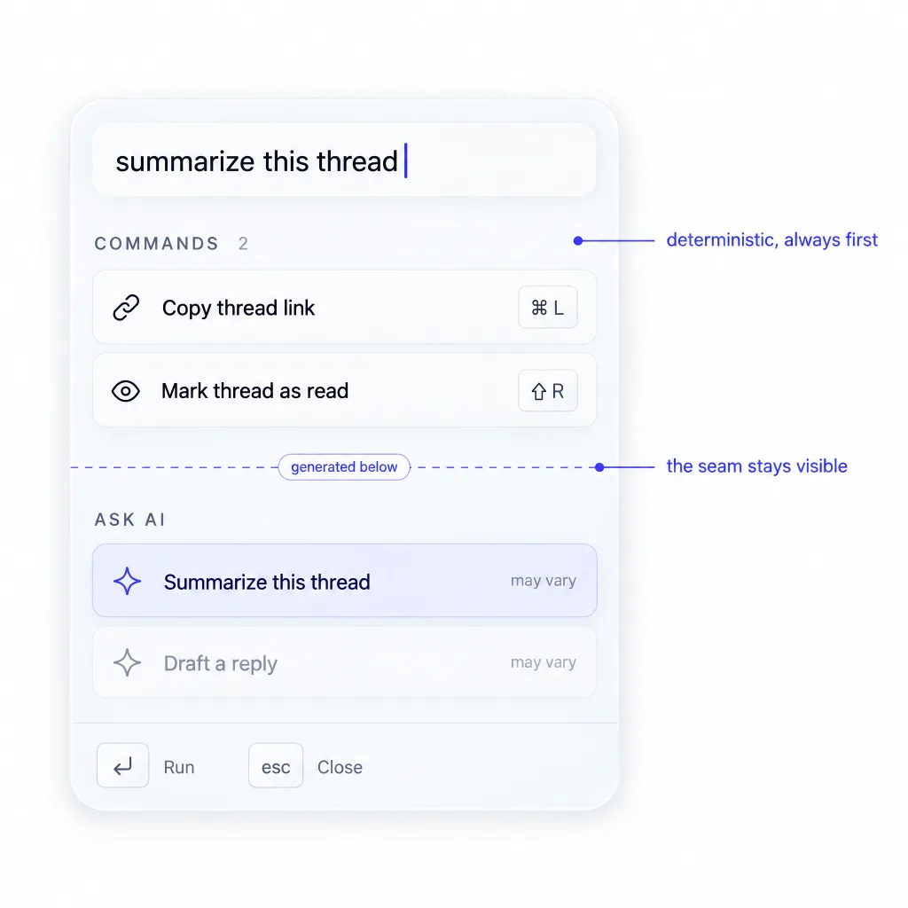
The palette is merging with the prompt input, and the merge is not clean.
Three versions exist. A query with no match falls through to an AI answer, so the empty state becomes a conversation. Commands accept natural language, so "assign this to Maya" runs without a nested page. The palette appears inline next to a selection, which is what Cursor does with Cmd+K: the overlay edits the selected thing. Raycast AI and Notion AI are the strongest references for the first two.
The tension sits in the promise. A palette is deterministic: the same three letters return the same results. That reliability is why power users trust it with real actions. A model does not offer that, and a ranked list that sometimes invents a command is worse than a short honest one.
Keep the seam visible. Mark AI results with a distinct group and a label, and never let a generated answer outrank a real command.
☛ Users forgive a fallback that admits what it is. They stop trusting the palette the first time it confidently runs the wrong thing.
What designers should know before shipping
Three libraries cover most cases. cmdk handles React lists and grouping, kbar handles app-level shortcuts with a palette on top, and Radix primitives give you the overlay and the list separately. Knowing which one your team picked changes what you can specify.
Map it as a combobox over a listbox, one option per row. Focus stays on the input while aria-activedescendant points to the active row, and a live region announces the result count. The WAI-ARIA Authoring Practices combobox pattern is the reference to hand your engineer.
☞ Hand that link to your engineer before the first ticket, not after the accessibility audit.
Two numbers to set expectations with. Virtualize above roughly 200 items, or the first keystroke stutters on a mid-range machine. Debounce async sources at 150 to 250ms and cancel the previous request, so a fast typist never sees stale results.
If you ship palettes across more than one product, a shared kit saves rework. We keep the palette shell and result row in the React UI kit, and collect fresh pattern references in our AI inspiration gallery.
When you should not build a command palette
Three honest cases.
A consumer app with low-frequency use. If someone opens your product weekly, a launcher solves a problem they do not have. Fix the primary flow.
A mobile-first product. The pattern needs a physical keyboard, and a mobile port becomes a button that opens a list nobody asked for. Contextual actions do more work.
A team without a shortcut culture. A palette teaches itself only when the product rewards the keyboard. If every action needs a mouse, users have no reason to believe the palette is faster.
The command palette audit checklist
Twelve questions. Answer yes or no, then fix the noes in order.
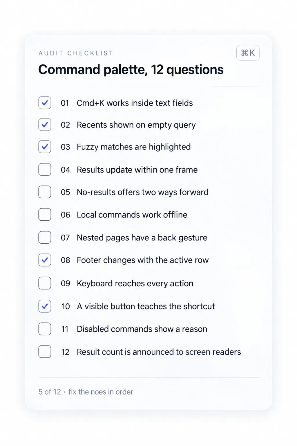
❶ Does Cmd+K work from inside text fields?
❷ Does the palette show recents when the query is empty?
❸ Are matched characters highlighted in every fuzzy result?
❹ Do results update within one frame of each keystroke?
❺ Does the no-results state offer at least two ways forward?
❻ Do local commands still work when the network fails?
❼ Inside a nested page, is there a back gesture that is not the same key as close?
❽ Does the footer bar change content with the active row?
❾ Can the keyboard reach every action a mouse can?
❿ Is there a visible button that teaches the shortcut?
⓫ Are unavailable commands shown greyed with a reason?
⓬ Is the result count announced to a screen reader?
Frequently asked questions
What is the difference between a command palette and a search bar?
A search bar finds existing content and hands you a result. A command palette executes an action, such as creating a task or changing a status. Most palettes do both, but the action layer defines them. If yours only lists pages users could already click, it is a search box with a shortcut.
What shortcut should open a command palette?
Cmd+K on macOS and Ctrl+K on Windows and Linux is the convention users already know from Linear and Slack. The one conflict that matters is "insert link" inside rich-text editors, so decide which wins when the caret is in an editor. Show the binding in the visible trigger so it gets learned.
Should a command palette show recent items when empty?
Yes. An empty query is the first thing most users see, and a blank list wastes the best teaching moment in the component. Show four to six recent actions, then a short group of suggestions for capabilities the user has never tried.
How many commands is too many for a palette?
The limit is not the total count but the first ten results. A palette can hold 500 commands if ranking puts the right one in the top three. Past roughly 200 items you need virtualization, and past one screen of grouped results you need nested pages.
Do command palettes work on mobile?
Mostly no. The pattern depends on a physical keyboard, so a mobile port needs a visible button and a different mental model. If your product is mobile-first, spend that engineering time on contextual actions inside the screen instead.
Conclusion
A palette is a promise of speed. Every state you skip breaks it somewhere: a blank empty query, a jumping list, an unreachable sub-page, a disabled command with no reason. None look fatal in a mockup, and all show up in adoption numbers.
Build the anatomy first, then walk the eight states with your engineer. Rank by frecency before you polish the icons. Measure how often the palette is opened, because a palette nobody invokes is the most expensive component you own.