

Roman Kamushken
A lot of SaaS onboarding UX ends up solving the team’s anxiety rather than the user’s job. The typical pattern looks polite: welcome screen, tour, tooltips, short education. In practice it often adds friction before the first meaningful action.
This tutorial shows a lighter, testable approach: contextual onboarding (also called progressive onboarding or in-app guidance) that appears only when the user actually needs it. The goal is higher activation rate, faster time to first value, and a calmer first session.
You will see a 7-chapter structured guide, plus a set of Do and Don’t illustration placements that make the post feel concrete.
Why touch onboarding at all
If your product has any learning curve, onboarding feels like the obvious fix. Yet onboarding is also one of the easiest places to create a hidden paywall: the user must invest attention before the product invests value back.
A useful mental model for user activation:
Activation is the moment a new user reaches a result that matches their intent. In product analytics it often correlates with a specific event (created first project, connected account, imported data, shared link). In real life it correlates with an emotion: I can use this.
When onboarding goes wrong, the symptoms look familiar:
☛ Users click through tours at top speed.
☛ Session recordings show frantic exploration.
☛ Support asks the same beginner questions.
☛ Activation stalls while signups keep coming.
It is tempting to respond by adding more guidance. A better first move is to ask a sharper question:
→ Does onboarding reduce effort toward the first result, or does it move effort earlier?
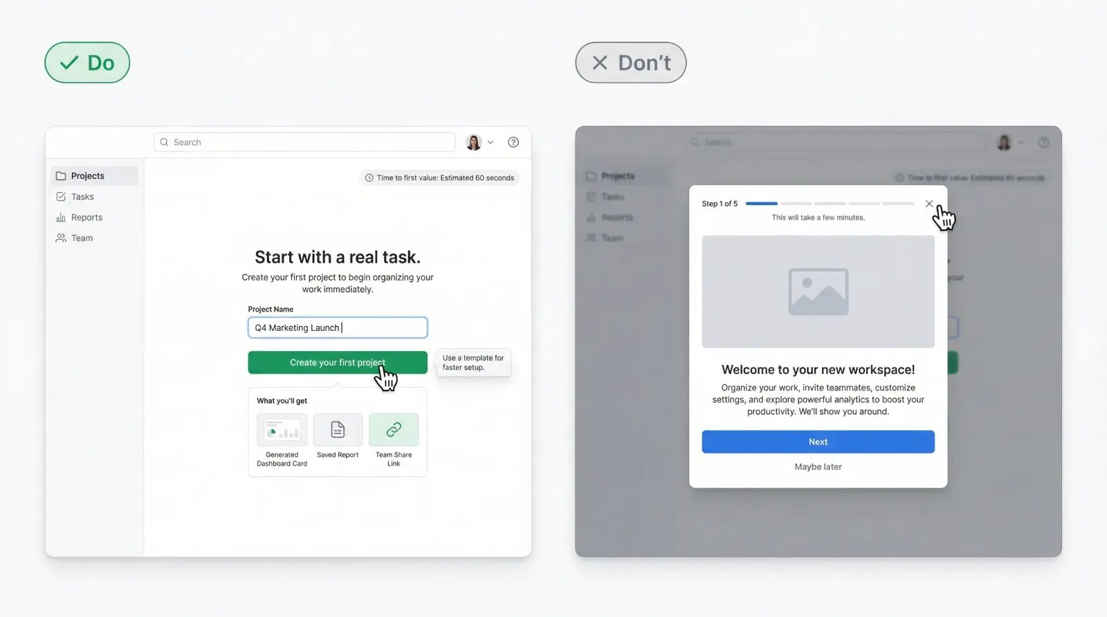
DO: A first screen that leads to a clear first action and an immediate payoff preview.
DON’T: A welcome carousel that blocks the product behind multiple steps.
The mistake: treating learning as a gate
Many product tours are designed like a mini course. The user gets concepts, navigation, terminology, and feature highlights before they have any context. That structure makes sense for internal demos and investor decks. For a first-time user it can feel like homework.
The core failure mode is subtle: you turn orientation into a mandatory sequence. That sequence steals three things the user relies on:
1) Momentum
The user arrives with intent. A tour interrupts it and forces context switching.
2) Agency
Exploration is how people build a mental model. A forced path replaces exploration with compliance.
3) Confidence
Confidence comes from successful actions. Explanations alone rarely create it.
There is also a measurement trap. Teams watch replays, see chaotic clicks, and interpret them as confusion. Often those clicks are the user searching for a fast path to value. In other words, the user is motivated, and the UI refuses to cooperate.
A practical diagnostic:
If your onboarding has more than one screen that can be skipped without losing core functionality, then part of it is marketing, not onboarding. Marketing can be valuable, yet it belongs in the product experience after the user has proof of value.
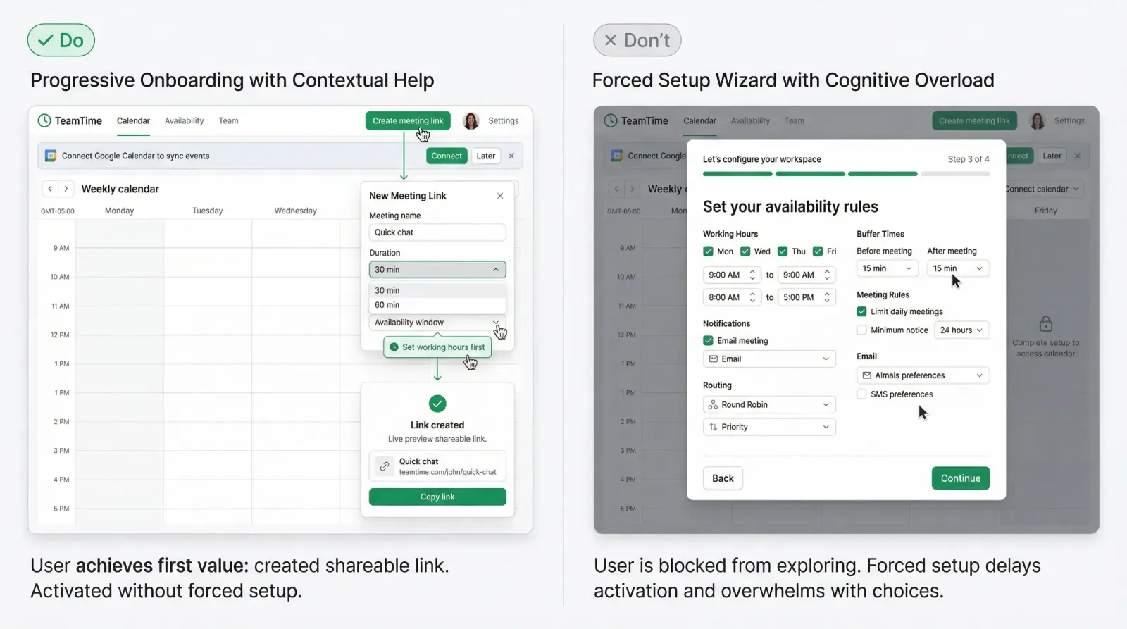
DO: One screen, one goal, one primary CTA, with optional help icon.
DON’T: A multi-step product tour that forces feature education before any real work.
The principle: help on demand, in context
Contextual onboarding flips the sequence:
First: action. Then: guidance.
This approach works because learning becomes a byproduct of doing. The UI teaches while the user moves forward. Done well, it feels like the product is responsive rather than instructional.
Three rules keep contextual help effective:
❶ One hint, one outcome
Every hint should point to the next action that advances the user’s job. If the hint explains concepts without enabling progress, it becomes noise.
❷ Help must be dismissible with zero penalty
Dismissal is a signal. It often means the user already knows, or the hint arrived too early.
❸ Help must respect the surface area of attention
A full-screen modal steals the entire session. A small tooltip near the relevant control costs less, and it keeps the user in flow.
A useful framing for onboarding design:
Your product has two “teachers.” The first is the default UI state (labels, empty states, examples). The second is contextual guidance (tooltips, nudges, rescue prompts). If the first teacher is weak, the second teacher becomes spam.
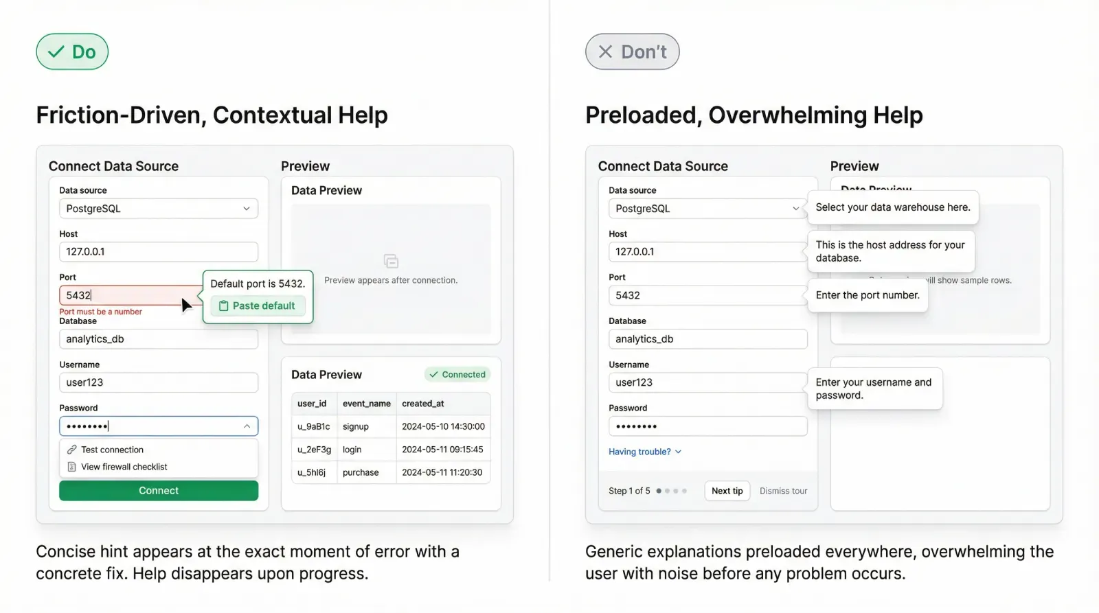
DO: A small tooltip anchored to the exact field the user is editing, with a short next step.
DON’T: A modal overlay explaining the whole system with multiple paragraphs.
Inspired by true events: onboarding removed, activation rises
A small B2B SaaS team built a new onboarding flow over several sprints. The product was solid, yet the team felt the UI required explanation. They shipped a classic bundle: welcome screen, a five-step product tour, and extra tooltips across the first dashboard.
They expected activation to go up. It went sideways.
Signups increased from a marketing push, yet the activation rate hovered around the same band. Session recordings looked discouraging. New users clicked around quickly, opened menus, backed out, then left. The team assumed the onboarding was still too light. They planned to add more tour steps.
Then a release happened with a feature flag in the wrong state. For a segment of new users, the welcome tour never appeared. Those users landed directly on the dashboard.
The next day, the metrics looked strange. Activation jumped. The team checked the numbers again, then checked cohorts. The jump held.
They reviewed recordings for the segment without the tour. The behavior looked different. Users opened the primary action panel, tried the main flow, hit an error, corrected it, then completed the first meaningful task. The “chaos clicks” mostly disappeared. What looked like confusion earlier was often impatience with the forced tour.
The team kept the tour disabled for a short controlled window and added a simple layer of contextual help instead:
→ A better empty state that suggested a first action.
→ A tooltip on the most error-prone field, shown only after the first failed attempt.
→ A lightweight help link near the primary CTA.
Activation stayed higher. Support tickets did not spike. The next improvement phase focused on trigger logic and the clarity of the first screen, rather than more onboarding content.
The lesson was uncomfortable: the tour had been an obstacle placed in front of motivated users.
The help ladder: three levels that scale
Contextual onboarding works best as a ladder. The UI starts with low interference and escalates only when signals show friction. This keeps guidance relevant, reduces annoyance, and supports both beginners and experienced users.
Level A: Passive help
Passive help is always present and rarely feels like onboarding.
Examples: clear labels, smart defaults, sample data, strong empty states, inline helper text, short error messages that suggest a fix. In many products, improving passive help lifts activation more than adding a tour.
A practical test:
If a user can land on a screen and understand what to do next within five seconds, passive help is doing its job.
Level B: Gentle nudges
Nudges are small, contextual hints that appear on first meaningful interaction.
Typical patterns: a tooltip on first focus, a subtle highlight of the next control, a single line of guidance near the CTA, a one-step prompt that suggests a shortcut.
A rule for nudges: they should feel like a hint from the interface, not a lecture from the product team.
Level C: Rescue help
Rescue help is a stronger intervention that triggers only after repeated friction.
Patterns: a short suggestion after repeated errors, a contextual link to a help article, a compact dialog offering an alternative path, a one-click fix for a common failure.
Rescue should solve a specific obstacle. It can also protect retention by preventing a frustrated user from leaving during setup.
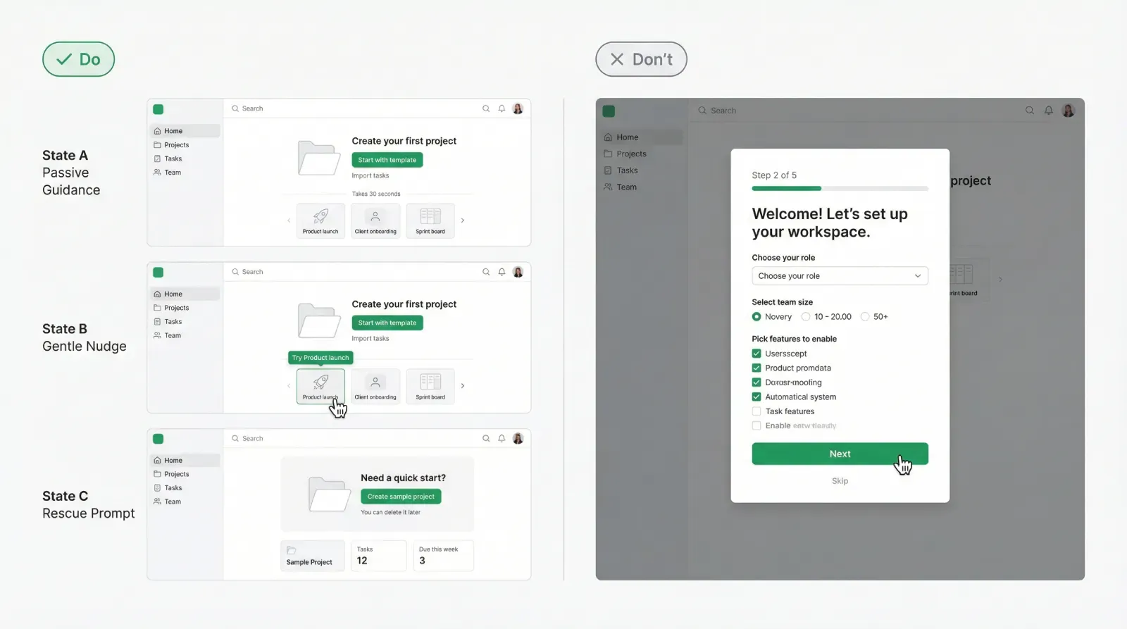
DO: One screen shown in three states A, B, C, each with a different intensity of guidance.
DON’T: The same tooltip shown to everyone on first visit, regardless of behavior.
Triggers: how to show hints only when needed
Trigger design is the core of progressive onboarding. Without triggers, contextual help becomes random and repetitive.
Think of triggers in three buckets: context, action, friction. Context answers where the user is. Action answers what they tried. Friction answers whether they struggle.
Below is the first bullet list (1 of 2). Keep it as a reusable template.
- Context triggers: first visit to a key screen, first time opening a panel, first time viewing an empty state
- Action triggers: first focus in a text input field, first click on the primary CTA, first attempt to connect an integration
- Friction triggers: repeated validation errors, long idle time after starting a task, rapid back-and-forth navigation between steps, multiple retries of the same action
- Intent triggers: opening help, using search, hovering the help icon, pressing a shortcut that signals confusion
Now add two constraints that prevent spam:
Frequency caps
A hint shown once per user per context is usually enough. For rescue hints, allow a second show only after a meaningful time gap or after a repeated failure pattern.
Completion logic
If the user completes the target action, retire the hint. If they dismiss it, record dismissal and avoid repeating it in the same session.
A strong trigger design gives you a simple promise you can state internally:
→ The product teaches only when the user demonstrates a need to learn.
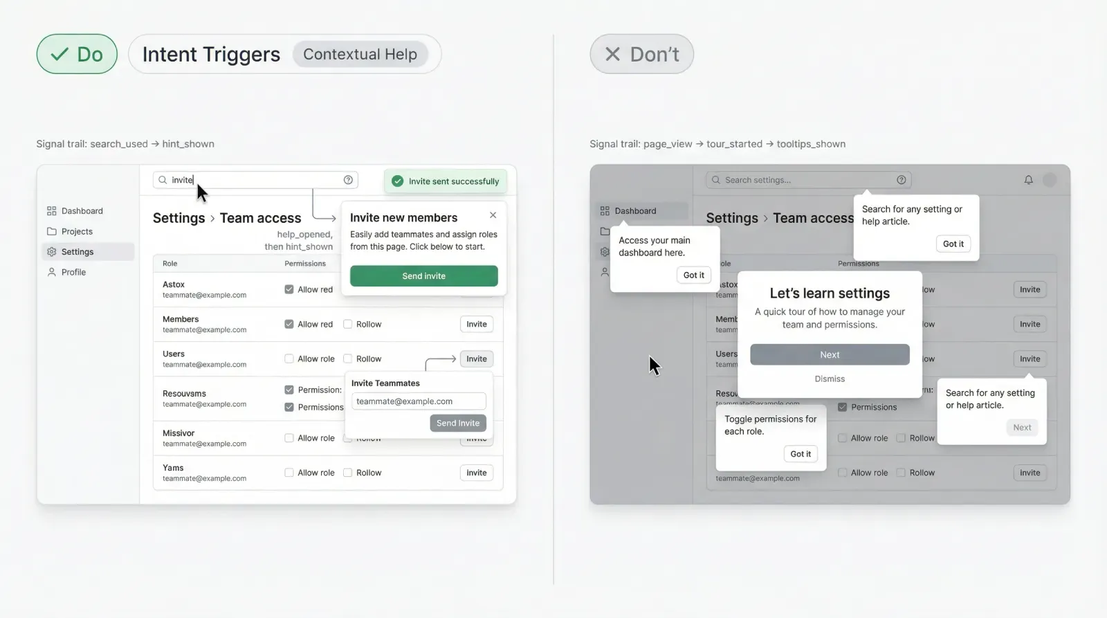
DO: A tooltip that appears after the second failed attempt, with a one-line fix.
DON’T: A tooltip that appears on a timer even when the user is progressing.
Measurement: keep it out of opinion land
Contextual onboarding is measurable. That is a major advantage over debates about whether tours feel helpful.
Start with two primary metrics:
Activation rate
Define an activation event that represents real value. It should correlate with retention and product adoption, not with shallow clicks.
Time to first value
Measure how long it takes from signup to the first meaningful outcome. Contextual onboarding often wins here because it removes delays.
Then add guardrail metrics to avoid false wins. This is the second and final bullet list (2 of 2).
- Retention: day 7, day 14, day 30 for the cohort
- Support load: tickets per new user and top categories
- Friction: error rate on key steps, retries, abandonment rate in setup flows
- Hint performance: hint shown, hint dismissed, hint clicked, success after hint within a time window
A measurement pattern that works well in SaaS analytics:
☛ Track the hint event.
☛ Track the user action it targets.
☛ Track the outcome event that represents progress.
☛ Compare outcomes for users who saw the hint versus those who did not, within the same cohort and stage.
Be careful with interpretation. A hint click rate can look low even when the hint is effective. Many hints work by clarifying, then the user proceeds without clicking anything. That is why 'success after hint' matters more than 'hint clicked'.
Finally, treat every onboarding change like a product experiment. If you run a controlled test, your team gets an answer that survives strong opinions.
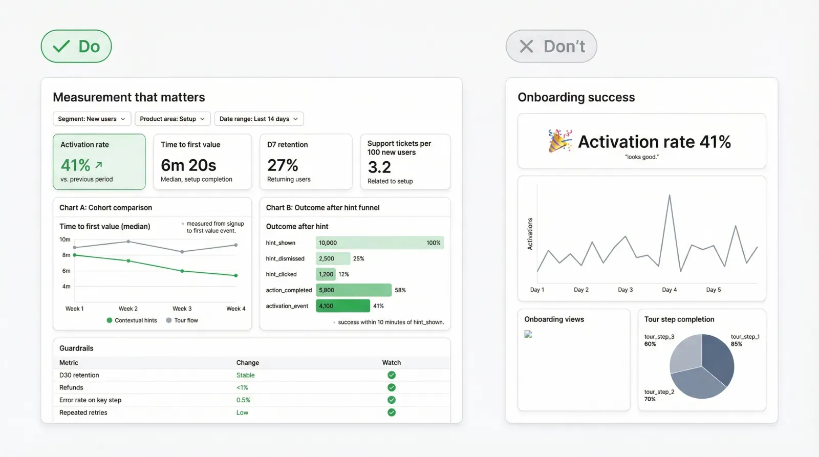
DO: A simple dashboard with activation, time to first value, retention, and hint outcomes.
DON’T: A single activation chart without guardrails.
Closing: the simple version you can ship fast
If you want the simplest rollout that still counts as contextual onboarding, do it in this order:
❶ Strengthen passive guidance on the first screen: empty states, labels, defaults.
❷ Add one gentle nudge on the most important action.
❸ Add one rescue hint for the highest-frequency beginner failure.
❹ Instrument outcomes and guardrails, then iterate.
This approach supports the behavior users already have: they explore, they try, they fail, they correct, they learn. Your job is to reduce unnecessary friction and to teach at the moment the user is ready to absorb information.
If the first version feels too small, treat that as a feature. Progressive onboarding scales through precision, not volume.


