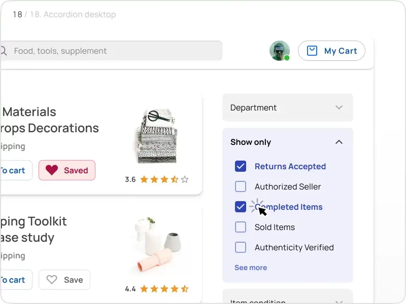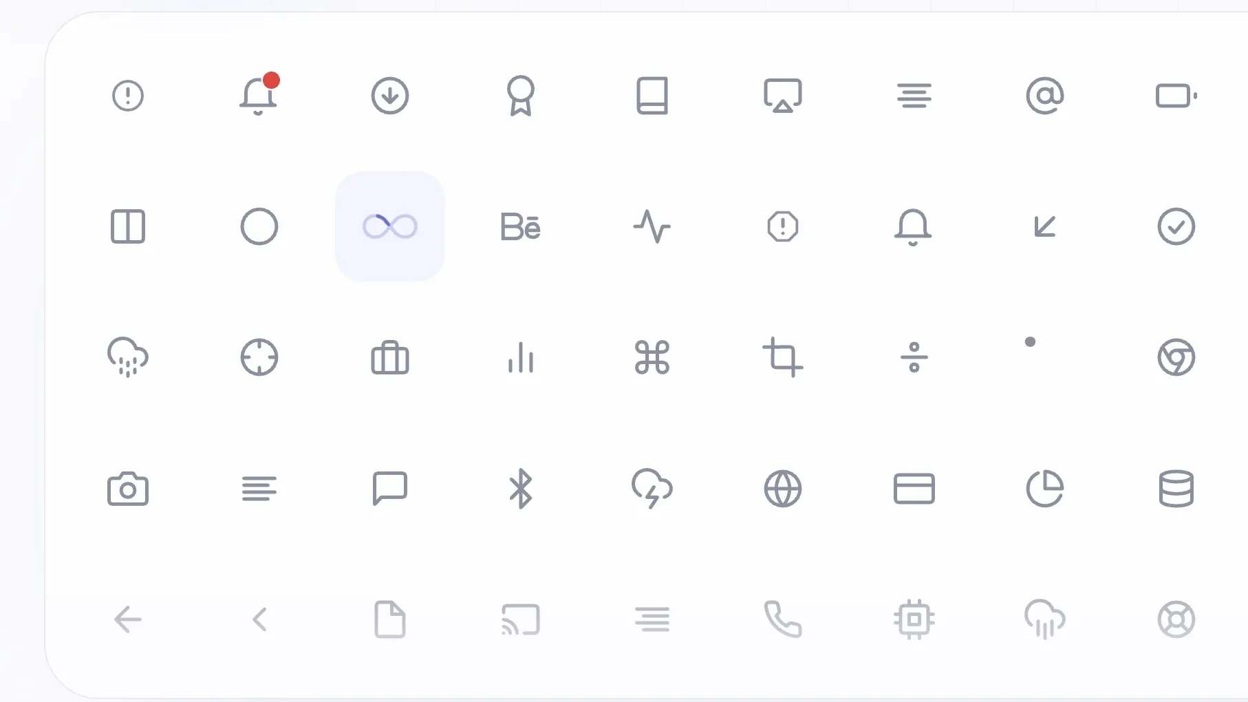

A spinner answers a question before any label does: something is still loading, and you can stop watching. A checkmark draws itself and the save is done. Point at a trash icon on useanimations.com and the lid lifts, so the click feels safe. react-useanimations ships 300 icons that behave this way out of the box, as plain React components.
What react-useanimations actually does
It is the official React package for useAnimations, a set of 300 animated icons. Each icon carries the interaction it has on the website, so the hover state is not something you write. You import a name and render it.
npm i react-useanimationsimport UseAnimations from "react-useanimations"import github from "react-useanimations/lib/github"<UseAnimations animation={github} size={32} />
Numbers make the case better than adjectives. There is no runtime dependency at all, and the built-in player weighs about 8 kB gzipped. A median icon adds roughly 2 kB, since each one is its own module and the bundle keeps only what you imported.
Licensing is MIT. Coverage runs from navigation arrows and loaders to social marks and media controls, plus the small utility glyphs that sit in toolbars.
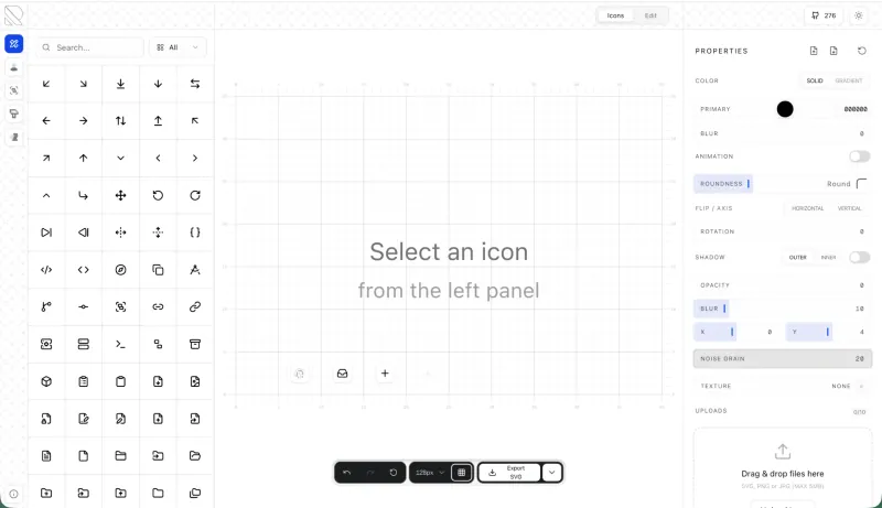
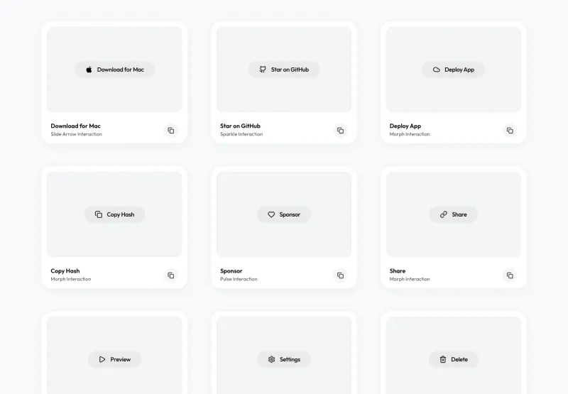
All 300 icons are searchable at useanimations.com. Hover a tile and it plays, which lets you judge the motion before installing anything. Source lives on GitHub, where the README carries the prop list and the upgrade notes from version 2.
Why animated icons end up as a folder of JSON
Most teams start well here. A designer exports a Lottie file for the loader. An engineer installs a player of a few hundred kilobytes, points it at the JSON, and the spinner moves. Then the second icon arrives, and the seams appear.
Color breaks first. Baked fills inside the JSON ignore the text color around them, so dark mode needs a second export. A hover state needs an event listener and a replay call, plus a guard against stutter when the pointer crosses fast. Keyboard focus needs its own handler. Touch needs a third decision. By the fifth icon the folder holds five files with five quirks, and nobody wants to open it again.
I have rebuilt that plumbing on client work more than once, and it always ends the same way: half the icons get wired, the rest ship static.
☞ Packaging is the useful shift. Build the whole set as one system and the player becomes one file, color comes from the parent text, and interaction becomes a property instead of a handler you write.
How the player renders an icon
A module like react-useanimations/lib/menu exports two things: the animation data and its default interaction. Then UseAnimations reads both, renders the animation as SVG, and listens for the events that interaction needs. Nothing else runs on the page.
Stroke color defaults to currentColor, so className="text-blue-600" or a plain CSS color rule recolors the icon, and the built-in rule has zero specificity so your own styles always win. fillColor follows the stroke unless you split them, which matters for a heart that fills when liked.
Some icons cut a notch out of themselves: the slash in visibility, the check in download, the ring around notification3. That notch takes the page background, white on a light page and dark when color-scheme is dark. On a tinted background, set --ua-knockout once on the body and the gaps match the surface.
Six interactions, one prop
Each icon arrives with a default interaction, and interaction overrides it. Six modes cover what an interface needs:
- ❶
hover-replayplays once when the pointer arrives, as onarrowRightandzap - ❷
click-replayreplays on every click, which fitsdownloadandsend - ❸
click-toggleflips between two states, the pattern behindmenuandheart - ❹
loopruns continuously, as onloadingandactivity - ❺
hoverplays forward on hover and backward on leave, which is what the lid ontrashdoes - ❻
hover-looploops while the pointer stays and finishes the cycle when it leaves
A toggle icon can also be driven from outside. Pass active and the icon follows your state, so a menu that closes on Escape animates back without a second call. That is the difference between an animated decoration and a real control.
What ships in the package
This npm package is more than a component. It carries the whole set in several shapes, which matters when your project is not React:
- → One module per icon under
react-useanimations/lib/, one file per icon name, and the safe import when your dev server does not tree-shake - → A named export from
react-useanimations/iconsfor several icons in one line - →
catalog.json, one record per icon, holding the title, the category, the search keywords, the default interaction, the import line, the preview image - →
svg.jsonwith the static states, so a non-React page can render the same shapes
Open the catalog first, it is the part worth the time. Keywords describe what an icon shows, so a search for eye finds visibility and bell finds notification. You stop scrolling a gallery and start querying it.
There is a shadcn registry too. One command drops a ready-made component that already wraps the package:
npx shadcn@latest add https://useanimations.com/r/checkmark.json
Two names need care. delete and package are reserved words in JavaScript, so import them under another name, the way the README suggests with deleteIcon.
Motion that respects the user
Motion is a preference, and the package treats it as one. When the system reports prefers-reduced-motion: reduce, looping icons hold their first frame and hover animations do not play at all. A toggle and a replay jump straight to their end state. Some products still need a spinning loader, so autoplay forces it back on, and that choice stays yours.
Keyboard users get the same feedback as pointer users. Hover animations play on focus when the icon or its wrapper can take focus, and taps on a touch screen are ignored so a finger scroll does not trigger a dozen animations at once. Looping icons pause once they scroll out of view, which keeps a long page calm.
For a clickable icon, wrap it in a real interactive element with the render prop. Then the icon becomes focusable, the keyboard works, and aria-label names the action. The WCAG guidelines cover the motion side in success criterion 2.3.3, and the pattern above satisfies it without extra work.
☛ Decorative is the right default. Most icons sit next to a label and should stay invisible to a screen reader. Pass an accessible name only when the icon is the whole control.
Frequently asked questions
Do I need lottie-web as well?
No. This package carries its own player and has zero dependencies. You install one thing, and the icons render as SVG. That is why the footprint stays small next to a standalone animation library plus a folder of JSON files.
Does it work with the Next.js App Router?
Yes. React 18 and 19, StrictMode, the App Router and server rendering are all listed as supported, and no dynamic import with ssr: false is needed. It renders on the server and hydrates without a mismatch.
Can I use my own animation files?
Yes. Pass animation an object holding your animationData and an interaction. Your Lottie plays through the same player and accepts the same props, so a custom icon behaves like the built-in set.
Is it free for client work?
Yes. License is MIT. Ship it in paid products, modify the icons, and keep the changes. No account is required, and nothing has to appear in your interface.
Why it belongs in your stack
A product feels alive when small actions get an answer. Most teams skip that layer because the wiring costs more than the effect is worth. Here the wiring is already done, once, for 300 icons, and the cost is a few kilobytes per icon you import.
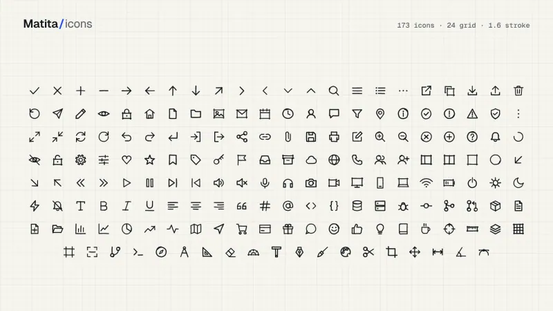
It pairs with the rest of this section. For a still set, Matita icons draws with a pencil and RuneIcons keeps the clean line school. Motion beyond icons is where Amicro comes in, with hover, cursor and scroll effects. For the question of where an animated cue helps and where a tooltip does the job better, read replacing onboarding with contextual help.
To see which patterns are landing in shipped products right now, browse the AI inspiration gallery. When the screens around those icons need a faster start, the other free resources and design and code kits are built for the same ship-it-yourself workflow.