


Roman Kamushken
A data table is a structured grid that puts many records in rows and their shared attributes in columns, so people can scan, compare, sort, and act on a lot of information at once. This guide is the long version. It covers anatomy, cell types, density, every interaction state, sorting, filtering, pagination, selection, mobile, and accessibility, with the trade-offs that decide whether your table feels sharp or sluggish.
I have shipped tables inside dashboard UI kits for years, and the same five mistakes show up in almost every audit. So this is the reference I wish I could hand to a client before the first design review.
TL;DR
→ Use a table when people need to compare records across shared attributes. Use cards when the visual content matters more than the comparison.
→ Density is a feature, not a default. Ship compact, comfortable, and spacious as real options, because an analyst and a casual user want different row heights.
→ Past roughly 1,000 rows, client-side rendering starts to stutter. Switch to server-side paging or virtualization before the scroll feels heavy.
→ Accessibility is decided by your markup. Semantic table, thead, tbody, and th scope give you keyboard and screen-reader support almost for free. ARIA grid roles are the fallback, not the starting point.
→ Hover-only actions, missing total counts, and sort arrows with no clear direction are the three anti-patterns I flag most. Each one quietly breaks trust.
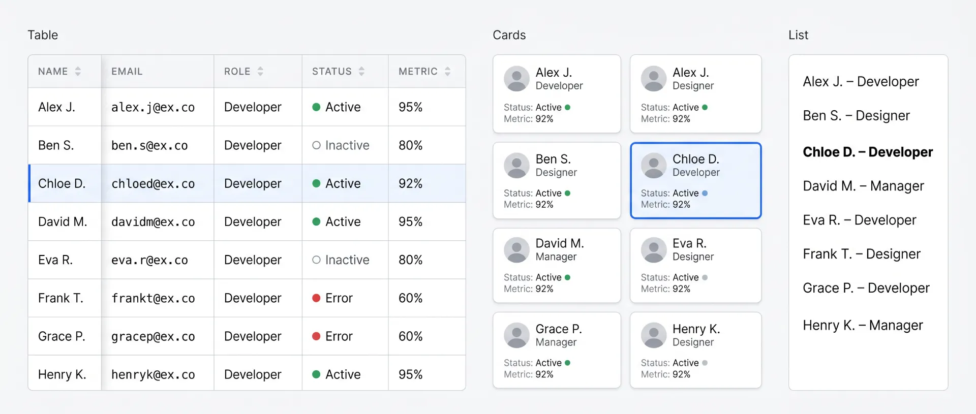
When to use a table vs cards or a list
Reach for a table when the core task is comparison across a consistent set of attributes. If a user needs to ask "which row has the highest value in this column," a table answers instantly. Cards and lists answer slowly, because the eye has to jump around instead of running down a column.
Cards win when each item carries rich, varied content: a product photo, a price, a rating, a short description. Lists win when the structure is shallow and mostly one line per item, like a settings menu or a notification feed. Tables win on density and on cross-record comparison, and they pay for that power with a harder mobile story.
Here is the decision in one place.
| Criterion | Table | List | Cards |
|---|---|---|---|
| Scannability (compare across records) | Excellent | Fair | Poor |
| Data density per screen | High | Medium | Low |
| Mobile UX out of the box | Hard | Easy | Easy |
| Accessibility with native markup | Strong (semantic table) | Strong | Depends on markup |
| Implementation complexity | High | Low | Medium |
| Best for | Many records, many attributes | Shallow one-line items | Rich visual items, small sets |
☞ The fastest gut check: if you would naturally describe the data as "rows," it wants a table. If you would describe it as "items," it probably wants cards.
This same trade-off shows up at the screen level inside a dashboard UI design system, where KPI cards carry the overview and tables carry the detail. The two formats are partners, not rivals.
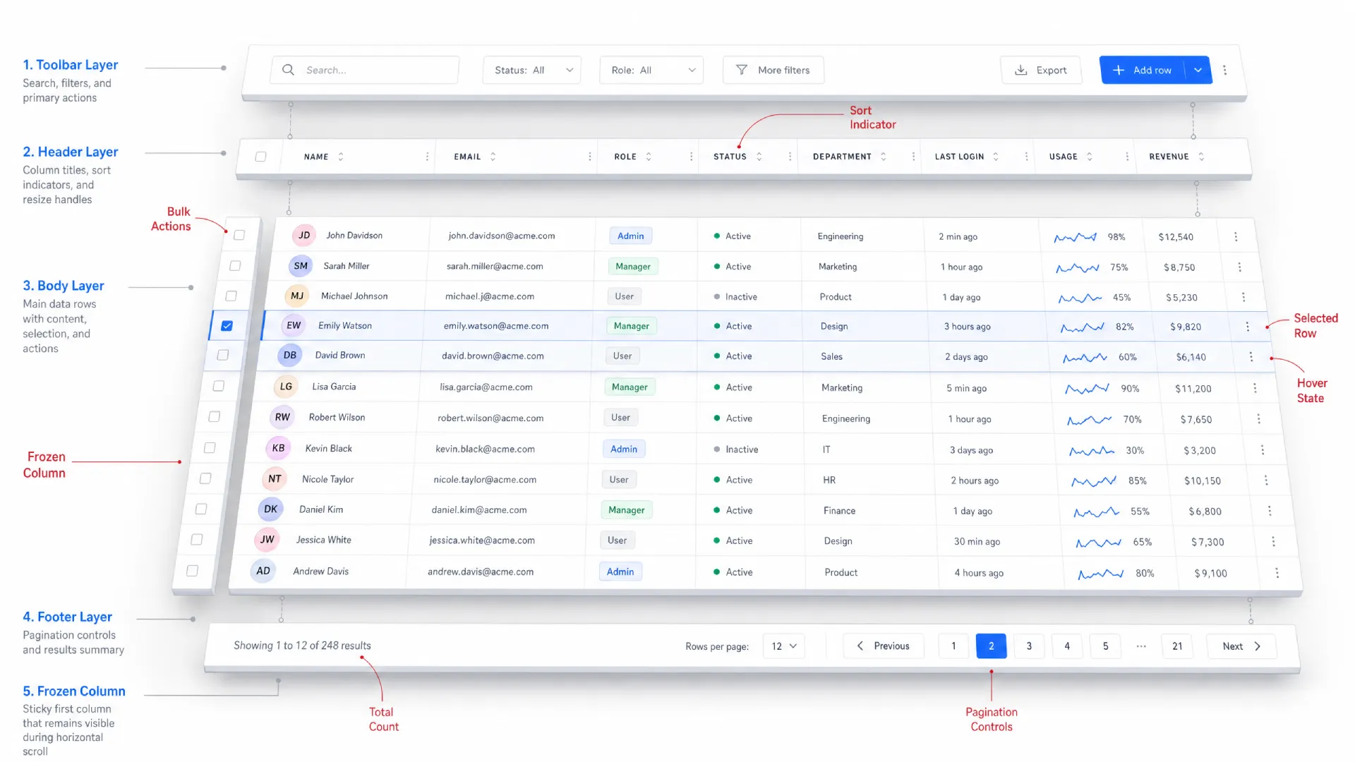
Anatomy of a data table
Most tables are built from the same parts. Learn them once and you can read or design almost any table you meet.
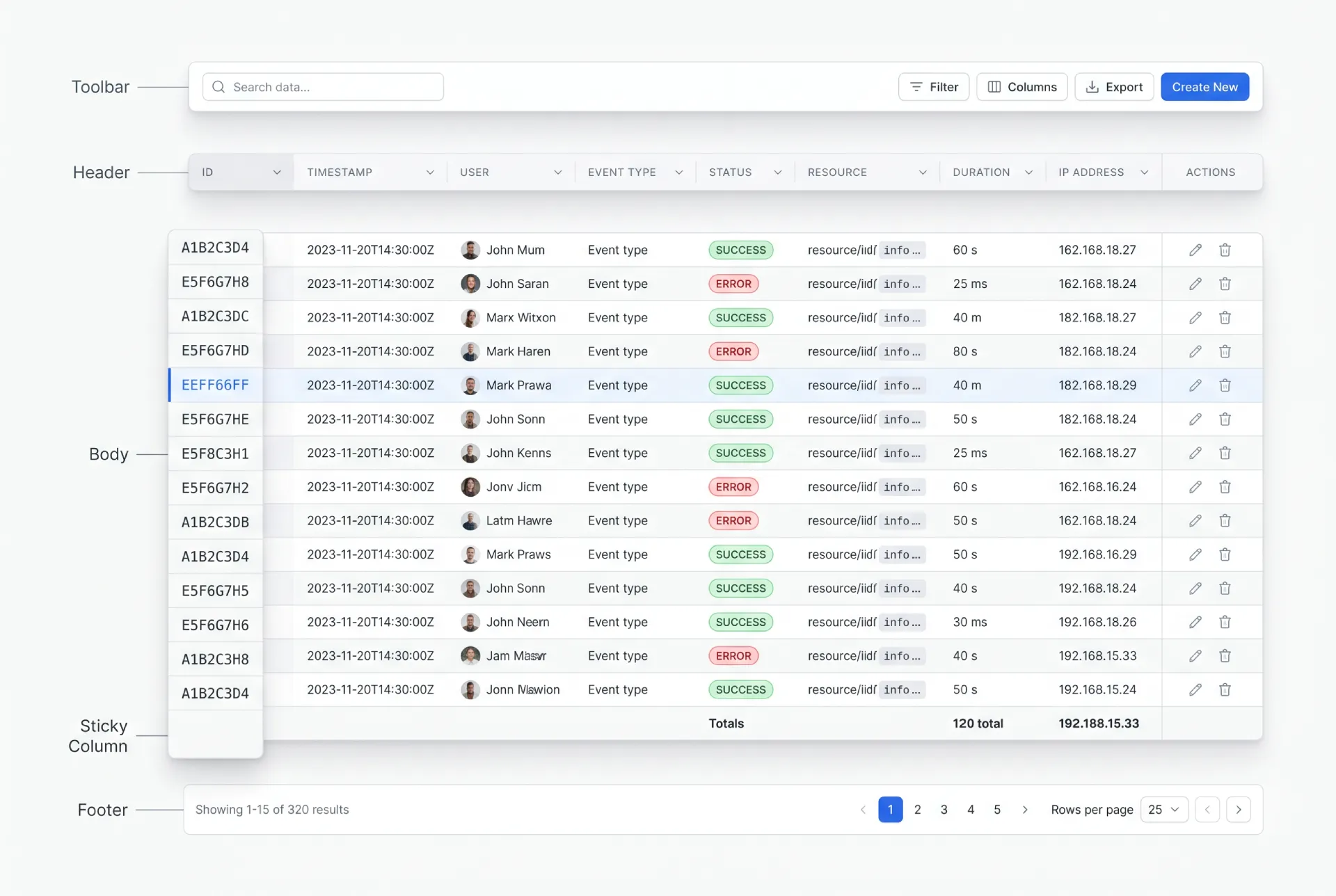
❶ Toolbar. The strip above the table. It holds the search field, filter controls, column settings, and the primary action like "Add row." When a selection is active, this is usually where bulk actions appear.
❷ Header. The row of column titles. Each title carries the sort affordance and, when relevant, a column-level filter. Good headers stay quiet until you interact with them, then show direction clearly.
❸ Body. Rows and cells, the actual data. This is where density, alignment, and cell types do their work. Most of the design effort lives here.
❹ Footer. Pagination controls, a results count, and sometimes a summary or totals row. A totals row that sticks to the bottom is a small touch that analysts love.
❺ Sticky elements. A sticky header keeps column titles visible during vertical scroll. A frozen first column keeps the row identifier visible during horizontal scroll. Both are situational, and both have pitfalls I cover later.
These parts share a fixed budget of space and attention. Every pixel you spend on chrome is a pixel taken from data. The skill is deciding what earns emphasis and what recedes into the background.
Cell types and content patterns
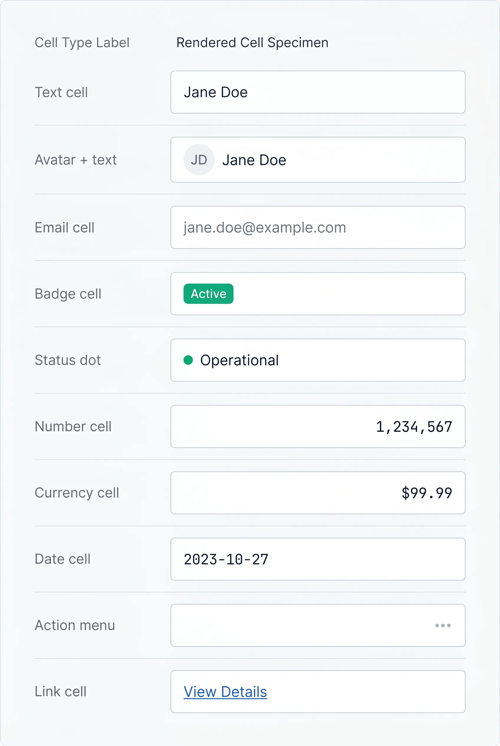
A table is only as good as its cells. The single highest-leverage habit is aligning each data type the way the eye expects.
→ Text aligns left. Names, titles, descriptions.
→ Numbers, currency, and percentages align right, so digits line up by place value and you can compare magnitudes at a glance. This one rule fixes more "messy table" complaints than any restyle.
→ Dates usually align left or right depending on whether you treat them as labels or values. Pick one and keep it consistent across the table.
Beyond raw values, cells carry richer patterns. Status badges and chips turn a string like "active" into a scannable color-coded token, and the badge UI design rules apply directly here. Inline avatars put a face next to a name in user tables. Icons signal type or state without spending a word. Action menus, usually a trailing "kebab" cell, hold row-level operations. Link cells make an identifier clickable to a detail view.
☛ Truncation is where tables quietly fail. A long value that overflows breaks alignment and looks broken. The safe default is a single line with an ellipsis, paired with a tooltip that reveals the full value on hover and on keyboard focus. Reserve full wrapping for one designated "description" column, never for the whole table, because multi-line rows destroy the vertical rhythm that makes scanning fast.
Use a tooltip for long content only when the full value is occasionally useful, not constantly needed. If people need the full text on every row, that column is too narrow or belongs in a detail view instead.
Density and spacing
Density is the row height and internal padding that control how many records fit on screen. Treat it as three named modes, not a single fixed value.
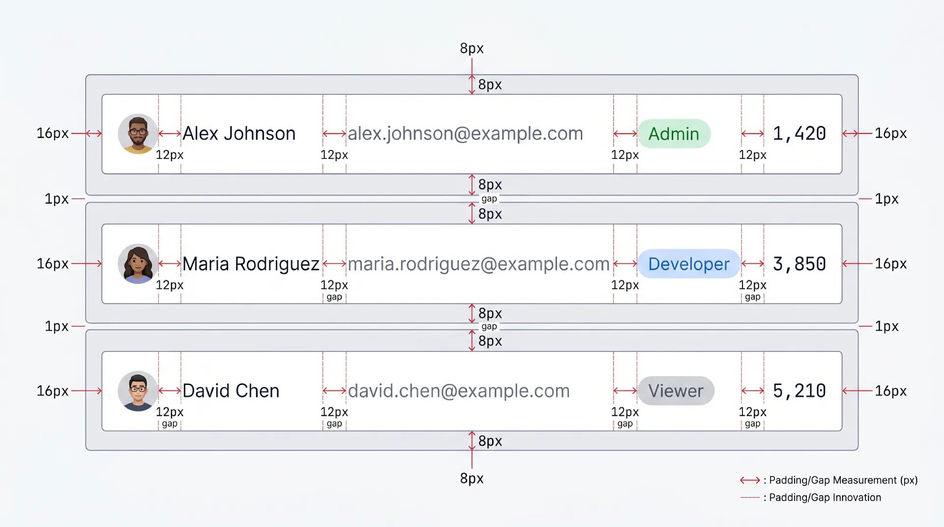
→ Compact packs the most rows per screen. Power users living in the table all day, like analysts and ops teams, almost always want this.
→ Comfortable is the balanced default for mixed audiences. Enough breathing room to feel calm, enough density to stay useful.
→ Spacious suits casual or touch-first contexts where rows are tap targets and the dataset is small.
On exact numbers, I will only cite documented guidance and stay general elsewhere. The WCAG 2.2 Target Size (Minimum) success criterion sets 24 by 24 CSS pixels as the floor for interactive targets, with spacing exceptions. Material Design 3 recommends a 48dp minimum touch target for interactive elements. So when your compact rows carry clickable controls, the row can be dense but the hit area for a checkbox or action still needs to clear those minimums. If you do not have a sourced number for a given measurement, design it by eye against your own type scale rather than inventing a precise pixel value.
☞ Ship density as a user setting and persist the choice. The "right" row height is the one each user picked, not the one you guessed.
States every data table needs
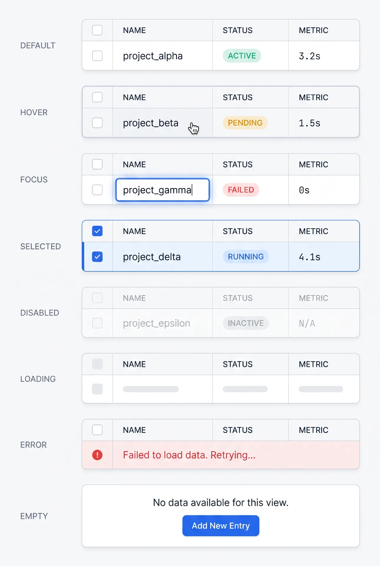
A table is an interactive surface, so it needs the same state discipline you would give any component. Borrow the formula used across the rest of these UI guides.
→ Default. The resting row. Quiet borders, clear alignment, no decoration competing with data.
→ Hover. A subtle background shift on the row under the cursor. It confirms which row an action will hit. Keep it light, because a loud hover on a dense table flickers as the cursor moves.
→ Focus. A visible focus ring on the focused cell or row for keyboard users. This is non-negotiable and must never depend on color alone.
→ Selected. A persistent background tint plus a checked checkbox. Selection has to survive scrolling and reads clearly even when several rows are picked.
→ Loading. Covered below as its own decision.
→ Empty. A deliberate first-run or no-results state, never a blank panel that reads as broken.
→ Error. A clear message when the data fails to load, with a retry action. Do not leave a half-rendered grid on screen.
→ Disabled. Rows or controls that are present but not actionable, dimmed and removed from the tab order.
Loading states, skeleton rows vs spinner vs partial reveal
Loading deserves its own comparison, because the wrong choice makes a fast table feel slow.
| Approach | Best for | Strength | Weakness |
|---|---|---|---|
| Skeleton rows | Known row count and layout | Preserves layout, no jump | More work to build |
| Spinner | Small or unpredictable results | Trivial to implement | Blank screen feels slow |
| Partial reveal | Streaming or server data | Time-to-first-row is fast | Needs progressive loading support |
My default is skeleton rows that match the real row height, because they hold the layout still and the table never lurches when data arrives.
Empty state as a mini-section
An empty table is a design surface, not an accident. A new user with no records yet and a filter that returns nothing are two different empty states, and they need different copy. The first says "here is what will appear, and here is the one action that fills it." The second says "no results, here is how to clear the filter." Both beat a blank rectangle. The full catalogue lives in the dedicated empty state UI design guide, and tables are one of the places it matters most.
Sorting
Sorting reorders rows by a column's values. The interaction has to make the current sort obvious, because an unlabeled sort is a silent lie about what the data means.
Single-column sorting covers most needs: click a header to sort ascending, click again for descending, and show a clear arrow or chevron pointing the direction. Multi-column sorting (sort by status, then by date inside each status) is a power-user feature. When you offer it, number the sort priority next to each arrow so people can see "status is primary, date is secondary." Without those numbers, multi-sort confuses more than it helps.
→ Always show a direction indicator on the active column. An arrow with no state is the single most common sort bug I find.
→ Keep unsorted columns visually quiet, so the active sort stands out.
The bigger architectural choice is where sorting happens.
| Aspect | Client-side sorting | Server-side sorting |
|---|---|---|
| Dataset size | Small, fully loaded | Large or paginated |
| Speed after load | Instant | Network round-trip |
| Works with pagination | Only the current page | Across the full set |
| Implementation | Simple | Needs API support |
The rule of thumb: if the whole dataset is already in the browser, sort on the client. The moment you paginate from a server, sorting has to move server-side too, otherwise you are only sorting the page you can see, which is misleading.
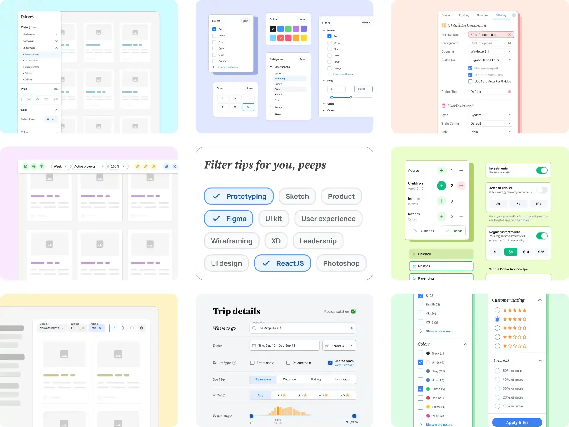
Filtering
Filtering narrows the dataset to the rows that matter right now. There are four common patterns, and the right one depends on how people think about the data.
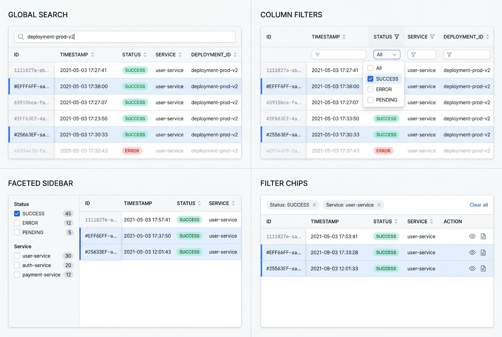
→ Global search / quick filter. One field that matches across columns. The fastest path when users know a keyword but not which column holds it.
→ Column-level filters. Controls attached to individual headers. Precise, and ideal when each column has a known, bounded set of values.
→ Faceted filtering with a sidebar. A panel of grouped checkboxes and ranges. Built for exploration across many dimensions at once, common in catalogs and analytics.
→ Filter chips above the table. Removable tokens that show every active constraint. The clearest way to answer "what am I looking at right now."
| Pattern | Best when | Watch out for |
|---|---|---|
| Global search | Users know a keyword | Ambiguous matches across columns |
| Column filters | Bounded values per column | Header clutter if overused |
| Faceted sidebar | Multi-dimension exploration | Real estate on smaller screens |
| Filter chips | Several active filters at once | Needs a clear "clear all" |
☞ Whatever pattern you pick, make active filters visible. A filtered table that looks identical to an unfiltered one is how people misread data and make bad calls. The deeper mechanics live in the filter UI design guide.
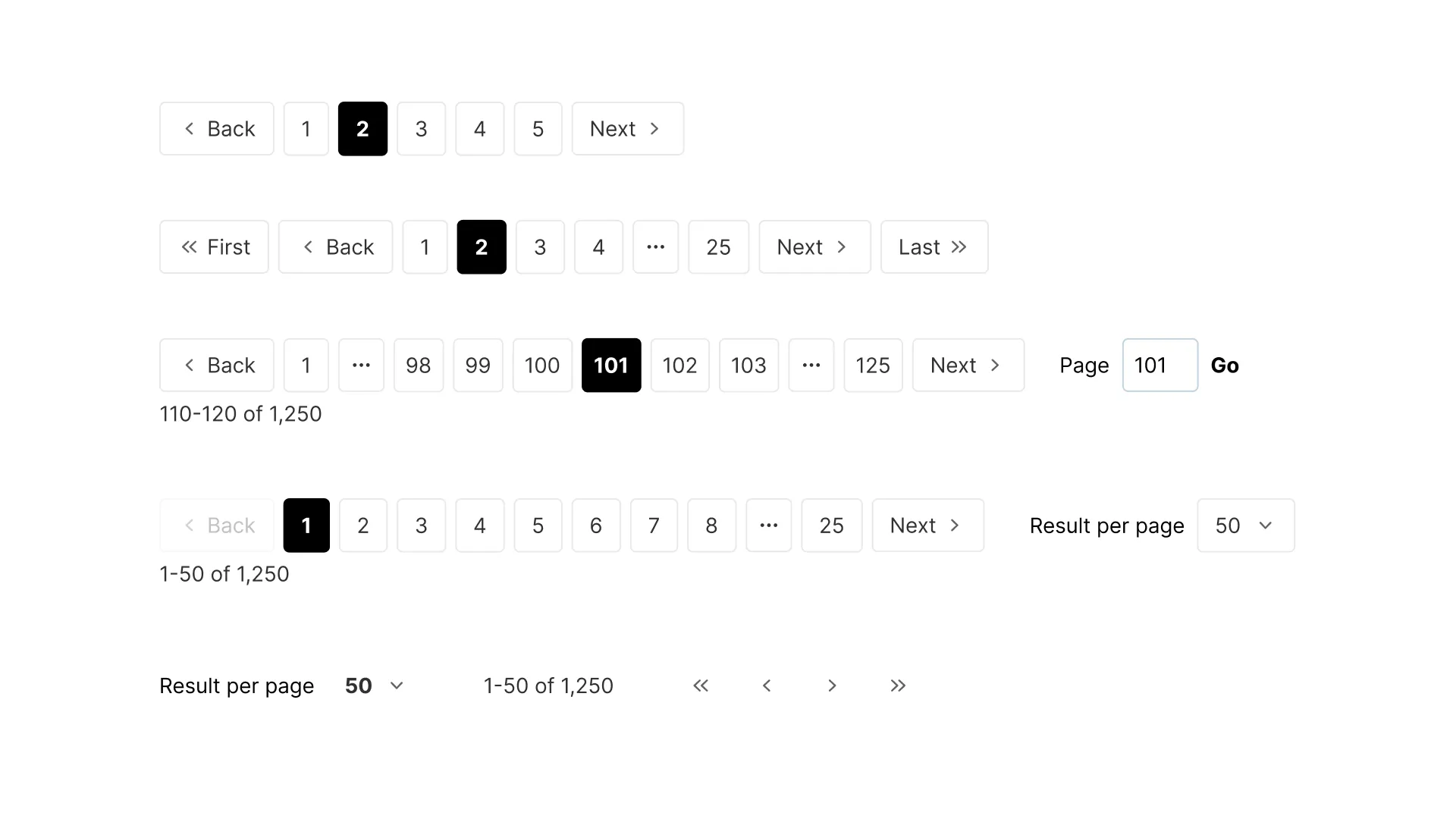
Pagination and virtualization
This is the section that decides whether your table scales. The question is how you deliver a large dataset without making the browser choke or the user feel lost.
There are three answers, and they are genuinely different tools, not flavors of the same thing. Pagination splits data into numbered pages. Infinite scroll loads more as you reach the bottom. Virtualization renders only the rows currently in the viewport while keeping the scrollbar honest about the full size.
| Criterion | Pagination | Infinite scroll | Virtualization |
|---|---|---|---|
| Best use case | Known, navigable sets | Feeds, discovery | Huge datasets in one view |
| UX feel | Structured, predictable | Effortless, immersive | Native scroll, no page breaks |
| Accessibility | Strong (clear controls) | Harder (focus, footer) | Needs careful ARIA and focus |
| Performance | Light per page | Grows over session | Constant, only visible rows |
| Mobile fit | Good | Very good | Good with care |
| Implementation | Simple | Medium | Complex |
Pagination is my default for tables people navigate deliberately, because page numbers and a total count give a sense of place. Infinite scroll suits browsing feeds where no one needs row 4,000 by number. Virtualization is the tool when the entire set must live in one scroll, and I reach for it once rows climb past the low thousands.
The full breakdown of page numbers, keyset paging, and the load-more pattern sits in the pagination UI design guide. One rule belongs here though: never paginate without showing a total count. "Page 3 of ?" leaves people stranded.
Selection patterns
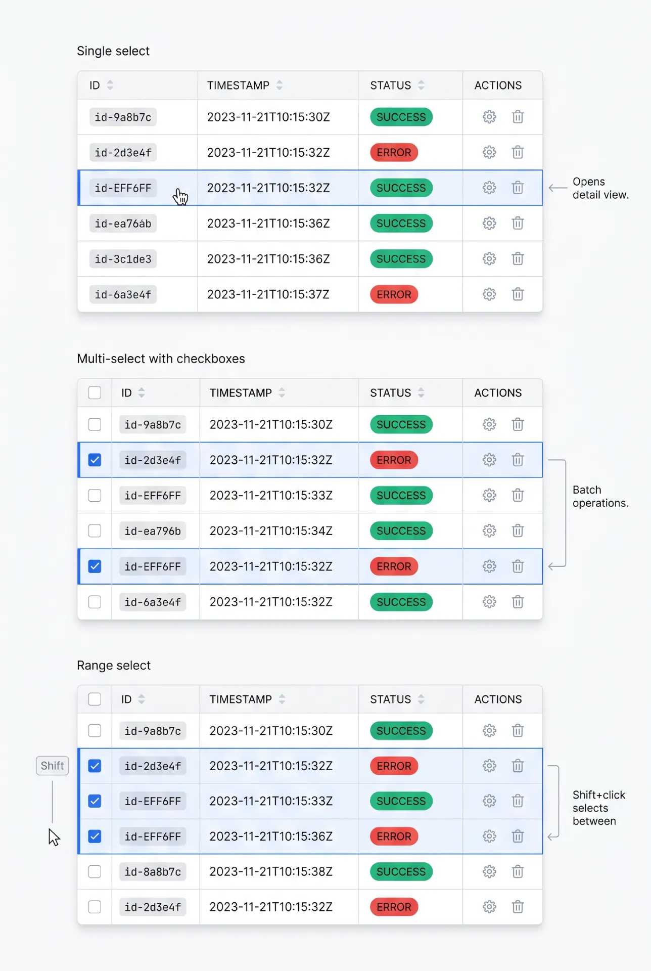
Selection turns a passive table into a tool for batch work. The model you choose sets the ceiling on what users can do.
Single-row select fits tables where one record is acted on at a time, often a click that opens a detail view. Multi-row selection with checkboxes is the workhorse for batch operations: delete twelve records, export a filtered set, reassign a group. A leading checkbox column is the clear convention, because people already know it from email clients and file managers.
A few behaviors separate a good selection model from a frustrating one.
→ Select-all needs a defined scope. A header checkbox that selects the current page is honest. If you also offer "select all 2,431 matching rows," say so explicitly with a banner, because selecting a page and selecting the whole result set are very different actions.
→ Range select with Shift+click is a small feature with a big payoff. Click one row, Shift+click another, and everything between is selected. Power users expect it.
→ Persistence across pages is the detail teams forget. If a user selects rows on page one, paginates, and the selection vanishes, bulk actions across a large set become impossible. Decide deliberately whether selection persists, and show a running count so people trust it.
Bulk actions toolbar
When a selection becomes active, the table needs somewhere to act on it. The bulk actions toolbar is that surface.
The cleanest pattern is a contextual bar that appears the moment one row is selected and replaces the default toolbar in place. It shows the selection count ("3 selected") and the actions that apply: delete, export, assign, archive. When the selection clears, the bar returns to its resting state.
→ When to appear. On first selection, not before. An always-visible bar full of disabled buttons is noise.
→ Where to place. In the toolbar slot above the table, where the eye already expects controls. A bar that floats over rows can cover the very data the user is deciding on.
→ Discoverability. Group destructive actions away from routine ones, and confirm anything irreversible. The bar is powerful, so make the dangerous buttons harder to hit by accident.
Inline editing vs modal editing
Editing data in place feels fast, but it is not always the right call. The choice comes down to how many fields change at once and how much validation they need.
| Aspect | Inline editing | Modal editing |
|---|---|---|
| Best for | Single field, quick fixes | Multiple related fields |
| Speed | Very fast, no context switch | Slower, deliberate |
| Validation | Light, per-cell | Rich, cross-field |
| Error handling | Cramped in a cell | Room to explain |
| Risk | Easy accidental edits | Heavier interaction |
Inline editing shines for the spreadsheet-style change: fix a typo, bump a number, toggle a status. Modal editing earns its place when an edit touches several fields, needs validation that spans them, or carries enough weight that a deliberate "save" beats an instant change. When in doubt, I keep single-value edits inline and push anything structural into a modal or a side panel.
Sticky header and frozen columns
Sticky elements keep your bearings during scroll. They are not decoration, they are orientation.
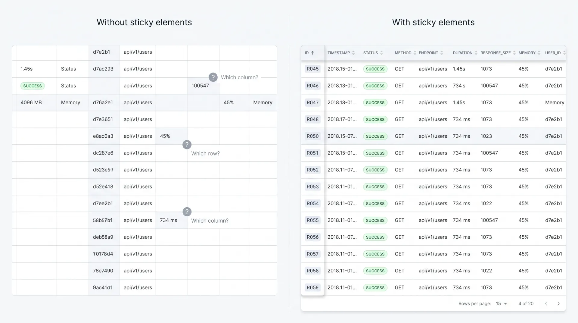
A sticky header becomes mandatory the moment a table is tall enough that the column titles scroll out of view. Without it, users scroll back up just to remember which column they are reading. For any table over roughly one screen of rows, pin the header.
A frozen first column keeps the row identifier visible during horizontal scroll. In a wide financial or analytics table, freezing the name or ID column means people never lose track of which row a far-right value belongs to.
Both features share the same implementation pitfalls.
☛ Watch the stacking order, so the sticky header sits above scrolling cells and the frozen column sits above the body but below the header at their intersection. Get the z-index wrong and cells bleed through each other. Add a subtle shadow on the frozen edge so it reads as a layer, not a seam. And test on real content, because a sticky header that jitters or a frozen column that misaligns by a pixel on scroll is worse than none at all.
Resizable, reorderable, and hidable columns
These are power-user features. They let people shape the table to their own work, and they cost real complexity, so spend them where the payoff is clear.
Resizable columns let users widen a truncated column or shrink one they ignore. Reorderable columns let them drag the attribute they compare most to the left. Hidable columns let them switch off the noise and keep only what matters for today's task.
The honest test for whether these are worth building: do people live in this table for hours, or visit it for seconds? A daily analytics workspace earns all three. A settings table that someone opens twice a month does not, and adding them there just inflates the interface.
☞ If you build these, persist the layout. Save column widths, order, and visibility to localStorage or, better, to the user's account so the setup follows them across devices. A power-user feature that resets on every reload is a tease, not a tool.
Expandable rows and tree tables
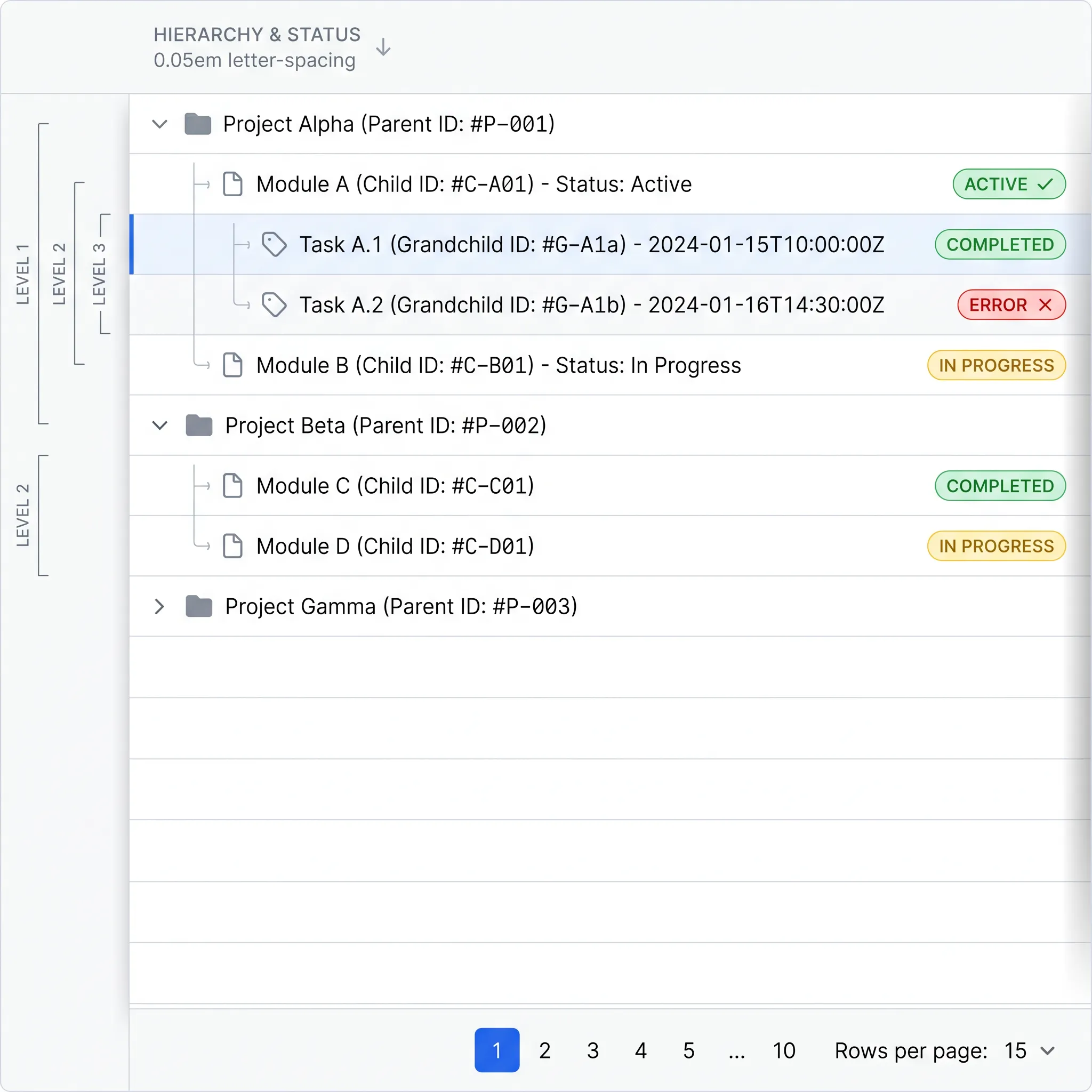
Sometimes a row has more behind it than fits in a line. Expandable rows and tree tables are two answers, and they solve different problems.
Expandable rows hold a master-detail pattern. The row is the summary, and clicking a disclosure control reveals related detail underneath: line items under an order, log entries under an event. The table stays scannable, and depth is available on demand.
Tree tables show genuine hierarchy, where rows nest inside rows: an org chart, a file system, a category tree. The indentation and expand controls communicate parent-child structure that a flat table cannot.
The judgment call is when a tree table is the right tool versus separate views. A tree table works when the hierarchy is shallow and people need to compare values across levels in one grid. Once nesting runs deep or each level has very different attributes, a tree table buckles, and a master list with drill-down screens serves people better. I lean toward separate views whenever the levels stop sharing the same columns.
Responsive patterns for tables on mobile
Tables are the hardest component to move to a small screen, because their power comes from horizontal comparison and phones are vertical. There are four real strategies, and the right one depends on how much of the data is essential.
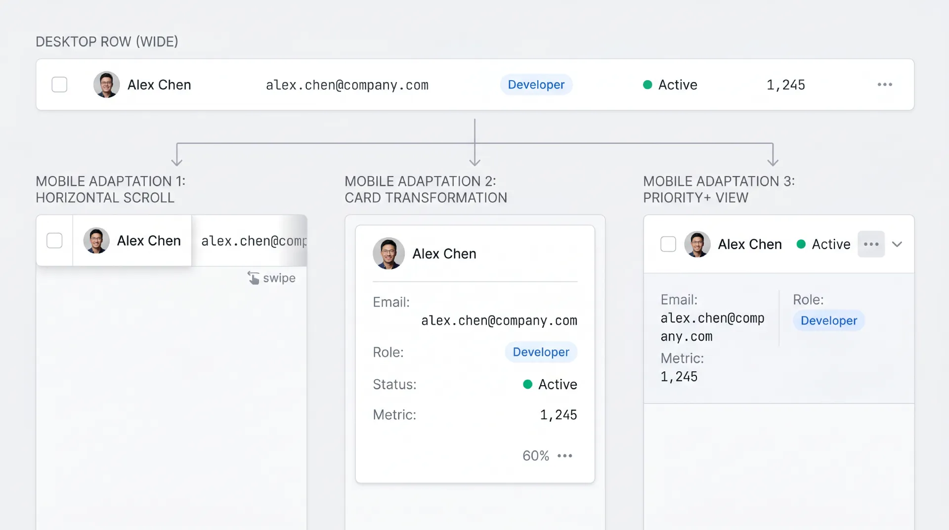
| Pattern | How it works | Best when |
|---|---|---|
| Horizontal scroll | Keep the table, swipe sideways, freeze first column | Data integrity matters more than fit |
| Card transformation | Each row becomes a stacked card | Few records, each read on its own |
| Hide non-critical columns | Show only essential columns, rest on detail | Clear priority among columns |
| Priority+ | Show top columns, reveal the rest on demand | Mixed importance, want flexibility |
Horizontal scroll keeps the table honest but asks people to swipe, so pair it with a frozen first column. Card transformation reads beautifully for small sets and falls apart past a few dozen records. Hiding columns is the pragmatic default when some attributes clearly matter more. The priority+ pattern is the most adaptive: show the top few columns and tuck the rest behind a "more" control. There is no free lunch here, so pick by asking which columns a user truly cannot decide without.
Accessibility is non-negotiable
A data table that a screen-reader user cannot parse is broken, no matter how it looks. The good news: native HTML does most of the work if you let it.
Start with semantic markup. A real table with thead, tbody, and th cells carrying a scope attribute gives assistive tech the row-and-column relationships for free. Screen readers announce "row 4, column Status, Active" because the structure tells them how cells relate. Reach for ARIA grid roles only when you cannot use a native table, for example a fully virtualized custom grid, and treat them as the harder fallback, not the default.
→ Keyboard navigation is the backbone. Arrow keys move between cells, Home and End jump to row ends, Page Up and Page Down move by viewport, and Tab reaches interactive controls. Every action a mouse can do needs a key equivalent.
→ Announce dynamic changes. When a sort or filter changes what is on screen, a screen-reader user gets no visual cue. Use a polite live region to announce "sorted by date, descending" or "showing 12 of 240 rows," so the change is perceivable.
→ Never rely on color alone for state. A sort direction, a selected row, an error all need a shape, an icon, or text alongside any color.
The authoritative reference is the W3C ARIA Authoring Practices Grid pattern, which documents the exact keyboard model and roles for a data grid. Read it before building a custom grid, because it will save you from reinventing an interaction model that screen-reader users already expect.
Performance considerations
Performance in tables is mostly a rendering problem. The browser slows down when it has to keep thousands of DOM nodes alive at once, and a table is a node factory.
The rule of thumb I use: past roughly 1,000 rows, client-side rendering of the full set starts to feel heavy on scroll, and it is time to virtualize or page. Virtualization renders only the rows in the viewport plus a small buffer, so a 50,000-row table costs about the same as a 50-row one. Libraries like TanStack Virtual and react-window handle the windowing math, and TanStack Table pairs the data logic with your own markup. These are references, not endorsements, and there are no affiliate links here.
☞ Pagination is a performance tool, not only a UX one. Loading 50 rows per page means the browser never holds more than 50 rows of DOM, which keeps even a modest device responsive. When you do not need everything in one scroll, paging is the simplest way to stay fast.
Real-world examples worth studying
Patterns are easier to trust when you see them shipped. Here are tables I keep coming back to, with what each does well and where it compromises.
❶ Linear (linear.app). The keyboard-first issue views are a masterclass in dense yet calm tables. Inline edits are instant and navigation rarely needs a mouse. The compromise is a learning curve aimed squarely at power users.
❷ Stripe Dashboard (stripe.com). Reference-grade currency and status cells, with filter chips that make the active view obvious. The trade-off is sheer feature volume, which can make some screens feel dense for newcomers.
❸ GitHub issues. A clear selection model, a strong bulk-actions bar, and a powerful filter syntax. Custom saved views are limited, and very long issue titles can stretch a row.
❹ Notion databases. Flexible cell types and the ability to flip the same data between table, board, and gallery. The cost shows on large datasets, where performance dips and the mobile table is weak.
❺ Airtable. A frozen first column, resizable and reorderable columns, and rich cell types out of the box. The interface is heavy, and for a simple list it is more tool than the job needs.
❻ Vercel project tables (vercel.com). Restrained, scan-friendly, with a clean card transformation on mobile. The functionality is intentionally shallow, which is the right call for the context and a limit if you need more.
❼ Material X. Our own Material X ships data tables with Material 3 density tokens and every state already styled, which is the fastest way to get a system-grade table without restyling each cell. The compromise is that you adopt the Material language, which is a feature if you want M3 and a constraint if you do not.
You can also study patterns without leaving your desk by browsing the AI inspiration gallery, where I check fresh table treatments most weeks to see how others solve density and state problems in production.
Anti-patterns to avoid
These are the table mistakes I flag in almost every review. Each one looks small and quietly costs trust.
☞ Tiny font for density. Shrinking type to fit more rows trades readability for count. Use a compact density mode with sane type instead.
☞ Excessive borders everywhere. A full grid of lines fights the data for attention. Let whitespace and a single subtle row separator carry the structure.
☞ Hover-only actions. Actions that appear only on mouse hover are invisible to keyboard and touch users. This is an accessibility failure, not a clever space-saver.
☞ Sticky headers that break on scroll. A header that jitters, overlaps, or detaches mid-scroll is worse than a plain one. Test it on real content and real devices.
☞ Pagination without a total count. "Page 3" with no total leaves people lost. Always show how many pages or records exist.
☞ Filters with no active indication. A filtered table that looks unfiltered makes people misread the data. Show chips, a count, or a banner.
☞ Sort with no direction indicator. A sorted column with no visible arrow is a silent lie about order. Always show ascending or descending state.
Frequently asked questions
❶ When should I use a table instead of cards?
Use a table when the main task is comparing records across the same attributes, like sorting users by signup date or scanning invoices by amount. The grid lets the eye run down a column and compare instantly. Use cards when each item is visually rich and self-contained, such as products with photos and prices, or when the set is small. The quick test: if the data is naturally "rows," it wants a table; if it is "items," it wants cards.
❷ How many columns is too many?
There is no fixed number, but you have too many once horizontal scrolling becomes the primary way people read the table. When essential values sit off-screen by default, the table stops working at a glance. The fix is rarely "delete columns" and more often prioritization: pin the columns people decide with, offer hidable columns for the rest, and consider a detail view for the long tail of attributes that matter occasionally.
❸ Should I paginate, infinite scroll, or virtualize?
Match the tool to the task. Use pagination for sets people navigate deliberately, because page numbers and a total count give a sense of place. Use infinite scroll for browsing feeds where no one needs a specific row by number. Use virtualization when the entire dataset must live in one continuous scroll, which I reach for once rows pass the low thousands. Pagination and virtualization both also cap how many DOM nodes the browser holds, so they protect performance, not only UX.
❹ Should I use fixed pixel widths or fluid columns?
A hybrid wins. Fix the width of predictable columns like status, dates, and the actions cell, so they never jump around. Let text-heavy columns flex to fill the remaining space. Add a sensible min-width to fluid columns so they never collapse to an unreadable sliver on a narrow viewport. Pure fixed widths waste space on wide screens, and pure fluid widths let one long value distort the whole layout, so blending the two gives the steadiest result.
❺ How do I make tables mobile-friendly?
Start by deciding which columns a user truly cannot act without. From there, pick a strategy: horizontal scroll with a frozen first column when data integrity matters most, card transformation when records are few and read individually, or hiding non-critical columns when priority is clear. The priority+ pattern, which shows top columns and reveals the rest on demand, is the most adaptive. Avoid cramming a wide desktop table onto a phone unchanged, because nobody enjoys pinch-zooming a grid.
❻ When is inline editing better than modal editing?
Inline editing is better for fast, low-risk changes to a single field: fixing a typo, adjusting a number, toggling a status. It keeps people in flow with no context switch. Modal or side-panel editing is better when an edit touches several related fields, needs validation that spans them, or carries enough weight that a deliberate save beats an instant change. As a rule, keep single-value edits inline and push anything structural or multi-field into a dedicated editing surface.
❼ What is the best way to indicate active filters?
Show active filters as removable chips above the table, paired with a visible result count and a clear "clear all" control. Chips answer "what am I looking at right now" without making people reopen a filter panel to check. A standalone count ("showing 12 of 240") reinforces that the data is narrowed. The cardinal sin is a filtered table that looks identical to an unfiltered one, because that is exactly how people misread data and make confident, wrong decisions.
❽ How do I make tables accessible to screen readers?
Use semantic HTML first: a real table with thead, tbody, and th cells carrying a scope attribute, which hands assistive tech the row and column relationships automatically. Support full keyboard navigation with arrow keys, Home, End, Page Up, and Page Down. Announce sort and filter changes through a polite live region so non-visual users perceive them. Reach for ARIA grid roles only when a native table is impossible. The W3C ARIA Authoring Practices Grid pattern is the canonical spec to follow.
Checklist before you ship
Run the table against this list before it goes live.
✔ Right format. A table is genuinely the best fit, not a default for data that wanted cards or a list.
✔ Aligned cells. Numbers and currency align right, text aligns left, dates are consistent.
✔ Density options. Compact, comfortable, and spacious exist, and the choice persists per user.
✔ Touch targets. Interactive cells clear documented minimums from WCAG 2.2 and Material 3.
✔ Hover state. Subtle row highlight that confirms the target without flicker.
✔ Focus state. A visible focus ring that never depends on color alone.
✔ Selected state. Survives scrolling and reads clearly with multiple rows picked.
✔ Loading state. Skeleton rows or partial reveal that hold the layout steady.
✔ Empty state. Deliberate copy for both first-run and no-results, with a next action.
✔ Error state. A clear failure message with a retry, never a half-rendered grid.
✔ Sort indicators. Active column shows direction, multi-sort shows priority order.
✔ Sort scope. Server-side sorting kicks in whenever the data is paginated.
✔ Visible filters. Active filters show as chips with a count and a clear-all.
✔ Pagination clarity. A total count is always present, never "page 3 of ?".
✔ Selection model. Select-all scope is explicit, and selection persists across pages.
✔ Bulk actions. A contextual toolbar appears on selection with destructive actions guarded.
✔ Sticky orientation. Header pins on tall tables, frozen column holds on wide ones, z-index tested.
✔ Layout persistence. Resized, reordered, and hidden columns are remembered.
✔ Mobile strategy. A deliberate responsive pattern, not a shrunken desktop grid.
✔ Semantic markup. Native table with th scope, keyboard navigation, live-region announcements.
✔ Performance plan. Past about 1,000 rows, virtualization or server paging is in place.
✔ No anti-patterns. No tiny fonts, hover-only actions, or invisible filters survived review.
Closing thought
The best data tables disappear. People stop noticing the interface and start reasoning about the data, which is the entire point. When I audit a table that feels wrong, the cause is almost never a missing feature. It is the opposite: too many borders, too much color, actions hidden until hover, density cranked so tight the type went unreadable. Restraint is the hardest skill to apply to a component that practically begs you to add one more column.
So treat the table as a system, not a screen. The states, the density modes, the sort and filter and selection behaviors all have to agree with each other, the same way a liquid glass material system only holds up when every surface follows the same recipe. Decide your rules once, apply them everywhere, and the table starts to feel trustworthy. That trust is what turns a grid of numbers into something people make decisions on.
Build the boring, consistent version first. Then earn every flourish you add on top.

.webp&w=1920&q=75)
.webp&w=1920&q=75)

.webp&w=1920&q=75)
.webp&w=1920&q=75)


.webp&w=1920&q=75)
.webp&w=1920&q=75)


