Avatar UI design

The anatomy of Userpic: content, states, use-cases. Colors & UI design ideas reviewed. Including some layouts for your inspiration.

Avatar UI design exploration — The states of userpic component
Tutorials

Published on

August 11, 2021

|

6 mins

Blog

Avatar UI design exploration — The states of userpic component

Navigation

Subscribe to new posts

Thank you! Your submission has been received!
Oops! Something went wrong while submitting the form.

By subscribing you agree to with our Privacy Policy.

Share this post

Roman Kamushken

Heya! Roman's here.

<span class="blog_big-paragraph">I am a UI designer, maker, and seller. It's been already 3+ years passed since I started to make templates for Figma and founded Setproduct to help startups and individuals save on design and release their apps faster.</span>

Handling 20+ years in graphic design, last years I've been browsing thousands of apps, screens, components, and layouts almost DAILY to assemble the most complete handbook of how to design components, templates, and entire apps.

But this guide is not there yet. I've faced a challenge trying to pull out everything I've learned, and I hope you'll help me to get a handbook started. I truly need to take off of my brain lay it down on paper…

Here is my exploration and research for the variants to design Avatars also known as Userpics. You will be guided through the States, Sizes, Styles, Usage, and Templates containing avatars in order to have all the keys for your design mission.

Prepare for the tiny UI details, you won't notice till you get too close.

{{spacer-64}}

What is Avatar?

Avatar (aka Userpic) — is a component used to represent a user's profile picture.

Implement Avatars with an action leading to the app section where the user is able to modify preferences, options, or edit self details.

{{spacer-64}}

{{setproduct-gpt}}

{{spacer-64}}

Anatomy

States

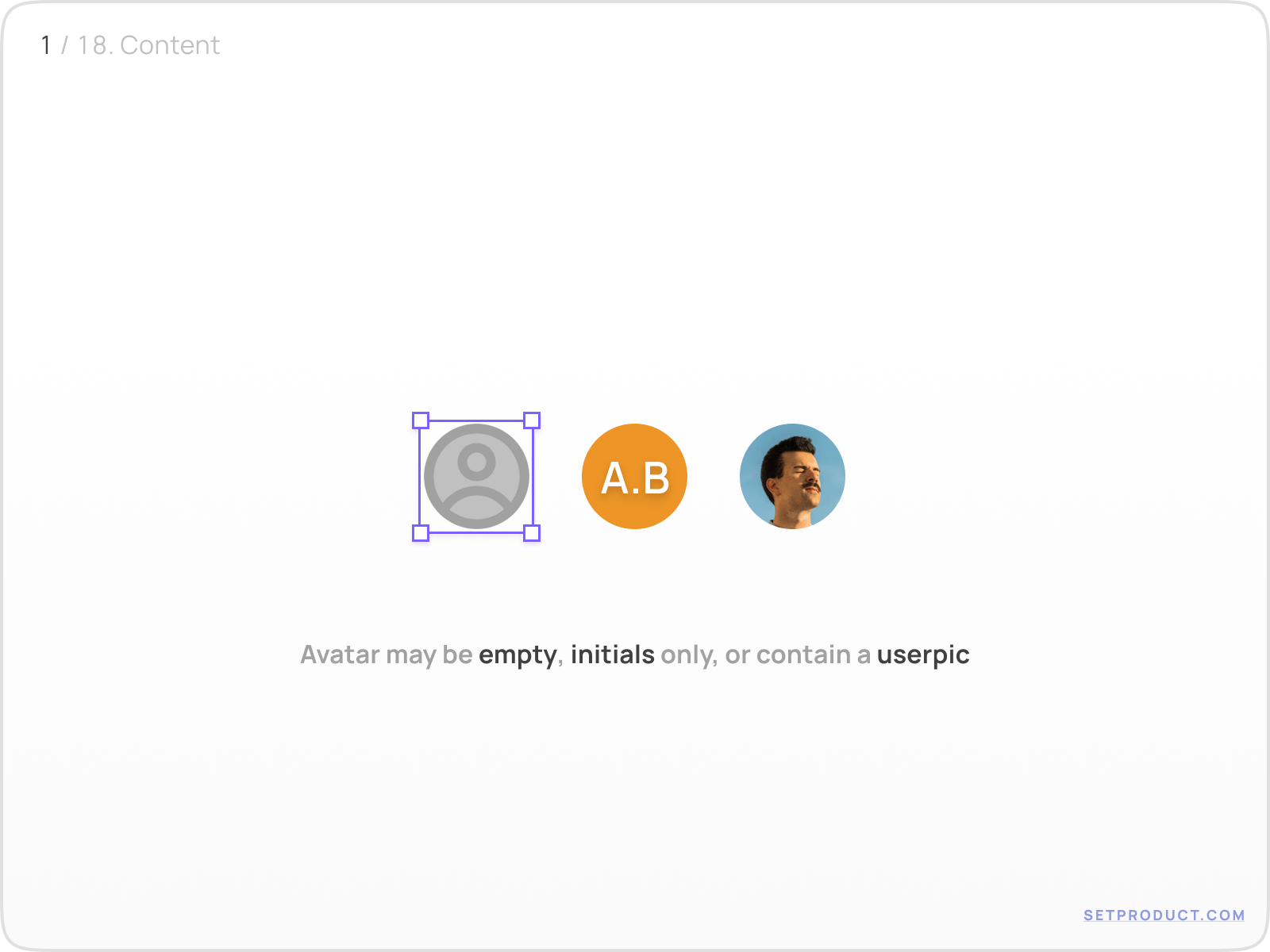
The default states for Avatar are:

  • empty
  • initials
  • user's picture
Avatar UI design exploration

{{spacer-24}}

Size & Color

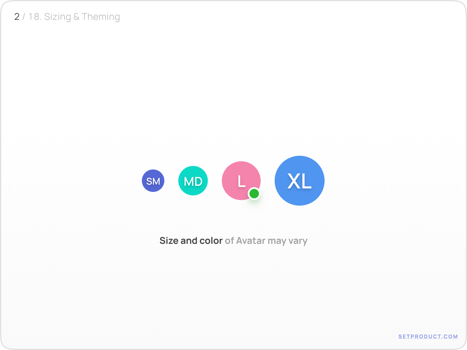
The size and color of the Avatar may vary, depending on a use case:

  • 24–40dp width is mostly used for App bars, Headers, etc.
  • 40–48dp for Avatars used in lists, or content blocks
  • 56+ when used in templates: Profile, Settings, etc.
  • Colors may vary for a better recognition
Avatar UI design exploration

{{spacer-24}}

Actions

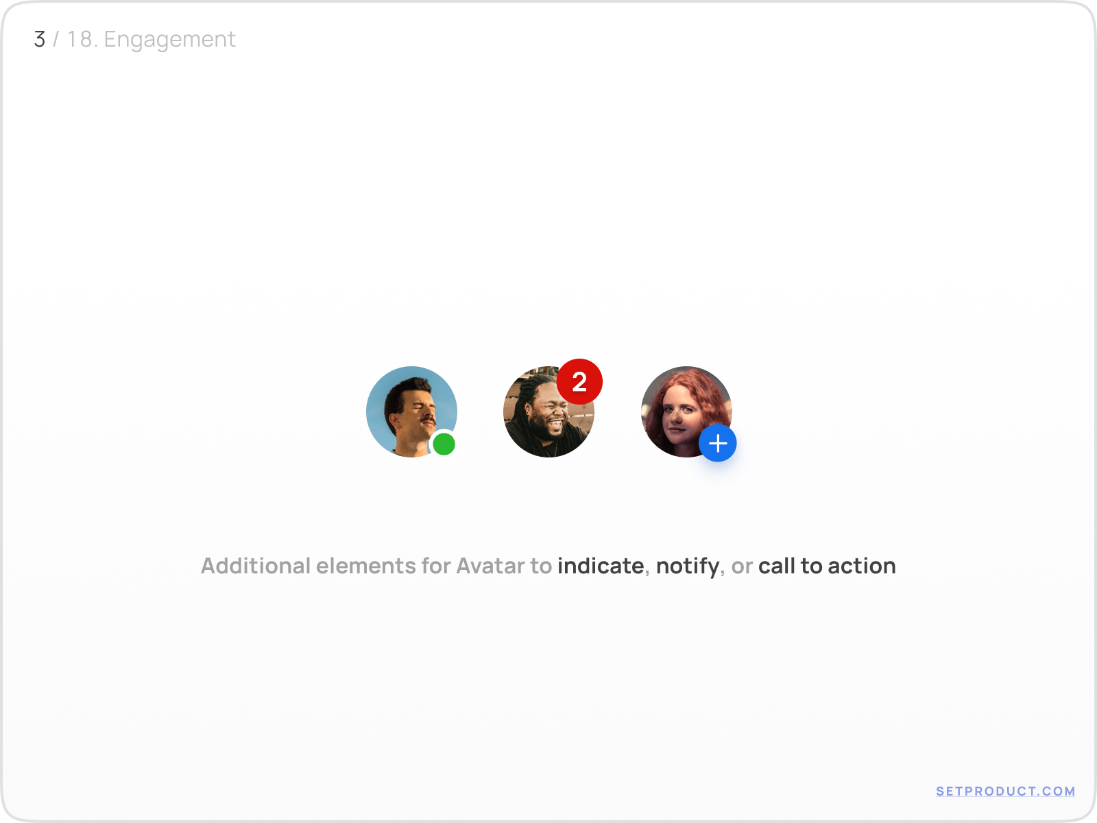
Additional elements for Avatar may be nested to indicate, notify, or call to action.

  • You may indicate whether a user is online, or not
  • You may notify and provide visual feedback with a numbered badge
  • You may show up an additional icon to encourage into action
Avatar UI design exploration

{{spacer-24}}

User status

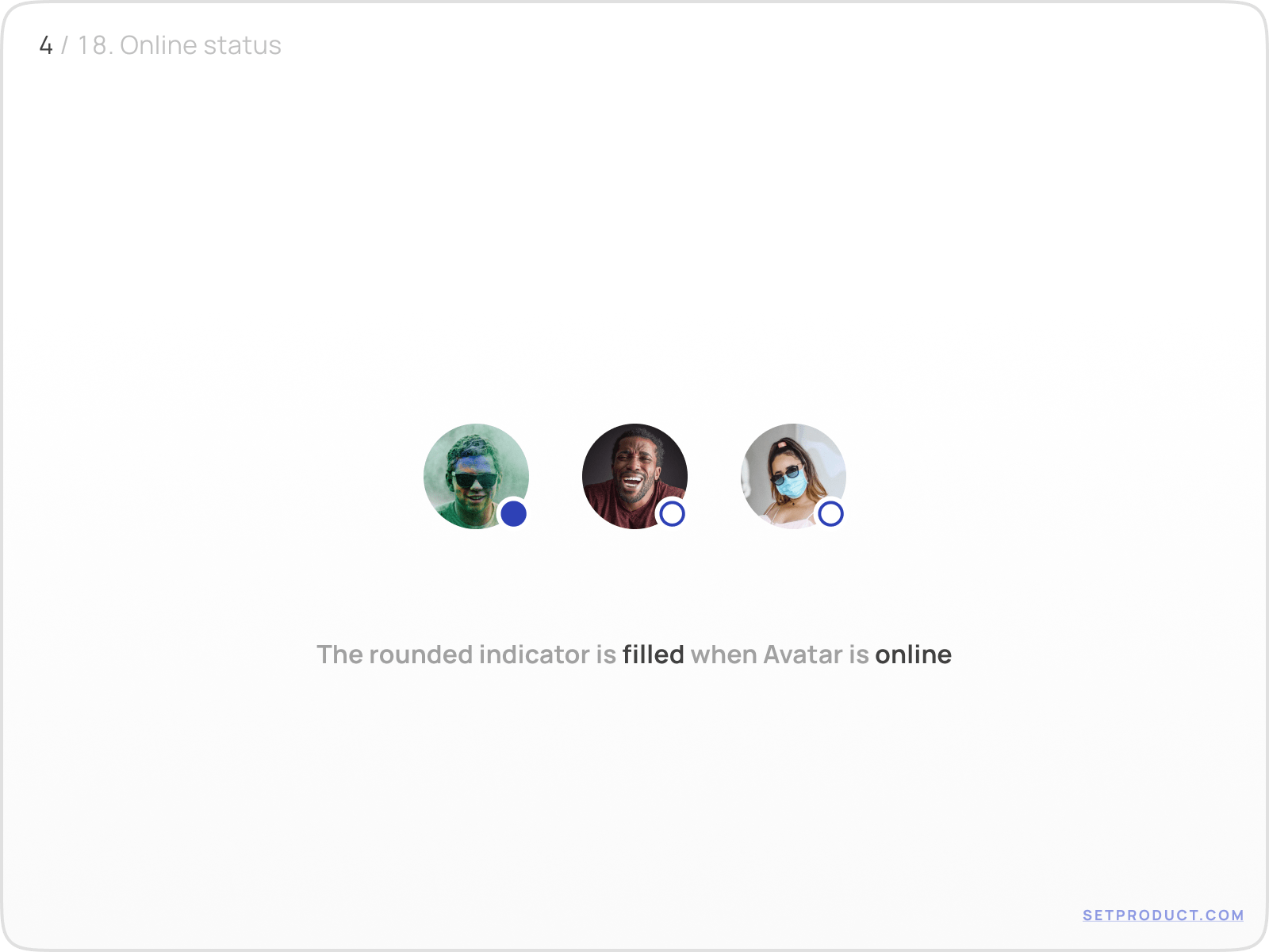
The common pattern of displaying the user's status is to nest a round indicator at the bottom right.

  • Use green for online, gray for offline status
  • Use filled shape when online, empty when offline (alt. variant)
Avatar UI design exploration

{{spacer-24}}

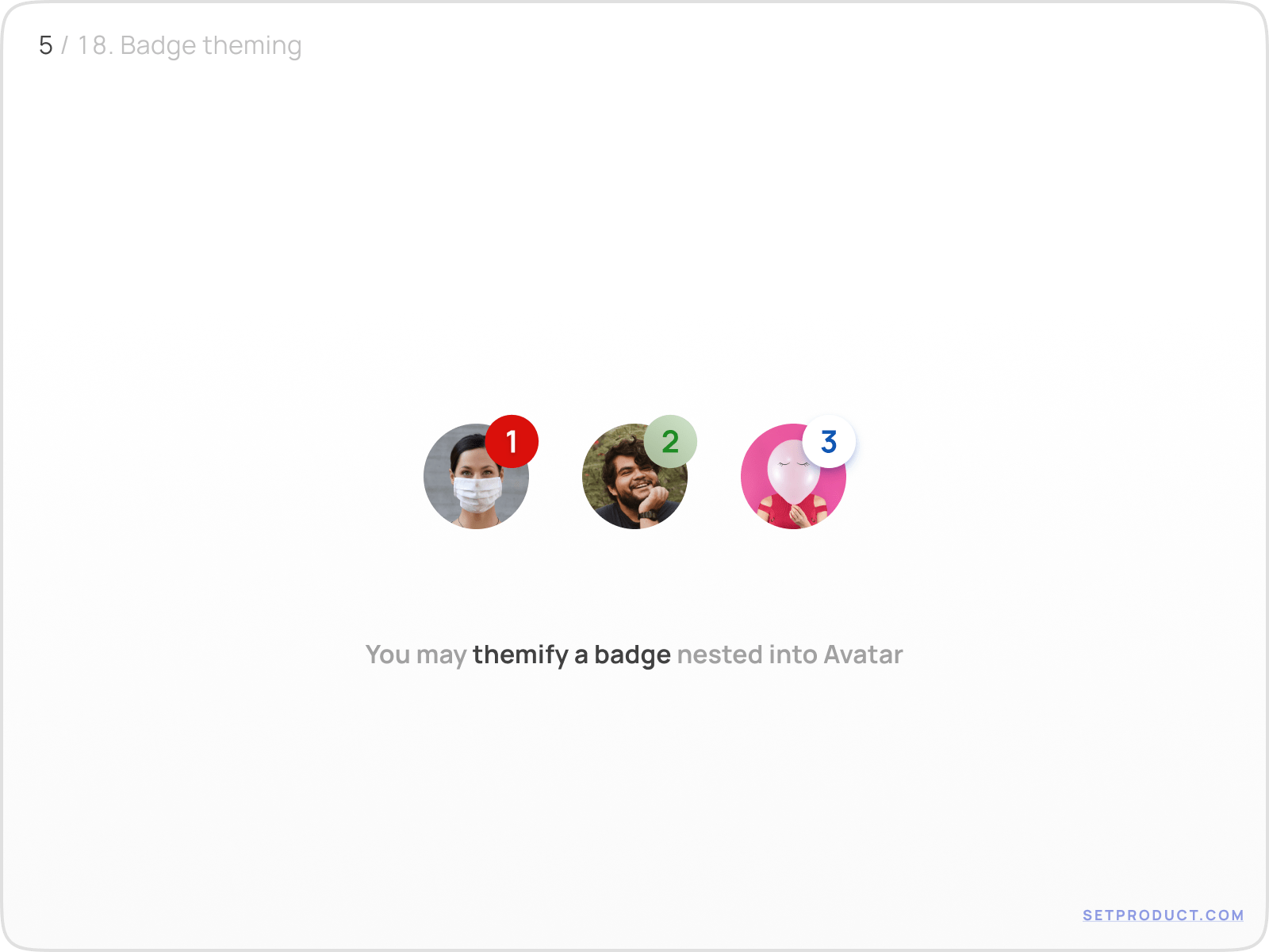
Notification badges

Avatar's badges could be stylized according to a priority to catch the user's attention.

  • Use solid and bright colors for high priority to notify
  • Use smooth or light background for other cases
Avatar UI design exploration

{{spacer-24}}

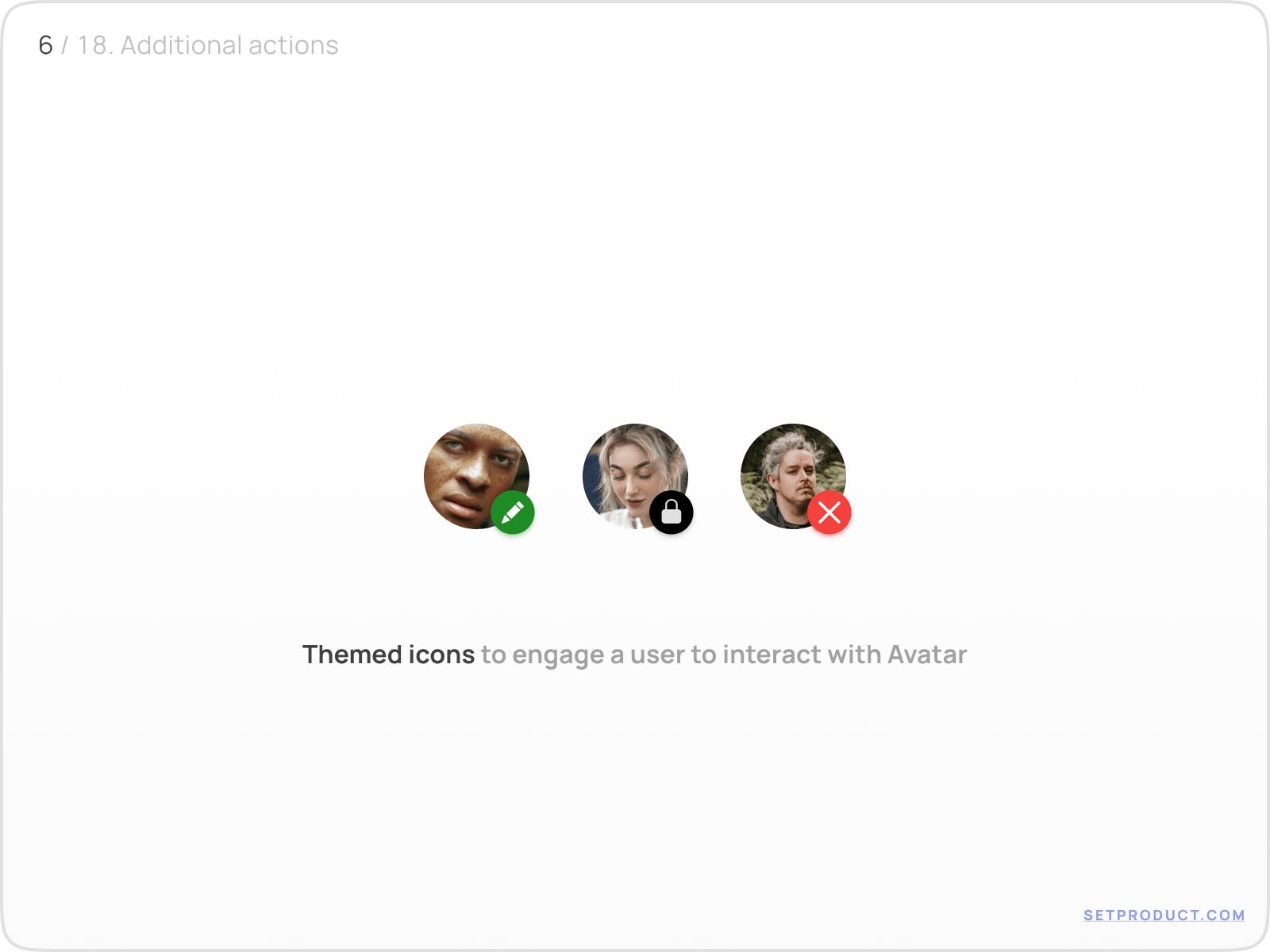
Call to action

Use side-nested icons / rounded buttons to clarify upcoming action when Avatar is clicked.

  • Swap the icon according to a result the user is about to expect
  • Apply the colors wisely to intense the meaning of the action
Avatar UI design exploration

{{spacer-64}}

Text & Captions

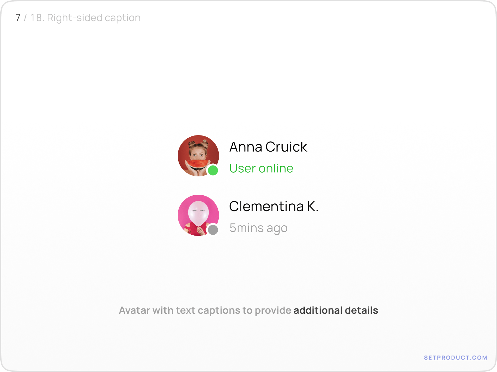
Avatar with sided text

In order to provide additional details, Avatar may be used with supportive titles. Mostly used in lists, application bars, tables, etc.

  • The larger caption to specify the persona's name
  • The subtitle is optional for additional info (e.g. status, last visit, role, followers amount, etc.)
Avatar UI design exploration

{{spacer-24}}

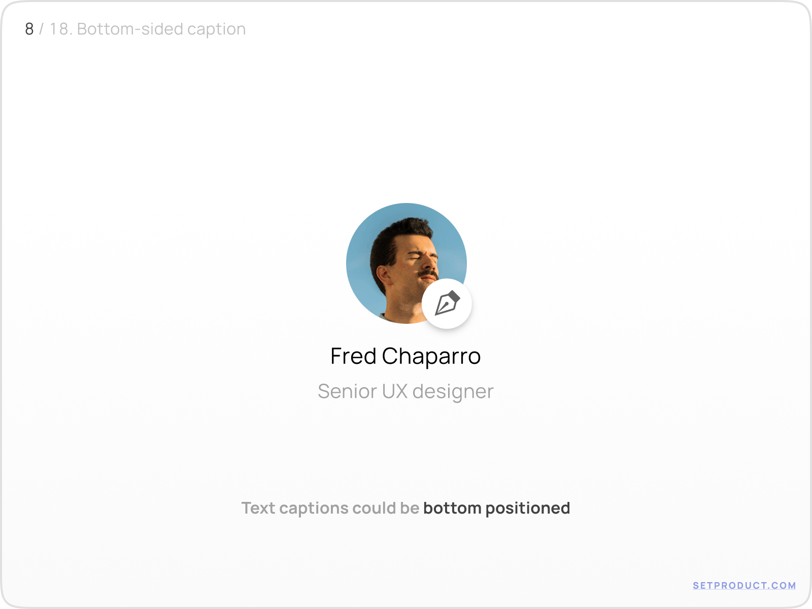
Avatar with bottom text

In templates, you may apply a larger Avatar with bottom-placed text. Mostly used in-app sections, like Profile, Settings, Social.

Avatar UI design exploration

{{spacer-64}}

UX & Usability

Events

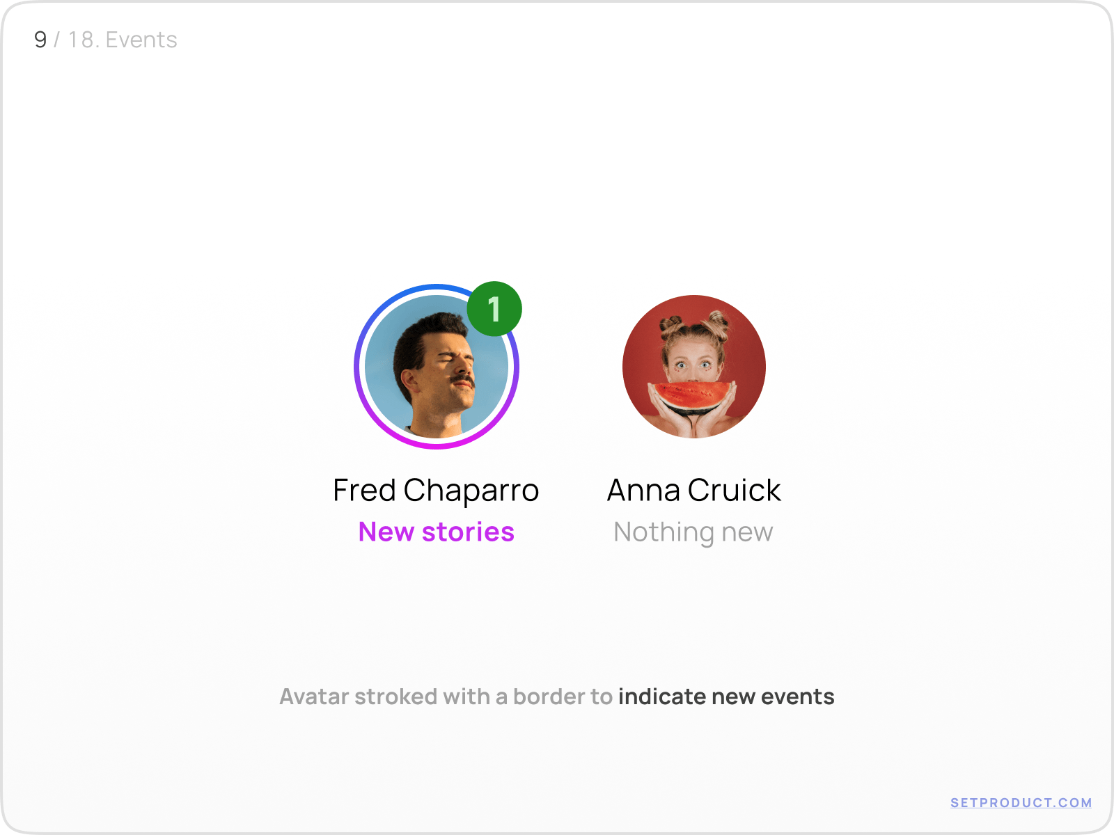
You may additionally indicate new user's events by adding a slightly distanced outline border around Avatar. The combination with badged counter is a strong engaging solution.

Avatar UI design exploration

{{spacer-24}}

Progress

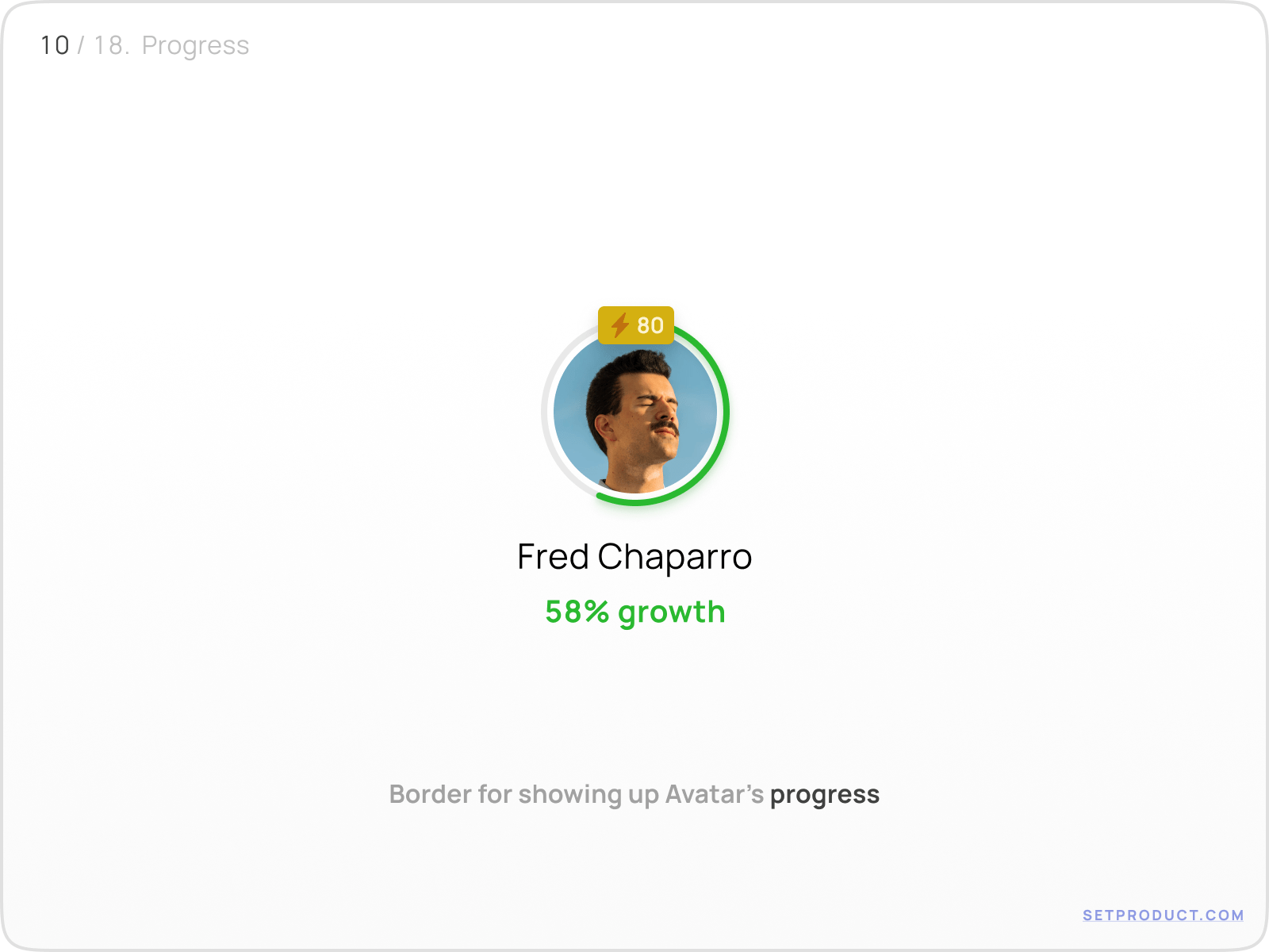
There is an extra case for applying the stroke as a progress bar to represent Avatar's achievements ergonomically.

Avatar UI design exploration

{{spacer-24}}

Selection

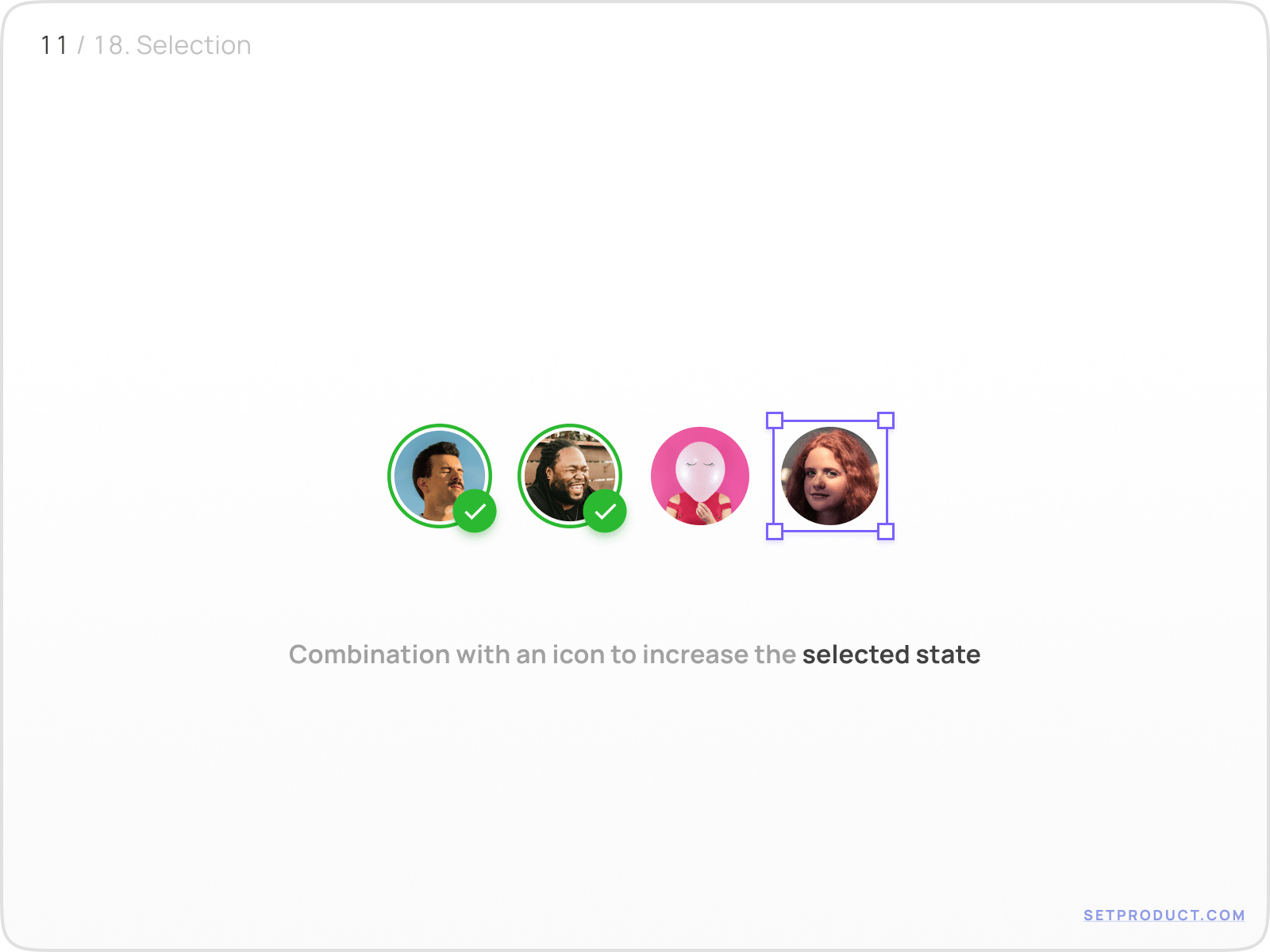
The combination of stroke with confirming icon is solid user feedback of the selected state.

Avatar UI design exploration

{{spacer-16}}

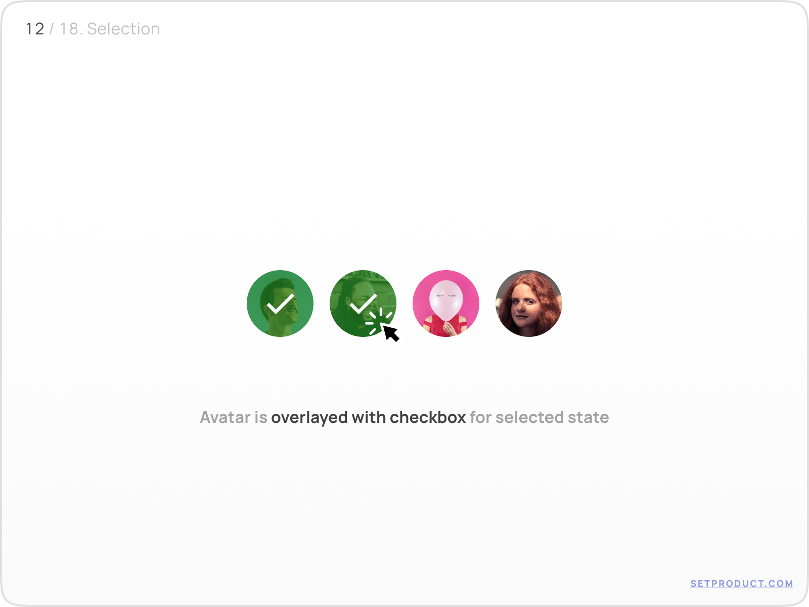
The classic variant of selected state performed:

Avatar UI design exploration

{{spacer-64}}

Avatar group

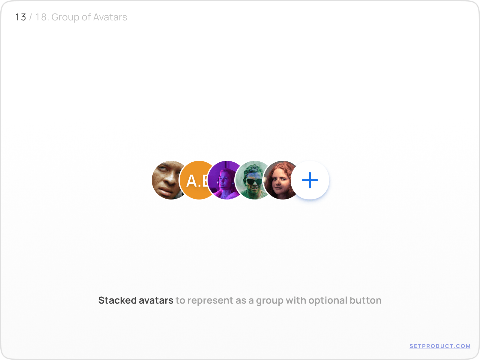
Nested Button

When Avatars are stacked into a group, the call to action button could be used in case of user's action is required.

e.g. "Plus" button leads to the flow related to interaction with a group of Avatars — Adding, Sorting, Editing, etc.

Avatar UI design exploration

{{spacer-24}}

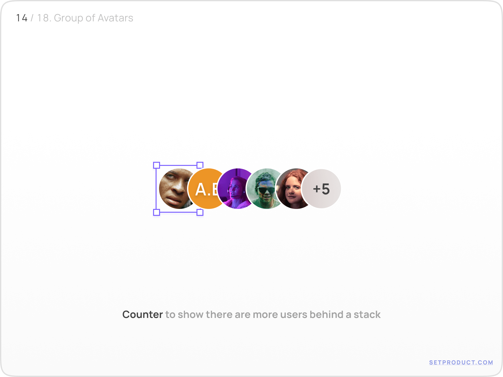
Nested Badge

Use a numeric badge to represent how many users are left behind the stack.

Avatar UI design exploration

{{spacer-24}}

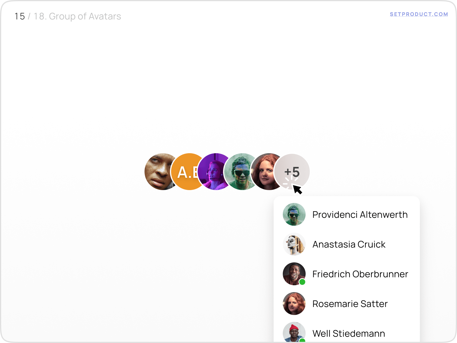
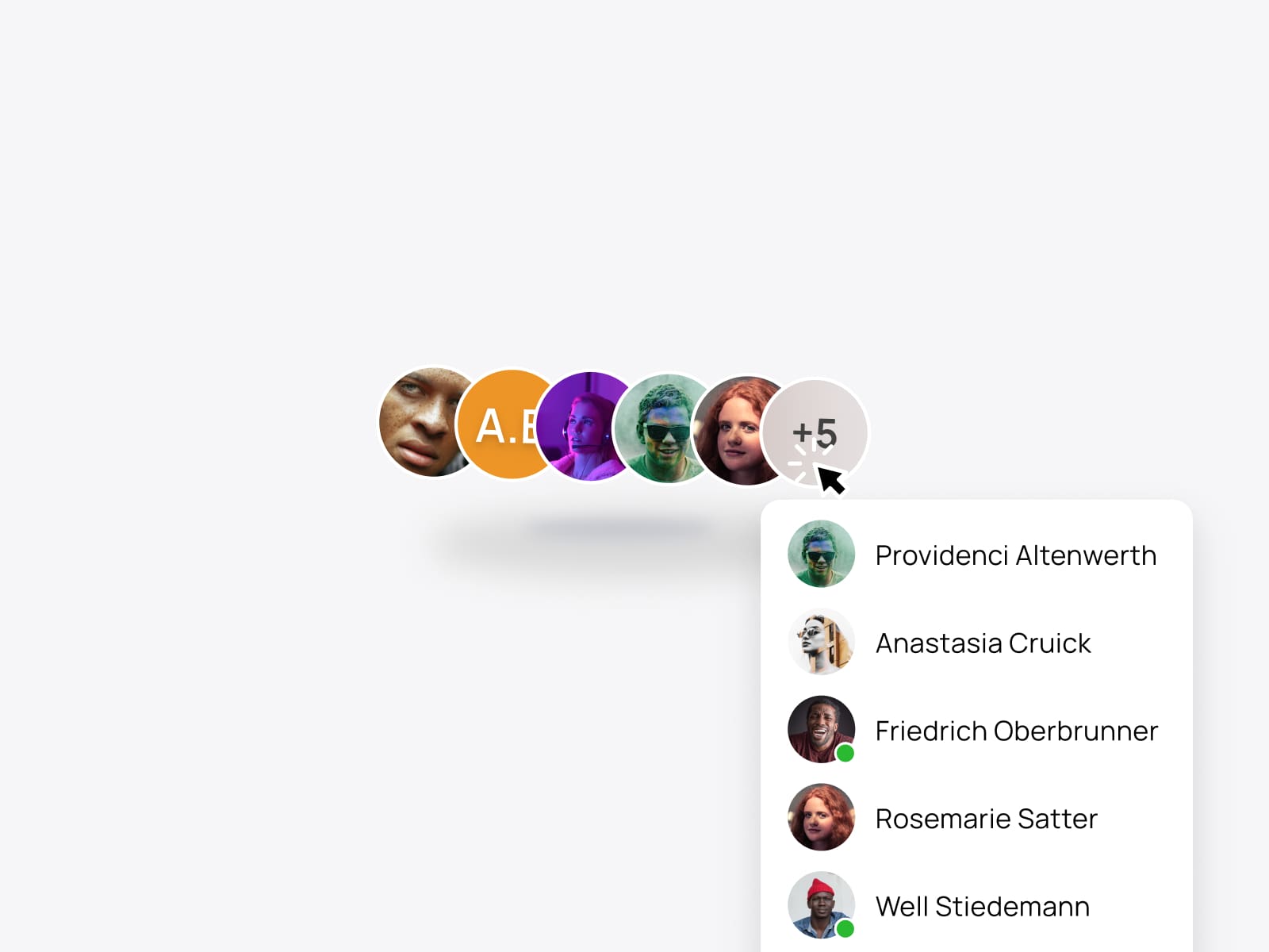
Onhovered Badge

The frequent pattern for a badge when onhovered is to expand users' details.

Avatar UI design exploration

{{spacer-24}}

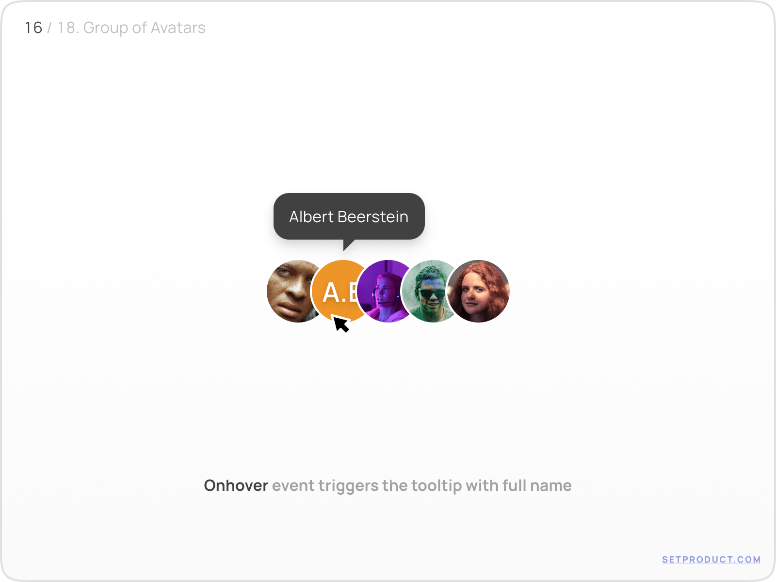
Onhovered Avatar

In a stack, you can show up the a full name using tooltip, when each userpic is onhovered.

Avatar UI design exploration

{{spacer-24}}

Templates

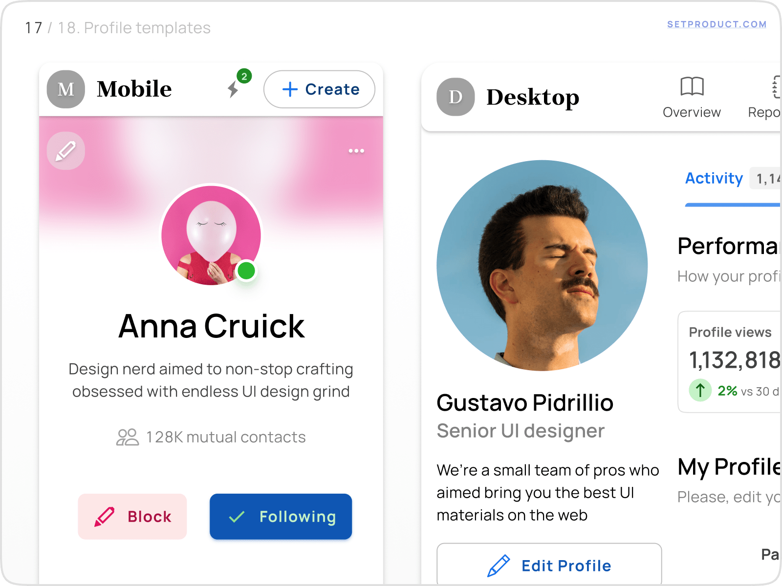
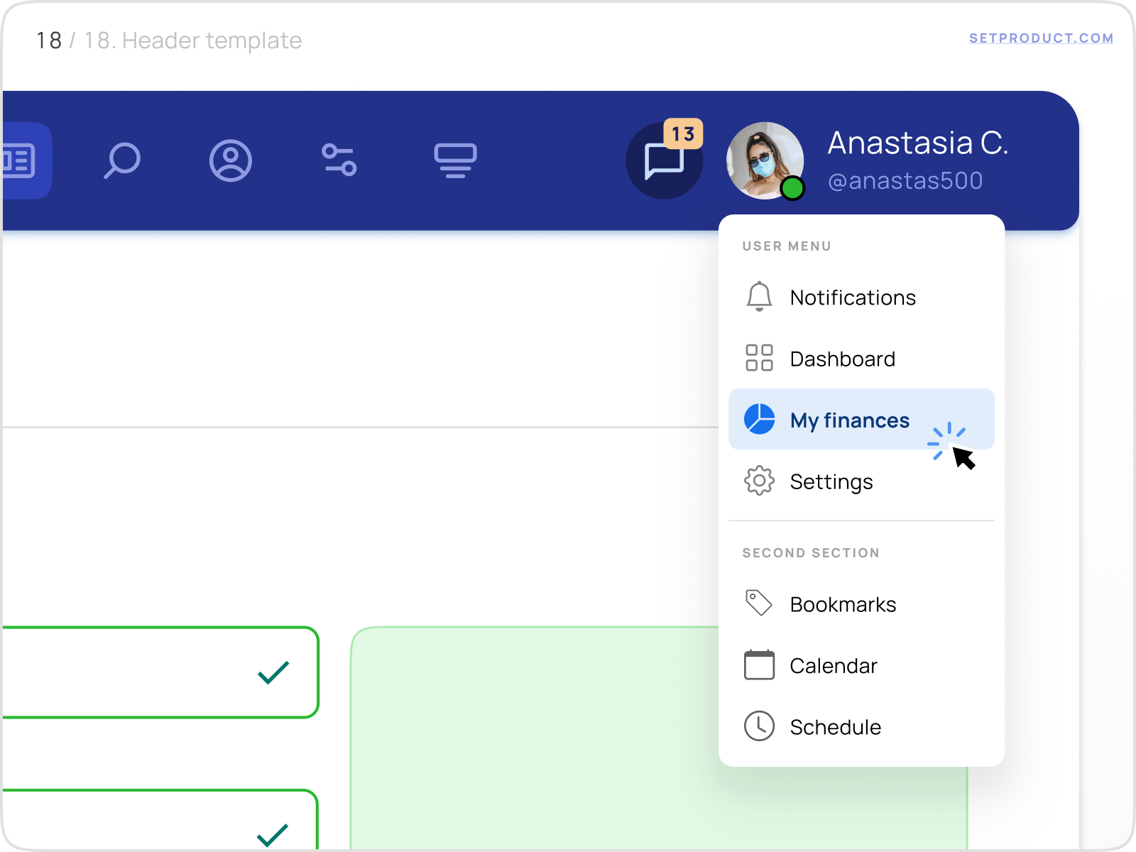
The most common use cases for Avatar is nesting into the Application Bar, or use a larger version in the Profile / Settings section, in order to be able to utilize edits for the user's picture.

Avatar UI design exploration

{{spacer-24}}

{{stars-conclusion}}

{{spacer-24}}

This is all you need to know to design better Avatars.

Hope my research will help you to improve your in-app UX. The next chapter is for the Accordions, probably. Stay tuned!

Share this post

Subscribe to Setproduct

Once per week we send a newsletter with new releases, freebies and blog publications
Oops! Something went wrong while submitting the form.

By clicking Sign Up you're confirming that you agree with our Terms and Conditions.

Congratulations!

You're in! Expect awesome updates in your inbox

FAQs

Lorem ipsum dolor sit amet, consectetur adipiscing elit. Suspendisse varius enim in eros elementum tristique.
No items found.

Our Dashboard Templates Will Make It A Treat To View Data

Experience the magic of data visualization with our user-friendly dashboard templates. Try out our dashboards now and enjoy efficient reporting processes, greater transparency in, among others monitoring and making educated decisions easily.

Material X for Figma

Figma library with 1100+ components & 40 app templates beyond Material Design. Powered by top-notch shapes and Manrope font. Customizable & Adjustable UI kit now available for Angular & Figma

Material You UI kit

Figma & React library with 2600+ variants of 32 components compatible with Material Design 3. Plus 220+ dashboard templates for all the viewports. Now available for NextJS & TailwindCSS.

Figma React UI kit

Designed and well-organized in Figma React-based UI toolkit for the web. Optimized for building complex data-dense interfaces for desktop and mobile applications.

Panda Design System

Figma library with dashboard, calendar, kanban, profile, table, ecommerce and 80+ templates in total. Components with variants, dark theme included.

Eclipse UI kit

Figma library with 1100+ components & 74 templates for data-driven web applications. Powered by auto-layout. Supercharged by Figma's variants.

Rome UI kit for Figma

Customizable and well-organized team library. Contains 250+ components & 30 web app templates powered by stylish and trendy guidelines.

Material Design System

Figma library is based on 100% guidelines compliance with Material.io. Contains ready‑to-use templates to accelerate app UI design.

Neolex Dashboard UI kit

Customizable & adjustable dashboard design system with 50+ ready-to-use app layouts, 1900+ variants for 30 components with auto-layout.

Material Desktop Dashboard UI kit

Figma library with 48+ dashboard templates based on reusable desktop app patterns carefully handpicked from the most popular web apps.

Xela UI kit for Figma

Figma library with 1900+ variants of 30 components categories to craft perfectly shaped desktop & mobile apps. Customizable & Adjustable dashboard design system with 50+ web app templates.

Figma S8 Design System

Figma design library for mobile and desktop apps made of high quality styled components. Full version includes 67 dashboard templates.

OE Figma Design System

Customizable and well-organized Figma library. This design system aimed to build highly loaded interfaces, boost the speed and save more costs.

Related posts

Lorem ipsum dolor sit amet, consectetur adipiscing elit.

Tutorials

10 min read

Carousel UI design best practices

Design accessible slider galleries, usable, and beautiful. Read our detailed guide on Carousel UI Design and learn how to design carousels that engage users.

Tutorials

5 mins read

Checkbox UI design – Unlocking anatomy, proven UX tips, and inspiring use cases

Get practical solutions for Checkbox design dilemmas, from styling complexity to inclusive user experience, in this dedicated tutorial.

Tutorials

6 mins read

Input UI Design – Optimize data forms UX with expertly crafted text fields

Learn how to design and optimize Input components for improved forms filling experience and UI. Our in-depth guide will help you create seamless and user-friendly designs.

Figma Templates & UI kits

Save time and human resources by reusing hundreds of pre-made templates crafted by us. Based on top notch UX taken from the World's best apps.

Material X for Figma

Figma library with 1100+ components & 40 app templates beyond Material Design. Powered by top-notch shapes and Manrope font. Customizable & Adjustable UI kit now available for Angular & Figma

Material You UI kit

Figma & React library with 2600+ variants of 32 components compatible with Material Design 3. Plus 220+ dashboard templates for all the viewports. Now available for NextJS & TailwindCSS.

Figma React UI kit

Designed and well-organized in Figma React-based UI toolkit for the web. Optimized for building complex data-dense interfaces for desktop and mobile applications.

Panda Design System

Figma library with dashboard, calendar, kanban, profile, table, ecommerce and 80+ templates in total. Components with variants, dark theme included.

Eclipse UI kit

Figma library with 1100+ components & 74 templates for data-driven web applications. Powered by auto-layout. Supercharged by Figma's variants.

Rome UI kit for Figma

Customizable and well-organized team library. Contains 250+ components & 30 web app templates powered by stylish and trendy guidelines.

Material Design System

Figma library is based on 100% guidelines compliance with Material.io. Contains ready‑to-use templates to accelerate app UI design.

Neolex Dashboard UI kit

Customizable & adjustable dashboard design system with 50+ ready-to-use app layouts, 1900+ variants for 30 components with auto-layout.

Material Desktop Dashboard UI kit

Figma library with 48+ dashboard templates based on reusable desktop app patterns carefully handpicked from the most popular web apps.

Xela UI kit for Figma

Figma library with 1900+ variants of 30 components categories to craft perfectly shaped desktop & mobile apps. Customizable & Adjustable dashboard design system with 50+ web app templates.

Figma S8 Design System

Figma design library for mobile and desktop apps made of high quality styled components. Full version includes 67 dashboard templates.

OE Figma Design System

Customizable and well-organized Figma library. This design system aimed to build highly loaded interfaces, boost the speed and save more costs.

Figma iOS kit

Figma library of iOS patterns served as ready-made templates. This UI kit inspired by World's best apps. Based on Human Interface guidelines.

Figma S8 Design System

Figma design library for mobile and desktop apps made of high quality styled components. Full version includes 67 dashboard templates.

Most iOS UI kit for Figma

iOS native components and app templates organized into a «Most Design System» fully compatible with Apple's Human Interface guidelines.

Rome UI kit for Figma

Customizable and well-organized team library. Contains 250+ components & 30 web app templates powered by stylish and trendy guidelines.

Material Design System

Figma library is based on 100% guidelines compliance with Material.io. Contains ready‑to-use templates to accelerate app UI design.

Nucleus UI

Nucleus UI contains 1000 components and variants with 500+ mobile screens designed for Figma (including 9 themes from Event, E-commerce, Finance, NFT, etc.).

Figma Android UI kit

Components-driven Android mobile UI library for Figma. Consists of 140 high quality application templates made of total 250+ UI components.

Mobile X UI kit

Customizable & adjustable iOS / Android design system loaded with ready-made 157 app templates based on 860+ variants for 20 components.

Appka iOS UI kit

Customizable & adjustable iOS design system with 4100+ variants for 28 components and 280+ ready-to-use app layouts crafted for Figma.

Full iOS UI kit

Customizable iOS design system with 320 ready-to-use app layouts. You can modify them or use as it is to save time and never design from scratch again.

Xela for Flutter

XelaUI for Flutter is a simple, modular and accessible component library that gives you the building Flutter apps for mobile and desktop.

Xela for Android

Ready-made collection of fully customizable widgets, UI screens and reusable components for Android coded with Jetpack Compose.

Xela for Swift

Designed for iOS Developers. We provide fully coded customizable components, widgets and well-organized iOS screens for Figma & SwiftUI.

Material You UI kit

Figma & React library with 2600+ variants of 32 components compatible with Material Design 3. Plus 220+ dashboard templates for all the viewports. Now available for NextJS & TailwindCSS.

Figma Charts UI kit

Components-driven graphs design kit for dashboards, presentations, infographics & data visualisation. Includes 25+ charts types for all the viewports.

Hyper Charts

Create impressive visuals with Figma's graphs templates – dozens of scalable and customizable data visualization blocks for dark and light modes.

Orion UI kit

Figma library with 40+ full-width charts templates served in light & dark themes. Contains 200+ of dataviz widgets that look perfect on desktop & mobile screens.

Xela for React

React based components library for beautiful user interface in React apps. Lightweight library for your projects. Contains pre-made web app templates.

Figma React UI kit

Designed and well-organized in Figma React-based UI toolkit for the web. Optimized for building complex data-dense interfaces for desktop and mobile applications.

Material X for Figma

Figma library with 1100+ components & 40 app templates beyond Material Design. Powered by top-notch shapes and Manrope font. Customizable & Adjustable UI kit now available for Angular & Figma

Xela for Flutter

XelaUI for Flutter is a simple, modular and accessible component library that gives you the building Flutter apps for mobile and desktop.

Xela for Android

Ready-made collection of fully customizable widgets, UI screens and reusable components for Android coded with Jetpack Compose.

Xela for Swift

Designed for iOS Developers. We provide fully coded customizable components, widgets and well-organized iOS screens for Figma & SwiftUI.

Material You UI kit

Figma & React library with 2600+ variants of 32 components compatible with Material Design 3. Plus 220+ dashboard templates for all the viewports. Now available for NextJS & TailwindCSS.

Xela for React

React based components library for beautiful user interface in React apps. Lightweight library for your projects. Contains pre-made web app templates.

Levitate 3D kit for Figma

Components-driven 3D kit to design eye-catching Figma presentations. Helps to enhance your landing page, product or app, brand ident, etc.

Website templates UI kit

Landing pages reusable templates kit based on most effective web design patterns. 140+ dark & light constrained design blocks.

Figma Landing Pages UI kit

Landing pages templates library based on constrained & organized components aimed to speed-up the production of effective websites.

Zeus UI kit

Create hassle-free landing pages in Figma. This kit is based on 10 landing page templates, powered by 1600+ variants for 630+ web blocks.

This is some text inside of a div block.