

Roman Kamushken
That is a 20% application-to-interview rate and an 18% interview-to-offer rate. In design job-hunting communities, people commonly report application-to-interview rates in the low single digits through 2025 and 2026. A 20% rate is several times that.
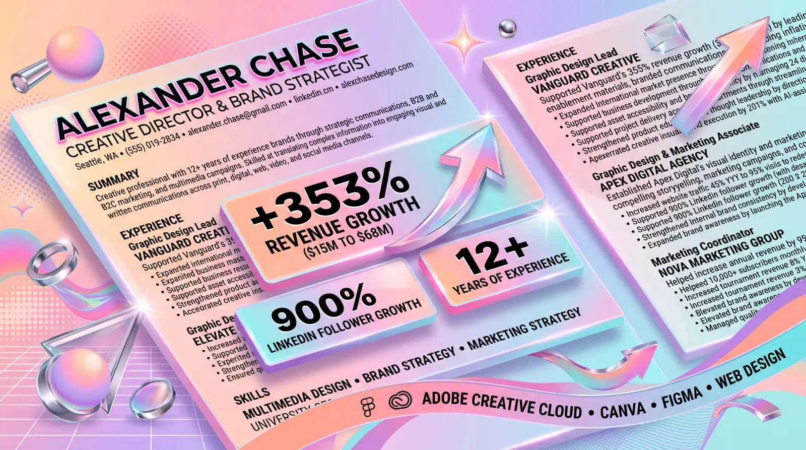
The resume behind those numbers belongs to a senior designer with 13 years of experience who shared their resume and results on Reddit. It is deliberately plain: one column of black text on one page, built in Apple Pages. Below, I take this designer resume example apart section by section, as a hiring manager would.
Who actually reads a designer's resume first
At an in-house company, the first person who reads your resume is almost never a designer.
The typical pipeline has four gates. A recruiter or coordinator screens the stack. The applicant tracking system (ATS, the software that stores applications and parses them into fields) turns your file into searchable text. A hiring manager reads the shortlist, and only after that does a creative lead open your portfolio.
The software gate is near universal. In a Jobscan survey of 384 recruiters, 99.7% said they use an ATS to filter candidates.
The Reddit author saw this firsthand. Every one of their 22 first-round interviews was with a recruiter or screener, and several screeners said outright that design skills would be evaluated in later rounds. For in-house roles, non-designers read the resume first.
Recruiters check title match and results, fast. Ladders' eye-tracking study of recruiters found an initial scan takes 7.4 seconds, and simple layouts with clear headings held attention better than busy ones.
A resume tuned for the first two gates wins more interviews than one tuned for the fourth. I made the companion argument in why you should not design your resume in Figma.
The one-page anatomy
It is one page in a single column, black text on white, with one accent color used only on the four section headers: SUMMARY, EXPERIENCE, SKILLS, EDUCATION.
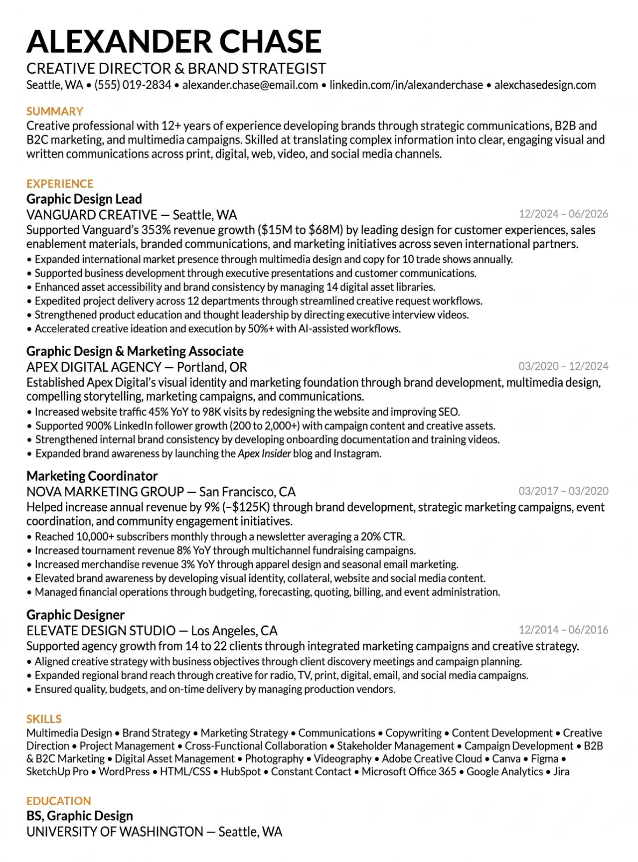
The whole page on one sheet, with the name and companies changed. Education last, the 2016-2017 gap visible, no sidebar.
There is no photo, sidebar, icon or skill bar. Each choice has a job.
→ Single column. ATS parsers read top to bottom. A two-column layout can get read across rows, so a job title on the left merges with a skill on the right. Jobscan's guide to ATS formatting mistakes flags columns and tables as a common cause of scrambled parsing.
→ Contact details under the name. Jobscan lists header and footer placement as a common reason contact details go missing after parsing.
→ One accent color, on headers only. Color marks the section breaks and nothing else. It survives a grayscale print and a conversion to plain text.
→ A visible gap. Mid-2016 to early 2017 is simply left as it is. An honest gap draws less attention than a vague date range trying to hide it.
→ Education last. After 12 years, a degree is a checkbox, so it sits at the bottom in two short lines.
The author reports that the file imports into application forms with no manual fixes, which is the cheapest ATS test you can run. An earlier version posted for critique got contradictory advice, so they changed almost nothing: contact info moved under the name, and the font and accent color changed. That was the right call. Most resume advice is taste, and when ten reviewers disagree, keep what parses and stop polishing.
The summary in two sentences and one positioning
The first sentence claims "12+ years of experience developing brands through strategic communications" across B2B and B2C marketing and multimedia campaigns. The second claims skill at "translating complex information into clear, engaging visual and written communications" across every channel a company uses. Ladders' study found that top-performing resumes opened with an overview statement, which is exactly what this is.
The word "creative" appears once, as a label, and the sentence moves straight to brand and marketing work. This reads as a design and marketing hybrid who can own a channel end to end.
"Translating complex information into clear communications" is a business-value claim. It names a problem every company has and says this person fixes it. The usual summary about loving bold typography describes a personality and gives a screener nothing to match against the job description.
The headline line under every role
Every role opens with one sentence that states its biggest business outcome, before any bullets. Here are the three strongest.
→ Lead role: "Supported 353% revenue growth ($15M to $68M) by leading design for customer experiences, sales enablement materials, branded communications, and marketing initiatives across seven international partners."
→ Marketing coordinator: "Helped increase annual revenue by 9% (~$125K) through brand development, strategic marketing campaigns, event coordination, and community engagement initiatives."
→ Agency designer: "Supported agency growth from 14 to 22 clients through integrated marketing campaigns and creative strategy."
A screener who reads only the first line of each role still walks away with three numbers and a sense of scope. The same Ladders study found recruiters spend more time on job titles than on any other element, and bold titles followed by bulleted accomplishments held attention best.
Now look at the verbs, "Supported" and "Helped." Revenue growth of 353% has many parents, and the author does not pretend otherwise. A designer claiming "Drove $53M in revenue" would trigger instant skepticism in any sales-led company. Modest attribution reads as honest, and honesty lets a big number survive the first read.
The bullet formula, outcome first and method second
Every bullet on the page follows the same structure.
| Part | What it does | Example |
|---|---|---|
| Past-tense verb | Signals finished, owned work | Increased |
| Measurable outcome | The number a screener remembers | website traffic 45% YoY to 98K visits |
| by / through / with | The hinge between result and method | by |
| What you did | Your method, in plain words | redesigning the website and improving SEO |
Here are four bullets, taken apart.
→ "Increased website traffic 45% YoY to 98K visits by redesigning the website and improving SEO." The growth rate comes with the absolute scale. A 45% gain on 500 visits means little, and the 98K anchor closes that question.
→ "Supported 900% LinkedIn follower growth (200 to 2,000+) with campaign content and creative assets." The raw count in parentheses keeps the percentage honest.
→ "Reached 10,000+ subscribers monthly through a newsletter averaging a 20% CTR." Reach is paired with click-through rate (CTR), the part a designer actually controls.
→ "Enhanced asset accessibility and brand consistency by managing 14 digital asset libraries." There is no revenue here, so the number measures scope.
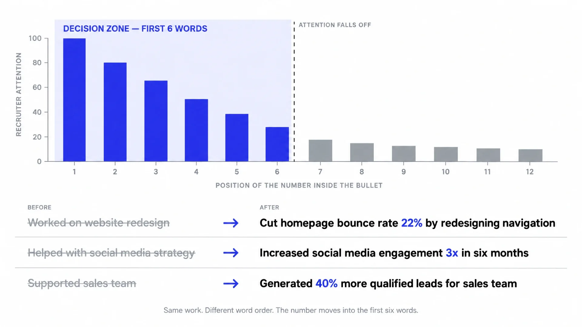
Why outcome first? A screener reads left to right and may stop after six words. Put the number inside those six words.
Every verb is past tense, including in the current role, because each line describes something already done. The phrase "responsible for" appears nowhere, because it describes a job description instead of a result.
One more bullet: "Accelerated creative ideation and execution by 50%+ with AI-assisted workflows." In 2026 almost every interviewer asks whether you use AI. This line answers it in advance, with a number attached.
Why the small numbers matter as much as the big ones
Next to 353% and 900%, the same resume lists a 3% merchandise revenue gain and 8% tournament revenue growth. Many designers would cut those lines. They are some of the most useful on the page.
Small numbers make big numbers believable. A resume where every metric is a triple-digit percentage reads like it was written by someone who rounds up. A mix of 3%, 8%, 45% and 353% reads like a log kept by someone who actually tracks results, .
Hiring managers who have run budgets know a 3% lift on merchandise is hard-won. Listing it shows you know it too.
Skills as a keyword bank instead of a trophy shelf
The skills section is one flat line of keywords with no ratings or groupings. Strategic skills like Brand Strategy, Stakeholder Management and Cross-Functional Collaboration sit in the same line as the tools.
The tool list is where most designers flinch. Next to Adobe Creative Cloud and Figma sit Canva, SketchUp Pro, WordPress, HTML/CSS, HubSpot, Constant Contact, Microsoft Office 365, Google Analytics and Jira.
Designers hide these tools because they feel unglamorous. For in-house roles, that is a mistake. Job descriptions often name HubSpot or Jira because that is where the marketing team lives, and the ATS matches those words literally.
Canva matters too, since in-house you will build templates that non-designers edit there. Treat the line as a keyword bank and mirror the tools named in each job description, as long as you have actually used them.
How to get metrics when you're "just the designer"
The most upvoted reply in the thread asked what many readers are thinking. A designer with 14 years in the TV industry explained that at a large media company, the design department sat apart from marketing. Requests went through producers or project managers, and even direct asks for data returned nothing more specific than broad audience demographics.
That problem is real, and the author's answer explains a lot. A marketing coordinator role taught them to track numbers, and they kept a running log of results at every job after that. In the lead role they worked close to the sales cycle, which is where the revenue figure came from. Being the sole creative who also ran the website and social accounts gave them direct access to analytics.
So the metrics came from a habit plus a position close to the money. You can build both.
❶ Start a results log today. A plain note with the date, the project and any number you hear in a meeting. Nobody remembers a CTR two years later.
❷ Ask the owner for the one number your work touched. Every deliverable has an owner in marketing or sales. Ask one specific question, such as how the landing page converted in its first month.
❸ Request view access to the dashboards. Google Analytics and the native social platforms both support read-only roles.
❹ Capture before and after. Whenever you redesign something, write down the old numbers first.
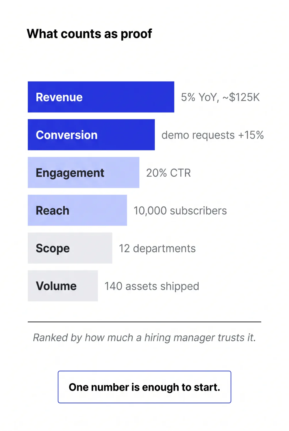
❺ Record proxies when revenue is out of reach. Open rate, CTR, leads from an event, assets shipped and departments served all count. The resume above uses "12 departments" for exactly this reason.
☞ Access is often a question of asking once. When you choose your next role, favor teams close to sales or growth, because numbers flow toward whoever sits near the money.
The honest objection that these metrics are partly fiction
A designer with 15 years across in-house and agency work pushed back hard. In their view, the vast majority of creatives cannot attribute metrics to their work, and numbers like these are partly fiction because creative impact cannot be isolated from everything else that moves a result. They also admitted that if they ran a marketing team and saw these numbers, they would be drawn in.
Both halves of that comment are correct. A designer cannot claim that a website redesign alone produced 45% more traffic, since SEO work and seasonality played a part too.
The resume handles this well. It never claims sole credit: the big numbers sit behind "Supported" and "Helped," and the method is stated right next to the outcome. Probing those claims is the hiring manager's job, in the interview. The resume's job is to earn that interview.
So be ready. For every number on your page, prepare a two-sentence answer about what you personally did and who else contributed. If you cannot explain a metric under questioning, take it off.
The 10-minute tailoring workflow
The author kept two base versions of the resume, one leaning toward design and one toward marketing. For each application, they gave a language model the base document and the job description and asked it to tailor the wording. They spent no more than 10 minutes per application.
That is how 110 applications fit into two and a half months. The time went into the portfolio and interview practice. If your portfolio needs work, start with advice from people on the hiring side.
A few rules keep the workflow safe.
→ Tell the model to rephrase and reorder only, and to keep every number exactly as written.
→ Reject any skill the model adds that you cannot defend in an interview.
→ After tailoring, paste the file into an application form or a plain-text editor and check that it still reads cleanly from top to bottom.
Models round 45% up to "nearly 50%" and slip Python into a skills list. One invented line is enough to sink a strong interview.
Rewrite your own bullets with three before/after pairs
Here are three typical designer bullets rewritten with the formula. The numbers are illustrative examples, so replace them with results from your own log.
| Before | After (example numbers) |
|---|---|
| Designed social media graphics | Raised Instagram engagement rate to 3.1% (up from 1.8%) in six months by redesigning post templates and launching a weekly carousel series |
| Worked on website redesign | Cut homepage bounce rate 22% and lifted demo requests 15% QoQ by redesigning the site navigation and pricing page |
| Created sales decks | Supported $1.2M in closed enterprise deals by designing a modular sales deck system used by 9 account executives |
Each rewrite makes the same two moves. The number goes to the front, and the method shrinks to the few words that make the number credible.
The third example uses "Supported" on purpose. A deck does not close a deal by itself, and an honest verb protects you in the interview.
No numbers yet? Use proxies: "Shipped 140 assets for 6 product launches" beats "Created marketing materials."
Conclusion
This resume won by being readable to a screener and parseable by software. It also carries a dense set of honest, outcome-first numbers. The plain layout freed time for the portfolio and interview practice, where design skill is actually judged.
Your next step is small. Open a note today, call it "results log," and write down one number from your current job. In six months, that file will write half your resume. These UX career mistakes and lessons show what drifting without a record costs.
☞ More on surviving the 2026 design job market: Navigating the job market storm and What gets designers to $300K.
FAQ
Should a graphic designer's resume be designed or plain?
For in-house roles, plain wins. Recruiters and ATS software read your resume before any designer does, and single-column layouts with clear headings parse and scan best. Use one accent color at most and skip photos and skill bars. Show your design skill in the portfolio, which is where creative leads judge it in later rounds.
How do you quantify design work on a resume?
Use a simple formula: a past-tense verb, a measurable outcome, then "by" or "through" plus what you did. Example: "Increased website traffic 45% YoY to 98K visits by redesigning the website." Pull numbers from analytics dashboards and from the marketing or sales owner of each project. When revenue is out of reach, use proxies like CTR or assets shipped.
What if I have no access to metrics at my company?
Ask for them directly: request read-only access to Google Analytics or the social dashboards, and ask the project owner for the one number your deliverable touched. Capture before-and-after figures whenever you redesign something. If that fails, record scope instead, such as assets shipped or teams supported. Keep a running results log so the numbers exist when you need them.
Should designers include tools like Canva or Jira on a resume?
Yes, for in-house roles. Job descriptions for in-house design jobs often name HubSpot, Jira or Canva because that is where marketing teams work, and ATS software matches keywords literally. List the tools you have actually used in one flat line next to your strategic skills. Leave out anything you could not discuss in an interview.
How long should a senior designer's resume be?
One page works for most senior designers, even with 12 or more years of experience. The resume in this teardown fits four roles and a summary on one page. Two pages are acceptable for very experienced candidates if page one carries the strongest material, since recruiters only continue when page one earns it. Keep three to six bullets per role and let the portfolio carry the rest.
Is it okay to use ChatGPT to tailor a resume?
Yes, if you control the output. Give the model a base resume and the job description, and tell it to rephrase and reorder without changing any numbers. Check every line afterward, because models round metrics up and add skills you do not have. Then confirm the file still pastes cleanly into an application form, which keeps the whole job to about ten minutes.
What interview rate should I expect as a designer in 2026?
Designers in job-hunting communities commonly report application-to-interview rates in the low single digits in 2025 and 2026. The resume in this article reached 20% across 110 applications, mostly in-house, which is unusually high. Your rate depends on role fit and on how closely the resume matches each job description. Track your own funnel and change one variable at a time.