


Roman Kamushken
I have shipped forms for checkout flows, multi-step KYC, account settings, onboarding wizards, and a Figma plugin that nobody asked to be complicated. The forms that worked were never the ones with the prettiest inputs. They were the ones where every field used the control that matched the answer, validated at the right moment, and stayed out of the way. This reference is the field guide I wish I had handed to every junior designer before they reached for a dropdown to ask a yes-or-no question.
What is a form control
A form control is any interactive element whose job is to capture a single piece of structured input and hand it to your application in a known shape. A text field returns a string. A checkbox returns a boolean. A date picker returns a date. That contract is the whole point, and it is what separates a real control from decorative UI.
Three things make a control more than just an input box:
- It is a contract on the shape of the data. A number input promises a number, not free text that happens to contain digits. When the control matches the data shape, validation gets simpler and downstream code gets safer.
- It carries a full set of states. Idle, focus, filled, disabled, read-only, loading, error, and success are not optional decorations. A control that only renders idle and filled feels broken the first time something goes wrong.
- It owns an accessibility contract. A label, a name, a role, keyboard operability, and a target size large enough to hit. Skip these and the control works for some users and quietly fails others.
Designers who copy the wrong control end up with forms that technically collect data but fight the user at every field. The fix is almost never visual polish. It is choosing a control whose contract fits the answer.
Control, field, and pattern
These three words get used interchangeably and that sloppiness causes real confusion in design reviews, so I keep them strictly separate.
A control is the bare widget: the checkbox, the select, the slider. A field is the control plus everything around it that makes it usable: label, required indicator, helper text, and error message. A pattern is a composition of fields into a flow: a sign-up form, a checkout, a settings page. Most of this reference is about controls and fields. The last third is about patterns, because the right control in the wrong pattern still produces a bad form.
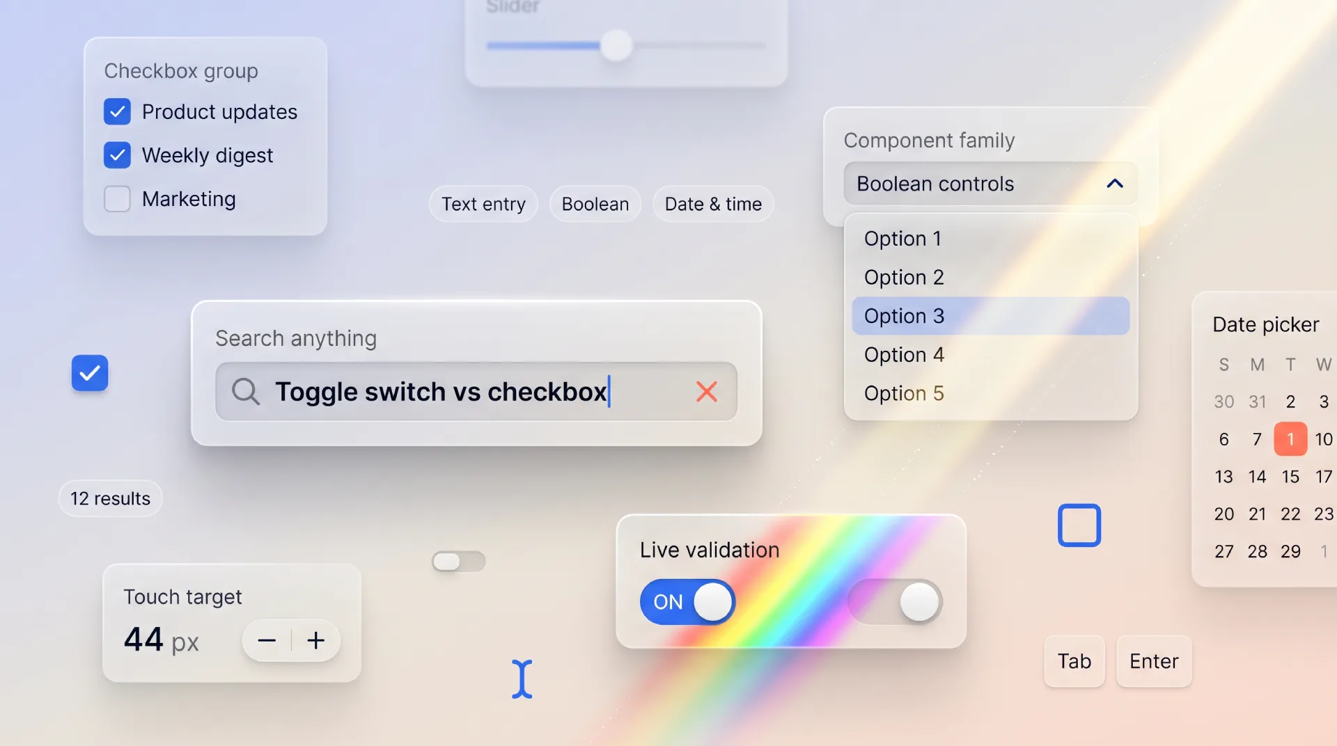
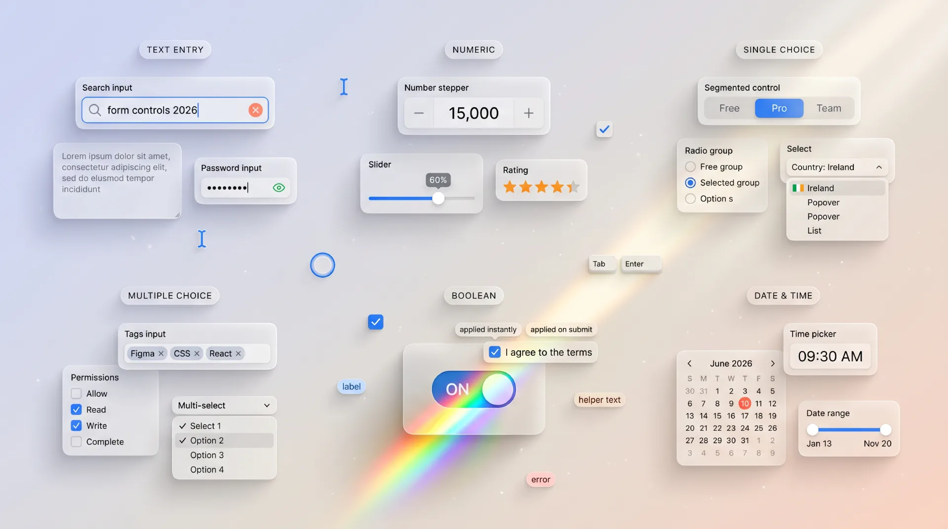
A taxonomy of form controls
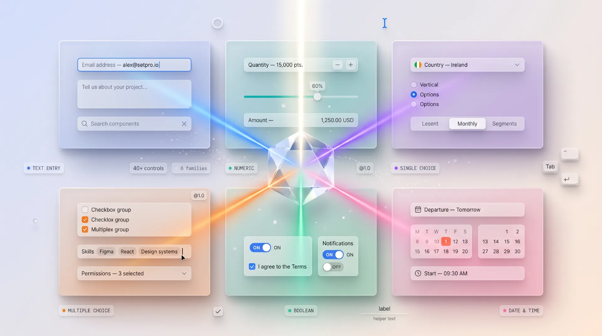
Strip away the styling and every form control fits into one of six families, sorted by the shape of the answer it returns. Memorize the families, not the forty widgets. Once you think in families, picking a control becomes a question of data shape rather than fashion.
| Family | Collects | Common controls | Data shape | Typical wrong choice |
|---|---|---|---|---|
| Text entry | Free or formatted text | Input, textarea, search, email, password, OTP, phone | String | Using a plain text input for a one-time code instead of a segmented OTP field |
| Numeric | A number or magnitude | Number input, stepper, slider, rating | Number | Free text where a number with inputmode belongs |
| Single choice | One option from a set | Radio group, select, dropdown, segmented control | One value | Dropdown hiding two options that should be radios |
| Multiple choice | Several options from a set | Checkbox group, multiselect, tags input, chips | Array of values | Multiple toggles where a checkbox group reads cleaner |
| Boolean | On or off, yes or no | Checkbox, toggle switch | Boolean | Toggle that needs a separate Save to apply |
| Date and time | A point or range in time | Date picker, calendar, time picker, range | Date or range | Three separate selects for day, month, year |
☛ The family is decided by the shape of the answer, never by how the control looks. A segmented control and a select can both collect single choice. The visual difference is secondary. The shared data shape is what tells you they are interchangeable and the option count tells you which one to ship.
Which control for which input
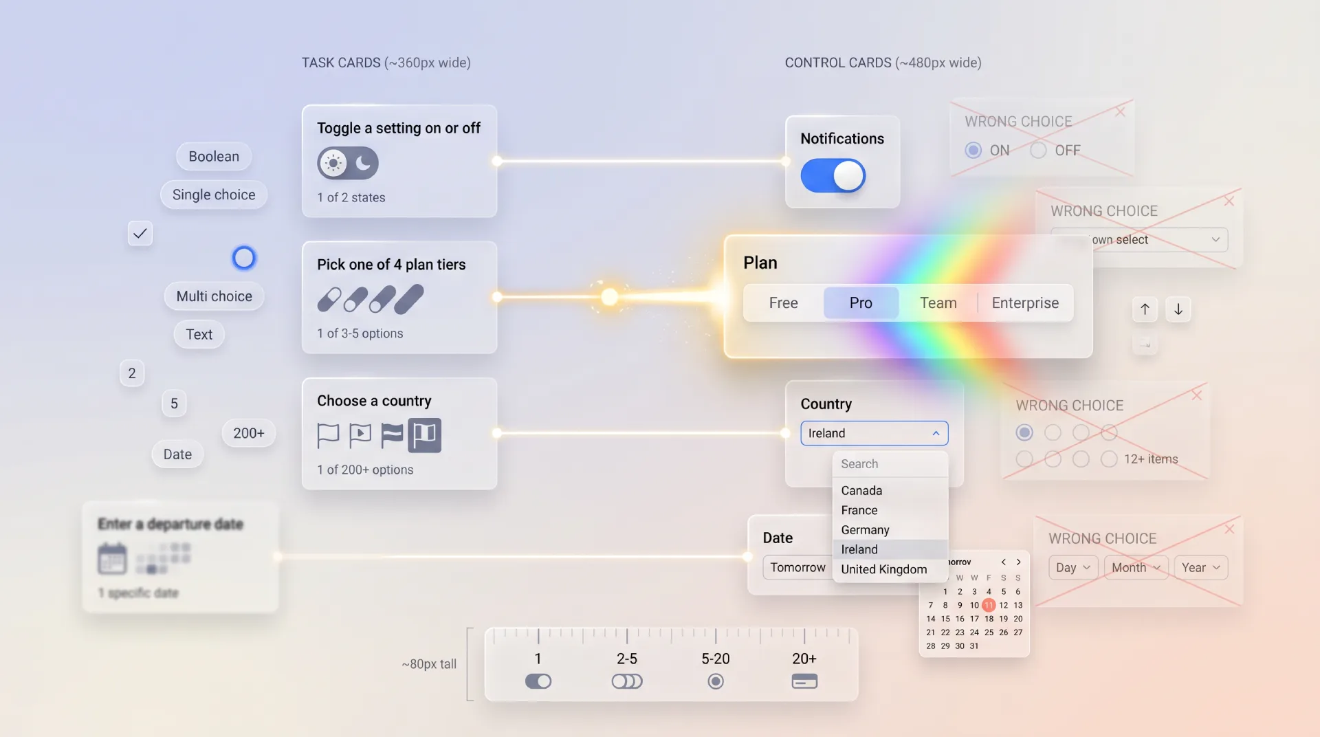
This is the table I run through before placing any field. Find the user need on the left, reach for the control in the middle, and check yourself against the wrong choice on the right. It is the fastest way to stop defaulting to a dropdown for everything.
| User needs to | Best control | Why | Common wrong choice |
|---|---|---|---|
| Pick one of 2 to 5 visible options | Radio group or segmented control | All options stay visible, one tap to choose | Dropdown that hides the options behind a click |
| Pick one of 6 or more options | Select or dropdown | Long lists overwhelm as radios | Radio list 20 items tall |
| Search and pick from a long list | Combobox with autocomplete | Typing narrows hundreds of options fast | Plain select with endless scroll |
| Turn a setting on or off instantly | Toggle switch | Applies immediately, no Save needed | Checkbox that requires a submit |
| Agree to terms before submit | Checkbox | Consent belongs to the form, applied on submit | Toggle that implies instant effect |
| Pick several from a set | Checkbox group or multiselect | Multiple values, all reviewable | A pile of toggles |
| Enter free-form labels or keywords | Tags input | Tokens are addable and removable | Comma-separated text in one input |
| Set a number within a known range | Slider | Direct manipulation, shows tradeoff | Number field for "volume 0 to 100" |
| Enter an exact number | Number input or stepper | Precision matters, keyboard friendly | Slider for "quantity 1 to 999" |
| Enter a short verification code | OTP input | Segmented boxes, paste, auto-advance | Single text input for a 6 digit code |
| Pick a date | Date picker | Calendar grid prevents invalid dates | Free text "DD/MM/YYYY" |
| Pick a known date far in the past | Native date input or year-first picker | Birthdays need fast year jumps | Clicking back 400 months |
| Upload a file | File upload with drag and drop | Clear target, progress, validation | Hidden file input with no feedback |
| Rate something 1 to 5 | Rating input | Compact, scannable | Five separate radios styled as stars |
☞ When fewer than six options exist and they matter to the decision, show them all with radios or a segmented control. Hiding five important options inside a dropdown saves a few pixels and costs the user a click plus the memory load of options they can no longer see.
Anatomy of a form control
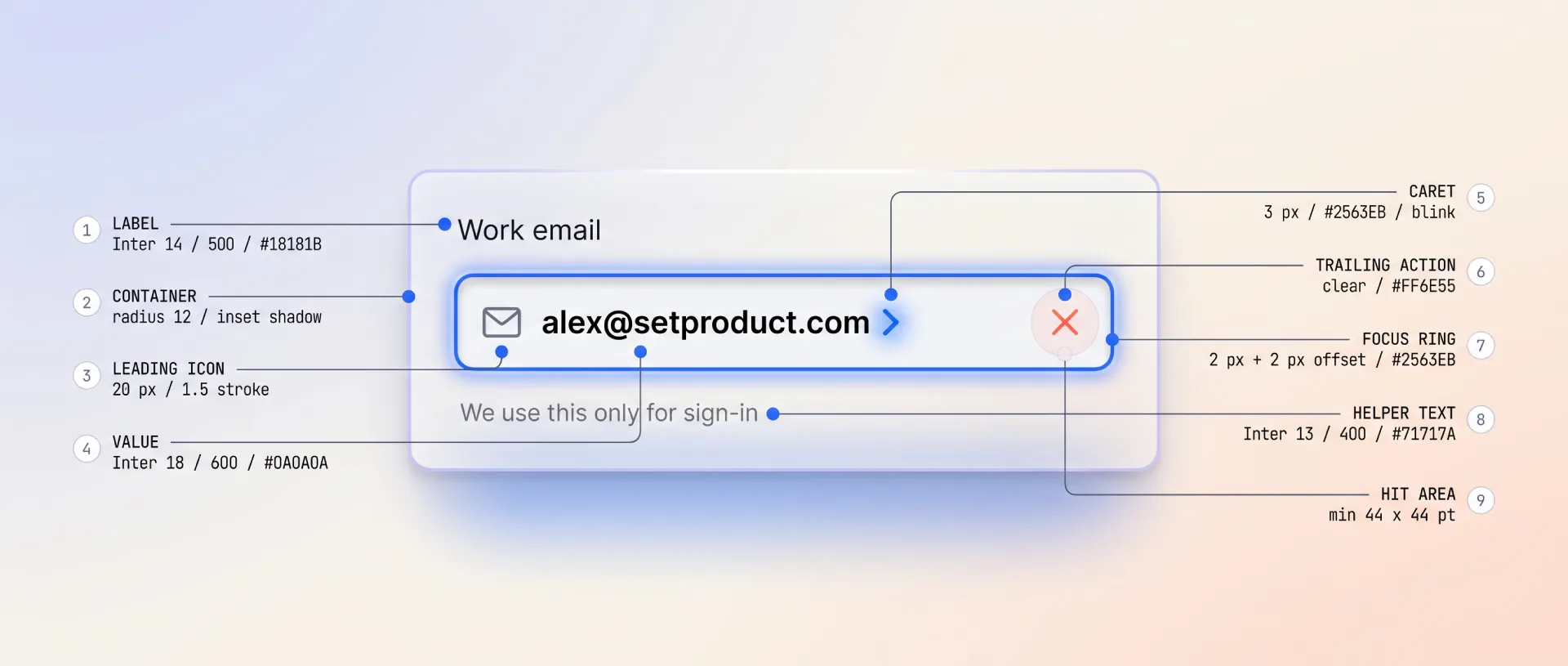
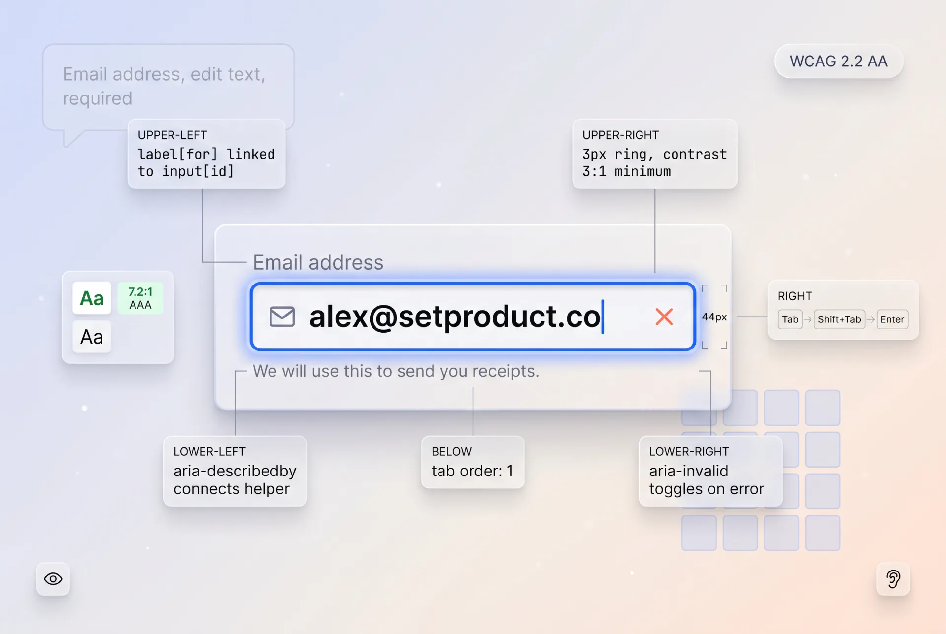
Every well-built field, no matter which control sits at its center, is assembled from the same parts. When a field feels confusing, one of these nine is usually missing or out of place. I check them in order on every design review.
❶ Label. The visible name of the field, always present, always tied to the control with for or aria-labelledby. Placeholder text is not a label. The moment a user types, a placeholder vanishes and so does the only hint about what the field wanted.
❷ Required or optional indicator. Mark whichever state is rarer in your form. If most fields are required, mark the optional ones with the word "optional". An asterisk alone is ambiguous, so pair it with a legend or skip it for explicit text.
❸ The control itself. The input, select, checkbox, or slider. This is the part designers obsess over and it matters least once the label and states are right.
❹ Placeholder versus default value. A placeholder is a disposable example that disappears on input. A default value is real data the field submits if untouched. Confusing the two ships forms that submit example text as if it were real.
❺ Helper text. A short line under the control that sets expectations before the user acts: format, constraints, or why you ask. Helper text prevents errors. Error text only reacts to them.
❻ Error message. Specific, adjacent to the field, and tied with aria-describedby. "Invalid input" is not an error message. "Enter a date in the future" is.
❼ Success or status feedback. For fields that validate asynchronously, like a username availability check, a clear success state closes the loop so the user stops worrying about it.
❽ Count and limit affordances. Character counters, remaining-item counts, and max-length hints belong inside the field, visible before the limit bites, never as a surprise on submit.
❾ Focus ring and target size. A visible focus indicator for keyboard users and a hit area of at least 24 by 24 CSS pixels, ideally 44 by 44 on touch. The prettiest field is useless if a thumb cannot land on it.
Building these nine parts consistently across forty controls is exactly where a system pays off. The React UI Kit ships every field with label, helper, error, and focus states already wired, so you compose fields instead of rebuilding anatomy from scratch on each project.
States every control must handle
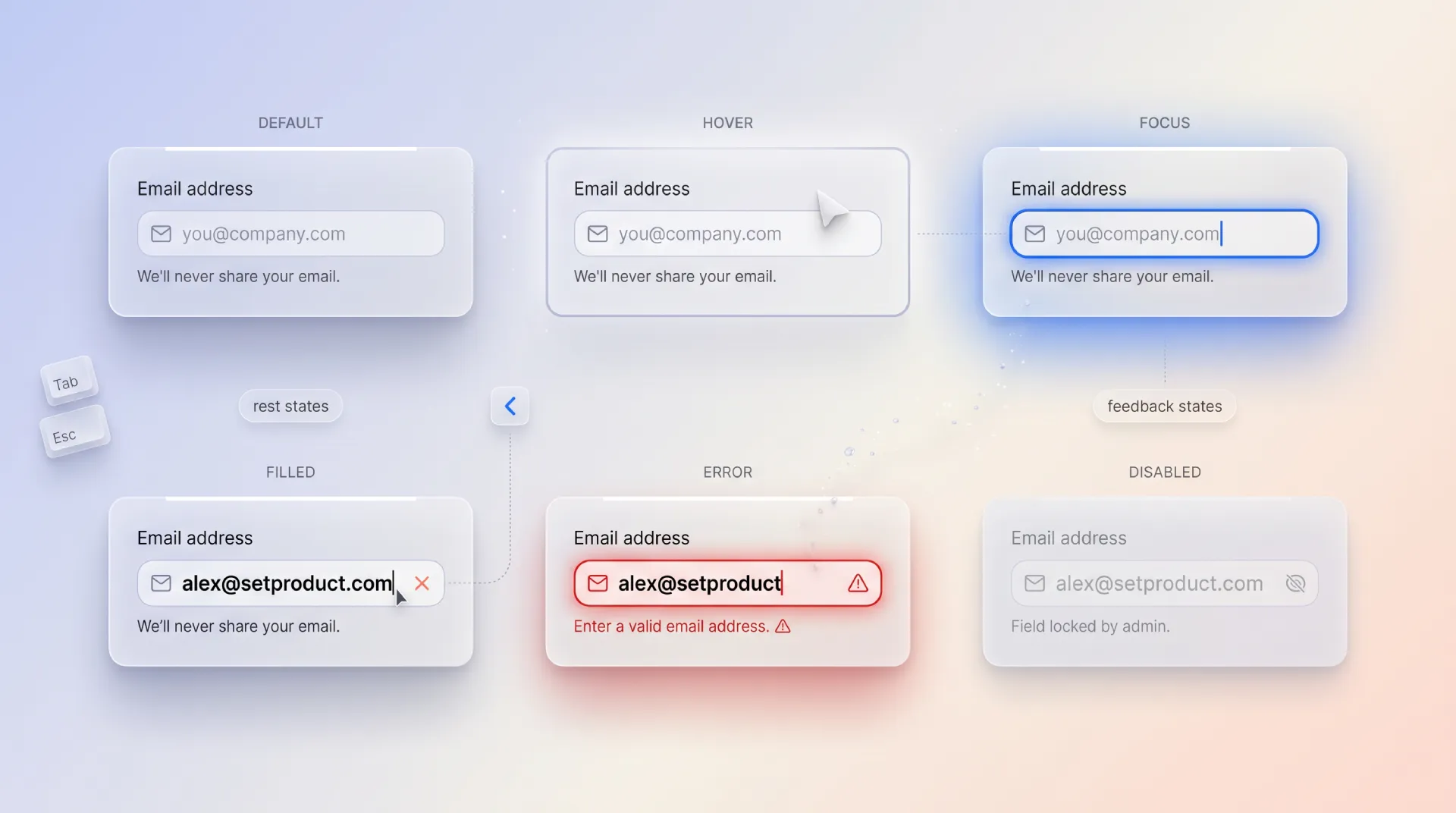
A control that renders only idle and filled is a prototype, not a product. The state set is where forms earn trust, because users spend most of their time in the messy states between empty and done. Here is every state a serious control has to handle.
Idle and hover
Idle is the resting state: visible border, readable label, enough contrast that the field reads as interactive without shouting. Hover gives a subtle cursor and border shift on pointer devices, and is purely a nicety since it never appears on touch. Never encode meaning in hover alone.
Focus
Focus is the most under-designed state and the one keyboard and screen-reader users live in. It needs a visible ring that meets contrast against both the field and the page, not a faint glow that vanishes on a busy background. Removing the focus outline without replacing it is an accessibility failure, full stop.
Filled and read-only
Filled holds real user data and must stay legible, with the label still visible rather than collapsed into a vanished placeholder. Read-only shows a value the user cannot edit here but can still select and copy, which is different from disabled. Use read-only for data shown for reference, like an account number.
Disabled
Disabled signals "not available right now". It should look muted, skip the tab order, and ideally explain why nearby, because a disabled submit button with no reason is the most frustrating dead end in forms. Never disable a button silently while validation fails off-screen.
Loading
Loading covers async work: a field checking a username, a select fetching options, a form submitting. Show progress in or next to the affected control, keep the layout stable so nothing jumps, and prevent double submits without freezing the whole screen.
Error and success
Error pairs a clear message with a visible treatment that does not rely on color alone, since red borders are invisible to many users. Pair color with an icon and text. Success confirms a value passed, most useful for async checks where the user would otherwise wonder if it worked.
☞ Color is never the only signal. Every error and success state needs a second channel, an icon, text, or a shape change, so the roughly one in twelve men with color vision deficiency get the same information as everyone else.
The control families up close
Now the families in detail, with the controls that live inside each one and the calls that trip people up. This is the longest section because it is the one you will come back to.
Text entry
The workhorse family. Most fields a user ever touches are text entry, which is exactly why getting the variations right pays off so widely. The base control is the text input, and almost every other text control is that input with a constraint or an affordance bolted on.
Use a single-line input for short, bounded text like a name or a city. Switch to a textarea the moment the expected answer runs past one line, and let it grow rather than trapping a paragraph behind a tiny scrollbar. For email, set type="email" and inputmode="email" so mobile keyboards show the right keys. For passwords, give a visibility toggle and stop blocking paste, because blocking paste only punishes password managers and the careful users who run them.
Two text controls deserve their own treatment and are missing from most kits. A one-time code field should be a segmented OTP input with auto-advance and full paste support, not a six-character text box. A phone field benefits from a country selector and inputmode="tel", formatting as the user types rather than scolding them afterward. When the answer is a keyword set rather than a sentence, reach for a tags input so each token is addable and removable on its own.
Numeric
Numeric controls collect a magnitude, and the choice between them comes down to precision versus range. A slider shines when the exact number matters less than the tradeoff, like a price ceiling or a volume level, because direct manipulation shows the range at a glance. A number input or a stepper wins when precision matters, like a quantity or an age, where typing 47 beats dragging to it. A rating input is numeric in disguise: five stars is just the integers one through five with a friendlier coat.
The reliable mistake here is a slider for a value that needs to be exact, or a free text input where a number with inputmode="numeric" belongs and would summon the right keypad.
Single choice
One answer from a set, and the only real variable is how many options exist. Two to five visible options that matter to the decision call for a radio group or a segmented control, so every choice stays on screen. Six or more, or options the user already knows by name, call for a select or dropdown that keeps the form compact. Hundreds of options, like a country, demand a combobox with autocomplete so typing narrows the list instead of an endless scroll.
The classic error is burying three or four meaningful options inside a dropdown. If the options drive the decision, show them.
Multiple choice
Several answers from a set. A checkbox group is the honest default when every option should be visible and reviewable at once. A multiselect or a chips input compresses many selections into a tidy space when the list is long and selections are sparse. The mistake is a row of toggle switches standing in for what is plainly a checkbox group, which reads as several independent settings rather than one multi-pick question.
Boolean
On or off, and the single question that decides the control is whether the change applies instantly. A toggle switch means immediate effect with no Save, the way a phone settings screen behaves. A checkbox means the value is collected and applied when the form submits, the way "I agree to the terms" works. Swapping these two is the most common boolean bug: a toggle that secretly needs a Save button betrays the instant-effect promise users have learned everywhere else.
Build forms on Material Design without the grind. Material X gives you 1100+ Figma components covering every control family, with inputs, selects, toggles, and date pickers already styled for Material You. Explore Material X →
Date and time
The family that hides the most edge cases. A date picker with a calendar grid prevents the invalid dates that free text invites, but the right variant depends on the date. A near-future date like an appointment suits a forward-looking calendar. A birthday needs fast year navigation, so a year-first picker or a native date input beats clicking back through four hundred months. Ranges, like a hotel stay, want a calendar that shows both ends and the span between them in one view. The evergreen mistake is three separate selects for day, month, and year, which guarantees someone picks February 31.
Form-level patterns
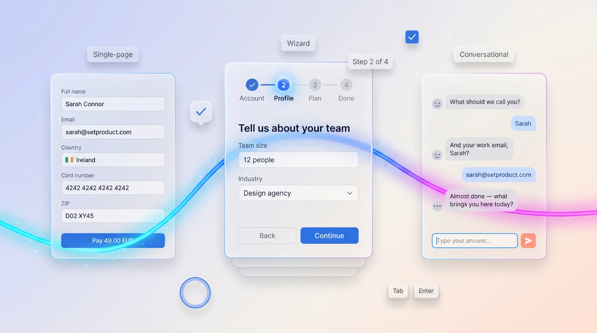
The right control in the wrong pattern still produces a bad form. Once the individual fields are sound, the composition decides whether the whole thing feels light or heavy. There are three patterns worth naming, and the choice between them is driven by length and stakes.
| Pattern | When it fits | Strengths | Watch out for |
|---|---|---|---|
| Single-page form | Short, low-stakes, under 8 fields | Everything visible, fast to scan and submit | Becomes a wall of fields past a dozen inputs |
| Multi-step wizard | Long or high-stakes flows like KYC and checkout | Chunks effort, shows progress, validates per step | Hiding required context, no way back, lost progress on refresh |
| Conversational form | Onboarding, surveys, lead capture | One question at a time, feels low-pressure | Slow for users who know the answers, weak for dense data |
A single page is the default until the field count or the stakes push you elsewhere. When you do split a form into steps, treat each step as its own validated unit and make a clear steps indicator so the user always knows where they are and how much remains. Save progress so a refresh does not wipe twenty minutes of typing.
Two adjacent patterns deserve a mention because they carry form controls without being forms in the classic sense. A settings page is a form where most controls apply instantly, which is exactly why toggles dominate it and a global Save button would feel wrong. A dialog often hosts a small focused form, and the discipline there is to keep it to the few fields the task truly needs, since a modal is the worst place to trap a long form.
Conversational forms, the Typeform style of one question per screen, have earned their place for onboarding and surveys where a gentle pace lifts completion. They are a poor fit for dense, expert data entry where a power user wants every field at once. Match the pattern to the user, not to the trend.
Validation strategies
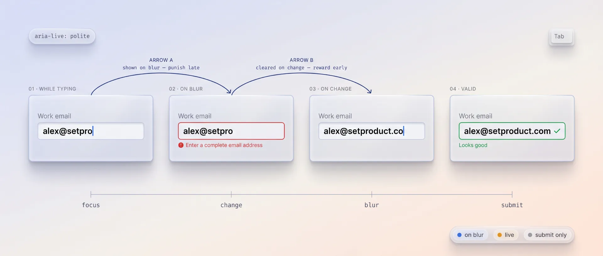
Validation is where forms most often turn hostile, and almost always because of timing rather than rules. The rule is simple to state and easy to get wrong: validate at the moment that helps the user, not the moment that is easiest to code.
The timing that works in practice is a blend. Validate format on blur, after the user leaves a field, so you are not screaming about an incomplete email while they are still typing it. Validate a field that previously errored on every keystroke, so the error clears the instant they fix it rather than making them tab away to find out. Always run a final validation on submit as the backstop. The pattern has a name worth knowing, reward early and punish late: confirm success eagerly, flag failure patiently.
Three rules keep error messages humane. Put the message next to the field, not in a summary box at the top that forces a scroll hunt. Say what to do, not just what went wrong, so "enter a date in the future" instead of "invalid". Never rely on color alone, because a red border is silent to a screen reader and invisible to many users.
On the implementation side, schema-first validation has become the default for good reason: one schema validates on the client for fast feedback and on the server for safety, with no duplicated rules drifting apart. A typical shape looks like this.
import { z } from "zod";

const signupSchema = z.object({
  email: z.string().email("Enter a valid email address"),
  password: z.string().min(8, "Use at least 8 characters"),
  age: z.number().int().min(18, "You must be 18 or older"),
  terms: z.literal(true, {
    errorMap: () => ({ message: "Please accept the terms to continue" }),
  }),
});
The same schema runs in the browser for instant feedback and on the server before anything touches the database. The error strings live with the rules, so the message a user reads is the message you maintain, in one place.
Form libraries and tools for developers
Designers do not have to write this code, but knowing what the engineering side reaches for makes every handoff smoother. The form stack in 2026 splits into three jobs: managing state, validating data, and rendering accessible controls. Pick one tool from each and most of the hard problems disappear.
State management
This is the layer that tracks values, touched fields, and submission. React Hook Form is the default in the React world, uncontrolled by design so it stays fast on large forms and re-renders little. TanStack Form is the newer, fully type-safe and framework-agnostic option that runs across React, Vue, Solid, and others. Formik is the mature predecessor, still in countless codebases, though most new projects start elsewhere now.
Validation
The schema layer that both the form and the server share. Zod is the TypeScript-first standard with a huge ecosystem. Valibot is the lighter, modular alternative that ships less bundle weight by importing only the validators you use. Yup remains common in older Formik setups. All three plug into the state libraries above through small resolver adapters, so the schema example earlier in this guide works with any of them.
Accessible controls
The hard part of any control is the keyboard and screen-reader behavior, and these libraries solve it once so you do not relearn the ARIA combobox spec on every project. Radix Primitives, React Aria from Adobe, Headless UI, and Ariakit all give you unstyled, accessible behavior that you skin to your brand. shadcn/ui packages Radix into copy-paste components that many teams now start from.
For builders who want a whole form rendered from config rather than assembled by hand, the schema-driven tier covers it: SurveyJS and Formily generate forms from JSON, while open-source survey platforms like Formbricks handle the conversational, one-question-at-a-time pattern end to end. Reach for these when the form structure is data, not layout.
What changed for form controls in 2026
The fundamentals of form controls do not change fast, but a handful of shifts have made it into real products this year and are worth folding into your defaults.
Native browser controls finally became good enough to trust for more cases. Date inputs, color inputs, and inputmode hints now behave consistently enough that reaching for a heavy custom widget is often the wrong instinct. Start native, and only replace a control when the native version genuinely falls short.
Passkeys and one-tap authentication are quietly retiring the password field. More flows now offer a passkey or a magic link first, with the password as a fallback rather than the front door. If you still ship a password field, the modern courtesy is to allow paste, show the rules up front, and stop forcing arbitrary complexity that managers handle better than humans.
AI-assisted fields are spreading: inputs that autofill an address from one line, parse a pasted block into structured fields, or suggest the next value. They help when they stay correctable, and they hurt the moment they overwrite what the user typed. Treat the suggestion as a draft, never as a decision.
Accessibility moved from nice-to-have to baseline because regulation made it so. With the European Accessibility Act in force, the WCAG 2.2 target-size and focus rules below are not polish, they are the floor you build on.
Accessibility, the non-negotiables
A form that some users cannot complete is a broken form, and the failures are predictable enough that a short list catches most of them. These are the rules I treat as non-negotiable, each backed by a primary source rather than my opinion.
Every control needs a programmatic label, tied with for and id or aria-labelledby, so a screen reader announces what the field wants. A placeholder is not a label. Group related controls, like a set of radios, in a fieldset with a legend so the group's question is announced once.
Touch targets must meet WCAG 2.2 target size, a minimum of 24 by 24 CSS pixels, and 44 by 44 is the comfortable target on touch. A checkbox is the control people most often shrink below the floor.
Focus must be visible and meet WCAG focus appearance. Never remove the outline without a clear replacement, because keyboard users navigate by it. Color is never the only carrier of meaning, so pair every error state with text or an icon to satisfy use of color.
For composite controls, follow the ARIA Authoring Practices rather than inventing roles. The combobox pattern in particular has precise keyboard expectations that the accessible-control libraries above implement for you, which is the strongest reason to use them.
Errors must be announced, not just shown. Tie the message to the field with aria-describedby and mark the field aria-invalid so assistive tech reads the problem when focus lands there, instead of leaving the user to guess why submit failed.
Anti-patterns that kill form UX
These are the mistakes I see most often in reviews. None of them are exotic, which is exactly why they keep shipping.
☞ Placeholder text used as the label. The hint vanishes the moment the user types, taking the only context with it. Use a real, persistent label every time.
☞ A dropdown for two or three options. Hiding a handful of meaningful choices behind a click trades a few pixels for a click and a memory tax. Show them as radios or a segmented control.
☞ A toggle that needs a Save button. Toggles promise instant effect. If the change applies on submit, it is a checkbox, and pretending otherwise breaks a learned expectation.
☞ Validation that fires on every keystroke before the first blur. Screaming "invalid email" while someone is still typing the address is hostile. Validate format on blur, then live only after an error exists.
☞ Errors shown only in color. A red border says nothing to a screen reader and little to a colorblind user. Pair every error with text and an icon.
☞ Blocking paste in password and code fields. This punishes password managers and careful users while doing nothing to stop attackers. Always allow paste.
☞ Three selects for a date. Day, month, and year as separate dropdowns invites February 31 and slows everyone down. Use a date input or a calendar picker.
☞ Disabled submit with no explanation. A greyed-out button while the reason hides off-screen is a dead end. Show what is missing, or keep submit enabled and surface errors on click.
☞ Required and optional left ambiguous. If the user has to guess which fields are mandatory, you will collect half-finished submissions. Mark the rarer state explicitly.
Pre-launch checklist
Run this before any form ships. It is grouped the way I review, from single control to whole flow.
Control choice
✔ Each field uses the control that matches its data shape, checked against the decision table.
✔ Fewer than six meaningful options are shown, not hidden in a dropdown.
✔ Boolean fields use a toggle for instant effect and a checkbox for submit-time consent.
Anatomy and states
✔ Every field has a persistent, programmatic label, not a placeholder standing in for one.
✔ Required or optional is marked explicitly for whichever state is rarer.
✔ All states are designed: idle, hover, focus, filled, disabled, read-only, loading, error, success.
✔ Helper text sets expectations before the user acts, errors react after.
Validation
✔ Format validates on blur, errored fields validate live, everything validates again on submit.
✔ Error messages are specific, adjacent, and say what to do.
✔ One schema validates on both client and server.
Accessibility
✔ Touch targets are at least 24 by 24 pixels, 44 by 44 on touch.
✔ Focus is always visible and meets contrast.
✔ No meaning is carried by color alone.
✔ Errors are tied with aria-describedby and aria-invalid.
✔ Composite controls follow the ARIA Authoring Practices.
Flow
✔ The pattern fits the length and stakes: single page, wizard, or conversational.
✔ Multi-step forms save progress and show a steps indicator.
✔ Paste is allowed everywhere, especially passwords and codes.
Frequently asked questions
❶ What is the difference between a checkbox and a toggle switch?
A checkbox collects a value that applies when the form submits, like agreeing to terms. A toggle switch applies its change instantly, like turning on dark mode. If your toggle needs a separate Save button to take effect, it should have been a checkbox. The deciding question is always whether the change happens now or on submit.
❷ When should I use radio buttons instead of a dropdown?
Use radios or a segmented control when there are roughly two to five options and they matter to the decision, because keeping them visible removes a click and the memory load of hidden choices. Switch to a dropdown or select at six or more options, or when the options are familiar enough that the user does not need to see them all at once.
❸ How many fields should a form have?
As few as the task genuinely requires. Every field you remove lifts completion. If a form runs long because the data is genuinely needed, split it into a multi-step wizard with a progress indicator rather than a single intimidating wall, and never collect data you cannot explain a clear use for.
❹ When should validation errors appear?
Validate format when the user leaves a field, not on every keystroke before they have finished. Once a field has shown an error, validate it live so the message clears the instant it is fixed. Always run a final pass on submit. The shorthand is reward early, punish late: confirm success eagerly and flag failure patiently.
❺ Are native HTML form controls good enough in 2026?
Often, yes. Native date inputs, inputmode hints, and color inputs have matured to the point where a custom widget is frequently the wrong call. Start native, and only replace a control when the native version genuinely cannot meet a real requirement like multi-date ranges or a branded combobox. You inherit accessibility and platform behavior for free.
❻ What is the best library for building forms?
There is no single best, because the job splits in three. For state, React Hook Form is the safe default and TanStack Form the type-safe newcomer. For validation, Zod is the standard with Valibot as the lighter option. For accessible controls, Radix, React Aria, or Headless UI. Pick one from each layer and most of the hard problems are already solved.
In the end, form design is not about the prettiest input. It is about respect for the person on the other side of the screen, who came to your product to get something done, not to admire your fields. Pick the control that matches the answer, validate at the moment that helps, and make every field reachable by keyboard and thumb alike. Do that consistently and your forms disappear, which is the highest compliment a form can earn.

.webp&w=1920&q=75)
.webp&w=1920&q=75)

.webp&w=1920&q=75)
.webp&w=1920&q=75)


.webp&w=1920&q=75)
.webp&w=1920&q=75)


