
Roman Kamushken
Introduction: Why sliders matter
See full AI-made sliders board at Pinterest. There is some stuff to really inspire you.
Sliders are among the most versatile and expressive UI components in product interfaces. They allow users to input values across a defined range, whether that range represents brightness, volume, price filtering, progress, opacity, rating, or playback.
Unlike traditional input fields, sliders offer immediate visual feedback and a more intuitive interaction model.
However, designing sliders is more complex than just placing a draggable knob on a horizontal line. Their success depends on precision, accessibility, tactility and proper contextual use. This tutorial will walk you through the complete design and implementation process, covering UX patterns, visual best practices, usability principles, and development concerns.
Let’s explore how to build sliders that are not just functional, but delightful to use.
Anatomy of a slider component
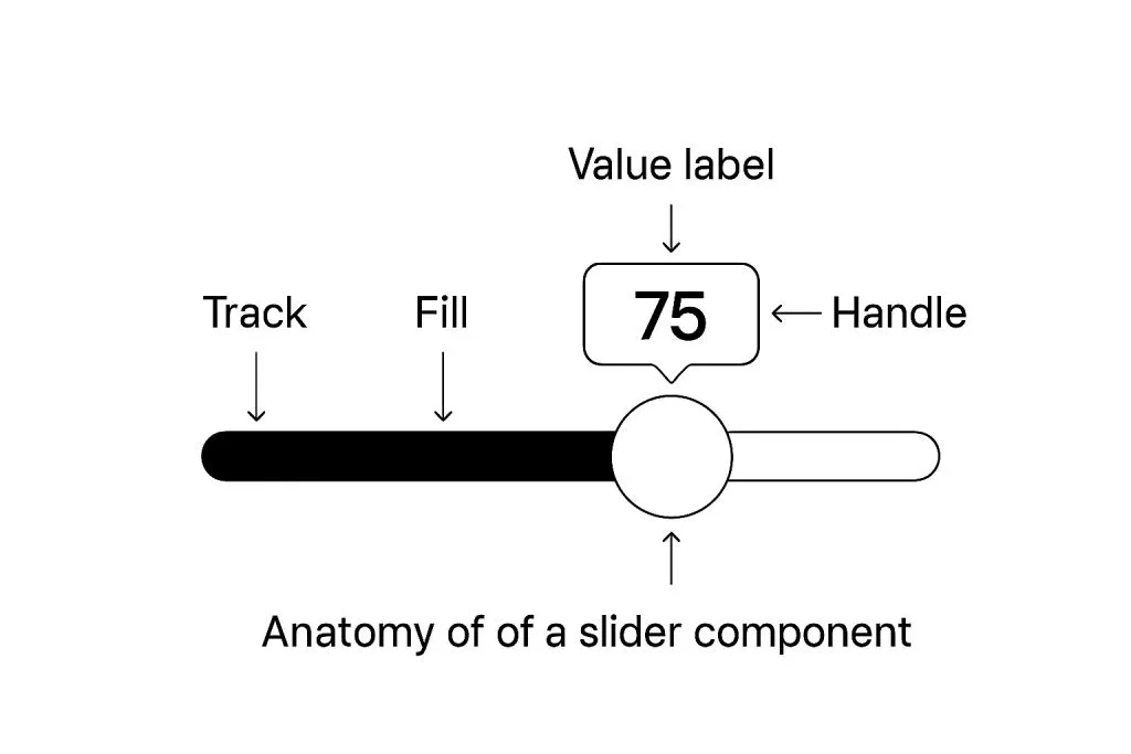
A well-designed slider is built from several parts that together provide clarity, control, and feedback.
Core elements include:
-
Track: the path along which the thumb moves, usually horizontal or vertical.
-
Thumb (handle): the draggable control that represents the current value.
-
Filled track: a visual highlight from the start of the slider to the current value.
-
Value label: an optional element that displays the current value explicitly.
-
Ticks: small marks for reference points or steps, often used in multi-step sliders.
-
Range indicators: when used as a double-thumb slider for selecting a range.
You may also incorporate icons, step indicators, tooltips, or micro-interactions, depending on the complexity of the use case.
Use a consistent structure for these elements to ensure users understand how to interact with the component at a glance.
Choosing the right slider use case
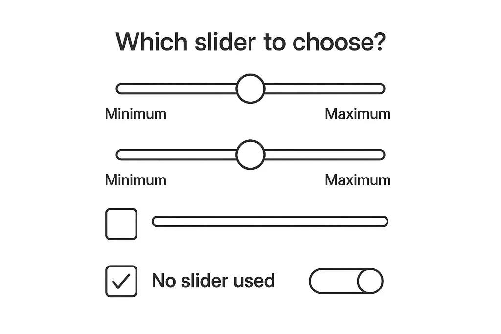
Sliders should only be used when users can benefit from adjusting a value across a continuous or discrete range.
Use sliders when:
✔ You need to let users quickly explore values.
✔ You want to provide instant feedback as values change.
✔ The exact value isn’t critical (e.g., brightness).
Avoid sliders when:
❌ Exact values are required (e.g., entering age or phone number).
❌ Accessibility or precision is a concern.
❌ The screen size limits interaction (e.g., sliders inside mobile tables).
Example: A price filter with a range from $10 to $10,000 can use a double-thumb slider, but it should also provide numeric input fields for exact value entry.
Always ask: Does a slider improve usability here, or just add friction?
Single vs. double thumb sliders
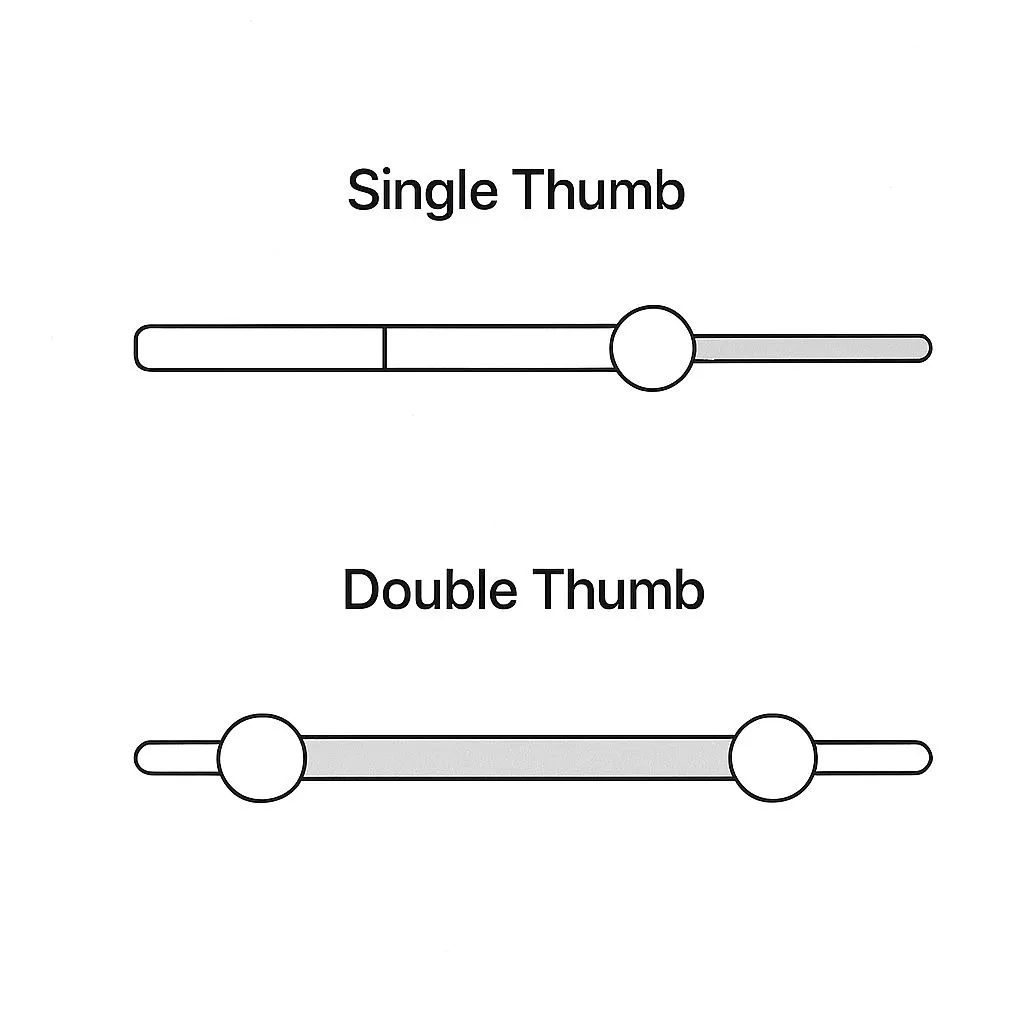
Sliders typically appear in two configurations:
-
Single-thumb: Best for selecting one value along a scale (e.g. setting volume).
-
Double-thumb: Used for defining a range (e.g. setting min/max price filters).
Double-thumb sliders need special consideration:
☞ Clear visual distinction between the two thumbs.
☞ Prevention of overlap or collision.
☞ Sufficient thumb size and spacing for touch interactions.
Make sure that users can always understand which thumb they are manipulating.
On mobile, consider increasing the active touch area invisibly beyond the visual thumb size.
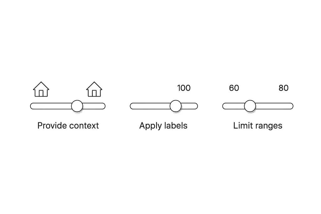
Step increments, snapping, and precision
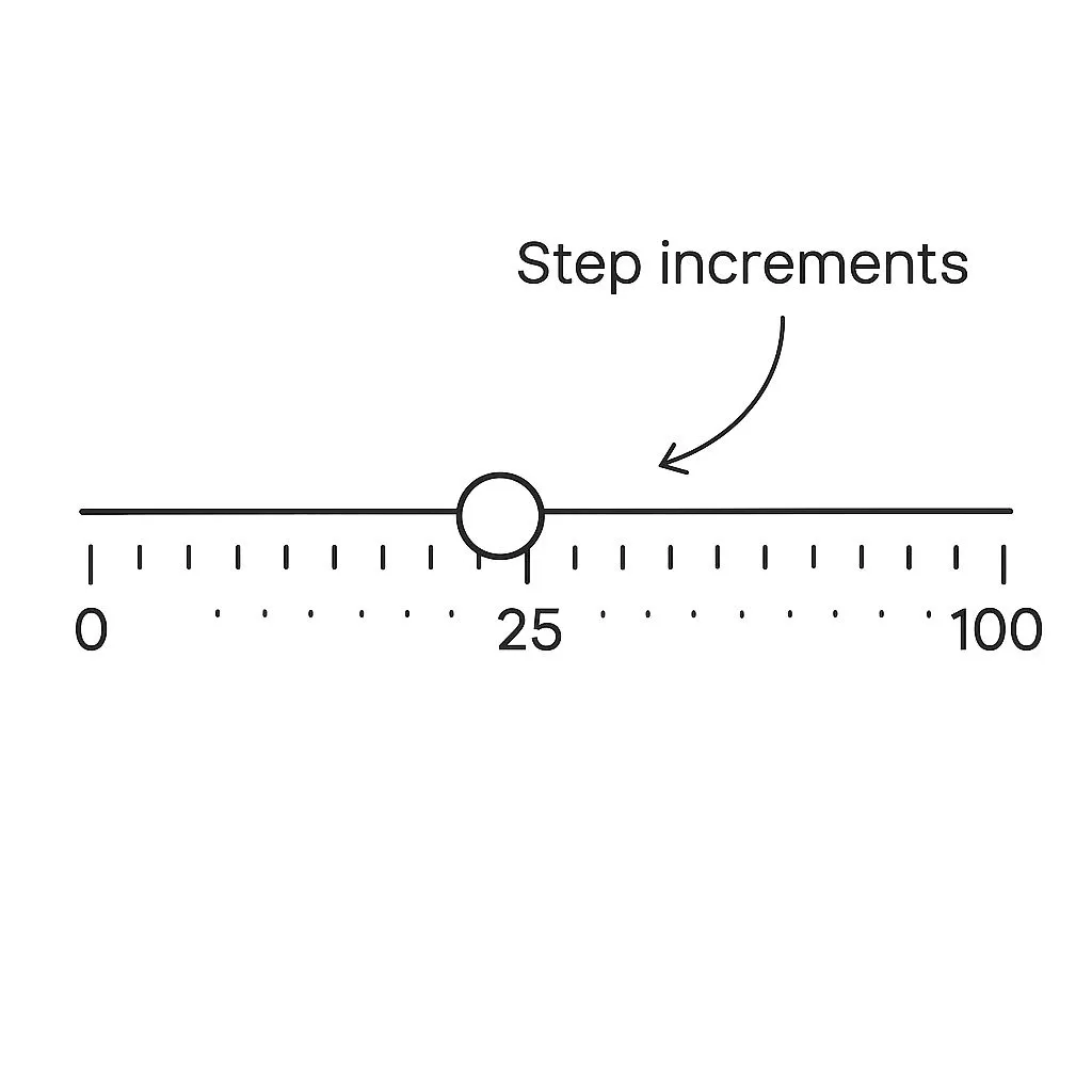
In some cases, the slider should snap to steps (e.g., 0, 10, 20, 30...) rather than being freely draggable.
Sliders with steps are easier to control:
• They work well for settings **with predefined levels.**
• They prevent users from selecting meaningless in-between values.
Use visual ticks along the track to hint at available steps.
For more granular control, include a numeric input field alongside the slider.
Avoid too many steps on small sliders: too cramped and confusing interactions. If snapping to step values, animate the thumb smoothly to the target point.
Accessibility and keyboard support
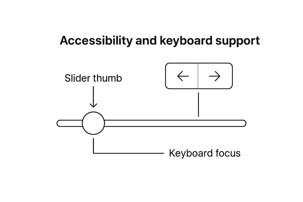
Sliders should be fully operable by keyboard and screen readers.
Minimum accessibility requirements:
❶ Arrow keys should increase or decrease values.
❷ Focus indicators should appear around the thumb.
❸ Screen readers should announce the current value and purpose of the slider.
Include labels (aria-label, aria-valuenow, etc.) to describe the slider’s function and state.
Make sure contrast ratios between thumb and track meet accessibility standards.
Provide high-contrast modes and visible focus outlines.
Styling sliders with brand consistency
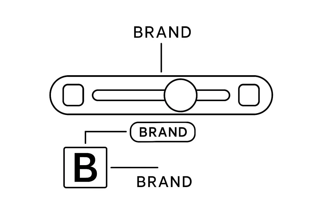
A slider should feel like it belongs to your design system.
This means:
☞ Track and thumb colors align with your primary or accent palette.
☞ Rounded corners or sharp edges match overall theme direction.
☞ Hover, active, and disabled states are clearly defined.
☞ Filled track matches other progress indicators.
Add micro-interactions like expanding thumbs or tooltip previews when dragging.
But don’t overdo it - function should stay clear.
Use shadows or elevation to give depth when appropriate.
On mobile, larger thumb size improves usability and comfort.
Responsiveness and mobile adaptation
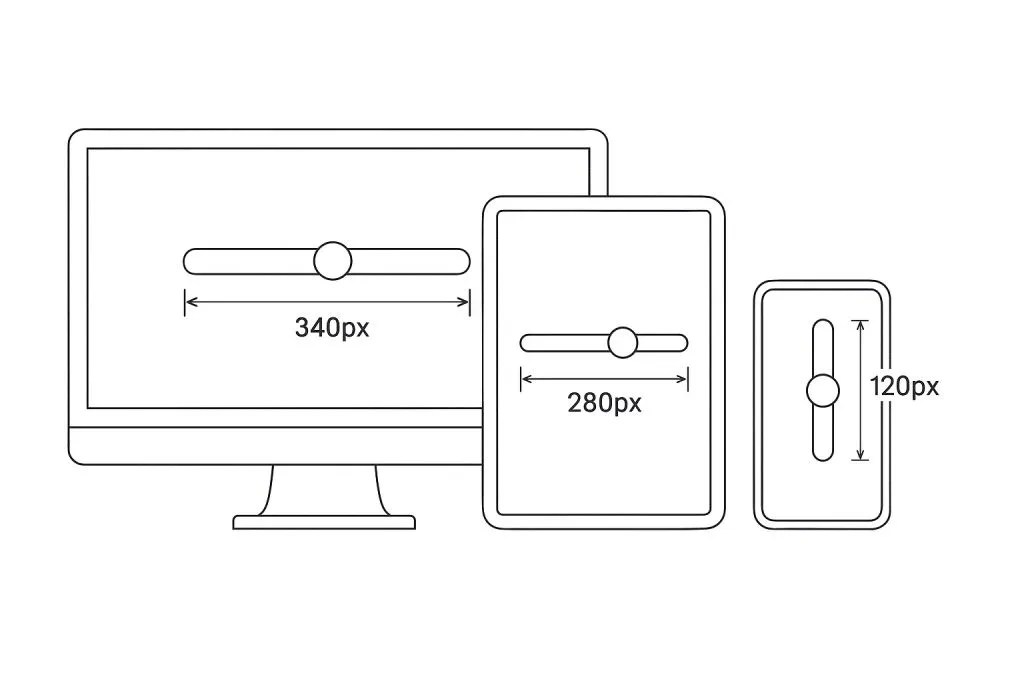
Design sliders to work across breakpoints. Key adjustments for responsive sliders:
• Touch targets: Minimum 44x44px for thumb areas.
• Spacing: Increase vertical or horizontal spacing to reduce mis-taps.
• Orientation: Use vertical sliders where horizontal space is limited.
• Fallbacks: Allow manual value entry when slider isn’t practical.
Use a component library or custom CSS that supports flexible track widths and adaptable thumb placement.
Test on real devices.
Especially check for touch responsiveness and focus indicators on Android/iOS.
Usability tips from real-world products
Sliders are used in many contexts : from media players to dashboards to design tools.
Here’s what we’ve learned from observing real products:
Adobe After Effects: Tooltips on hover and drag help with precision.
Spotify: Volume slider fades in only on interaction, keeping UI clean.
Airbnb: Price filter uses dual sliders with readable numeric inputs.
Figma: Sliders combine drag and input field for exact editing.
Tips to improve usability:
☛ Show current value on drag, then hide it.
☛ Use animations sparingly but effectively.
☛ Match the scale of slider with the screen size.
☛ Avoid edge overflow or unexpected behavior on resize.
Development concerns and handoff guidance
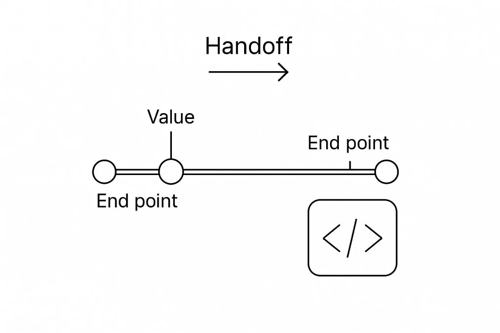
When handing off sliders to developers, make sure you cover:
• Default, active, disabled, and error states.
• Minimum and maximum values.
• Step increments or free drag.
• Keyboard support expectations.
• Touch area size and behavior.
• Responsive behaviors and fallbacks.
Use tokens for spacing, color, and radius. Describe hover and press interactions.
If your slider has tooltips, define their position, delay, and content style.
Include aria-* attributes in specs for accessibility.
Testing and iteration
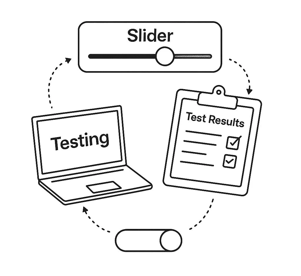
Sliders must be tested in multiple environments. What to look for during testing:
❶ Thumb remains responsive on all devices.
❷ Track doesn’t overflow on small screens.
❸ Tooltip and value previews are readable and don’t block interaction.
❹ Keyboard navigation is fluid and predictable.
❺ Range sliders prevent thumb overlap.
Conduct usability testing with both desktop and mobile users. Gather feedback on how precise, predictable, and accessible your slider feels. Iterate based on user behavior.
FAQ: Slider UI design
1. What’s the optimal thumb size for touch interfaces?
Minimum 44×44pt. This follows Apple and Google guidelines. Anything smaller risks mistaps. Anything bigger eats layout space. Stick to balance, especially in dense UI.
**2. Can the track be visually distorted or curved?
**Yes, but only visually. Internally, values should still map to a linear scale unless the use case demands non-linearity (e.g. volume control). Skewed visuals must be justified.
**3. Can I use icons instead of numbers for slider steps?
**Only if:
· each icon is instantly recognizable;
· the sequence is obvious without labels;
· the user doesn’t need to guess meaning.
When in doubt, go numeric. Icons are riskier.
4. Is showing the current value optional?
Never. It’s essential. Even if the value floats near the thumb, consider duplicating it statically below the track if range clarity is critical.
**5. Should the track be clickable outside the thumb?
**Yes, absolutely_._ Users expect to tap anywhere and have the thumb jump there. Dragging is just one input mode (not the only one).
**6. Is keyboard navigation required?
**Yes. A slider must support arrows, Page Up/Down, Home/End. Designers should care too: accessibility starts at the layout stage.
**7. How do I keep a custom slider from looking overdesigned?
**Avoid visual clutter:
· skip shadows on thumb if there’s already glow;
· use contrast in shape and size, not just color;
· don’t show ticks unless they’re truly helpful.
Rule: the UI should guide input, not show off.
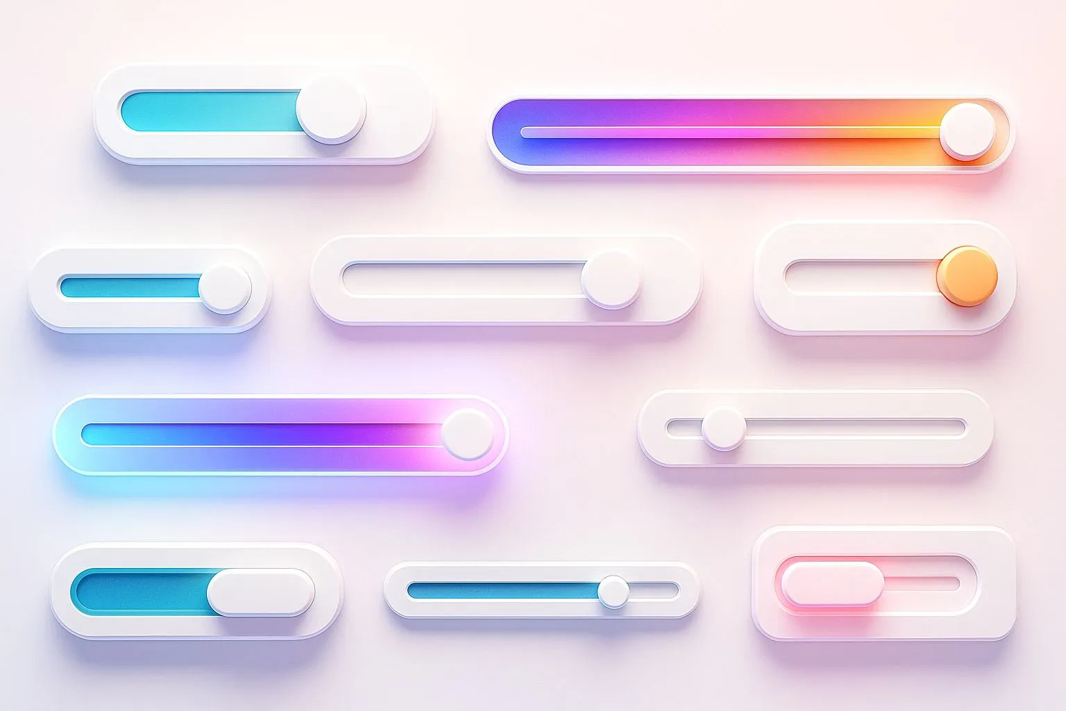
Appendix: Generate slider UI design variants with AI
What if you could instantly visualize dozens of slider styles: from neon-glowing cyberpunk tracks to vintage analog knobs or glassmorphism-inspired handles? (If you are weighing glassmorphism against other glass looks, see which glass style to actually use in 2026.)
Thanks to modern diffusion models like Qwen-VL and HiDream (available via Venice.AI), you can now generate stunning, diverse slider UI concepts without lifting a Figma pixel.
These tools allow designers to explore:
- Unusual textures: grain, gel, holographic, glass, clay
- Experimental layouts: vertical stacks, arc sliders, radial controls
- On-brand adaptations: soft pastels, brutalist monochrome, skeuomorphic realism
- Styling depth: lighting, shadows, inner glow, embossed thumb edges
With the right prompt structure, you can rapidly produce 3:2 hero illustrations for portfolios, mockups, and even production design inspiration.
Example prompt: A set of 5 horizontal slider UI components, each in a different visual style (glassmorphism, neon, claymorphic, brutalist, pastel), pastel background, 3:2 aspect ratio, white canvas, UX UI showcase.
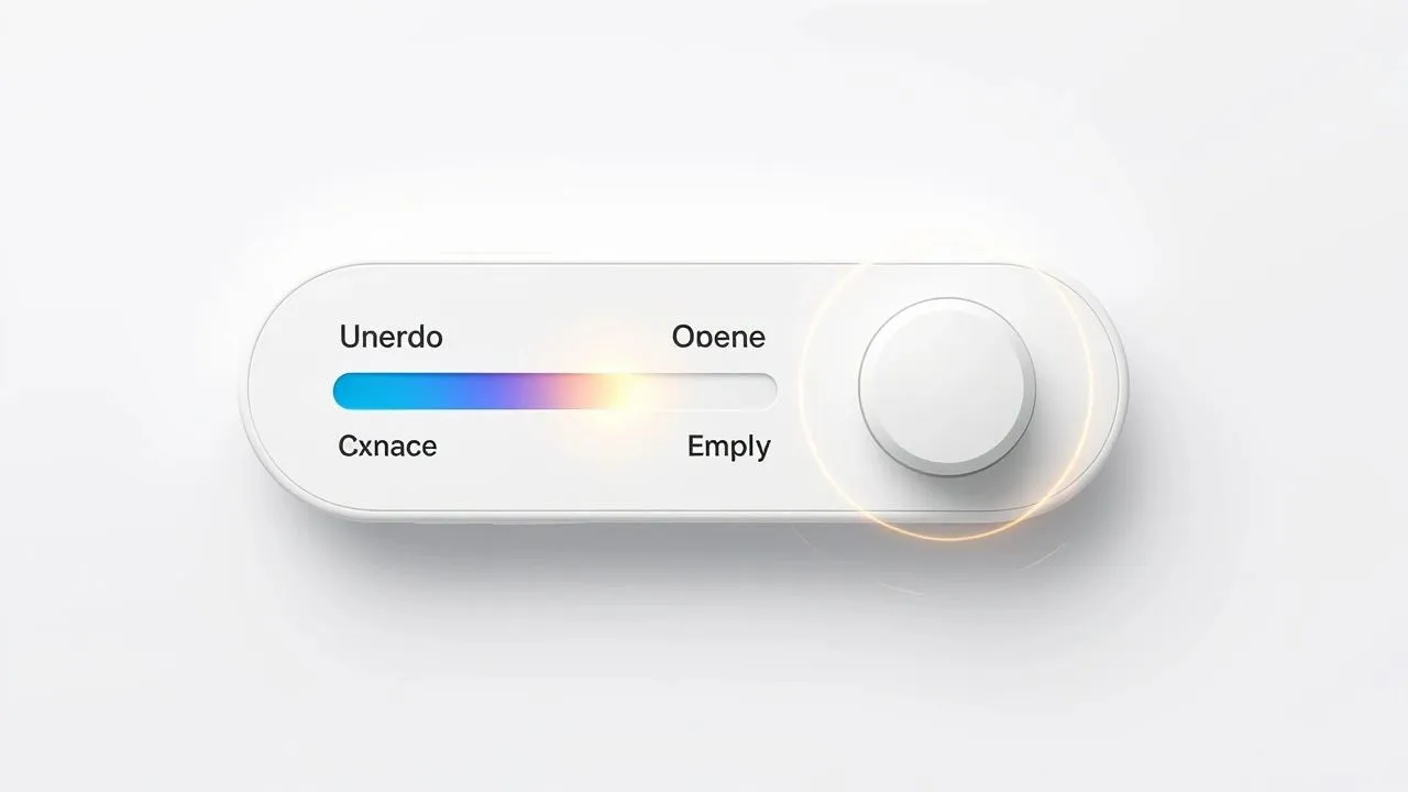
It took ~13s to generate 4 variants, and here is my winner:
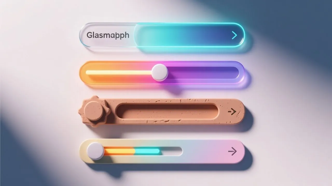
Generated via Qwen Image model in Venice.ai
AI-generated UI doesn’t replace design expertise — it augments ideation, especially in early visual exploration.
It helps surface unexpected directions, visual metaphors, or tactile vibes you might not consider otherwise.
In any case: Try Venice.ai today, even without PRO account, it's a serious tool.


