

Roman Kamushken
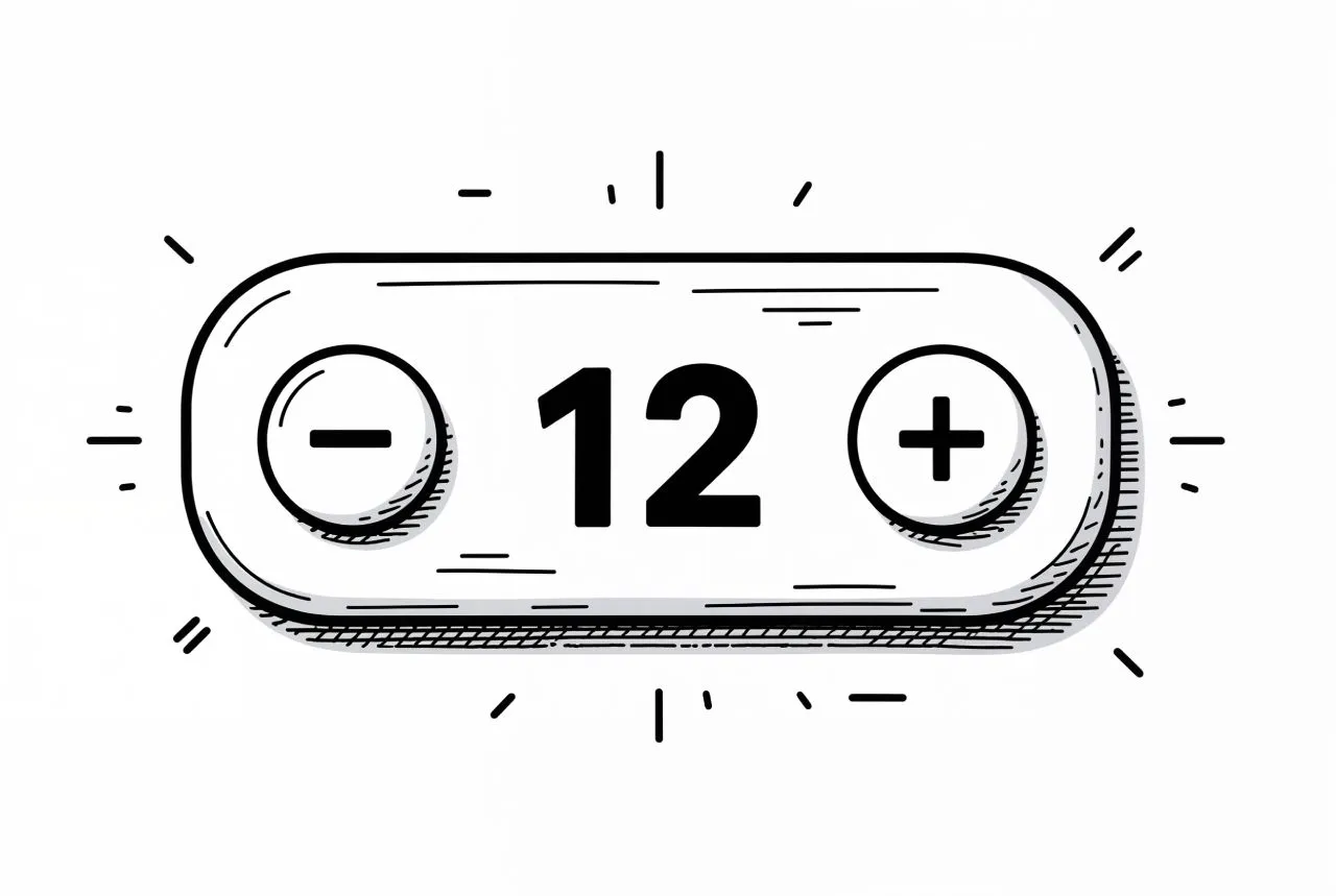
The Stepper is a simple numeric input control component used to increase or decrease values through incremental actions.
Common in e-commerce carts, settings panels, or configuration interfaces, it often consists of a minus button, a numeric value, and a plus button. While minimal in appearance, its behavior, states, and accessibility require precise implementation.
Component purpose and context
Steppers are used when a user needs to adjust a numeric value with accuracy. Compared to sliders or input fields, a Stepper offers better control and avoids invalid entries.
Steppers work well for small ranges (1–10) and when each increment has meaning (e.g., item quantity, font size, rating score). They are not suitable for wide ranges unless enhanced with direct input or shortcuts.
A typical Stepper includes:
- A decrement button
- A visible current value
- An increment button
Variants may include unit labels (e.g., px, kg), icons instead of text, or alternate layouts for compact interfaces. These follow common UI patterns found across modern design systems.
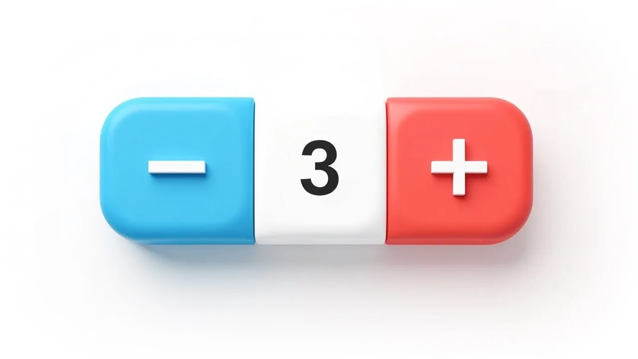
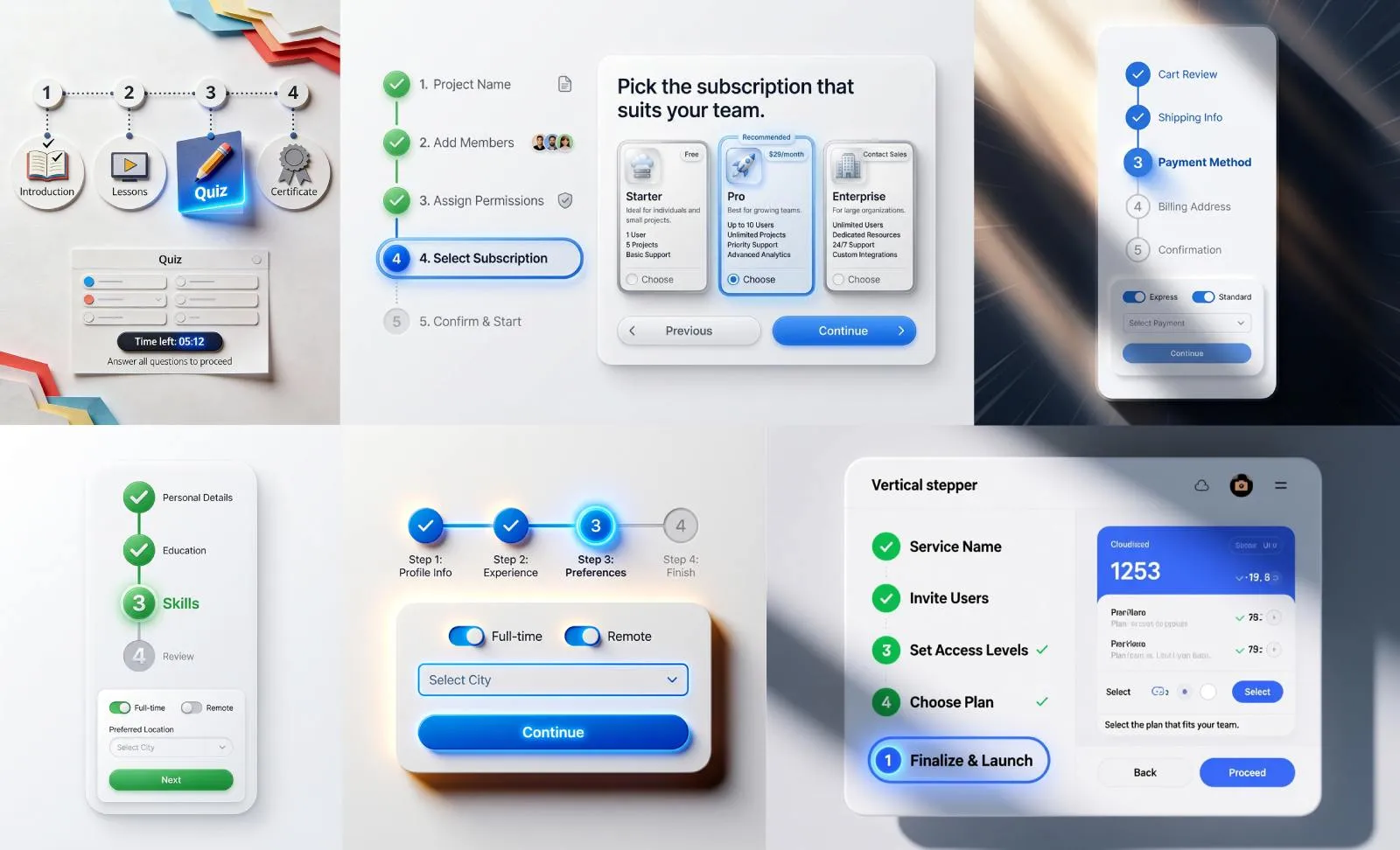
This component was AI-generated with Venice.ai. Their recently integrated HiDream image model is designing UI stuff better and faster than your chatGPT.
Anatomy and structure
The Stepper consists of multiple elements that require precise visual and functional alignment.
Layouts must ensure legibility, touch precision, and clear interactive affordances.
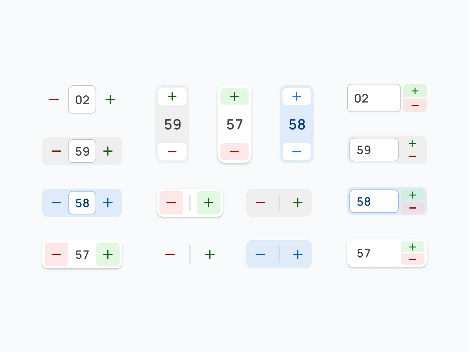
Decrement and Increment Buttons are usually placed on the left and right sides of the numeric value. These can be square, round, or pill-shaped depending on the design system styles. Icon-only buttons are recommended for space-saving interfaces.
Value Display may be static or editable. In editable mode, the number becomes an input field on focus or tap. Always validate typed input against min and max limits.
Container may have borders, shadows, gradients, or background fills. Padding must ensure that the component does not feel cramped, especially with 3-digit or negative numbers.
Accessibility is critical. Users must be able to navigate between buttons and the value using a keyboard.
Focus states must be visible and follow platform conventions.

Component states
Each Stepper must include clear visual and functional states to improve usability.
Default: Idle state with visible buttons and value.
Hover: On desktop, buttons respond with color or elevation changes.
Focus-visible: For keyboard navigation. Focus rings must be applied to buttons and inputs.
Disabled: Buttons should visibly deactivate when a limit is reached. The state must prevent interaction and reduce opacity or color contrast to indicate non-interactivity.
Active (Pressed): During click or tap, buttons should show clear pressed styling.
Loading (Optional): If value changes trigger asynchronous updates (e.g., server validation), include a spinner or temporary disable.
Edge cases such as decimals, negative values, or unit suffixes must be handled with consistent logic and formatting.
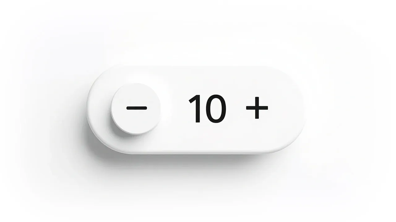
The component must not shift layout when value length changes.
Usability considerations
The usability of a Stepper depends on consistency, predictability, and responsiveness.
Below are key design and behavior guidelines rooted in UX best practices:
- Maintain consistent button size and padding across states.
- Prevent layout shifts when numbers change (e.g., 9 → 10).
- When at min or max, the relevant button must disable — do not hide it.
- Avoid relying on color alone to show disabled or active state.
- Support step values (e.g., increment by 5, 0.25, etc.) where needed.
- Always round decimals visually. Do not expose floating point artifacts.
- If editable, validate on blur or Enter key.
- Use semantic roles (spinbutton) and aria- attributes for accessibility.
Mobile-specific behavior
On mobile devices, touch interaction requires additional considerations.
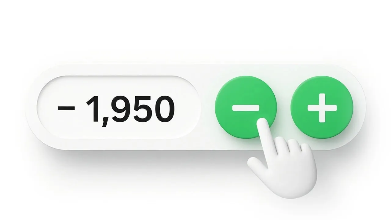
Touch Targets: Buttons must be at least 44×44px in clickable area. This can be achieved with invisible padding if needed.
Press-and-Hold: Long press on +/– should trigger continuous changes. Add delays and throttle as needed.
Haptics and Animation: Optional tactile or visual feedback (e.g., vibration, value scale animation) improves perceived responsiveness.
Editable Input: For large value ranges, allow tap-to-edit on the value field. Ensure keyboard types and formats are optimized for numeric input.
Visual Simplicity: Mobile steppers should remove decorative elements that reduce clarity. Emphasize tap zones, legibility, and spatial separation.
The component must remain usable in both portrait and landscape layouts.
Avoid placing steppers too close to screen edges or other controls.
Design variants and theming
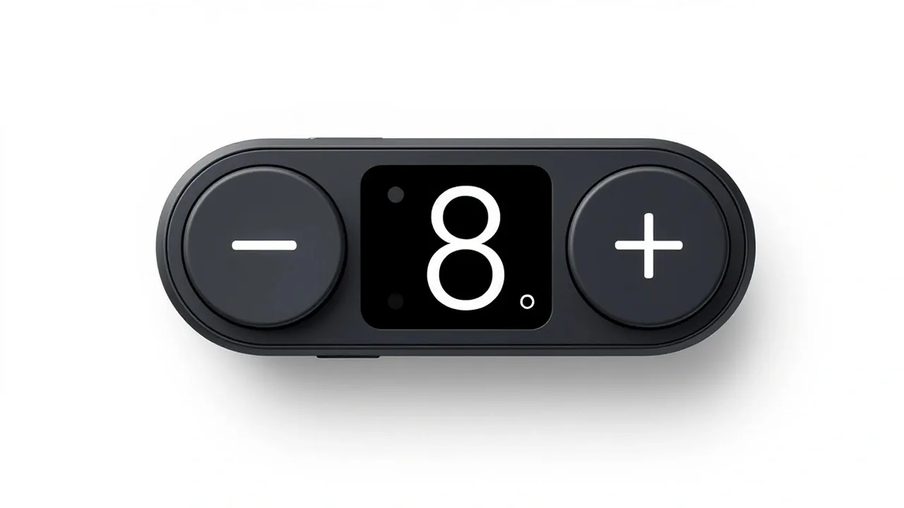
Steppers can be customized, but behavior should remain consistent. Some visual styles include:
- Minimal ghost-style buttons on white backgrounds
- Bold solid buttons with icon indicators
- Soft-rounded variants with neumorphic depth
- Compact inline stepper inside table cells or forms
While aesthetic freedom is possible, it should never compromise clarity, contrast, or accessibility. Test variations across screen sizes, color modes, and languages with longer unit suffixes.
Avoid replacing buttons with gestures unless paired with visual indicators. Maintain discoverability. For where a stepper sits next to sliders and number inputs, see the form controls reference for 2026.

Stepper component FAQ

1. Is it mandatory to allow typing into the Stepper value?
No, but it's recommended when the range is large or precision is needed.
2. What’s the difference between disabled and hidden buttons?
Disabled buttons remain visible but inactive. Hiding creates layout shifts and must be avoided.
3. How are decimals and precision handled?
Use consistent step values and round outputs to a fixed number of digits. Prevent overflow or rounding errors.
4. Should Stepper support keyboard-only navigation?
Yes. All interactive parts must be focusable. Arrow keys can optionally control value changes.
5. What ARIA roles improve accessibility?
Use role="spinbutton" with proper aria-valuenow, aria-valuemin, and aria-valuemax attributes.
6. Can the Stepper loop from max to min?
Not by default. Looping is a custom behavior and should only be used if it reflects the mental model (e.g., day-of-week selector).
7. What’s the best default state for an empty Stepper?
Initialize with the min value or a logical default. Avoid null states that require user action before interaction.
Appendix, visualizing UI components with Venice.ai
If you're designing UI components like Stepper, input fields, or dropdowns; seeing real-time visual variations can help speed up ideation.
Instead of searching for references across Dribbble or manually drawing dozens of variants, you can now generate component ideas instantly using AI.
I’ve been testing Venice.ai - a fast, privacy‑focused image generation tool tuned specifically for structured UI concepts.
Unlike general-purpose LLMs, Venice produces layout‑correct, component‑accurate outputs without hallucinated buttons or inconsistent behavior states.
Why Venice stands out for designers:
- It generates multiple UI variations in seconds
- Results are consistent, editable, and based on clean component logic
- It doesn’t track or store your prompts (full local privacy)
- No branding or watermarks on outputs
- Prompt tuning is minimal: describe the UI element and style (the model handles structure)
If you're building inspiration boards, spec sheets, or component libraries, try Venice.ai as a visual companion to this tutorial. It helps validate edge cases, explore states, or simply refine how your Stepper looks across themes.