
Roman Kamushken
Generation stopped being the expensive part a while ago. Review is where the hour goes. Every screenshot-to-code result needs someone to diff it against the design, and that diff usually costs more time than the generation saved.
This guide covers a workflow where the agent runs that diff on itself. It is built around design-to-code, an open-source agent skill by Atharv Jadav, released under the MIT license. You will see how it works and where it breaks, then get a ten-minute check to run before you merge.
Why screenshot-to-code output always needs re-checking
A screenshot looks like a spec, yet it is only a sample. The design-to-code skill says it plainly: treat one screenshot as one sampled route, viewport, state, theme and scroll position. Everything outside that sample is a guess, and four kinds of guesses show up in every review.
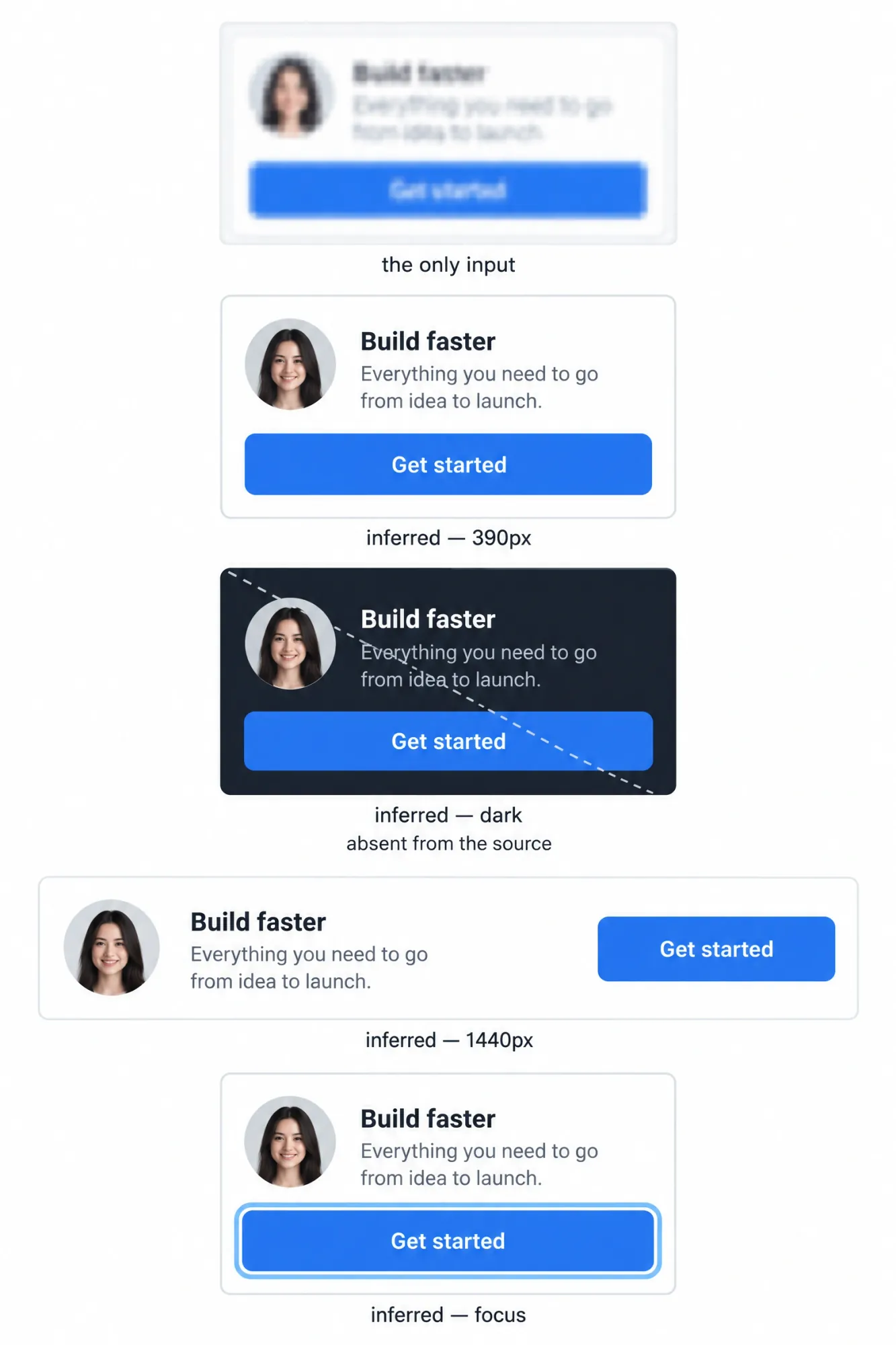
A single sample. The image shows the page at one viewport, in one color scheme, scrolled to one spot. Tablet and ultra-wide views simply are not in it.
Fonts are pixels. Text in a PNG carries no family name. The agent reads letter shapes, and a family that runs slightly wider than the original moves every line break below the fold.
Interaction is invisible. Hover, focus and the mobile menu never appear in a static frame. Someone has to invent them, and most tools invent them silently.
"Looks close" is the target. Most generators judge themselves at the one width they were shown. At that width the output passes a glance, and at 768px it falls apart.
The skill's README lists what typical AI output does under those conditions: Inter or a random system font everywhere, emoji placeholders, a screenshot pasted in as a background, and "Done!" with no proof. That is the default behavior of a model asked to look similar and never asked to prove it.
What an agent skill is, and why it beats a long prompt
A skill is a plain folder. Inside sits a SKILL.md with the main workflow, plus a references directory of playbooks the agent loads only when the task calls for them. Forensics loads for screenshot work, verification for anything that claims to be exact.
A long prompt is a wish. A skill is a process with gates: a checklist the agent copies into its notes, a fixed order for resolving conflicts, and a short list of verdicts it must end on. You rewrite a prompt for every task, while the skill applies the same discipline every time.
Install takes one line with the Vercel skills CLI:
npx skills add https://github.com/Atharvsinh-codez/skills --skill design-to-code
Manual install is a copy of the design-to-code folder from the design-to-code repo into your agent's skills directory: ~/.claude/skills/ for Claude Code, ~/.codex/skills/ for Codex, ~/.factory/skills/ for Factory Droid.
The skill is stack-agnostic. It works in React, Next.js, Vue, Svelte or plain HTML, and keeps whatever conventions your project already has. If an agent already sits between your Figma file and Vercel, as in the solo founder tech stack for 2026, the skill is one more folder next to it.
The workflow, step by step
Here is the process the skill makes the agent follow, in order. Each step leaves a written trace you can check later, and that trace is the whole point.
❶ Pick a mode before touching code
The agent picks one of six source modes and records it: reference reconstruction, greenfield art direction, hybrid expansion, variant exploration, retrofit or repair, and semantic scaffold. The mode decides what counts as truth.
The rule I like most: in reconstruction mode the image wins, and the agent may not "improve" it into its own taste. That rule targets the drift I wrote about in why every AI startup looks the same, where a model left alone pulls every page toward the same safe average.
❷ Read the design like a forensic analyst
Before writing markup, the agent inspects every image at full useful detail and measures values from the pixels. Container width, gutters, columns, spacing rhythm, type scale, radii, shadows and color roles all get recorded.
For complex work the results go into a reference manifest: each source with its route, viewport, theme, state and authority. Unknown values are recorded as unknown. That sounds trivial until you notice how often generated code acts certain about things the image never showed.
❸ Label every decision as observed, inferred or substituted
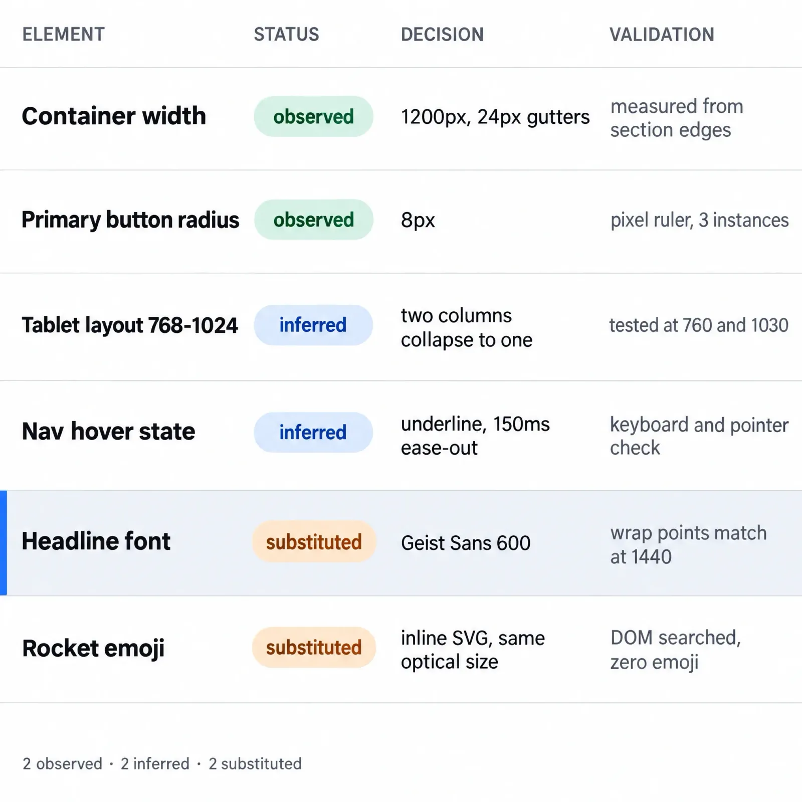
This is the step that changes your review. Every material decision lands in an evidence ledger, a compact table with the element, its status, the source, the decision and how it was validated.
Only three statuses exist. Observed means directly visible, measured or supplied, while inferred means derived from relationships or convention where evidence is absent. Substituted means replaced on purpose because of rights, availability or technical limits, with a note on what visible delta remains.
A typical row reads: headline font, substituted, licensed grotesk not available, Geist Sans at 600, wrap comparison at 1440px.
The skill forbids presenting an inference or a substitution as an exact match. Silent guessing is how a wrong font survives a review round, and the ledger writes the guess down before you open the page. Your review turns into reading: skip the observed rows and spend attention on the other two.
❹ Lock the font plan
Typography is treated as geometry. The agent identifies the typeface, checks its license and picks the closest legal match when the original is commercial. Font files copied from a live site without a license are on the skill's list of rejected failures.
When nothing relevant fits, the fallback is Geist Serif, or Geist Sans and Mono for clearly sans or mono roles, instead of a framework default. Then comes the check most humans skip: compare wrap points at the reference viewport. If the headline breaks after a different word, the font plan is wrong, and a forced <br> only hides it.
❺ Sign a fidelity contract
Before deep implementation, the agent writes down what must match exactly, what may adapt, and what the image never showed. The contract holds a one-sentence visual thesis, canonical copy, grid and breakpoint rules, type and spacing scales, an asset inventory with rights, and a responsive transformation per section.
Detailed styling waits until the contract explains the major geometry and the dominant visual system.
❻ Build macro to micro
The build order is fixed. Page shell, landmarks and section geometry come first, then the first viewport and primary action. Fonts and wrapping follow, then components and their states, then assets, and finally borders, focus rings and hover.
The skill bans the shortcuts that make screenshot-to-code fast and fragile: a screenshot behind the page, a giant SVG trace, a canvas bitmap, a pile of absolutely positioned elements. We were doing this by hand in 2019, one Figma button at a time, and the order of operations has barely changed.
❼ Recompose for every screen
Mobile is a deliberate composition here, and a proportionally shrunken desktop counts as a failure. For each section the agent picks one transformation: preserve, reflow, collapse, reorder, crop, simplify or hide.
Breakpoints go where content or composition fails, and the agent tests immediately above and below each one to remove horizontal overflow. It keeps one logical DOM instead of separate desktop and mobile trees.
❽ Enforce SVG-only icons and zero emoji
Every interface icon renders as SVG, preferably from the project's existing icon set. Icon fonts, Unicode symbols and raster icons are banned as substitutes.
The rule holds even when the reference itself contains an emoji. The agent swaps it for the closest SVG icon or plain text and logs a required substitution. Emoji are the cheapest way for a model to fake an icon, so only a hard gate checked before the verdict keeps them out.
❾ Verify by rendering
A compiling build proves nothing here. The agent stabilizes the conditions (route, viewport, device-pixel ratio, fonts, theme, state, scroll position, animation) and screenshots its own build under exactly those conditions. Then it compares full pages and component crops side by side.
Fixes follow a fixed order: content and state, geometry, typography, dominant assets, spacing, color and material, details, interaction, motion. A wrong font or container can produce dozens of apparent spacing errors, so global causes go first. Every nontrivial reconstruction gets at least two correction passes.
There is no universal pixel-diff percentage to hit, so remaining differences get written down. Then the agent issues exactly one readiness verdict: READY, READY WITH SUBSTITUTIONS, NOT READY or UNVERIFIED. An unverified result can never be called exact or pixel-perfect.
Proof from six sites built from images only
The repo ships six working Next.js sites, each an image-to-code rebuild that started from a single picture of a page. Agentwork came from one full-page screenshot pasted into chat, and the app window in its hero is real DOM. Medusa was rebuilt from a blurry, low-resolution thumbnail.
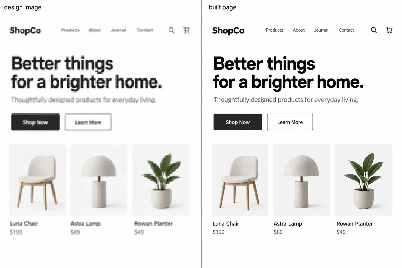
The other four are AutoSend, an email platform page with serif display type, and AccessGrid, with a phone mockup and wallet card rebuilt in code. Terms is an AI contracts page set in Geist, and arix is a set of animated brand guidelines. Each sits next to its source image in the GitHub README, ready to clone and run.
They are study reconstructions of publicly visible designs. The code is MIT, while names, logos and brand designs belong to their owners, so treat the sites as a technique demo.
Where it still breaks
The skill's own FAQ says it gets very close and tells you exactly where it falls short. Those places are predictable.
Licensed fonts force substitutes, and a substitute with different metrics shifts wraps however carefully it was picked. Hover, focus and mobile layouts are inferred from a desktop frame, so they are educated guesses. When I need to judge one, I compare it against how other products solve that section, which is what the AI inspiration gallery is for. Blurry inputs produce inferred proportions, and you should read those values that way.
Embedded product screenshots and dashboards inside a marketing page are treated as media unless you explicitly put them in scope. Hardware-only behavior, such as stuck hover or safe-area padding on a real phone, stays unverified in device emulation.
None of this is hidden. Each gap shows up as an inferred or substituted ledger row, or as an unverified line in the handoff, and that reporting is the real product. A tool that admits three gaps is easier to ship than one that claims zero.
The 10-minute review when the agent says READY
A verdict tells you what the agent believes. These ten checks tell you whether to agree, ordered to catch the most problems first.
❶ Read the verdict first. READY WITH SUBSTITUTIONS or UNVERIFIED changes what the rest of the review is for.
❷ Scan the substituted list. Each row names a visible delta you are signing off on.
❸ Check font wrap at the reference width. Matching line breaks are the fastest proof that the font plan holds.
❹ Open the side-by-side at 100%. Zoomed-out comparisons hide spacing and weight drift.
❺ Resize through each breakpoint. Look for horizontal overflow just above and below every one, since that is where recomposition fails.
❻ Tab through with the keyboard. Focus order and visible focus are inferred states, and WCAG 2.2 AA is the skill's own target.
❼ Search the DOM for emoji and img icons. One leftover means the icon gate was skipped.
❽ Toggle prefers-reduced-motion. The skill requires a gentler motion path, and an empty one is a bug.
❾ Check the console for hydration errors. The skill allows zero new runtime errors and hydration warnings.
❿ Confirm the dominant asset. The hero should be real DOM or an authorized image, never the reference screenshot pasted in.
When you have the Figma file instead of a PNG
A Figma to code job starts from more evidence, and more evidence shrinks the inferred column of the ledger. A Figma frame gives exact values, tokens give named colors and spacing, and frames at several widths turn mobile into an observed target. The skill already ranks supplied assets and extra viewport references above its own defaults.
A design system built for agents goes further. When surfaces are tokenized and components carry names, reconstruction gets close to deterministic, which is the bet behind the landing template an AI agent can rebrand. A kit such as the React UI Kit already names its buttons and inputs the way an agent expects to find them. The groundwork matches designing a UI kit foundation: tokens first, named components second.
Frequently asked questions
❶ Can AI turn a screenshot into code accurately?
Close, and measurably so once the agent verifies its own render. A screenshot shows one width in one state, so hover, mobile layout and sometimes fonts are inferred or substituted. A good workflow labels those guesses and reports them in a readiness verdict instead of claiming pixel-perfect output.
❷ Do you need Figma for design to code?
No. The six example sites in the design-to-code repo were built from images alone, one from a blurry low-resolution reference. A Figma frame, a live URL or screenshots at several widths add evidence, which moves decisions from inferred to observed and shortens your review.
❸ Which framework does design-to-code output?
Whatever your project already uses. The skill works with React, Next.js, Vue, Svelte or plain HTML and CSS, and keeps your existing conventions. In an empty folder it picks the smallest maintainable setup. All six example sites in the repo run on Next.js 16 and React 19.
❹ How do you verify AI-generated frontend code against a design?
Render the build under the same viewport, theme, state and fonts as the reference, then compare side by side or with an overlay. Fix content and geometry before spacing and color. Run at least two correction passes and record what still differs instead of chasing a pixel-diff percentage.
❺ Is screenshot-to-code legal to use on other people's sites?
Studying a public layout differs from shipping someone else's brand. The design-to-code examples are MIT code reproducing designs that belong to their owners, and the author says they are for study, not commercial use as-is. Point the technique at your own or licensed designs.
The real win is verification you can audit
Screenshot-to-code generation is already cheap. The cost sits in the re-check, and most tools leave that to you. The design-to-code skill moves it into the agent's own loop and ends it with one honest readiness verdict.
You stop diffing a page from scratch and read a short list of inferred and substituted decisions instead. Install it and judge your next screenshot build by its ledger before its first render.