

Roman Kamushken
That is the thesis. The AI startup aesthetic is no longer a style. It is a uniform, and a uniform makes you invisible.
AI startup branding borrows from good work, and that part is fine. The problem is that it borrows all of it from the same three places. I am going to show you the anatomy of that uniform piece by piece, explain the five forces that produced it, name what it costs, hand you eight tactics that work, and give you a checklist to score yourself honestly.
The anatomy of the AI startup landing page in 2026
This is a field guide. Read the list and count how many parts your own page ships today. Most founders hit ten or more without noticing.
- A near-black background around #0A0A0A. A shade off pure black and well away from any mid-tone. Dark enough to look serious, light enough to keep text legible.
- A single radial glow, usually top center. Purple bleeding into blue, occasionally cyan. It is the cheapest way to fill empty space.
- The four-point sparkle icon. The universal "AI is happening here" symbol. Three diamonds or a star burst, usually in the top-left of a button or a badge.
- A chat input box as the hero element. No headline, just a text field that says "Ask anything." The product demos itself and explains nothing. It is the one component where the pattern is hardest to escape.
- An "Introducing [Product]" pill badge above the H1. Small rounded rectangle, thin border, a date or a launch label inside.
- Inter or Geist as the only acceptable typeface. Sometimes the geometric alternative of the season. Nothing with a serif, nothing with a personality.
- A bento grid feature section. Four to six rounded tiles of different sizes, each holding an icon and a two-line promise.
- Gradient-border cards with a 1px glow. A hairline that fades from purple to transparent, borrowed straight from dashboard chrome.
- A logo marquee of "trusted by" companies. Grey marks scrolling horizontally, often after a seed round that gives three of them.
- Names ending in -ly or -ify, or with "AI" bolted on. The naming pattern is its own uniform, and it trains people to expect the same product.
- "Meet your AI copilot" as the H1 formula. Swap copilot for teammate or agent and you have covered most of the market.
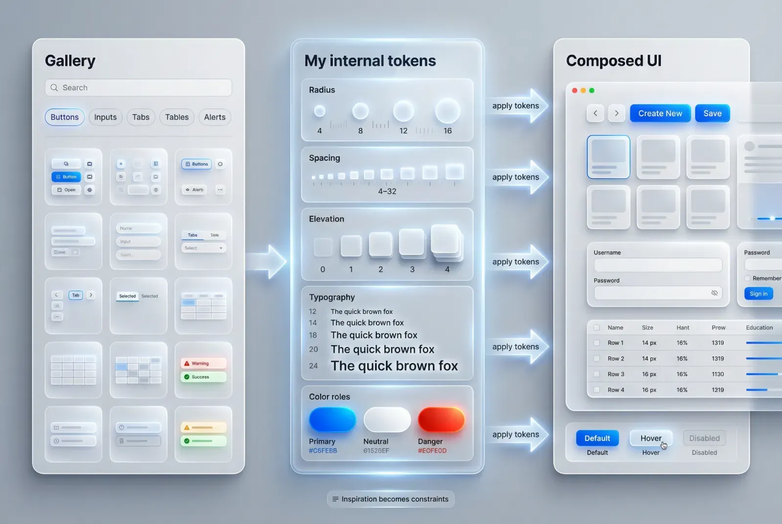
- Glassmorphism panels floating over the glow. Frosted cards with backdrop blur, sitting on top of the radial light like a window on a night city. Apple's liquid glass shows how far the real technique sits from the frosted-panel copy most AI pages ship.
- A "Backed by" line with an accelerator logo. Y Combinator orange, or a fund mark, placed directly under the hero fold.
- An animated typing effect. A prompt typed character by character, then a fake answer. A static screenshot makes the same point faster.
None of these is a crime on its own. Stacked together they become a fingerprint, and every competitor has the same one.
The AI startup aesthetic is no longer a style. It is a uniform, and a uniform makes you invisible.Where the uniform came from
Nobody sat in a room and decided the whole industry should look like this. Five forces pushed everyone to the same finish line.
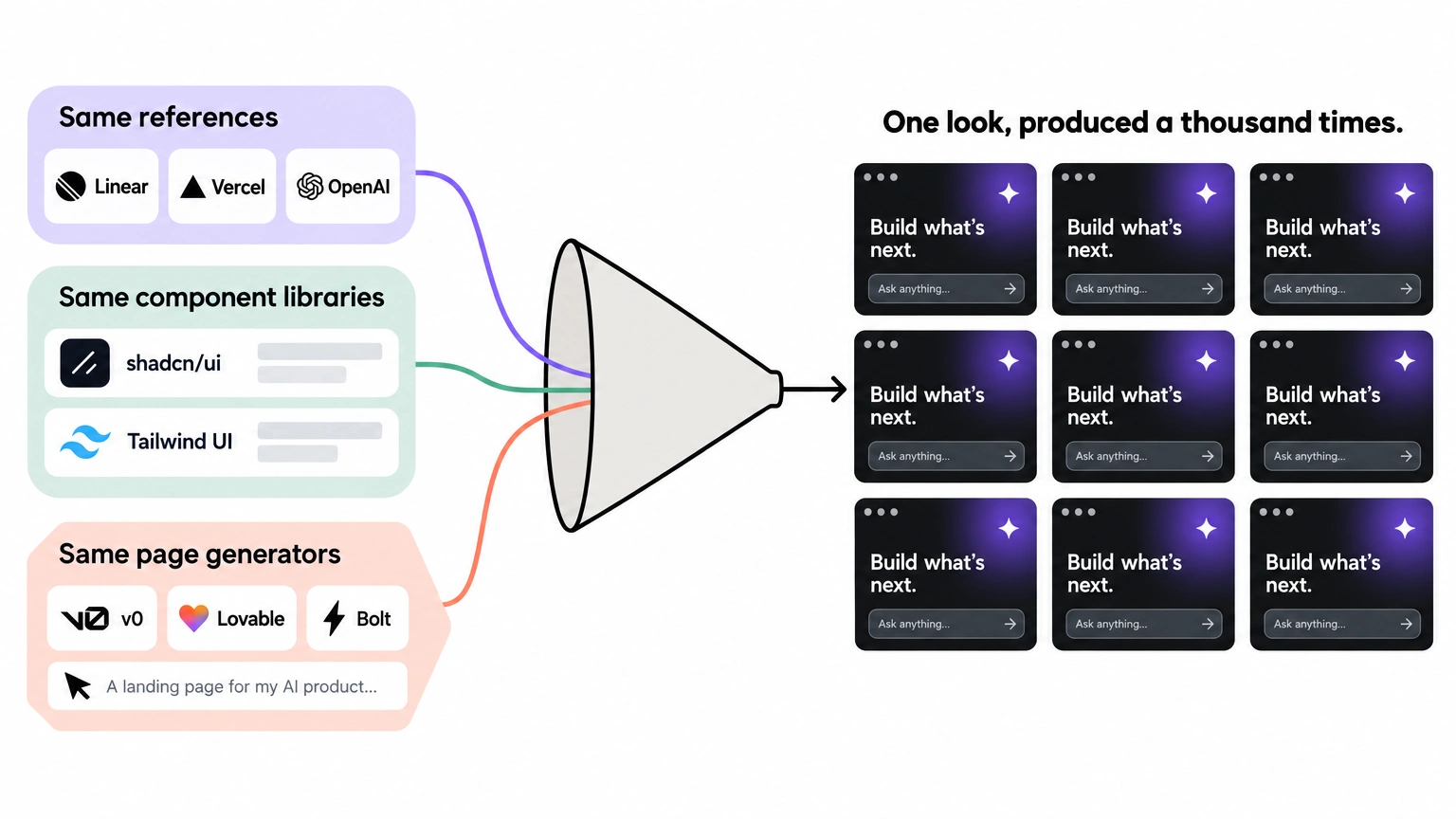
The same three references
Ask a founder for design references and one name comes up first: Linear. Vercel follows, then OpenAI. The lineage is almost literal. Linear proved a dark, high-contrast interface could feel fast and premium. Vercel turned that into a reusable system with Geist, a typeface and component language built for consistency.
OpenAI gave the chat box its cultural meaning. Google's Gemini and a thousand "AI" buttons turned the four-point sparkle into a generic glyph for "a model lives here." Every product after that inherited the vocabulary instead of earning its own. They were excellent when they shipped, which is why they spread.
The same component libraries
shadcn/ui gave the ecosystem a default. Tailwind UI supplied the marketing sections. Framer shipped templates with the glow preset. Aceternity and similar effect kits handed out ready-made gradient borders and animated backgrounds.
When ten thousand products import the same primitives, the output converges by arithmetic. At that point the look arrives baked into your dependencies, and accepting it counts as the decision. The median AI landing page is a stack of borrowed decisions.
AI designing AI
This is the loop that closed the trap. Tools like v0, Lovable, Bolt and Cursor generate a landing page from a sentence. Their training data is dominated by the last two years of AI landing pages, which are dominated by this aesthetic.
So the model returns the average of the genre, and the average is the uniform. The style now reproduces itself faster than any designer can push back against it.
Speed over identity
A seed-stage founder ships the landing in a weekend. Brand work feels like a Series B problem. That math works for features and fails for identity.
In AI, the buyer's first job is to separate a real product from a thin wrapper. Your landing page is the only evidence available in the first five seconds, and the default look is the least trustworthy evidence you can offer. Speed is the reason for the uniform, and it is the wrong trade.
Category signaling
Here is the honest part. The uniform exists because it works as a legitimacy signal.
Looking like Vercel says "we are serious infrastructure." Looking like OpenAI says "we are a model company." Buyers who live in dark terminal windows read that instantly.
The look does have one function, and I will name it plainly: proving you belong to a category. The problem starts when every member of the category proves belonging the same way, and belonging stops being a differentiator.
What sameness actually costs you
The uniform carries a price. It trades four things you needed for one thing you never asked for.
Zero recall. A founder evaluating five AI note-takers will try all five and remember none. The screens blend and the names blur together. Lindgaard and colleagues measured the mechanism: visual appeal judgments form in about 50 milliseconds and stay stable on repeat exposure, so if your page carries no distinguishing mark, there is nothing to store.
Wrapper suspicion. The darkest look in software is now associated with the thinnest products. Thousands of GPT wrappers shipped on #0A0A0A backgrounds with a sparkle and a chat box. The visual became a tell.
If your real product has genuine depth and you dress it in wrapper clothing, you invite the exact skepticism you spent months trying to avoid. Buyers judge the costume long before they look at the engine.
Price compression. Undifferentiated visuals signal undifferentiated products. When a buyer cannot see a difference between two tools, the only axis left to compare is the number. Design is the strongest non-price signal a small company has, and the uniform throws it away. It moves the whole conversation to procurement.
Invisible in the feed. Picture a timeline of ten AI product screenshots. Ten dark cards, ten purple gradients, ten white sans-serif headlines, ten sparkles. Your eye slides down the column without stopping once, because there is no edge to catch on.
Then one screenshot at the bottom is warm cream with a serif headline in oxblood red. That is the only one anyone comments on. On a crowded feed sameness turns into active invisibility.
Looking like Vercel used to signal that you were serious. Now it signals that you are interchangeable.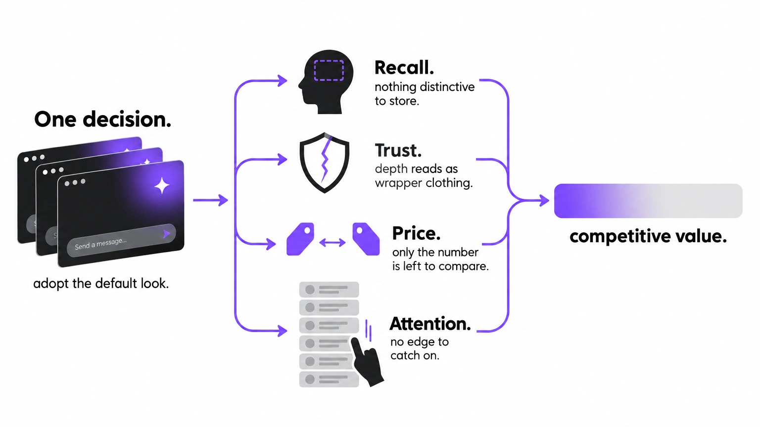
The ones who broke out
Recognition is possible in this category. Five companies did the opposite of the uniform and became identifiable from a thumbnail.
Anthropic and Claude
Anthropic went warm where the market went black. The interface sits on an off-white ground with a serif voice and a terracotta accent, closer to a well-set book than a control room. The illustration language feels hand-drawn and deliberately human. The result reads as calm and thoughtful, which happens to match the brand's entire safety-first argument.
The lesson goes past "use beige": the palette and the values point the same direction.
Perplexity
Perplexity chose teal, serif headlines, a distinctive asterisk-like mark, and an editorial layout with real typographic hierarchy. It presents answers with sources the way a publication presents a researched article. Nothing about the interface says "chatbot."
Everything says "read this, then check the citation." For a product whose whole promise is trustworthy answers, looking like a newsroom does more persuasion work than any feature list could.
ElevenLabs
ElevenLabs is nearly monochrome, with a waveform used as the single recurring motif. No gradient. No glass. The restraint is the identity.
When you strip color to a minimum, every decision that remains becomes readable: spacing, weight, motion, the sound itself. The brand says "we are precise" by refusing to decorate, and it holds up at any thumbnail size.
Midjourney
Midjourney's site is close to anti-design. It stays sparse and lets the generated images carry the whole page. The community work is the brand, and the interface gets out of the way to let it speak.
Most AI products show a UI; Midjourney shows output. That single reversal is why its pages are recognizable in a feed full of glowing dashboards.
Runway
Runway frames itself in film and studio language, with cinematic imagery and the vocabulary of editing and production. It positions as a creative tool that happens to run on AI. The visuals borrow from the world it serves, so a filmmaker reads it as a peer. The technology stays in the product; the branding talks about the outcome.
What these five share is a decision to look like their category of outcome rather than their category of technology. A publishing brand reads as publishing, a film tool reads as film. That is the whole move. Declare the world you belong to, and stop declaring the mechanism you happen to use.
Your competitors all look alike because they are all describing the same technology. Describe the outcome instead.8 ways to design an AI product that doesn't look like AI
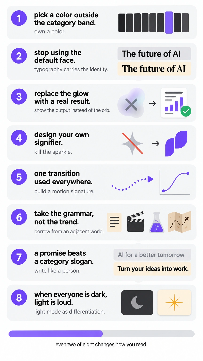
The diagnosis is done. Here is the playbook, in order of impact.
❶ Own a color nobody in your category uses
Audit twenty competitors before you open Figma. Screenshot each hero, then drop the dominant colors into one file. You will see the whole category collapse into a narrow band of near-black and purple. The gap is your opportunity.
Pick a color that sits outside that band and commit to it everywhere, including your favicon and your error states. A color nobody else owns becomes a shortcut to memory the moment a buyer sees you twice.
→ Try this: build the twenty-screenshot color audit before your next design review.
❷ Make typography carry the identity
Inter is a fine interface font, and that is the problem. It is the default, so it carries no information. Choose a typeface that says something: a serif for editorial credibility, or a mono for technical honesty.
Commit to it for headlines and let the system font handle the small print. The typeface does more branding work than your logo in most screenshots.
→ Try this: set one headline in three candidate faces and compare them as thumbnails.
❸ Show the output instead of the orb
Abstract glows and orbs prove nothing. Real output proves everything. Put an actual generated result in your hero: the document, the chart, the finished image, the honest transcript.
Let a stranger see, in one glance, what your product produces. Product output is the only spec your buyer actually cares about, and it is also the most distinctive asset you already own. The Claylo landing template case study shows a build that leads with output and skips the glow entirely.
→ Try this: replace the hero illustration with one real output artifact this week.
❹ Kill the sparkle icon and design your own signifier
The sparkle means "generic AI feature" to everyone who sees it. Borrowing it makes your product read as a plugin rather than a company. Build a small proprietary mark instead: a shape or a letterform pulled from your own product's logic.
Repeat it across the loading state and the primary button. Distinctive assets earn their value through repetition, a principle Jenni Romaniuk and the Ehrenberg-Bass Institute have documented across two decades of brand research, so one custom mark used everywhere beats ten borrowed icons used once.
→ Try this: remove every sparkle in the interface and design one replacement mark.
❺ Build a motion signature
Motion is the most underused branding tool on the web because most teams treat animation as decoration. Choose one recognizable transition and use it everywhere: how panels open and how data loads. It should be subtle enough to survive daily use and specific enough to be noticed on a second visit. Material Design's motion system is a good study in making movement feel consistent rather than random.
→ Try this: define one easing curve and one duration token, then apply them site-wide.
❻ Borrow from an adjacent physical world
Pick a world outside software and take its visual grammar: print layout, lab equipment, film titles, cartography, archival records. The farther the reference from the AI bubble, the more distinctive the result, because your competitors are all reading the same three websites. A landing page that feels like a scientific instrument or a claymorphism surface modelled from real putty is memorable in a way that another dark gradient never will be.
→ Try this: moodboard one non-software world before wireframing the hero.
❼ Write like a person
"Meet your AI copilot" reads as a category slogan instead of a promise. Rewrite your H1 as a specific outcome for a specific person: what changes, and for whom. Specific copy reads as a real product and it also improves conversion, because it answers the buyer's actual question. If your headline could sit on any competitor's page without edits, it belongs to them.
→ Try this: rewrite the H1 so no competitor could use it unchanged.
❽ Light mode as differentiation
When the entire category lives in the dark, a warm light interface is the loudest possible choice. That is the quiet part of what Anthropic pulled off. Light mode reads as neither retro nor lazy.
It is a statement that your product is used in daylight, in calm moments, by people who work away from a terminal. White space and real paper tones stand out precisely because nobody else is doing them.
→ Try this: mock your hero in a warm light palette and compare it beside five competitors.
The "Are you a template?" checklist
Answer yes or no. Your buyers are already scoring you.
- Is your hero background within a few shades of #0A0A0A?
- Is your primary CTA a gradient button on a dark background?
- Does a purple or blue radial glow sit behind your headline?
- Do you use the four-point sparkle icon anywhere in the product?
- Is your H1 built on the word copilot or agent?
- Is your only typeface Inter or Geist?
- Does your feature section use a bento grid of rounded tiles?
- Is there a logo marquee of "trusted by" companies above the fold?
- Does your name end in -ly or -ify, or contain the letters "AI"?
- Is your hero a chat input box instead of a stated promise?
Six or more yes answers means you are wearing the uniform. Four or five means you are on the edge. Three or fewer, and you have something worth protecting.
When the uniform is the right call
I am arguing against burning the dark theme for its own sake. Differentiation is a lever rather than a religion. If you are pre-product-market-fit and burning runway to find a signal, the uniform is cheap and fast, and finding your first users matters far more than looking original.
If you sell infrastructure to engineers who already trust the Vercel aesthetic, matching that language reduces friction. The look is a default for a reason, and defaults help when you have nothing better to say yet. The mistake is treating a temporary shortcut as a permanent brand and never revisiting it once you have something real to signal.
Frequently asked questions
Why do all AI startup websites look the same?
Most founders point designers at the same references and build from the same component libraries. AI generators then supply the first draft. Identical inputs converge on identical output. Nothing in that pipeline rewards originality, so the median result is the average of everything that came before it. The uniformity falls out of the workflow, and nobody picked it deliberately.
What is the AI aesthetic in design?
It is a loose visual style: near-black backgrounds, a purple-to-blue radial glow, the four-point sparkle icon, glassmorphism panels, an Inter or Geist headline, and a bento feature grid. It originated with Linear and Vercel above all, then spread through shadcn/ui and AI page generators. It now reads as modern infrastructure and it is used by thousands of unrelated products.
Should an AI startup use dark mode?
Only if dark mode says something true about your product. It fits developer tools and anything used at night. For consumer or editorial products it sends the wrong signal.
When every competitor is dark, a warm light interface becomes the most noticeable thing on the page. Pick the mode that matches how your product is actually used.
How do you make an AI product look different?
Pick a color your category avoids, then let typography carry the identity. Show real product output in the hero instead of an abstract orb. Add one motion signature and rewrite the H1 as a specific promise. Break one or two rules of the uniform and you are already more recognizable than most.
Is glassmorphism still in style in 2026?
As a supporting detail, yes. As the main event, no.
Frosted panels over a dark gradient are the default AI look and they no longer signal anything. Use blur to separate one layer. Building an entire page out of it is the mistake. Apple's liquid glass work pushed the technique forward, and that makes the copycat version easier to recognize.
The list, one more time
Scroll the Demo Day list once more, logos taped over. This time one card stops your thumb. It is warm cream with a serif headline, and there is a real document where the chat box used to be.
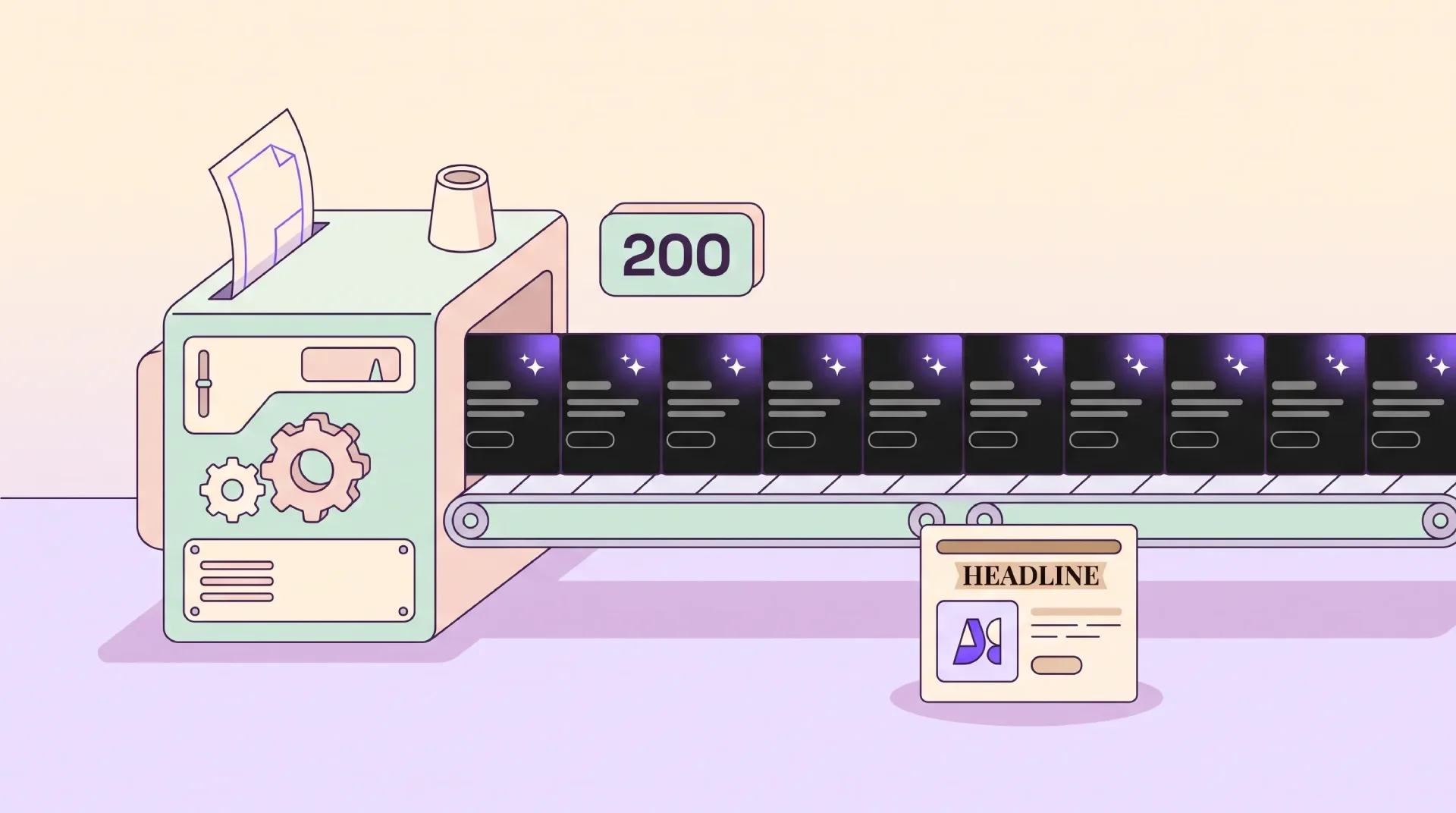
You still cannot read the name, but you remember the tile, and that is the entire job. Recognizability is the difference between being one of two hundred and being the one anybody recalls.