
Roman Kamushken
A UI kit becomes valuable when it removes ambiguity.
Developers want predictable APIs and stable styling hooks.
Product managers want fewer regressions and faster iteration.
Design system architects want a component library that scales across teams, themes, and releases.
This post is an engineering-style guide to building a production-ready UI kit foundation for a SaaS UI kit or enterprise UI kit.
By the end, you will have four concrete artifacts you can ship as part of your design system architecture:
➀ A design tokens model with a naming convention that supports theming and dark mode
➁ A shared UI component states matrix for core controls
➂ A component contract template, plus two filled examples you can copy into docs or Storybook
➃ A Figma component library structure that maps to real implementation constraints
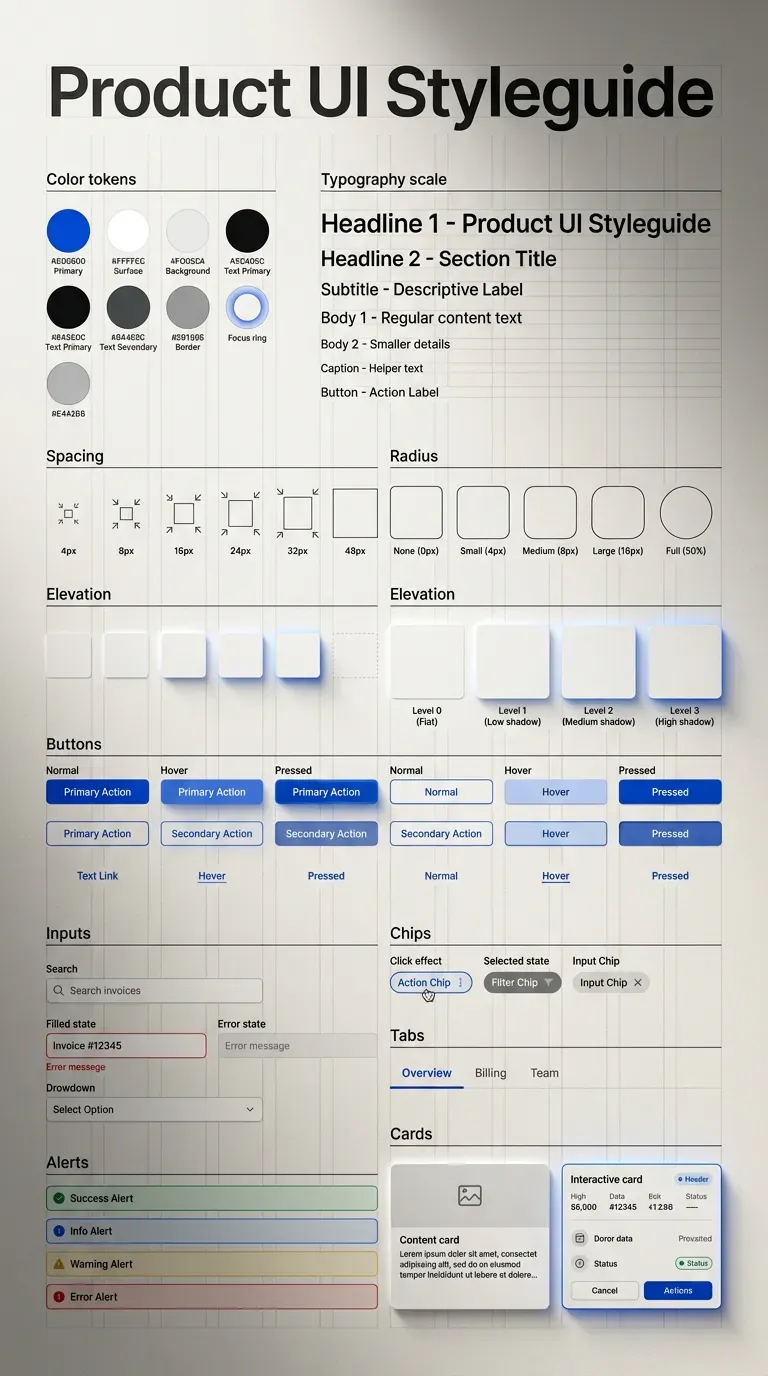
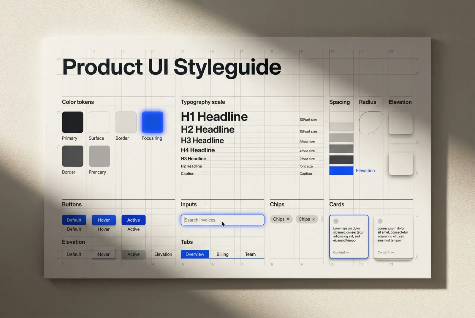
How to design a UI kit foundation: tokens, states, and component contracts. A product UI style guide sample fully generated by Venice.AI - a handy tool for not only designers & vibe coders.
Scope and terminology
A short alignment saves weeks later.
Style guide
→ visual rules and primitives: color ramps, typography scale, spacing, elevation, borders, icon rules
→ the “grammar” that components inherit
UI kit
→ reusable UI components: buttons, inputs, navigation, feedback, overlays, data display
→ variants, states, and usage patterns
Design system
→ operating model around the library: governance, contribution workflow, versioning, documentation, QA practices
This guide focuses on UI kit foundation work that directly impacts implementation speed, consistency, and long-term maintainability.
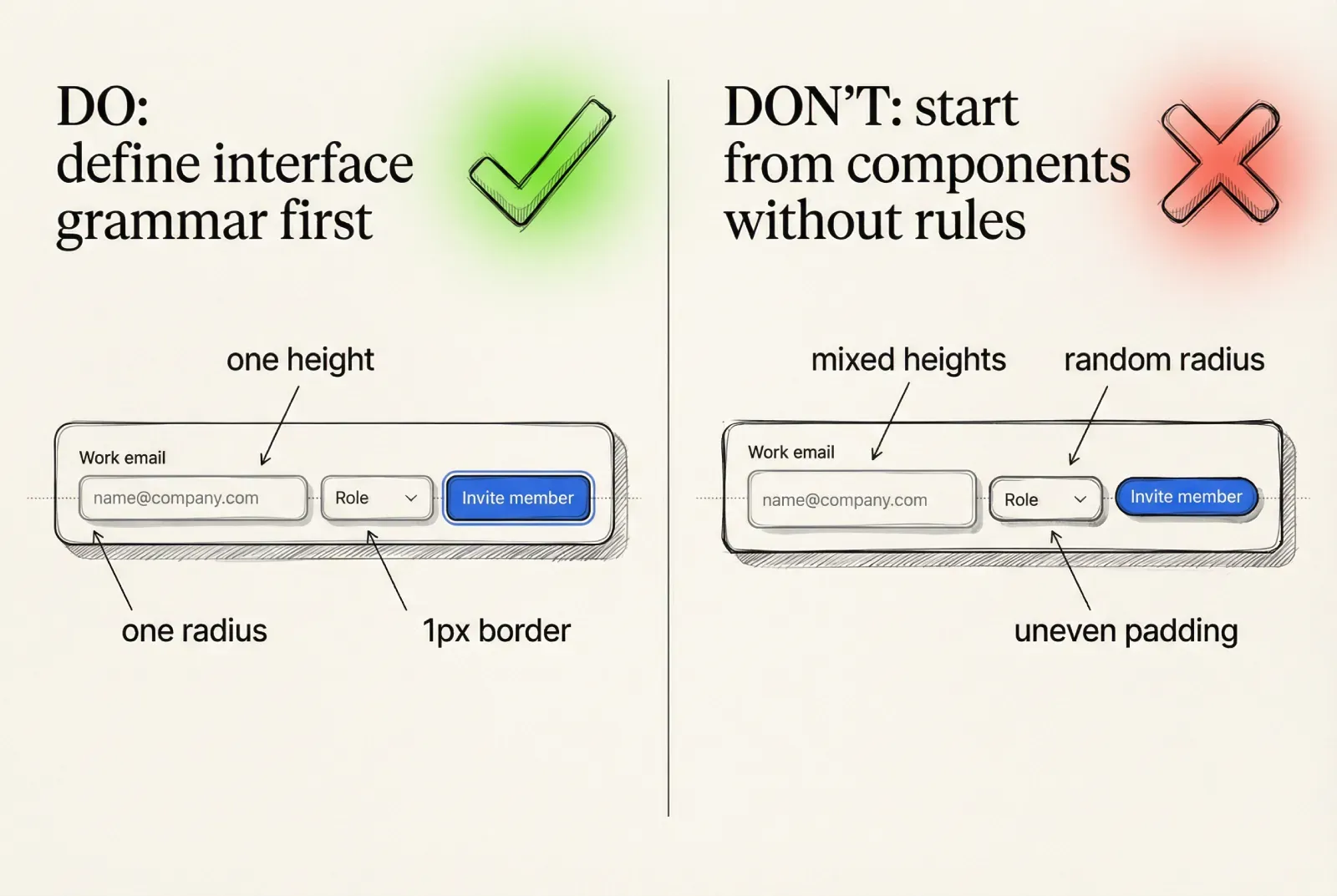
Start with interface grammar before components
If you build UI components first, you freeze hidden decisions inside each component. Later you discover five paddings, three baselines, and inconsistent focus styling.
Interface grammar is a small set of constraints that every component uses.
Spacing scale and layout rhythm
Choose one spacing system and treat it as an API, not a suggestion.
❶ Pick a base step (4 or 8 is common)
❷ Define a finite set of spacing tokens derived from it
❸ Define where exceptions are allowed and what approves them
❹ Define vertical rhythm rules for forms, tables, and dense screens
A practical spacing token set for a UI kit foundation:
· space.1 = 4
· space.2 = 8
· space.3 = 12
· space.4 = 16
· space.6 = 24
· space.8 = 32
· space.10 = 40
These values are less important than two properties:
→ the set is small
→ components stick to the set
☞ If your product includes admin screens or data-heavy views, define density rules now. Dense enterprise UI forces spacing exceptions later unless you plan for it.
Control heights, hit targets, and baselines
Developers will implement these as constants. Make them explicit.
❶ Define control heights as tokens (S, M, L)
❷ Define minimum hit targets where touch matters
❸ Define baseline alignment rules for label, value, and helper text
❹ Define icon sizes and baseline alignment relative to text
Example control sizing tokens:
· control.height.s = 32
· control.height.m = 40
· control.height.l = 48
And the rule that prevents layout drift:
→ the text baseline aligns across inputs, selects, and buttons for the same size preset
☞ Baseline alignment becomes visible only when you assemble real forms. Test with long labels, helper text, and mixed icon presence.
Radius, borders, and elevation
Small sets scale. Large sets fragment.
❶ Pick 2 to 4 radii values
❷ Map each radius to a UI meaning
❸ Define border roles as tokens
❹ Define elevation levels and which components may use them
Example radii mapping:
· radius.1 for small controls (chips, toggles)
· radius.2 for inputs and buttons
· radius.3 for cards and panels
· radius.4 for modals and large surfaces
Elevation levels that remain implementable:
· elevation.0 canvas and flat surfaces
· elevation.1 raised card, subtle hover lift
· elevation.2 popovers and dropdown menus
· elevation.3 modal dialogs
☞ Use borders and elevation together. In many SaaS UI kits, a subtle border plus a mild shadow reads cleaner than heavy shadows.
What to verify early
These checks catch most “foundation drift” before the component library grows.
❶ Place a button, input, select, and icon button on one row for each size preset
❷ Add label and helper text under the input and select
❸ Toggle hover and focus styles
❹ Confirm there is no layout shift across states and sizes
This single assembly is a fast quality gate for a UI kit foundation.
Start with interface grammar before components
Design tokens that survive theming, dark mode, and scale
Design tokens are the contract between visual intent and implementation.
If tokens are treated as palette names, theming becomes fragile.
If tokens are treated as semantic roles, theming becomes mapping.
A scalable token system uses three layers:
→ Primitive tokens (raw ramps and constants)
→ Semantic tokens (meaningful roles)
→ Component tokens (targeted overrides under strict rules)
Primitive tokens
Primitive tokens represent raw values. Keep them stable and descriptive.
· color.neutral.0 … color.neutral.900
· color.accent.100 … color.accent.900
· color.success.*, color.warning.*, color.danger.*
· opacity.*
· shadow.* (if you store shadow primitives)
Primitive tokens should rarely appear in component styles directly.
Semantic tokens
Semantic tokens represent UI roles. This is where your design system architecture gets leverage.
Examples that cover most UI kits:
· text.primary, text.secondary, text.muted, text.inverse
· bg.canvas, bg.surface, bg.surfaceRaised
· border.default, border.subtle, border.divider
· accent.primary, accent.primaryHover, accent.primaryPressed
· selection.bg, selection.text
· focus.ring, focus.ringInner
· state.success, state.warning, state.danger
The key property:
→ semantic token names remain identical across themes
→ only the mapping changes
☞ If you want reliable dark mode, build it as a semantic token mapping problem. This avoids maintaining two parallel UI kits.
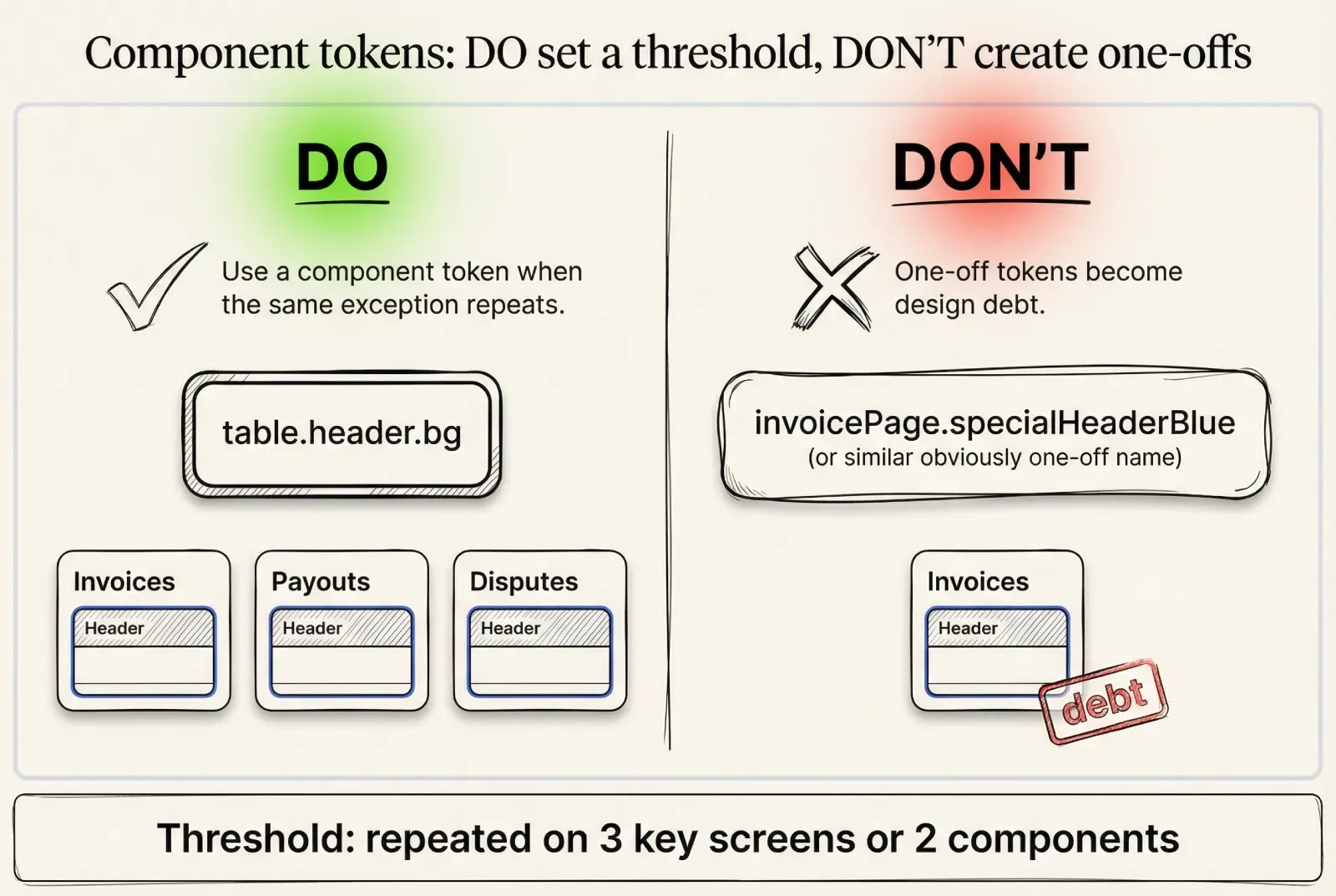
Component tokens under strict rules
Component tokens are justified when semantic roles cannot express a repeated visual requirement.
Use a clear threshold so token sprawl is controlled:
❶ Introduce a component token only if the exception repeats on at least 3 key screens or appears in at least 2 different components
❷ Tie the component token to a stable UI meaning, not a one-off layout
❸ Document where it is allowed and where it is forbidden
❹ Ensure the token works under theming without manual fixes
Examples:
· table.header.bg
· table.row.hover.bg
· toast.bg (if it differs from normal surfaces)
· input.border.error (when the error behavior is standardized)
☞ If a designer wants a one-off treatment for a single screen, treat it as a screen style decision, not a design token decision.
Token naming convention
A naming convention is part of your UI kit foundation. It impacts discoverability and the ability to automate.
A practical structure:
→ primitives: color.<family>.<step>
→ semantics: <category>.<role>[.<state>]
→ components: <component>.<part>[.<state>]
Examples:
· color.neutral.700
· bg.surfaceRaised
· text.primary
· accent.primaryHover
· button.bg.pressed
· input.border.focus
· select.option.bg.highlighted
This is readable for engineers and stable for design systems.
A small, implementation-ready token excerpt
This is the level of specificity developers expect when building a component library.
{
  "color": {
    "neutral": { "0": "#FFFFFF", "900": "#0B0F14" },
    "accent": { "600": "#2563EB", "700": "#1D4ED8" },
    "danger": { "600": "#DC2626" }
  },
  "semantic": {
    "bg": {
      "canvas": "{color.neutral.0}",
      "surface": "{color.neutral.0}",
      "surfaceRaised": "{color.neutral.0}"
    },
    "text": {
      "primary": "{color.neutral.900}",
      "secondary": "{color.neutral.900}",
      "muted": "{color.neutral.900}"
    },
    "border": {
      "default": "{color.neutral.900}",
      "subtle": "{color.neutral.900}"
    },
    "accent": {
      "primary": "{color.accent.600}",
      "primaryHover": "{color.accent.700}"
    },
    "state": {
      "danger": "{color.danger.600}"
    }
  }
}
The exact colors will differ by brand. The structure scales.
☞ If you plan to connect tokens to code, keep the token tree stable and avoid frequent renames. Versioning design tokens is harder than versioning components.
Design tokens that survive theming, dark mode, and scale
Color rules that remain readable under real data
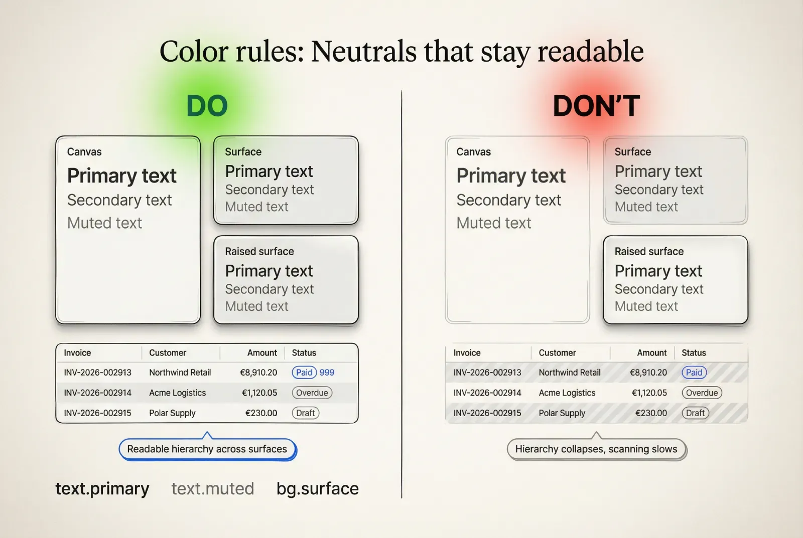
Color problems in a UI kit usually come from missing state rules and missing surface rules.
Neutral ramp strategy
A neutral ramp must support four distinct tasks:
· readable text across surfaces
· subtle borders and dividers
· elevation separation
· disabled and muted content
A frequent failure in enterprise UI is using the same neutral for text and borders across every surface. This reduces hierarchy and makes tables hard to scan.
☞ Validate your neutral ramp using actual components, not swatches. Put neutrals under text, inside tables, inside modal overlays, and inside dropdowns.
Accent behavior across states
Define state deltas, then implement them consistently across the component library.
❶ Default uses accent.primary
❷ Hover uses accent.primaryHover
❸ Pressed uses accent.primaryPressed
❹ Focus uses focus.ring and focus.ringInner, not ad hoc styling
❺ Disabled has no hover and no pressed behavior
Then apply the same logic to secondary and ghost variants.
☞ The UI component states matrix must avoid layout shifts. Colors and shadows can change, padding and border widths should remain stable.
Status and semantic meaning
Status colors need both foreground and background roles, especially for alerts, badges, and form errors.
Define pairs:
· danger.fg, danger.bg, danger.border
· success.fg, success.bg, success.border
· warning.fg, warning.bg, warning.border
Then map them to component parts:
→ input.border.error = danger.border
→ input.helper.error = danger.fg
→ alert.danger.bg = danger.bg
☞ Use status with redundancy in critical flows. Combine color with icon and text, and define where status messaging lives so it does not jump layouts.
Theming and dark mode parity
Dark mode fails when the token model duplicates intent.
A stable approach:
❶ Keep semantic token names identical
❷ Map semantic tokens to theme-specific primitives
❸ Validate contrast and hierarchy using the same component assemblies in both themes
❹ Confirm selection, focus, and error treatments remain recognizable
This is the difference between “dark UI kit” as a duplicate design and “theming” as a controlled mapping.
Color rules that remain readable under real data
Typography and numeric formatting as part of the UI kit foundation
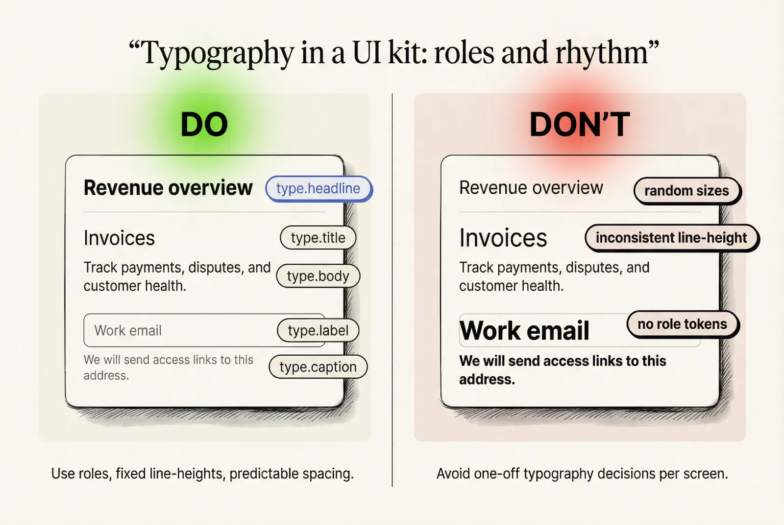
Typography influences readability, density, and layout stability. It also influences how components scale with content.
Define typographic roles, not just sizes
A role-based typography system is more useful than a list of font sizes.
→ type.caption for helper text and metadata
→ type.body for primary text content
→ type.label for control labels and UI chrome
→ type.title for section headers
→ type.headline for page anchors
For each role define:
· font size token
· line height token
· font weight token
· letter spacing token (if needed)
☞ If your product supports compact density, define compact line-height tokens. This prevents random “tightening” per screen.
Numeric UI and tabular figures
In a SaaS UI kit, tables, dashboards, and admin panels depend on numerical scanning.
Define a numeric text role:
→ type.numeric uses tabular figures and stable width behavior
This improves readability for:
· €8,910.20
· Invoice #INV-2026-002913
· 2026-02-09 14:35
· Latency 128 ms
☞ If tabular figures are unavailable in your font, define a fallback: a numeric-friendly font stack or a monospace role reserved for IDs.
Formatting rules that reduce product inconsistency
Formatting is part of the component contract, especially for data display components.
Define patterns for:
❶ Currency display (symbol, spacing, decimals)
❷ Dates and time (absolute formats, relative formats)
❸ IDs and reference numbers (grouping, truncation, copy behavior)
❹ Truncation (where ellipsis appears, tooltip behavior)
A practical example for a table column set:
→ Amount: €8,910.20
→ Status: Paid
→ Invoice: INV-2026-002913
→ Customer: Customer success team - Northern Europe
This kind of real microcopy is the fastest way to reveal layout weaknesses.
Typography and numeric formatting as part of the UI kit foundation
UI component states: build the matrix, then enforce it
UI component states are where design tokens and implementation meet.
A UI kit foundation should standardize state coverage and define what changes per state.
Shared state vocabulary
For most component libraries, this shared vocabulary scales:
→ default
→ hover
→ pressed
→ focus
→ disabled
→ loading
→ error (where applicable)
→ open (for overlays and selects)
→ selected and highlighted (for lists and options)
The key is to use the same meaning across components.
☞ State naming should match implementation naming. If designers say “active” and engineers say “pressed,” alignment breaks immediately.
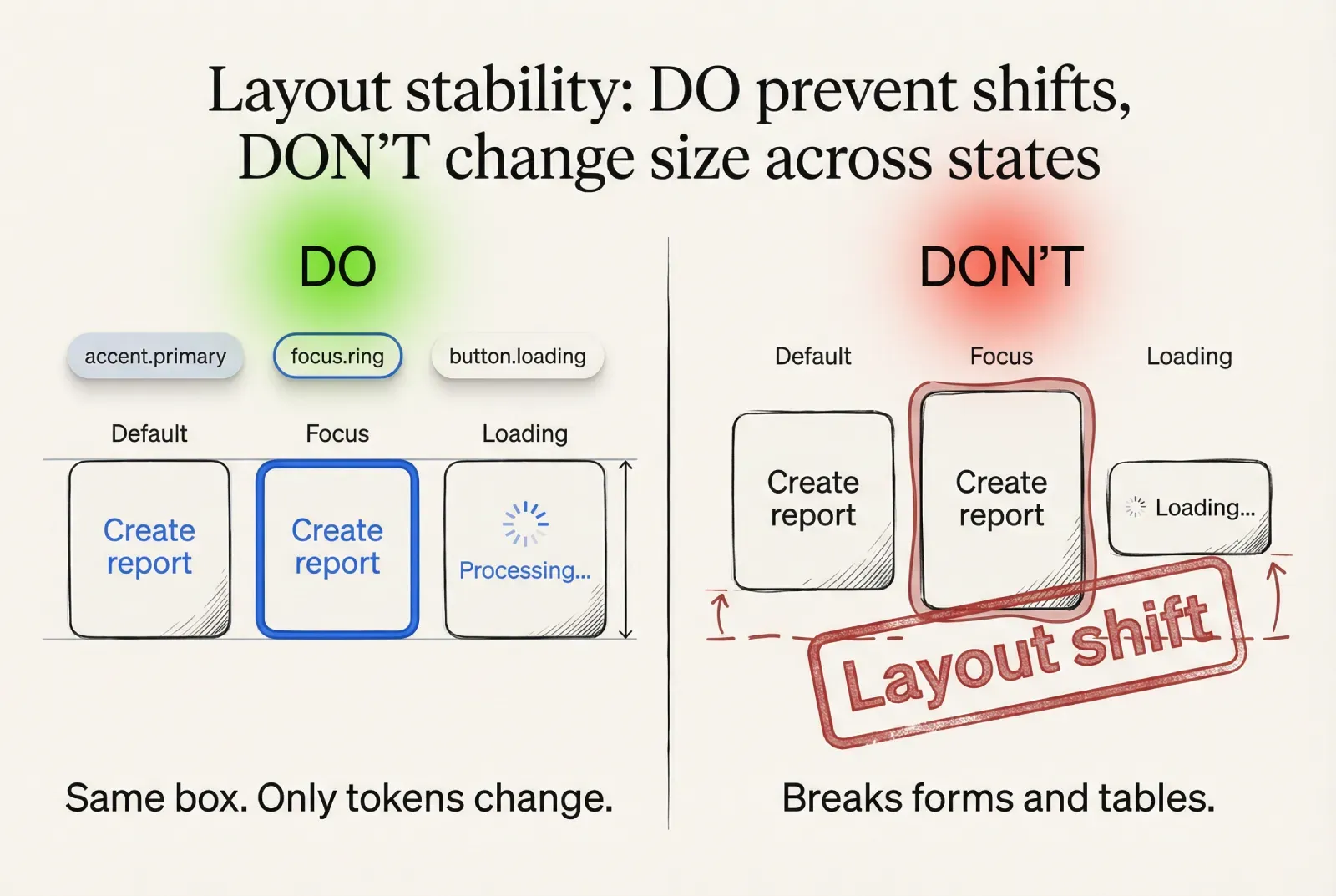
Button state specification
Button states should define explicit changes in a stable order:
❶ Surface change: background and border tokens per state
❷ Text change: text color remains readable under every state
❸ Elevation change: optional, small, stable across variants
❹ Focus change: ring tokens, consistent placement and thickness
❺ Loading change: spinner placement and label behavior, no width jump
Common acceptance criteria for a production-ready button:
→ border width remains constant across states
→ padding remains constant across states
→ label baseline remains constant across states
→ loading keeps the button width stable
→ disabled ignores hover and pressed
☞ If a pressed state darkens the background and also changes the border thickness, developers will implement it differently per component. Keep state deltas simple.
Text field state specification
Text field contracts often fail around helper text, error messaging, and icons.
A stable specification:
❶ Empty: label stable, placeholder visible
❷ Filled: value style, placeholder hidden
❸ Hover: border emphasis only
❹ Focus: ring appears, border token changes, helper spacing unchanged
❺ Error: border uses error token, helper becomes error message with identical spacing
❻ Disabled: content muted, cursor behavior defined, icons updated consistently
Acceptance criteria:
→ helper line height and spacing remain stable between helper and error
→ focus ring does not create layout shift
→ error state remains readable under theming
☞ Error messaging should not change the component height when possible. Layout jumps cause users to lose context during correction.
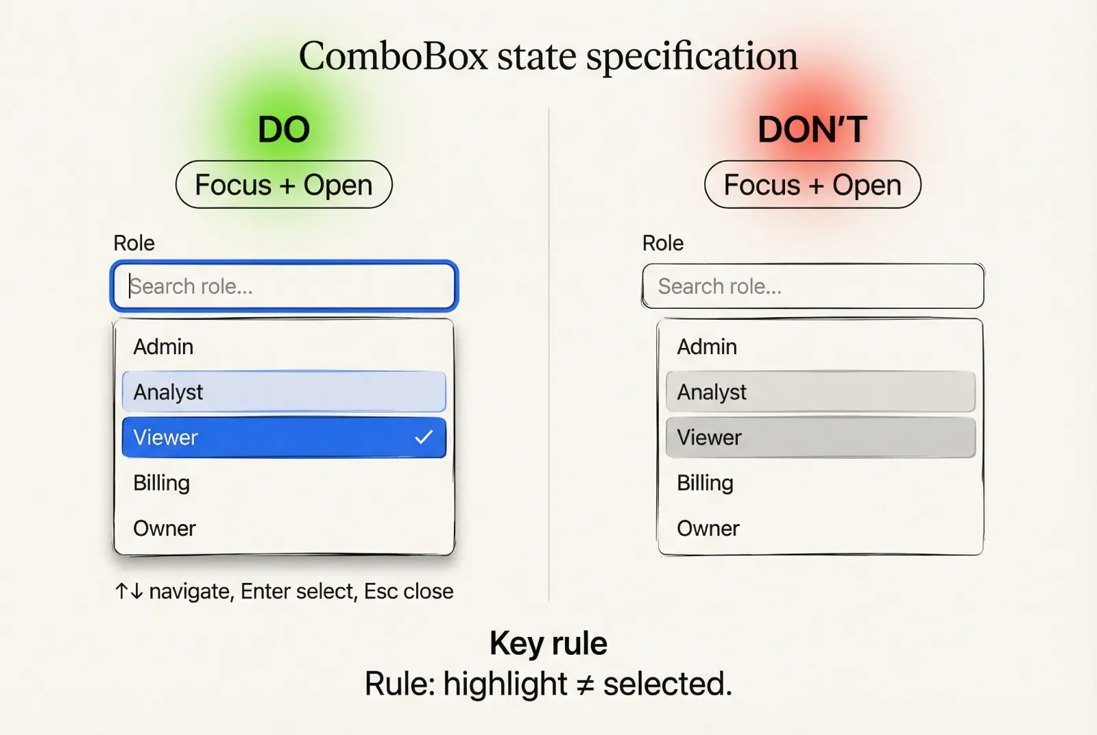
Select and ComboBox state specification
Selection controls are composite components. Contracts must cover both control and menu.
Control states mirror inputs:
→ closed, hover, focus, disabled, error
Menu states and behaviors must be explicit:
❶ Open: menu uses an elevation token surface, defined max height, scroll behavior
❷ Highlighted: option highlight uses a token distinct from selection
❸ Selected: selection uses a token distinct from highlight
❹ Empty results: defined empty state messaging
❺ Loading: defined loading behavior for options
❻ Keyboard: arrow navigation, enter selection, escape close, type-ahead rules
Acceptance criteria:
→ highlight and selection are visually distinct
→ option content handles long text (wrap or truncate rule is explicit)
→ menu width and alignment are defined relative to the control
☞ If your design system includes accessibility requirements, define ARIA roles and keyboard behavior as part of the component contract, not as an implementation footnote.
UI component states: build the matrix, then enforce it
Component contracts: the definition of “dev-ready” UI components
A UI kit is production-ready when every component has a contract that engineers can implement and reviewers can verify.
A component contract is a structured spec. It removes guesswork.
Contract template you can copy into docs
Use a fixed template across the component library so it becomes predictable.
· Purpose and usage scope
· Anatomy and slots
· Props and variants (implementation-facing)
· State matrix coverage
· Layout rules (padding, alignment, sizing)
· Content rules (wrapping, truncation, overflow)
· Interaction rules (mouse, keyboard, touch)
· Accessibility notes (labels, focus order, roles)
· Tokens used (semantic and component-level)
· Edge cases and test strings
· Known constraints and versioning notes
☞ If a contract section is missing, developers will fill it with assumptions. Assumptions diverge across teams.
Example contract 1: Button
Purpose and scope
→ primary and secondary actions across the product UI
→ supports destructive actions via a dedicated variant
Anatomy and slots
→ container
→ leading icon slot (optional)
→ label slot
→ trailing icon slot (optional)
→ loading indicator slot (optional)
Variants and sizes
→ variants: primary, secondary, ghost, danger
→ sizes: S, M, L
→ icon-only variant uses the same height tokens, with width equal to height
State matrix
→ default, hover, pressed, focus, disabled, loading
Layout rules
→ padding uses spacing tokens, never ad hoc values
→ border width constant across states
→ label baseline aligns with other controls for the same size
→ icon size fixed per size preset
→ loading indicator does not change button width
Content rules
→ long labels truncate with ellipsis for single-line buttons
→ multi-line labels are allowed only for dedicated layouts and must be explicit in the variant
→ icon presence does not change vertical alignment of label
Interaction rules
→ click triggers action once
→ loading state disables additional triggers
→ disabled state prevents interaction and ignores hover
Accessibility notes
→ focus visible using focus.ring
→ icon-only button requires accessible label
→ danger variant uses semantic roles, not color-only meaning
Tokens used
→ accent.primary, accent.primaryHover, accent.primaryPressed
→ text.inverse for primary button label
→ border.default for secondary and ghost
→ focus.ring, focus.ringInner
→ state.danger roles for danger variant
Edge cases and test strings
→ label: “Export transactions”
→ label long: “Download report for Customer success team - Northern Europe”
→ icon-only: “Open settings”
☞ This contract is implementable because it answers state behavior, layout stability, and content rules. It also maps directly to a component API in React, Vue, or native frameworks.
Example contract 2: Text field
Purpose and scope
→ single-line text input for forms and settings
→ supports validation messaging and optional leading and trailing actions
Anatomy and slots
→ container
→ label
→ input area
→ leading slot (icon or prefix)
→ trailing slot (clear button, action icon)
→ helper slot (helper or error text)
Variants and sizes
→ variants: default, with leading icon, with trailing action, with prefix
→ sizes: S, M, L
→ optional mode: read-only style if your system supports it (define separately)
State matrix
→ empty, filled
→ default, hover, focus, disabled
→ error (applies to both empty and filled)
→ loading (optional, if remote validation exists)
Layout rules
→ height fixed by size token
→ padding fixed by spacing tokens
→ label and helper alignment fixed across states
→ focus ring drawn outside the component box so layout remains stable
→ error message occupies the same line box as helper text
Content rules
→ placeholder text uses text.muted
→ value uses text.primary
→ helper uses type.caption and text.secondary
→ error text uses state.danger roles
→ long helper wraps within component width, max 2 lines unless pattern defines otherwise
Interaction rules
→ clear button appears only when value is non-empty and the trailing slot exists
→ pressing escape clears only if the product uses that convention, define it explicitly
→ enter behavior depends on form context, do not override by default
Accessibility notes
→ label association required (visible label preferred)
→ error message must be programmatically associated
→ focus visible and consistent with other input-like controls
Tokens used
→ bg.surface, border.default, border.subtle
→ input.border.focus, focus.ring
→ state.danger mapping for error border and helper text
→ typography roles for label, value, helper
Edge cases and test strings
→ label: “Work email”
→ placeholder: “name@company.com”
→ helper: “We will send access links to this address.”
→ error: “This field is required. Use your work email.”
→ long value: “customer-success-emea@very-long-company-domain.example”
☞ This contract reduces implementation debate because it specifies layout stability, error behavior, keyboard expectations, and token dependencies.
Component contracts: the definition of “dev-ready” UI components
Density and layout rules for real SaaS screens
Density is a product decision with direct performance impact in enterprise UI.
If density is undefined, teams solve it per screen and the UI kit drifts.
Define density as tokens
Treat density as a preset of core tokens:
→ control heights
→ padding within components
→ typography line heights
→ table row heights
→ spacing between groups
A practical approach:
❶ Define density.comfort and density.compact presets
❷ Map a small set of tokens to each preset
❸ Provide a rule for where each preset is used
❹ Ensure components can switch density without redesign
Example token mapping:
· control.height.m points to 40 in comfort and 32 in compact
· space.4 stays constant, but component internal padding changes by preset
· typography roles keep sizes, but line heights tighten within a defined range
☞ Product managers can use density presets to reduce scope creep. A request becomes “use compact preset for tables” instead of “redesign the table.”
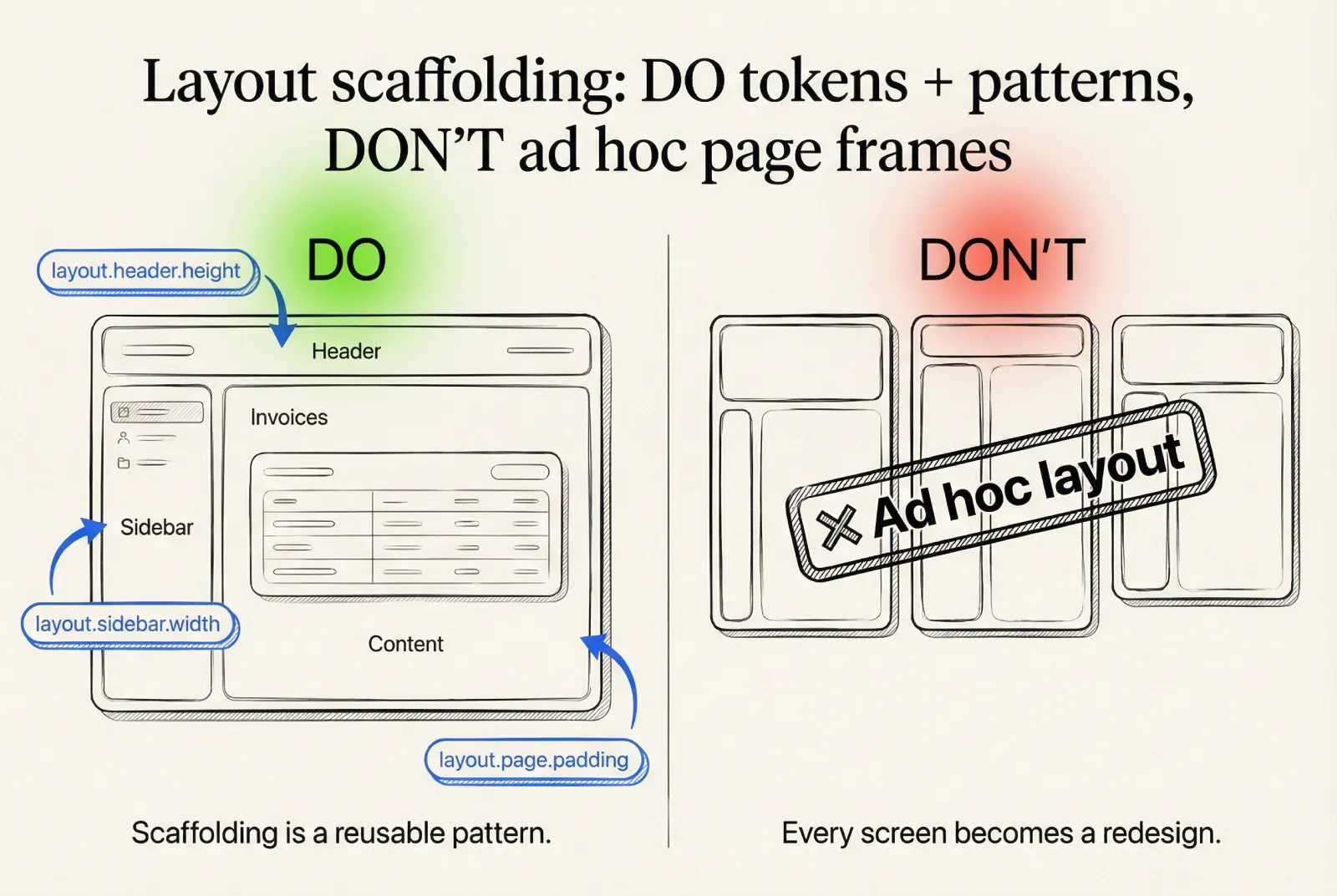
Layout scaffolding
A UI kit foundation benefits from consistent scaffolding tokens.
Define:
· page padding tokens
· content max width tokens
· sidebar widths and collapse thresholds
· header height and sticky behavior
· section spacing rules
This keeps screens consistent even when multiple teams build features.
☞ Scaffolding should be documented as patterns that reuse components. This is where design system architecture becomes real for delivery teams.
Density and layout rules for real SaaS screens
The minimal UI kit that covers most product screens
A component library scales when it starts small and strict.
The goal is coverage of real flows, not maximal component count.
Minimal set for most SaaS UI kits:
· Inputs: text field, textarea, search field, select, ComboBox, checkbox, radio, switch
· Actions: primary button, secondary button, icon button, danger button pattern
· Navigation: tabs, breadcrumb, pagination, sidebar item
· Feedback: tooltip, toast, inline alert
· Overlays: modal dialog, popover
· Data display: table baseline, badge, chip, tag
A rule for adding components that works across teams:
❶ Add a new component if it appears on at least 3 key screens and repeats with the same structure
❷ Add a new variant if it repeats with the same behavior and differs mainly in tokens
❸ Treat one-off UI as a screen decision unless it becomes a repeated pattern
☞ This rule helps PMs and architects manage the backlog of “please add this to the design system” requests.
Figma component library structure that maps to implementation
A Figma UI kit succeeds when it prevents duplication and makes handoff predictable.
The structure should match how engineers think about a component library.
Page structure
Keep it consistent and shallow:
→ Foundations: design tokens, typography, elevation, spacing, icon rules
→ Components: the canonical library
→ Patterns: repeated compositions (filters, empty states, form sections)
→ Examples: reference screens built only from library parts
This maps to design tokens, component library, and patterns in implementation.
Naming and property model
A naming convention improves reuse and reduces search friction.
A practical scheme:
❶ Component name
❷ Variant
❸ Size
❹ State
For properties, align with the implementation API:
→ size
→ variant
→ state
→ leading
→ trailing
→ hasHelper
→ isDestructive
☞ When Figma properties align with component props, developers can reason about UI behavior directly from the library.
Rules that prevent drift
These rules reduce the most common failure modes in Figma component libraries:
❶ Overrides are allowed for content only, not for core styling
❷ Layout changes require a defined variant or a pattern
❸ Visual changes require token changes, not local custom values
❹ Detached instances are treated as debt and must be reviewed
These rules are lightweight governance that design system architects can enforce without heavy process.
Publishing and versioning
Even a small design system benefits from release discipline.
❶ Publish the UI kit as a library
❷ Track changes with short release notes
❸ Flag breaking changes: token renames, contract changes, variant removals
❹ Provide migration notes when needed
☞ Versioning matters because a design tokens rename can break multiple products faster than a component rename. Treat tokens as a shared dependency.
FAQ
If you want the full system, not just the first three chapters, the complete Liquid glass UI playbook goes deeper into tiers, stress tests, and repeatable Do and Don’t rules you can apply to real component libraries. Not sure which glass style fits your kit? Start with glassmorphism vs neumorphism vs liquid glass.
➀ What is the practical difference between a style guide and a UI kit?
A style guide defines the visual rules and the design tokens model. A UI kit converts those rules into reusable UI components with variants, states, and contracts. A component library becomes reliable only when contracts specify behavior, sizing, and edge cases.
➁ What is the best design tokens strategy for theming and dark mode?
Use layered design tokens: primitives for raw ramps, semantic tokens for roles, component tokens only under strict thresholds. Dark mode becomes semantic mapping across themes. This approach scales for enterprise UI and multi-brand products.
➂ Which UI component states should be mandatory in a component library?
For most SaaS UI kits: default, hover, pressed, focus, disabled, loading. Inputs also require error. Selection controls require open, highlighted, selected, empty results, and loading for options. A shared state matrix prevents inconsistent implementation.
➃ When do component tokens make sense?
Component tokens are justified when semantic roles cannot express a repeated requirement and the exception repeats across key screens or across multiple components. Define a threshold and document usage. This prevents token sprawl and keeps theming stable.
➄ How do you keep dense enterprise UI consistent without redesigning everything?
Define density presets as tokens and map control heights, paddings, and line heights to presets. Ensure core components can switch density via tokens. This keeps layouts consistent and reduces per-screen overrides.
➅ What makes a component contract “dev-ready”?
A dev-ready contract includes anatomy and slots, props and variants, state coverage, layout stability rules, content constraints, keyboard interactions, accessibility notes, token dependencies, and edge-case test strings. This reduces guesswork and speeds delivery.
➆ How can a product manager evaluate UI kit maturity quickly?
Look for stable design tokens naming, consistent UI component states across core controls, explicit component contracts, predictable density presets, and a basic versioning approach for the component library and tokens. These indicators correlate with fewer regressions and faster iteration.
Closing
A high-quality UI kit foundation is an investment that pays back in reduced ambiguity.
· Design tokens become stable interfaces for theming and dark mode.
· UI component states become consistent across the component library.
· Component contracts turn “design intent” into implementable behavior.
· Figma UI kit structure reduces duplication and aligns designers with engineers.
If you are building design system architecture for multiple teams, focus on foundation constraints, semantic tokens, state matrices, and contracts before you expand the library. This sequence prevents drift and keeps the UI kit production-ready.


