
Roman Kamushken
Ask an agent for a settings panel and you get the same screen every time. A centred white card, a column of grey inputs, a blue button at the bottom. Each control was written from scratch for this one prompt, so the toggle you got today shares no code with the toggle you got yesterday.
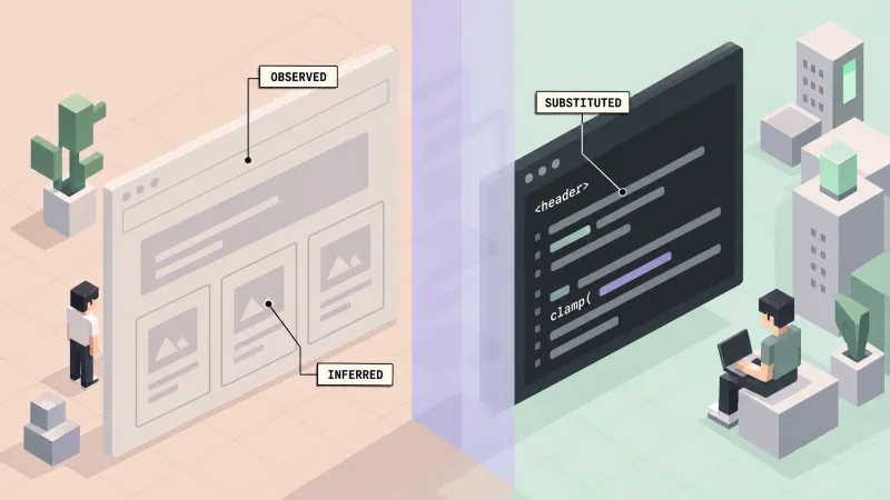
The cause is simple: the agent has no vocabulary. It knows what a settings panel looks like on average, and it has never seen your buttons or your spacing scale.
A longer prompt will not close that gap. A component vocabulary the agent can read will close it: real parts with props, usage examples and rules attached.
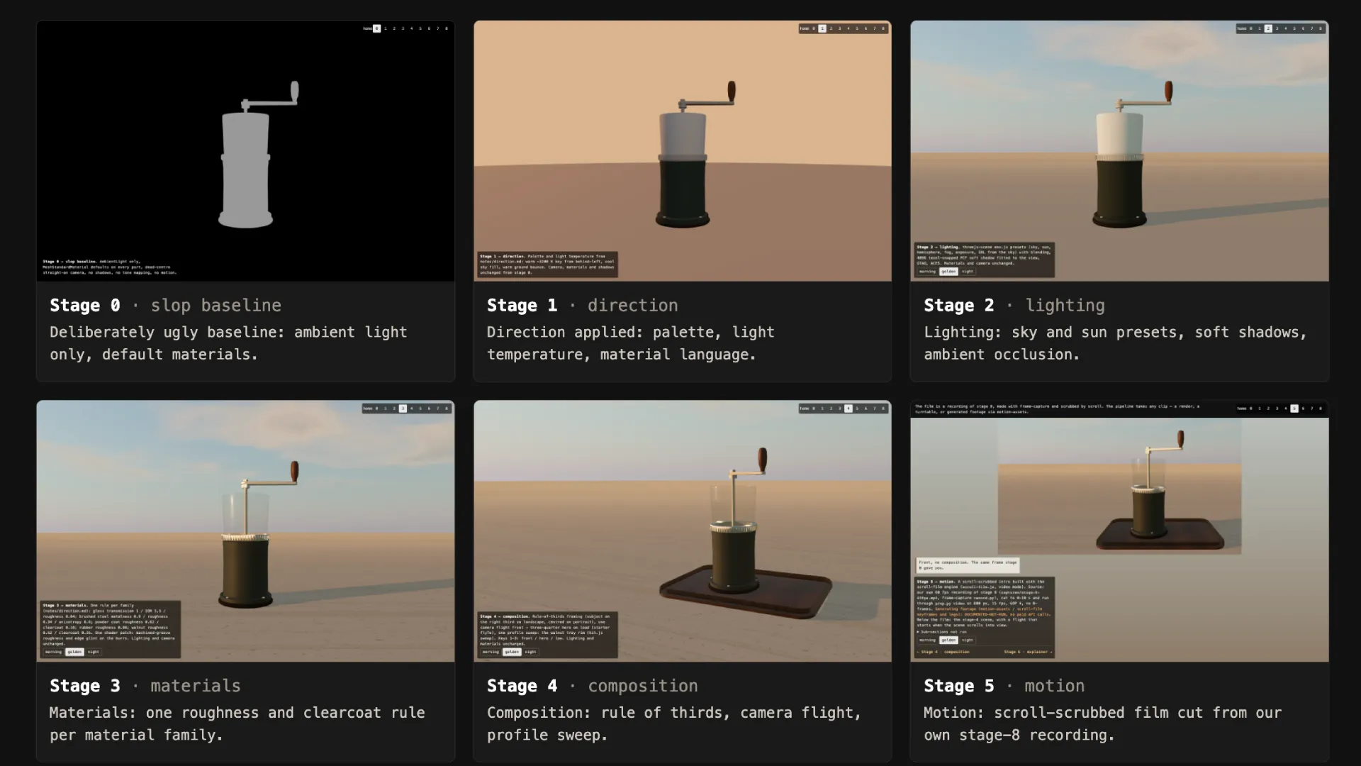
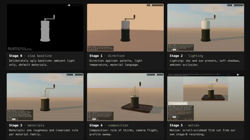
I made the same argument about 3D in why AI-generated 3D looks like slop. There the missing piece was a direction document written before any code. Here it is a design system the agent can browse.
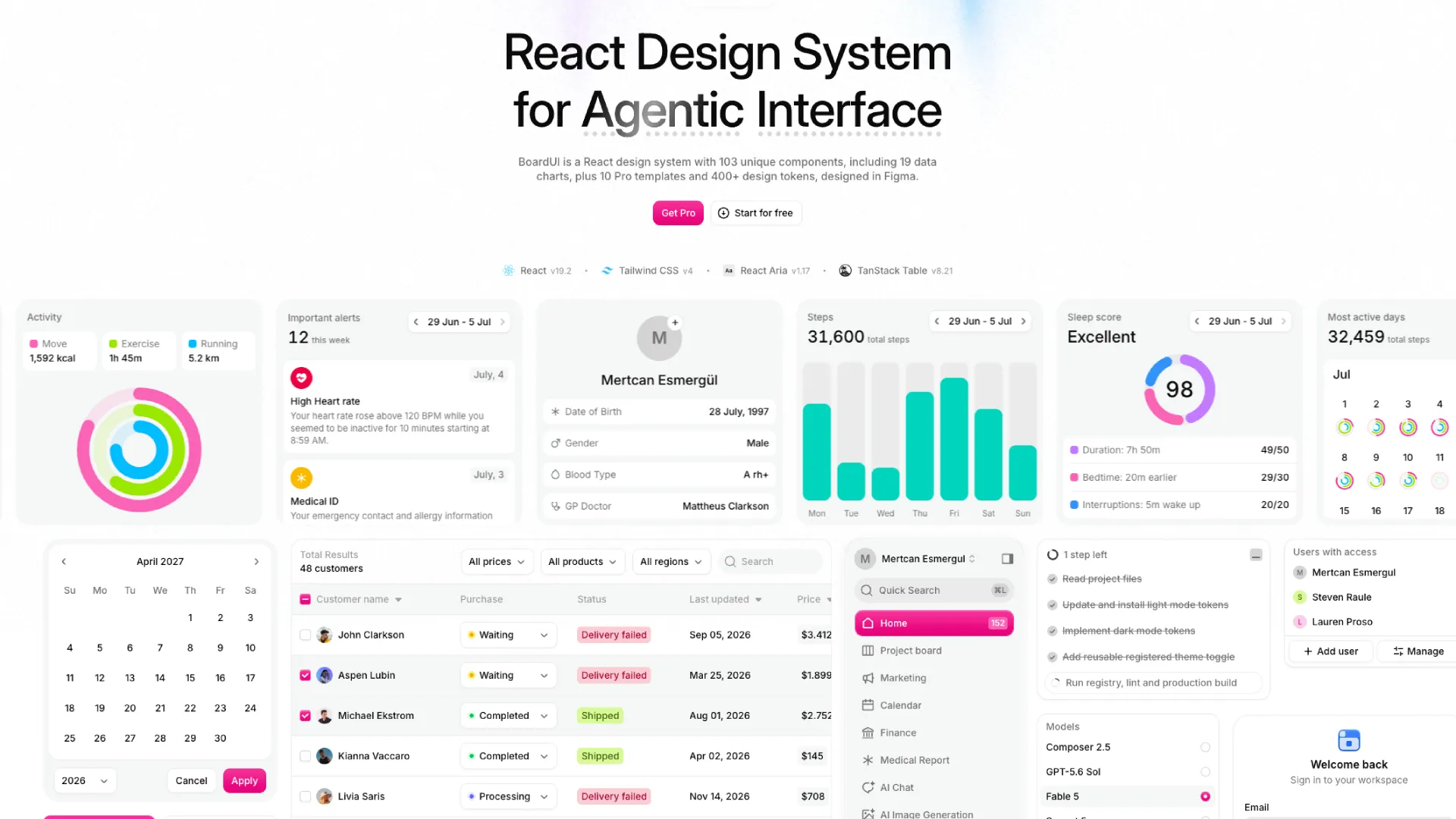
This article walks through one such system, BoardUI, which serves its components to agents over an MCP server. MCP, the Model Context Protocol, is the standard way an agent in your editor calls outside tools. I cover what it fixes, how the loop runs, and where it stops helping.
Why an agent invents every control
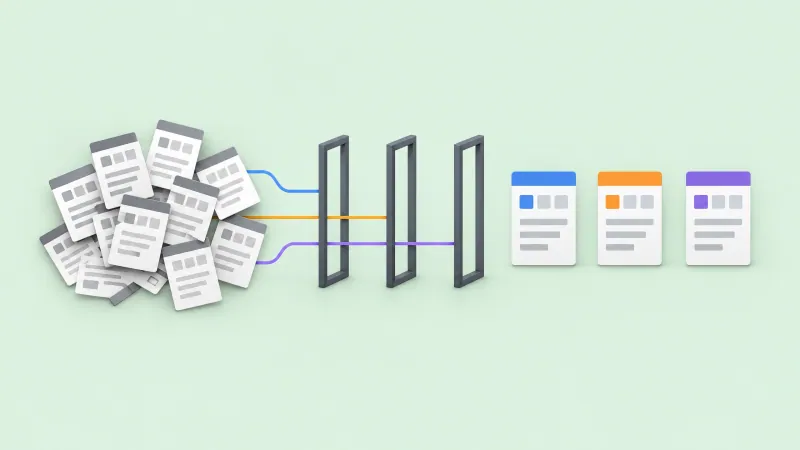
An agent keeps no memory of your components between sessions. Each request starts from zero, and with no parts to reach for, it samples the statistical middle of every dashboard in its training data. The middle is grey and centred, because that is what averaging produces.
Three consequences follow.
❶ Spacing drifts. One card gets 16 px of padding and the next gets 20 px, because each value was guessed on its own.
❷ The select is inaccessible. A dropdown built from a div and a click handler ignores the arrow keys, and a screen reader announces it as plain text.
❸ There is nothing to review against. Every control is new code, so the reviewer reads each line of fresh markup with no reference to compare it to.
The behaviour a real select needs, from keyboard support to error states, is listed in the form controls reference. An agent writing from scratch skips most of it.
☞ Generated UI looks generic for the same reason generated 3D looks flat. Every decision the prompt skipped was filled with the default.
What a vocabulary changes
Four things change when the agent has real parts to use. Each one has a mechanism behind it.
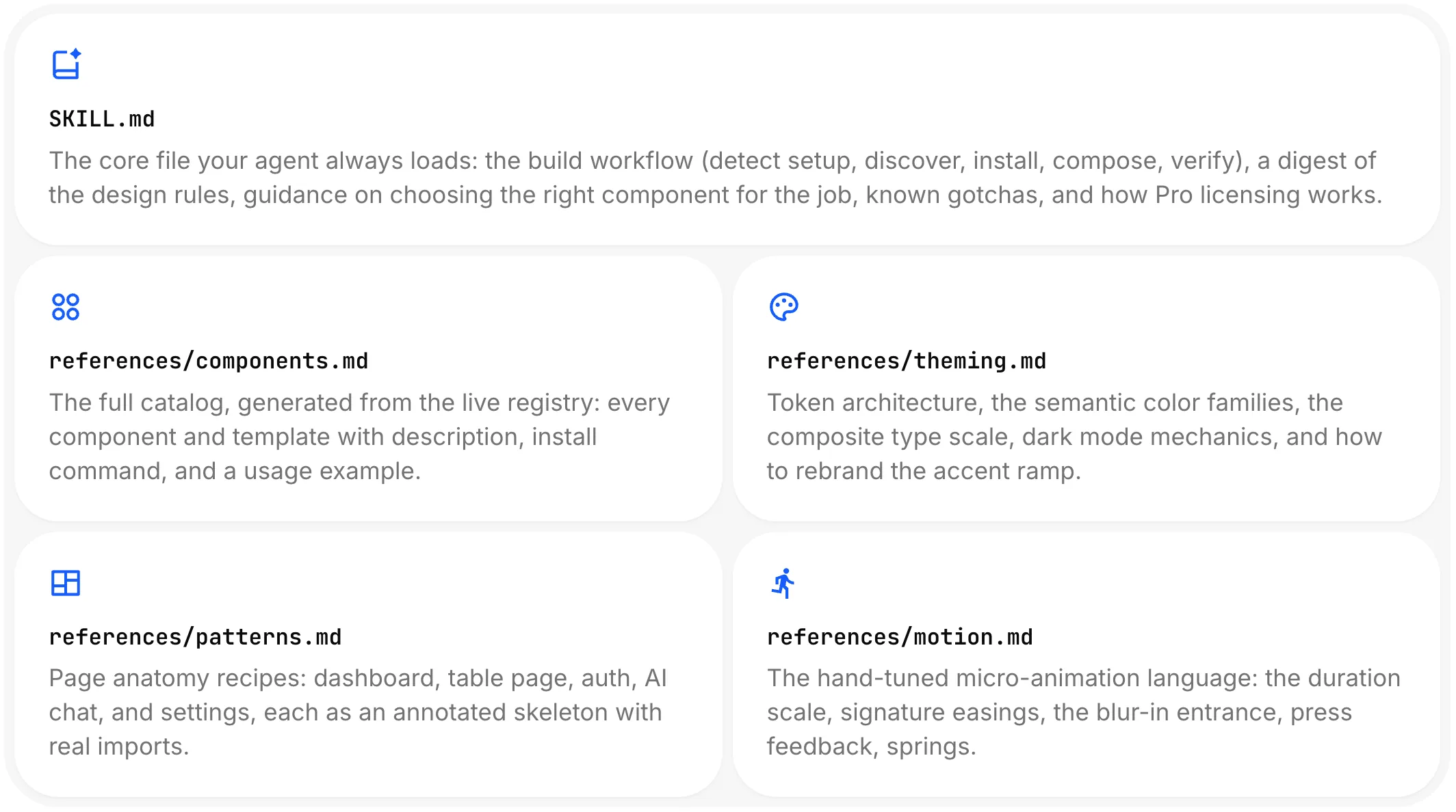
❶ Components arrive with rules. Before writing a line, the agent reads a component's source, dependencies and a working usage example. BoardUI also writes always-on instruction files into the project at setup, which pin the colour tokens, type scale and spacing conventions. The rules hold even when the agent forgets to ask for them.
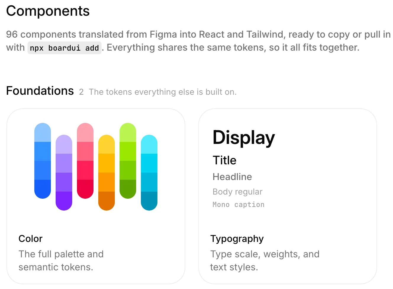
❷ Tokens keep one scale. Spacing, colour and radius come from 400+ named design tokens built on Tailwind CSS v4. When the agent sets padding, it picks a step from that scale, so two cards built a week apart land on the same value.
❸ Accessibility is inherited. The interactive components are built on React Aria 1.17, Adobe's library of accessible behaviour for React. Keyboard navigation, focus management and screen reader roles come with the component, so the agent has nothing to forget.
❹ The diff becomes reviewable. The agent composes existing parts, so a pull request reads as imports and props. You check which Select it used and what it passed in, and you skip auditing a dropdown written from nothing.
The same logic covers the heavy parts. The data table runs on TanStack Table, so sorting and pagination are the library's job. What a good table needs on top of that is in the data table UI design guide.
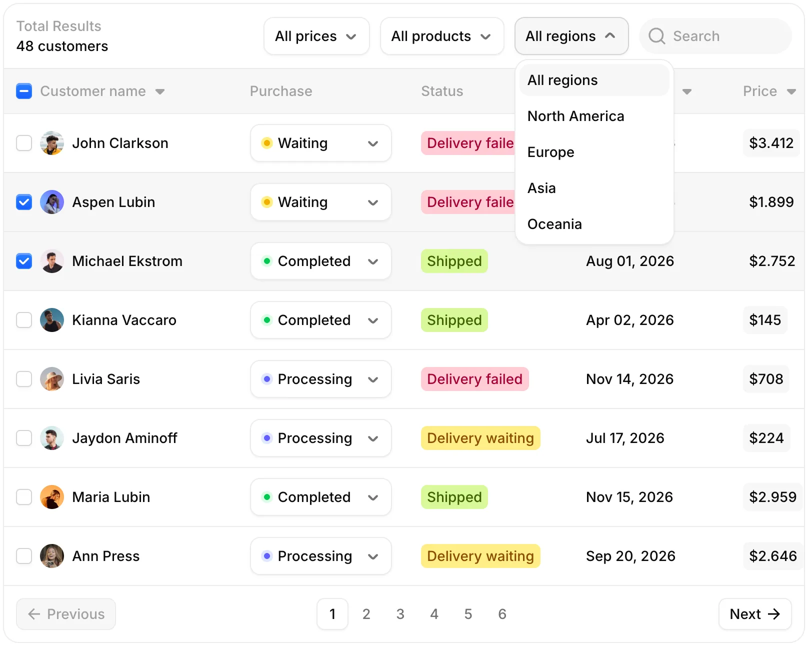
The BoardUI Table with four filters, status pills, row selection and pagination, built on TanStack Table.
How the MCP loop actually works
The setup is short. Here is the loop as the BoardUI MCP docs describe it.
❶ Connect once. Cursor and VS Code add the server with one click, and Claude Code and Codex take one terminal command. MCP tools bind when a session starts, so open a new session afterwards.
❷ The agent browses. The list_components tool returns every installable item with its exact name. get_usage_examples returns working snippets from each component's docs page.
❸ It installs. init_boardui prepares the project and writes the instruction files. Then install_components writes the component source into the project and installs any missing npm dependency.
npx boardui@latest add <component>
The CLI line is the manual route, for the case where you already know the component name.
❹ It writes against real props. get_component returns the full source of one item, so the agent passes props that exist instead of props it imagined.
There is a second door. The BoardUI registry speaks the shadcn schema, so an agent that already runs the shadcn MCP server can reach it by adding the @boardui namespace to components.json and asking for @boardui/button. The dedicated server stays the richer path, because it also serves usage examples, theme tokens and the Pro licensing flow.
A realistic prompt for the panel from the intro:
Set up BoardUI in this project and build a notification settings page.
Tabs for Email and Push, a switch per notification type, a select for
digest frequency, and a save button that shows a toast on success.
A connected agent should come back with five catalogue names: Tabs, Switch, Select, Button and Toast. If it starts writing its own toggle, the session lost the tools and needs a restart.
The agentic components nobody has patterns for yet
Buttons and tables have decades of reference material. The controls an AI product needs have almost none, and that is where a vocabulary matters most.
BoardUI ships a set for that job. These are the names the catalogue uses.
• Composer Attachments. File tiles landing one by one above the prompt, each with its own upload ring.
• Web Search. Research trail with the sources an agent opened.
• Agent Thinking. Thinking indicators for chat composers.
• Task List. Streaming agent log that reveals step by step.
• Agent Progress. Collapsible progress for multi-step AI tasks.
• Agent Limits. Context window and plan usage limits.
• Composer Panel. Two-row chat input with permission modes.
• Questionnaire. Plan-mode questions, one step at a time.
• Agent Creator. Creates an agent's identity, animated avatar and voice preferences.
• Composer Loader. Orbiting light band for a working composer.
• AI Image Generation. From the templates, not the component list: a prompt thread with a generation frame and a gallery panel.
A designer starting an AI product today has no shelf to pull these from. I have not found a token budget meter in Material Design or Apple's guidelines. Without a reference, every team redraws the same screens and makes the same mistakes.
I would rather start from an opinionated progress component and argue with it than draw one from a blank frame. The opinion has a cost, though. These components assume a chat-and-composer product, and if your metaphor is a canvas or a background job queue, expect to rewrite them.
Now the split, because it decides the price. The agentic blocks are Pro. So are the charts. Free covers the foundations and the base components, which is enough for a plain dashboard and not enough for an AI product.
The MCP server does not hide the Pro items. list_components returns them for every user, and without a license the agent receives the description and purchase instructions instead of the source. That is why a free user gets a sentence about Pro rather than a half-written file.
Activation happens in the same chat. activate_license stores the key on the machine and takes one seat, and deactivate_license releases that seat when you move to another computer. A five-developer tier exists at €349.
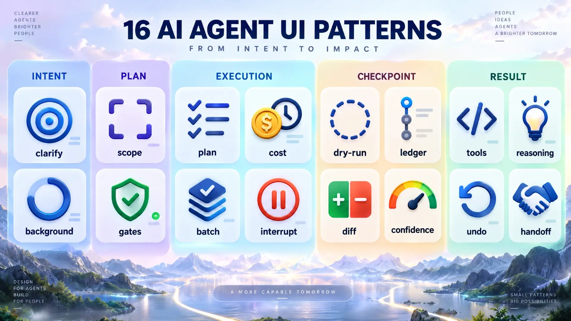
For the interaction side of the same problem (plans, approvals, undo), see AI agent UI design patterns.
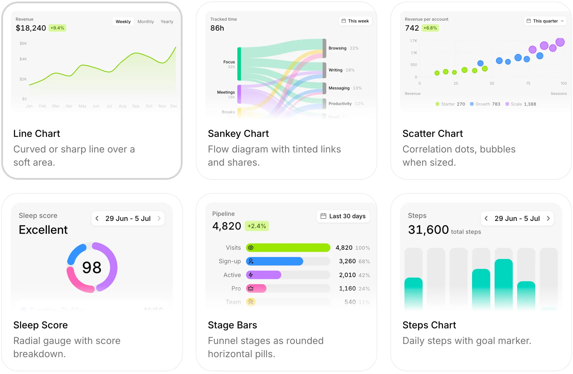
Six BoardUI chart cards: line, Sankey, scatter, radial score, stage bars and steps, all Pro.
The free tier installs with one command and no card. Browse the components →
Where the system stops and you start
Tokens do not choose the light. A component library gives you consistency, accessibility and reviewability. It does not give you taste.
Two failures survive any design system. A bad layout stays bad when every part in it is correct, and a screen with no hierarchy still reads as a flat list of equal boxes. The agent can place a perfect Card in the wrong spot, and the token scale will make that mistake look tidy.
So the order of work stays the same as in 3D. Stage 1 of the Three.js art direction lab was a one-page direction document written before any code, and that page is still yours to write. Decide what the screen is for and which number matters most, then let the agent assemble it.
Hierarchy on data-heavy screens is its own discipline, covered in the dashboard UI design guide.
☛ The stack is fixed. BoardUI targets React 19.2 and Tailwind CSS v4 only, so a Vue project or one on Tailwind v3 cannot use it as is.
Need the same components on web and native? HeroUI ships free, accessible components for React and React Native from one theme. 38k stars combined on GitHub, backed by Y Combinator, no lock-in. See HeroUI →
What it costs and what free gets you
The free tier is a public repo under the MIT license, with 1,164 GitHub stars at the time of writing. It needs no card, and you add a component with one CLI command. The MIT license lets you use it in commercial work.
BoardUI Pro is paid once. It costs €149 with a year of updates or €199 with lifetime updates, and neither price renews. You keep the code forever and use it in unlimited projects.
The catalogue is 103 components, 19 chart cards, 10 templates and 400+ design tokens, all designed in Figma first. Pro unlocks the Pro components, the charts and the templates. I have shipped UI kits for a decade, and a set that size takes weeks of design work before anyone writes code. Compare €149 with one week of your own time and the decision is short.
One more thing to know before you install. Successful installs send anonymous events with the component names, the package manager and the version, tagged as coming from the MCP server. No paths and no source code leave the machine, and BOARDUI_TELEMETRY_DISABLED=1 turns the events off.
Frequently asked questions
❶ Is a design system enough to make AI UI good?
No. A design system makes generated UI consistent and easy to review, because the agent assembles documented parts. It does not decide what the screen is for or which element matters most. Hierarchy and art direction still come from a designer, ideally written down before the agent starts.
❷ Does BoardUI work with Cursor?
Yes. Cursor and VS Code add the BoardUI MCP server with one click, while Claude Code and Codex take one terminal command. Any other MCP client can connect too. Restart the session after adding it, because MCP tools bind when a session starts, then ask the agent to set up BoardUI in your project.
❸ Is BoardUI a subscription?
No. The free tier costs nothing and needs no card. Pro is a single payment of €149 for a year of updates or €199 for lifetime updates, with no auto-renewal. In both cases you keep the code forever, and the single-user license covers unlimited projects.
❹ Can I use BoardUI in client work?
The free tier is MIT-licensed, which allows commercial use, including client projects. The Pro single-user license covers unlimited projects and lets you keep the code forever. For edge cases such as reselling templates or handing source to a client team, read the license terms on the BoardUI site before you ship.
❺ Is BoardUI React only?
Yes. BoardUI is built for React 19.2 and Tailwind CSS v4, with React Aria 1.17 under the interactive components and TanStack Table for data tables. A Vue, Svelte or Angular project cannot install it, and neither can a project on an older Tailwind version without migrating first.
The vocabulary is the lever
An agent with no parts writes the average of everything it has seen. That average is what people call slop.
Slop is a missing decision. A component library is a set of decisions already made, with rules attached, that you can hand to an agent in one setup step. Your job moves up a level: write the direction, check the hierarchy, review a diff of named parts.
Start with the free tier and one prompt you already know produces a generic screen. Run it again with the vocabulary connected and compare the two diffs. Try BoardUI.