Ramka, the headless lightbox for React

Headless lightbox primitives for React with View Transition morphs, native scroll swiping and pinch to zoom. MIT licensed, zero runtime dependencies.

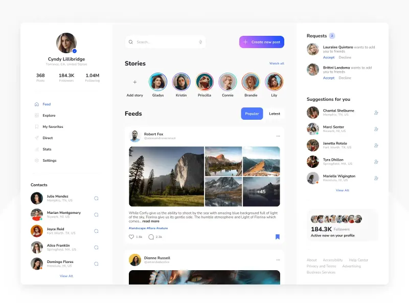
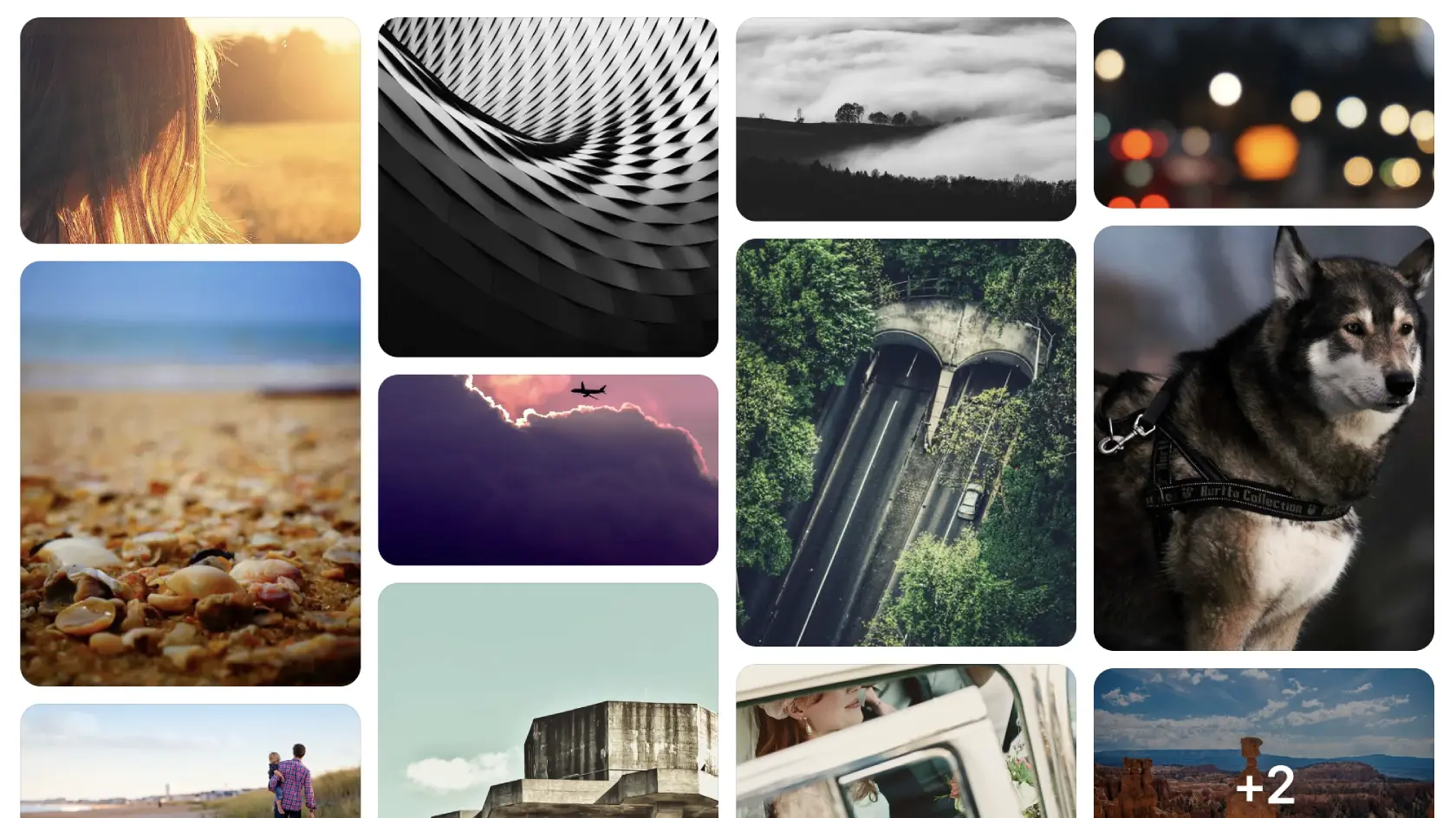
Masonry photo grid of landscape shots, a husky portrait and bokeh lights, with a plus two counter on the last tile
Home
Resources

Ramka, the headless lightbox for React

The gallery ships. Thumbnails load. A visitor taps a photo and a white overlay throws the image into the middle of the screen, with a close button parked in the corner. The picture opened. The feel did not. That gap between opening and feeling is where galleries lose people, and it is the gap Ramka was built to close.

What Ramka actually does

Ramka is a lightbox for React, published as @ramka/reactunder the MIT license. The name is Polish for “frame”, which is what the component gives you: a frame that holds any media and gets out of the way.

The library is headless. It handles the dialog, the focus trap, the gestures and the transitions, and it ships no visual style at all. You compose the parts you need, name them yourself, and write the CSS. The only dependencies are react and react-dom at version 18 or newer, and both React 18.3 and React 19 are tested in CI.

Install it in one line, then import a namespace for the part you are building:

  • npm i @ramka/react
  • import * as Lightbox from '@ramka/react/lightbox'

Why most lightboxes feel wrong

Two technical decisions cause most of the damage, and neither one shows up in a screenshot.

The first is the scroll. Plenty of galleries emulate swiping by translating a strip of slides with CSS transforms. It works on a desktop trackpad and falls apart on a phone, because the browser no longer owns the momentum. The swipe fights the finger.

The second is the opening. A lightbox that appears as a new state on top of the page reads as a page change. The eye has to rebuild the scene: where the photo was, where it went, what just happened. Shared-element transitions fix that by keeping one object on screen the whole time.

Ramka takes the honest version of both. Slides ride real CSS scroll snapping, so the swipe is native because it is native. The morph is a real shared-element transition rather than a crossfade pretending to be one.

☞ A lightbox is a gesture before it is a modal. Every decision that treats it as a modal leaks.

How the parts compose

The API follows the pattern you already know from Radix UI and Base UI. Each piece has one job and you decide the order:Root, Trigger, Portal, Backdrop, Content, Slides, Slide, Item, Zoom, Media, Caption, ThumbnailGroup, Counter, Previous, Next and Close. Nothing renders until you render it, and nothing has a color until you give it one.

One detail is worth copying into your own components. Ramka exports no prebuilt namespace object, because bundlers cannot shake a package that hands you one. Accessing Lightbox.Root stays statically visible to esbuild, so unused parts drop out of the bundle. Destructuring the namespace into local names keeps every part, which is exactly the kind of quiet regression nobody notices until a bundle report lands.

Since the parts carry no styling, the fastest way in is a preset. A copy-paste default preset gives you a working look in a few minutes, and colors and radii are tuned through documented --lightbox-* custom properties, so your preset and your tokens stay in one place.

The morph that sells the click

The morph is the part people notice, even if they never name it. The clicked tile and the fullscreen version share an element, so the browser interpolates position, size and corner radius in one motion. Going back reverses it, and the photo lands exactly where the visitor left it.

Anything can morph. Images, video, a 3D model and plain HTML all work, which means the same component covers a product gallery, a design portfolio and a screenshot viewer without a second library. Browsers without the View Transitions API get a clean crossfade, so the fallback is boring rather than broken.

That fallback matters more than it sounds. A transition that degrades into a flash of white is worse than no transition, because the visitor reads it as a bug. A crossfade reads as a fade.

Gestures, and where it stops

The gesture set is what you would expect from a native photo app, and the source of a few pleasant surprises:

  • ❶ Swipe between slides on touch, with scroll snapping doing the work
  • ❷ Pinch on a touchscreen or a trackpad, double-tap to zoom, and ctrl plus scroll to zoom at the cursor
  • ❸ Pan with a finger, a mouse or the arrow keys
  • ❹ Pull down, or scroll a trackpad, to dismiss
  • ❺ Tab through the controls with the focus trapped inside the dialog

Pull to dismiss is elastic and interruptible, and it checks the zoom level and any swipe still in flight before it closes. Small detail, large effect: a dismiss gesture that ignores the current zoom will eat the photo the visitor was trying to inspect.

Every gesture above is documented with a live example at ramka.dev, where the docs run from the lightbox overview through view transitions and gestures to the full API reference. Try the pull gesture on a trackpad before you read the props table, because the feel is the part a spec sheet cannot carry.

Weight is the other argument. There are no runtime dependencies, the zoom, morph and pull engines load on demand, and a full gallery ships about 19 KB gzipped up front. For a component that only appears after a click, that number is the difference between adding it and skipping it.

☛ Where it stops. Ramka is pre-1.0, so pin the version. It ships no user-facing copy, so Close, Previous, Next and the zoom controls arrive without an aria-label. Give each one a label or your own visible text, or the dialog opens nameless and a development warning fires. If you need a player with ads, chapters and analytics hooks, keep your video platform. Ramka frames media, it does not manage it.

Wiring it into your own app

The setup is short enough to describe as a list:

  • ❶ Install the package and import the lightbox namespace
  • ❷ Wrap each grid tile in a Trigger and pass the image ref it hands back
  • ❸ Put Content, Slides and Zoom in a portal
  • ❹ Write the CSS, or start from the preset and override the variables
  • ❺ Add a label to every icon-only control before you ship

Images accept srcset and work with next/image out of the box, and RTL layouts are handled by the component rather than by your overrides. If your gallery uses a masonry grid, the trigger side is unchanged: the morph starts from whatever element you point at.

Security teams get their own section in the README. The library runs under a strict style policy with style-src 'self' and style-src-attr 'none', with no unsafe-inline and no nonce to configure, because its styles arrive as constructed stylesheets and CSSOM writes rather than markup. Every release is published from GitHub Actions with npm trusted publishing, so each tarball carries a signed provenance attestation, and a CycloneDX SBOM ships inside the package. For a component that handles user photos, that paper trail is worth more than a feature list.

The article on designing an image upload component covers the state model that sits on the other side of this handoff, and the carousel design guide explains why snapping beats transform tricks for touch interfaces. If your gallery sits inside a slider, the slider rules apply to the same interaction budget.

Frequently asked questions

Does Ramka work in browsers without View Transitions?

Yes. The morph falls back to a crossfade, and every other part, including scroll snapping, zoom and pull to dismiss, keeps working. Nothing in the component depends on the API being present.

Is it a whole gallery or just the overlay?

It is both, in pieces. The overlay, the slide track, thumbnails, the counter and the navigation are separate parts, so a single-image viewer and a hundred-photo gallery use the same import with different composition.

Can I use it with next/image and responsive sources?

Yes. The media parts take a normal image element, so srcset and next/image both fit without a wrapper, and the trigger passes back the ref the morph needs.

What does headless cost me in setup time?

One styling pass. The default preset is copy-paste and close to production ready, and the documented CSS variables cover the rest. Expect an afternoon for a custom look, not a sprint.

Why it belongs in your stack

You already have a gallery. What you probably do not have is a viewer that feels native on a phone, keeps the photo in place through the transition, and ships less code than the average modal wrapper. Ramka is that piece, and it is small enough to try without a meeting.

Start from the GitHub repository, read the license, and point it at your three most viewed images. If the morph lands, keep going. When you want the grid around it to match, our free Figma files and design and code kits are built for the same fast, small-team workflow.

Related articles

Case study: Design iterations for Cleeve's image upload component

Case Studies

6 min read

Case study, redesigning an image upload component

A detailed look at the design iterations for an image upload UI for Cleeve app. You will discover the steps of successful upload UI design, including layout optimization, visual appeal, and balancing hierarchy. The case study offers a real-world example of how iterative design can lead to a polished component.
Carousels are controversial UX: sometimes essential, often misused

UI Design

15 min read

Carousel UI design, when carousels actually work in 2026

Carousels are controversial UX: sometimes essential, often misused. Learn the anatomy, types, usability rules, and the cases where a carousel wins.

Slider UI design exploration: Anatomy, states, and accessibility

UI Design

10 min read

Slider UI design for single and range inputs with accessibility

Design sliders users can actually grab. A practical guide to anatomy, single vs range thumbs, snapping rules, accessibility, and mobile interactions.

More free resources

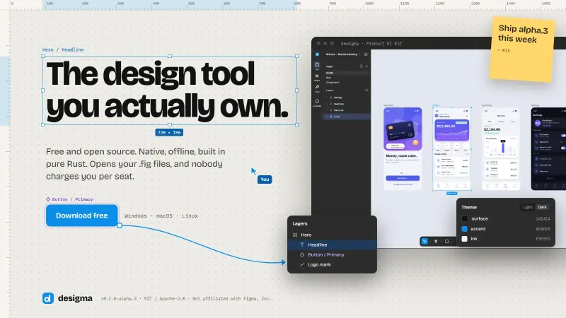
desigma launch cover with the headline the design tool you actually own, a download button, the editor on four phone screens and a layers panel

Design and AI tools

Desigma, a design tool written in Rust

Open source design tool in Rust for macOS, Windows and Linux. Opens real Figma files, keeps components and variables, and runs offline with no account.

Looseleaf, 123 hand-drawn shadcn/ui components

UI components

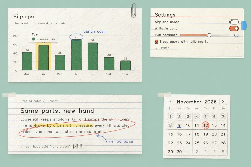
Looseleaf, 123 hand-drawn shadcn/ui components

Every shadcn/ui part redrawn as paper and ink, with 123 components, 61 blocks, 160 icons. Installs as source through the shadcn registry, MIT licensed.

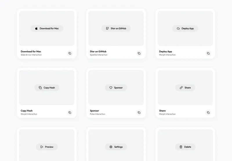
react-useanimations, 300 animated icons

Icons and animations

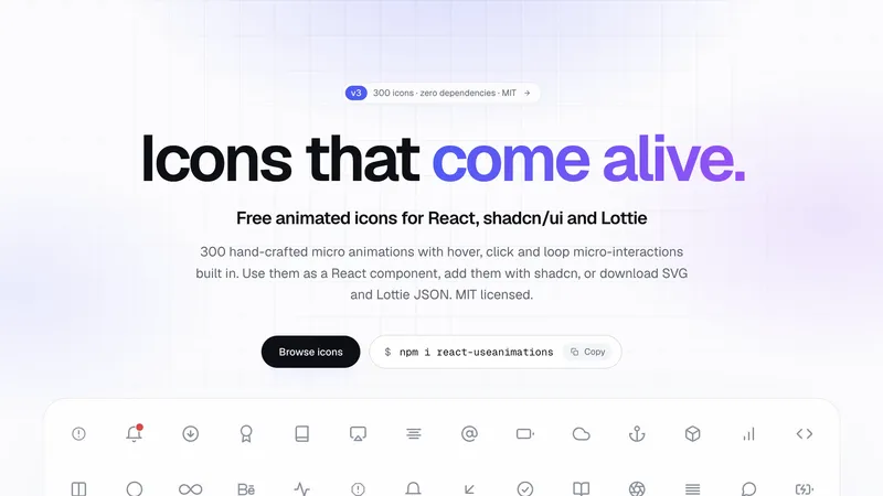
react-useanimations, 300 animated icons

300 free animated icons for React with hover, click and loop interactions built in. Zero dependencies, an 8 kB player, and reduced-motion support.

Matita icons, 200 pencil-style glyphs

Icons and animations

Matita icons, 200 pencil-style glyphs

200 pencil-style icons as SVG files and React components. Every stroke overshoots like a ruled pencil line, and the whole set is free under the MIT license.

CleanYourTV — Android TV without the ads

Desktop utilities

CleanYourTV — Android TV without the ads

Open source setup that disables ad services and bloatware on Android TV and Google TV over Wi-Fi. No root, nothing uninstalled, one line restores it.

Gr8r Studio — calm project management workspace

Self-hosted apps

Gr8r Studio — calm project management workspace

A calm project workspace with dashboard, inbox, board, calendar and timeline views. Plain JavaScript modules, no UI framework, zero runtime dependencies.

Spectrum UI — animated React components you copy and own

UI components

Spectrum UI — animated React components you copy and own

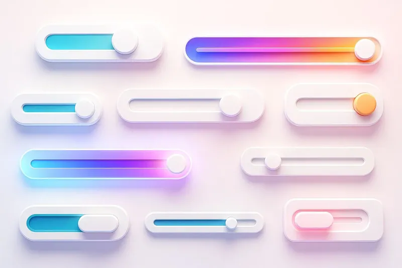
Open source React and Tailwind component library for animated interfaces. Buttons, cards, loaders, and text effects arrive through one CLI command and land in your own repo as editable files.

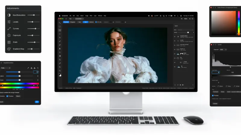
Compositor — free Photoshop alternative for macOS

Design and AI tools

Compositor — free Photoshop alternative for macOS

Free and open source Photoshop alternative for macOS. Layers, masks, PSD import, and a project format any AI agent can read and write.

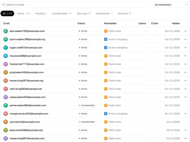
Mailcheap, self-hosted newsletter on Amazon SES

Self-hosted apps

Mailcheap, self-hosted newsletter on Amazon SES

Self-hosted newsletter on Amazon SES. Write an issue, send it to your list, publish an archive, and pay about $0.10 per 1,000 emails with no per-subscriber fee.

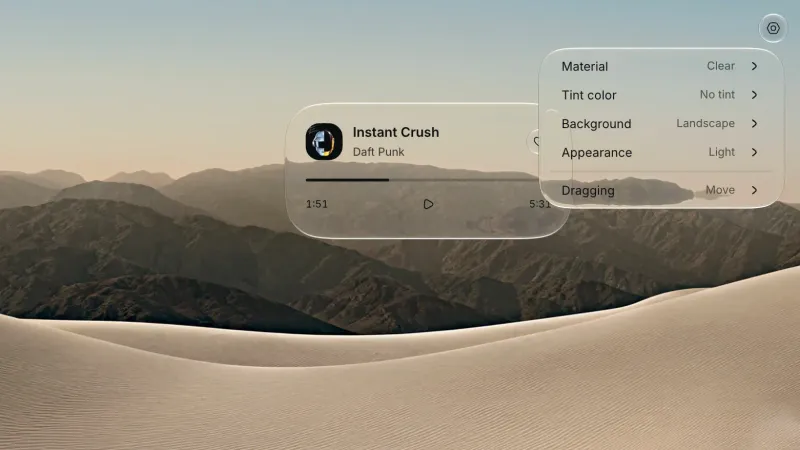
Liquid Glass for React

UI components

Liquid Glass for React

Glass surfaces and controls for React on the web and in Electron. Clear and Regular materials refract live content, and every control runs on Base UI behavior.

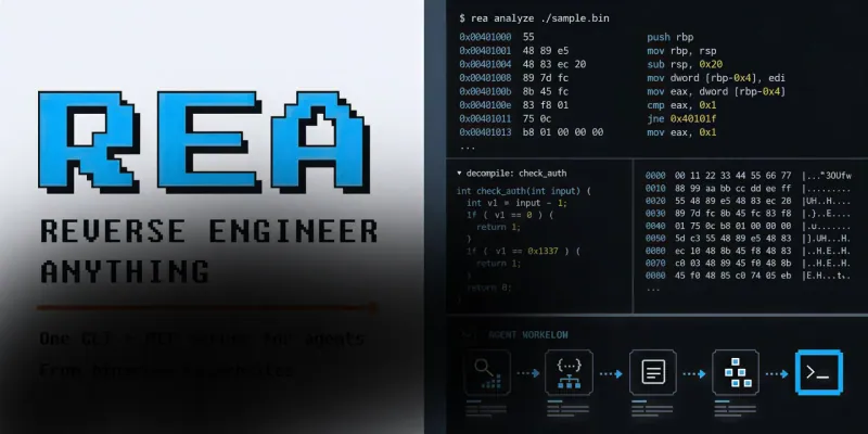
REA — reverse engineering MCP for AI agents

Design and AI tools

REA — reverse engineering MCP for AI agents

Give your AI agent an MCP server that reverse engineers any app: native binaries, Electron, .NET, APKs, and websites. Analysis runs locally, MIT licensed.

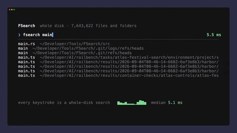
FSearch — whole-disk file search for macOS

Desktop utilities

FSearch — whole-disk file search for macOS

Find any file on your Mac in about a millisecond, typos included, and search inside text files. Whole-disk index in Rust, MIT licensed, one small daemon.

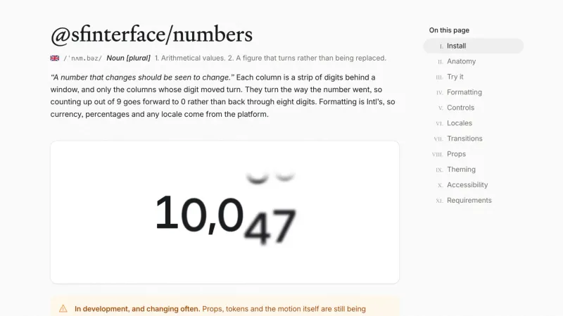
@sfinterface/numbers — rolling numbers for React

UI components

@sfinterface/numbers — rolling numbers for React

React component that turns only the digits that changed. 13 kB, no dependencies, Intl formatting, five transitions, and reduced-motion support.

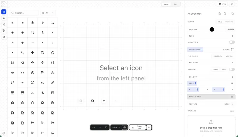
RuneIcons — open source icon set for modern UIs

Icons and animations

RuneIcons — open source icon set for modern UIs

Thousands of clean, consistent SVG icons for web and app interfaces. Open source, MIT licensed, and ready to drop into Figma, React, or plain HTML today.

Amicro — micro-interactions for any landing page

Icons and animations

Amicro — micro-interactions for any landing page

Open source collection of ready-made micro-interactions: hover glow, magnetic buttons, scroll reveals. Copy a snippet, paste into any page, ship motion today.

M3E Canvas — Material 3 Expressive UI builder

Design and AI tools

M3E Canvas — Material 3 Expressive UI builder

Assemble Material 3 Expressive interfaces in your browser and export a ready-to-use prompt for AI. Open source, free, and built for Android vibe coding.

Driver.js — product tours & onboarding

UI components

Driver.js — product tours & onboarding

Lightweight, vanilla JavaScript library for building powerful product tours, feature highlights, and contextual onboarding. No dependencies, just 5kb gzipped, fully customizable and accessible by default.

pdfcn — PDF viewer component for React

UI components

pdfcn — PDF viewer component for React

Open source PDF viewer built on the shadcn stack. Renders documents inside your React app with zoom, search, and navigation. No iframe, no vendor lock-in, MIT license.

Free invoice template for Figma

Figma templates

Free invoice template for Figma

Clear and simple table-based document for your business purposes. Powered by editable data grid, which is easy to manage.

Avatar UI design templates & tips

Figma templates

Avatar UI design templates & tips

A part of the upcomong design handbook «The State of Component». Colors, Styles & UI design for Avatar. Events, States and Actions. Including layout samples for inspiration.

App Bar UI design templates & tips

Figma templates

App Bar UI design templates & tips

Application Bar (aka Navigation Bar) — displays prior in-app controls related to the current app section. This freebie contains things to consider when designing App Bars.

Fonts Playground

Figma templates

Fonts Playground

Best web fonts precisely handpicked and optimised for better web legibility and ready to implement into your Figma project.

Website Template

Figma templates

Website Template

Landing page template made for Figma. Contains styled components UI kit, desktop & mobile versions. Global styles, Inter, FlatUI colors.

Android UI kit

Figma templates

Android UI kit

8 mobile app templates based on popular Android UI design patterns: Calendar, Cards, Tasks, Kanban & Project management and more.

Figma iOS UI kit

Figma templates

Figma iOS UI kit

iOS native components and app templates organised into a «Most Design System» fully compatible with Human Interface guidelines.

Material X Starter

Figma templates

Material X Starter

Top-notch styled components in the design system powered by Auto-layout. Ready-to-use Figma UI kit with styles from the nearest future.

Radar Chart

Figma templates

Radar Chart

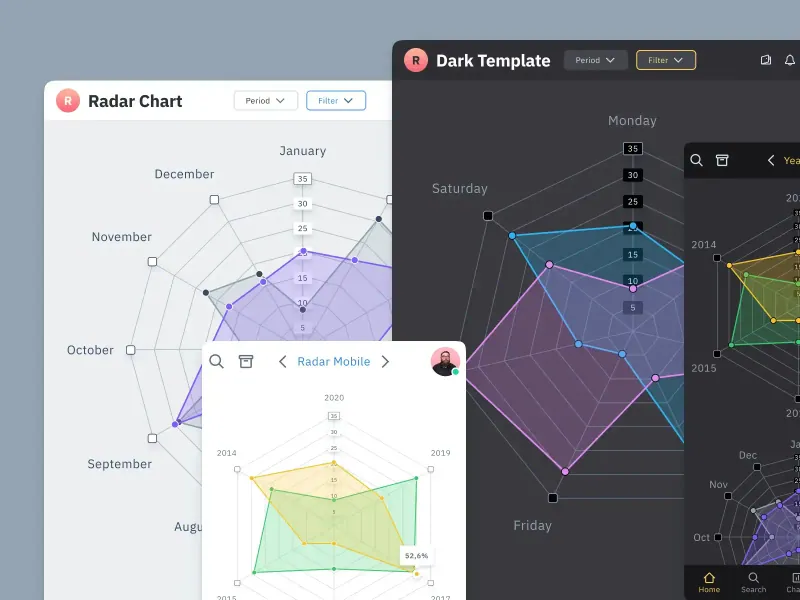
Radar chart template made of components and available within a range of popular viewports: desktop, tablet and mobile. Light & Dark.

Rome UI kit lite

Figma templates

Rome UI kit lite

Components & templates for desktop & mobile apps. Powered by clean and trendy custom guidelines and DM Sans font (OFL).

Xela UI kit starter

Figma templates

Xela UI kit starter

100+ variants of several components to craft perfectly shaped desktop & mobile apps. Modern styleguides and free Nunito Sans font.

Free iOS UI kit

Figma templates

Free iOS UI kit

Customisable & adjustable mobile design system with 100+ variants for a set of components and 8 ready-to-use app layouts to try out.

Mobile-X UI kit

Figma templates

Mobile-X UI kit

Meet Mobile-X Figma design system for mobile app design. Cross-compatible & stylish UI kit which fits both iOS / Android apps.

Accordion guide

Figma templates

Accordion guide

The exploration for Accordion component: styles, states, samples, and use cases for desktop & mobile viewports.

Eclipse UI kit

Figma templates

Eclipse UI kit

Fine components fully loaded with variants, auto-layout, global text & color styles. Hi-end customizable Figma design system (starter).

Appka iOS UI kit

Figma templates

Appka iOS UI kit

Appka is a fine-themed & customized iOS design system with 4100+ variants for 28 components and 280+ ready-to-use app layouts for Figma.

Nav templates

Figma templates

Nav templates

This design resource represents navigation components. It contains sidebars, drawers and headers both in light & dark modes.

Dark charts UI kit

Figma templates

Dark charts UI kit

Try out this handy source of graphs for your next dashboard, pitch, or even print materials. Contains most common dark chart templates.

Figma email templates

Figma templates

Figma email templates

Five awesome and scalable free email templates to engage your subscribers. Dark & light themes. Contains buttons, lists and cards.

Charts widgets dark & light

Figma templates

Charts widgets dark & light

Line & Wave charts, Bars, Histograms, Ratings and more graphs widgets are available in this free Figma resource. For dashboards, mobile & desktop.

Shopping layout for web app

Figma templates

Shopping layout for web app

Contains navigation, filtering components, tabs, cards and more. This layout was made with Angular and fully coded.

Orion dark templates

Figma templates

Orion dark templates

Figma library with 40+ desktop charts templates served in light & dark themes. Contains 200+ of dataviz widgets for every case.

Responsive imagery cards

Figma templates

Responsive imagery cards

A variety of responsive cards templates for Figma. Constrained and scalable. Made with global styles for typography and colors.

Landing page & web blocks

Figma templates

Landing page & web blocks

Use given blocks as a quickstarter for your very next web design mission. This freebie contains 3 landing pages for desktop, tablet & mobile.

Mobile tables several themes

Figma templates

Mobile tables several themes

Components-driven iOS layouts with data grid made from one singe cell. Based on different styles. Allows to create better tables in Figma.

12 free mobile templates

Figma templates

12 free mobile templates

Use our Full iOS design system as the starter for your next mobile app. This freebie includes 12 screens dark & light powered by 200+ components.

Calendars & Date picker templates

Figma templates

Calendars & Date picker templates

UI design resource with 56 calendars extracted from our popular UI kits. All the best samples of schedule patterns, planners, event managers.

Schedule & Events template

Figma templates

Schedule & Events template

This clean calendar template has been made of a scalable grid, accurately made with colored items and wrapped for the desktop.

Material You for web apps

Figma templates

Material You for web apps

Figma Material Design 3 starter fully loaded with several desktop & mobile templates (with dark themes) and a bundle of components.

iOS Datepickers

Figma templates

iOS Datepickers

Stand out with our Figma iOS date picker. Offering a true-to-life isometric design and easy-to-edit text, it's the most realistic option.

Segment UI kit

Figma templates

Segment UI kit

Design stunning Android apps with our free Figma UI kit. Follow Android guidelines and components and use our fonts, colors, and templates.

Figma React UI kit

Figma templates

Figma React UI kit

Our Figma React UI kit 2-in-1 makes web app building faster. Created in Figma, exported to React, and customised with Blueprint.js library.

Messenger app desktop template

Figma templates

Messenger app desktop template

Effortlessly create world-class communication design with our Messenger Template for Figma. With dark and light mode options.

Zeus UI free website template

Figma templates

Zeus UI free website template

Zeus Web UI kit-inspired landing page template. Supports all viewports, card-driven UX, polished with Syne and Space Grotesk fonts.

Design system starter

Figma templates

Design system starter

Launch your project with confidence thanks to our Figma design system. Customize grids, text, color, gradients, and shadows with ease.

Navigation layout 4 samples

Figma templates

Navigation layout 4 samples

Sleek Navigation Menu for Material X design system in Figma. Various sizes and design options. Features badges and active state highlight.

Chart cards

Figma templates

Chart cards

Make your data pop with our easy-to-use Charts UI kit. Featuring bar charts and heatmaps, it's perfect for dataviz, dashboard, pitches and others.

Material UI styled

Figma templates

Material UI styled

New and improved Material UI Kit, refreshed with enhanced material.io guidelines. Free and ready-to-use components included.

Hyper charts

Figma templates

Hyper charts

Transform your data into captivating visuals with several Figma's chart templates based on Hyper Charts kit. You'll find 8 editable widgets inside.

Search inputs

Figma templates

Search inputs

Explore how Figma inputs are revolutionizing search interface design. Gain key insights to enhance user experience with impeccable UIs.

Figma Grid Layouts

Figma templates

Figma Grid Layouts

This template is designed to help you create templates that are beautifully balanced. Features both mobile and desktop layouts with 16/24 gutters.

Panda dashboard template

Figma templates

Panda dashboard template

Build sleek dashboards with our Panda UI kit starter! Featuring a 1920w desktop template, UI widgets, and components.

Orion dataviz templates

Figma templates

Orion dataviz templates

The design system starter for your next application. This resource contains 6 dashboard templates and a bundle of UI design widgets.

Subscribe to Setproduct

Once per week we send a newsletter with new releases, free resources and blog posts

By clicking Sign Up you're confirming that you agree with our Terms and Conditions.