

Roman Kamushken
Apple, Linear, Vercel, and dozens of SaaS sites use bento grids for feature sections. The pattern shows hierarchy without a headline that shouts "this one matters most."
This guide treats bento grids as a layout tool with real math, not a trend to copy by eye. Every principle below carries a CSS or Tailwind note, because "make it look like Apple" is not a spec a browser can render. By the end, you will know the grid math, the content rules, and the twelve places that get it right or wrong. Build one that survives a resize instead of falling apart at 768px.
What makes a grid a bento grid
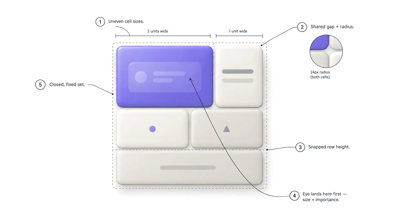
A grid qualifies as a bento grid when five properties hold at once. Miss any one of them, and the layout drifts into a different pattern, usually a card grid or a masonry feed. Each related pattern solves a different problem, and each compiles into different CSS.
- Uneven cell sizes on one grid. At least two distinct cell footprints (say 1×1 and 2×1) must appear, or the grid is just a uniform card grid with a different name.
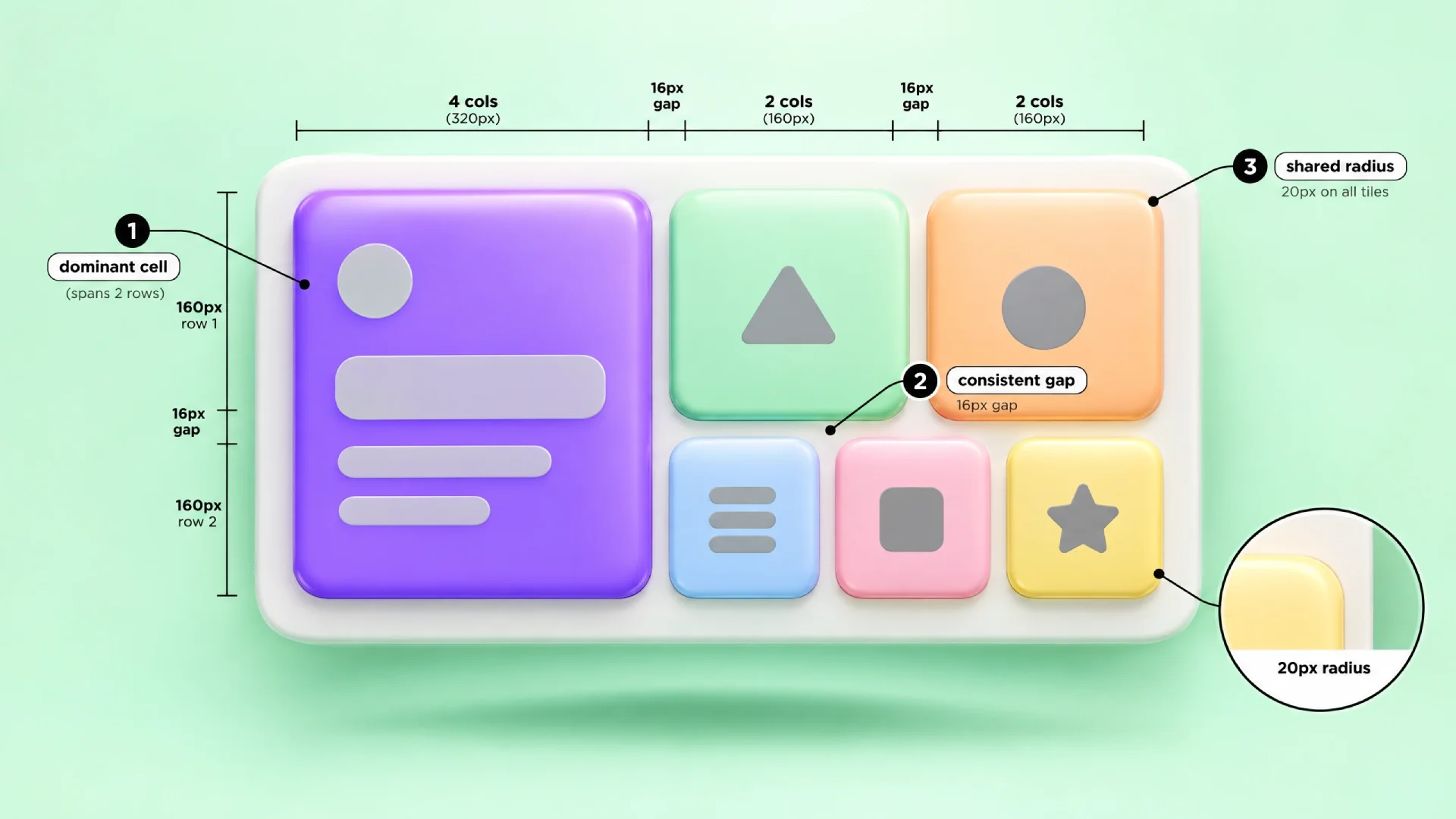
- One gap and radius system. Every cell shares the same gap value and the same corner radius, so the eye reads the tiles as one object instead of unrelated cards.
- Alignment to a shared row height. Every cell height is a multiple of one base row unit, which keeps the bottom edge of the grid flat even though the tiles vary.
- Size encodes importance. The largest tile should hold your best proof point, not the item that happened to have the most copy.
- A closed, fixed set of cells. A bento grid has a start and an end. An infinitely scrolling or dynamically appended grid is a feed, not a bento.
Three neighboring patterns get confused with bento grids constantly. The confusion causes real implementation bugs. A card grid uses identical cell sizes, so it needs none of the row-span math below. A masonry grid (think a photo feed) lets height vary freely per item, the opposite of rule three. A dashboard UI grid looks similar at a glance, but its cells hold live data and resize based on user preference, not editorial hierarchy.
| Pattern | Cell sizing | Height alignment | Best for |
|---|---|---|---|
| Bento grid | Fixed set of uneven sizes | Snapped to shared row unit | Marketing feature sections, product highlights |
| Card grid | Uniform | Uniform | Product listings, blog indexes |
| Masonry grid | Free, content-driven | Staggered, unaligned | Photo feeds, Pinterest-style browsing |
| Dashboard grid | User-resizable | Snapped to a data grid | Widgets, KPIs, live metrics |
The grid math
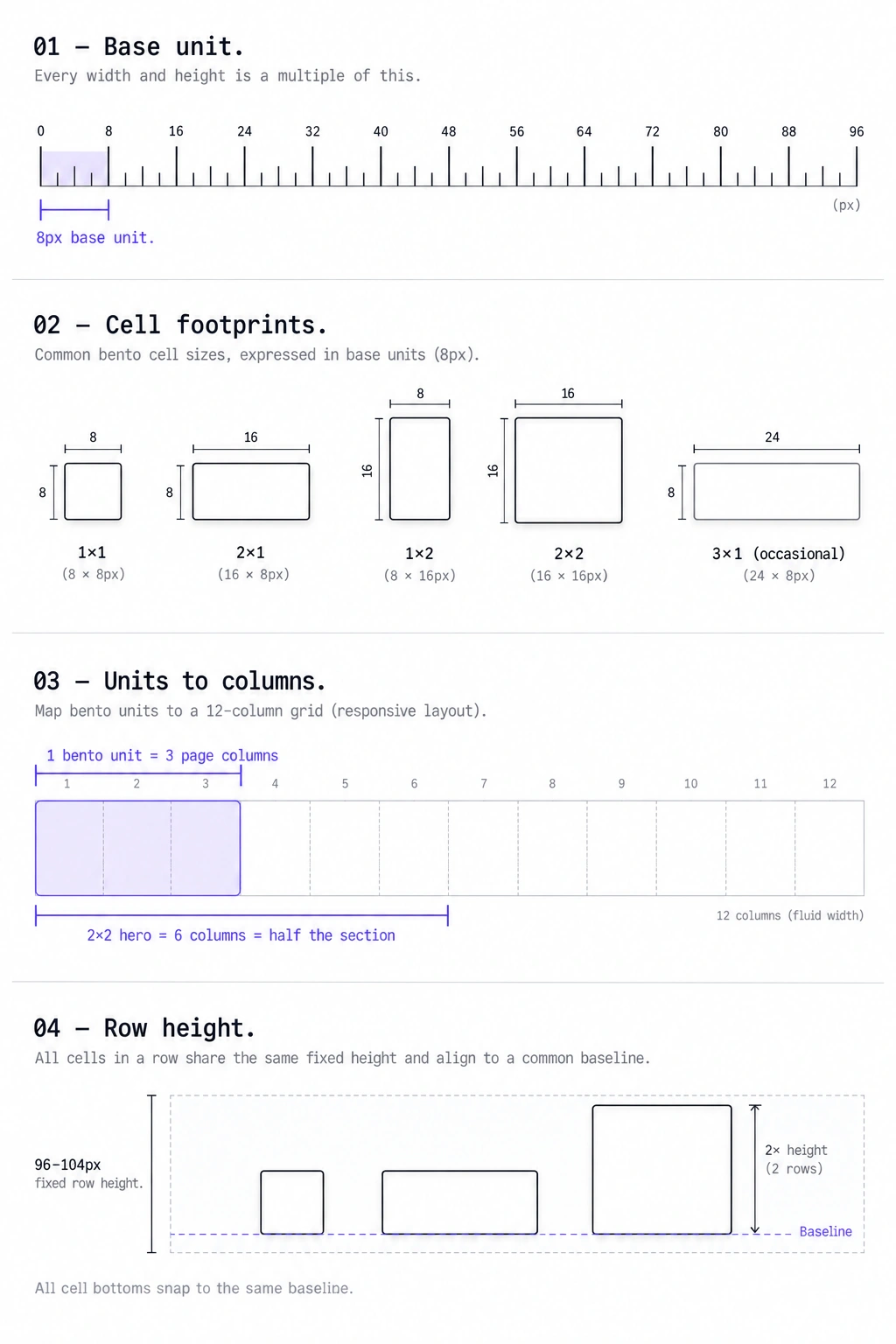
The math behind a good bento grid is closer to a spreadsheet than to freehand design. It comes down to one base unit, a short list of legal cell sizes, and a gap formula tied to your corner radius. Get these four numbers right, and every layout decision downstream becomes a lookup instead of a guess. Get them wrong, and no amount of icon polish saves the section.
Start with a base unit, typically 8px or 4px. Almost every design system already uses one of these as its spacing scale. Every cell width and height should be a whole multiple of that unit.
That is what keeps rows and columns snapping cleanly across different tile sizes. A common desktop setup is a 4-unit bento on a 12-column page grid, so one unit is 3 columns, with a 96-104px row height. A 1×1 cell, a 2×1 cell, and a 2×2 cell all land on exact row boundaries at that height.
Cell footprints and aspect ratios are two different things. Mixing them up is where most grid math goes wrong. A footprint is how many grid units a cell spans: 1×1, 2×1, 1×2, 2×2, and occasionally 3×1. An aspect ratio is the shape that footprint produces once rendered.
Footprints are measured in bento units, not page columns. A bento section usually runs 4 or 6 units across. On a 12-column page grid, one unit equals 3 columns for a 4-unit bento or 2 columns for a 6-unit bento. This is why a 2×2 hero reads as half the section width, not one sixth of it: it spans 2 of 4 units, which is 6 of 12 columns. Every footprint, teardown and code example in this guide counts in units.
A 1×1 footprint renders at 1:1. A 2×1 footprint renders at 2:1, and a 1×2 footprint renders at 1:2. A 2×2 footprint also renders at 1:1, just as a bigger square, not some separate "2:2" ratio. Keep the grid to three ratio families: 1:1, 2:1, and 1:2, with 3:1 as an occasional wide banner cell. A 2×2 cell is a footprint choice for a hero tile, not a fourth ratio to track.
Gap and corner radius are linked, not independent choices. A reliable formula: set the gap between half the corner radius and the full radius value. A 24px radius pairs with a 12-20px gap, and a 16px radius pairs with an 8-14px gap. Padding inside each cell should sit close to the gap value, or slightly above it, so the internal spacing does not fight the grid spacing.
Radius, row height and nesting
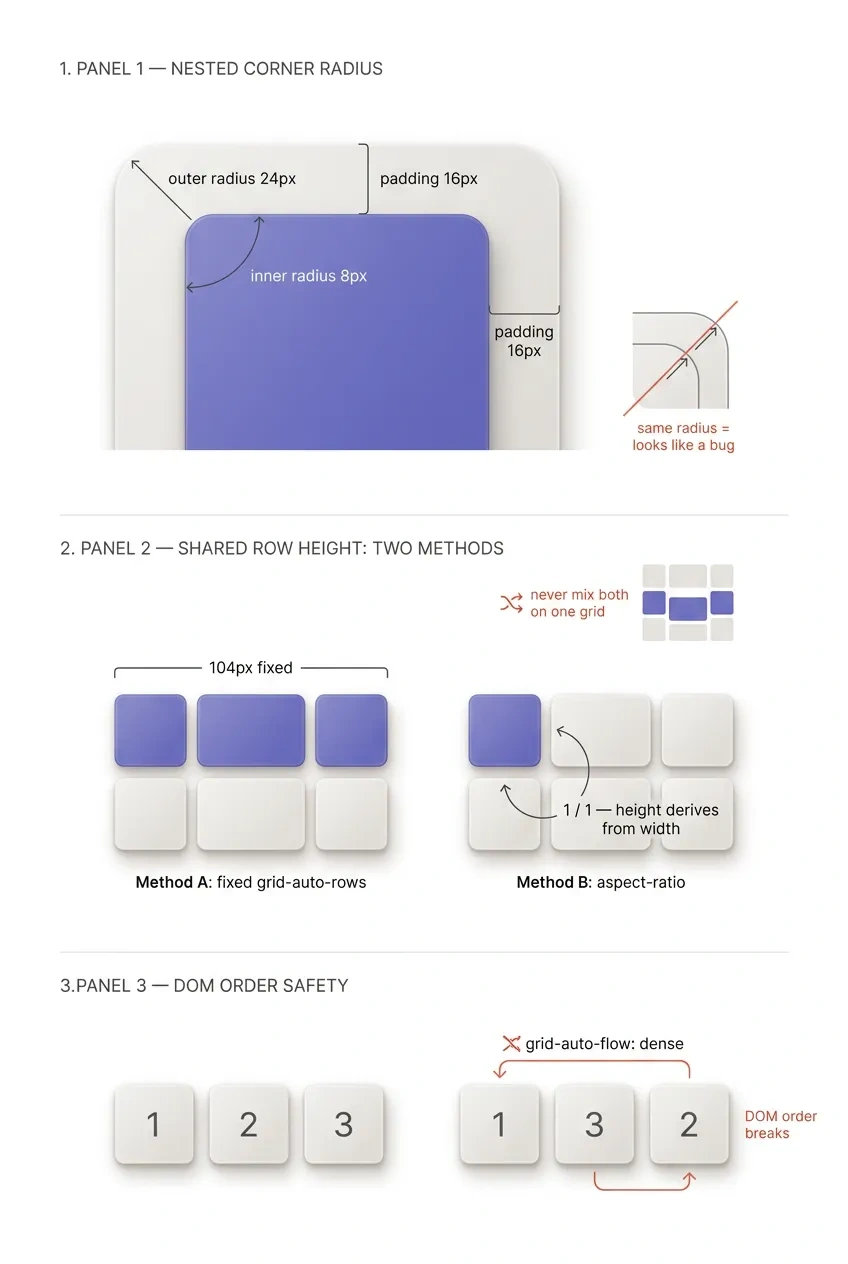
Nested corner radii need their own rule, or a cell containing a smaller rounded element, like an icon badge or a screenshot with its own radius, looks subtly wrong. The formula: inner radius ≈ outer radius − cell padding, floored at 4px so small elements never go fully square. A 24px outer radius with 16px of cell padding gives roughly an 8px inner radius, not another 24px. Two equal concentric corners read as a rendering mistake, not as polish.
Shared row height needs an explicit rule too. Without one, content height quietly drives row height, and the grid stops snapping to its own base unit. Two approaches work.
Set a fixed value on grid-auto-rows, for example grid-auto-rows: 104px;. Or set aspect-ratio on every cell so height derives from width instead of content, for example aspect-ratio: 1 / 1; on a square cell. Pick one and apply it everywhere, since mixing the two on the same grid reintroduces the exact misalignment they are meant to prevent.
Never reach for grid-auto-flow: dense to patch a layout with gaps. Dense packing backfills empty cells by pulling later items forward out of source order. That quietly breaks the DOM-order rule below, and it can place a low-priority tile ahead of your hero. Fix cell sizes so the grid fills correctly on its own, instead of asking the browser to reorder content for you.
| Cell type | Content | When to use | Max per grid |
|---|---|---|---|
| 1×1 square | Icon, stat, single metric | Supporting proof points | 4-6 |
| 2×1 wide | Headline plus small image | A feature that needs one sentence of context | 2-3 |
| 1×2 tall | Screenshot or list with several items | A feature with real depth to show | 1-2 |
| 2×2 hero | Product screenshot, video, or animated demo | The single most important feature | 1 |
Content hierarchy
The size of a cell is a promise about how much attention that content deserves. The mapping between cell size and content type has to be deliberate, not whatever fits.
A 2×2 hero cell should hold the one feature you want a skimming visitor to remember: a screenshot, a short looping demo, or a product illustration with almost no supporting copy. A 2×1 wide cell works well for a headline plus one supporting sentence. The extra width exists for breathing room, not for more text.
A 1×1 square cell is the wrong place for a paragraph. It wants a number, an icon plus a short label, or a tiny visual, because the eye reads a square tile in under a second. Tall 1×2 cells are the exception: they can hold more information, typically a short bulleted list or three to four stacked proof points. If you catch yourself shrinking the font to fit copy into a small tile, cut the copy instead.
The general rule: content density should scale down as cell size scales down, not stay constant. A hero tile can absorb an image, a headline, and a caption. A supporting tile should absorb exactly one idea. This is the same hierarchy discipline that makes a well-built data table readable at a glance instead of a wall of identical rows.

12 teardowns
These come from public marketing pages as they render today. Any layout can change between when this was written and when you read it. Where a specific number could not be confirmed, it is flagged as an estimate, not stated as fact.

Apple
Grid: ~3 units desktop · footprints used 2×2, 2×1, 1×1 · gap approx. 20px · radius approx. 24px · 5 cells in the section
Hierarchy move: The largest tile always carries the single most differentiated feature (the chip, the camera, the display), never a generic "designed for you" filler.
Weak spot: Text inside tiles is often minimal to the point of requiring you to already know the product category.
Steal this: One dominant visual per tile, with copy limited to a headline and at most one short sentence.

Linear
Grid: ~4 units desktop · footprints used 2×1, 1×1 · gap approx. 12px · radius approx. 12px · 6 cells in the section
Hierarchy move: Product screenshots are cropped tightly so the UI chrome barely shows, keeping every tile visually calm despite dense content behind it.
Weak spot: Several tiles rely on subtle animation to communicate their point, which is easy to miss on a static screenshot or a slow connection.
Steal this: One consistent accent color per feature category makes a mixed-size grid still feel organized.

Vercel
Grid: ~4 units desktop · footprints used 2×1, 3×1 · gap approx. 16px · radius approx. 16px · 6 cells in the section
Hierarchy move: Code and terminal output get the widest cells, since horizontal space is what code actually needs to stay legible.
Weak spot: Because so many cells share a similar wide aspect ratio, the hierarchy between "most important" and "supporting" features can read as flatter than intended.
Steal this: Match cell aspect ratio to your actual content shape (code wants width, screenshots often want height) rather than forcing a uniform ratio family.
Raycast
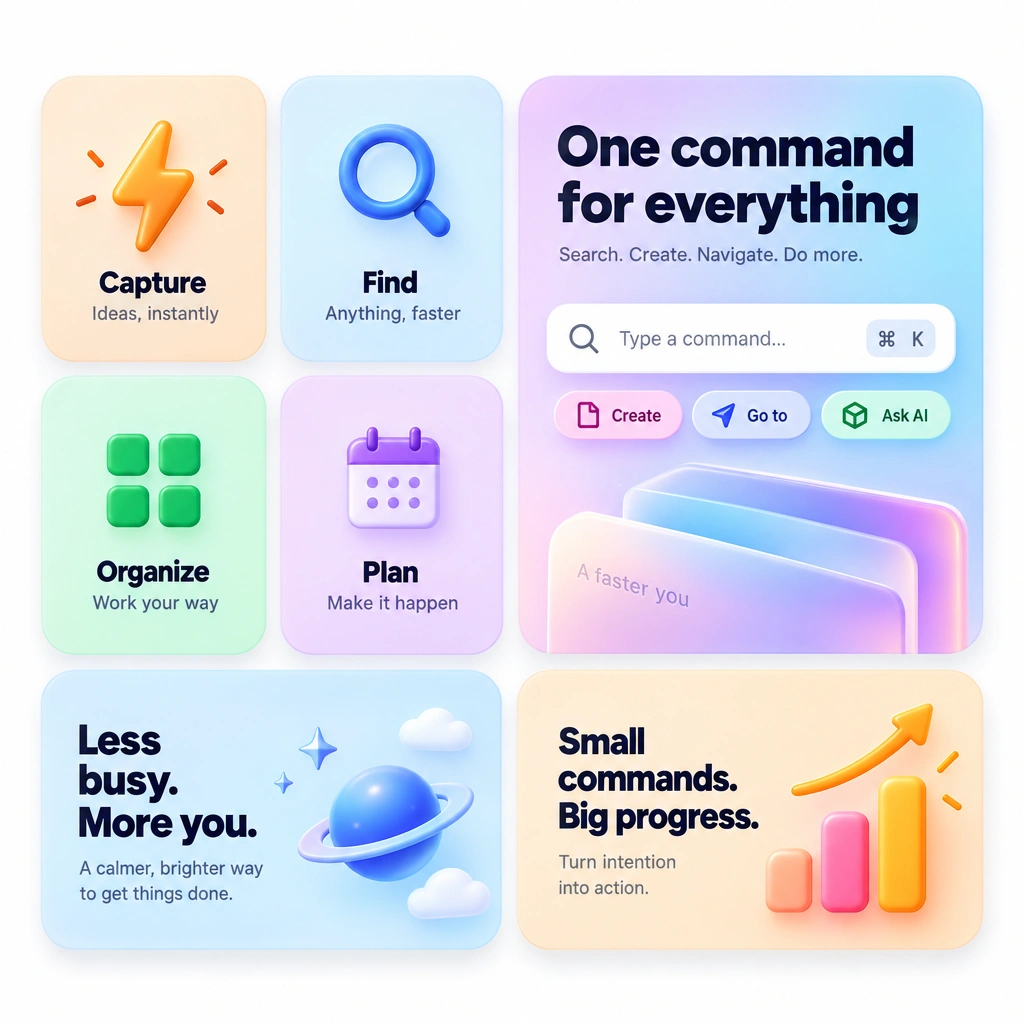
Grid: ~4 units desktop · footprints used 1×1, 2×1, 2×2 · gap approx. 16px · radius approx. 20px · 8 cells in the section
Hierarchy move: Color-coding by feature category substitutes for a strict size hierarchy, letting many small tiles coexist without feeling like clutter.
Weak spot: Heavy reliance on brand color to differentiate tiles can be harder to parse for a first-time visitor unfamiliar with the product.
Steal this: A consistent icon-plus-label format inside every small tile keeps a busy, colorful grid scannable.

Arc
Grid: ~3 units desktop · footprints used 2×1, 1×2, 1×1 · gap approx. 20px · radius approx. 24px · 6 cells in the section
Hierarchy move: Motion and micro-interaction inside tiles (previewed as short loops or GIFs) does much of the hierarchy work that size alone would normally carry.
Weak spot: The unusual aspect ratios make this layout notably harder to reproduce responsively, and the mobile version compresses significantly.
Steal this: Motion can substitute for size when your product's differentiator is an interaction, not a static screen.

Supabase
Grid: ~3 units desktop · footprints used 2×1, 1×1, 1×2 · gap not measured · radius not measured · 6 cells in the section
Hierarchy move: Technical tiles (code, schema diagrams) get more visual weight than marketing-copy tiles, matching the audience's actual interest.
Weak spot: Some tiles pack enough technical detail that they read closer to documentation than to a scannable marketing section.
Steal this: Let audience expertise decide density; a developer audience tolerates a denser tile than a general consumer audience.

Framer
Grid: ~3 units desktop · footprints used 2×2, 2×1, 1×1 · gap not measured · radius not measured · 5 cells in the section
Hierarchy move: Real customer-site screenshots substitute for abstract icons, which suits a tool whose whole pitch is visual output.
Weak spot: Heavier image weight per tile means this pattern is more sensitive to slow image loading than icon-based grids.
Steal this: If your product's output is inherently visual, let real output fill the tiles instead of illustrating with generic icons.

Notion
Grid: ~4 units desktop · footprints used 1×1, 2×1 · gap not measured · radius not measured · 5 cells in the section
Hierarchy move: Use-case tiles (for teams, for engineering, for notes) are sized close to equally, then one larger tile anchors the "all in one workspace" thesis.
Weak spot: Near-equal sizing across several use-case tiles slightly undercuts the "size means importance" rule this guide leans on.
Steal this: When you genuinely have multiple equally-important use cases, near-equal sizing is a legitimate exception, not a mistake.

Tailwind UI / Tailwind Plus
Grid: ~4 units desktop · footprints used 2×2, 2×1, 1×1 · gap not measured · radius not measured · 8 cells in the section
Hierarchy move: Size correlates with component complexity (a full dashboard preview gets a large tile, a single badge gets a small one) rather than with marketing priority.
Weak spot: Because the grid indexes a catalog rather than tells a story, it reads more like a directory than a persuasive feature section.
Steal this: A bento grid can double as a visual table of contents when your product's differentiator is the breadth of what it ships.

Cursor
Grid: ~3 units desktop · footprints used 2×1, 1×1 · gap not measured · radius not measured · 5 cells in the section
Hierarchy move: The editor screenshot that best demonstrates the flagship feature (AI-assisted editing) takes the largest cell.
Weak spot: Editor screenshots at small tile sizes can lose legibility, since code text does not scale down gracefully.
Steal this: If your smallest legible screenshot still needs a 2×1 footprint, respect that instead of forcing it into a 1×1.
Resend / Loops
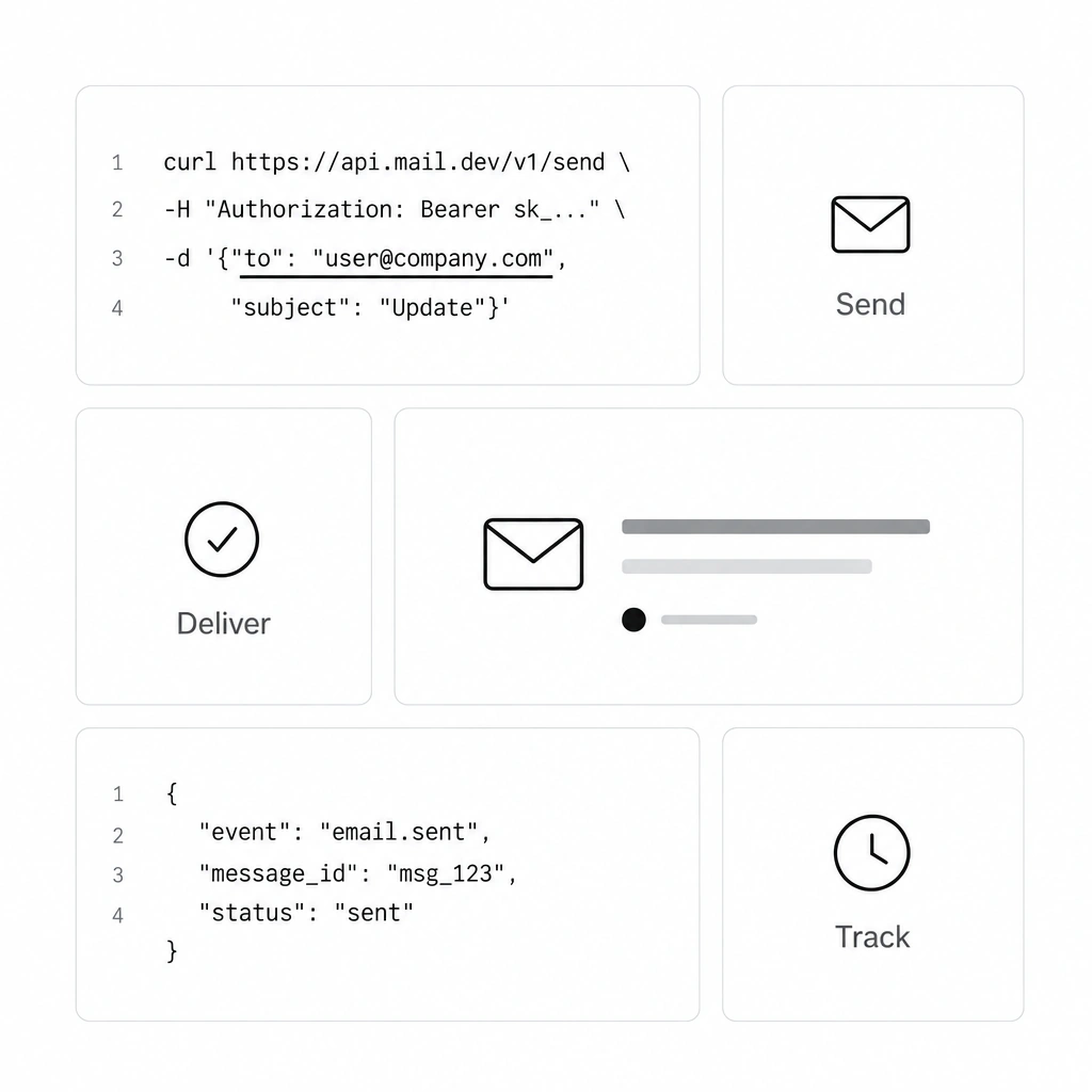
Grid: ~4 units desktop · footprints used 1×1, 2×1 · gap not measured · radius not measured · 6 cells in the section
Hierarchy move: API and code-snippet tiles are prioritized in size over generic marketing tiles like "reliable delivery" or "great support."
Weak spot: A grid this minimal depends heavily on strong copywriting in the small tiles, since there is little visual detail to fall back on.
Steal this: For a developer tool, a code snippet in a tile often out-communicates an icon and an adjective.

The generic personal portfolio bento
Grid: ~2 units desktop · footprints used 1×1, 2×1 · gap not measured · radius not measured · 4 cells in the section
Hierarchy move: Often none. Size is decided by the template default rather than by which piece of information matters most about the person.
Weak spot: Every tile carries near-identical visual weight, so a hiring manager scanning the page cannot tell which project the person considers their best work.
Steal this: Even in a personal portfolio, pick one tile (your best project, your current role) and size it larger on purpose.
Responsive behavior
A bento grid has to give up its asymmetry gracefully as the viewport shrinks. The biggest failure mode: a layout that looks intentional on desktop and random on mobile.
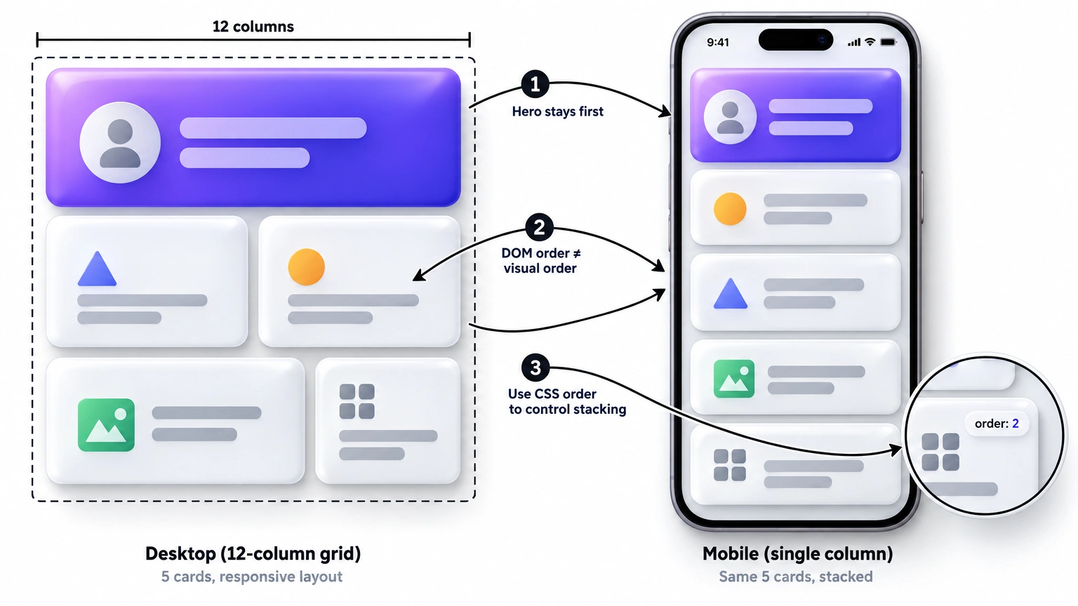
The standard collapse path runs in three steps. Desktop keeps the full 12-column grid, with all size variety visible. Tablet narrows to 4-6 columns, and the tallest and widest cells simplify to 2×1 or 1×1. Mobile drops to a single column, every cell becomes full-width, and order becomes the only remaining hierarchy signal.
On mobile, cell size can no longer communicate importance. The stacking order has to do that job instead.
This creates a real accessibility problem if you are not careful. The visual order on desktop, achieved with grid-template-areas or explicit grid-column/grid-row placement, does not automatically match DOM order. And DOM order is what screen readers and keyboard navigation follow.
DOM order equals mobile order.
Mobile is the only breakpoint where source order is the visual order. A single-column grid stacks elements exactly as they appear in the markup, with no area map overriding it. Author your HTML in the order you want the mobile stack to read. Then let grid-template-areas on desktop handle all the visual reordering, since desktop is the only place reordering is safe.
.bento {
  display: grid;
  grid-template-columns: repeat(4, 1fr);
  grid-template-areas:
    "hero hero small1 small2"
    "hero hero wide wide";
  gap: 16px;
}
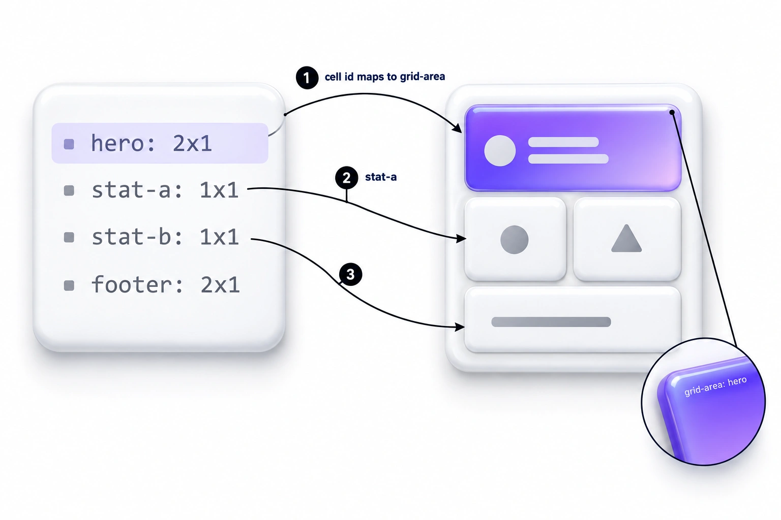
.hero { grid-area: hero; }
.small1 { grid-area: small1; }
.small2 { grid-area: small2; }
.wide { grid-area: wide; }
@media (max-width: 640px) {
  .bento {
    grid-template-columns: 1fr;
    grid-template-areas: none;
  }
  .bento > * { grid-area: auto; }
}
With grid-template-areas: none and grid-area: auto, the single column falls back to plain DOM order. One trap: .bento > * and .hero have equal specificity, so the reset only wins because the media query comes later in the stylesheet. Keep it below the cell rules, or raise its specificity if it moves to another file. The HTML should already be written hero, wide, small1, small2, to match the intended mobile reading order.
Building it: CSS grid, Tailwind, Figma
CSS grid
grid-template-areas is the most maintainable way to build a bento grid. The layout reads like an ASCII map of the final result, and every breakpoint gets its own map without touching the HTML. Define your cells as named areas, assign each element a grid-area, then redeclare the area map, not the elements, inside each media query. This keeps the responsive logic entirely in CSS, exactly where a purely visual concern belongs.
Tailwind
Tailwind's col-span-* and row-span-* utilities are a fast path for simpler bento grids that mostly resize rather than reorder. A typical hero tile becomes col-span-2 row-span-2. A wide tile becomes col-span-2 row-span-1. Everything else defaults to col-span-1 row-span-1.
For grids that need true reordering at breakpoints, use Tailwind's arbitrary properties instead. Put [grid-area:hero] on the element, and [grid-template-areas:'hero_hero_small1_small2'_'hero_hero_wide_wide'] on the container. Pin the shared row height the same way, with auto-rows-[104px], since Tailwind has no built-in utility for named grid areas.
Figma
Figma's auto-layout is one-dimensional. A reliable bento structure needs nested auto-layout instead of a single flat frame: a vertical auto-layout frame holds each row, and each row is itself a horizontal auto-layout frame holding that row's cells. Give row frames a fixed height, so every row shares the same base unit, the same discipline the CSS row height needs. A 2×2 hero cell becomes its own fixed-height frame spanning two rows inside a small wrapper, instead of living inside a single row frame like everything else.
Bind gap and radius to Figma variables (bento/gap, bento/radius, bento/radius-inner) instead of hardcoding pixel values on each frame. That way the gap-to-radius ratio survives edits made months later, by someone who was not in the room for the original math. Name every cell frame with its grid-area name, like hero, wide, or small1, rather than a generic label like "Frame 12." A developer, or an agent reading the file through Figma's MCP server, can then map layers to CSS grid areas one to one, without guessing.
Building a bento grid with an AI agent
Coding agents (Cursor, Claude Code, Copilot, v0, Lovable, Figma Make) default to tile walls when asked for a "bento grid." The reason is training data, not a prompting failure on your part. Most public code labeled "bento grid" online is a uniform card grid with grid-auto-flow: dense bolted on, or a hardcoded grid-column: 3 / 5 that breaks the moment content changes. An agent trained on that corpus reproduces its statistical average, exactly the pattern this guide argues against.
The fix is not a better adjective in your prompt. It is handing the agent explicit constraints it cannot average away: a spec prompt for one-off sessions, a rules file for persistent projects, and a layout manifest it can generate from and be checked against. See how a fully agent-editable landing page holds up under this kind of constraint for the same idea applied to a full page.
Five ways agents get bento wrong
| Agent default | Why it happens | The line that fixes it |
|---|---|---|
| Uniform card grid with icons | Matches the most common labeled example in training data | State the required footprints explicitly: one 2×2, two or three 2×1 or 1×2, the rest 1×1 |
grid-auto-flow: dense | Looks like a quick fix for gaps in a generated layout | Ban it outright: no grid-auto-flow: dense, ever |
Hardcoded grid-column: 3 / 5 line numbers | Easiest way for a model to force a specific cell position | Require named grid-template-areas, never raw line numbers |
| Mismatched radii between nested elements | Model copies a generic 12px radius onto every layer, nested or not | Require a single radius token and the inner-radius formula from this guide |
| No defined mobile order | Model treats mobile as an afterthought resize, not a reorder | Require DOM order to equal mobile order, stated as its own rule |
The four-step loop
- Write the manifest first. Hierarchy is a design decision, so make it before any code exists.
- Ask the agent for the ASCII
grid-template-areasmap only, and approve or correct it. Fixing a map is one line; fixing generated CSS is twenty. - Let the agent generate HTML and CSS from the approved map under the rules file.
- Diff the output against the manifest with the three checks below.
The spec prompt covers steps 2 and 3 in one session. The rules file makes them hold across sessions.
The bento spec prompt
For a single session, paste this before asking for a bento section:
Build a bento grid section with these constraints. Treat every line as a hard rule.

GRID
- 4 bento units across on desktop (on a 12-column page grid, 1 unit = 3 columns).
- Fixed row height: grid-auto-rows: 104px. Gap: 16px. Radius token: 24px.
- Allowed footprints in units: 1x1, 2x1, 1x2, 2x2. Exactly one 2x2 hero cell.
- Never use grid-auto-flow: dense. If a gap appears, change a footprint.

PLACEMENT
- Place cells only with grid-template-areas and named grid-area values.
- No grid-column or grid-row line numbers anywhere.
- Author the HTML in mobile reading order. Desktop areas map is the only place visual order changes.
- Below 640px: grid-template-columns: 1fr; grid-template-areas: none; every cell grid-area: auto.

STYLE
- One radius token (24px) on every cell. Inner rounded elements use 24px minus cell padding, floor 4px.
- Same padding for every cell of the same footprint.
- No paragraph text in 1x1 cells. If copy does not fit on one line, promote the cell or cut the copy.

OUTPUT
- First, print the grid-template-areas map as ASCII and stop for approval.
- After approval: semantic HTML, one wrapper, one element per cell; CSS or Tailwind with the ASCII map as a comment above it; a comment listing DOM order and confirming it equals mobile order.
The rules file
For a project you will return to across sessions, put a persistent version in .cursor/rules/, CLAUDE.md, or AGENTS.md:
# bento.rules.md

## Grid
- Base unit: 8px. Row height fixed via grid-auto-rows or aspect-ratio.
- Never use grid-auto-flow: dense.
- Cell footprints allowed: 1x1, 2x1, 1x2, 2x2. Exactly one 2x2 per grid.
- Bento runs 4 units across on desktop. Footprints count in units, not page columns.

## Placement
- Use grid-template-areas and named grid-area values only.
- No hardcoded grid-column / grid-row line numbers.
- Mobile query (max-width: 640px) sets grid-template-columns: 1fr, grid-template-areas: none, and grid-area: auto on every cell. It never declares a new area map.

## Style
- One radius token per grid. Inner radius = outer radius - padding,
  floor 4px.
- Gap between 0.5x and 1x the radius token.

## Before finishing, confirm:
- [ ] Exactly one 2x2 cell exists
- [ ] No grid-auto-flow: dense anywhere in the output
- [ ] No hardcoded grid-column / grid-row line numbers
- [ ] A single radius token drives every cell, nested or not
- [ ] DOM order equals the mobile stacking order
The layout manifest
A layout manifest turns the hierarchy decision into structured data. An agent can generate directly from it, and a reviewer can diff it against the generated CSS afterward. It also gives you a stable artifact to hand to a different agent, or a different session, without re-explaining the grid from scratch.
{
  "units": 4,
  "pageColumnsPerUnit": 3,
  "rowHeight": 104,
  "gap": 16,
  "radius": 24,
  "cells": [
    { "id": "hero",   "footprint": "2x2", "priority": 1, "content": "product-demo", "mobileOrder": 1 },
    { "id": "api",    "footprint": "2x1", "priority": 2, "content": "code-snippet", "mobileOrder": 3 },
    { "id": "teams",  "footprint": "2x1", "priority": 3, "content": "screenshot",   "mobileOrder": 4 },
    { "id": "uptime", "footprint": "1x1", "priority": 4, "content": "stat",         "mobileOrder": 2 },
    { "id": "speed",  "footprint": "1x1", "priority": 5, "content": "stat",         "mobileOrder": 5 },
    { "id": "soc2",   "footprint": "1x1", "priority": 6, "content": "badge",        "mobileOrder": 6 }
  ]
}
Priority and mobileOrder are separate on purpose. Priority decides footprint: the higher the priority, the larger the cell on desktop. MobileOrder decides the single-column stack, which is also DOM order. They diverge when a small cell deserves an early mobile position: here the uptime stat is a 1×1 on desktop but stacks right after the hero on mobile, because a number is faster to read on a phone than a code snippet.
Once code is generated, run three checks against the manifest. Every cell id appears as a grid-area with the footprint the manifest specifies. The priority-1 cell is the only 2×2. DOM order equals mobileOrder. A mismatch is a bug, not a style preference. The manifest is the source of truth; the CSS is what you verify against it.
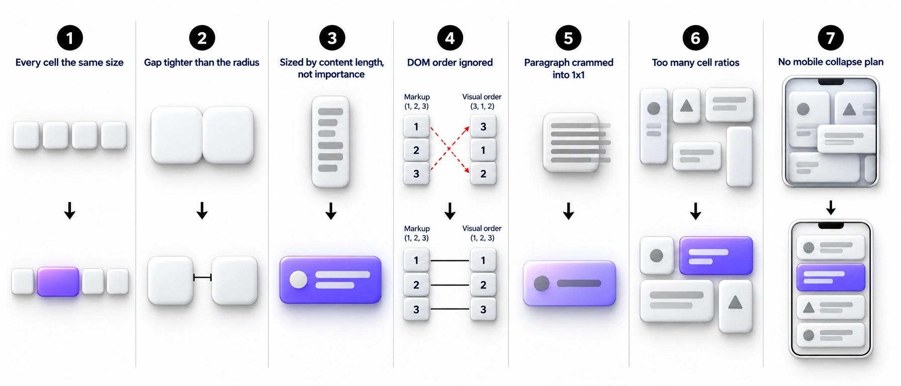
7 mistakes that turn a bento into a tile wall
Making every cell the same size. This is a card grid pretending to be a bento grid, and it forfeits the entire point of the pattern. Fix: commit to at least two distinct cell footprints before you place a single piece of content.
Skipping the gap-to-radius ratio. A gap that is too tight makes tiles look like one merged shape instead of a set. Fix: use the gap formula above (half to full radius) as a hard rule, not a suggestion.
Sizing cells by content length instead of importance. The tile with the most copy is not automatically the most important feature. Fix: decide hierarchy first, then write copy to fit the cell, not the reverse.
Ignoring DOM order. A visually reordered grid that does not match markup order breaks screen reader and keyboard navigation. Fix: keep source order matching intended reading order, and use grid-template-areas for visual reordering.
Cramming a paragraph into a 1×1 cell. Small tiles cannot hold dense copy no matter how small the font gets. Fix: cut the copy to one short label, or upgrade the cell to a 2×1.
Using more than three cell ratios. A grid mixing five or six distinct aspect ratios reads as chaotic rather than curated. Fix: cap the ratio families at three (1:1, 2:1, 1:2) for the whole grid, occasionally adding 3:1 for a wide banner cell.
Forgetting the mobile collapse plan. A bento grid designed only at desktop width often breaks in ways nobody notices until launch. Fix: design the single-column mobile stack order at the same time as the desktop layout, not after.
When not to use a bento grid
A bento grid is the wrong tool the moment your content becomes a real dataset that people need to scan, sort, or compare across many records. A data table handles that job with far less friction. It is also the wrong tool when every item on the page genuinely carries equal weight, since a bento grid without a size hierarchy is just a tile wall with extra visual effort.
The pattern has also become a shorthand cliché in AI-startup marketing pages, applied by default rather than by decision. That is worth reading about in why every AI startup looks the same. If you cannot name which single tile in your grid matters most, that is the signal to reach for a simpler layout instead.
Bento grid checklist
- Does the grid use at least two distinct cell sizes?
- Does one cell hold the single most important feature?
- Is the gap between half and a full corner radius?
- Does every cell height snap to a shared row unit?
- Are there three or fewer distinct cell ratios on the grid?
- Does small-tile content stay to one label or one number?
- Does DOM order match the intended reading order?
- Is there a defined mobile single-column stack order?
- Does
grid-template-areashandle the breakpoint reordering? - Would the grid still make sense with the icons removed?
- Could you explain the size of every tile in one sentence?
- Is the grid a closed set, not an infinitely appended feed?
- Is there a rules file or spec prompt in the repo so the next agent session keeps the constraints?
- Does
grid-auto-rowsoraspect-ratioenforce the shared row height?
FAQ
What is a bento grid in UI design?
A bento grid is a layout where content sits in rectangular cells of different sizes inside one shared grid frame, similar to a Japanese bento box. Cell size signals importance instead of every item getting equal weight. Apple, Linear, and Vercel all use the pattern for feature sections and marketing pages.
What is the ideal gap size for a bento grid?
Set the gap between roughly half and a full corner radius. A 24px radius pairs well with a 12-20px gap, and a 16px radius pairs with an 8-14px gap. Too small a gap reads as one merged shape, and too large a gap breaks the "one tray" feeling the pattern depends on.
How many columns should a bento grid use?
Twelve columns is the common page grid, but bento footprints count in units, typically 4 or 6 across, so one unit equals 3 or 2 page columns. Keep every cell a whole number of units, never a fractional column span. Mobile collapses the whole grid down to a single unit.
Is a bento grid the same as a masonry grid?
No. Masonry grids let cell height vary freely based on content length, producing a staggered, unpredictable bottom edge. Bento grids use a small set of fixed cell sizes that snap to a shared row height, so the bottom edge stays aligned. That constraint is what keeps a bento grid feeling deliberate instead of accidental.
Should I use CSS grid or Tailwind for a bento grid?
CSS grid is the right primitive either way, since Tailwind's grid utilities are a thin wrapper around it. Reach for raw CSS grid with grid-template-areas when cell placement needs to change per breakpoint. Reach for Tailwind's col-span and row-span utilities when the layout is simpler and mostly resizing.
When should I avoid a bento grid?
Skip it when your content is a real dataset that needs scanning and comparison across rows, which a data table handles better. Also skip it when every item genuinely carries equal weight, because a bento grid without a size hierarchy is just a tile wall with extra steps.
Can an AI coding agent build a bento grid?
Yes, but only with explicit constraints. Left alone, most agents default to a uniform card grid with grid-auto-flow: dense, since that pattern dominates their training data. Give the agent allowed footprints, a single radius token, and grid-template-areas placement. Also require a DOM-order-equals-mobile-order rule, ideally saved as a persistent rules file rather than repeated per prompt.
Closing thought
A bento grid is grid math and a hierarchy decision wearing a friendly name, not a visual trick you can eyeball into place. The layouts that hold up, like Apple's product pages and Linear's feature sections, all share the same discipline underneath the variety: one base unit, a short list of legal cell sizes, and a size choice that maps directly to what actually matters.
The ones that fall apart, including most personal-portfolio templates and the AI-startup bento cliché, skip that decision and let the template choose for them. Do the math first, and the "make it look like Apple" brief stops being a mystery. It starts being a checklist.