

Roman Kamushken
Search UI is the set of states and surfaces that turn a text field into a way of finding content. It spans the field itself, the suggestion panel, scopes, the results page and the zero-results recovery screen. Designing it means designing the transitions between those states, not the input alone.
This guide builds one system for the whole component, from the empty field to the zero-results recovery screen. It covers anatomy, placement, six states, autocomplete, recent queries, scoped search, then results layout, and closes with a pre-ship checklist. Mobile and semantic search each get a section.
Users who search arrive with intent. A person who types a query has told you what they want, and they convert or return at higher rates than a person idly scrolling a list. The damage lives at the edges: an empty dropdown that shows nothing, or a zero-results screen that ends the session without a way out.
Anatomy of a search bar
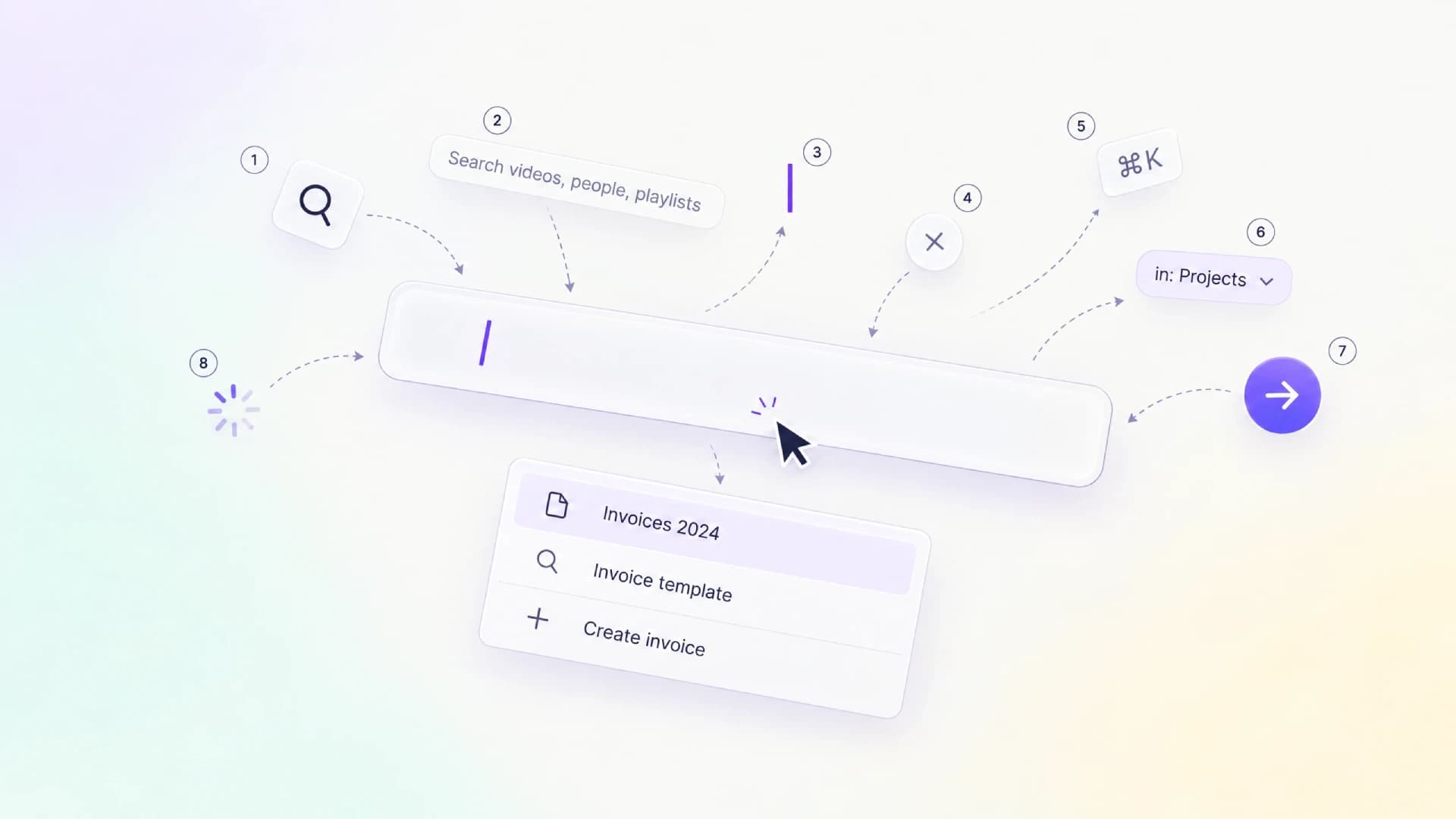
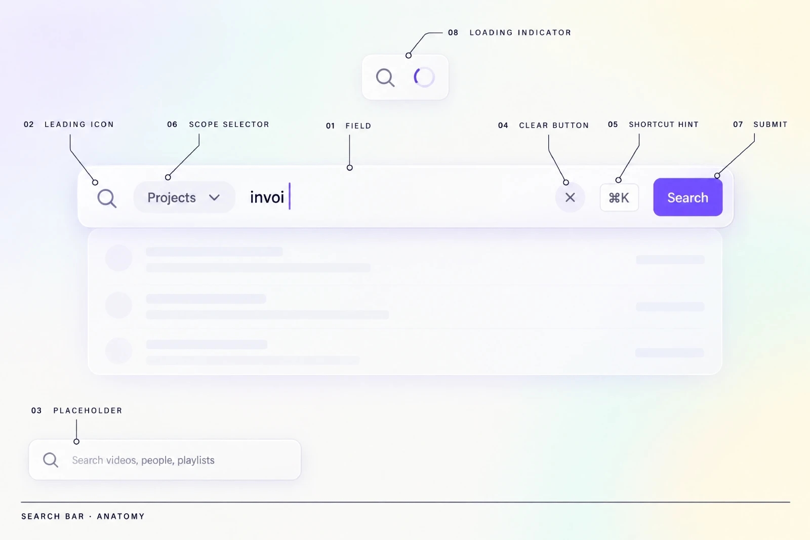
Picture a single rounded field resting on a tinted surface. The caret blinks in the middle of a half-typed word, a magnifier icon sits at reduced opacity on the left, and a clear button has just faded in on the right edge. Behind the text, a faint panel is beginning to paint its first row.
Add parts one at a time
Every part earns its place or it should be cut. The field is the only mandatory element, and everything around it is a decision about how much the component promises the user. Add parts one at a time, then remove the ones that repeat each other.
The leading icon signals purpose before the placeholder is read. The placeholder should name a real category of content rather than say "Search", so a media library reads better as "Search videos, people, playlists" than as a bare label.
The clear button resets the field and reopens the recommendation panel. A shortcut hint earns space only when a keyboard path exists.
A scope selector narrows the space before a query runs. A submit affordance matters when search is expensive or the results page is a heavy load. The loading indicator replaces the icon in place, so the field never changes width.
| Element | Purpose | When to omit |
|---|---|---|
| Field | Holds the query and the caret | Never |
| Leading icon | Signals search at a glance | When the field sits in a labeled search region |
| Placeholder | Sets expectation of what is searchable | Never, but keep it specific |
| Clear button | Resets to the empty state | Hide it while the field is empty; never omit it on touch screens |
| Shortcut hint | Teaches a keyboard path | When no shortcut is bound |
| Scope selector | Limits the search space | Single-type products with one content model |
| Submit affordance | Commits an expensive query | Fully instant search |
| Loading indicator | Signals that results are coming | Only when results are local and return instantly |
Optional parts create most of the inconsistency. A scope selector on one screen and not another makes the same query behave differently depending on where it started. The field's own states follow a separate logic, covered in the input UI design guide.
Placement and prominence across three search postures
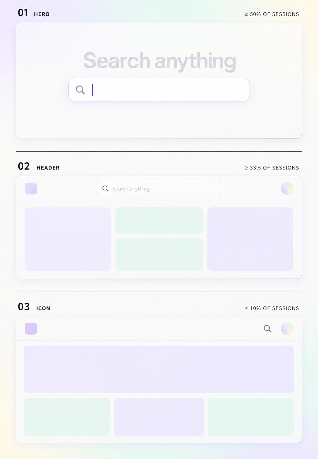
Three screens, three relationships with search. On the first, the field sits alone in the center of a mostly empty page with the caret already active. On the second, a slimmer field sits in the top bar between the logo and the avatar. On the third, only a magnifier icon remains.
Hero search
Hero search treats the query as the product. The field is the largest element on the page, it takes focus on load on desktop, and suggestions fill the space below. It fits marketplaces and documentation portals where the first useful action is a lookup. Autofocus on mobile is a different story, because opening the keyboard over half the screen before the user chose to search reads as an interruption.
Persistent header search
Persistent header search treats the query as a primary path. The field stays visible on every screen so a user can pivot without hunting for it. GitHub keeps search in the header on every page, while a documentation site often puts it in the hero instead, because the two products expect a different first move.
In a crowded header, the field competes with navigation and account controls for the same row. Give it a fixed maximum width and let it shrink before any neighbor truncates, because a header that reflows on a narrow viewport moves the field away from where the user learned to look. Keep the same position on every screen so the muscle memory survives a resize.
Icon-collapsed search
Icon-collapsed search treats the query as a fallback, a magnifier in the header that expands on activation. Expand the field in the direction of the free space, so a right-aligned icon opens toward the center rather than off-screen. Decide early whether the expanded field pushes its neighbors or overlays them, because a push reflows the header and an overlay hides the controls beneath it.
Hiding search behind an icon costs discoverability, and that cost is worth paying only when search is a rare path. Pair the icon with a visible placeholder on first visit, then let it settle down to the glyph once the user has seen it.
Pick the posture from one number, the share of sessions that include at least one query. As a starting heuristic, a third or more argues for persistent header search, and half or more on the landing screen argues for the hero posture. Below a tenth, collapse to an icon and spend the space on the primary flow. These thresholds are a starting point rather than a benchmark, and your own session data decides.
The six states of a search field
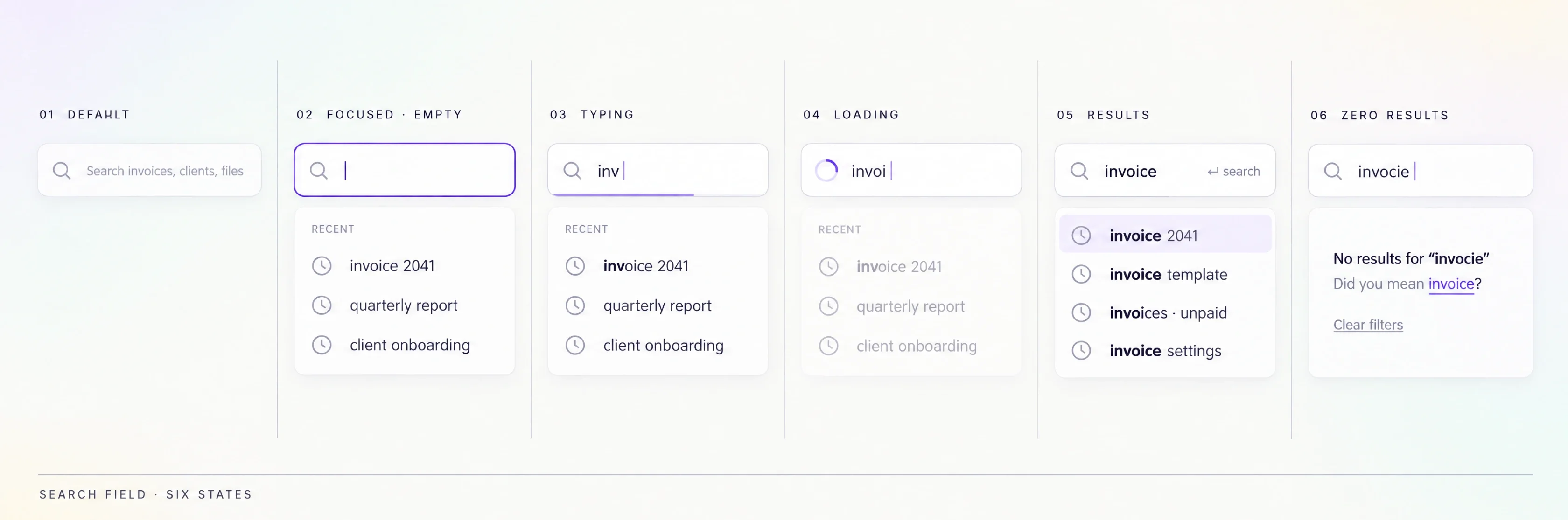
Run the same field through six moments in one session. It starts idle with a gray placeholder, and a click lifts the border to full contrast. Letters appear and a spinner replaces the leading icon, then results paint. A query that matches nothing leaves a short explanation and a suggestion.
| State | What the user sees | What changes | Common mistake |
|---|---|---|---|
| Default | Placeholder, low-contrast border | Nothing until focus | Placeholder reads "Search" with no scope |
| Focused empty | Recommendation panel opens | Border and label reach full contrast | Panel opens blank |
| Typing | Text plus a subtle loading cue | Panel starts ranking | Layout shifts as the panel resizes |
| Loading | Icon becomes a spinner | Previous results stay until new ones land | Field collapses or jumps in width |
| Results | Ranked rows under the field | First suggestion visually marked, typed query stays the default for Enter | Enter opens a suggestion the user never chose |
| Zero results | Query echoed with a recovery line | Panel switches to suggestions | Panel flashes empty before the message |
Transitions matter more than the states themselves. Keep the previous rows on screen during loading, then swap them in one commit. A dropdown that flashes empty for a single frame reads as a glitch, enough for a user to believe the field ignored them.
Autocomplete and suggestions
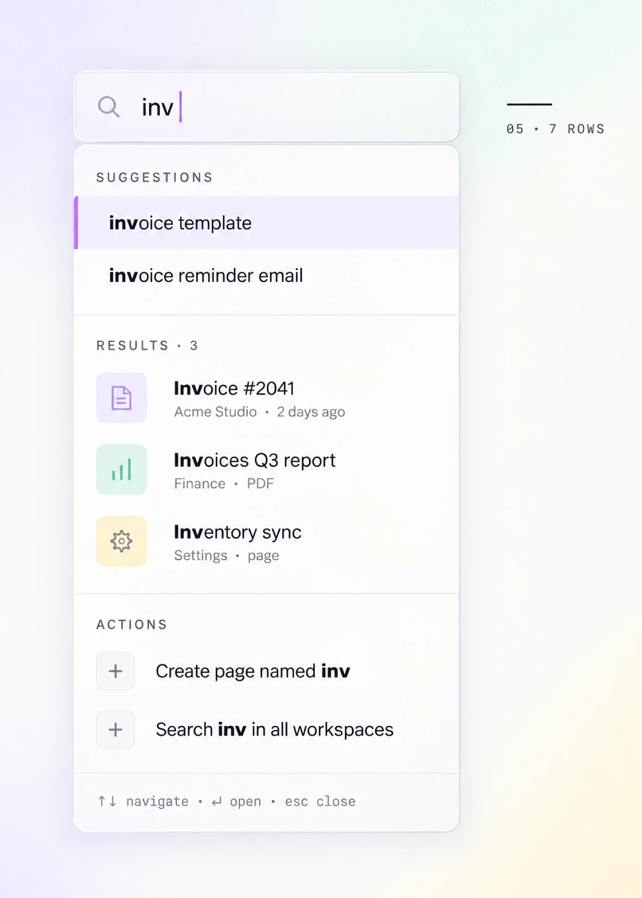
The dropdown is now a small ranked list. A bold fragment repeats the typed letters inside each row, and a thumbnail sits on the left for a direct match. A thin divider separates three labeled groups, and the first row is already highlighted.
How the panel ranks and times suggestions
Three kinds of suggestion share one panel. Query completions extend what the user is typing, entity results are direct hits shown with a thumbnail and metadata, and actions let a user create or run something from the typed phrase. Keep the groups labeled and ordered by confidence. Let entity results outrank generic completions on an exact match.
Match highlighting is the cheapest usability win here. Bold the matched substring and keep the rest of the row at full contrast so the eye can still read the whole label.
Order rows by relevance blended with personal history, because a user who opens the same item daily expects it near the top. Spotify blends listening history into suggestion order, so a track played last week can outrank a closer textual match. Nielsen Norman Group's research on search suggestions found that suggestions work when they are few and scannable.
Debounce the input so a fast typist does not fire a request per keystroke, and cancel in-flight requests when a newer one starts. Both mechanisms keep a query hook from flooding the backend, and teams commonly settle in the 150 to 300 millisecond range.
Handle Enter with care. The typed query is the implicit first row, so Enter runs it as typed unless the user has arrowed down to a suggestion. Mark the first suggestion visually so the list reads as ready, but never let that mark hijack the commit. Five to eight rows is the comfortable range for the default panel.
Recent and saved queries in the empty dropdown
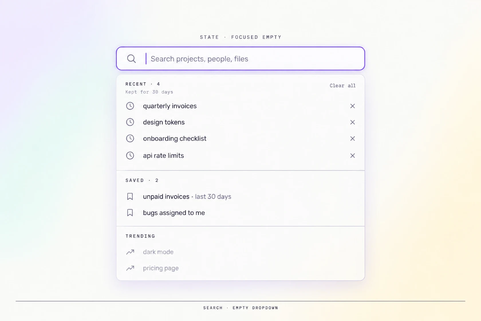
The field is focused and empty. No keystrokes yet, but the panel below is already populated. A short list of recent queries sits on top, each row carrying a small clock icon and a remove cross. Underneath sit saved searches, then a lighter row of what is popular right now.
The focused-empty state is a free recommendation surface, and most products waste it. A blank panel throws away the one moment when the user is paying full attention.
Recent queries come first, three to five in reverse chronological order, each with a remove action. Saved searches follow for products where users return to the same filter sets, and trending fills the last group.
Offer a clear-all action and keep recents out of shared sessions. On a shared device or a shared workspace, a recent-query list can leak a private search to the next person at the screen, so the clear-all action has to be reachable in one tap. State the retention window next to the list so a user knows how long a query stays.
Do not sync recents across accounts by default, because a query typed on a work account should not surface on a personal one. Make the choice explicit, and let the user turn sync on rather than opt out of a default they never saw.
Scoped search
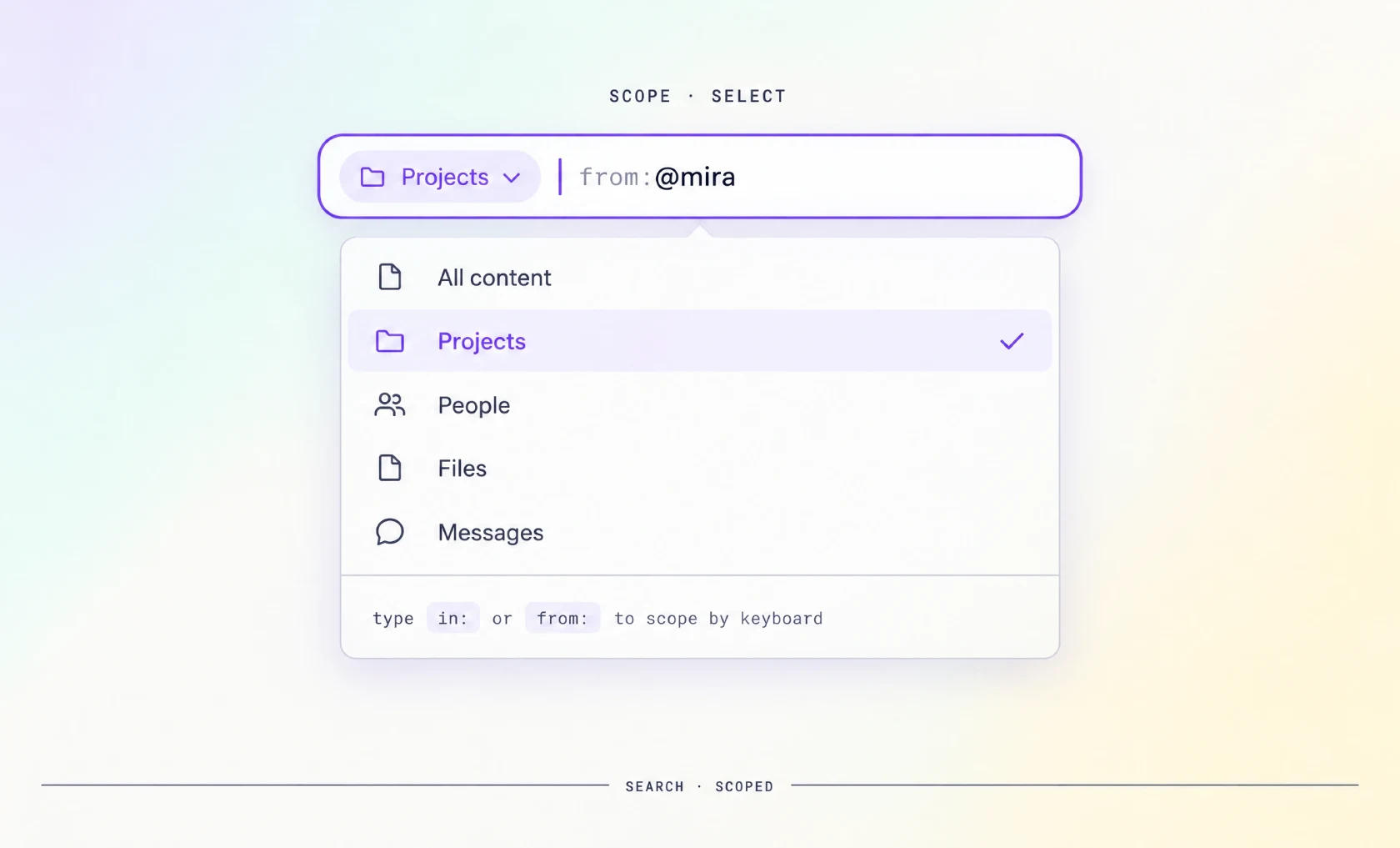
A small chip sits inside the field on the left, reading a category name in the accent color. The caret rests to its right, and a dropdown hangs below listing every scope with a checkmark on the active one. The component already knows where to look before a letter is typed.
Scopes limit the search space before a query runs, and they come in three shapes.
• A dropdown works when the list is long and space is tight.
• A row of tabs works when there are three or four scopes.
• Inline chips work best inside the field, because the active scope stays visible next to the text. Backspace at the start of the text should remove the chip, so the scope is undoable from the keyboard.
Short prefixes such as "in:" for a container or "from:" for an author let an experienced user build a narrow query without leaving the keyboard. GitHub and Slack show the same pattern with tokens like "is:open" or "from:@name", where the prefix is typed as plain text and styled as a token once it is recognized. Parse the prefix as a token and style it as a chip, but never hide the raw text.
Default scope should follow context, so a search started inside a project defaults to that project. Once the query lands and produces a list, the job moves from intent to attributes, which belongs to the filter handoff later in this guide.
Search results page layout
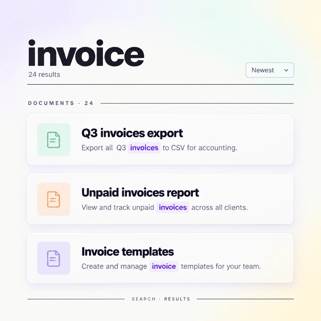
The query is gone from the field and now lives as a title above the results. A count sits under it and a sort control is parked on the right. Rows group under small uppercase type headers, each snippet highlights the matched word, and every card anchors on a thumbnail.
How layout and cards follow content
The layout follows the content shape.
• A list suits documents and messages, where each row needs a title and a snippet.
• A grid suits images and products, where the visual decides.
• Grouped-by-type results suit mixed content, and they need a visible type header with a count.
Baymard Institute's research on e-commerce search catalogs a dozen distinct query types, from exact product names to symptom-style descriptions. One template rarely serves all of them, which is the case for varying the card by content type.
Each card carries four things.
• A title.
• A snippet with the matched term highlighted.
• A line of metadata.
• A thumbnail when the content is visual.
Echo the query and show the count above the list, then choose progressive loading or pagination. Our notes on pagination UI design and data table design cover those mechanics.
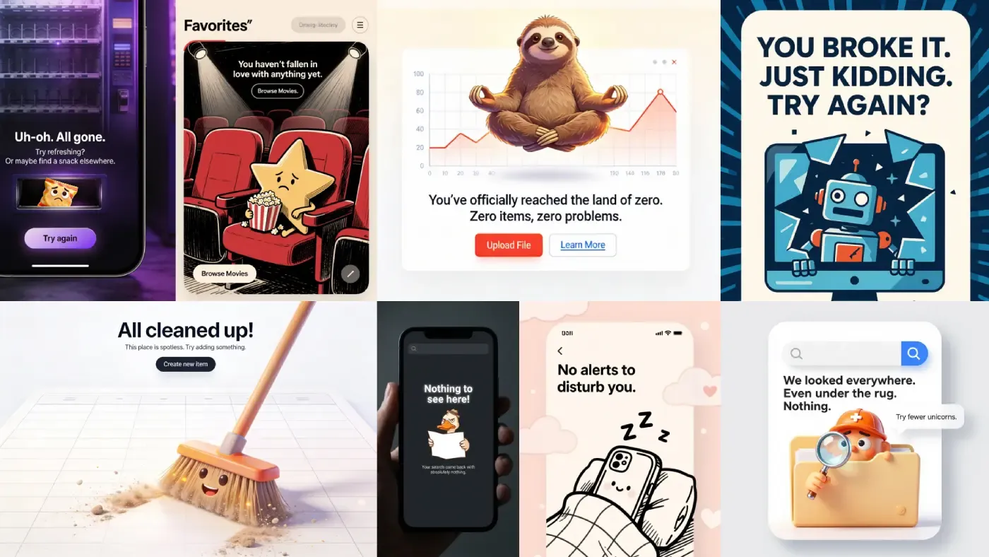
Designing the no-results page
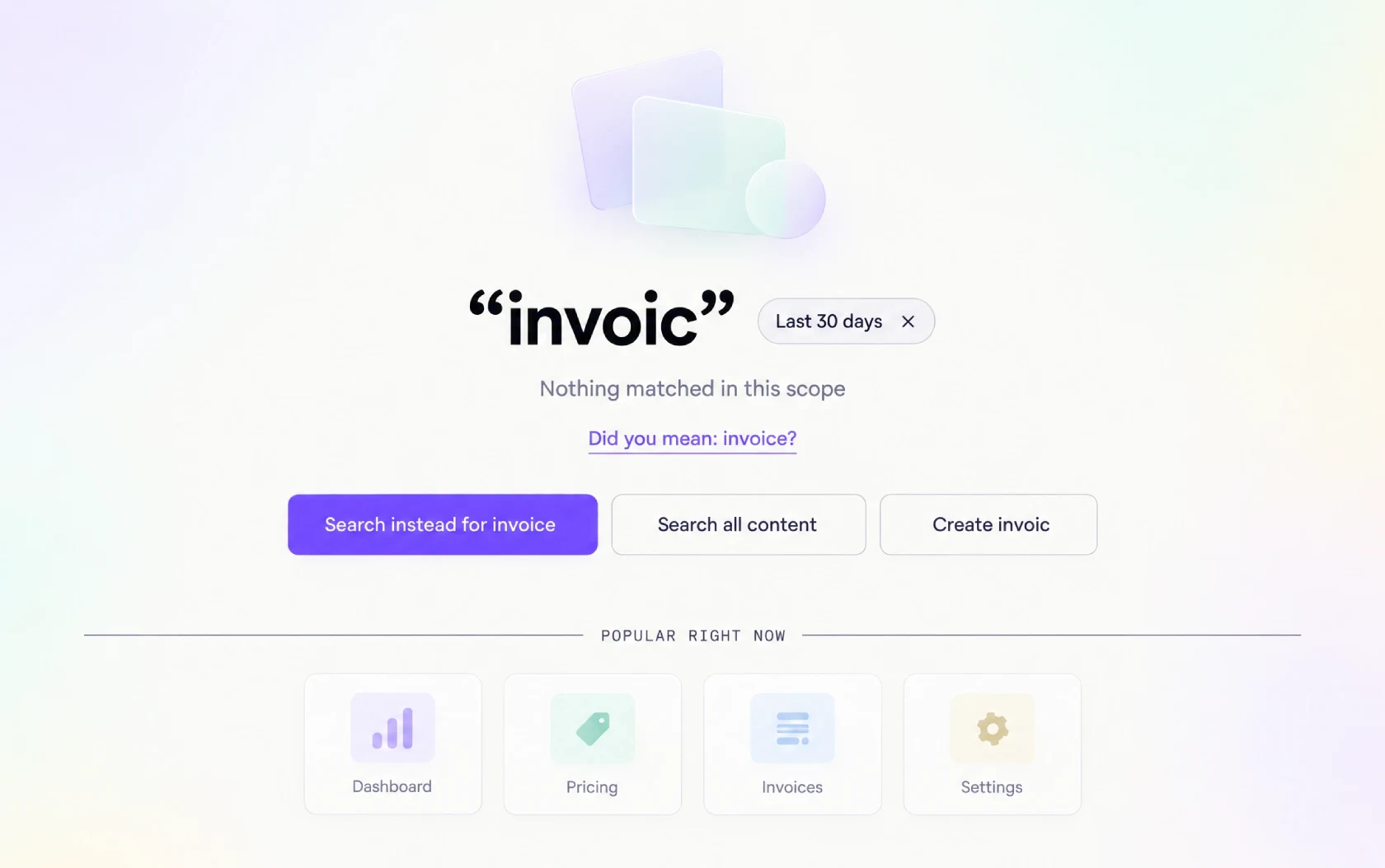
The screen is calm instead of blank. The query is echoed back in quotes at the top, with a short line explaining that nothing matched and a correction for a likely misspelling. Three buttons sit underneath, and a small row of popular items fills the lower half.
A zero-results screen has three jobs. Confirm what was searched and explain, in plain language, why nothing came back. Then offer a next step the user can take without retyping. A no-results page fails when it skips the second job, because a user who cannot guess the cause assumes the product is empty rather than the query too narrow.
Recovery actions, in order
❶ Spelling suggestions come first, offered as a clickable row, because a silent autocorrect is worse than a visible "did you mean" that shows why the results changed.
❷ Broadening comes next, so a scoped search can relax its scope with one action.
❸ Carried filters. A filter applied three screens ago is the most common hidden cause, so surface them as removable chips right here.
❹ A create action catches the item that does not exist yet in tools that accept user content.
The empty state UI design guide covers the visual and copy patterns.
The search and filters handoff
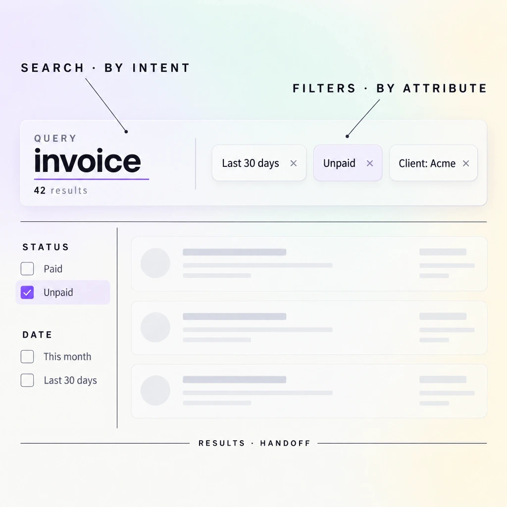
A results header holds the query on the left and three filter chips on the right, each with a remove cross. A sidebar of facets is open on a wide screen, and the count in the header has already dropped.
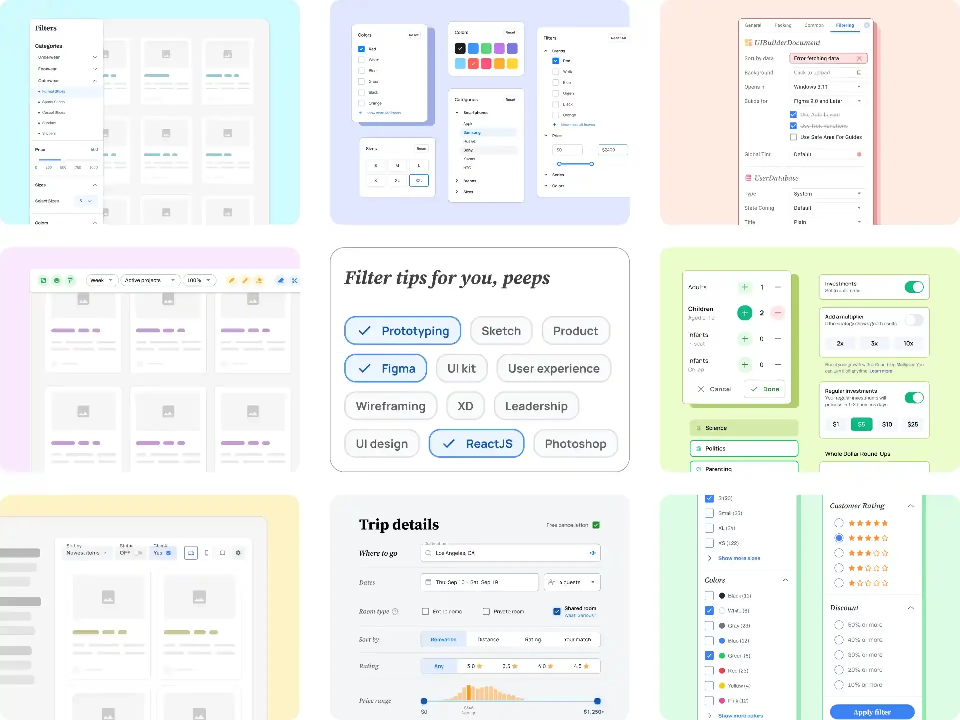
Keep the division of labor simple. Search narrows by intent, and filters narrow by attribute. A user types "invoice" to state what they want, then filters to "last 30 days" to state which one. The two controls should sit close together, because users move between them in a loop.
Place applied filters next to the query echo as well as inside the sidebar. A chip row beside the query shows the current state without a click, and each chip removes itself. Add a single reset that clears the filters and leaves the query intact. The filter UI design guide covers the full filter layer, so this post stays focused on the query side.
Search and the command palette
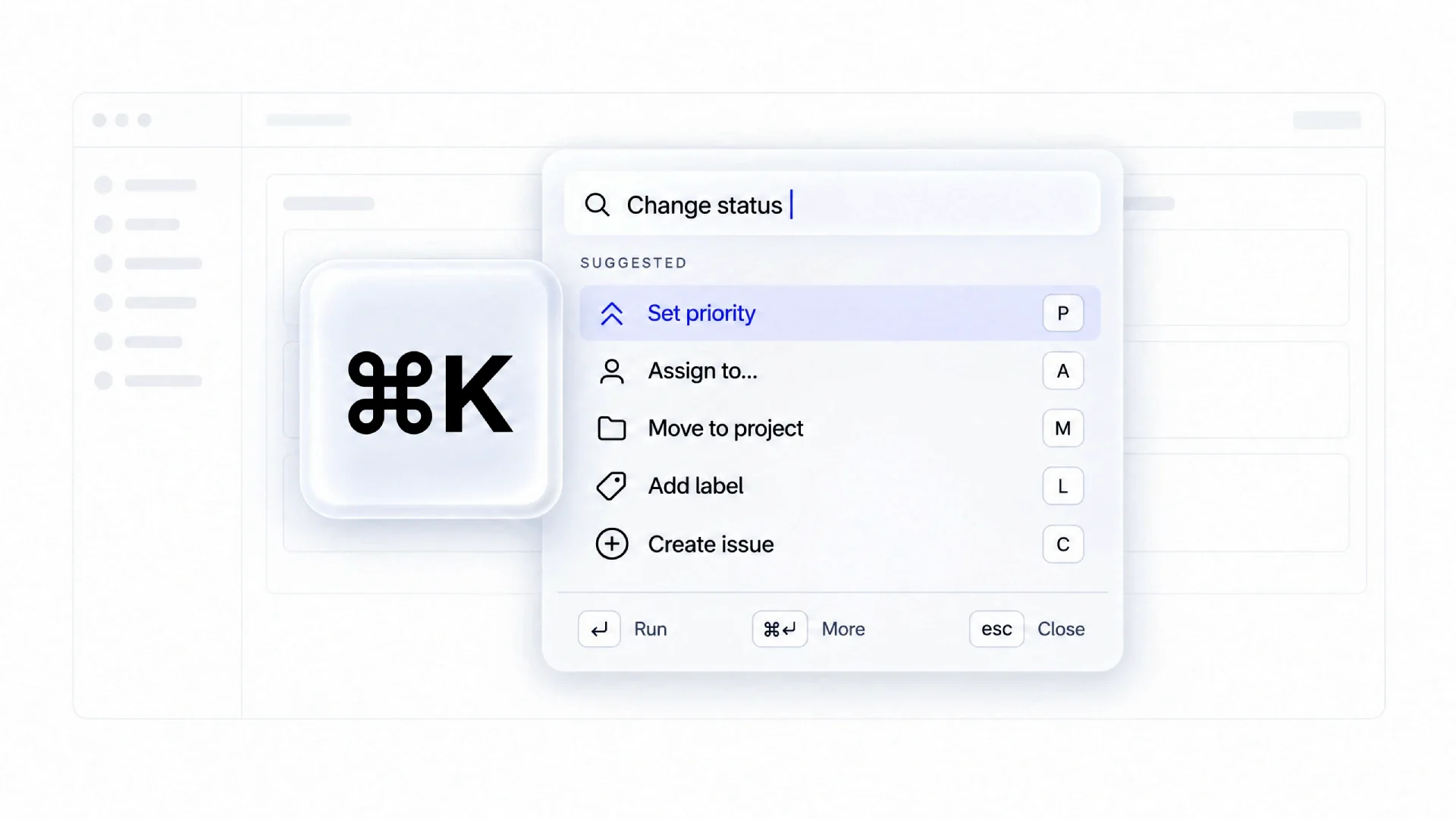
Two overlays, one screen apart. The first is a content search that lands the user on a page. The second is a palette that runs an action and stays exactly where it was.
Both patterns answer a keystroke, so teams assume one can replace the other. The mental models differ, search finds content and hands it over, while a palette executes a command without navigation. A user who types "new project" expects a project to exist afterward, not a list of pages about projects.
Decide by output rather than by input. If the component's job ends with a result the user clicks, it is search; if it changes state or creates an object, it is a palette. Linear unifies navigation and commands behind one shortcut, but keeps the results in labeled groups so the two jobs never blur. Products with a large object graph and a task-heavy workflow often need both.
Unify them behind one shortcut only when the groups are clearly labeled, so a content result never outranks a command the user meant to run. The command palette guide covers ranking and the states a palette needs.
Mobile search
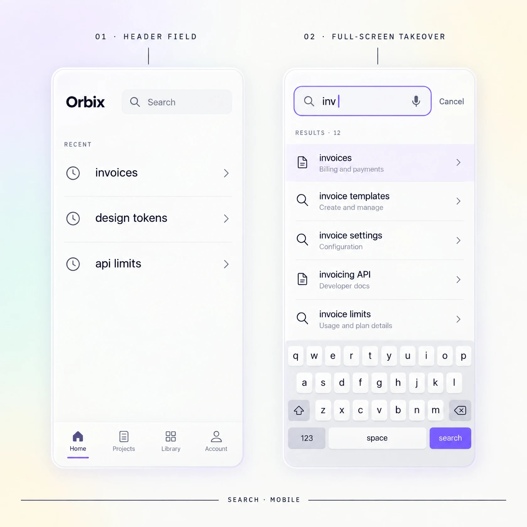
A phone is held in one hand. In the first frame, a slim field sits in the header, close to the thumb. In the second, a tap has expanded it into a full-screen overlay, and a live list of results fills the space above the keyboard.
The field should sit low enough for a thumb to reach without a grip change. Headers push it toward the top corner, the hardest zone for one-handed use, so a common fix is an entry point near the bottom bar. Pull-to-reveal works when the list is long, because the gesture is already familiar.
A full-screen takeover on focus removes the ambiguity of a cramped overlay. When the keyboard opens, results sit in one scroll region that clears it, because a keyboard that covers the first result breaks the whole interaction.
Tap targets for recent and saved queries need a full row height, with the remove action kept clear of the main tap area. Keep a cancel affordance visible, and add voice input beside the field, because dictation often beats typing a long query on glass.
AI and natural-language search
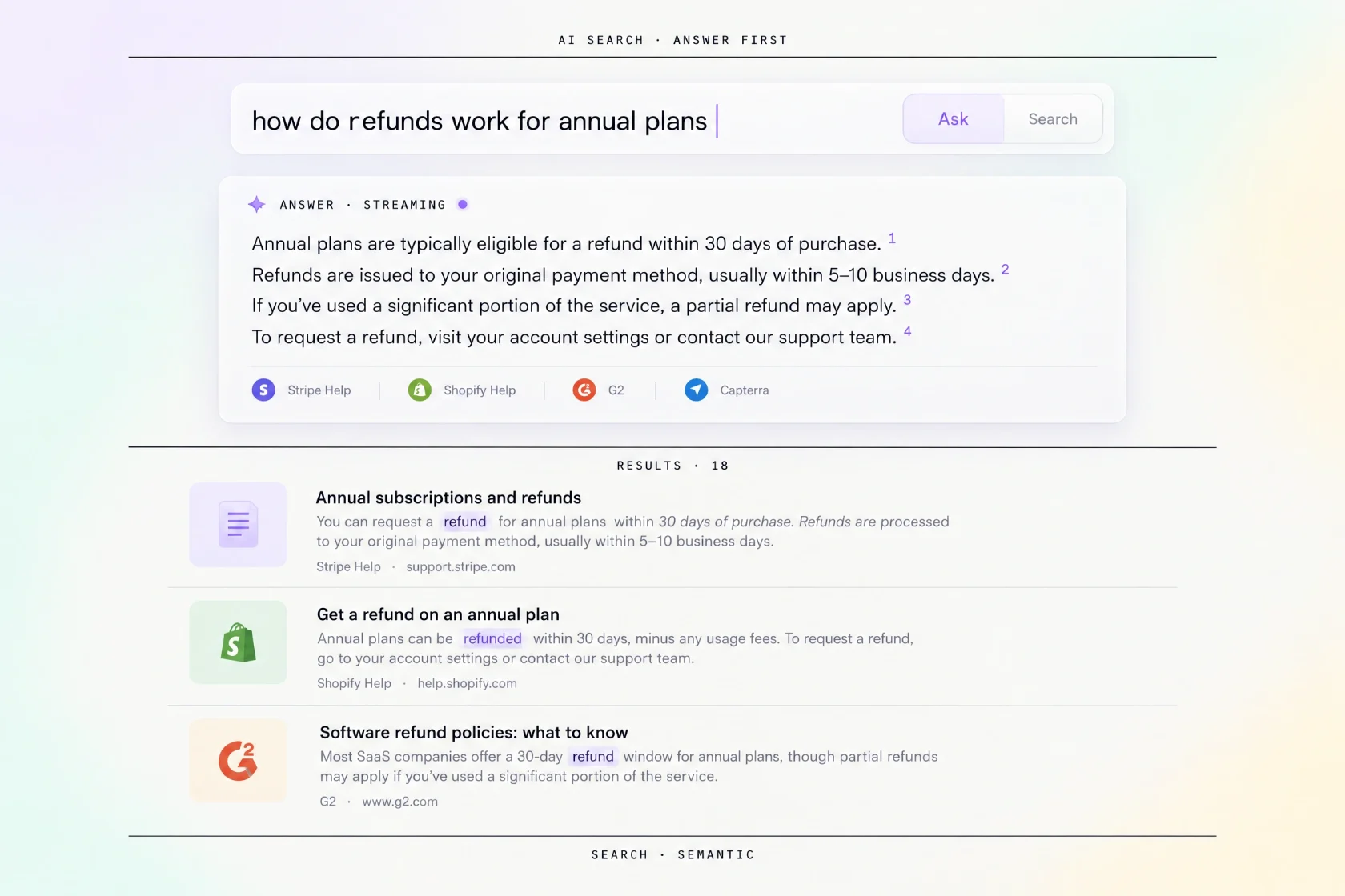
A results page where the first block is a paragraph instead of a link. It answers the question directly, with small numbered citations at the end of each sentence. The classic list of results begins below it, unchanged.
Semantic search changes what users type. A keyword field invites two or three words, while a natural-language field invites a full question. The interface has to signal which one it expects, or users default to keywords and never discover the answer mode. Label the field with what it accepts, and offer an ask-versus-search toggle when both behaviors are useful.
The synthesized answer is a new result type, so place the answer block above the classic list and attribute every claim to a visible source. Perplexity popularized the answer-first layout with numbered citations, and Stripe's docs show the quieter version where an answer sits above the classic results.
Streaming the answer makes a slow backend feel alive and lets a user start reading before the response finishes. Mark a low-confidence answer as uncertain and fall back to the result list rather than inventing a reply. The layout rules for a chat-style surface are in the AI chat interface guide.
Accessibility and keyboard
Wire the combobox to the listbox
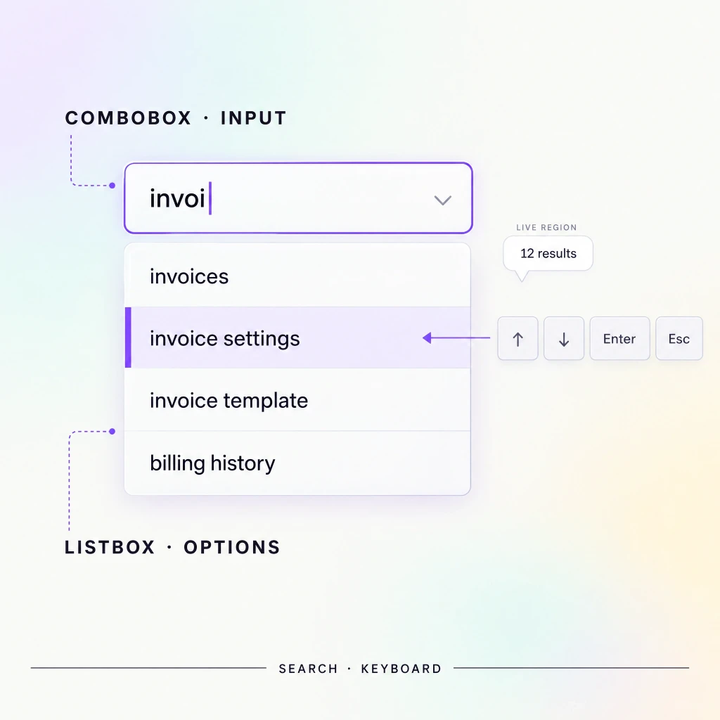
Treat the field and its dropdown as one component, not two. The input is the combobox and the dropdown is the listbox, with the active row as the current option. Expose that relationship with the combobox role, an expanded state, and a pointer to the active option, so a screen reader announces the list as it opens.
The arrow keys must move the active row without moving focus out of the input. Keep the caret in the field the whole time and point the active option at the highlighted row. Enter commits the active row once the user has arrowed to one, and runs the typed query before that; Tab should never silently select a row.
Escape closes the dropdown first and clears the query on a second press only if that behavior is consistent everywhere. Announce the result count through a live region so a screen reader hears "12 results" without reading every row. Give the field and every row a focus ring that survives on dark surfaces, and test the whole flow with the keyboard alone. The WAI-ARIA Authoring Practices combobox pattern is the reference to hand to your engineer before the first ticket.
Measuring search
Five numbers tell you whether the component works. Track them as a set, because any one can look healthy while the others expose a problem.
Start with the search usage rate, and read it against the three postures from the placement section. Rising usage is healthy for hero-search products, where the query is the product, while for header and icon postures it can mean navigation is failing and users search because they cannot browse. Next, watch the zero-results rate, the clearest signal that the index is thin. Result click-through and the refinement rate show whether ranking lands and whether users keep rephrasing, and time to first click measures speed to the moment of value.
☞ The zero-results rate is the number teams watch least and the one that most often explains stalled search adoption.
| Metric | What it signals | Healthy direction |
|---|---|---|
| Search usage rate | Share of sessions with a query | Depends on posture: rising for hero search, stable for header and icon search |
| Zero-results rate | Queries that return nothing | Falling |
| Result click-through | Searches that end in a click | Rising |
| Refinement rate | Searches followed by another query | Falling |
| Time to first click | Speed from query to result | Falling |
Pre-ship search UI checklist
Run this against the component before it ships. Twelve questions in two passes, each answered yes or no. The noes are the work.
The field and the dropdown
1. Does the field open a populated panel the moment it is focused and empty?
2. Are recent queries removable one by one, with a clear-all option?
3. Do suggestions highlight the matched substring in every row?
4. Does the dropdown keep the previous rows during loading instead of flashing empty?
5. Does the zero-results screen echo the query and offer at least two recovery actions?
6. Is the active scope always visible inside the field?
Keyboard and mobile checks
7. Are results grouped and labeled when more than one content type returns?
8. Do the arrow keys move the active row without leaving the input?
9. Is the result count announced to a screen reader?
10. Does Escape close the panel before it clears the query?
11. Are recent and saved queries large enough to tap on mobile?
12. Does the layout survive the mobile keyboard without hiding the first result?
Frequently asked questions
❶ Where should a search bar be placed?
Place persistent header search when a meaningful share of sessions starts with a query, and hero search when the query is the product. If search is a fallback, collapse it to an icon. Pick the posture from session data rather than from taste.
❷ How many autocomplete suggestions should you show?
Five to eight rows in the default panel. Fewer than five wastes ranking work, and more than eight pushes the list past a comfortable glance. Show the top three without scrolling, and group the rest under labels so the count stays readable.
❸ What should a no results page include?
Echo the query, explain the likely cause, and offer at least two ways forward. Add a spelling correction, a broaden-scope action, and a short list of popular items. In tools that accept user content, add a create action so the dead end becomes a starting point.
❹ Should search be instant or on submit?
Instant for suggestions, submit for the results page. Debounce the input at roughly 150 to 300 milliseconds so a fast typist does not fire a request per keystroke. Keep Enter working as an explicit commit, because some users want to decide when the search runs.
❺ What is the difference between search and a command palette?
Search finds content and takes you to it. A palette runs an action without leaving the screen. Products with both should keep the entry points distinct or unify them behind one input with clearly labeled groups. The action layer is what separates the two.
Conclusion
Search is a system of states, and each one is a small promise to the user. Design the six field states and fill the empty dropdown with recent and trending queries. Treat the zero-results screen as a recovery path rather than an error. I keep a folder of reference patterns from the AI inspiration gallery for exactly this stage.
Build the anatomy first, then walk the states with your engineer before polishing the icons. Rank suggestions by relevance and history, and debounce without flicker. Then measure the five numbers that tell you whether the component works. A field nobody uses is the most expensive input on the page.
☞ Want the field states ready to drop in? Our free Search Inputs kit for Figma includes all six states and the mobile variants. Get Search Inputs → Need production components too? The search shell and result rows ship in our React UI kit.