


Roman Kamushken
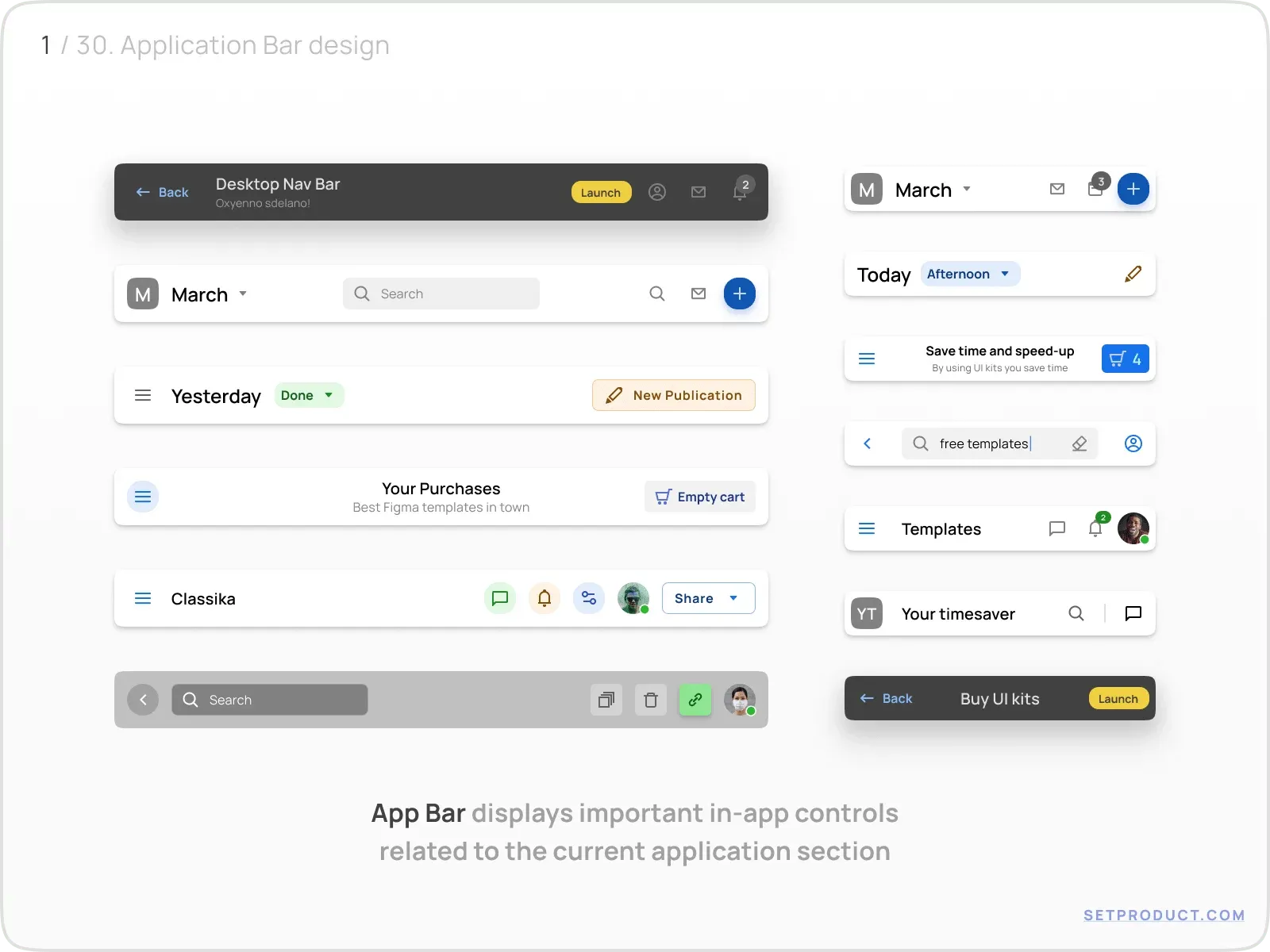
App Bar (also known as the Application Bar or Navbar) – is a prominent and persistent UI component located at the top of an application or screen.
Designed to provide consistent navigation and access to essential functions, the App Bar serves as a central hub that allows users to switch between screens, access important features, and maintain contextual awareness throughout their app journey.
Appbar typically includes various interactive elements such as menus, buttons, icons, search bars, and notifications. These elements enable users to perform common actions and navigate to different sections of the application.
Now let's dive deeper into the App Bar UI design details ↓
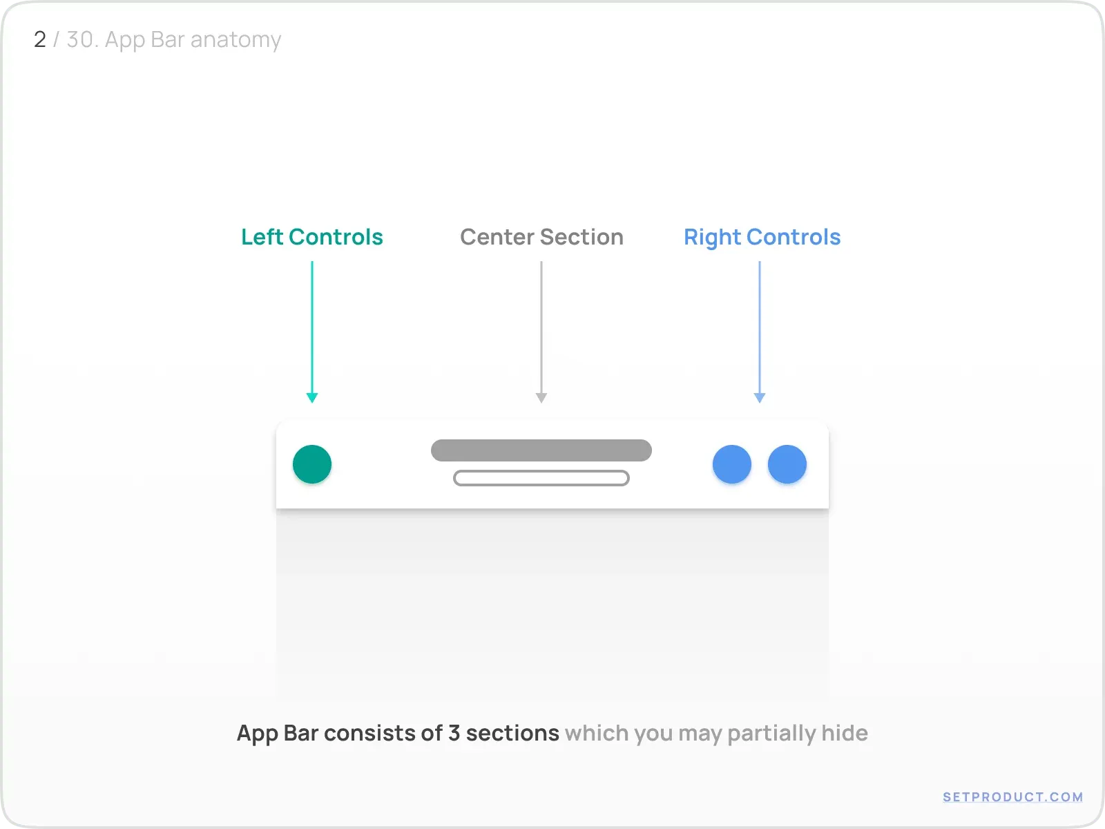
Anatomy
Let's review separately the left, center, and right elements of App Bar. You may hide unused sections, and implement partial App Bars, for example without a title, or no right controls at all.
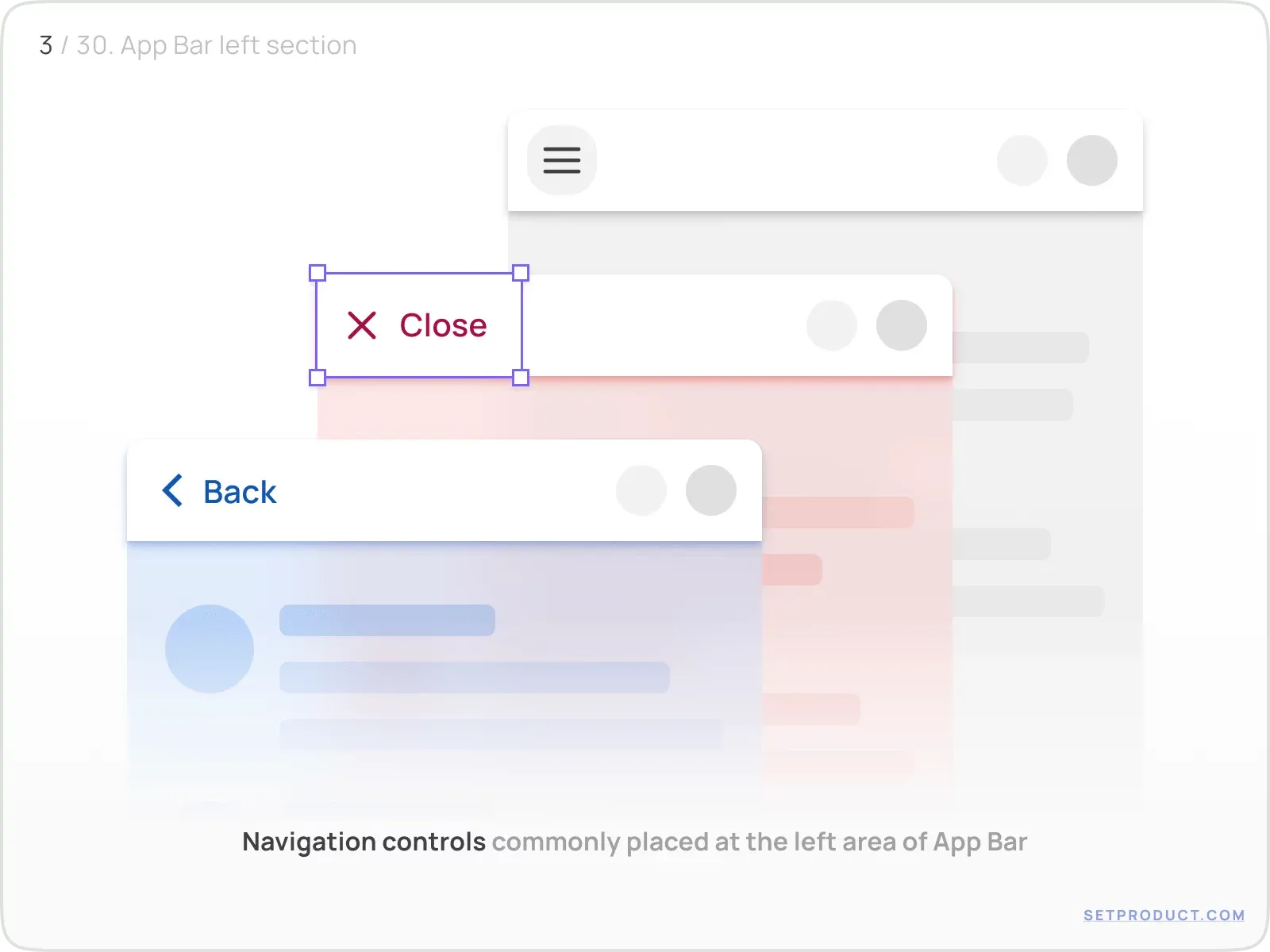
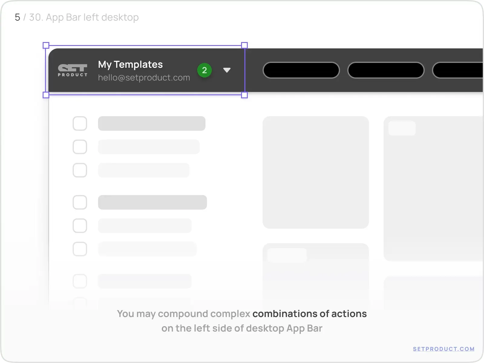
Left controls
Sustain any kind of actions at the App Bar's left side you want to focus the user's attention on by keeping them in sight.
System navigation controls are a common choice for most cases and the users are familiar with this pattern.
They may lead to:
- Back
- Menu
- Close
- Custom (e.g. settings, profile, etc)
Either, you may use other types of controls, you want to emphasise as attainable on a particular screen.
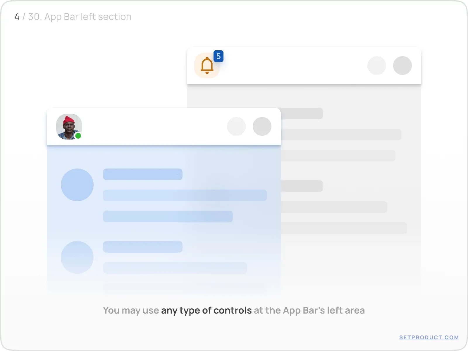
On the desktop screen you are allowed to compound combinations of elements in order to use more App Bar's space functionally.
Combine logo, search inputs, dropdowns, icons (as buttons) and so on.
Center section
App Bar's middle space is committed to title an application screen mostly. If necessary, you can replace it with additional controls specific to the current app section.
Center may contain:
- Title (with possible subtitle)
- Userpic (with possible name)
- Logo
- Segmented controls
- Search input
- Navigation items (Tabs, Button Group, Breadcrumbs, etc)
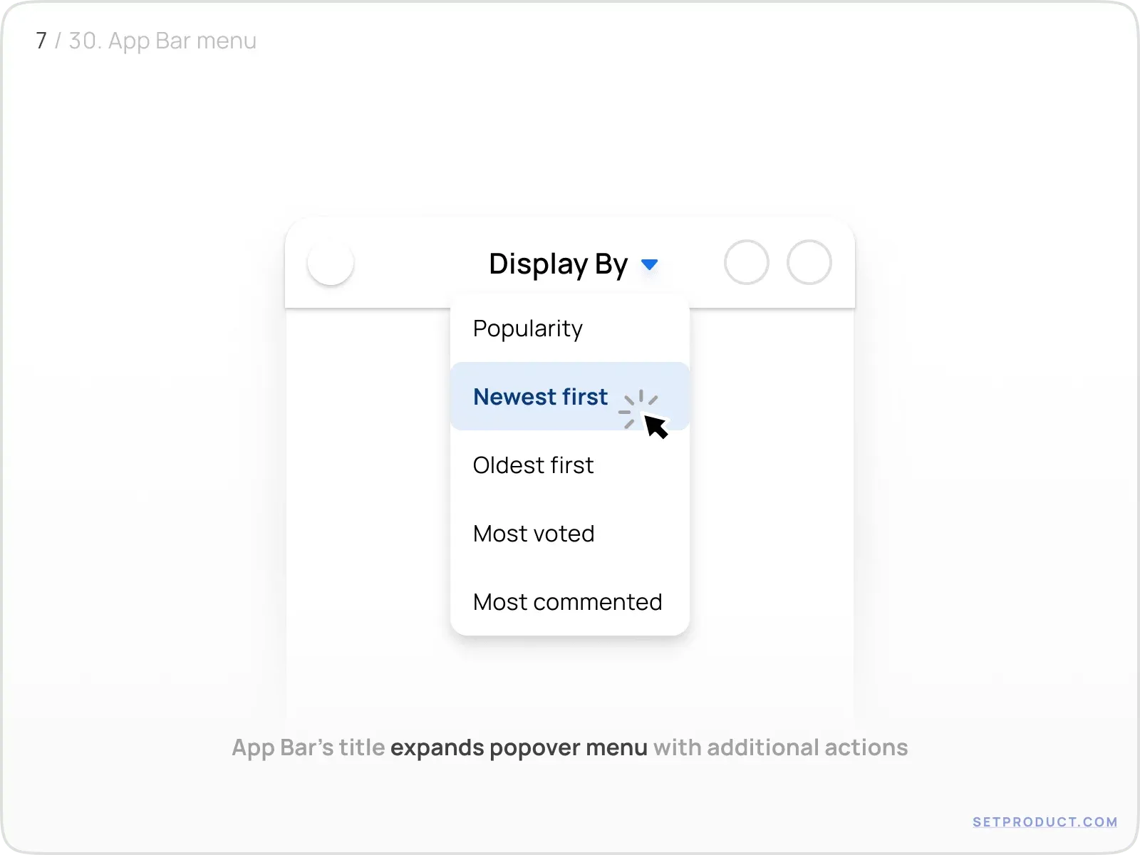
Title
You may use a single title for the app section naming or extend to more informational purposes by enabling a sub-title.
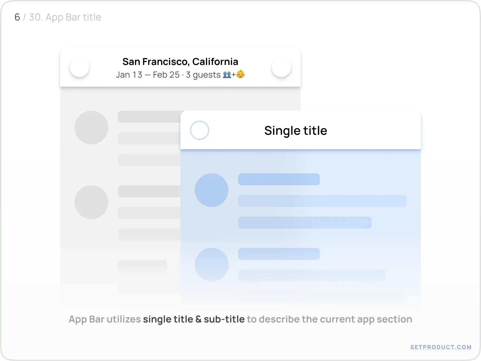
Adding a Chevron/Caret item is clearly distinguish there is something to reveal after a title was tapped.
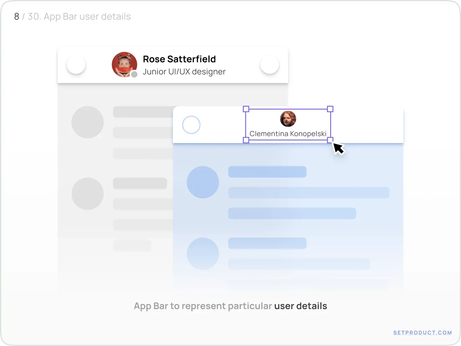
Userpic
May be used for providing particular user details especially when interacting with Profiles, Messengers, Social apps.
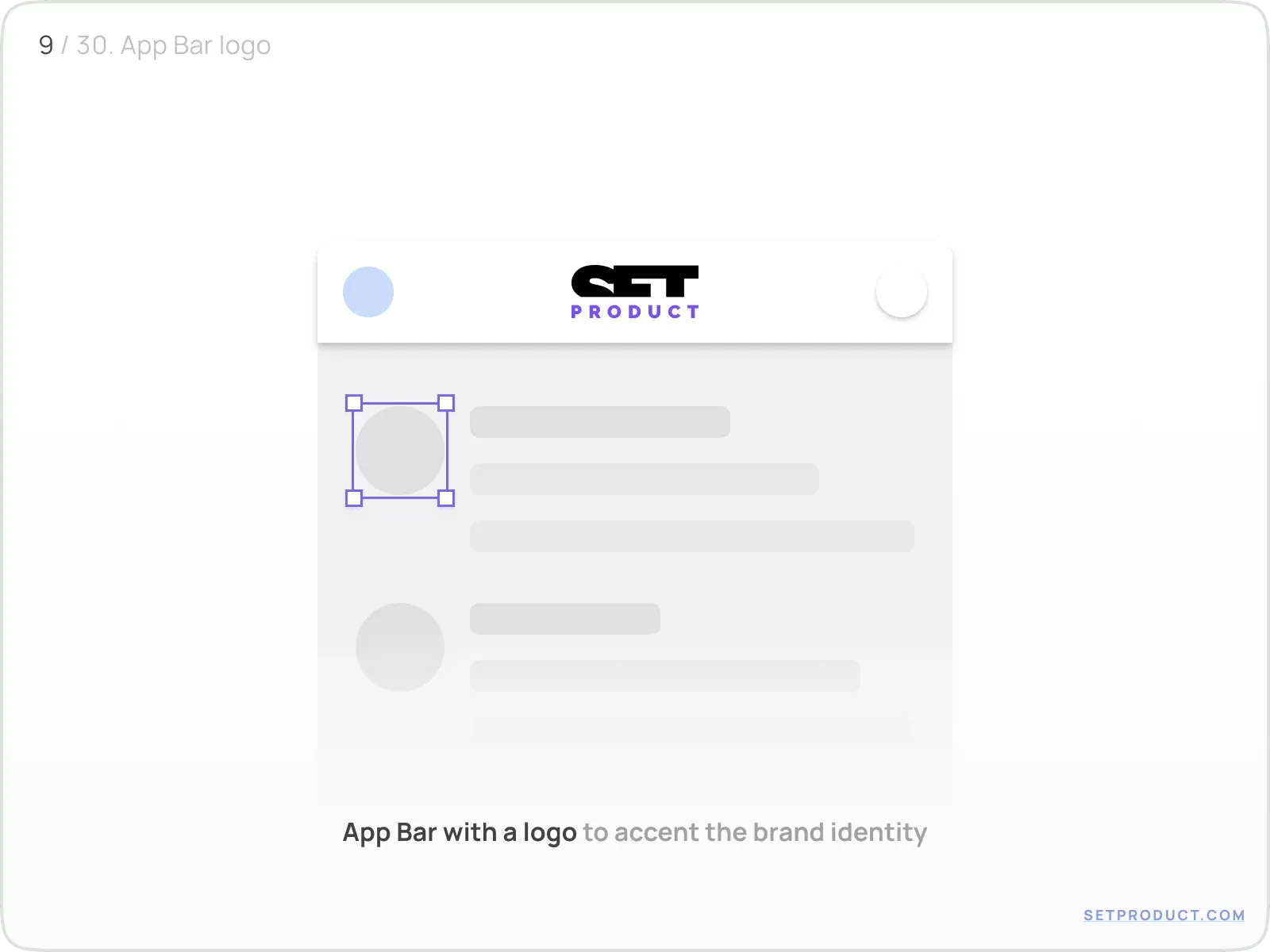
Logo
Put a logo into a central part of App Bar to prioritize the brand identity. Fits especially for Home/Start screens where a user's journey usually begins.
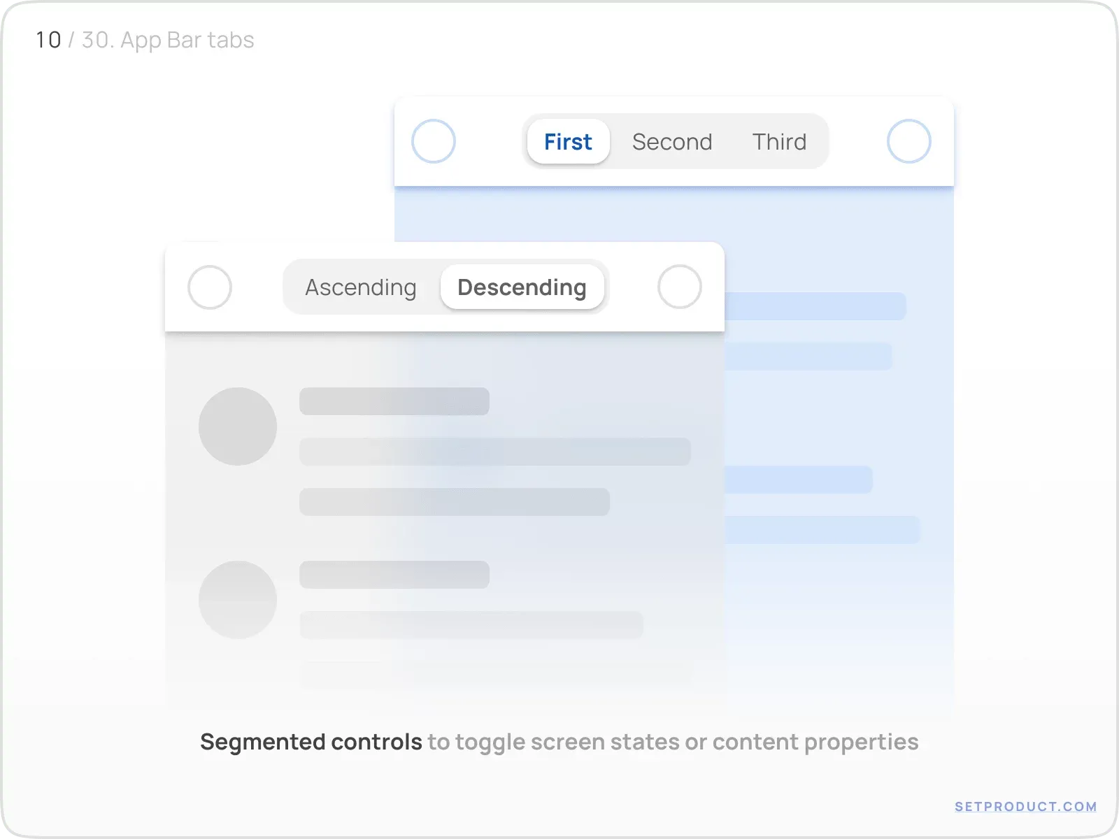
Segmented control
On mobiles place a Segmented Control into App Bar to toggle screen states or content properties within just a single action.
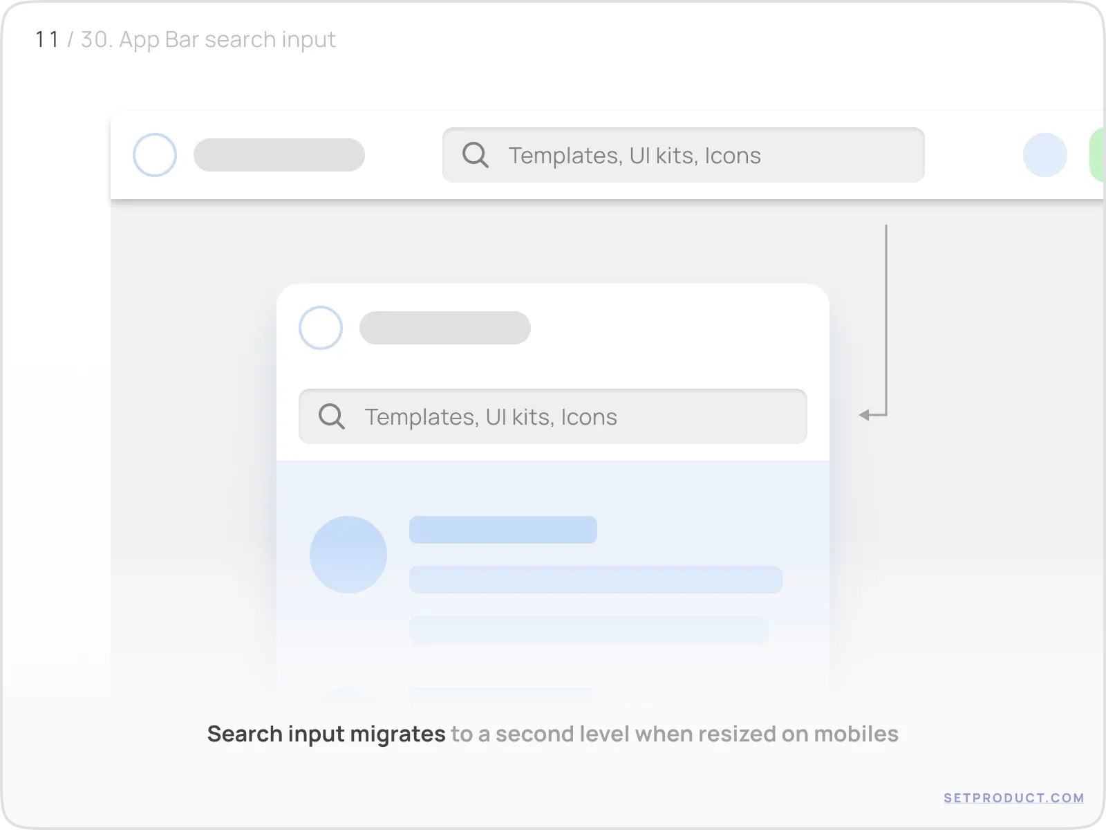
Search input
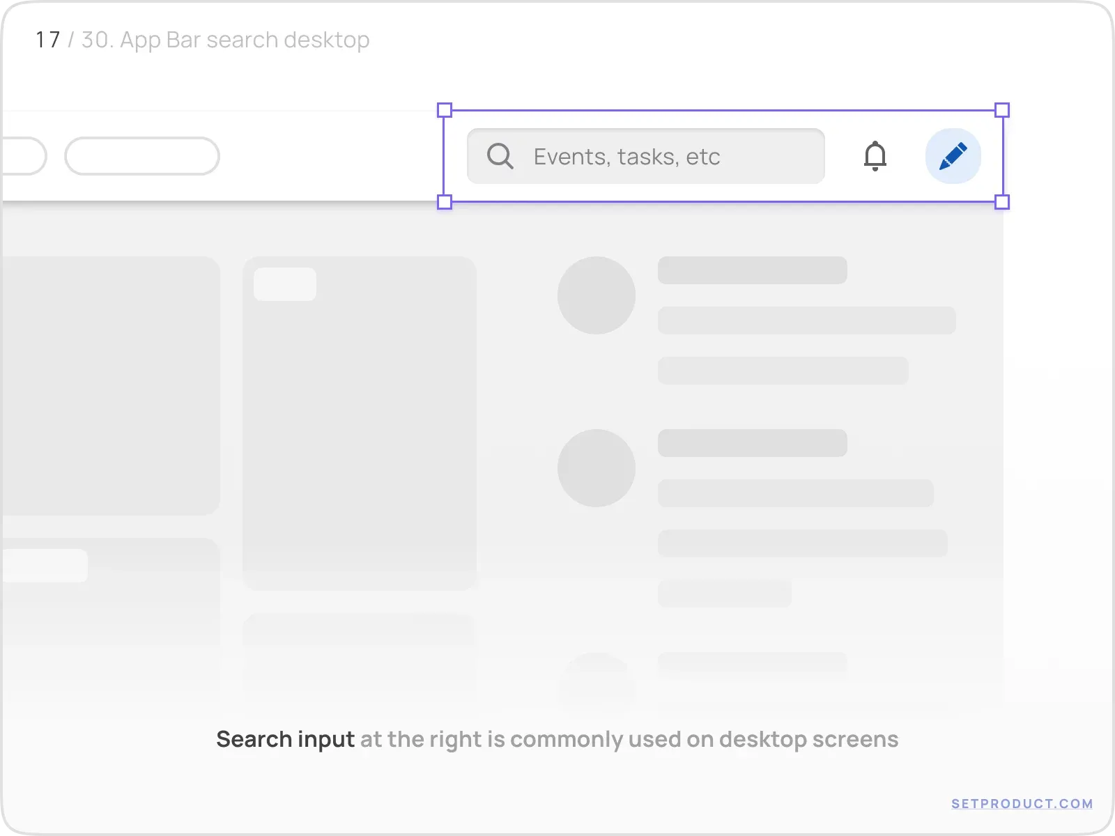
Generally used for desktop App Bars, center-based input may be utilized in order to have a search on hand.
On mobiles it usually migrates as the App Bar's second level when resized.
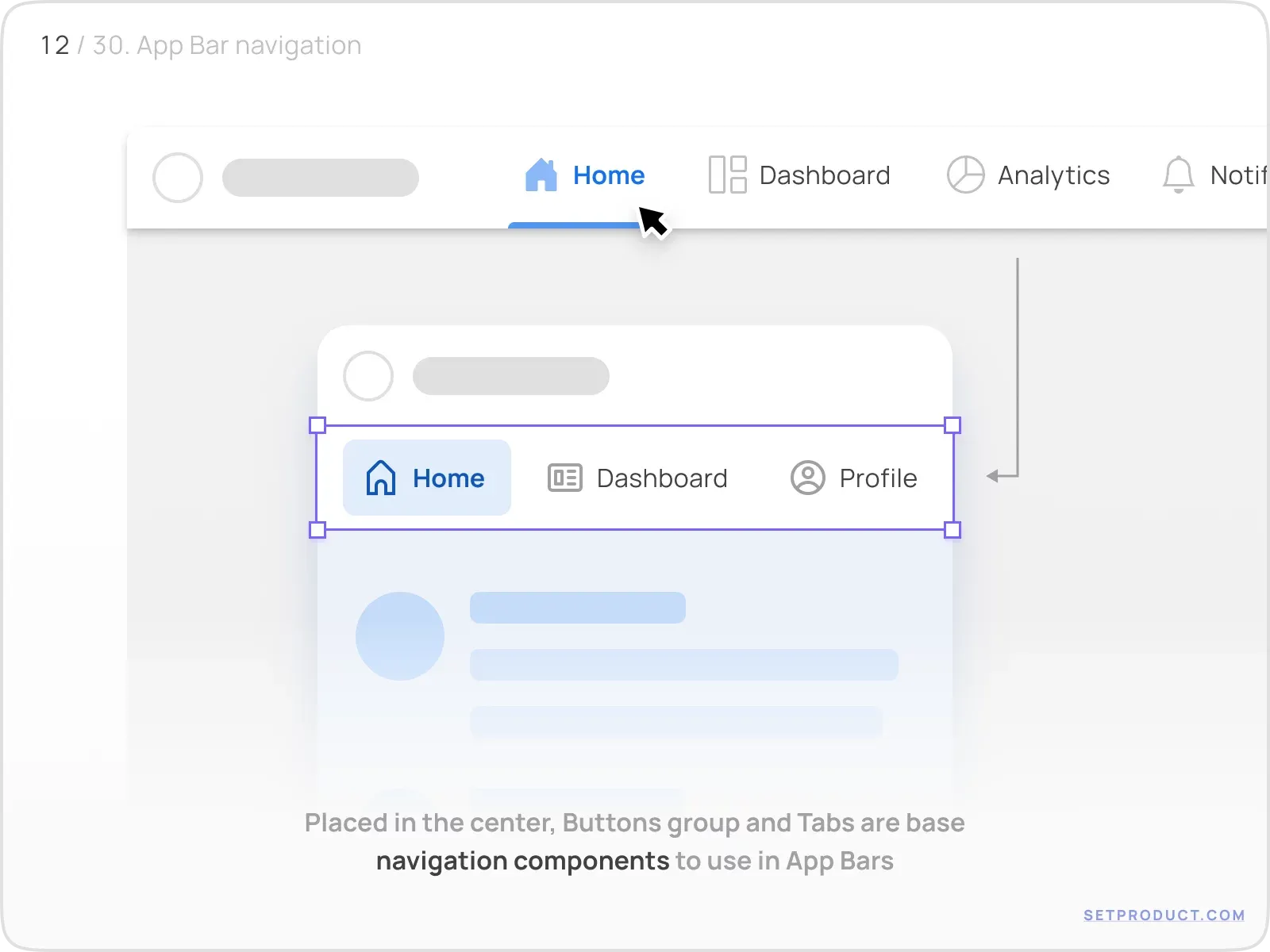
Navigation items
Tabs, Buttons Group, Breadcrumbs are common navigation components to locate at the App Bar's center.
Either as for the previous case, they migrate on a second level when shrunk to the mobile viewport.
Right controls
Maintain any kind of components on the App Bar's right side. Place a single control or a combination of frequently used, which may be:
- Avatar
- Icons (as Buttons)
- Buttons (Call to action)
- Search Input (mostly desktop)
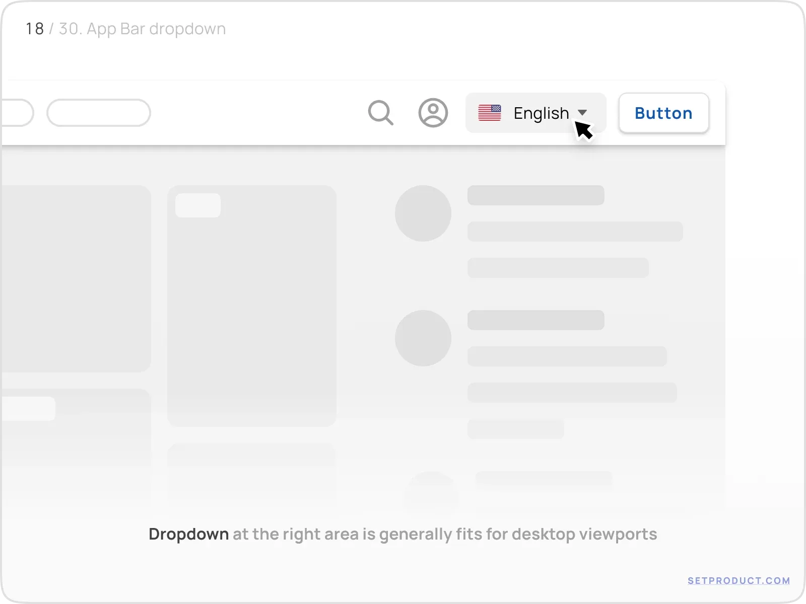
- Dropdown (e.g. for an account swap, language)
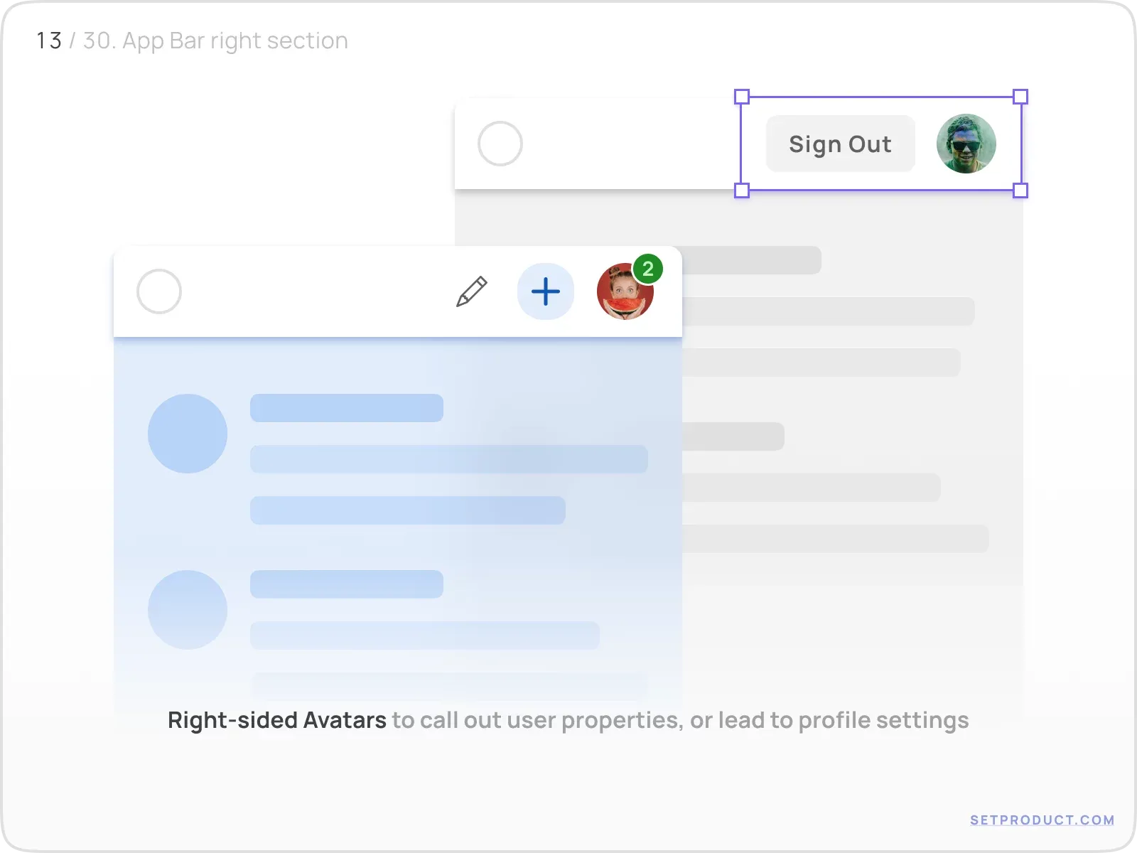
Avatar
To call out a function related to user properties, place an tappable Avatar at the top right area of App Bar.
A tap may lead to profile settings or reveal popover menu.
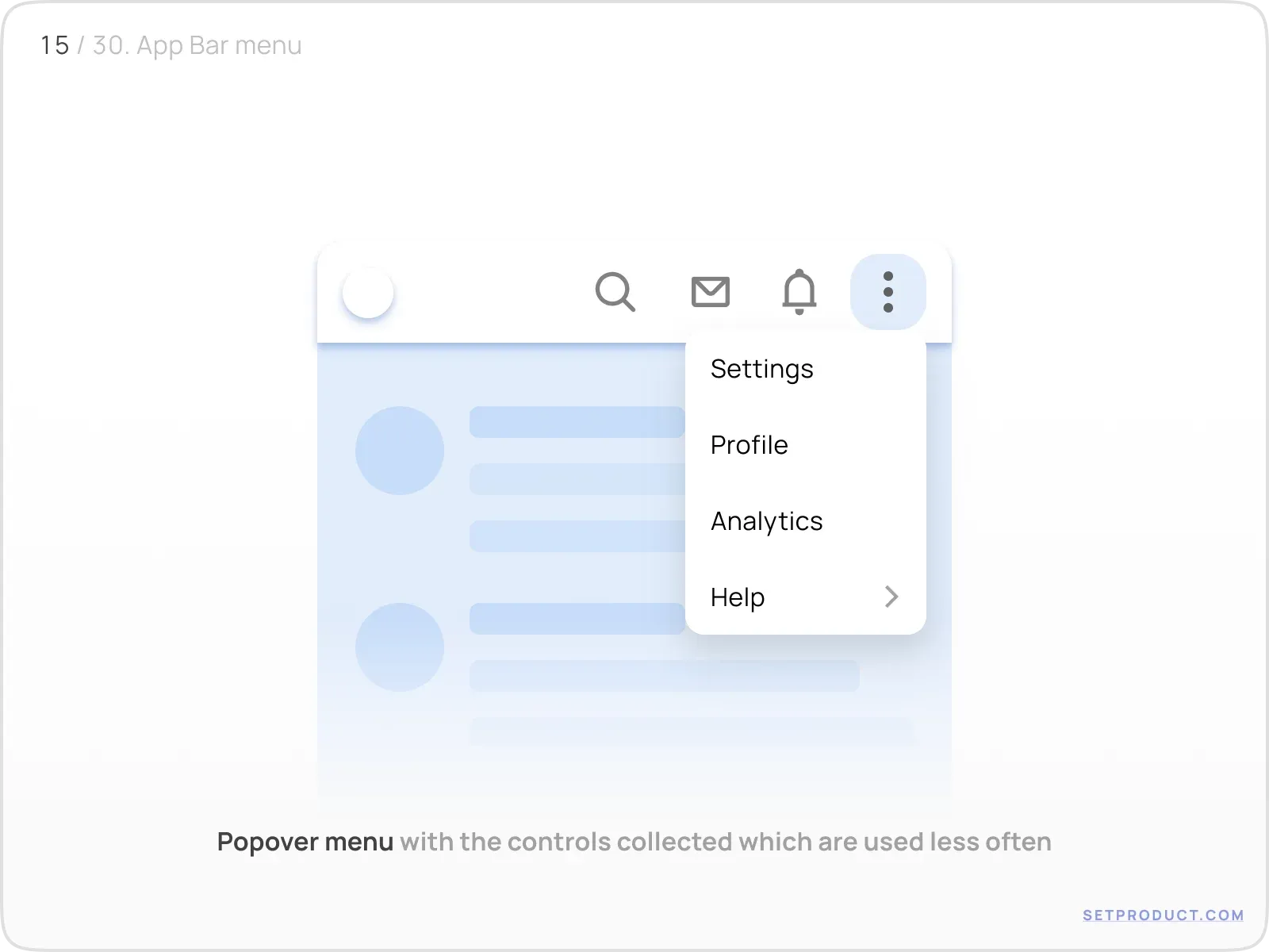
Icons
Using icons as Buttons aimed to represent popular in-app actions ergonomically.
Place here the most used controls you want to have permanently on a users' sight.
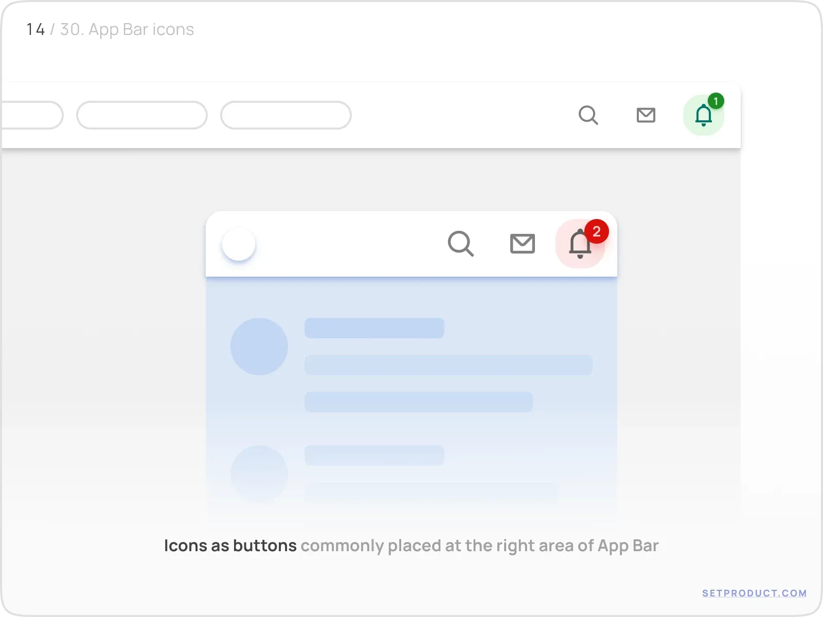
You may hide behind a popping menu all the items used less often. Especially fits for apps with 5 or more independent sections.
Works well when you want your user to have 5+ in-app links on hand.
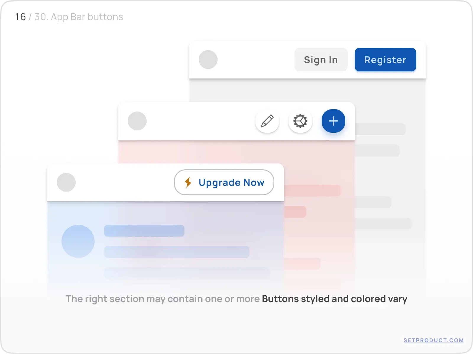
Buttons
Place Buttons into the right-sided region to call to action. Use styles and color wisely when having several buttons to distinguish primary and secondary actions associated with the business logic of the app.
You may have a variety of shapes: Square, Circle, Pill buttons. And a variety of styles: Filled, Raised, Outlined (Ghost), Flat and so on depending on a necessity to grab user's attention.
Search input
Have a quickly accessible search input by placing it at the right as a single component, or among other controls. Mostly fits desktop cases.
Dropdowns
To toggle users, accounts, languages, etc. use Dropdown nested into App Bar's right section. Applied often for tablet/desktop resolutions.
Styles & Themes
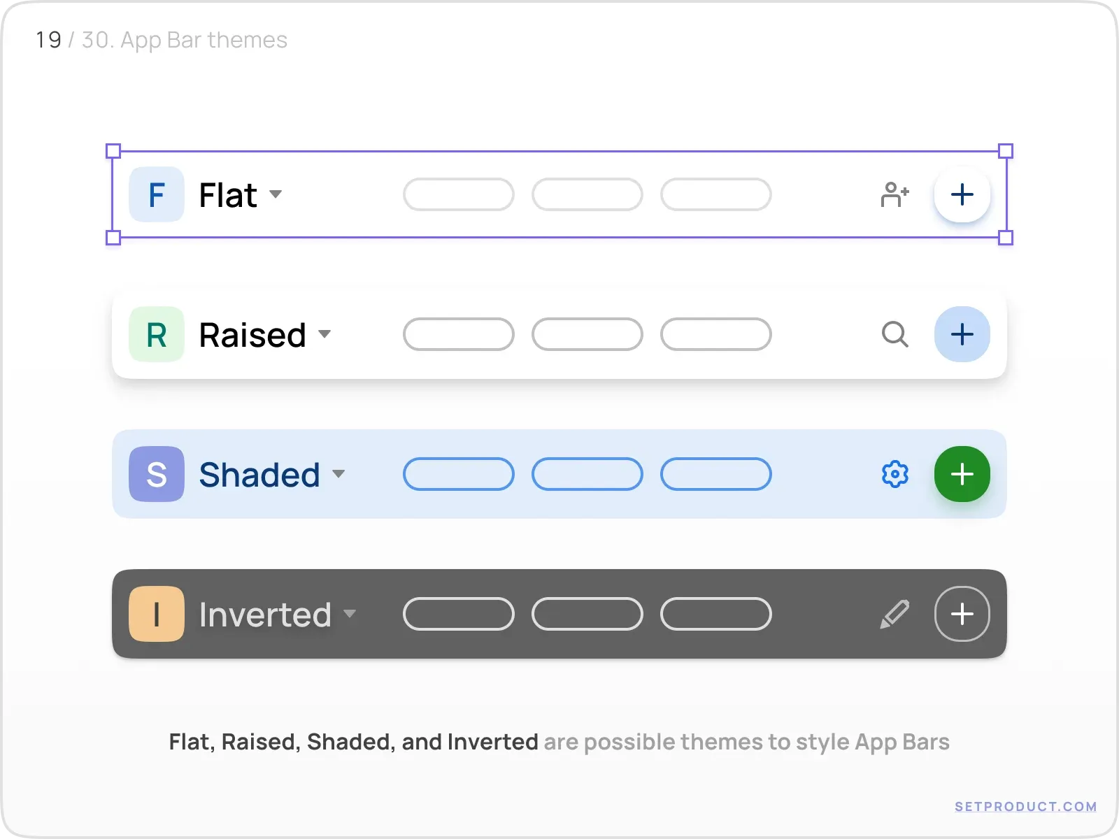
You can themify App Bars within a variety of styling methods. To match the exterior of your overall in-app UI, you may use the following themes:
- Flat
- Raised
- Shaded
- Inverted
- Transparent
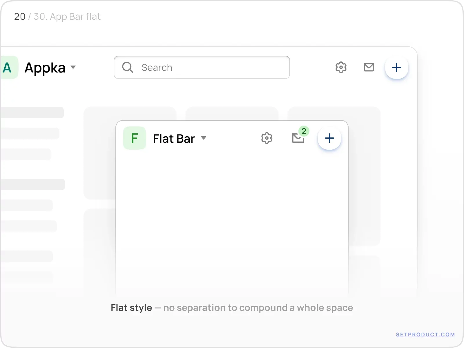
Flat
App Bar's flat theme proposes a minimalistic approach with no separation, where the header and background compounding a visually holistic surface.
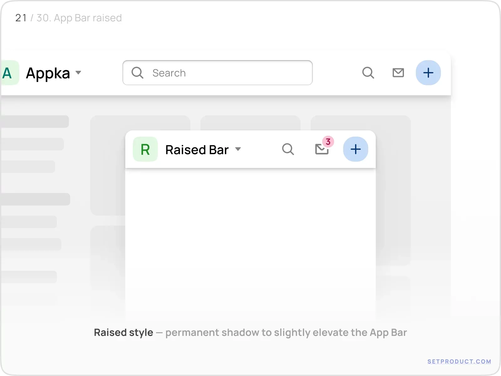
Raised
Elevated style proposes to implement a smooth shadow to easily distinguish App Bar hovering over a background.
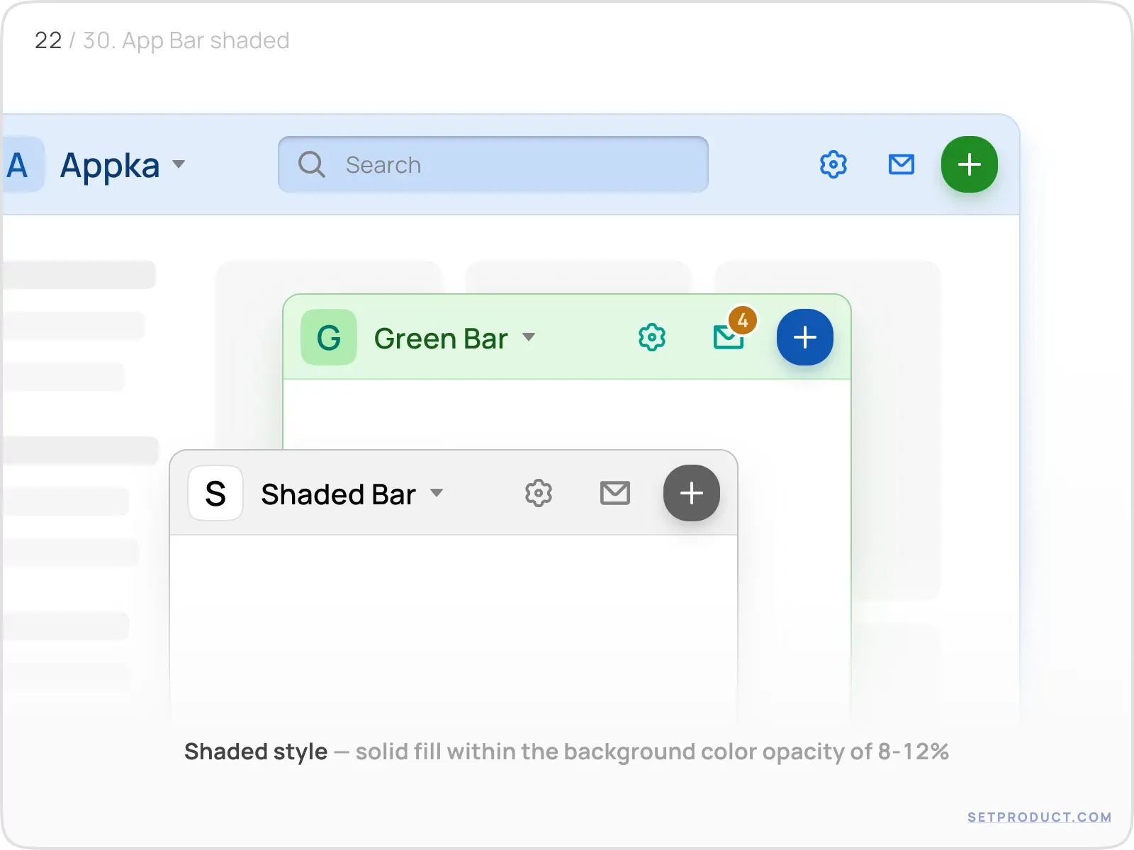
Shaded
App Bar filled with solid color with opacity decreased to 8–12%. Thus you may suit an app with the smooth palette of your brand colors.
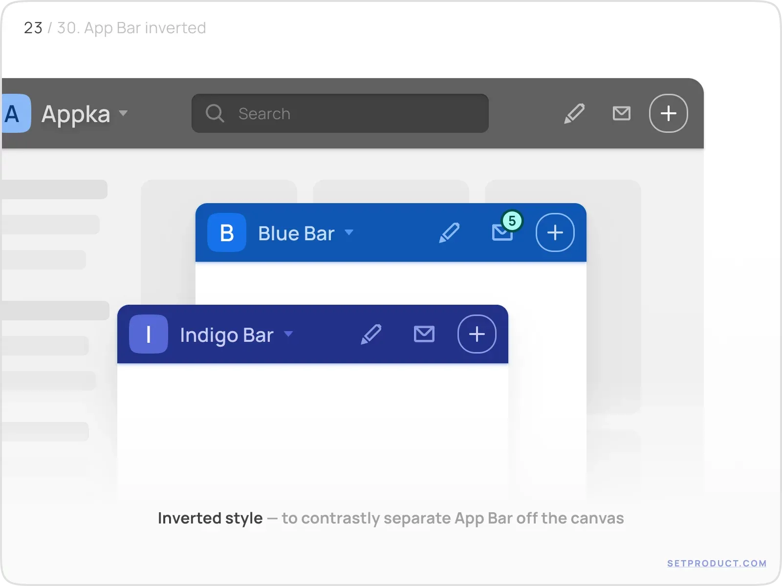
Inverted
Dark version of App Bar you may use to distinguish the header by highlighting with color contrast. It's inverted as it's colored opposite to the overall application theme.
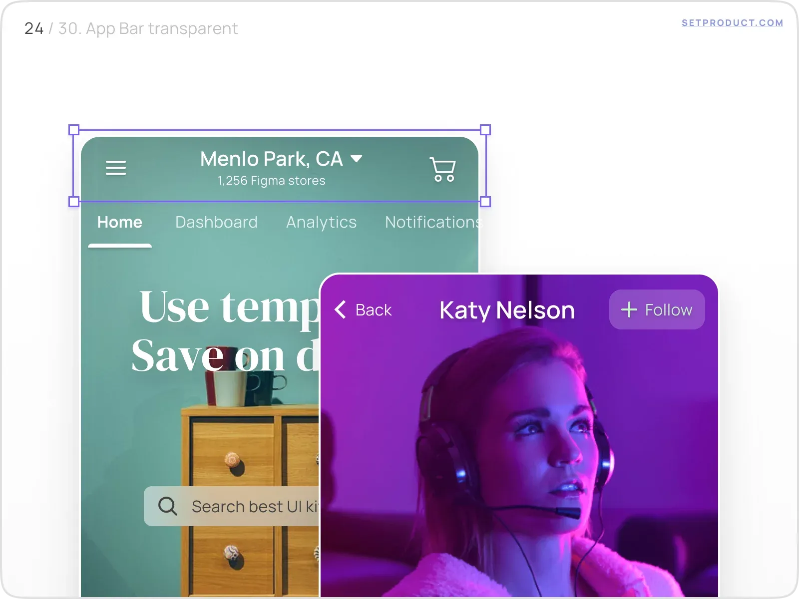
Transparent
Mostly used for mobile App Bars, this style reveals more space for full-size images in some specific sections (e.g. item details, profiles, deals).
UX & Usability
Let's review some kinds of behaviour extra special for App Bars. There are some cases when the app header can have:
- Selected state
- Bottom positioning
- Shadow on scroll
- Blurred background
- Hide items on resize
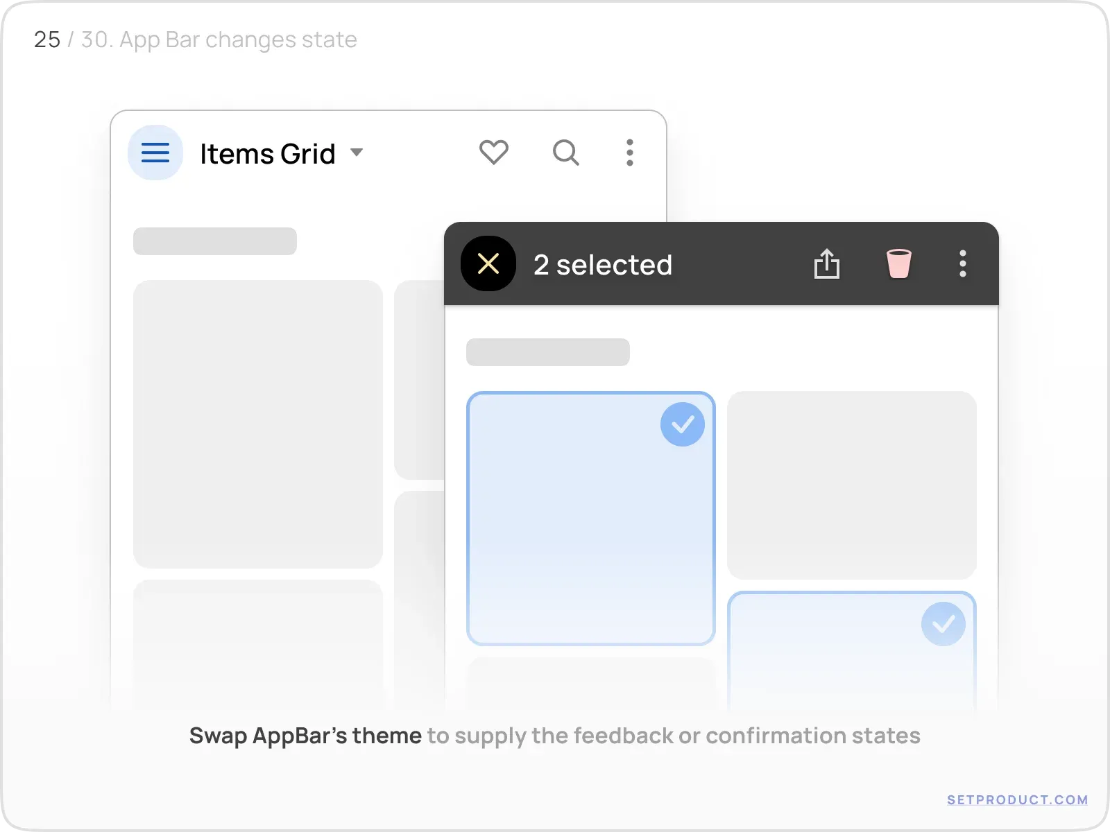
Selected state
App Bar can dynamically swap themes to provide instant user feedback, e.g. when selecting items, events happening, warning states, etc.
Bottom positioning
On mobile viewports, you may attach App Bar to the bottom. Thus all the primary actions become available within fewer fingers stretching.
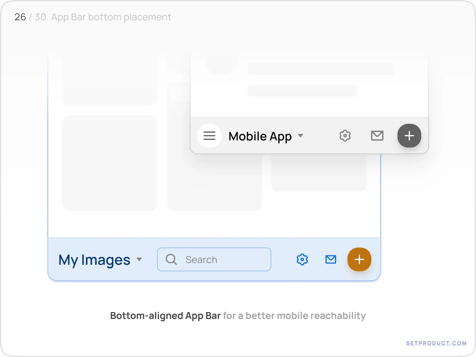
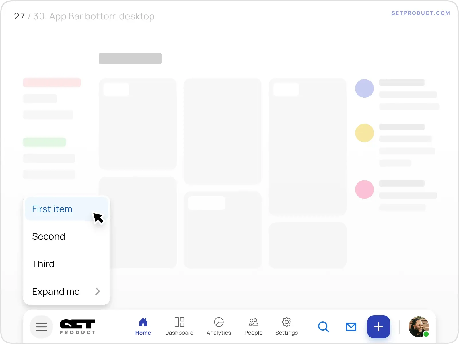
Conceptually, you may implement the same positioning either for desktop web apps. For example, there is a successfully utilized bottom bar on macOS and Windows and this pattern is familiar to users.
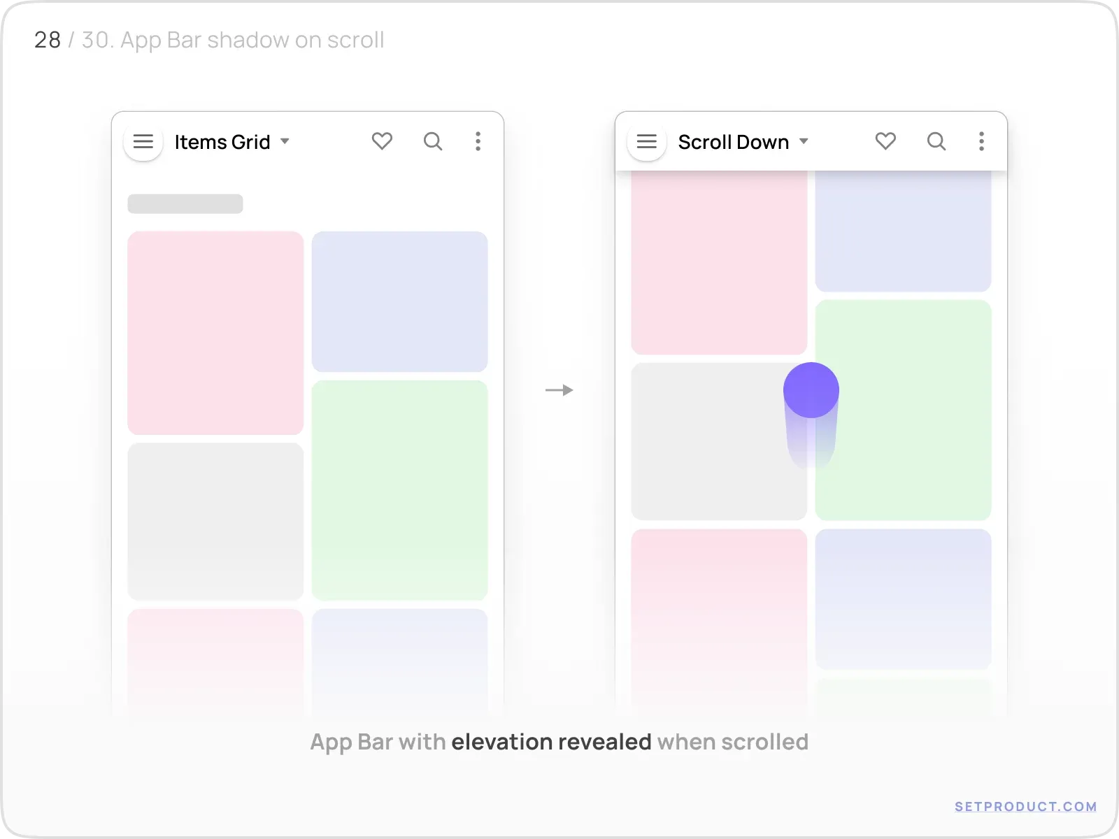
Shadow on scroll
App Bar gets elevated when the screen is scrolled. Mostly fits for flat headers.
Emerged shadow emulates the hovering effect which makes it seem in-app environment more natural and logical.
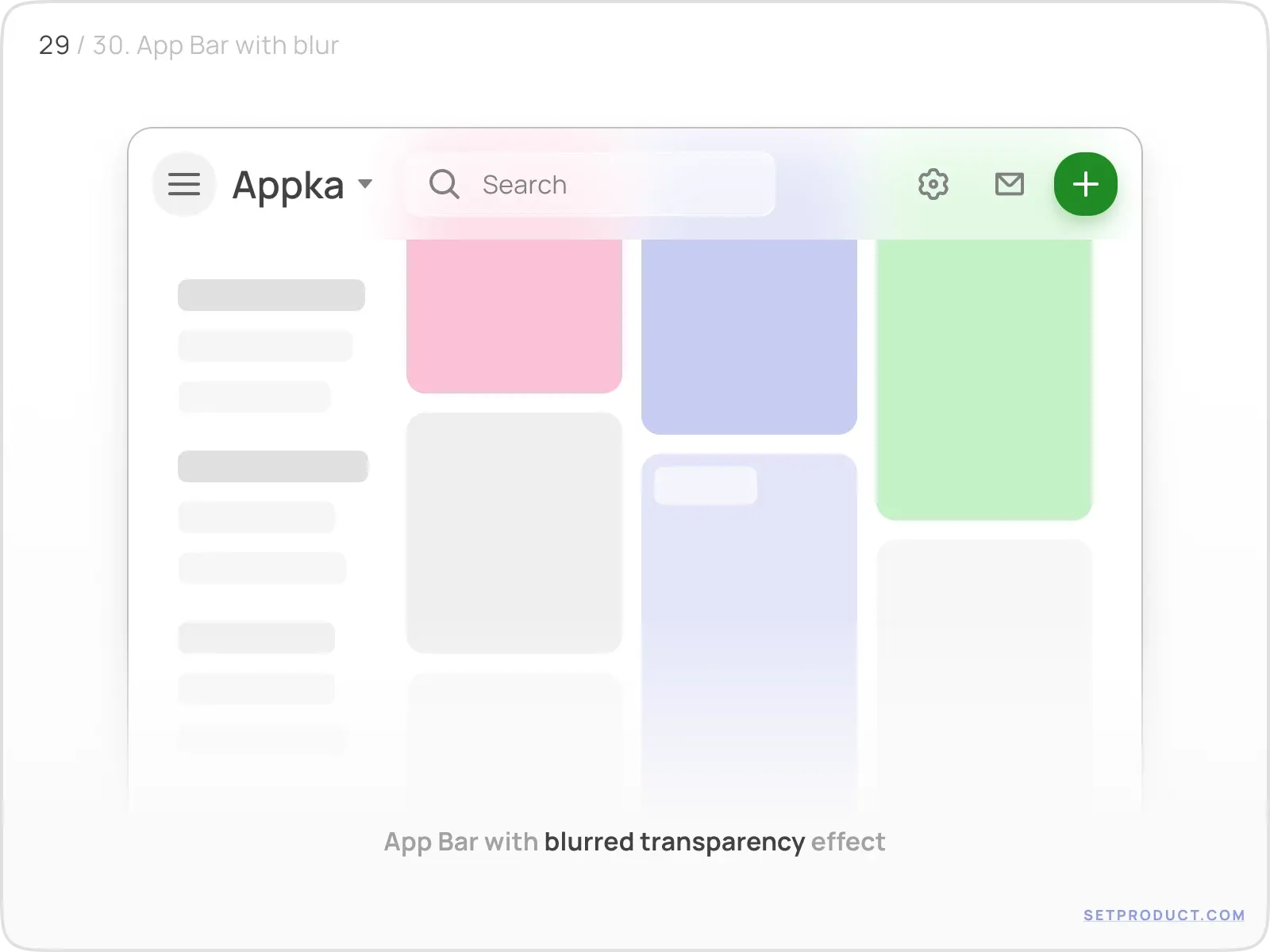
Blurred background
This tiny visual effect also makes the overall user experience slicker.
Use a CSS property backdrop-filter: blur(16px); to achieve App Bar's surface transparently blurred.
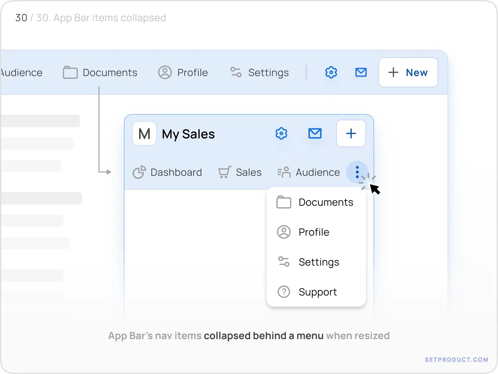
Hide items on resize
App Bar's navigation items are sometimes required to collapse and cover behind "More" action (dots), especially when resized from desktop to mobile.
This is all you need to know to design better App Bars.
Hope this exploration will help you to improve your in-app UX. The next chapter is for Badges, probably. Stay tuned!
Related links
- Navbar component (React)
- Application bar (Angular)
- iOS App Bars (Figma)
- MobileX App Bars (Figma)

.webp&w=1920&q=75)
.webp&w=1920&q=75)

.webp&w=1920&q=75)
.webp&w=1920&q=75)


.webp&w=1920&q=75)
.webp&w=1920&q=75)


