Liquid Glass for React

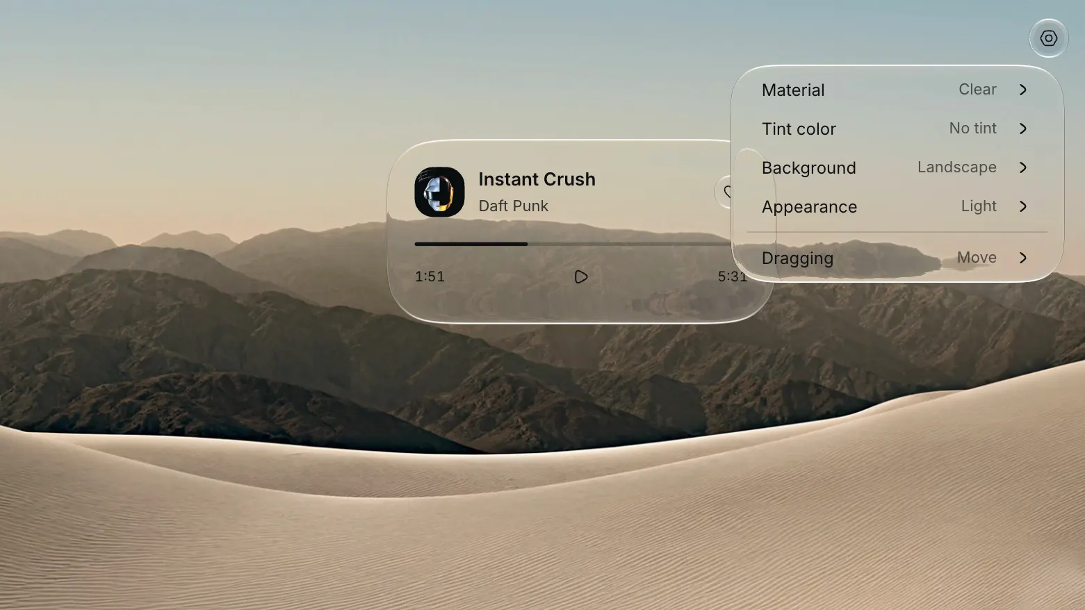
Glass surfaces and controls for React on the web and in Electron. Clear and Regular materials refract live content, and every control runs on Base UI behavior.

Liquid Glass for React — code freebie
Home
Freebies

Liquid Glass for React

You want the interface to feel like glass, where the surface bends what sits behind it and the controls stay legible on top. Most web glass stops at a translucent panel and a backdrop blur. Liquid Glass goes a step further and refracts the content behind every surface in real time, so a button over a photo bends the photo the way materials do on Apple platforms.

What Liquid Glass actually does

Liquid Glass is an open source library that renders glass surfaces and controls for React on the web and in Electron. Each surface reads the live DOM behind it, displaces that content through a refraction value, and keeps text and icons crisp on top. Two materials cover the range: Clear for a light, transparent look, Regular for a denser frost. Both support light and dark appearances, and the tint prop colors the glass without changing the label.

The set is not a folder of static images. Buttons, toolbars, and tabs all respond to pointer and keyboard input. Standard props and refs stay available, along with accessible names and state callbacks, so the components drop into an existing app without a rewrite.

Why live refraction beats a CSS blur

Glassmorphism on the web usually means backdrop-filter: blur() over a semi-transparent fill. That reads as glass until the layout moves. The blur is uniform, so it ignores the shape of the light and the depth of the content behind it. A card over an image looks the same whether that image is bright or dark.

Liquid Glass samples the content behind a surface and bends it. That displacement is what gives the material its thickness. Edges pick up a soft highlight, nested surfaces limit their refraction to the parent inset, and the content under the glass stays live instead of turning into a flat panel.

How it renders glass on the web

The library splits the work between the GPU and SVG filters. WGSL shaders render material maps, and SVG filters apply those maps to live DOM content. Maps are cached and reused as surfaces move, and a geometry change prepares a new map. The library never captures a screenshot, so a video or a chart keeps animating underneath a glass surface, and so does a canvas.

The same scene model works in React and outside it. In React you wrap content in GlassScene and GlassContent, then place surfaces on top. Outside React, createGlassScene from the /dom export builds the same structure by hand, so a plain page or a small Electron shell can use it too.

How materials and motion work

Defaults live on GlassScene, and any surface can override them. The props that shape the look are small in number:

  • material → "clear" or "regular"
  • appearance → "light" or "dark"
  • radius → corner radius in pixels, or "capsule" and "circle"
  • refraction → displacement in pixels, default 60
  • tint → a six-digit hex color for the glass alone

The motion prop accepts "full" or "reduced", and "none" for a hard stop. System reduced-motion preferences always apply. The fluid prop animates the outline when a layout dimension changes, and morphFrom lets a surface open from the shape of another element. Override styles with className or the --lg-foreground variable when text and icons need to shift.

What ships in the box

The package covers the controls most interfaces need, all on the same material system:

  • GlassScene and GlassContent for the scene and its live background layer
  • GlassSurface and GlassButton for containers and buttons
  • GlassToolbar with buttons and links, plus groups and a spacer
  • GlassTabs with a moving selection indicator, plus a composable root and panel set
  • GlassMenu with submenus, plus focus restoration and positioning
  • GlassSlider and GlassSwitch for input
  • GlassProgressiveBlur and GlassScrollEdges for scroll context

Foreground content that should refract under a higher surface uses GlassForeground or the useGlassForeground hook. Geometry helpers like GlassShape and GlassCorner keep nested corners concentric without a scene.

What it needs to run

The React components require React 19 or newer. Rendering the material maps needs HTTPS or localhost and an available WebGPU adapter, while progressive blur works without WebGPU. The project tests against Chromium and Firefox, with Safari and Electron on the same list, and performance differs between them. Safari can take longer to filter large content layers, so test animated menus on the devices you support.

A scene holds up to maxSurfaces, which defaults to 16. NodeNext TypeScript consumers need skipLibCheck: true for the upstream vgpu declarations. For clean refraction in Safari, give GlassContent an opaque background. The project is MIT licensed.

Frequently asked questions

Do I need WebGPU to use it?

Only for the glass material maps. Progressive blur renders without WebGPU, so a scene that leans on blur alone runs on more machines. When a material map cannot be prepared, the content stays readable and onDiagnostic reports the error.

Does it work outside React?

Yes. The /dom export exposes createGlassScene, and the lower-level exports give you geometry and rendering APIs for custom integrations. React is the shortest path, not the only one.

Will it look the same in every browser?

Close, but the engines differ. Firefox draws each surface as its own filtered layer, and Safari can spend more time filtering large layers than Chromium. The materials and motion settings stay the same across browsers, so the look holds while the performance varies.

Is it free for commercial work?

Yes. Liquid Glass is MIT licensed, so you use it in personal and commercial projects without paying anyone or asking permission.

Why it belongs in your stack

If you already want glass in your interface, this saves the weeks you would spend writing shaders and SVG filter graphs from scratch. You install one package, import one stylesheet, then wrap a scene. The controls arrive accessible through Base UI, the motion respects user preferences, and the material reads the live page instead of a frozen copy.

It pairs with the reading on this site. The practical guide to liquid glass covers the visual language, and the liquid glass vs glassmorphism comparison explains where the plain blur falls short. When you want the rest of the interface to match, the other free code resources and design and code kits are built for the same fast, solo workflow.
More Figma freebies

REA — reverse engineering MCP for AI agents

Code

REA — reverse engineering MCP for AI agents

Give your AI agent an MCP server that reverse engineers any app: native binaries, Electron, .NET, APKs, and websites. Analysis runs locally, MIT licensed.
FSearch — whole-disk file search for macOS

Code

FSearch — whole-disk file search for macOS

Find any file on your Mac in about a millisecond, typos included, and search inside text files. Whole-disk index in Rust, MIT licensed, one small daemon.

@sfinterface/numbers — rolling numbers for React

Code

@sfinterface/numbers — rolling numbers for React

React component that turns only the digits that changed. 13 kB, no dependencies, Intl formatting, five transitions, and reduced-motion support.

RuneIcons — open source icon set for modern UIs

Components

RuneIcons — open source icon set for modern UIs

Thousands of clean, consistent SVG icons for web and app interfaces. Open source, MIT licensed, and ready to drop into Figma, React, or plain HTML today.

Amicro — micro-interactions for any landing page

Code

Amicro — micro-interactions for any landing page

Open source collection of ready-made micro-interactions: hover glow, magnetic buttons, scroll reveals. Copy a snippet, paste into any page, ship motion today.

M3E Canvas — Material 3 Expressive UI builder

Code

M3E Canvas — Material 3 Expressive UI builder

Assemble Material 3 Expressive interfaces in your browser and export a ready-to-use prompt for AI. Open source, free, and built for Android vibe coding.

Driver.js — product tours & onboarding

Code

Driver.js — product tours & onboarding

Lightweight, vanilla JavaScript library for building powerful product tours, feature highlights, and contextual onboarding. No dependencies, just 5kb gzipped, fully customizable and accessible by default.

pdfcn — PDF viewer component for React

Code

pdfcn — PDF viewer component for React

Open source PDF viewer built on the shadcn stack. Renders documents inside your React app with zoom, search, and navigation. No iframe, no vendor lock-in, MIT license.

Free invoice template for Figma

Components

Free invoice template for Figma

Clear and simple table-based document for your business purposes. Powered by editable data grid, which is easy to manage.

Avatar UI design templates & tips

Components

Avatar UI design templates & tips

A part of the upcomong design handbook «The State of Component». Colors, Styles & UI design for Avatar. Events, States and Actions. Including layout samples for inspiration.

App Bar UI design templates & tips

Components

App Bar UI design templates & tips

Application Bar (aka Navigation Bar) — displays prior in-app controls related to the current app section. This freebie contains things to consider when designing App Bars.

Fonts Playground

Global Styles

Fonts Playground

Best web fonts precisely handpicked and optimised for better web legibility and ready to implement into your Figma project.

Website Template

Web Design

Website Template

Landing page template made for Figma. Contains styled components UI kit, desktop & mobile versions. Global styles, Inter, FlatUI colors.

Android UI kit

Mobile Templates

Android UI kit

8 mobile app templates based on popular Android UI design patterns: Calendar, Cards, Tasks, Kanban & Project management and more.

Figma iOS UI kit

Mobile Templates

Figma iOS UI kit

iOS native components and app templates organised into a «Most Design System» fully compatible with Human Interface guidelines.

Material X Starter

Mobile & Desktop

Material X Starter

Top-notch styled components in the design system powered by Auto-layout. Ready-to-use Figma UI kit with styles from the nearest future.

Radar Chart

Data visualization

Radar Chart

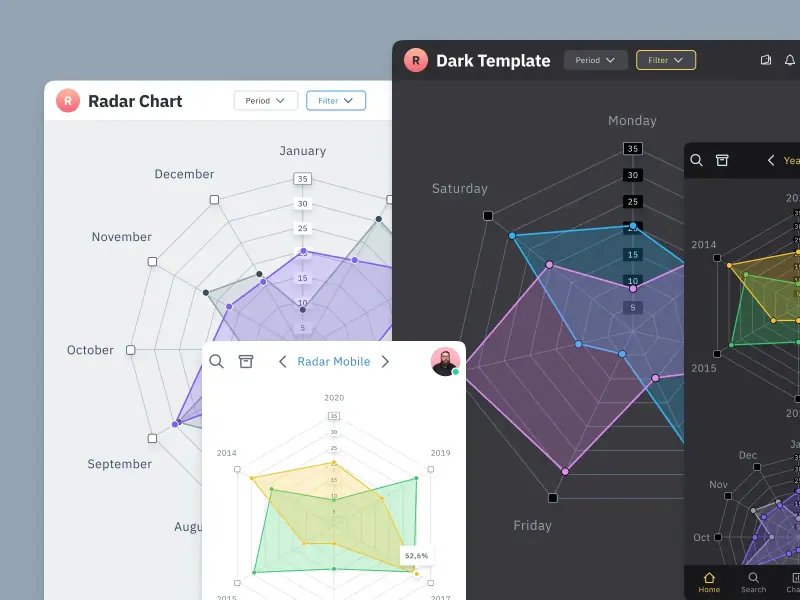
Radar chart template made of components and available within a range of popular viewports: desktop, tablet and mobile. Light & Dark.

Rome UI kit lite

Mobile & Desktop

Rome UI kit lite

Components & templates for desktop & mobile apps. Powered by clean and trendy custom guidelines and DM Sans font (OFL).

Xela UI kit starter

Mobile & Desktop

Xela UI kit starter

100+ variants of several components to craft perfectly shaped desktop & mobile apps. Modern styleguides and free Nunito Sans font.

Free iOS UI kit

Mobile Templates

Free iOS UI kit

Customisable & adjustable mobile design system with 100+ variants for a set of components and 8 ready-to-use app layouts to try out.

Mobile-X UI kit

Mobile Templates

Mobile-X UI kit

Meet Mobile-X Figma design system for mobile app design. Cross-compatible & stylish UI kit which fits both iOS / Android apps.

Accordion guide

Tutorials & Education

Accordion guide

The exploration for Accordion component: styles, states, samples, and use cases for desktop & mobile viewports.

Eclipse UI kit

Mobile & Desktop

Eclipse UI kit

Fine components fully loaded with variants, auto-layout, global text & color styles. Hi-end customizable Figma design system (starter).

Appka iOS UI kit

Mobile Templates

Appka iOS UI kit

Appka is a fine-themed & customized iOS design system with 4100+ variants for 28 components and 280+ ready-to-use app layouts for Figma.

Nav templates

Mobile & Desktop

Nav templates

This design resource represents navigation components. It contains sidebars, drawers and headers both in light & dark modes.

Dark charts UI kit

Chart Templates

Dark charts UI kit

Try out this handy source of graphs for your next dashboard, pitch, or even print materials. Contains most common dark chart templates.

Figma email templates

Email Templates

Figma email templates

Five awesome and scalable free email templates to engage your subscribers. Dark & light themes. Contains buttons, lists and cards.

Charts widgets dark & light

Chart Templates

Charts widgets dark & light

Line & Wave charts, Bars, Histograms, Ratings and more graphs widgets are available in this free Figma resource. For dashboards, mobile & desktop.

Shopping layout for web app

Desktop

Shopping layout for web app

Contains navigation, filtering components, tabs, cards and more. This layout was made with Angular and fully coded.

Orion dark templates

Data visualization

Orion dark templates

Figma library with 40+ desktop charts templates served in light & dark themes. Contains 200+ of dataviz widgets for every case.

Responsive imagery cards

Card Templates

Responsive imagery cards

A variety of responsive cards templates for Figma. Constrained and scalable. Made with global styles for typography and colors.

Landing page & web blocks

Web Design

Landing page & web blocks

Use given blocks as a quickstarter for your very next web design mission. This freebie contains 3 landing pages for desktop, tablet & mobile.

Mobile tables several themes

Mobile Templates

Mobile tables several themes

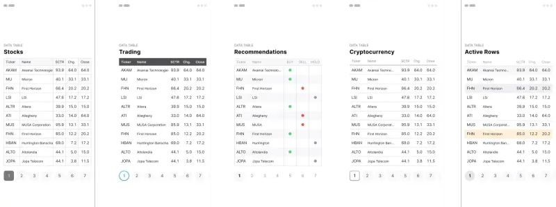
Components-driven iOS layouts with data grid made from one singe cell. Based on different styles. Allows to create better tables in Figma.

12 free mobile templates

Mobile Templates

12 free mobile templates

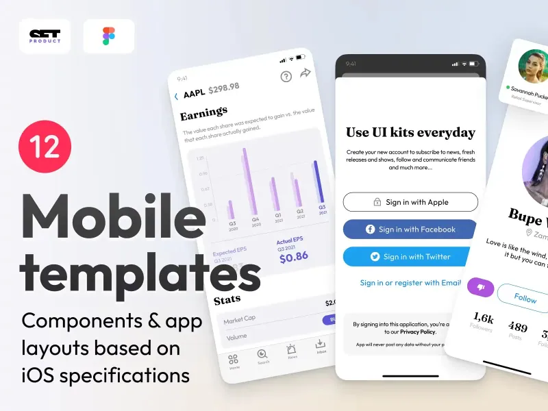
Use our Full iOS design system as the starter for your next mobile app. This freebie includes 12 screens dark & light powered by 200+ components.

Calendars & Date picker templates

Mobile & Desktop

Calendars & Date picker templates

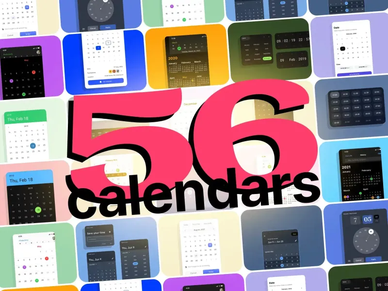
UI design resource with 56 calendars extracted from our popular UI kits. All the best samples of schedule patterns, planners, event managers.

Schedule & Events template

Desktop

Schedule & Events template

This clean calendar template has been made of a scalable grid, accurately made with colored items and wrapped for the desktop.

Material You for web apps

Mobile & Desktop

Material You for web apps

Figma Material Design 3 starter fully loaded with several desktop & mobile templates (with dark themes) and a bundle of components.

iOS Datepickers

Tutorials & Education

iOS Datepickers

Stand out with our Figma iOS date picker. Offering a true-to-life isometric design and easy-to-edit text, it's the most realistic option.

Segment UI kit

Mobile Templates

Segment UI kit

Design stunning Android apps with our free Figma UI kit. Follow Android guidelines and components and use our fonts, colors, and templates.

Figma React UI kit

Design & Code

Figma React UI kit

Our Figma React UI kit 2-in-1 makes web app building faster. Created in Figma, exported to React, and customised with Blueprint.js library.

Messenger app desktop template

Desktop

Messenger app desktop template

Effortlessly create world-class communication design with our Messenger Template for Figma. With dark and light mode options.

Zeus UI free website template

Web Design

Zeus UI free website template

Zeus Web UI kit-inspired landing page template. Supports all viewports, card-driven UX, polished with Syne and Space Grotesk fonts.

Design system starter

Global Styles

Design system starter

Launch your project with confidence thanks to our Figma design system. Customize grids, text, color, gradients, and shadows with ease.

Navigation layout 4 samples

Mobile & Desktop

Navigation layout 4 samples

Sleek Navigation Menu for Material X design system in Figma. Various sizes and design options. Features badges and active state highlight.

Chart cards

Data visualization

Chart cards

Make your data pop with our easy-to-use Charts UI kit. Featuring bar charts and heatmaps, it's perfect for dataviz, dashboard, pitches and others.

Material UI styled

Mobile & Desktop

Material UI styled

New and improved Material UI Kit, refreshed with enhanced material.io guidelines. Free and ready-to-use components included.

Hyper charts

Data visualization

Hyper charts

Transform your data into captivating visuals with several Figma's chart templates based on Hyper Charts kit. You'll find 8 editable widgets inside.

Search inputs

Components

Search inputs

Explore how Figma inputs are revolutionizing search interface design. Gain key insights to enhance user experience with impeccable UIs.

Figma Grid Layouts

Grid Layouts

Figma Grid Layouts

This template is designed to help you create templates that are beautifully balanced. Features both mobile and desktop layouts with 16/24 gutters.

Panda dashboard template

Desktop

Panda dashboard template

Build sleek dashboards with our Panda UI kit starter! Featuring a 1920w desktop template, UI widgets, and components.

Orion dataviz templates

Dashboard Templates

Orion dataviz templates

The design system starter for your next application. This resource contains 6 dashboard templates and a bundle of UI design widgets.

Subscribe to Setproduct

Once per week we send a newsletter with new releases, freebies and blog publications

By clicking Sign Up you're confirming that you agree with our Terms and Conditions.