


Jamshed Kasimov
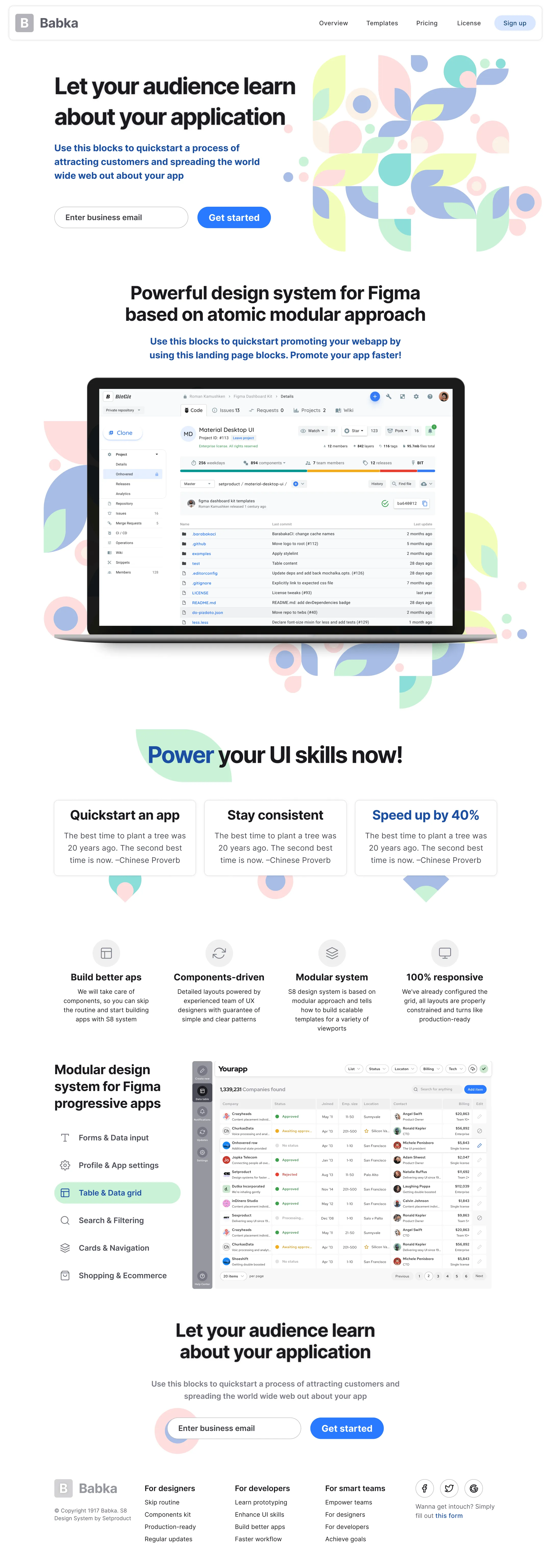
How you can save on design
If you plan to make changes to your UI / UX team, ensure consistency across the entire range of products, or if you are a freelancer and just want to improve your work and take it to the next level – then design systems are the invaluable advantage.They can save a huge amount of time, facilitate the transition to development, and make the user experience more smooth. The end-users of such products can be designers, developers, and organisations. Particularly, popular systems in ready-to-use design solutions field are products developed at Figma. Nowadays this tool is one of the leaders in creating designs and prototypes, primarily due to the real-time collaboration function.
So, let's take a closer look at the benefits of such products reviewing the S8 design system for Figma, as an example.
The advantages of working with a commercial design system
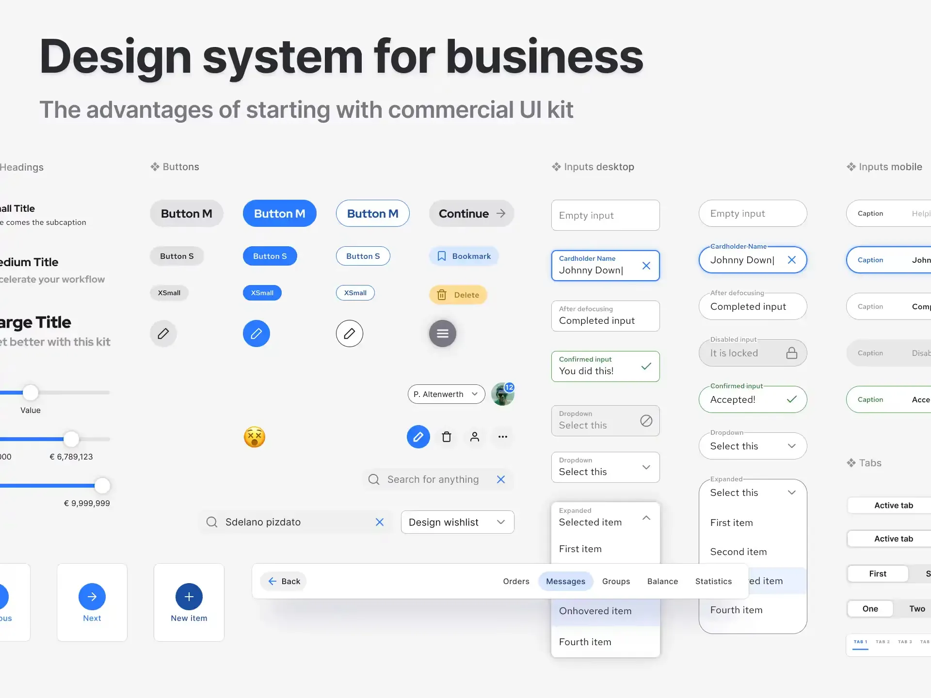
Let's start with the components, as they are the foundation of the design system. They are a kind of building blocks, sets of repeating elements, for example, buttons, cards, forms, tabs, navigation and overlays. Various components, such as buttons, can be duplicated many times with different styles and content.
With the correct, thoughtful composition and accurate design of such a system, the components can become the user's best friend. Even complex themes with components inside components become easy to use.
Another advantage of a design system is thoughtful behaviour. All objects are scaled depending on which devices you plan to create your design for - from mobile to desktop apps. All elements are adapted to your needs. This is where the principles of the web's progressive enhancement are applied.
Styles is another feature to notice. They are created in a way, so that everyone can use them and apply them to any object. And do it fast. Admit it - it super convenient when you have a large selection of fonts and colors at hand, and which you can globally change with just one click, depending on the needs of customers.
A good design system is also distinguished by good organisation and order. All patterns and templates are beautifully presented, and the files and layers in the toolbox are neatly arranged.
Now, a few words about those, who these products are created for.
Features of S8 design system
The first thing to note is that S8 is a modular design system. The main feature in the modular system is the grid. The flow of information and the amount of content on the screen will depend on how the user configures the functions in the grid. All modules are clearly joined together, without extra space and holes.
Guidelines of current interest: in S8 it's something between the new Twitter and roundly Pinterest, which makes the styles in the interface very attractive and user-friendly.
Templates for mobile and desktop devices. Now it's even easier to create responsive web applications and websites, because the extensive UI kit in the system allows to reuse the same components and instances for a variety of projects. S8 has over 60 templates.
Organised UI kit with components. For Figma's S8 design system, the best materials have been developed to create top-notch products. There is a huge number of components in the system (more than 150), and they are well and competently organised and labeled, which makes workflow faster and more efficient. System navigation is simple and straightforward, all elements are very easy to find. Just import them into your project and use.
Two themes and fonts styles. A few themes are available in the system - light and dark. Beautiful Red Hat and Inter fonts add attractiveness to the interface. The S8 Figma UI Kit uses an intelligent styling system that works not only for texts and colors with balanced tints, but also for gradients and even effects such as blur and shadow.
Effective UX patterns. With S8 design system, you can quickly and easily create the design of niche applications, such as Taxi Ordering, Pizza Delivery or Traveling app, or websites of various directions, because S8 offers a huge number of options with more than 60 clear and convenient UX patterns that are suitable even for the most complex projects. All patterns included in the system are based on real projects and contain the best practices of the world's top companies.
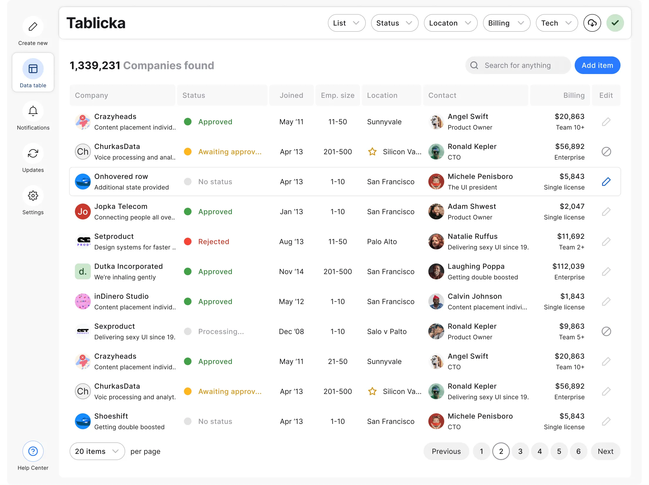
Components
The components in S8 are very easy to use. They were designed to solve specific user interface problems. All components in S8 Figma Design System were designed to work together harmoniously, all of them are small parts of a big whole. They are perfectly organised, all sections of the components are located on separate pages, so navigating through them is easy and convenient.
To create the components, we used the principles of atomic design. All names of components are clearly labeled, there are many hidden layers inside each of them that add flexibility (for example, a button with an icon can be obtained from the master component, just make the layer with it visible inside the instance).
Working with the component library will greatly simplify the maintenance of product consistency and will maintain a stable level of design quality. Also, do not forget about easy overrides: you can change the properties of a layer in a component instance without detaching it from the master component.
For many components the states are considered, such as: active, inactive, disabled, etc. These states help users understand the interface. For example, which buttons in the menu bar are active and which are not, or which input fields in the forms are the required fields, in which fields the user made a mistake, etc.
All the small nuances are taken into account and competently presented in S8.
Templates
"Start your projects in the right way" – this is the basic idea that we followed when developing our design system for Figma.
We created S8 to help you design beautiful and effective applications and websites that will fully meet your business goals. S8 contains an extensive library of more than 60 well-organised templates, which are divided into 12 categories. This library is customisable, organised, responsive, and based on the ideas of modular web applications.
Here you are the host of the main resources of this library: icons, backgrounds, images, avatars, fonts and much more, all this at your hand. All templates are attached to the grid, they resize correctly and made of components.
Templates are designed for mobile and desktop devices. You can use them in the initial form in which they were created, or you can disassemble everything into fragments, reuse them and create a project that meets your business goals.
Two styles are available for desktop templates - white and light grey. The scope for the choice of the templates is huge.
What's included
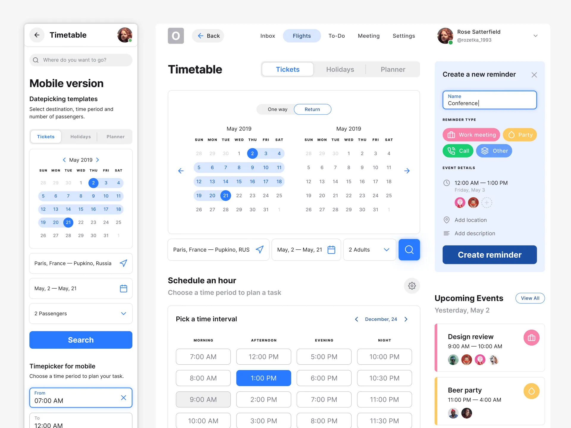
Calendar
This template is presented as a scheduler. It contains a two-phase datepicker. The time interval selection component was used, as well as the cards of upcoming events. The "Create a new reminder" section has been raised to emulate an active state. All filters in the template are user-friendly and very easy to manipulate. Ideal for event planning, travel, meeting, etc.
Dashboard
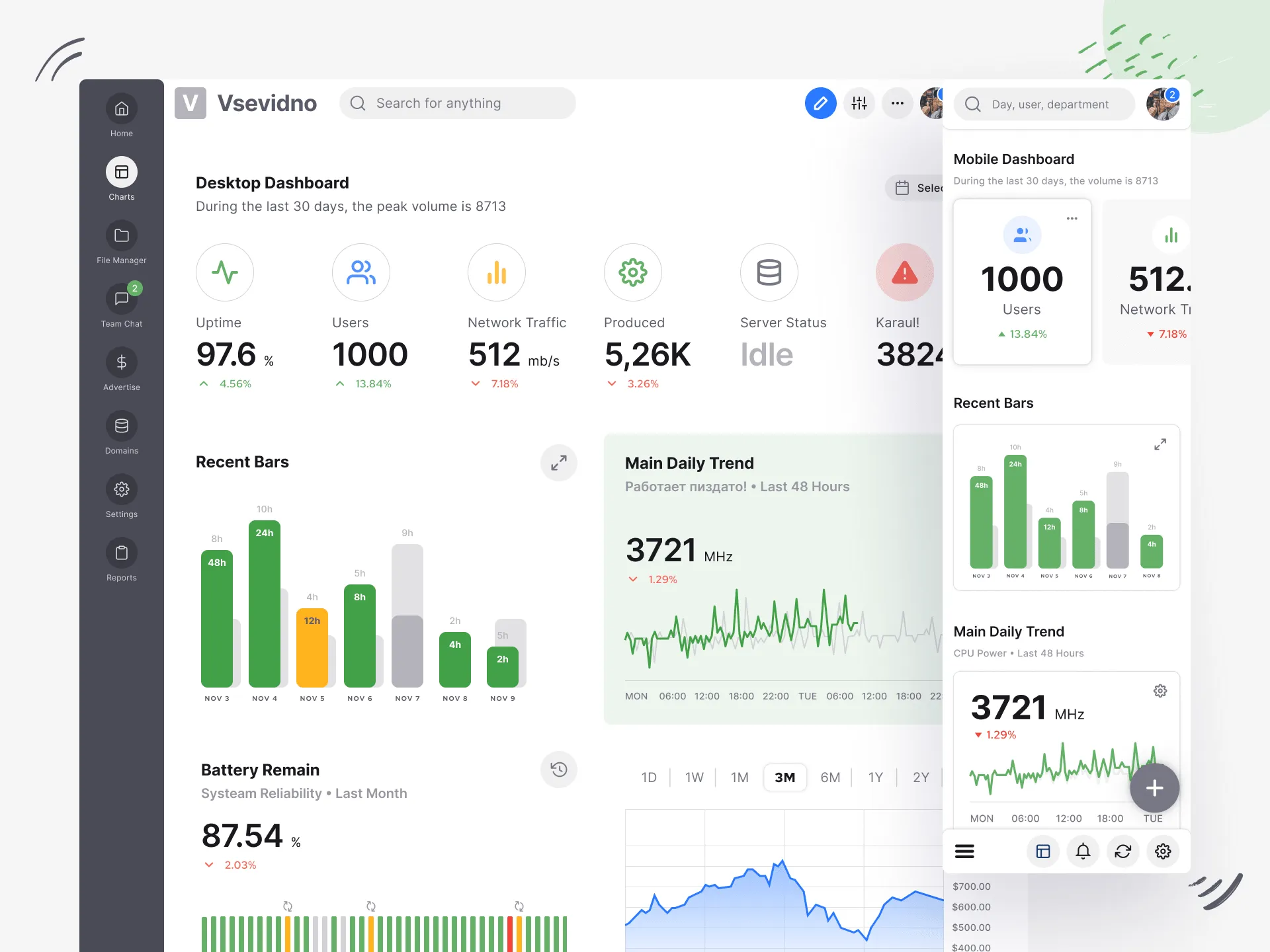
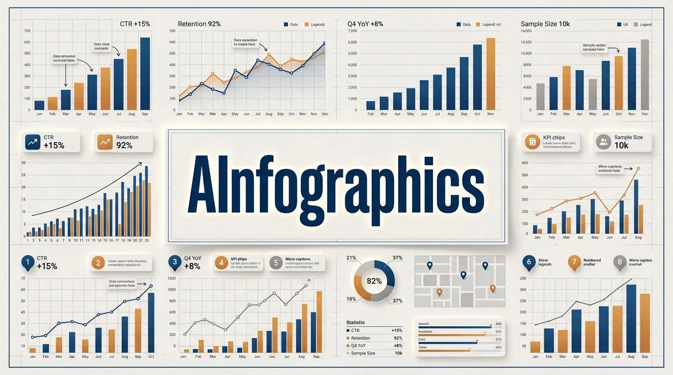
We did our best to make great, clear, intuitive, and customisable dashboards in S8 Design System. They are understandable at a glance, simplify the visual presentation of complex data and help users understand, analyse and present key ideas. This template is for collecting and visualising statistics. It has sidebar navigation. Cards for numerical values are used. The following chart templates are applied: vertical bars, linear charts, histograms, tables. Such a dashboard is universal and can display any type of data for any project.
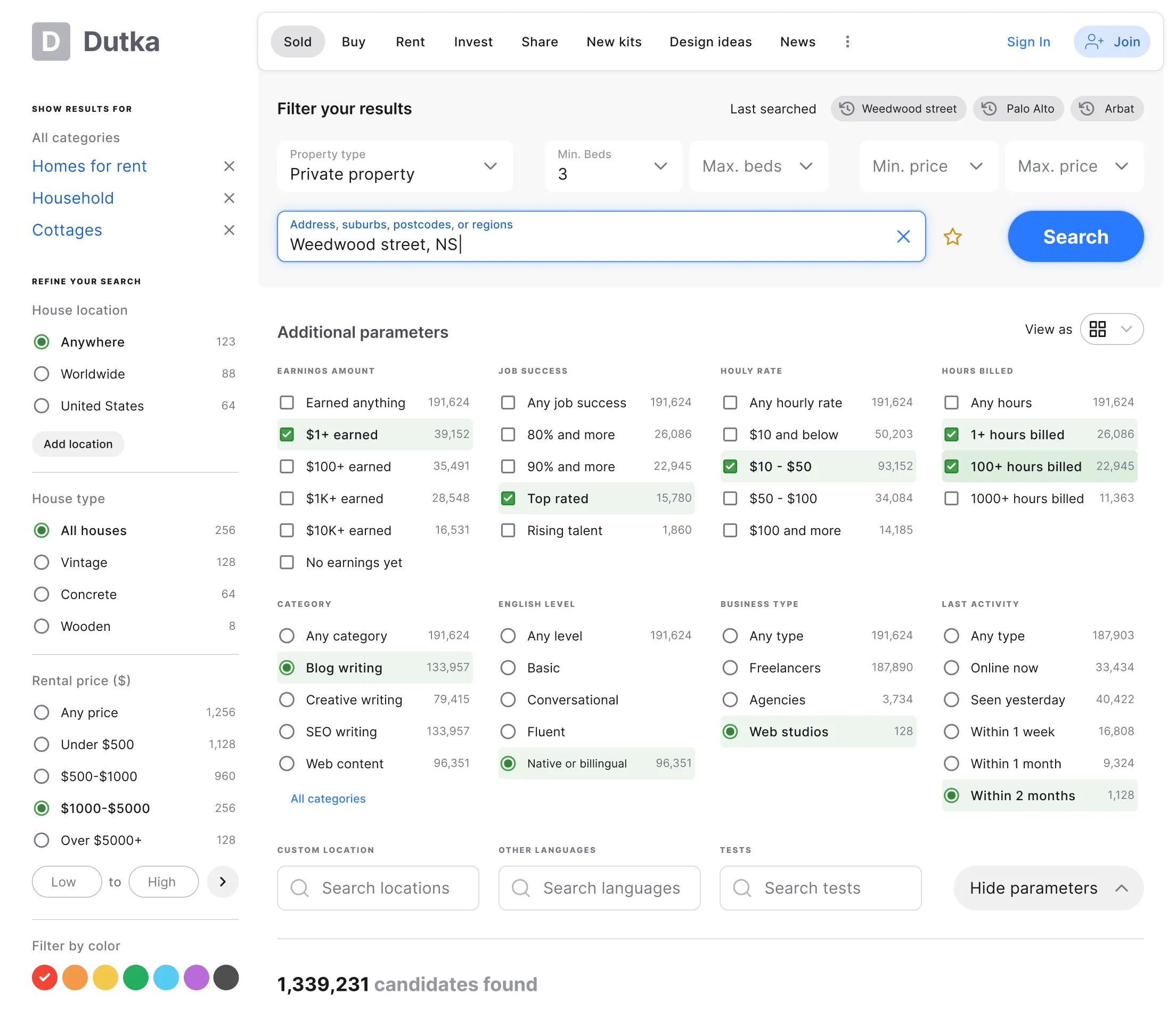
Filters
Data filtering is used in a wide range of applications. Therefore, this template is made as a multicolumn pattern, so that you yourself can edit the number of blocks. Parameters are selected either using checkboxes or radiobuttons. All filters are made in the form of components. Also, in this template you will find ready-made examples of using inputs when entering filtering criteria. In addition to all of the above, S8 provides a multi-select dropdown and searching with tags functions.
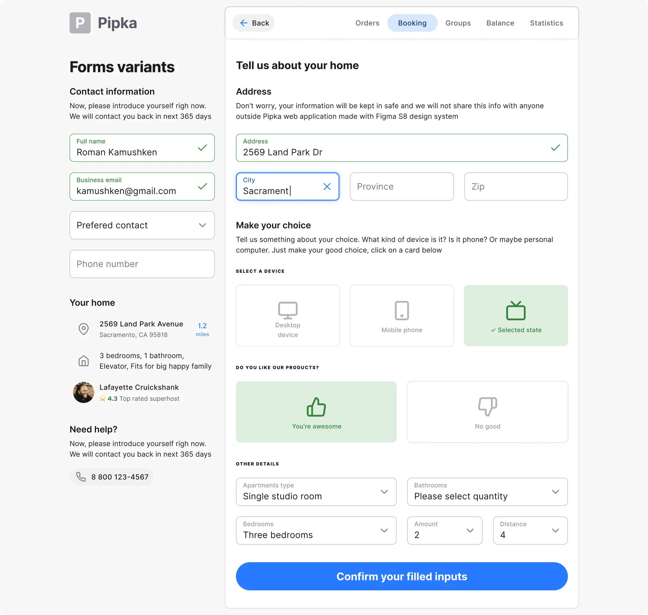
Inputs
This template shows variations in the use of inputs and selectors to receive data from the user. Inputs are inscribed in the grid and can be quickly reconfigured. For your convenience, several position options are shown: column, input over the entire width, two inputs in a row, three inputs in a row. Thus, you have examples for creating forms of any complexity. Clone them, rename and attach to each other.
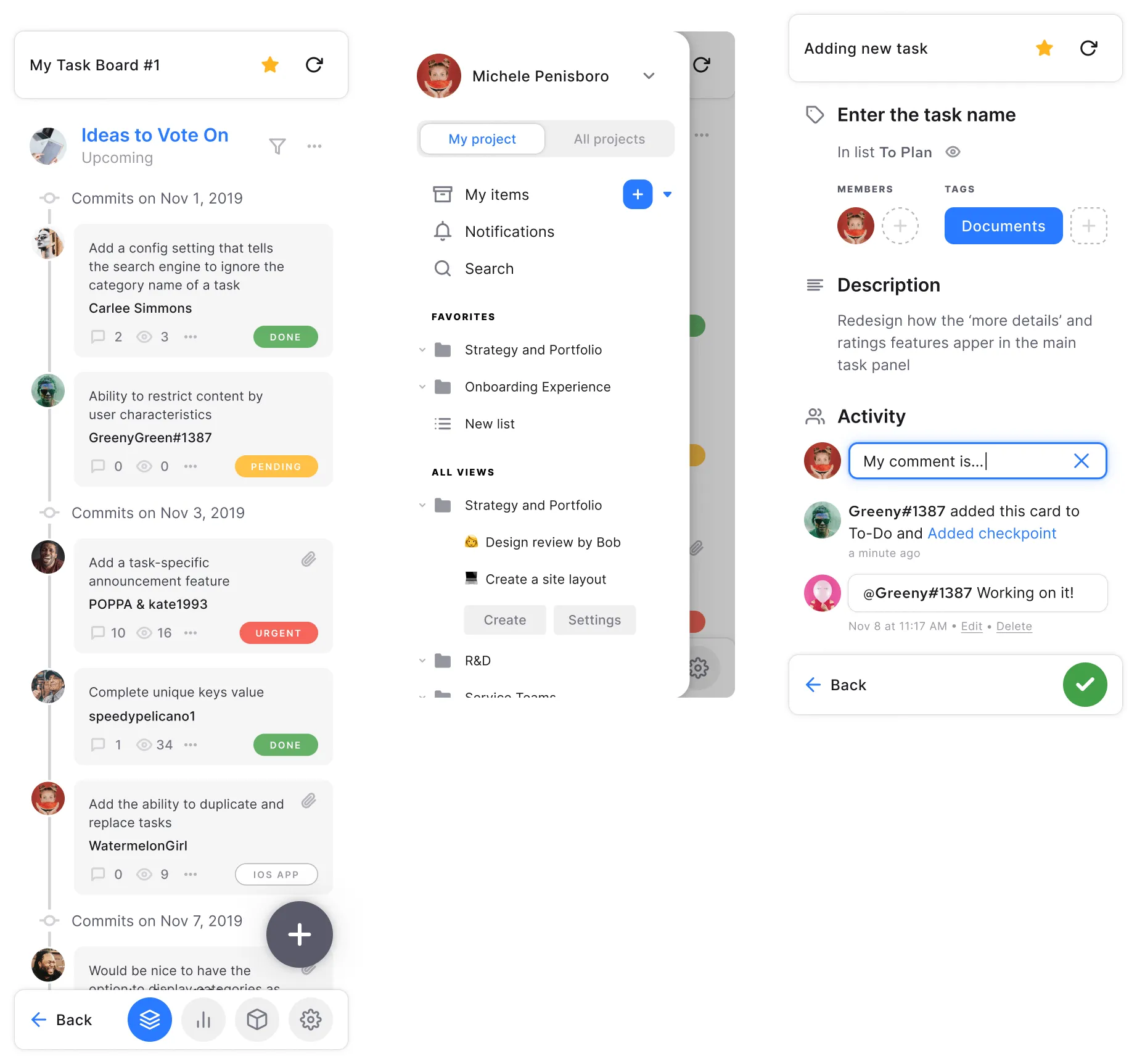
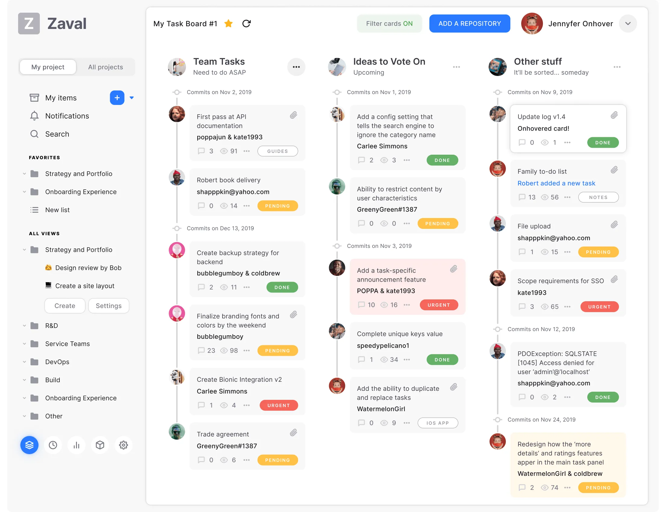
Kanban
This template is ideal for any project management application. Here you can draw up tasks that will look like cards that you can move between columns (work steps). Using cards, you can determine how many tasks are currently in work and at what stage each member of your team is at. Track overloaded areas in the project, distribute the load, easily switch between different tasks, projects and participants, change the deadlines and the people who are responsible for completing tasks - all on one screen.
The template has a standard set of cards ("Urgent", "Pending" and "Done"), as well as the Analytics section, where you can create reports.
Landing page
We have included the Landing page template in our S8 design system so that you could have the opportunity to quickly create websites of different directions. In this elegant and professional template, all landing page design principles are followed. You can find all the elements that are required to quickly and conveniently launch a page of a product or service. Suitable for creative agencies, corporate companies to present a new product or for marketing purposes.
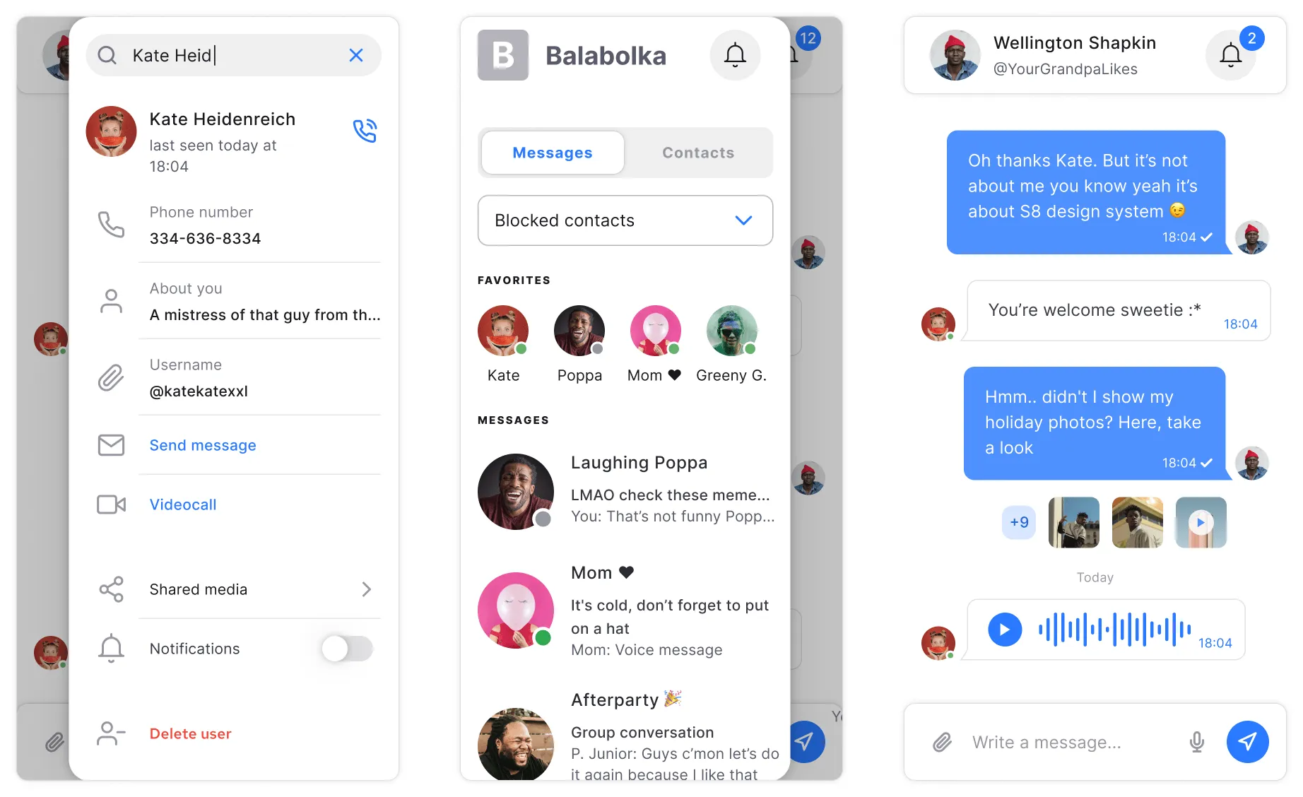
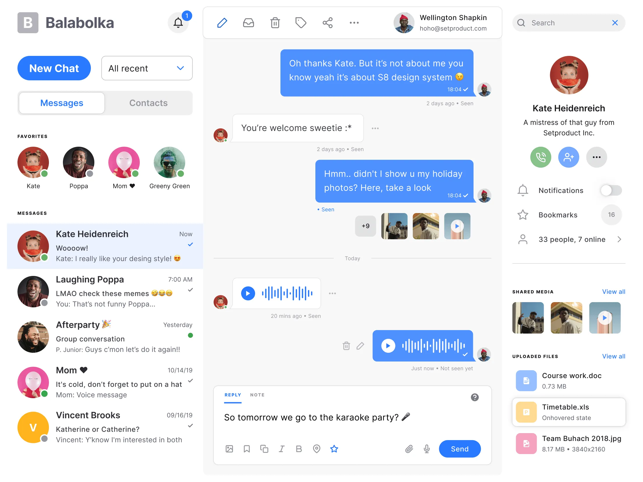
Messenger
Use these patterns, if your application contains any of the conversation flows. In these patterns, in addition to text messages, there are functions of voice messages, the exchange of media information and files of various formats. It consists of the main screen in the middle and two sidebars on the right and left. Sidebars contain a list of people you have a chat with, detailed information about them, with call function, as well as a function of adding a person to a group chat, etc.
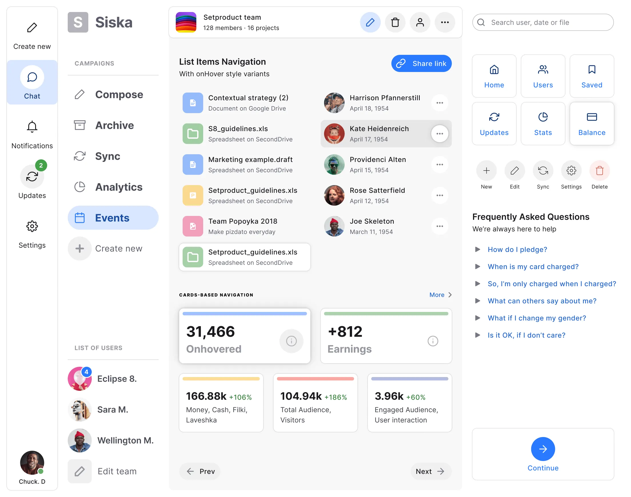
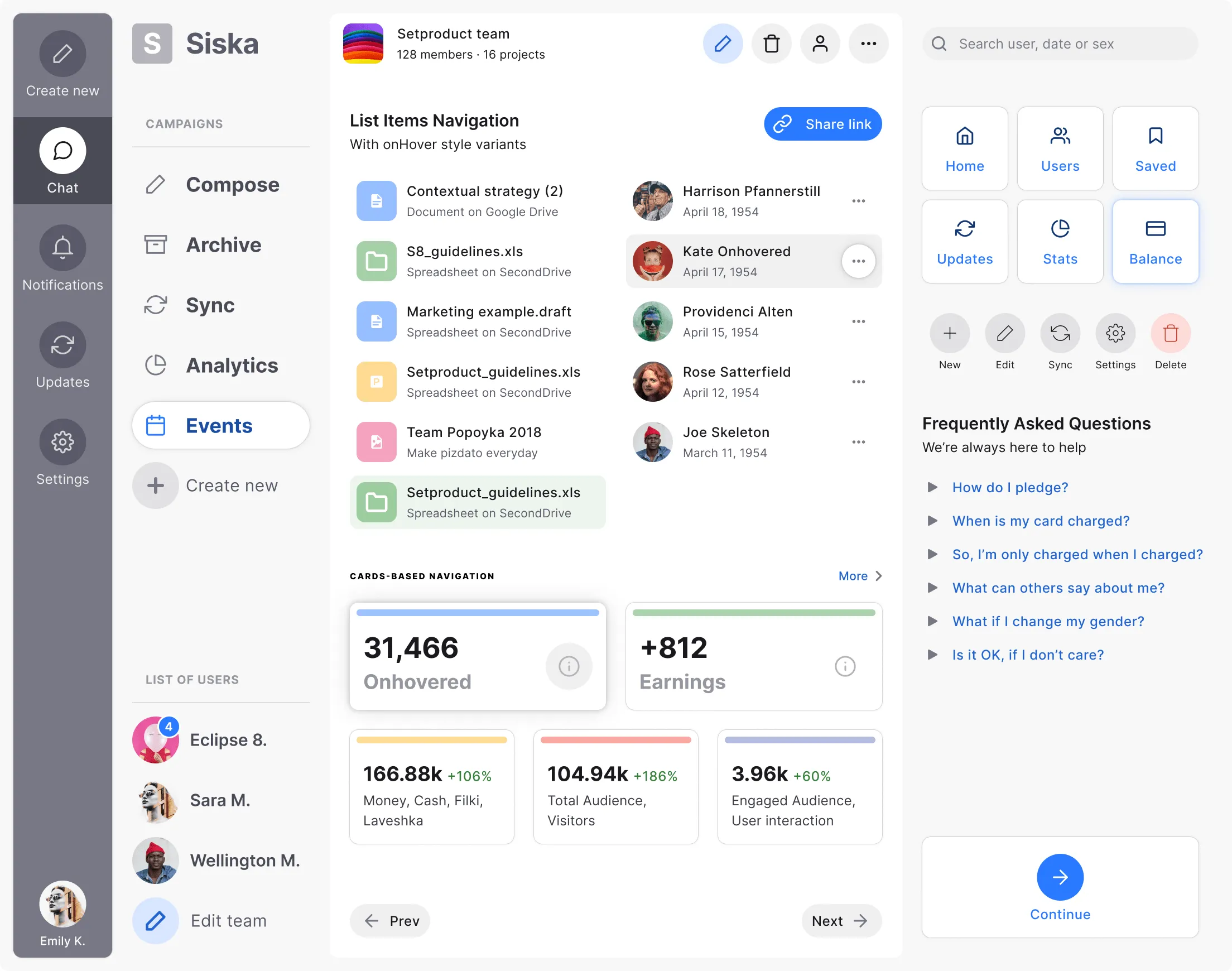
Navigation
Variants of in-app mobile navigation. Some elements are presented in an onhovered state. Sidebars in the template have elements such as: archive, chats, user profiles, events, analytics, statistics, balance, etc. Statistical information is presented in the form of cards. Thus, the user can interact with the most important information on each screen by selecting the desired section on the side panels.
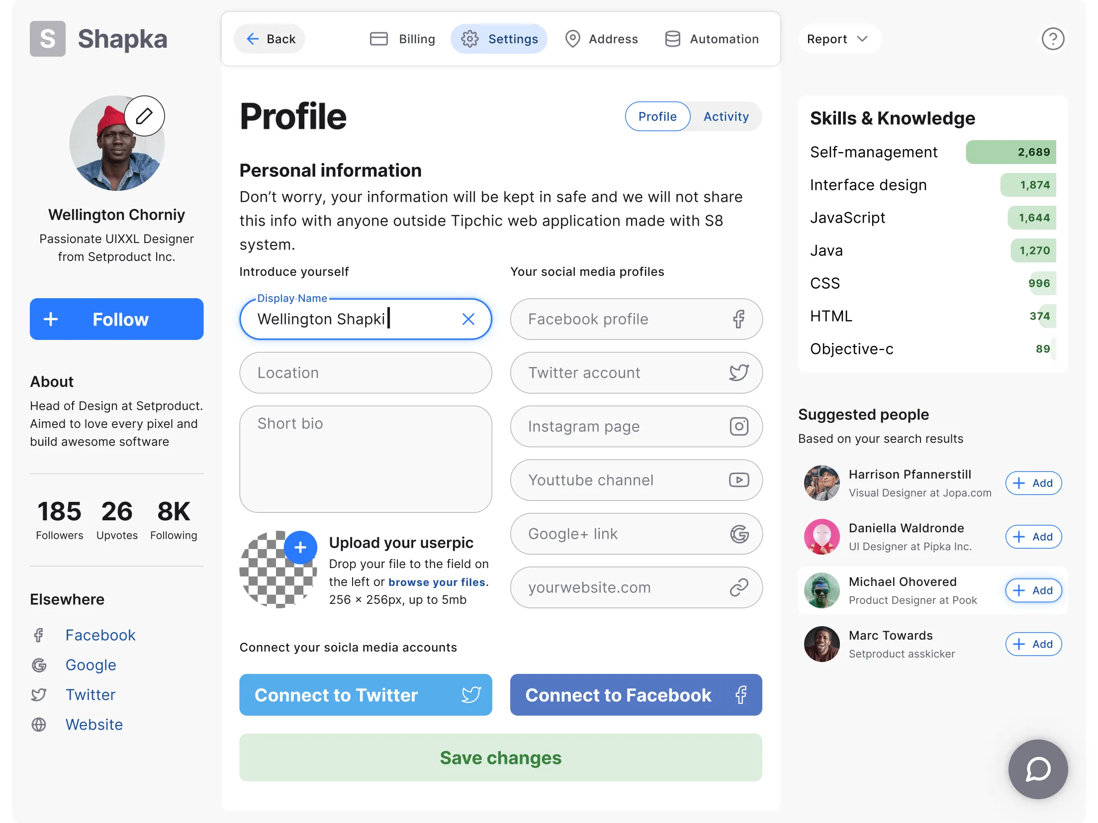
Profile
This type of template is perfect for designing a user's personal account. Users' preferences and it has a huge variety of options are listed here. The interface is simple, not overloaded, made in the best traditions of minimalism. And this allows users to feel comfortable and faster to create the right design solutions. Here you will find many functions and patterns, such as: changing user information, data on professional skills, the ability to connect via social networks, Suggested people based on search, counter items, etc.
Search
We all know that searching can help you understand the depth of your content. So having that said, we added the Search results patterns for a better UXability to your projects. One of the elements of search results is elevated, emulating an active state. This template contains many filters, including: dropdown, slider, as well as various parameters in the form of checkboxes. The search bar itself is supported by the Chips component.
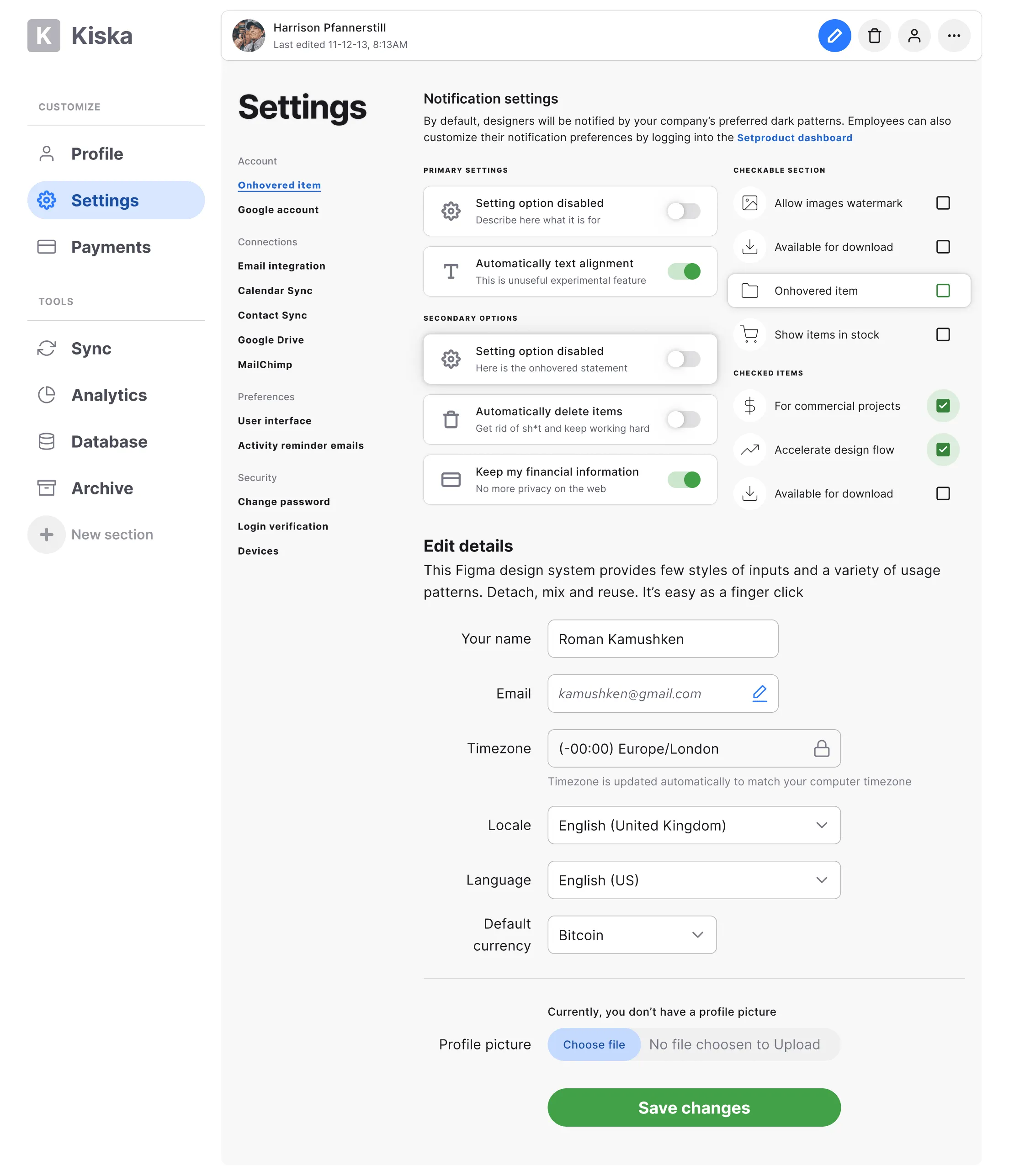
Settings
Settings are simply everywhere. This is an integral part of any application or website. Some elements in the template are highlighted as onhovered state. The basic information here is presented in the form of elements with checkboxes, switch function (on and off), as well as in the form of inputs and dropdowns. The main navigation sections are presented in the sidebar with the ability to add a new section.
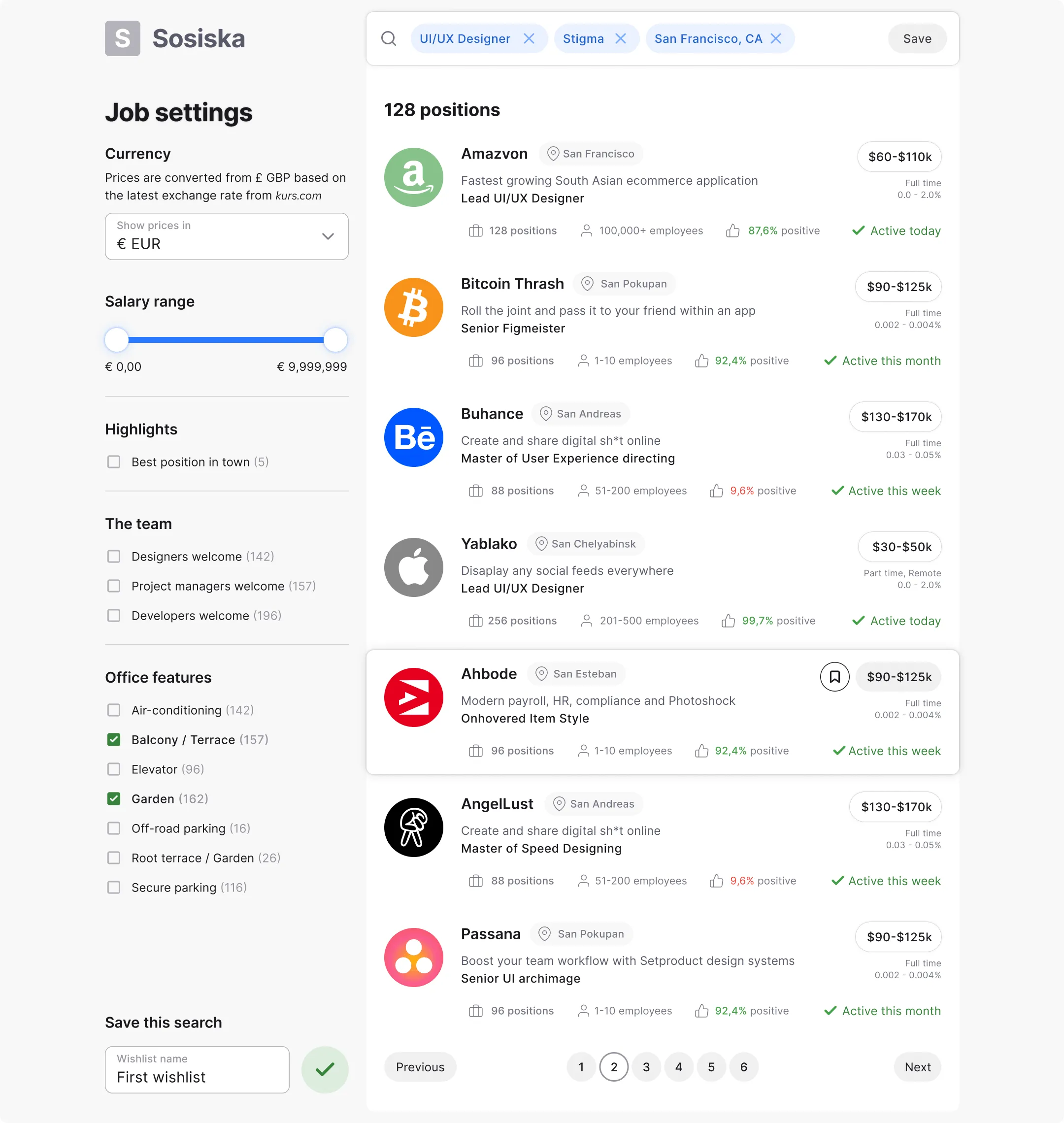
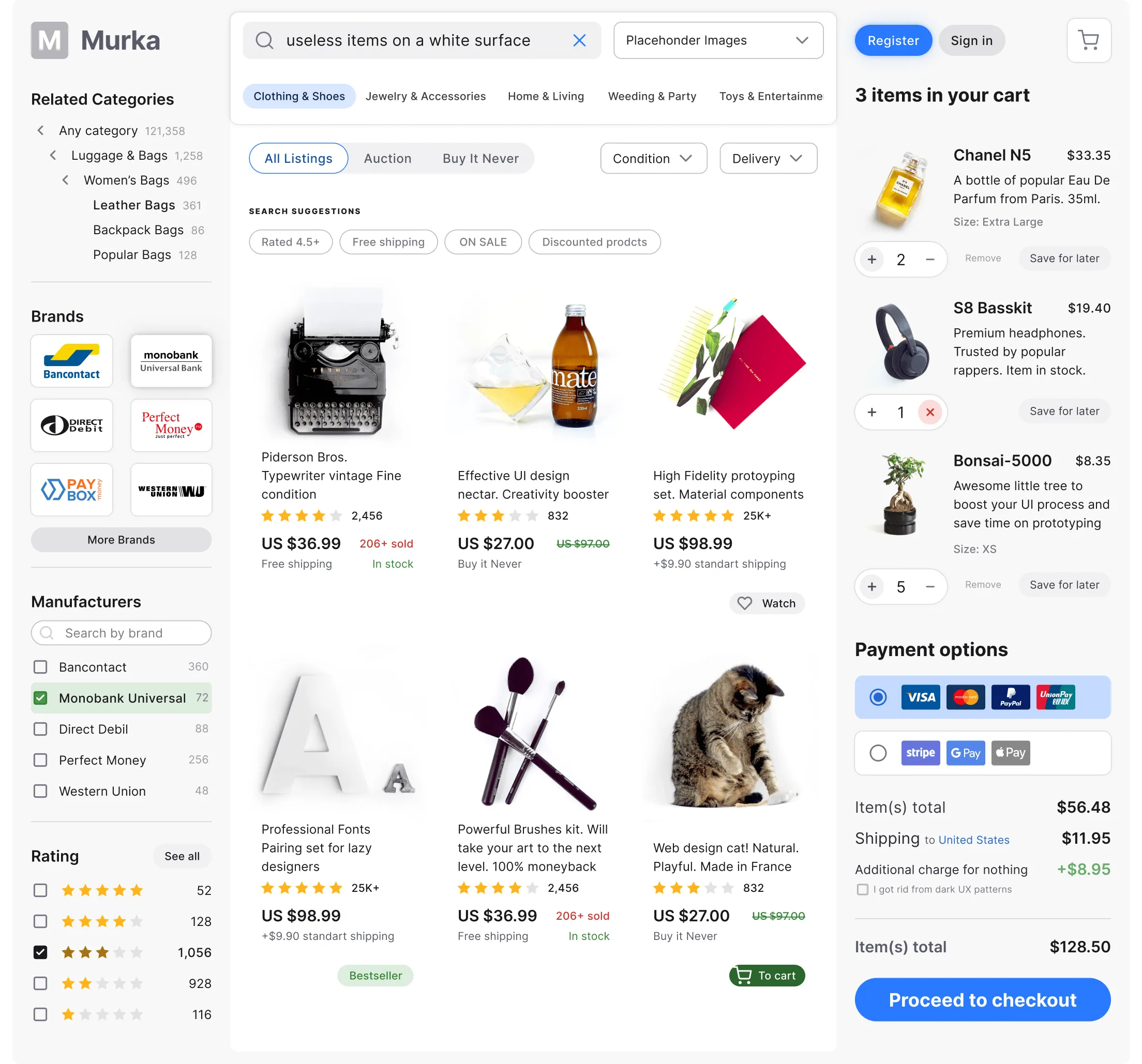
Shopping
When we are talking about Ecommerce websites and apps, it's really all about great design and user-friendly multifunctionality. And when these factors are combined together, they can increase your sales. That's why we did our best to create the awesome Ecommerce patterns for Figma, so the users can have their way around and be able to design wonderful things with S8. In addition to the elegantly designed search results items in the center, we have collected a huge number of filters (by category, brand, manufacturer, rating) and useful functions such as Login / Sign Up, Cart, Payment Options, Chips and much more.
Tables
This template is a great design solution when it comes to working with data, whether we you are tracking your workout results, operating the users or planning the wedding. All of this can be made in a most convenient way. Users can work with tables even on mobile devices. The tables are structured. All data is inscribed in the grid and is quite easy to reorganise. Rows and columns with data make it easy to search for relevant content. Each cell is an Instance of a Master cell component. So it's easy to adjust your custom style to a whole table at once.
Conclusion
The design system creates a sense of unity and helps the consumer achieve the desired goal in the shortest possible time, and for large businesses to earn more money.
Let's just summarise once again all the advantages you get from S8 Design System for Figma.
-
You save a tremendous amount of time for design and development;
-
S8 is dynamic and can be easily updated;
-
It's scalable with a variety of viewports considered;
-
Great constructor tool thanks to the power of components;
-
Standardises interfaces and minimises bugs;
So as you can see, the future of design systems belongs to Figma, as prototyping processes are accelerating both for freelancers and organisations. Each user who purchases a design system only benefits from it, because he protects himself from the risk of drowning in a pixel routine. He just immediately begins to create beautiful, stylish projects that will be clear to users at a glance.


.webp&w=1920&q=75)
.webp&w=1920&q=75)

.webp&w=1920&q=75)
.webp&w=1920&q=75)


.webp&w=1920&q=75)
.webp&w=1920&q=75)


