

Roman Kamushken
Designing for AI products comes with unique challenges. The complexity of data, the need for seamless user workflows, and the pressure to iterate quickly while maintaining consistency can turn even the most organized design process into chaos.
That’s where Nocra steps in: a Figma UI kit and design system crafted specifically for AI startups.
Whether you’re building a machine learning dashboard, a chatbot interface, or a code-generation tool, Nocra provides pre-built, customizable components that save time without sacrificing polish. Below, we’ll walk through five key screens from the kit, explaining their purpose and how they address pain points for designers and developers.
Get into AI product design faster with Nocra Figma UI kit - available to buy a license on Gumroad.
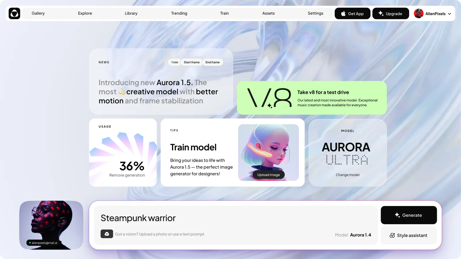
The Nocra dashboard is for clarity in complexity
What’s happening on the screen
The Nocra dashboard is a masterclass in balancing functionality with visual simplicity.
At a glance, users see a navigation bar with labeled icons (Gallery, Explore, Library, etc.), a news feed highlighting updates (like the introduction of the Aurora 1.5 model), and a circular progress bar indicating usage metrics.
On the left, a prompt history sidebar keeps past interactions organized, while the main area focuses on the current task; whether that’s analyzing data or generating outputs.
The problem it solves
AI products often overwhelm users with dense data, unclear workflows, and inconsistent layouts. A poorly designed dashboard can make it hard to prioritize features or understand progress. Tired of reinventing the wheel? Nocra design system for AI startups offers plug-and-play templates to reduce friction.
Nocra solves this by:
Hierarchy: Critical metrics (like usage stats) are visually prominent, while secondary info (news updates) sits in a digestible feed.
Navigation: The fixed top bar ensures users never lose their way, even as they dive into deeper features.
No cognitive load: The minimal color palette and logical grouping of elements prevent visual fatigue, letting users focus on their work.
For designers, this screen is a blueprint for organizing complex AI workflows into intuitive interfaces. It’s not just a template; it’s a framework for scaling as your product evolves.
Preview this template in Figma source file
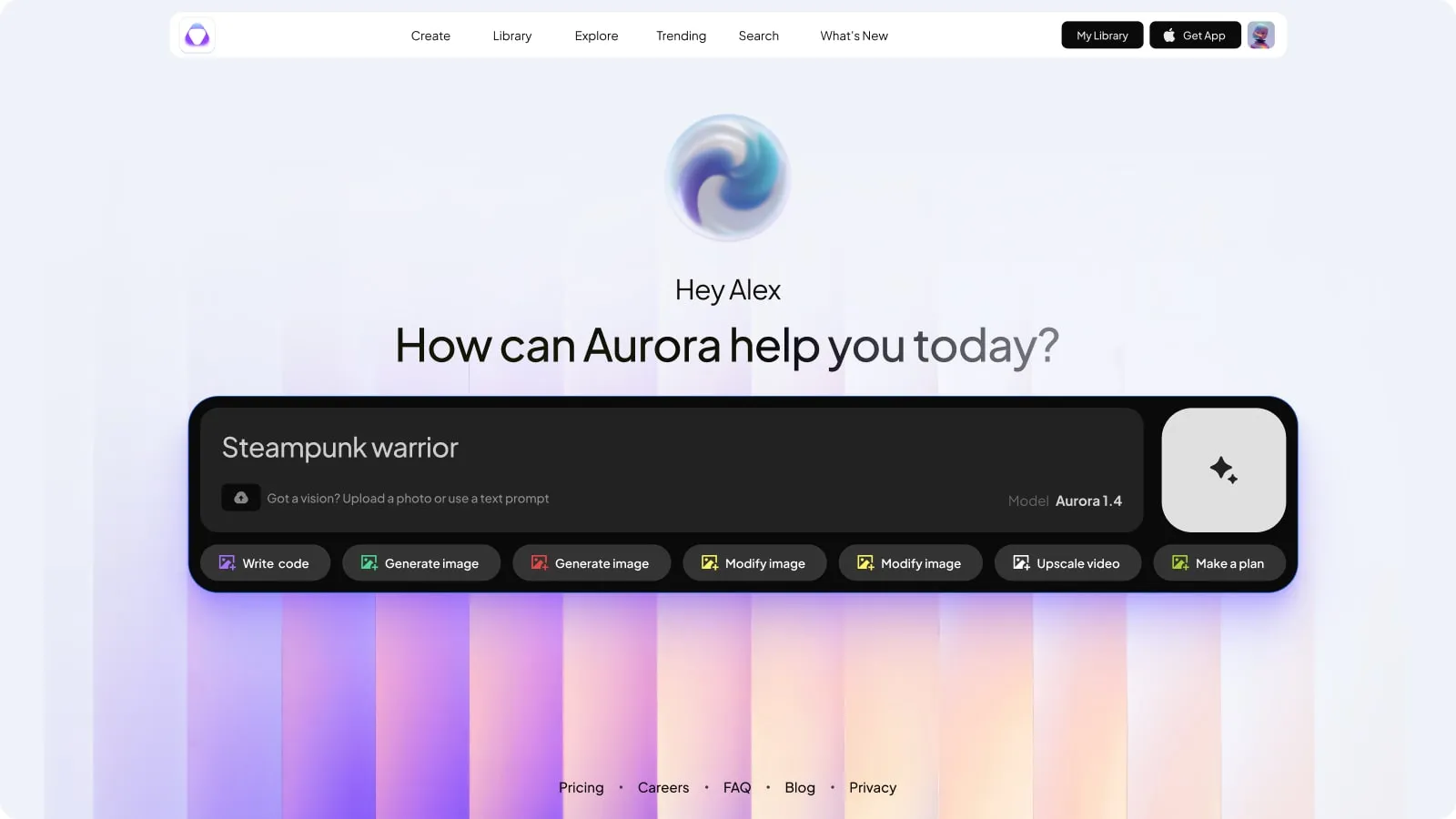
The home screen where first impressions matter
The core features in focus
The home screen greets users with a personalized message (“Hi, John!”) and a bold, red-bordered prompt input box.
Action buttons for generating content, accessing the style assistant, and switching models sit below, while a row of icons at the bottom hints at core functionalities: code generation, image creation, video upscaling, and more.
Accelerate your AI tool’s launch with Nocra modern dashboard design: available now on Gumroad for instant access.
The problem it solves
AI tools can feel intimidating to new users. Without clear guidance, they might struggle to start or abandon the product altogether.
Nocra’s home screen tackles this by:
Setting expectations: The prominent prompt box immediately signals the product’s purpose: user-driven input.
Instant utility: Action buttons and feature icons give users a sense of what’s possible, reducing the “Where do I begin?” moment.
Simplicity and depth: While the layout is clean, subtle gradients and layered cards hint at the product’s advanced capabilities without overwhelming newcomers.
For designers, this screen demonstrates how to make AI products feel approachable yet powerful. The components are modular, allowing you to tweak labels, icons, or color accents to match your brand.
Preview this layout in Figma source file
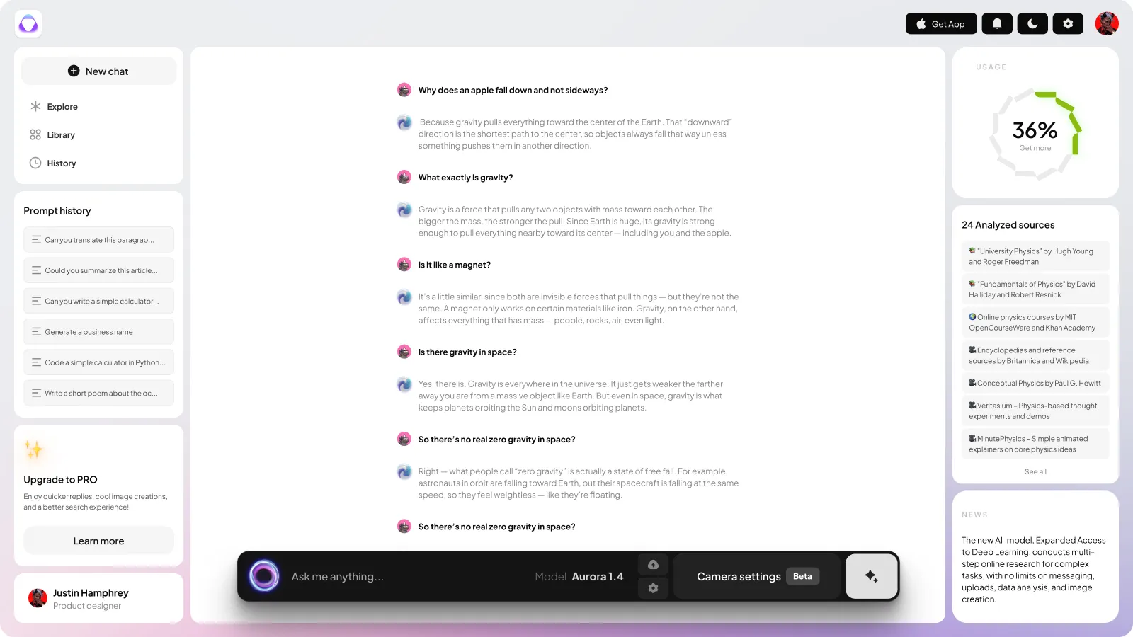
The chat interface for conversations that make sense
Mapping the user chat workflow
The chat interface divides the screen into three zones:
- Left sidebar: Scrollable list of past prompts for easy reference.
- Center panel: Threaded conversation with AI responses, including source citations for transparency.
- Right sidebar: Live usage meter and model details (e.g., “Aurora Ultra”).
Users can copy, edit, or share AI-generated text directly from the interface, and the input box at the bottom includes a “+” button for advanced settings.
From prototype to production: Nocra’s code generation UI templates simplify complex workflows — grab your license on Gumroad
The problem it solves
Traditional chat UIs often lack structure, leading to messy, hard-to-follow conversations. Nocra’s interface fixes this by:
Sense of continuity: Threaded messages and source references make it easy to trace how answers were formed.
Iterative workflows: The prompt history sidebar lets users revisit and refine previous interactions, which is critical for debugging or improving AI outputs.
Advanced features: The model switcher and usage meter are visible but not intrusive, giving power users control without complicating the experience for casual users.
This screen is ideal for startups building conversational AI tools.
The layout ensures clarity, while Figma’s auto-layout features let you scale the design for different screen sizes effortlessly.
Preview this screen in Figma source file
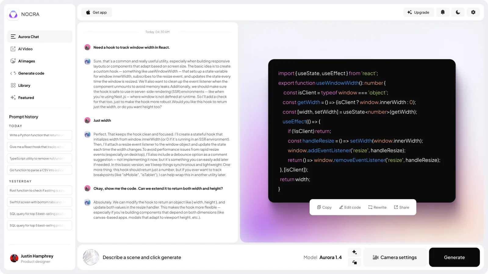
The code generation to bridge design and development
What’s built into this template
Here, Nocra shifts into a developer-centric mode.
The screen displays a prompt input at the top, followed by a code editor-style output window. Users can copy, rewrite, or share generated code snippets. A model selector and camera settings (beta) are tucked into the top-right corner, while a “Regenerate” button offers quick iterations.
The problem it solves
AI code generation tools often drop users into a black box: outputs are hard to parse, and customization options are buried.
Nocra’s code screen addresses this by:
Real-world workflows: The split between input and output mirrors how developers work in IDEs, making the transition from prototype to production smoother.
More collaboration: The “Share” button and version history features (if your startup adds them) align with team-based coding practices.
It's flexible: The beta camera settings and model selector give advanced users granular control without cluttering the interface.
For designers, this screen is a lesson in designing for hybrid audiences.
The code editor’s syntax highlighting and spacing are pre-styled, so you can focus on the bigger picture rather than pixel-perfect code formatting.
Buy a license and organize AI-generated content effortlessly with Nocra Figma library screen design. Built for scalability and clarity.
Preview this desktop mockup in Figma source file
The library layout aimed to manage the overflow
The structure behind the screen
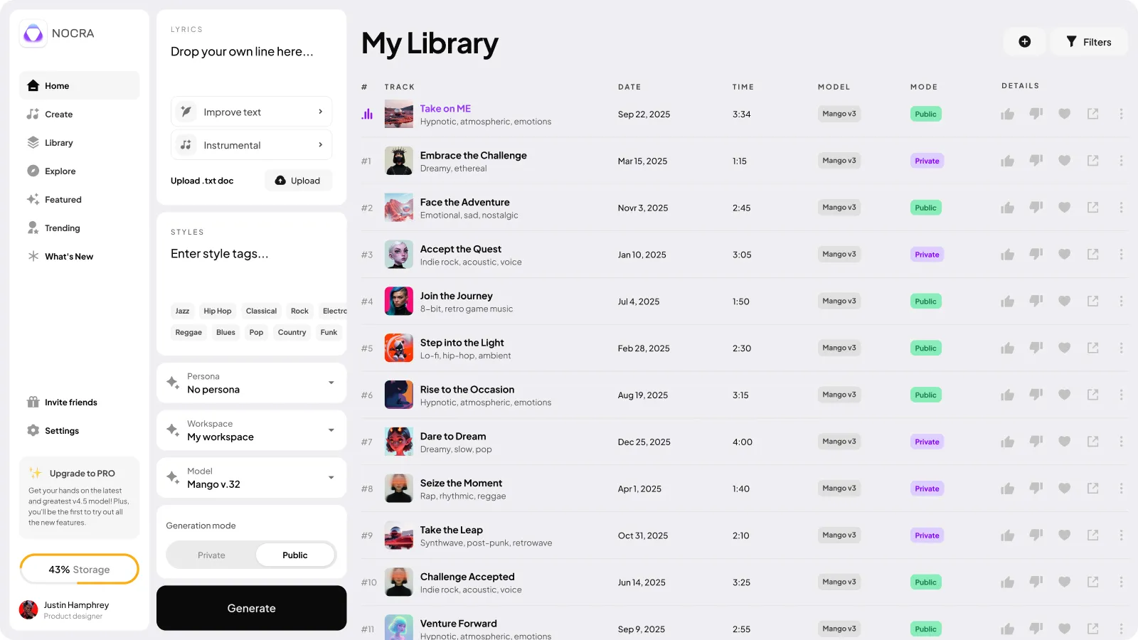
The library screen is a grid-based hub for managing generated assets.
A left-hand menu includes filters like “All,” “Text,” “Images,” and “Code,” while the main area displays thumbnails of outputs. Each item includes metadata (date, model used, processing time) and actions like “Download,” “Edit,” or “Delete.” A storage usage bar at the bottom keeps users informed.
Save time-to-market with Nocra’s pre-built Figma components → Available on Gumroad to kickstart your AI product.
The problem it solves
As AI tools generate hundreds of outputs, disorganization becomes inevitable. Nocra library screen solves this by:
Smart sorting: Filters and metadata tags help users find what they need without manual searching.
Show resource limits: The storage meter keeps users aware of their usage, a must-have for freemium products with tiered plans.
Asset management: The “Download” and “Edit” buttons are consistent across all asset types, creating a unified interaction model.
For startups, this screen is a template for handling scalability.
The grid layout adapts to any volume of content, and the Figma components are reusable across other sections of your product.
Preview this data grid template in Figma source file
Why Nocra works (And why you should try)
Nocra isn’t just a collection of Figma frames: it’s a bundle of HQ reusable templates.
Every screen is built with scalability, consistency, and user empathy in mind. Here’s what makes it stand out:
- Purpose-built for AI: Most UI kits assume a generic web app, but Nocra anticipates the quirks of AI workflows (e.g., model switching, source citations).
- Time-to-market efficiency: Startups can skip the “designing from scratch” phase and focus on refining their product’s unique value.
- Developer-friendly design: Code snippets, storage meters, and version history elements are styled to appeal to both technical and non-technical audiences.
If you’re designing an AI product, Nocra is worth exploring. It’s a foundation that lets you spend less time on layout and more on solving real problems. And for designers, it’s a reminder that great UIs don’t have to be reinvented every time. Sometimes, the best work comes from adapting smart, proven systems.
Optimize your AI dashboard’s visuals today. Nocra’s purpose-built templates are just a click away on Gumroad.
What's inside
✅ 44+ Pre-built screens
Accelerate development with ready-to-use layouts for media generation (video, audio, image, music), onboarding, promo slides, and more. Solve common UX patterns before you start designing.
✅ 1,200+ Smart components
Buttons, inputs, cards, alerts, dropdowns, and nav elements: all built with auto layout, variables, and tokens. Edit once, update everywhere. No more repetitive tweaks or broken consistency.
✅ 22 Polished animations
Add life to your interface with loaders, thinking states, and microinteractions (delivered as .mp4, .webm, .mov). Enhance user engagement without hiring a motion designer.
✅ Light & dark themes
Toggle-ready, token-driven themes for instant adaptability. Maintain clarity and brand alignment across environments, whether users prefer light or dark mode.
✅ Interactive prototypes
All components include hover, loading, success, and disabled states. Showcase real-world user flows and test ideas faster. No coding or third-party tools required.
Ideal for: AI assistants, chatbots, media generators (image, music, video, audio), prompt-based interfaces, AI dashboards, internal tools, MVPs, and idea validation.
So, the next time you’re staring at a blank Figma canvas, ask yourself: Why build every button and panel from zero?
Nocra gives you the starting line. The race is yours to win.


