
Roman Kamushken
Introduction
Any designer has the opportunity to earn on their own design product these days. Icons, illustrations, website and app templates can be turned into a digital product and sold worldwide. Your craft will help someone speed up their work and they will pay for it. Someone else can buy to see how it's done. The third can fill in their resource with your design solutions.Your product can take off and get to the top, or can turn out to be useless to anyone. But it is worth trying to do it at least for the sake of pumping skills, working with sales, a chance to give up office work or work for a customer.
And I'm going to tell you about a step-by-step plan to create a commercial design system. You'll learn how to make and market your product. I'll tell you what to do before you start, how to prepare and make a plan.I'll consider the stages of the Figma design system development. I'll give you advice on how to promote and hype it up in the last part.
Who buys it and why
Designers, developers, managers and business owners buy design systems not to draw all the little things from scratch, but to immediately start building layouts from finished parts. The approach to screen design has changed and requires fine-tuning of each component. Styles, constraints, naming, grid and general architecture in the design system needs to be ordered, which requires time.
You can't just open Sketch, XD or Figma and start making templates. You always start with a blank screen and work requires basic elements: buttons, lists, cards, etc. Where could all of this be taken from? Well, you can either create all the components yourself, debug and test them, losing a month, or buy something ready-made.
Why to issue a design asset
This should be done to develop professional skills and opportunities to improve the financial situation. This is a more exciting job, because you come up with the tasks yourself. If you do what you like, you are already motivated enough.
You have the opportunity to sell your components to other designers and organisations from around the world. You will receive flattering feedback from satisfied customers, so you will have to make your best UI. Creating a design product is interesting and exciting, but you'll need to invest time.
Impressive presentation is a good method to promote your product
A kind of design assets
- Icons set
- Illustrations set
- Prototyping set
- Website templates
- App templates
- Presentations
- Fonts
- Design-systems, UI kits, etc.
Flexible design product is of the greatest value for the customer. It certainly contains a lot of options, states, sizes of the elements used. Therefore, you will have to try hard and take into account everything, develop a system, and then double-check everything carefully. Competition in the market of ready-made resources for Figma is not so visible, but it exists, and so you'll have to use all the experience and make a product of the highest quality.
You can deepen your future design system in any of the themes, especially if you have already worked with it: Ecommerce, Cryptocurrency, Social, Project management, etc. You can assign a higher price for a more niche product and then gradually reduce it if there is no result. But it's more difficult to sell a product in a narrow specialisation, as fewer people need it. But when such a buyer is found, they can pay $200 or more for an individual license. I recommend to develop a system on the selected theme, but be sure to show how easy it is converted into another one.
Providing more variants and use cases - your key to attract a potential customer
The time is your only bet
Your only investment is time. But it will be returned to you with experience anyways. Solving those design tasks that you are interested in, you will raise the quality of your portfolio to a new level. I've tested it myself. And I try to see myself objectively.
So, with a favourable outcome, you'll get your first sale and a very cool feeling. Someone's found your handiwork useful and paid for a copy. You`'l lose the desire to sleep, your head will be full of further plans for your product development. But before the first sale, no one will pay you for the time spent, as when working for a customer. There is always a risk that what is done will be useless. I also failed the first time. Therefore, you need to accept the fact that you may not earn anything, but will get pumped in any case.
You improve your portfolio
If sales haven't taken off, it's not the end, in any case, you'll be proud to attach this work to your portfolio. You've qualitatively for yourself and are not in a hurry to put the made design product aside. For example, it can be reused and developed in a fictional case. If you've made a mistake and drawn another Food Delivery UI kit, like many beginners, you can come up with and describe the process as if this work is done for the customer and how you approached it. Based on this story, you can write on Medium, and scatter cool graphics in Dribble and Instagram. You may get valuable feedback and new subscribers. You should always re-use your own graphics to improve your portfolio and create an audience.
I've mentioned above that I didn't succeed the first time, but six months later I made a turn and started to research more before the second attempt. Research is an important stage before the start and I want to dwell on it. Analysing patterns and popular products deeper, I managed to achieve successful experience in the sales of Figma design libraries, so I'll talk about the creation of design templates made of components or "design system".
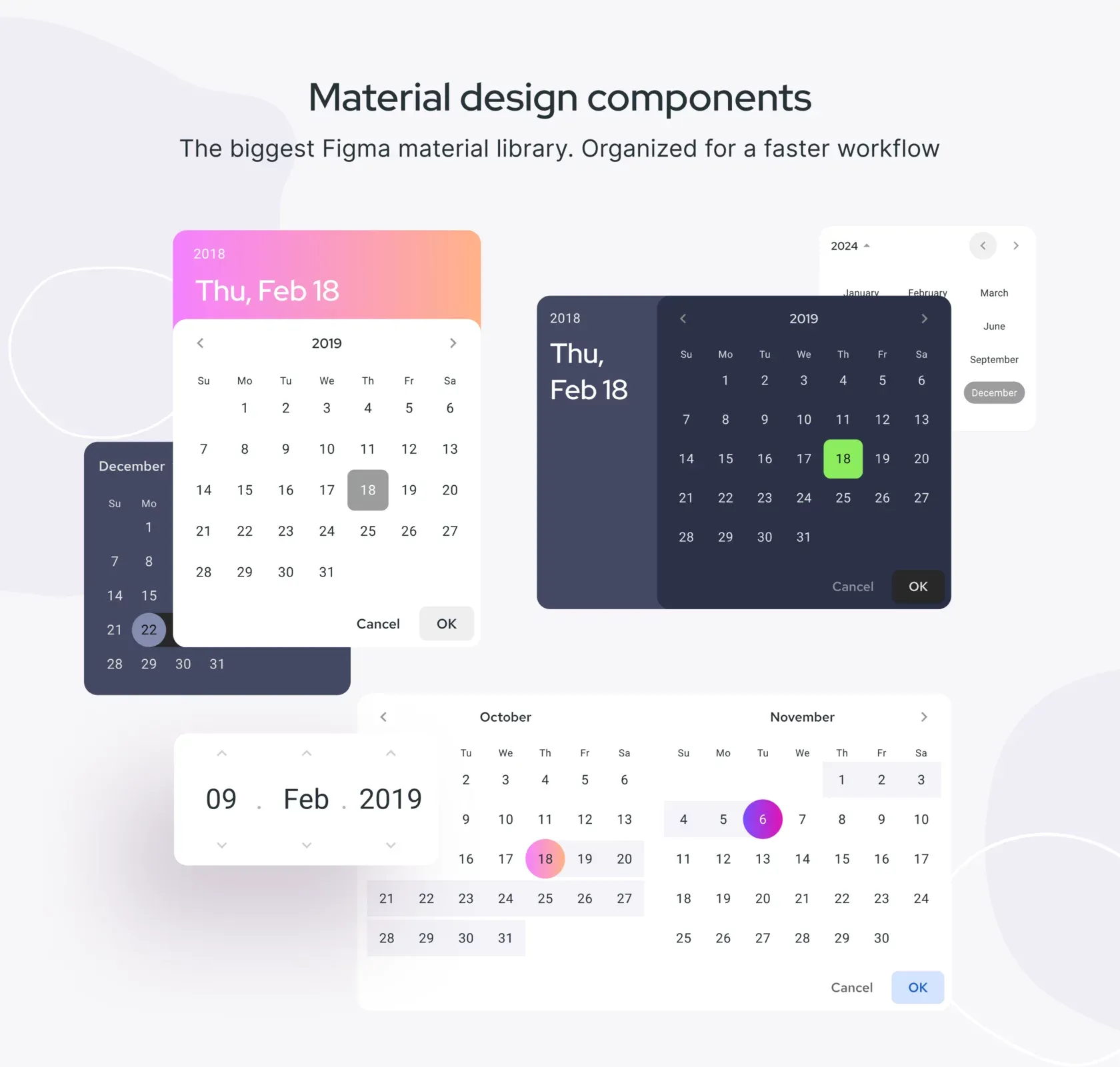
Take a look at this Figma freebie - iOS datepicker template
Have a plan before you start
Self-organisation, discipline and the role of a personal project manager are important components to get things done. If you try to create a design system in the evenings, after the main work in the office, you need to be effective and have time to do a lot.
We have families, children and domestic affairs. Such an emergency can easily knock out of balance and you need to have a comfortable plan of action. There will be three main stages - research, creation and promotion of the product. You need to expand each stage and make a separate list of steps for each stage. Today we'll draw up a research plan.
Starting your product
Pick a design tool (and a market)
The tool selection for the future design system is the choice of the market where you will work. I prefer Figma, you may prefer to work in XD, for example. It is important that the tool is growing and has its audience. If someone is already selling in this market - that's great, reuse their ideas by skipping through a look at your product. If you are the first, there is a reason to be wary.
For example, the design market is not visible around the Invision Studio missing from the radar, and it exists around the rare Axure. It's just much smaller than the Sketch market. And this one is so huge that it is full of templates and UI kits, so the average price for a copy is lower. All these factors need to be weighed before choosing a direction. But first, go to the popular tool, if you haven't done this before and start to gradually learn what products similar to yours can be bought.
Pick a topic
The theme of the design product must be defined for it to acquire a specification. For example, with this system, you can prototype in the material design style, and this fresh library contains more rounded shapes and is made in a different style. These are two design systems, but each one has its own purpose. And the market is waiting for more new themes, so feel free to come up with them.
Get ready to use all your experience for the topic in which you are best versed. So it will be easier to find those people who your knowledge will help to solve their design problems. Then you'll only have to tell the future buyer from what area your product is and that it can be used to build. These may be charts, admin dashboards, financial templates and the like. At the very beginning, it is necessary to determine the direction and stick to this course during development.
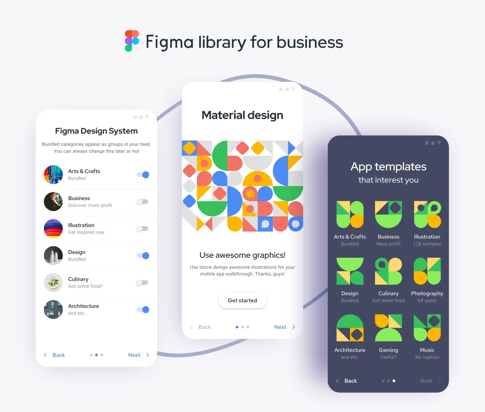
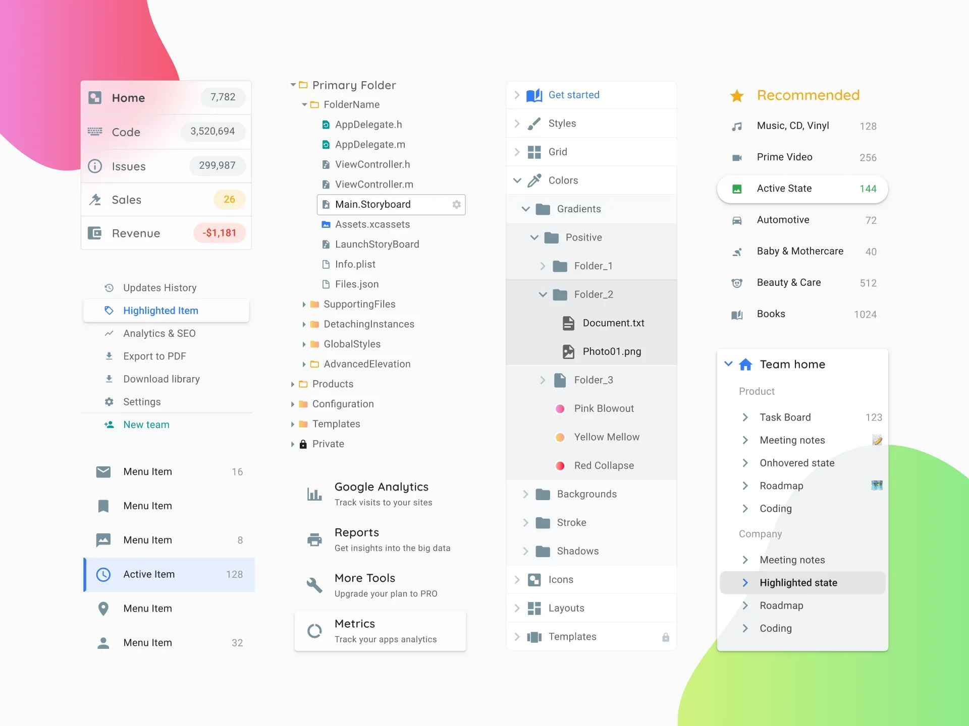
Material Design System - still powerful and the hugest UI library for Figma
Pick UI guidelines
Users buy the product design because they like the exterior, among other things. But if you miss with the style, they won't buy. So, it's important to monitor how the design of services, social networks, web applications changes - this will help you to make the actual UI. For example, after the Twitter redesign, rounded buttons are back in fashion. And Pinterest has long been in this style as well.
So it makes sense to follow their example, then someone might think "Oh! This design is in the new Twitter style. I'm taking it!". Dark themes have also become popular, you can't ignore that. Trends change quickly and design products become obsolete, so UI should be done in the form that is popular today. If you have no idea about style - research.
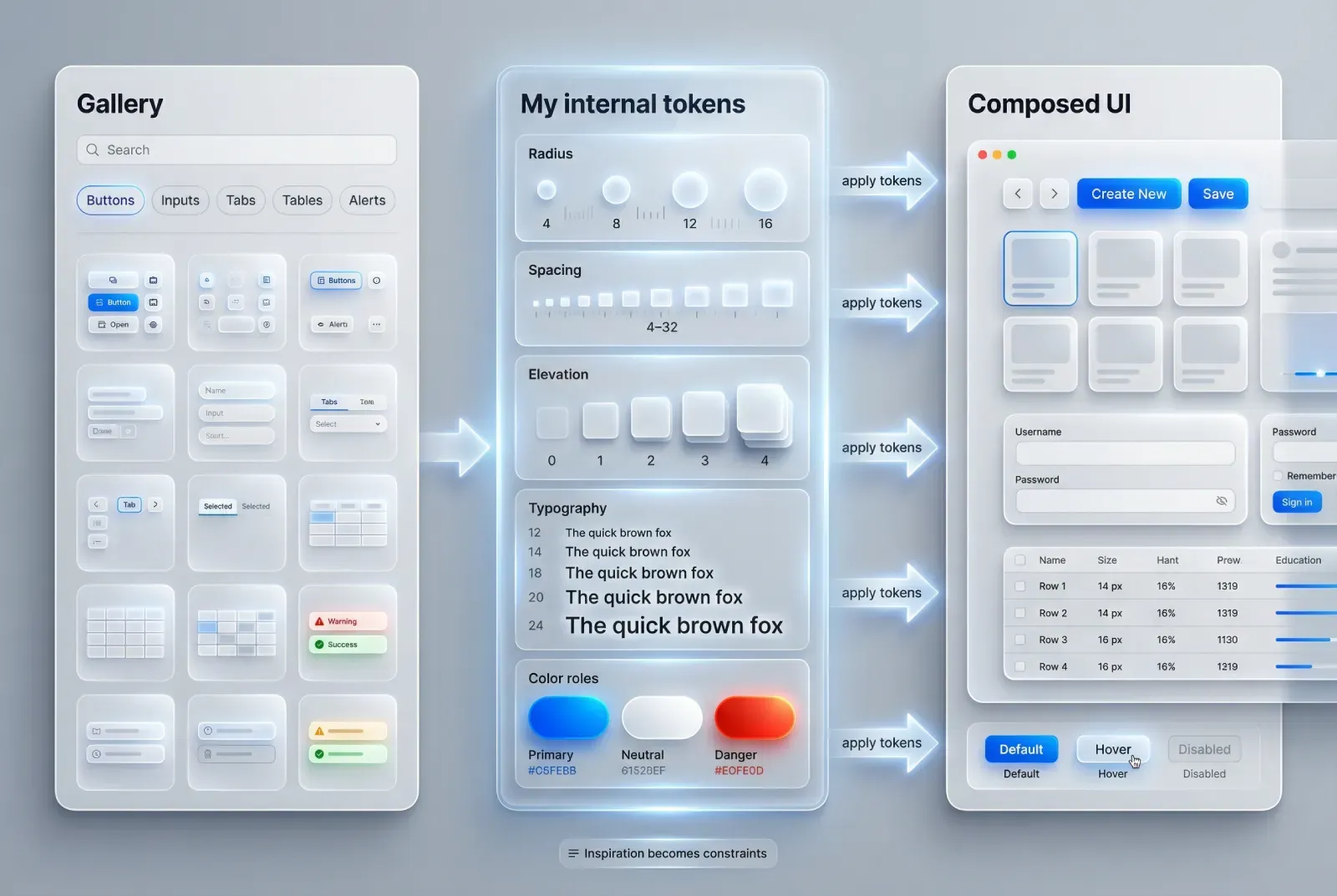
Pick what to include
You will need to draw a lot of sections with simple components: buttons, tabs, dialogs, calendars, chips, and so on for a complete design system. You'll have to provide the whole set, which you can only come up with.
Wanna know a secret? There are no new components in the world, it's the only UI that changes. Any dashboard is basically the same buttons, lists and tables. So you can go for ideas on these resources: Mobbin.Design, Webframe.xyz, Nicelydone.club and make a moodboard of the components that you need for a start. After a few intensive studies, you'll have an extensive list, where there will be everything - all the components that you will need to organise and redraw in your style.
How many templates to craft
The more versatile your templates are, the higher the chance to interest a potential buyer. Think about how to make a flexible design system, where there are many ready-made solutions. Consider all the options and states, because developers can ask questions: do the buttons change at onHover, what does the active input look like and so on. So you need to take into account the components' states in the future system.
Pick the patterns that are most common in life for your starting version: Tables, Navigation, Profile, Settings, and so on. Almost any application can be assembled from these basic parts. Therefore, when you give a lot of popular templates to choose from - it makes the design product more functional.
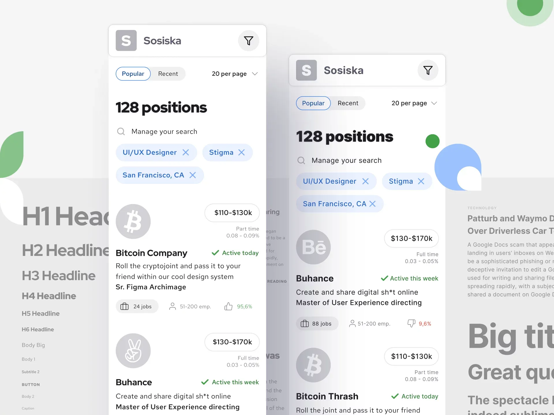
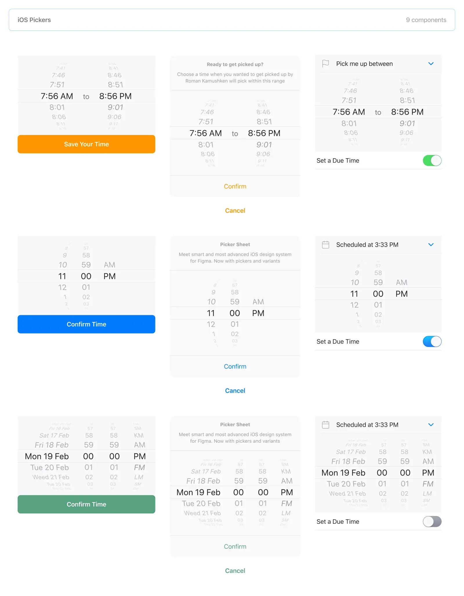
Mobile templates with search results - S8 design system
Use all available resources
The global design space is full of a variety of templates that can be profitably reused. Start to get used to effective work - why redrawing something that has been done a hundred times and is available for free with the authors` consent. At least you have to find a set of good icons, a design system is defective without them. Or look for those that are allowed to create commercial products. Only make sure if the license allows resale. Respect the authors, because now you are the author yourself! For a good presentation, you need devices mockups, and they are at Figma freebies. Look for interesting free things and think about how to use them in your product: Google fonts, devices mockups, vector patterns and etc.
Make a moodboard
Research popular design resources and put interesting screens into a separate project. Over time, it will become a moodboard where you will peep a particular element or verify that you adhere to the selected style. For example, you decide to make a system for mobile apps and you need a lot of ideas on this topic. Start with Pinterest, there is the smartest picture search and the opportunity to collect native moodboards. Then develop a plan to create a UI set in a certain style. Delve into the financial product design if you want to create a more niche design system. Explore the top applications in this field. Make a moodboard from the collected screenshots and get started.
An example of Material Design moodboard
Ready to start
You can safely start work with the detailed plan, but don't exhaust yourself if there is a need to retreat from the plan. This is your guideline, not your law book. It is important not to become a perfectionist until the first sale has happened and to spend your time effectively.
Routine is inevitable in this process, so change the order in the points of the plan. In the next part we will make a plan for a design system development in Figma.
We've found out that every designer should try to create their own design product. You'll either get boosted, or earn and get boosted. But you'll need to invest your own time. Are you ready to spend evenings out of the office for your own project? Or spend your days knowing you won't get paid for this job right away, if at all?


