


Roman Kamushken
Part of: Dashboard UI design: From KPIs to layouts that convert — the complete reference to dashboard design on Setproduct.
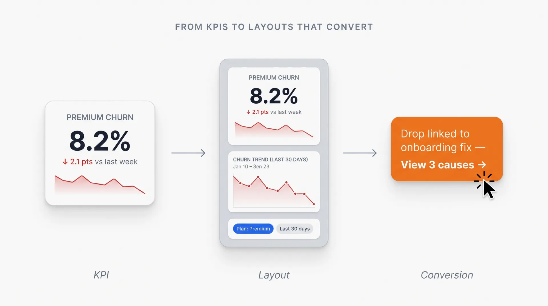
Why dashboard design matters
Imagine this: Marketers are drowning in data. Developers are stuck rebuilding charts. Stakeholders demand “simple” reports that somehow include every metric.
The bridge between chaos and clarity? You, the UI designer.
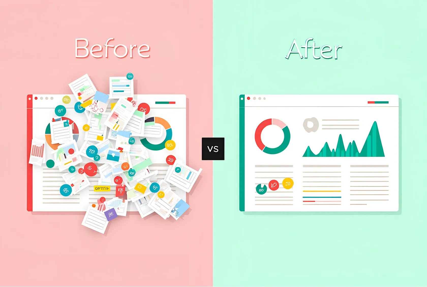
Marketing dashboards aren’t just graphs on a screen. They’re decision-making engines. A poorly designed dashboard costs teams hours in meetings, missed opportunities, and money.
When done right, it becomes a company’s compass.
This guide is not about fancy animations or the latest design trends.
It’s about creating dashboards that make data actionable, keep users up-to-date, and survive handoff to developers.
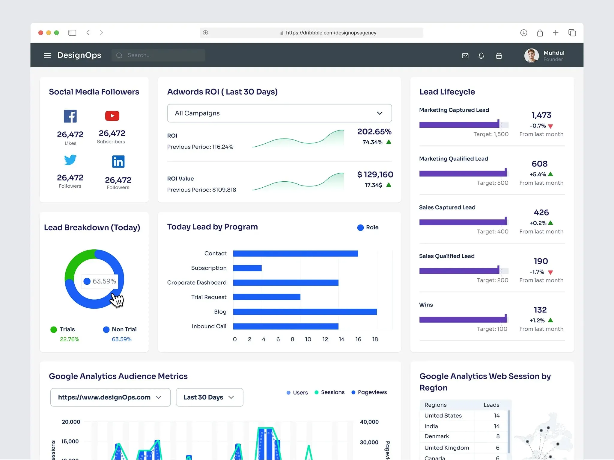
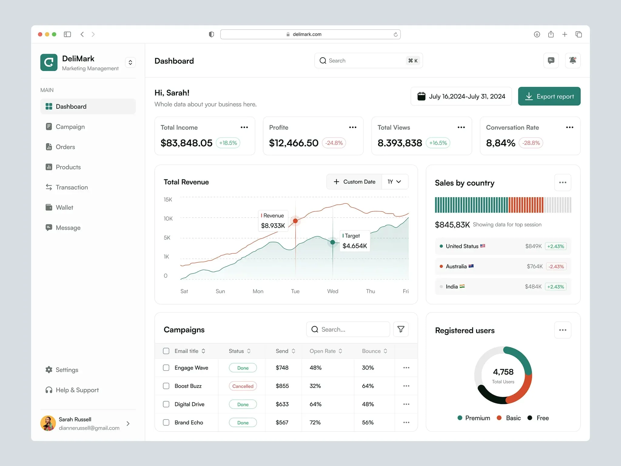
Marketing overview dashboard by Omotive
Dashboard anatomy

Every marketing dashboard has four non-negotiable parts. Miss one, and you’ll end up with a tool people avoid.
Start with global controls. These are the filters and dropdowns that let marketers tweak date ranges or campaigns. Place them at the top-left—that’s where eyes go first. Use simple toggles, not clunky menus.
Next, the key metrics bar. This is your headline act. Limit it to three to five numbers max. Example: "Website Visitors: 24k (↑12% vs. last month)." Big fonts, clean icons, no jargon.
Then, the visualization zone. This is where charts and graphs live. Never mix more than two chart types here. A line graph for trends and a bar chart for comparisons work 90% of the time.
Finally, action buttons. Every dashboard should answer "What do I do next?". Add clear CTAs like "Export Report" or "Set Alert" at the bottom-right.
Pro tip: Sketch a 12-column grid first. Developers will thank you later.
Picking right charts
Bad charts are why marketers lose trust in data. Here’s how to pick the right ones.
Use line charts for trends over time. Monthly website traffic? Perfect. Bar charts are for comparing stuff—like ad spend versus revenue. Scatter plots show relationships, like how social media clicks tie to sales.
Avoid pie charts. Always. They’re hard to read, especially on mobile. If you must show parts of a whole, use horizontal bars.
Labels matter. Put them directly on chart elements, not in a separate legend. And for colorblind users, add texture. Dots for one line, stripes for another.
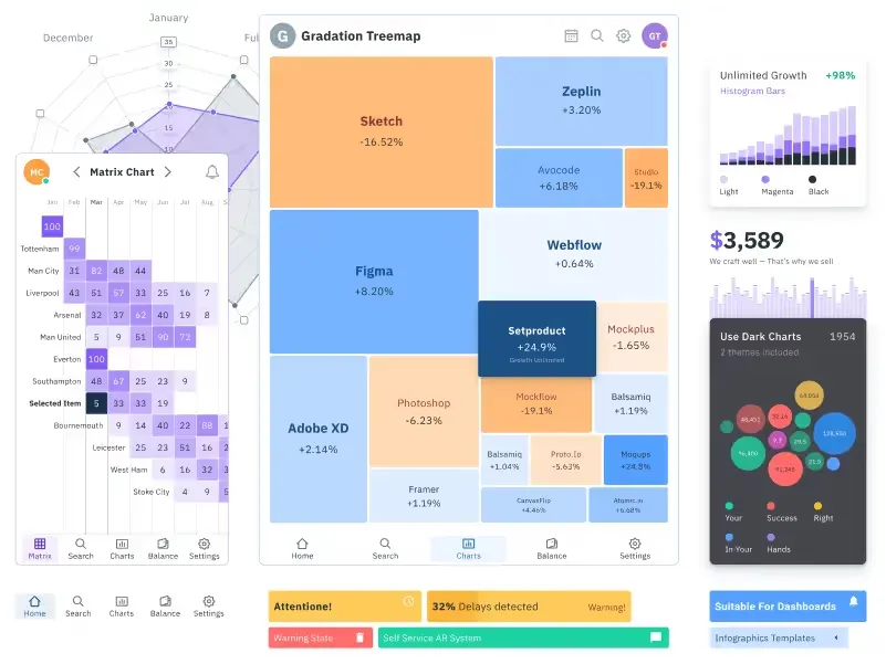
Use Figma charts UI kit to save time when designing marketing dashboards
Designing for mobile screens
If your dashboard looks great on desktop but fails on mobile, you’ve wasted your time.
Stack everything vertically. Filters first, then metrics, then charts. Hide secondary data under a "See More" button.
Tap targets must be at least 48x48 pixels. Tiny buttons cause rage-quits.
Tables are tricky. Let users scroll horizontally instead of squeezing ten columns into a postage stamp.
Test on actual phones. Not simulators.
Handing off to developers
Developers aren’t mind readers. Your Figma file needs to be their bible.
Define a grid system. Use 8px or 4px increments for margins and padding. Write it down.
Create spacing tokens. For example: "Small = 8px," "Medium = 16px," "Large = 24px."
Document interactions. What happens when a user hovers over a chart? How do error messages look? Annotate every state.
Share HEX codes and CSS variables. Better yet, use Figma’s variables feature.
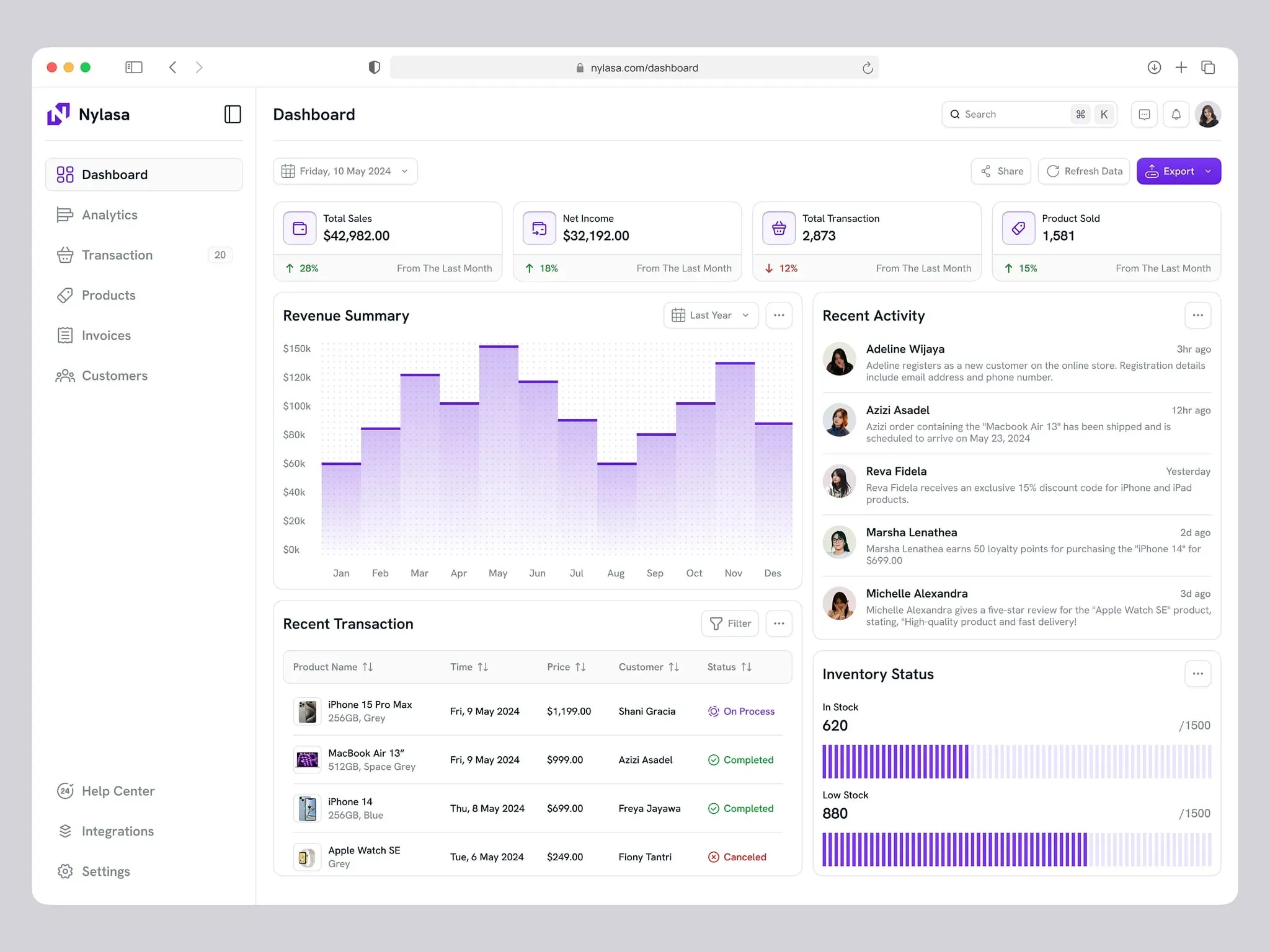
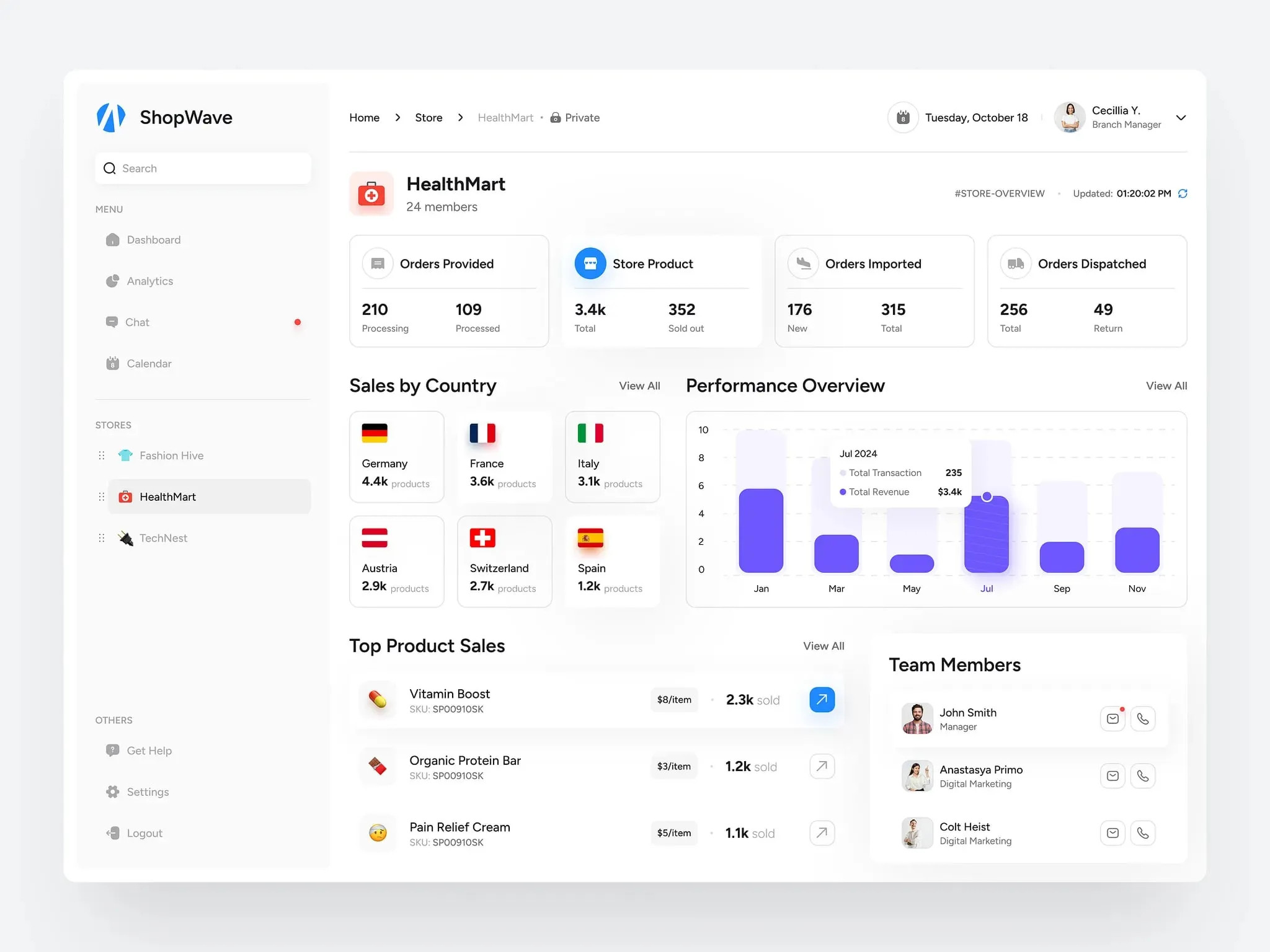
Track sales marketing dashboard by Bayu Sasmita
Accessibility check
Most dashboards fail here. Don’t be that designer.
Check color contrast. Tools like Stark or Contrast Checker will save you. Text needs a 4.5:1 ratio against backgrounds.
Keyboard navigation is a must. Can users tab through filters and buttons in a logical order?
Add hidden labels for screen readers. As well, Include onHover tooltips. Describe charts plainly: "Bar chart showing Q3 sales growth: 15%."
Offer a "low motion" mode. Some users get dizzy with animations.
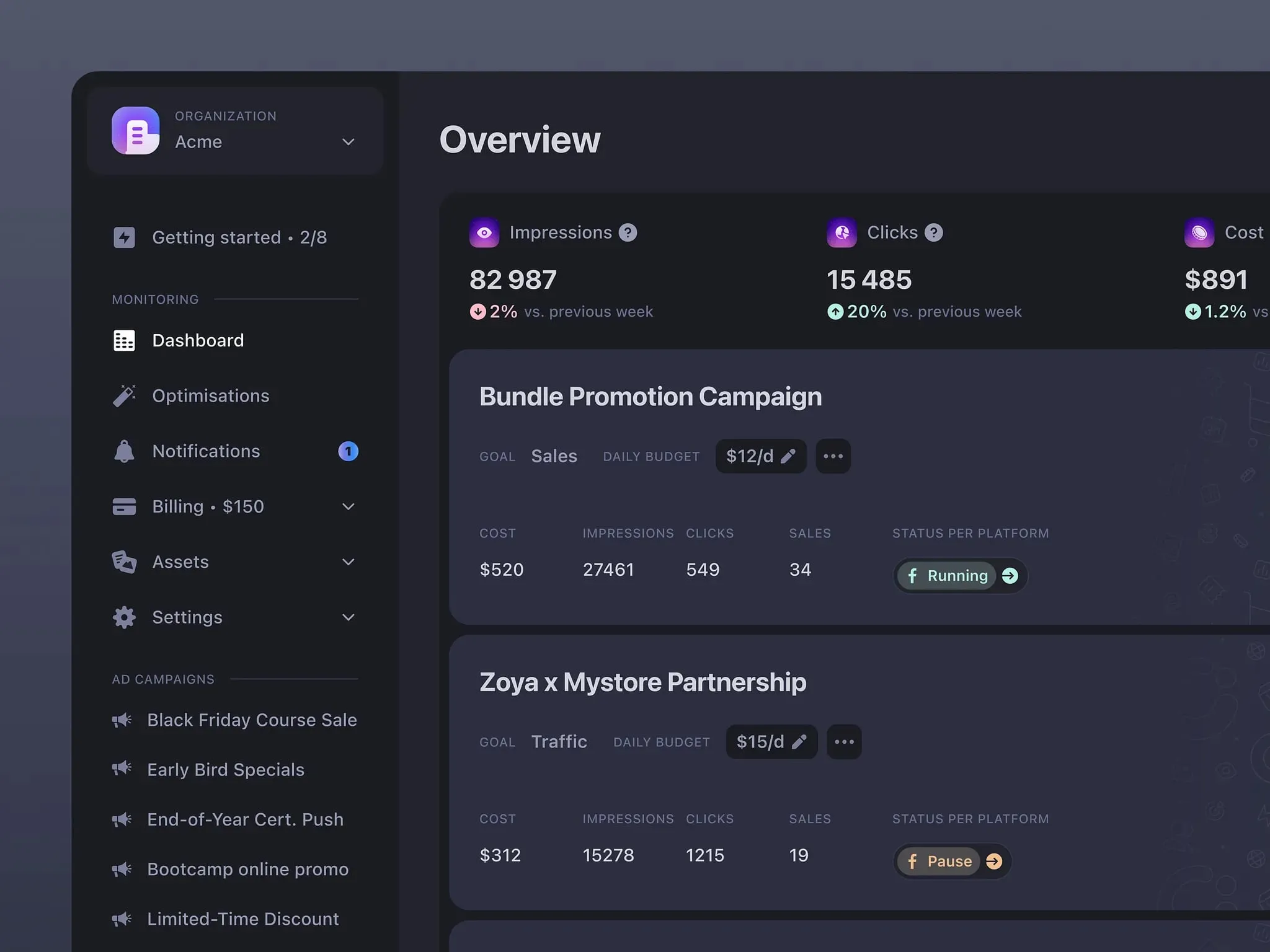
Sales dashboard by Delisa Agency
Style guide tips
Your style guide is the glue holding everything together.
Pick two fonts max. One for headers (bold, modern), one for body text (clean, readable).
Stick to a tight color palette. One primary color, two neutrals (gray and white), and status colors (red for errors, green for success).
Icons need consistency. Same stroke weight, same corner radius. Use Venice.ai image generator to brainstorm ideas fast.
E-commerce marketing dashboard by Vetrick Wilsen
Do’s and Don’ts
Creating a marketing dashboard is like building a compass.
It has to point users in the right direction without making them decode hieroglyphics.
Stick to the essentials. Test early. Work closely with developers. And always ask, "Would a tired marketer understand this at 2 AM?"
Do:
- Limit hero metrics to five.
- Test on real mobile devices.
- Annotate hover states for devs.
Don’t:
- Use pie charts. Ever.
- Skip contrast checks.
- Hide critical filters behind multiple clicks.
This guide was crafted using Venice.ai - a privacy-first platform that lets you upload brand docs, generate design assets, and even mock data visualizations without Big Brother watching.
Need templates that actually work?
Browse the Setproduct Figma Dashboard Kits. It’s packed with customizable components, from responsive grids to accessibility-friendly charts.
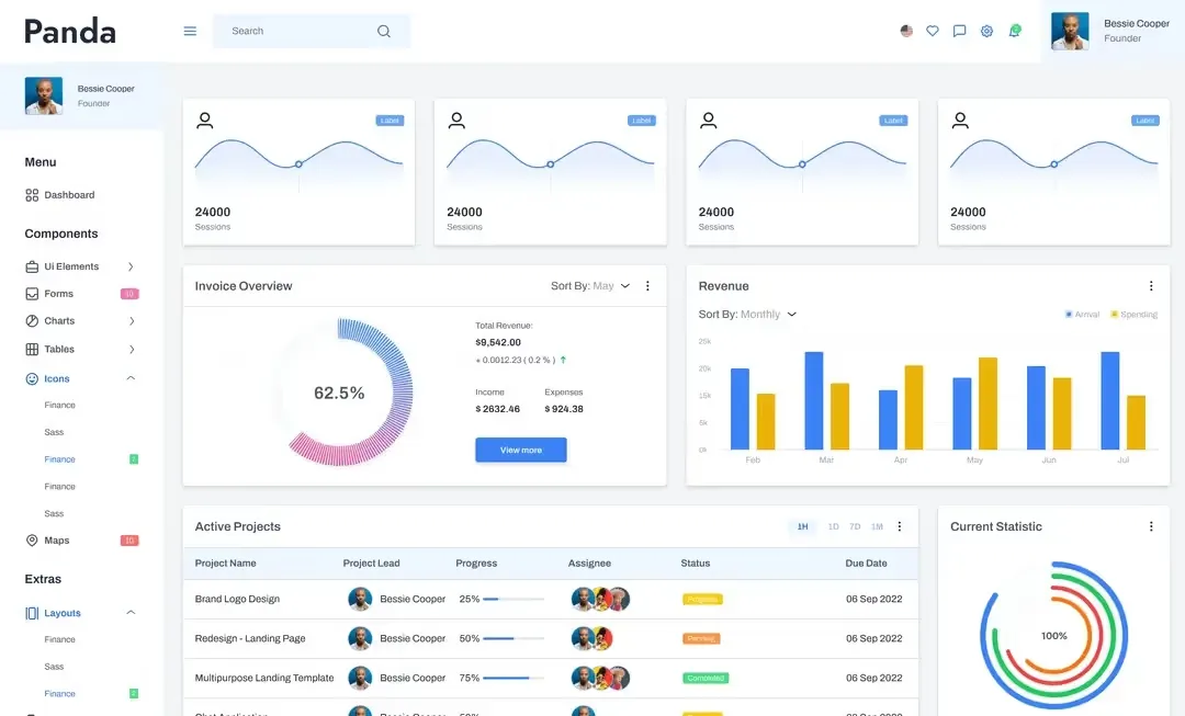
Marketing dashboard
Marketing campaign dark theme dashboard by Juliette Lagache


.webp&w=1920&q=75)
.webp&w=1920&q=75)

.webp&w=1920&q=75)
.webp&w=1920&q=75)


.webp&w=1920&q=75)
.webp&w=1920&q=75)


