


Roman Kamushken
Benefits of Button Groups
Button Group is a UI component consisting of multiple buttons which are grouped together to perform related actions. In digital product design it is a highly-used element that allows users to select from an options’ set or trigger different related actions.
Button Group explorations by Wouter de Bres
Pros of Button Groups’ using:
- Simplifies the UI due to the grouping related actions together
- Reduces mess and saves more screen space
- Improves user experience due to the easy processes of finding and performing related actions
- Enhances visual attractiveness and the UI’s aesthetics
- Can be applied for creating a clear and consecutive button group design language
Although, the cons exist too:
- Can create clutter if a lot of buttons are grouped together
- May cause difficulties while making decision if the user is offered with too many options
- Requires careful design-consideration that will provide usability and accessibility
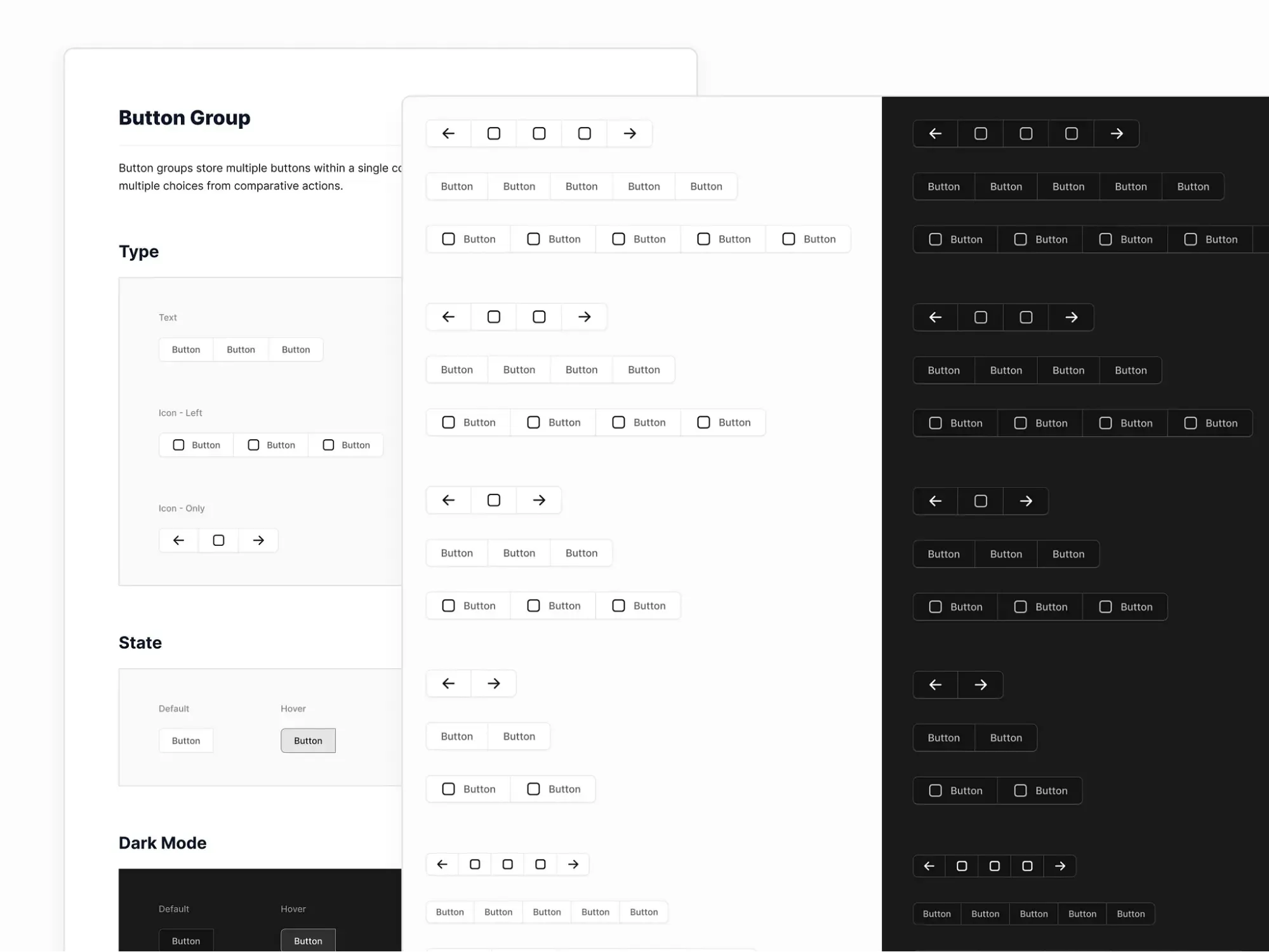
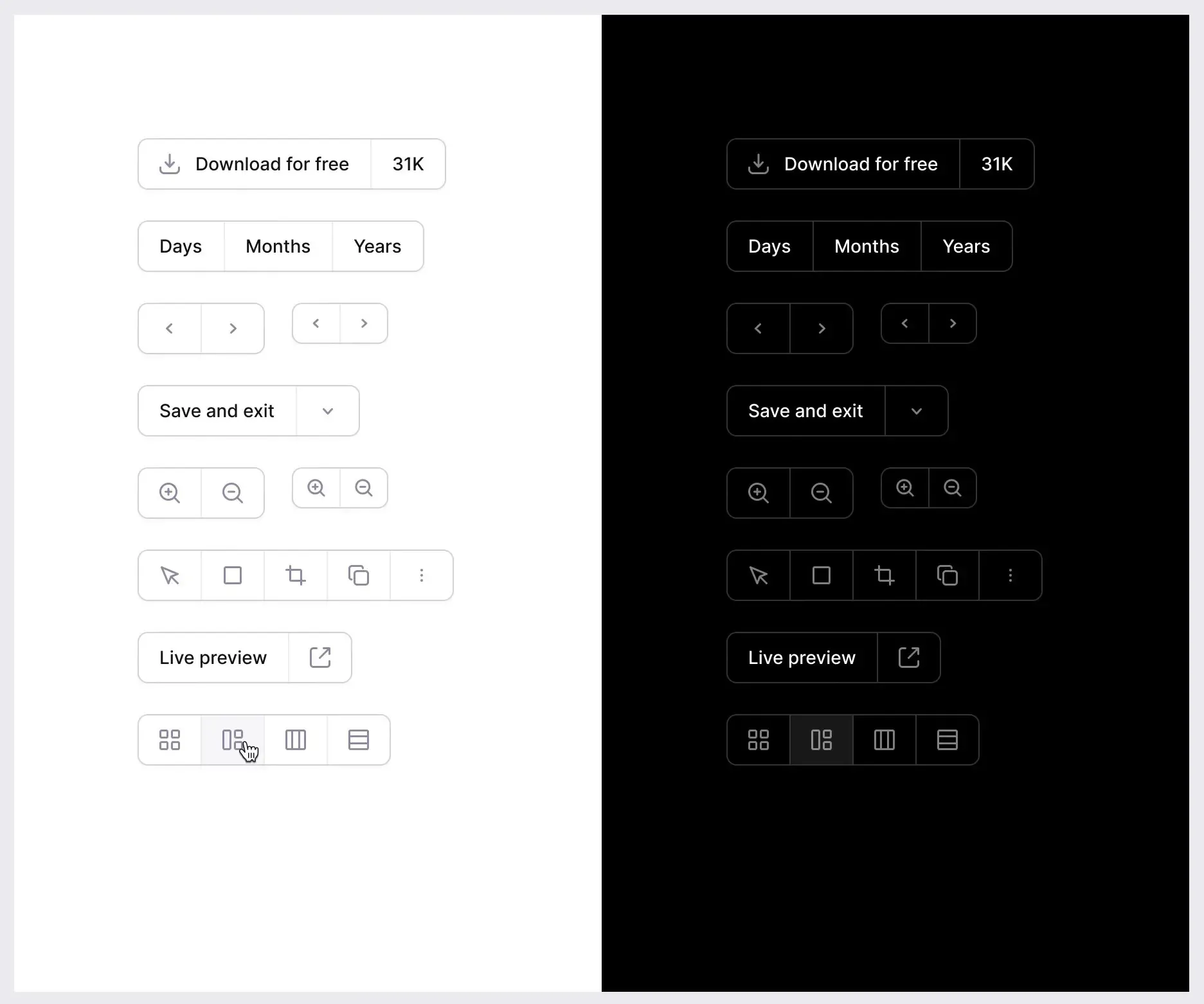
The Anatomy of Button Group UI Design
A Button Group is typically consisted of these following UI elements:
Container - the outermost element that wraps the buttons together.
- Do: Apply a design that creates a clear visual hierarchy + defines the Button Group’s boundaries.
- Don't: Use a container that is too large or too small for your case, because it may affect the buttons’ usability.
Buttons - the individual elements that conduct specific actions.
- Do: Make sure that all buttons have clear and distinct labels and are organized logically.
- Don't: Use a lot of different button’ styles, as it can lead to visual noise.
Dividers - the separating elements that divide buttons from each other.
- Do: Utilize dividers to craft a clear visual separation between the buttons + they can help the users to distinguish individual buttons.
- Don't: Apply too thick or too thin dividers, as they can negatively impact the buttons’ usability.
Button Group themes by Bunin Dmitriy
Icon - the optional element that can be used for providing additional visual context.
- Do: Apply icons that are easily recognizable and supportive for the label text.
- Don't: Put too many icons, if you don’t want to create visual noise.
In order to make a cohesive and effective UI component that helps in achieving the users’ goals - carefully design each element of the Button Group.
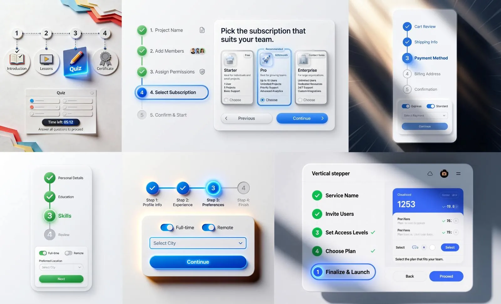
Use Cases of Button Group
Button Groups can be easily applied to a variety of contexts in order to provide users with a clear and efficient performance of related actions.
Let’s explore some examples of Button Group use cases:
Button Group component by Farrel Putra
Text Alignment
A Button Group can be used for making a quick and easy way to adjust the text alignment as the users need.
For example, a Button Group with three buttons that are labeled "Left", "Center", and "Right" will allow users to level their text just within a second.
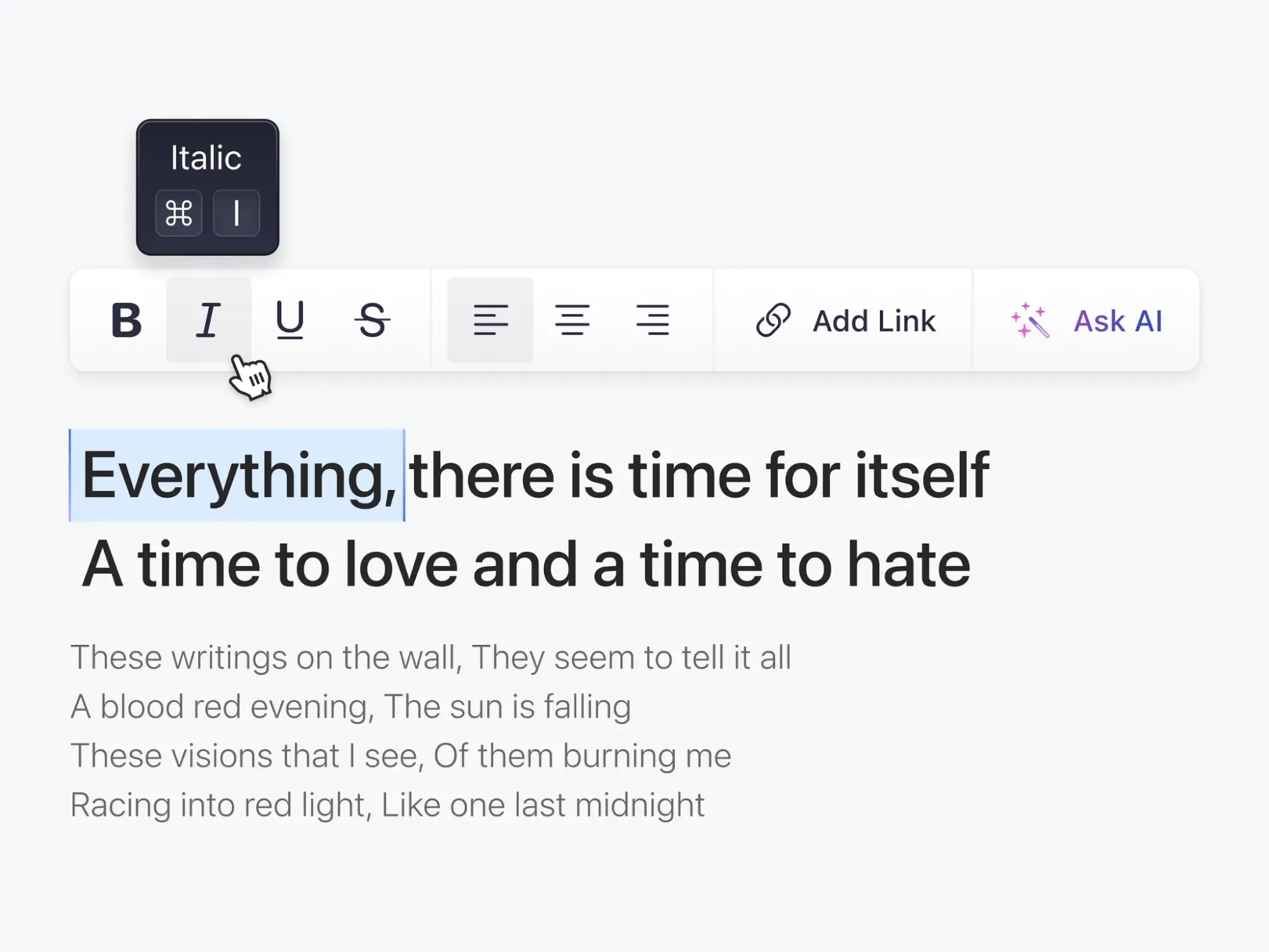
Text Styles
In the case of applying different text styles (bold, italic, or underline), a Button Group may conveniently format their text. Thus, a group with multiple buttons, such as "Bold", "Italic", "Underline" and "Strikethrough" can easily implement different text styles to the user’s text.
Button Group filter UI by Kevin Dukkon
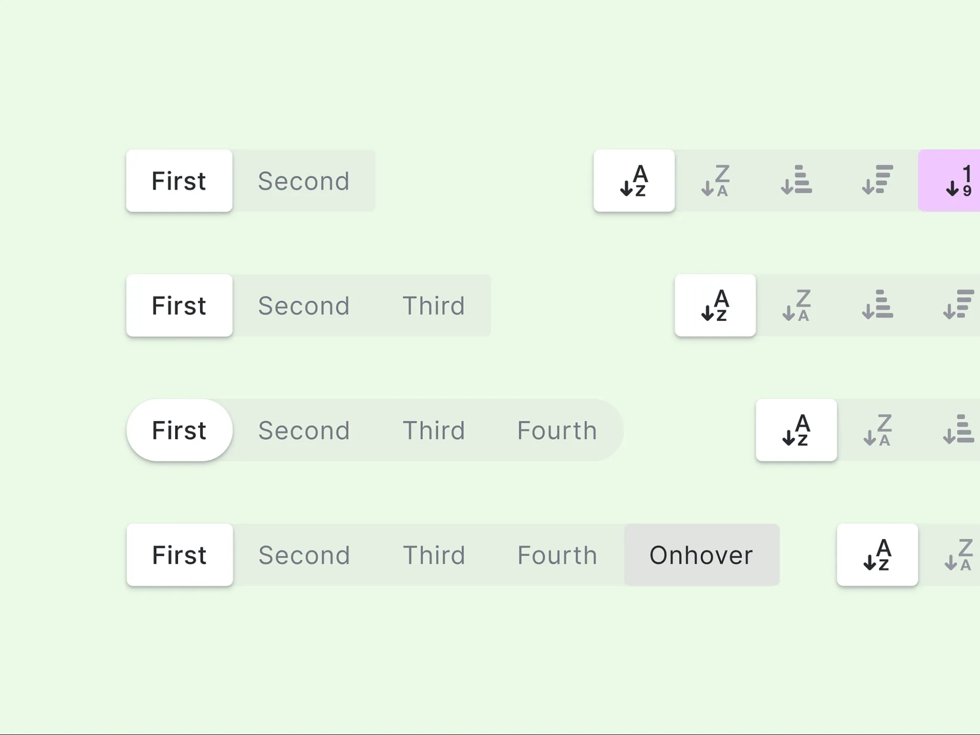
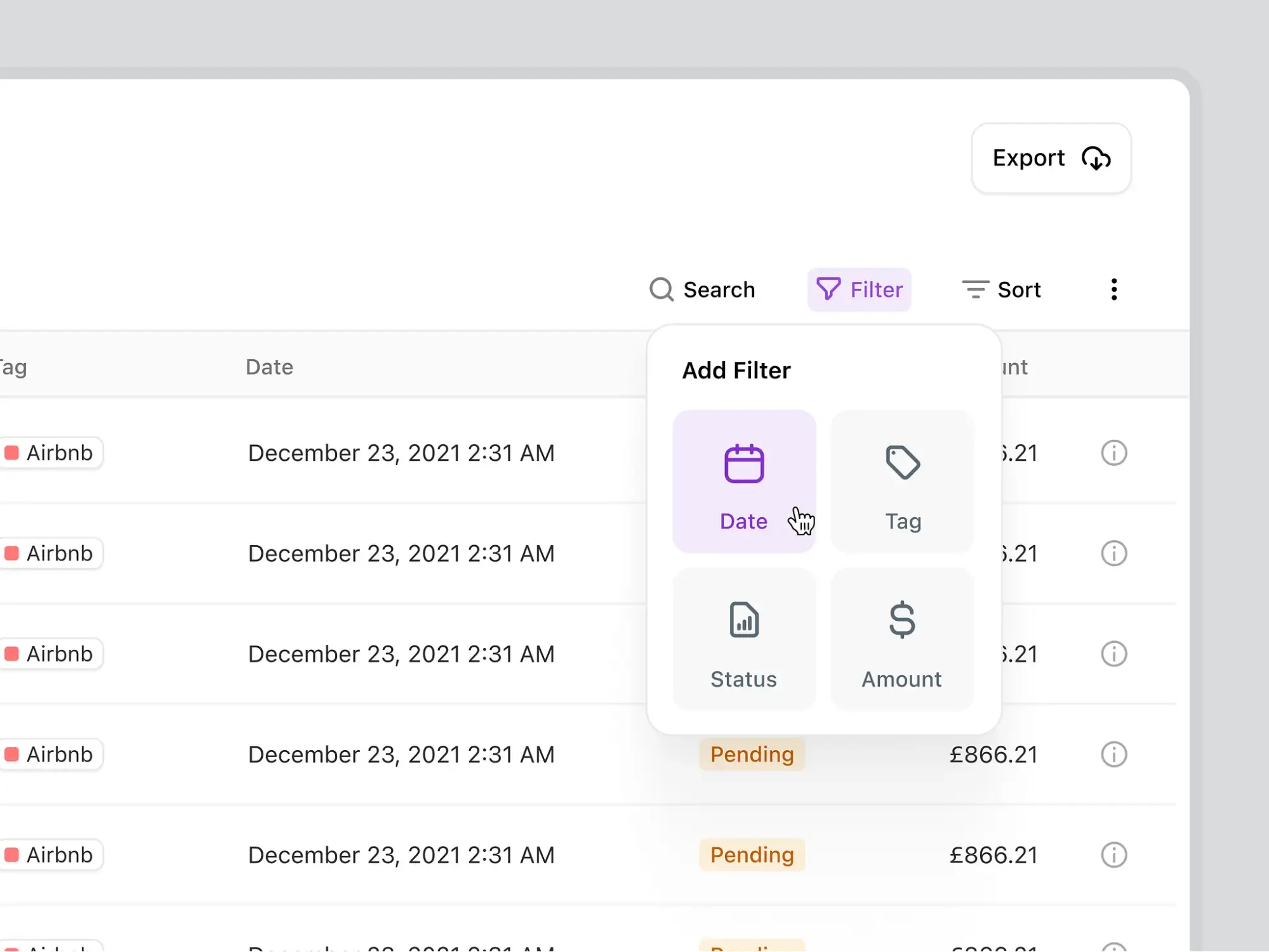
Filter & Sorting
For filtering or sorting data in a table or list, a Button Group is useful for narrowing down or organizing the data.
In an e-commerce website, a group with buttons: "Price: Low to High", "Price: High to Low","Alphabetical" can be used by customers for sorting products by price or name.
Button Group in account settings by Vasile Labici
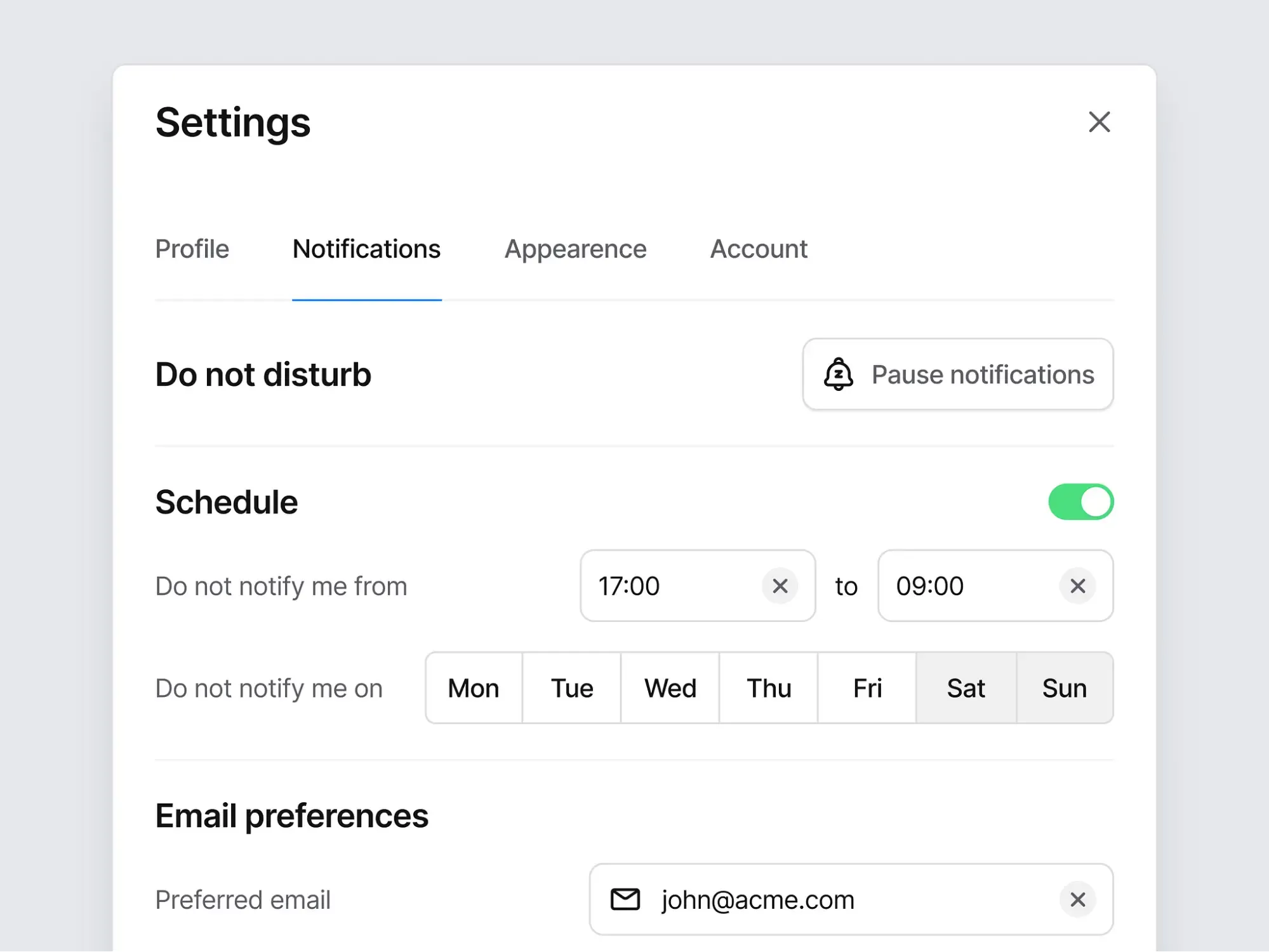
Date & Time
If you need to provide the users with the date or time selection, a Button Group, again, is helpful. It may offer a convenient way for the users to choose a specific period.
So, for instance, in a calendar application, a group with buttons named "Today", "This Week", "This Month" and "This Year" can be utilized for quick data range’s selection.
Display View
Switching between different display views, such as a grid or list - again a Button Group.
This feature is able to provide a convenient method of changing the way the users’ data is displayed. As in a photo gallery application,"Grid", "List", and "Map" buttons allow the customers to switch over between their display views.
Pagination
In order to navigate through multiple pages of data, be sure that a Button Group can simplify the users’ process of moving between pages. Such as with the case of a search results page, a group with "Previous", "Next", and "Go to Page" buttons lets the users guide through a huge number of similar pages .
Direction
Additionally, a Button Group may be used to offer the customers a simple path for moving forward or backward their checkout processes, if we are talking about the case of changing the direction of a workflow. Therefore, such buttons as "Back", "Next", and "Cancel" can give the users an opportunity for easy movement through their checkout process.
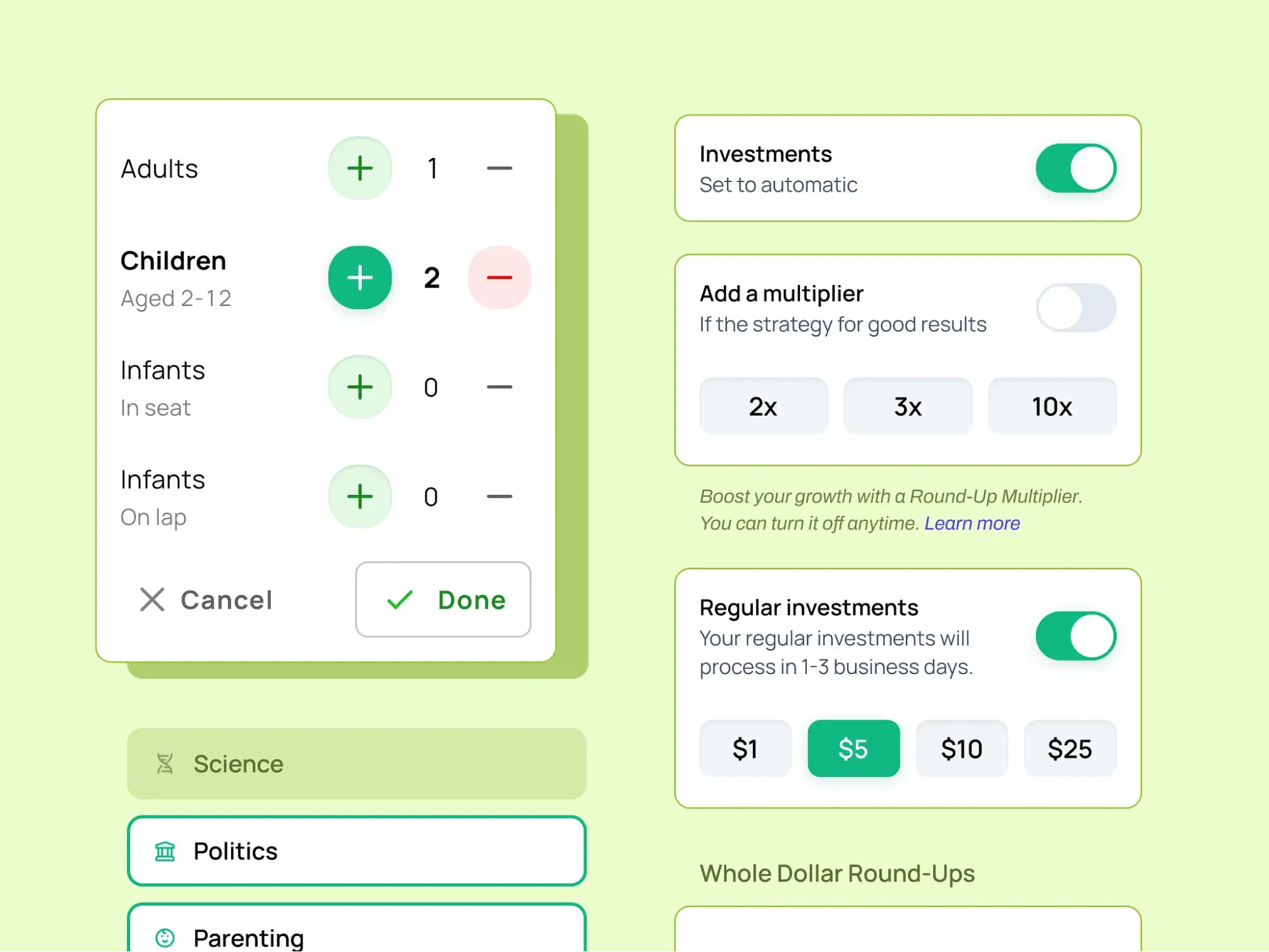
Button Groups and predefined values
Predefined Values
A Button Group with "0.1%", "0.5%", and "1%" buttons (in the context of a cryptocurrency trading application) is able to provide users with a concrete technique to choose from a list of predefined options.
That’s why such a group can help the customers to set their Slippage Tolerance, as the example.
Categorizing
In the following case a Button Group works too, e.g. in an email client, a Button Group with controls that are labeled "Inbox", "Sent", "Drafts" and "Trash" can be applied to enable the users to categorize their emails into different folders or, generally speaking, to adjust data into different groups.
Split Button group by Farrel Putra
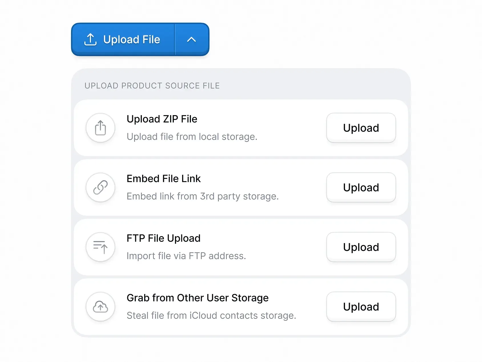
Split Button
For a convenient way to perform a primary action and access additional options - choose a Button Group another time.
Like in a text editor, where a Button Group with a primary “Save” button and a dropdown menu with "Save As", "Save All", and "Save As Template" options allow customers to save their work as needed.
Zoom
And last but not the least, the usage of a Button Group is a great thing for facilitating the process of adjusting the zoom level. Look at a mapping application, a group with buttons "Zoom In", "Zoom Out", and "Reset Zoom" is perfectly used by customers for getting the right zoom level of the map.
Button Group: The Usability Tips
Button Groups by Orman Clark
In the end, I want to share with some usability tips to keep in mind while designing Button Groups:
Apply a clear and consistent design: Use a consecutive design-language throughout the designing Button Group to create a cohesive appearance: apply the same font, color scheme, and button style for every detail in the group. Consistency crafts two senses - familiarity and understanding. Thus, the users realize the purpose of each button.
Use Visual hierarchy: Don’t forget about visual hierarchy, if you want to get a clear distinction between the buttons and the container. The usage of different colors, font sizes, or button styles will help you to create that noticeable separation. The hierarchy allows the customers to find the needed button quickly.
Try to avoid too many options: A lot of options in a single Button Group can confuse the users while they are making a decision. Instead of this, reduce the number of options to 3-5 buttons and clearly label them to help everyone to understand the point of each button.
Utilize different styles for Button Group: Use diverse button group CSS design styles for the Button Group container to create a visual distinction between the buttons and the surrounding content. For example, a shadow style for a sense of depth or an outline for a sense of separation.
Escape long labels: No more than two words! Long labels are overwhelming. They don’t assist the users, they confuse them. So apply only short and concise labels, e.g. "Export to CSV File" => "Export CSV".
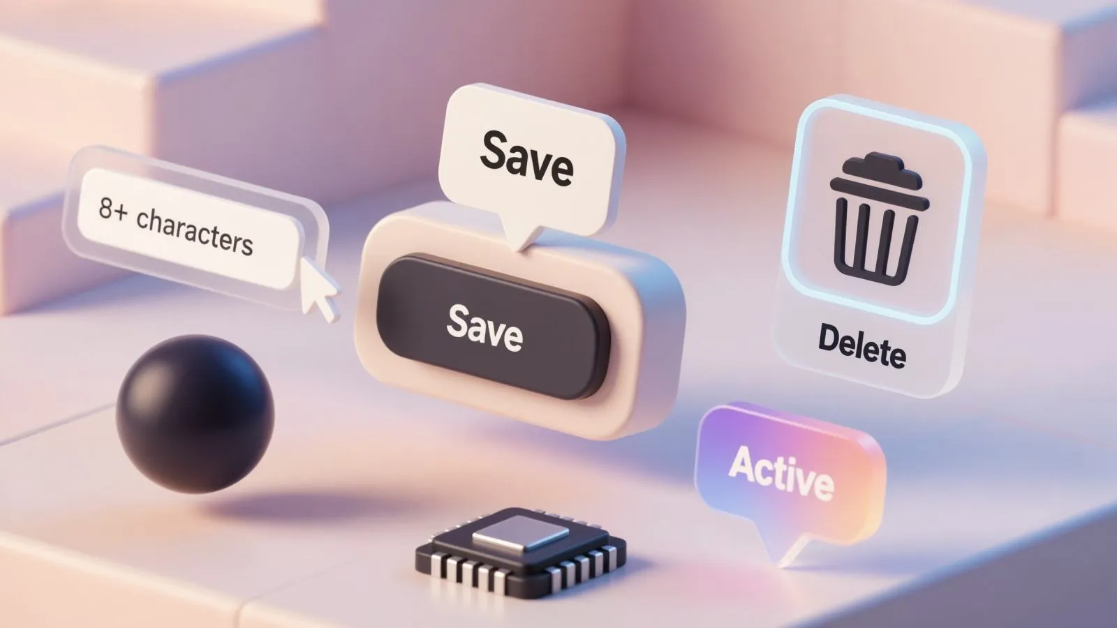
Use a selected state: A prominent selected state indicates which button is currently active. It can be achieved by applying different colors, font\button styles. As a result - a visual distinction between the selected and unselected buttons. For example, a selected button is blue, while unselected buttons are gray.
Buttons Group in code
- Dark themed Buttons Group with SVG images
- CSS3 patterned Buttons Group
- Button Group in Figma React UI kit
- ButtonGroup component in Material UI
- Button Groups are used in Lightning Design System
- Button Group in Base Design System
- Button Group in Clarity Design System

.webp&w=1920&q=75)
.webp&w=1920&q=75)

.webp&w=1920&q=75)
.webp&w=1920&q=75)


.webp&w=1920&q=75)
.webp&w=1920&q=75)


