


Roman Kamushken
Themification of tables
In the previous article on the tables design in Figma, we found that the basic element of creating any data grid is a cell component, within which everything necessary to remain in one instance and build tables cell-by-cell is hidden. Now let's speculate on its structure: what elements are embedded, use cases, consider the tables themification through color tokens. And finally, we'll tell you about the transfer of specifications to developers and the tables integration into React/Angular frameworks straight from the Figma design system. Still by hand, because the future is still somewhere there.
Let's get it started! I will start with the demonstration of useless, but cool effects of customising the entire table through the main master-cell:
Selecting the desired layers in the cell master component and propagating all the changes into the table
Cell-component composition
Building tables with the help of components is an algorithm that is hardly required by every project, especially for a serious design system that is used by designers and developers within the organisation. But since Figma gives the components, then they need to be used to the maximum.
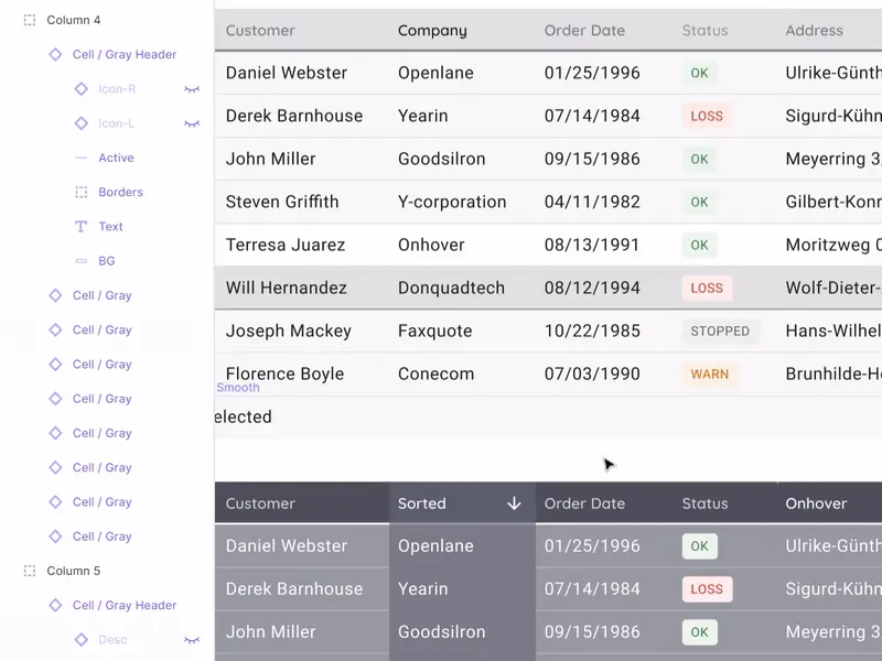
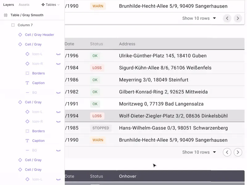
The composition of the cell is formed from the embedded layers, some of which are hidden. To create a universal cell for all occasions, you need to know about data grids much more than everything. The composition is determined based on how diverse instances of cells we want to get.
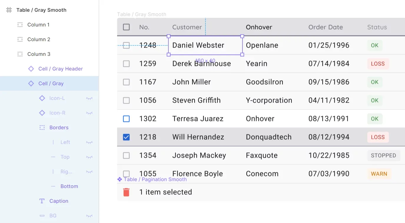
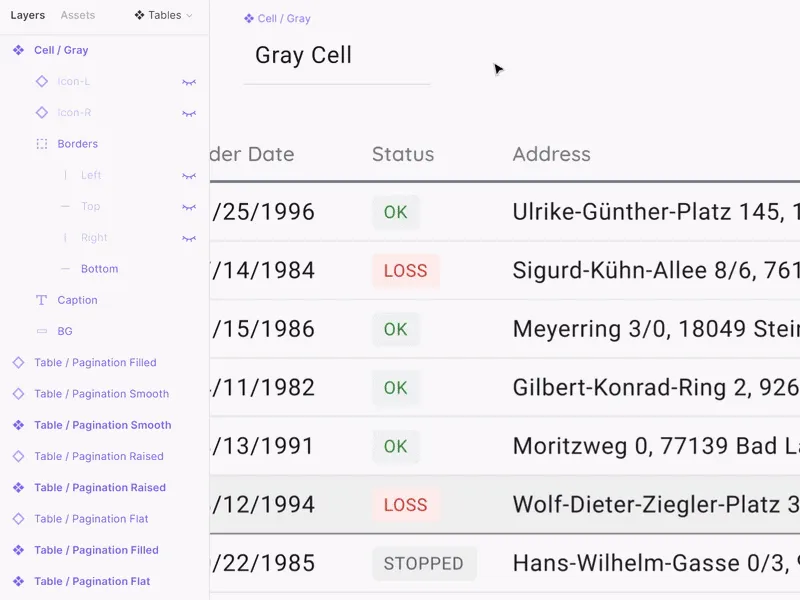
The structure of the layers is on the left in the sidebar
Cell anatomy
• Icon-L/R - two hidden icons placed on the sides of the cell on the left and right respectively. By default, you can make them visible to show the sort status. Icon-R can be activated and replaced with an icon, for example to enhance an action, or to display an additional function
• Borders - four independent lines pressed inside to all sides of the cell
• Caption - text element directly with it's contents
• BG - background component to get new states in the future
Let's take a closer look at each of the items.
Icon-L/R
To get the cell in the sorting state, it is recommended to activate the Icon-L layer. Thus, you don't need to detach the instance, it is enough to switch the content of the icon itself to show the sorting order in descending or ascending order. It is believed that any icon library is already integrated in your design system and then the direction of the arrow is quickly switched through the Instance menu. The text can be shifted from under the icon with a simple technique by hitting several times on the space bar and it's not a crime:
Whether to create a new component due to the inability to move the label,
when the icon is disabled, or to indent with a space – you can decide for yourself
Icon-R activation is useful when you want to show the possibility of additional action in the cell. For example, an ellipsis for a menu, or a pencil icon if the cell may be edited:
Do you remember that instances in Figma can be replaced by pressing Ctrl/Cmd at the time of a drop?
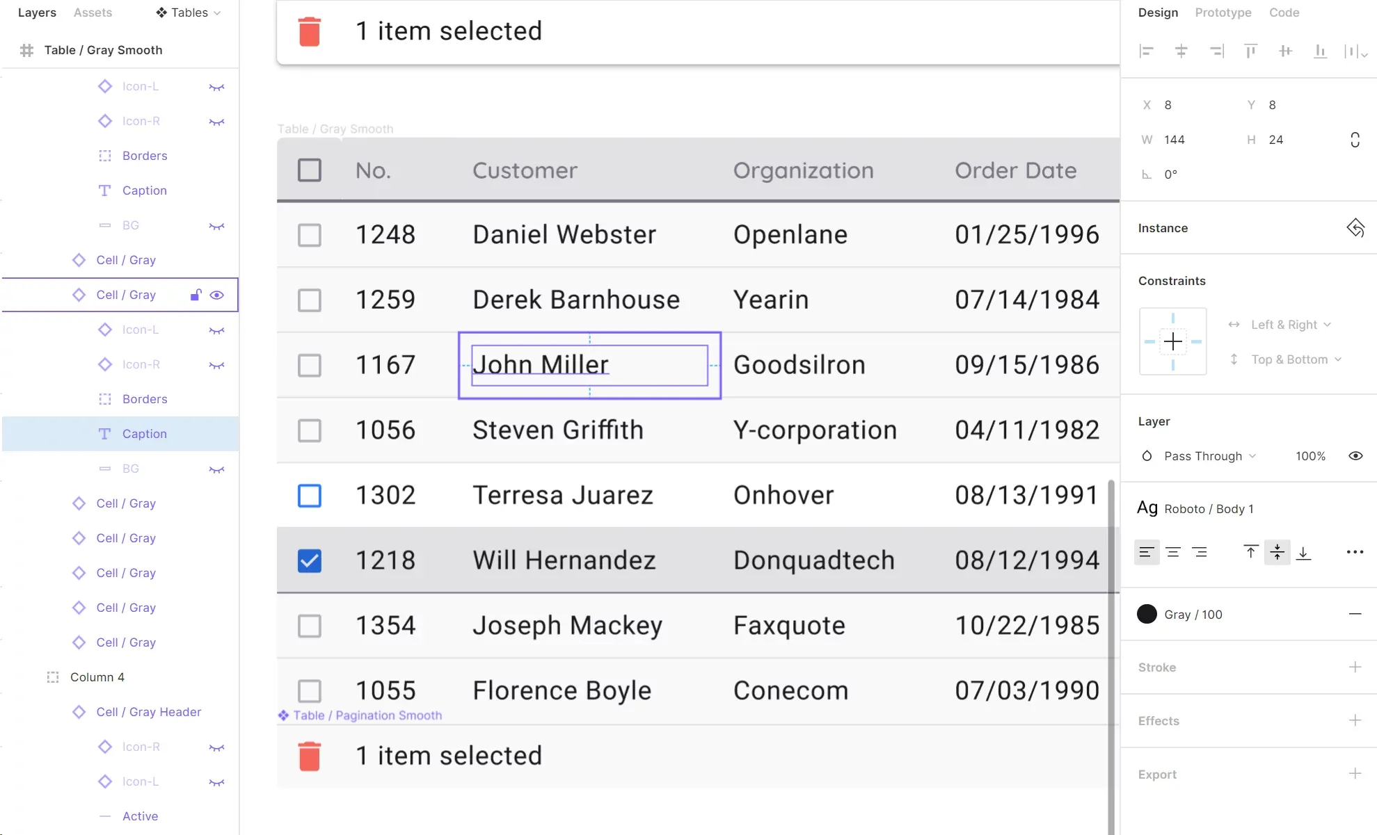
Borders
The insertion of independent separators on the four sides of the cell is, alas, a forced life hack due to despair We all understand that the design component in its capabilities should strive for the component in the code, which means that the independence of the borders should be set at the level of properties, but not with crutches. Unfortunately, it is still not implemented in Figma yet (2019), and Axure, for example, has long been able to do it. Borders are especially necessary to control the division of content throughout the table. Color, thickness, even with dotted lines. Create tables as you want:
The borders are arranged in left-to-right clockwise order.
By changing the color for them in the master, we can quickly change the separators in all tables
Caption
With this element, everything is simple: the text element is stretched over almost the entire area of the cell, but with small internal indents, so that the alignment of the numbers on the right side looked proportionally. By putting left & Right / Top & Bottom constraints, we get unlimited scaling in height and width with the ability to direct the text as you like without losing visual quality.
The internal indents from the text field to the cell borders is 8dp. For tables of higher density, 4dp can be used
Background
For each cell, I prefer to have an additional background layer that can be used to round corners. Unfortunately, in the instance, you still can't specify rounding the corners independently in Figma. As above in the case of borders. You can change the state of a cell or a row, for example, by making it blue. It turns out to be the Selected style:
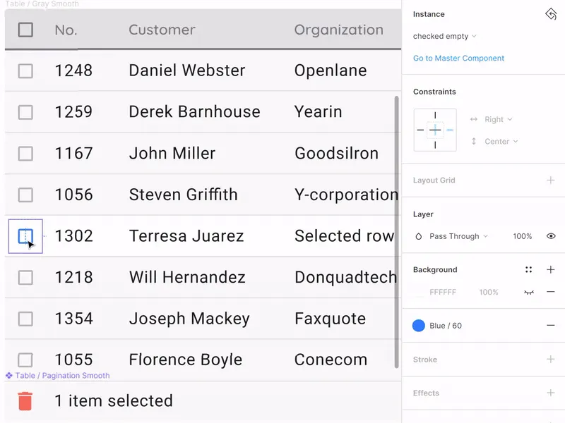
If the current task requires frequent switching of row states it is recommended to place a cell with a new style into a separate component
Design system tokens
Styling and implementation
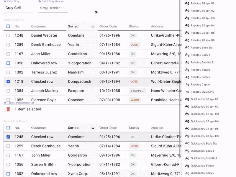
This article would not be complete without examples of real tables selected according to the above specifications (it's fashionable to say design token nowadays). Now we are preparing all-in-one framework in Figma / React / Angular for a quick start of web applications of any complexity. This system will gather many components to solve any prototyping and development tasks; and tables are one of the necessary sections, which we treated with increased attention. So, data grid tables are available in four variations:
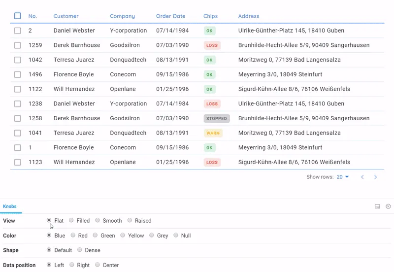
All these tables are fully in the code, taking into account the states, sorting, the presence of badges and
their matching the overall style. Pagination will be improved over time
Themes for tables
• Flat - simple data-first material table, but with a little customization
• Raised - table turns into a card
• Smooth - acquires soft color saturation
• Filled - painted completely (specific case, for example for an accent)
As you can see from the GIF above, certain attention is paid to the states: onHover, onClick, and sorting. This type of detailing became possible through the use of design-tokens from Figma that were transferred to developers in a clear manner. They had only to intercept the necessary shades from the color system in the Setproduct Design System and fasten it into the ready-made React framework to get such data-grid, which would suit us completely. Thus, future users of our system will have many options, based on the same component of the table, but stylized variously through SCSS.
Color specs
To be honest, the description of our approach to the color system requires a separate article. But not before there is an opportunity to capture and store tokens for a grey theme in one design system. In this Figma file, as a demonstration, you can see that the entire color palette, in addition to the declaration in global styles, is also converted to components. Thus, the developers get the binding of the color system to the tables for a minimum of clicks in the Figma:
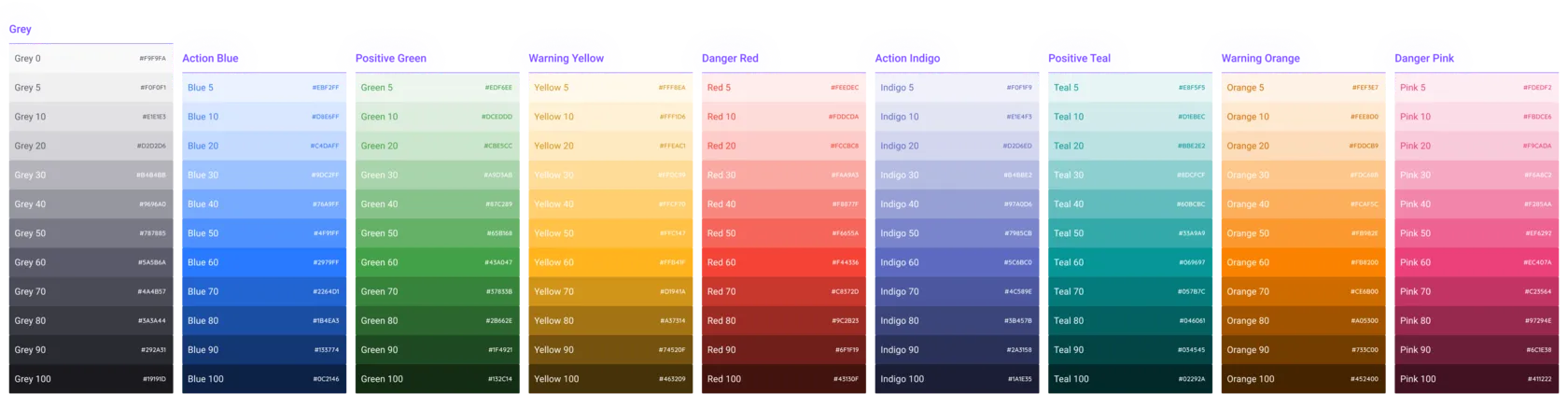
Grey, 4 primary colors and 4 alternative colors. Gradients are here as well
Who really needs these red tables? Who knows.. But our product is aimed at covering all kinds of cases. If we don't use these styles, that just most likely means we use trivial tasks. We show the tables in 5 colors in Storybook by default.

Our React documentation . It allows you to quickly organise a preview of all table styles in any color. It is a very good service, apart from functionality, it helps to catch bugs in styles. We project a similar concept of "four styles" onto all components in our system. I'll tell you about it one day…
That's all I wanted to say about the design of tables through the component. Thanks for reading this. In the near future there is a series of posts on the mentioned product is planned - Setproduct Design System. So, stay tuned!


.webp&w=1920&q=75)
.webp&w=1920&q=75)

.webp&w=1920&q=75)
.webp&w=1920&q=75)


.webp&w=1920&q=75)
.webp&w=1920&q=75)


