Styling ideas for React checkbox component

Modifying Chakra UI styles for a checkbox component to redesign & visually enhance it. This post contains UI design ideas, live components, code samples and some inspiration to assist coders design better.

Design & Code

Published on

October 4, 2022

|

5 mins read

Blog

Checkbox UI design – React component styled in Chakra

Navigation

Subscribe to newsletter

Thank you! Your submission has been received!
Oops! Something went wrong while submitting the form.

By subscribing you agree to with our Privacy Policy.

Share this post

Roman Kamushken

When to redesign a checkbox

<span class="blog_big-paragraph">When examining ways to improve the UX of your web app, start with a single component! By tweaking Chakra UI checkbox styles, colors, and states, you can achieve a faster response, better accessibility, and a more satisfying overall UI design lift-up.</span>

There are several parameters to modify for a checkbox that affect it's UI design. By combining the check icon shape, it's color; or adjusting the whole container corners radius, shadows, and background – you achieve UI performance, reduce user delays and pivot the whole web application to more clear, accessible, and modern.

Here are the params we are going to twist today:

  1. Container corner radius
  2. Check icon redesign
  3. Background states style
  4. Color themes

All further CSS customizations are based on several aspects to modify: BG color, corners, border, and shadow. By mixing and styling them you will achieve visual harmony, a slick experience, and an overall user positive attitude to your app.

Let's get to it.

{{spacer-64}}

Corners radius
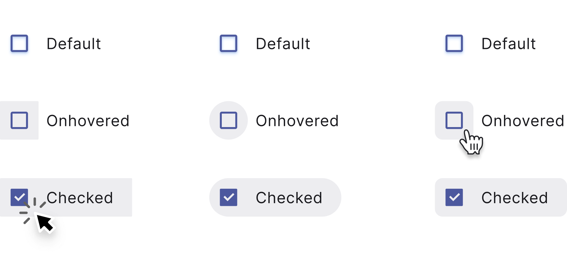
Checkbox component border radius CSS

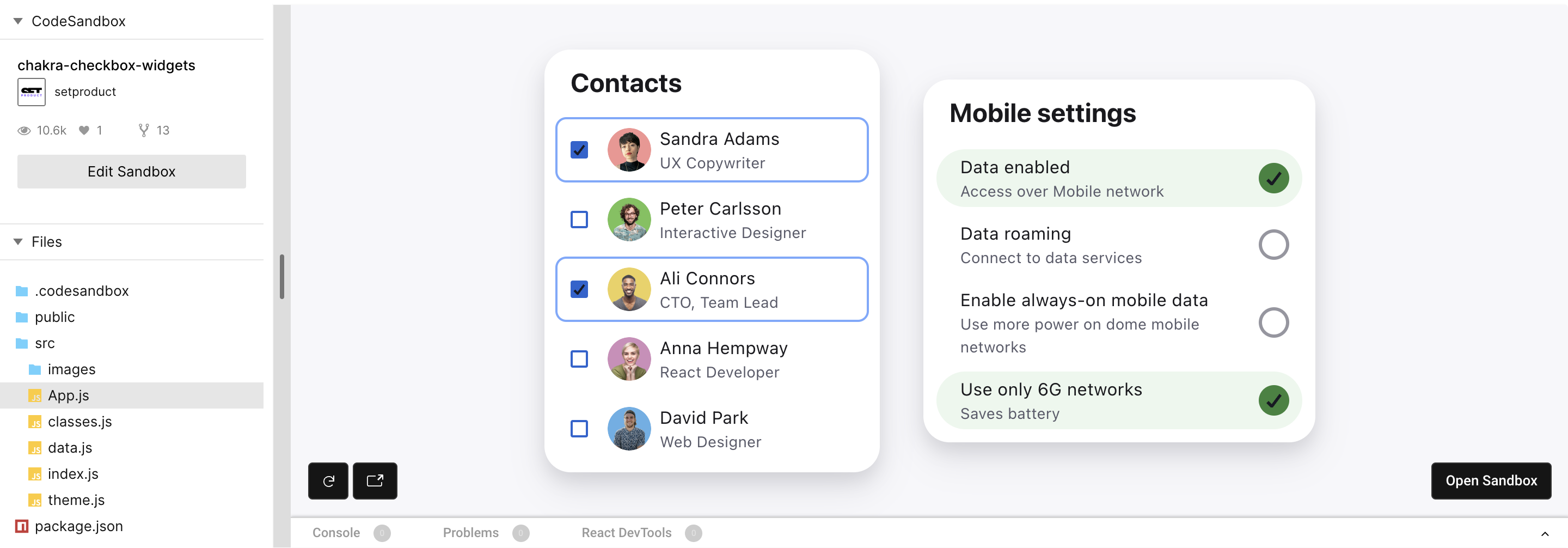
Adjusting corner radius value is the key to quickly change a checkbox container look, especially when the component is checked, or hovered.

When a checkbox set to selected, by filling down the whole container we can additionally highlight the change of state. Shaded grey, blue or indigo color makes the container visible, so we can manage corners to configure components shape.

Experimenting with corners makes it easy to fit a checkbox component with a proximity of your particular interface UI. For example, highly-rounded corners will be a best fit for the same rounded visual scheme, on the other hand tiny-rounded shapes is a kind of standard for enterprise GUIs. Where is a button may look like a brick, and you should keep this consistent for checkboxes either (e.g. border-radius: 0-2px).

{{spacer-16}}
Open in Sandbox

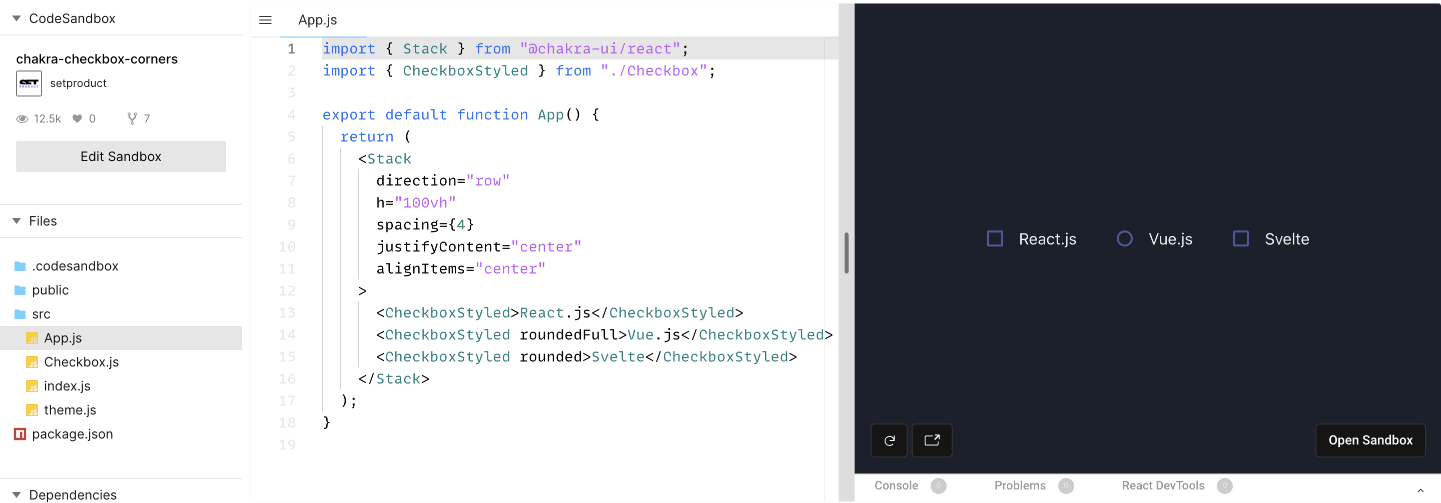
See how background expands and wraps a caption when a checkbox is clicked? When a text label is hovered it makes obvious for the user – clicking here will toggle the checkbox state as well. A caption involved into the action.

Play with corners for your own by editing radius, controlRadius values:

Checkbox.js

{{spacer-64}}

{{setproduct-gpt}}

{{spacer-64}}

Checkbox redesign
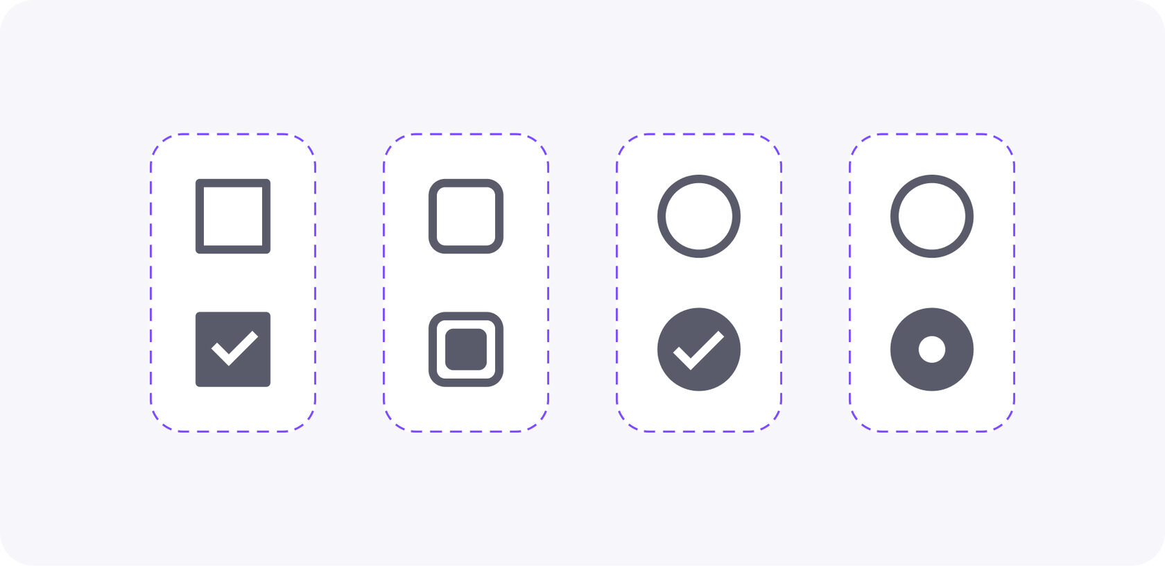
Checkbox UI design inspiration
Chakra-UI styled checkboxes

There is no outcome redesigning checked/unchecked icons for the vast of majority cases. The user knows – an icon checked means a confirmation of conditions changed. When a checkbox appears, it means everything is OK, and the new state is confirmed. Any other icons instead of ✓ may confuse.

However, in the world of GUIs (especially from the recent past), you can observe various metaphors to correspond to the active checkbox state. Rounded checkbox, donut-like, squared, outlined, and others.

Stay between the default checkbox and circle-shaped so as not to confuse users, unless your app UI design requires exclusive styles or uncommon solutions.
For example, squared checkboxes are commonly used for enabling/disabling, while rounded is more utilized to represent multiple selections (e.g picking several properties when filtering). So, your final choice must be based on a checkbox use case.

{{spacer-16}}
Open in Sandbox

{{spacer-64}}

Styled background

Checkbox styled component background CSS

To make it more obvious for a user to distinguish checked items from unchecked you can apply styles to a container background, mainly when it's hovered, or clicked. When you're highlighting a checkbox active state, thus the items are now additionally separated, and styled hover makes it explicit to divide elements.

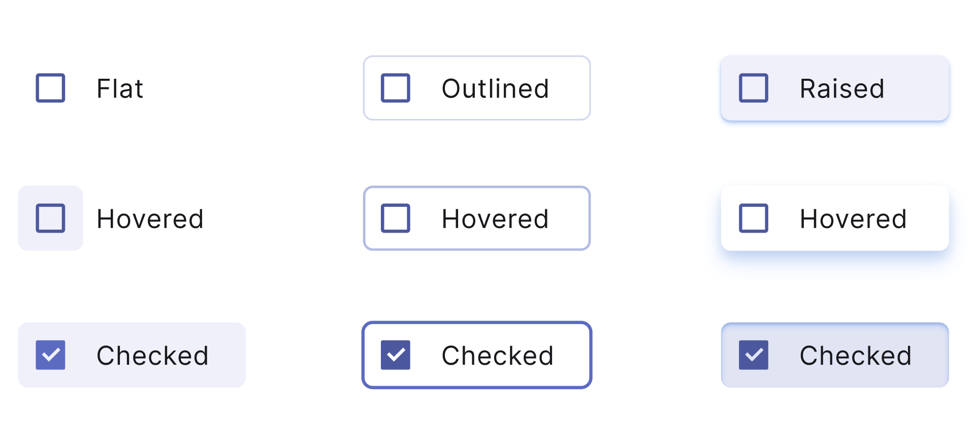
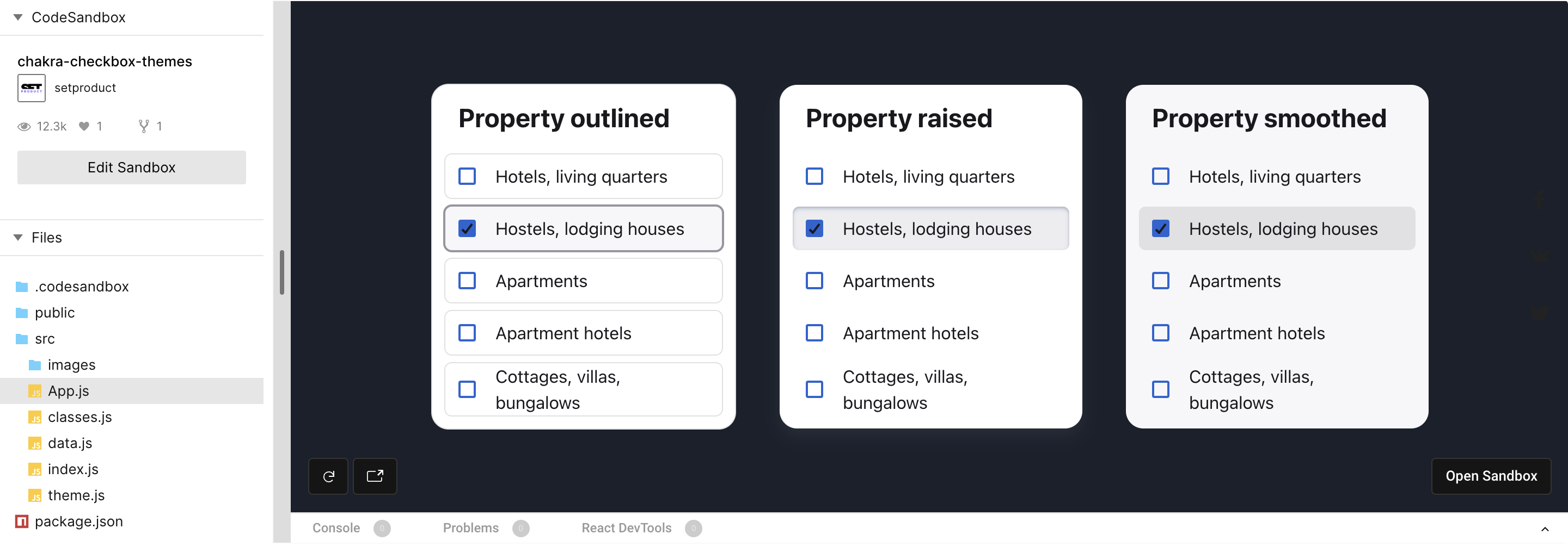
Wrap selected states with a border (Outlined) to intense a selection performed. Equip with a shadow (Raised) to make it look like a clickable button. Fill a background (Smooth) with shaded colors to use on white, or colored surfaces. Picking a proper style depends on UX results you want to achieve.

Styling a checkbox background is a path to endorse usability and highlight what matters most now in your GUI. However, some basic design skills are required to generate modern & user-friendly themes. The vast of cases recommend staying with a trustworthy combination: an ordinary checkbox + simple text together.

Play with styled checkboxes below (Outlined, Raised, Smooth):

{{spacer-16}}
Open in Sandbox

{{spacer-64}}

Color themes

Checkbox color tokens in Figma

Swapping color themes for the checkbox component is easy within the color tokens. There are 10 tokens for each color in the Chakra palette. Each color is numbered: the higher the value – the darker is color. Overall, Chakra's colors are well-set and good to go with, taking off the headache to compound a palette for your next app UI.

To calibrate a component and prepare it for the themification you have to set proper color token values for each element the checkbox consists of an icon, text caption; hover, active, and other states. And this requires UI design skills and precise attention to UI details.

The image above shows an example of tokens specifications. After, by toggling color names (e.g Green→Blue→Purple) but keeping values you can easily recolor a checkbox in Chakra UI.

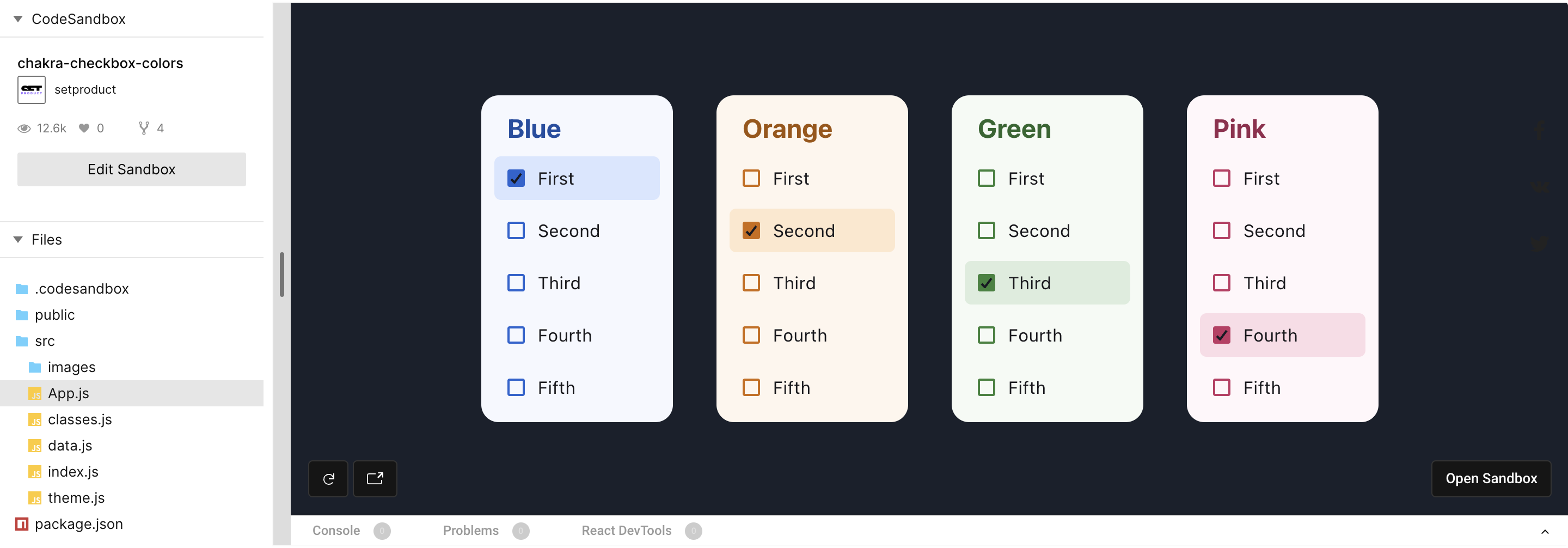
Why change checkbox colors, in general? In many cases you don't need to tune it deeply, however, you can't avoid using red for warning states, yellow for caution, and green for success. In order to highlight or diversify blocks, complex components, or even full app sections, you're free to use wisely Grey, Purple, Cyan, or other colors.

{{spacer-16}}
Open in Sandbox

To learn how to store color tokens in React, open the data.js section. You will discover each color named as it is and consists of several values declared internally. This makes styling effortless with component props:

Data.js

{{spacer-64}}

{{stars-conclusion}}

{{spacer-64}}

Conclusion

A component deep themification is a key to achieve a slick UI and smooth user's experience, but UI design intermediate skills are required here. A visual designer calibrates specs for each tiny detail for a component, then a developer carefully convert those styles into code.

So, let's get through a crucial points once again:

  • Experimenting with separate parts of a component makes it easy to fit a checkbox component with a proximity of your particular interface UI.
  • It's safe to stay with the default checkbox icon as it is acquainted for users, unless your app UI design requires exclusive styles or uncommon solutions.
  • To make it easier for a user to distinguish checked items from unchecked you can apply styles to a container background, mainly when it's hovered, or clicked.
  • In order to highlight or diversify blocks, complex components, or even full app sections, you're free to use wisely Grey, Purple, Cyan, or other colors.

The ideas given in this post might be useful for designers who code (and learn React) and developers who aimed for a polished interfaces, as our coders are. Learn more about our services, if you're looking for a team of professionals dedicated to design & code beautiful components and web apps. Figma, Webflow, React, Angular and other stacks are not only we're capable of. Hire us!

Share this post

Subscribe to Setproduct

Once per week we send a newsletter with new releases, freebies and blog publications
Oops! Something went wrong while submitting the form.

By clicking Sign Up you're confirming that you agree with our Terms and Conditions.

Congratulations!

You're in! Expect awesome updates in your inbox

Related posts

Lorem ipsum dolor sit amet, consectetur adipiscing elit.

Design & Code

2 mins read

9 reasons to use Material UI kit for Next.js, TailwindCSS and Figma

Discover the 9 reasons why our Figma & Next.js library is the best choice for web applications, especially when styled with the trendy Material You design theme.

Figma Templates & UI kits

Save time and human resources by reusing hundreds of pre-made templates crafted by us. Based on top notch UX taken from the World's best apps.

Material X for Figma

Figma library with 1100+ components & 40 app templates beyond Material Design. Powered by top-notch shapes and Manrope font. Customizable & Adjustable UI kit now available for Angular & Figma

Material You UI kit

Figma & React library with 2600+ variants of 32 components compatible with Material Design 3. Plus 220+ dashboard templates for all the viewports. Now available for NextJS & TailwindCSS.

Figma React UI kit

Designed and well-organized in Figma React-based UI toolkit for the web. Optimized for building complex data-dense interfaces for desktop and mobile applications.

Panda Design System

Figma library with dashboard, calendar, kanban, profile, table, ecommerce and 80+ templates in total. Components with variants, dark theme included.

Eclipse UI kit

Figma library with 1100+ components & 74 templates for data-driven web applications. Powered by auto-layout. Supercharged by Figma's variants.

Rome UI kit for Figma

Customizable and well-organized team library. Contains 250+ components & 30 web app templates powered by stylish and trendy guidelines.

Material Design System

Figma library is based on 100% guidelines compliance with Material.io. Contains ready‑to-use templates to accelerate app UI design.

Neolex Dashboard UI kit

Customizable & adjustable dashboard design system with 50+ ready-to-use app layouts, 1900+ variants for 30 components with auto-layout.

Material Desktop Dashboard UI kit

Figma library with 48+ dashboard templates based on reusable desktop app patterns carefully handpicked from the most popular web apps.

Xela UI kit for Figma

Figma library with 1900+ variants of 30 components categories to craft perfectly shaped desktop & mobile apps. Customizable & Adjustable dashboard design system with 50+ web app templates.

Figma S8 Design System

Figma design library for mobile and desktop apps made of high quality styled components. Full version includes 67 dashboard templates.

OE Figma Design System

Customizable and well-organized Figma library. This design system aimed to build highly loaded interfaces, boost the speed and save more costs.

Figma iOS kit

Figma library of iOS patterns served as ready-made templates. This UI kit inspired by World's best apps. Based on Human Interface guidelines.

Figma S8 Design System

Figma design library for mobile and desktop apps made of high quality styled components. Full version includes 67 dashboard templates.

Most iOS UI kit for Figma

iOS native components and app templates organized into a «Most Design System» fully compatible with Apple's Human Interface guidelines.

Rome UI kit for Figma

Customizable and well-organized team library. Contains 250+ components & 30 web app templates powered by stylish and trendy guidelines.

Material Design System

Figma library is based on 100% guidelines compliance with Material.io. Contains ready‑to-use templates to accelerate app UI design.

Nucleus UI

Nucleus UI contains 1000 components and variants with 500+ mobile screens designed for Figma (including 9 themes from Event, E-commerce, Finance, NFT, etc.).

Figma Android UI kit

Components-driven Android mobile UI library for Figma. Consists of 140 high quality application templates made of total 250+ UI components.

Mobile X UI kit

Customizable & adjustable iOS / Android design system loaded with ready-made 157 app templates based on 860+ variants for 20 components.

Appka iOS UI kit

Customizable & adjustable iOS design system with 4100+ variants for 28 components and 280+ ready-to-use app layouts crafted for Figma.

Full iOS UI kit

Customizable iOS design system with 320 ready-to-use app layouts. You can modify them or use as it is to save time and never design from scratch again.

Xela for Flutter

XelaUI for Flutter is a simple, modular and accessible component library that gives you the building Flutter apps for mobile and desktop.

Xela for Android

Ready-made collection of fully customizable widgets, UI screens and reusable components for Android coded with Jetpack Compose.

Xela for Swift

Designed for iOS Developers. We provide fully coded customizable components, widgets and well-organized iOS screens for Figma & SwiftUI.

Material You UI kit

Figma & React library with 2600+ variants of 32 components compatible with Material Design 3. Plus 220+ dashboard templates for all the viewports. Now available for NextJS & TailwindCSS.

Figma Charts UI kit

Components-driven graphs design kit for dashboards, presentations, infographics & data visualisation. Includes 25+ charts types for all the viewports.

Hyper Charts

Create impressive visuals with Figma's graphs templates – dozens of scalable and customizable data visualization blocks for dark and light modes.

Orion UI kit

Figma library with 40+ full-width charts templates served in light & dark themes. Contains 200+ of dataviz widgets that look perfect on desktop & mobile screens.

Xela for React

React based components library for beautiful user interface in React apps. Lightweight library for your projects. Contains pre-made web app templates.

Figma React UI kit

Designed and well-organized in Figma React-based UI toolkit for the web. Optimized for building complex data-dense interfaces for desktop and mobile applications.

Material X for Figma

Figma library with 1100+ components & 40 app templates beyond Material Design. Powered by top-notch shapes and Manrope font. Customizable & Adjustable UI kit now available for Angular & Figma

Xela for Flutter

XelaUI for Flutter is a simple, modular and accessible component library that gives you the building Flutter apps for mobile and desktop.

Xela for Android

Ready-made collection of fully customizable widgets, UI screens and reusable components for Android coded with Jetpack Compose.

Xela for Swift

Designed for iOS Developers. We provide fully coded customizable components, widgets and well-organized iOS screens for Figma & SwiftUI.

Material You UI kit

Figma & React library with 2600+ variants of 32 components compatible with Material Design 3. Plus 220+ dashboard templates for all the viewports. Now available for NextJS & TailwindCSS.

Xela for React

React based components library for beautiful user interface in React apps. Lightweight library for your projects. Contains pre-made web app templates.

Levitate 3D kit for Figma

Components-driven 3D kit to design eye-catching Figma presentations. Helps to enhance your landing page, product or app, brand ident, etc.

Website templates UI kit

Landing pages reusable templates kit based on most effective web design patterns. 140+ dark & light constrained design blocks.

Figma Landing Pages UI kit

Landing pages templates library based on constrained & organized components aimed to speed-up the production of effective websites.

Zeus UI kit

Create hassle-free landing pages in Figma. This kit is based on 10 landing page templates, powered by 1600+ variants for 630+ web blocks.

Research, copy and ideate with SetGPT!

We've launched the alternative ChatGPT clone dedicated to UI designers, UX researchers, writers and indiehackers.

Powered by the latest OpenAI gtp-3.5-turbo model, this free chatbot is the perfect tool for those in need of intelligent and innovative insights, wrapped with a slick UI and sophisticated user experience.

Start now

SetGPT is a free service; however, authentication is required

This is some text inside of a div block.